March 29, 2016
This is the 1,500th post on The Vivienne Files! If you're looking here for a specific color scheme, or general ideal, I encourage you to go to Google and enter "The Vivienne Files" and then whatever things you'd like to find. The chances grow greater every day that you might find something helpful to you in my archives! And if you don't find it, let me know and I'll build it, some day. I've got no intentions of stopping now...And thank you, very humbly, and very sincerely, for your continued support of my efforts. You each mean so much to me!
love, Janice
On with the show!!!
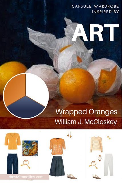
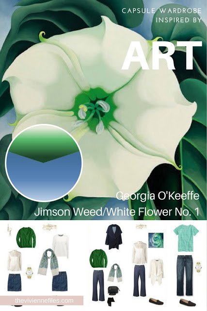
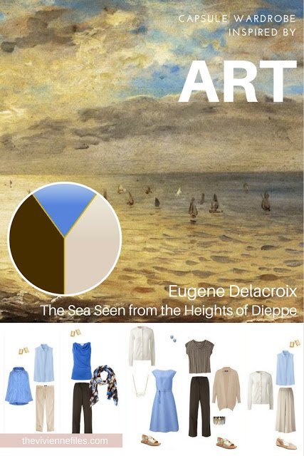
What a simple, but lovely painting:
It's the kind of painting that you might walk right past during a museum visit, but ... View the Post
