October 11, 2023
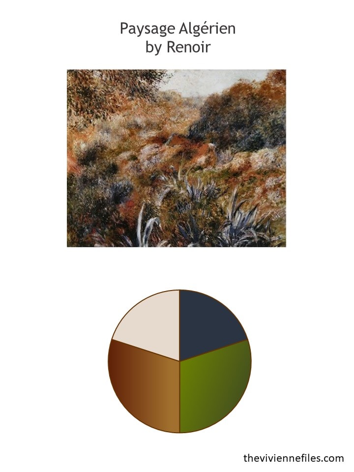
This painting really feels just right for this time of year – we’re actually on our 4th consecutive day of true autumn weather!
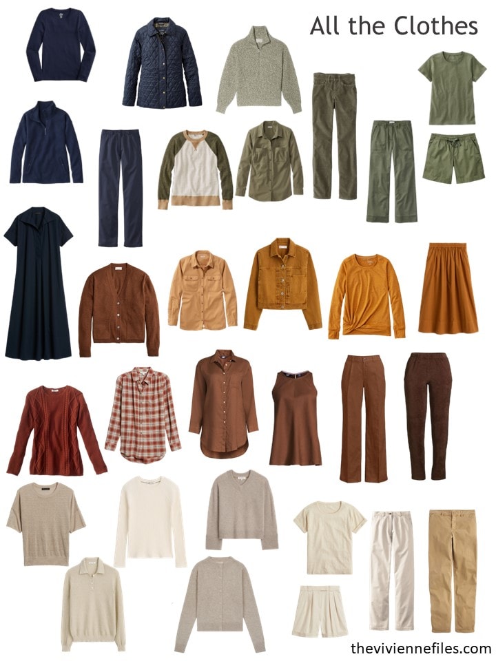
What do you think? To me, this feels the most like a “normal” wardrobe. Maybe it’s the mix of colors, or the number of colors?
This heroine starts out thinking that she’s going to get some basic, infinitely useful garments this month; many of us start out thinking this way!
A navy tee shirt? Perfect for a solid column of color with her navy pants. The polo sweater can be worn with something under it, or on its own. And a v-neck sweater is classic, and also can be layered or worn alone…
Maybe gold loafers and a sparkly brooch aren’t absolutely basic!
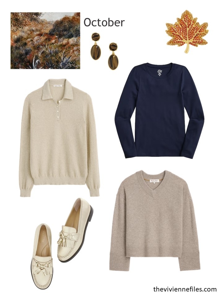
Earrings – Talbots; maple leaf brooch – Talbots; navy tee – J.Crew; driftwood cotton polo sweater – Alex Mill; cashmere v-neck sweater – Alex Mill; gold loafers – Talbots
This wardrobe doesn’t look a lot different – maybe a stronger level of the beige family. Her purchases were very consistent with her existing wardrobe, which is always pretty efficient and smart!
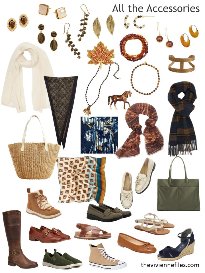
Her accessories are lovely – I’m seeing a pair of beige short boots for her?
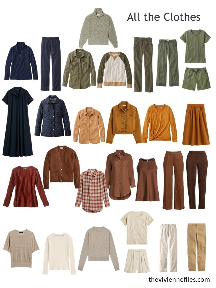
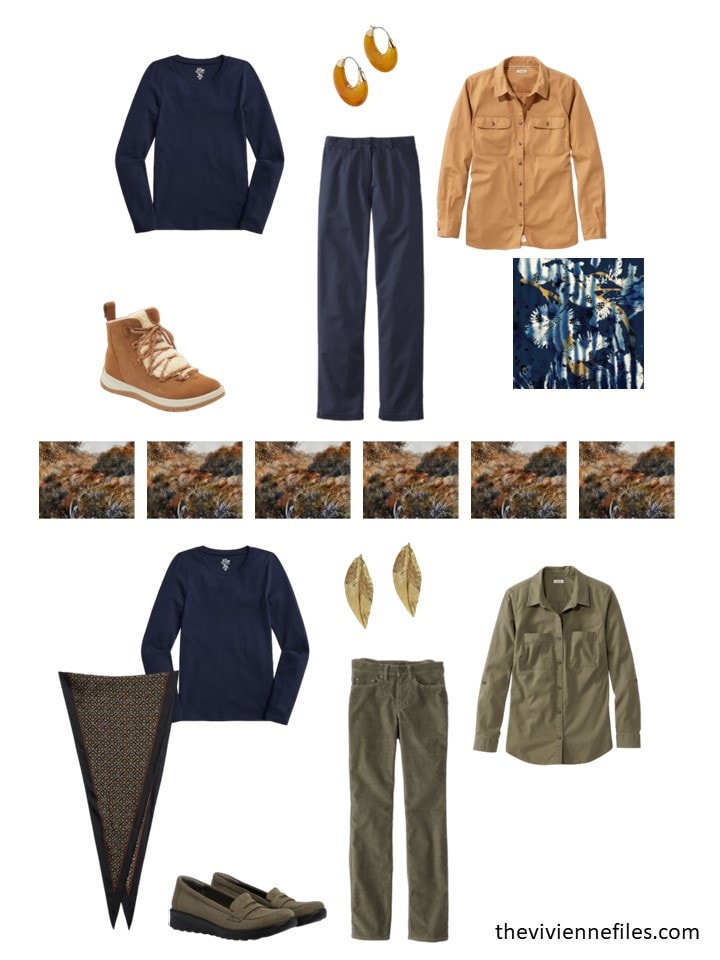
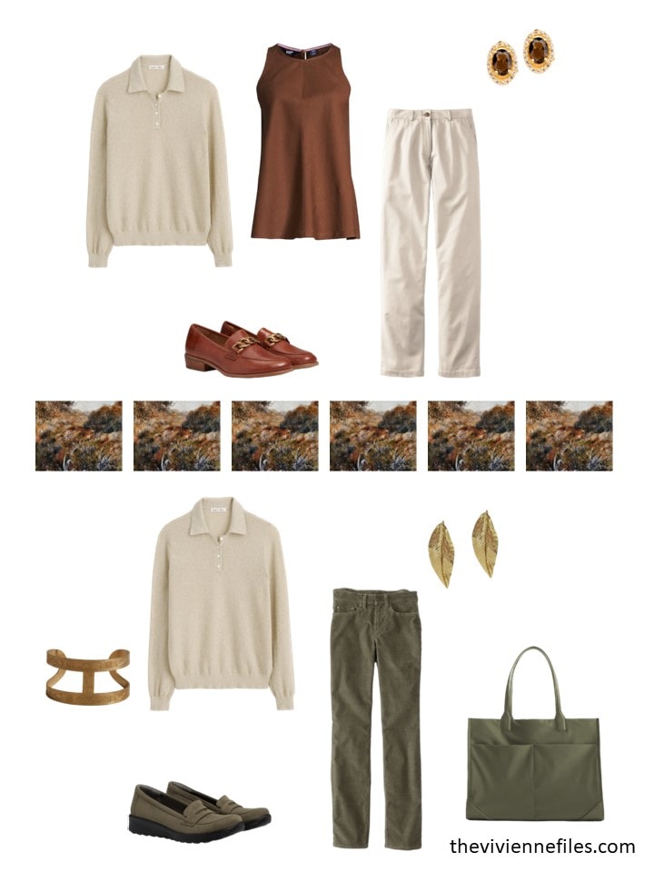
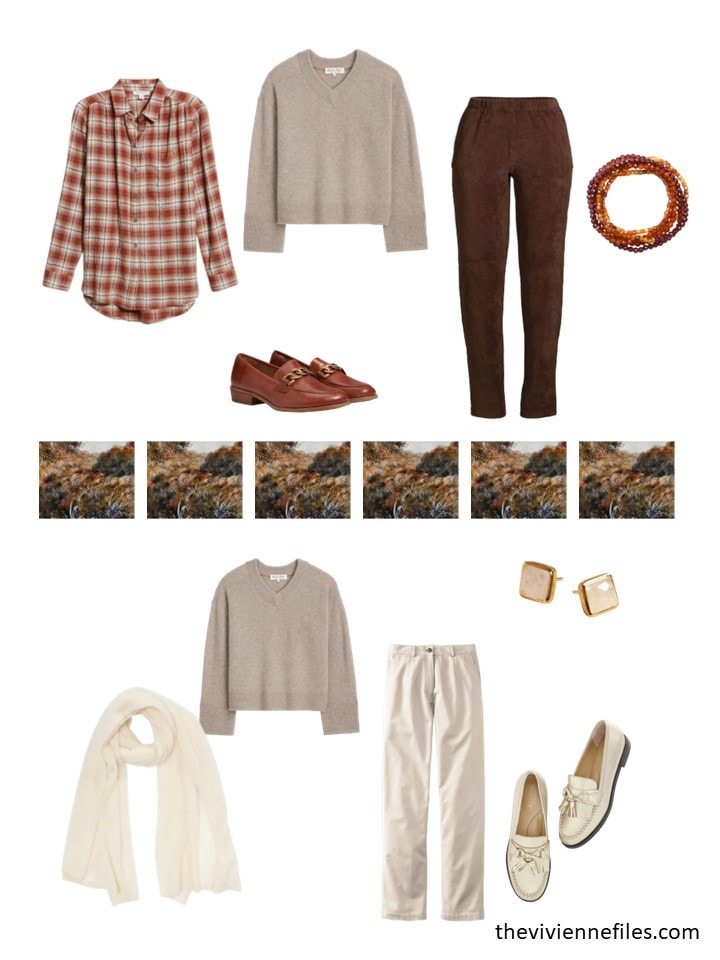
As always, we like to see how new purchases will be worn! This wardrobe is almost infinitely variable…
What about this wardrobe? If you arrived somewhere for a month, and this wardrobe was what you found in your luggage, could you manage? Would you be happy?
love,
Janice
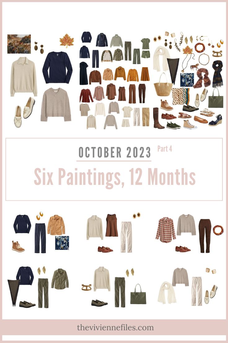
Like this wardrobe? Save it to Pinterest!
My favourite so far. Love the navy and camel.
I have been struggling to find basic colours to build a wardrobe. This is perfect for me – simple, clean, autumnal, natural. Thanks!
This is the wardrobe I could wear all year. These are my colors. The only exception is the Navy. I would change the pants to dark denim jeans. I don’t wear black either. I’m thinking brown. I love brown and now is the time to shop for it.
The browns and tans are lovely. It’s easy to get a lot of mileage from them. Even though I don’t like olive and mustard gold, I will wear my tans & browns with Oxford blue, bright navy, red, apple green, banana, salmon, coral. (Oh, yes, I have a drawer FILLED with scarves😄)
Morning Ladies, we’ve finally hit fall here as well – with the rain coming down! My own wardrobe merges the Rothko and this one. Well, mostly, I do have some lavender pieces at the moment. I don’t have the yellow of the Rothko, the bronze/copper color in this one, or the beige’s – which completely wash me out. I’m actually pretty happy with it. It would be helpful if I would commit to either warm or cool – particularly with my greens – but oh well, it does give me a very wide range.
Have a good day everyone!
Some of us have neutral colouring and can wear both warm or cool colours. I’ve discovered this with so much green in my wardrobe. Some are warm, some are cool, both work, for me.
I could easily live in this wardrobe. The colors are perfect together.
I could live with this wardrobe all year, let alone for a trip. I look better with cool colors, but have lots of khaki green and some of that lovely butternut / mustardy yellow in my wardrobe. The beige would make me look like death, though. Not sure how I’d replace that – white seems too stark with these colors.
This is my favorite of the scarf series this year. A beautiful selection.
With a few additions I can get through the whole year. Would divide the bottom row into beige and white… additionally red, yellow… And turquoise for summer and pair of patterned clothes.
That’s what I have in my closet. 🤩
I bought blue ballerina shoes a week ago. Oh, a brown bag is still missing.
Love this wardrobe!
It’s feeling like fall here in Our Nations Capitol! Love this wardrobe. Where would I find the straw bag?
Yep, I could wear this. It wouldn’t look great on me, but the style is right. Ditto on the arrival of fall, it’s been rainy and ‘atmospheric’ for the last few days. I love it!
Love this, would totally wear! Like many of the people commenting, I don’t think I could handle all the beige/stone… but if we swap the colors and make the stone pieces navy, and the navy pieces stone… that’s about the balance I would want. Navy as the larger amount of pieces and stone as more of an accent. I agree, Janice, that this one feels like a more “normal” mix of colors to me – although my closet is rainbow-hued (I’m definitely a color-magpie).
Although, interestingly enough, when I was working from home more, I was happy to live in a very limited color palette of neutrals (black, navy, cream, “work blue”, grey…). Turns out I seem to need an extra color boost to interact with people on a day-to-day basis. Did anyone else find that?
Yes. 100% yes. I think for me it’s a mix of having colors and patterns that make me happy when I see them, and being able to have control over something, both of which are sorely needed when I’m in the office.
Yes. I too am finding the same.
I find this question very interesting. All through the pandemic, I never worked from home. I was working for a manufacturing facility, and we were considered “essential,” so it was only in March of this year, when I changed jobs, that I finally had a position where I am able to work from home. So, I’m only now going through the process of adjustment so many others went through a couple of years ago. Admittedly, I am a color magpie, and as someone with Spring coloring, I like and look good in bright, warm colors. However, I tend to continue to wear these colors both in working from home and the occasional travel to the office. I do think there may be something to the extra color boost bit as they seem to help me stay on track and focused in an environment where it can be very easy to get distracted. Also, I find that it works better for me to get dressed just as I would if I were going to the office, even to wearing dress shoes. My productivity is way better.
With fall weather arriving and rain coming down, I wonder if our heroines need some rain boots and nice trenches or rain jackets. Rain hats? Certainly merino or cashmere scarves can’t be far behind as temperatures plunge.
Talbots certainly comes through with its classic styles and pieces I can add year to year and season to season! Especillaybthose loafers. Stores chasing trends managed to ruin loafers. I don’t want to risk a fall tottering around on two-inch lug soles which will become party costumes 20 years hence. 😂
Janice,
You are looking at the colors in my closet, along with some mustard tops ! The navy is the only color that I would minimize as it has become too dark for me , though I can wear it if off white is next to my face. As someone else remarked, I would sub out a lot of the navy for chocolate brown. . It wasn’t until viewing your posts over the years that I have finally plunged into wearing navy with olive green, but again only with off white under my face to split them up to get the right amount of value contrast . I do like the contrast of the cooler navy worn with the warmer olive green ,split up by off white , as all warm colors all of the time become tedious to me and my eye screams for contrast and variety !
Denim blue would work better for me than navy blue .
This is the closest yet to my actual fall wardrobe, which is mostly navy, beige, rust and teal with some black, chestnut, berry and chambray accents.
It was these scarf posts that got me to start with a color palette. I made myself a color chart on canva, and then, when I went through my closet, everything that didn’t fit the palette got packed away. That made it easy to see what was missing in terms of tops/bottoms/sleeve length/color balance. Based on the gaps, I spent an afternoon shopping.
Over a month later, I’m delighted to say that everything mixes and matches, and that I always have an outfit that fits my mood/the demands of the day. This is my fourth capsule season, and I feel like I’ve finally nailed what works for me. So thank you for this structure of choosing colors first!
Oh I like the idea of your own color chart on canvas. Did you use markers, paint, what? Did you start with one or two scarves and go from there? How did you determine your palette?
I didn’t actually start with scarves, but thought about what “fall” colors I already had, and then played around with a mix of colors until I felt like it had enough variety. Basically, I laid it out as 3 neutrals (black, beige, navy), three main colors (rust, teal, and berry) and three accents (chestnut, olive, and chambray). For my summer palette I had 15 or 16 colors, and it felt like too much, but nine that all work well together seems perfect. Enough variety without being overwhelming! I created an image with all of the colors on Canva and printed it out.
I like your idea of having three neutrals, three main colours and three accents. It’s an alternative to the neutrals and accents and gives one more colours to play around with. I don’t like to be limited. For example, I wear a lot of blue but different shades. Today, I wore a completely blue outfit , mainly navy but with a lighter navy jumper and a patterned top of navy, light blue, grey on white. I had navy and white shoes, a navy bag and wax jacket because it was damp. I initially wore a mid blue and silver scarf but that got put in my bag.
Thank you for sharing how you developed your palette. The 3 neutrals, 3 main colors, and 3 accents format is something I think I want to play around with in my own wardrobe. And I could possibly see this also working well with the idea of building a capsule in 3s that I’ve read about before, as in 3 of each type of clothing. For example, have 3 t-shirts, one in a basic/neutral, one in a color, and one in a print/pattern. Rinse and repeat for pants, toppers, etc. My analytical mind likes to think about the possibilities when layering the concepts, at least!
Coming back to this late, but your comment made me realize that I also thought in 3s for tops – when I went shopping, I looked for short sleeves, long sleeves, and layering pieces, going for a balance of each in each color. Fall in Colorado has temps that swing 40+ degrees within a single day, which means I’ve gotten plenty of use out of all of them!
The overall style of this wardrobe is definitely most like my wardrobe. The colors are not, but they really are quintessential autumn! Beautifully done.
If I woke up somewhere with this capsule in my suitcase, I would wonder where I was that I needed this much weather variety in my wardrobe ;) I would like the navy, olive, and some of the cooler stone/taupe (though even there, it feels like there are too many similar tops though they may be targeting different weather conditions). But the beige pants and the overwhelming amount of warm brown would be a real struggle for me. I would prefer to replace everything from the third row down, I think!
On that point, it’s interesting to note that the olive + navy are half of the color palette but only make up about a third of the garments. The navy seems particularly under-represented here. Maybe the heroine just got lucky finding a lot of her warm brown in stores this year and decided to lean into it, but this balance of colors took the capsule for me personally from “oooh, promising” with the initial reveal of the color palette to “uh, pass” as the capsule has developed. I’d need the warm brown/cognac to be the accent color (mostly in leather goods; perhaps a pair of pants/skirt + t-shirt as an inner column to layer over though it wouldn’t be my first choice) instead of the navy (which I would bolster with various shades of blue denim/chambray, of course).
This said, it’s a nice wardrobe, and it’s clear (from this capsule and others) that anyone who likes and can easily wear a blend of warm cream/tan/brown items in varying values from light to dark will find building a mix-and-match-able capsule much easier than those who don’t. I think navy/denim comes close to the warm browns in terms of easy blendability but the special nature of denim-on-denim in creating actual outfits makes it less versatile than the warm browns in this way.
Ah Sally, I always end up reading your comments more than once. Such a lot of food for thought. I am not near as mindful as some of you are. 😂 The beauty of this blog and all those who read it and comment. Thank you!
Thanks for your comment, Sheila! I think it’s wonderful how we all bring something to the table in our discussions on this lovely blog.
I agree with Sheila, Sally. You always bring a lot of insightful commentary to the discussion.
I love looking at this wardrobe! It’s so beautiful and fits the fall perfectly. I wouldn’t be able to wear most of it as I look sallow and horrible in the greens and rusts shown, but the navy and beige and some of the brown I could definitely work with. I could survive!
This wardrobe is lovely and I could survive in it for sure. Not all of my best colors but it sure looks like fall weather!
I love this wardrobe – it looks fresh for fall! But, other than the navy and some of the less warm colored beige items – I couldn’t wear it because it would make my skin tone look poor.
But I do appreciate all of the wardrobes and get ideas from each. I do much of my shopping based on your recommendations and I’m happy that a lot of the wardrobes have blues, pinks, purples and greys that I can wear.
Although the colors aren’t perfect for me, I would take this capsule in a heart beat. I love the level of casual it has and the colors are so pretty!
These colours sing “cozy” to me. Wonderful wardrobe!
Nope. If I found this in my suitcase for a month long trip I’d wonder how to manage with only the dark chocolate pants and a few navy items. Everything else would look ghastly on me. Or I would look ghastly in it, or both.
I’d have to try the 100 Day Challenge with the navy dress.
That said I still covet that horse brooch.
Definitely a favorite!
I would be very happy to find this in my suitcase. I could survive 9 months in them and look good or sometimes okay. I would be more than happy if there was a magic wand in this suitcase that allowed me to change some of the clothes or their colors.
What I would do: the stone color is too dull on me, so I would change a big part of it to black or charcoal.
Navy: okay but not great, so I would change those clothes to stone with 20% green or brown in it.
Then I would change some of the clothes and accents to a coral French 5, and some to maybe a curry French 5. I kept on changing it till I had a fun wardrobe with a solid base.
I like the style of the clothes, the only clothes for the magic wand treatment are the shorts.
Thank you for this capsule, I am sure there is someone in this world that could wear this without using a wand;)
I’ve been following 4 of these wardrobes on paper and this is one of them. I could live with this although to be truly happy, I would change the cuts of some of the pieces and shift the dark items to the bottoms and the beige up to my face. I look like death with navy, etc close to my face. Funny thing is that a deep brown or green looks fine. I’ve been using the paper following to figure out what I do and don’t like and why. For example, I liked the idea of the Rothko, but it is overall too dark. I like the pastel theme of the last post, but it leans too pink which I haven’t worn for many years. This one isn’t balanced correctly for me with light colours nearest the face. I would definitely recommend doing a paper run through of a capsule. I have learned so much by doing this and didn’t put money into items that I won’t wear. Janice, thank you for sharing your work with us. I look forward to each post day with eagerness to see what you have created.
If I woke up with these items in my suitcase, I think I would actually be pretty happy with the wardrobe as is, especially regarding the current ratio of navy to beige pieces because I am finding navy to be a bit too cool and dark for me and usually only wear it with lighter and/or warmer colors. Ivory/stone/beige/camel work better for me as lights and neutrals with my Spring coloring. However, I would always be looking for some printed pieces containing two or more of the palette colors to work as bridge pieces. I would also want to bring in some warm brights as accents. This wardrobe and the Degas have been the two that I have followed the most closely, simply because the colors in those two paintings are closest to the colors I know work for me. I think anybody with warm coloring could use both of those wardrobes as starting points for thinking about building a foundation of neutrals in their closet. As a color magpie, this has always been my struggle and kryptonite.