August 7, 2023
Ah, back to seeing the possibilities in olive green!
Please note that there were other colors that I wanted to include, but just couldn’t find a cardigan that would do… I had to look for a shockingly long time to find a red cardigan! And there wasn’t nearly as much pink in the world as one might believe, now in the Barbie times…
But we still have beautiful options!
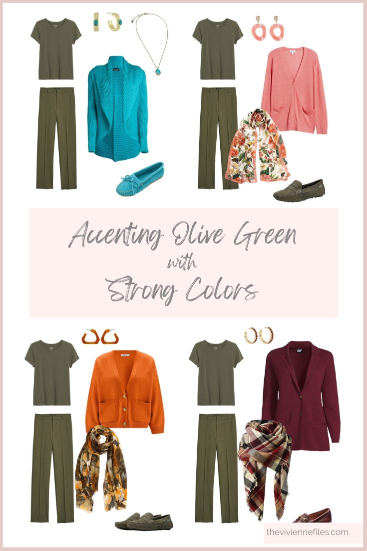
Rust is my first thought with green; red is technically the compliment color to green (i.e. it is opposite to green in the color wheel), but I really feel like orange/rust is just a natural fit…
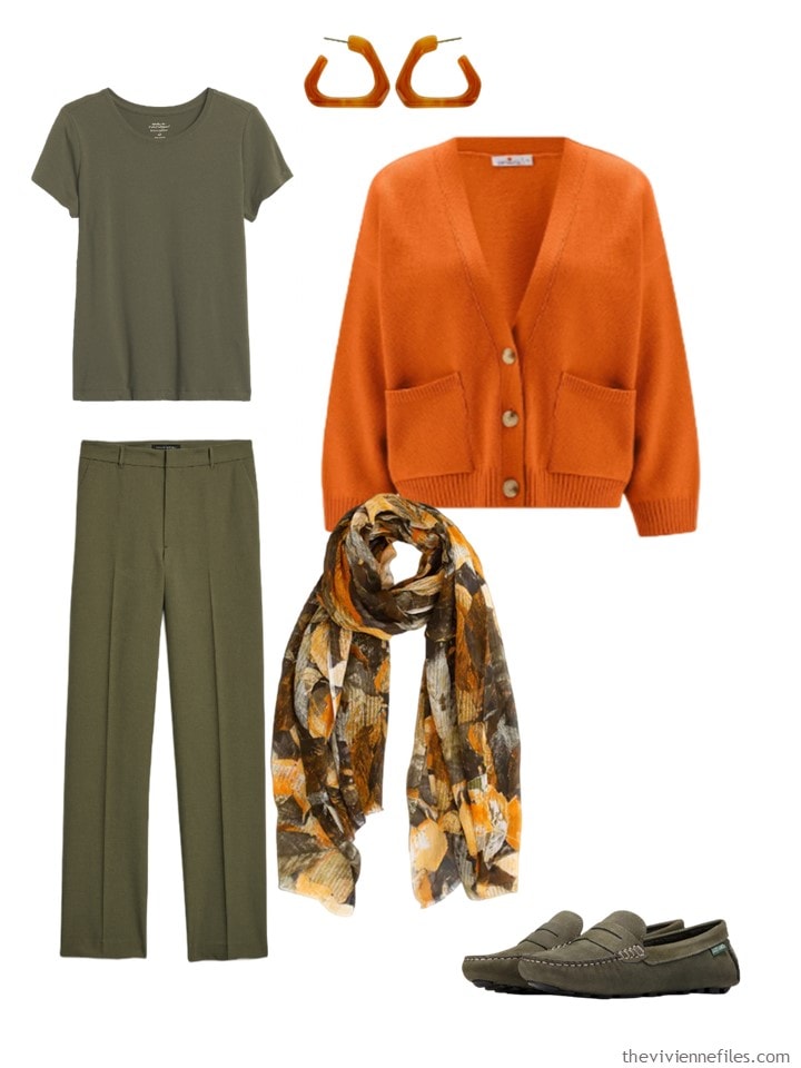
Tee shirt – Banana Republic; resin earrings- Panacea; cardigan – Peraluna; pants – Banana Republic; scarf – Aventura; loafers – Eastland
Turquoise! I love turquoise so much that I’m going to do another, brighter one below.
My thinking here is that if you’re wearing an amazing, eye-catching cardigan, you can keep the rest of your accents pretty simple. This is a rare case in which I wouldn’t want a scarf to distract from the lovely textured collar and lapels of this beauty…
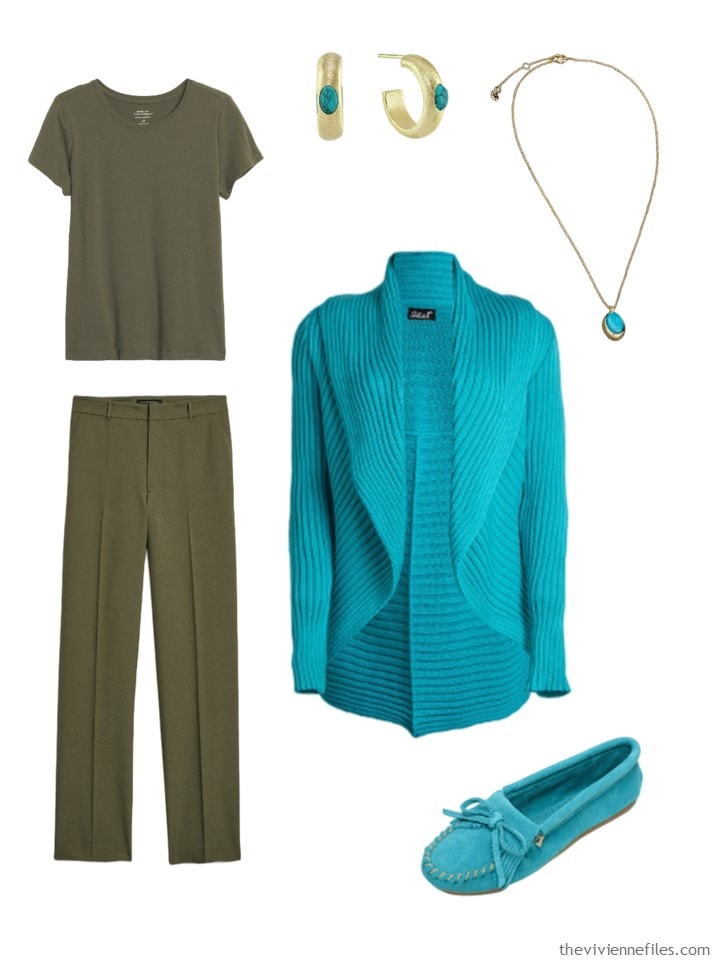
Tee shirt – Banana Republic; pants – Banana Republic; earrings – Marcia Moran; pendant – Lucky Brand; cardigan – Süel; moccasins – Minnetonka
Someone suggested coral – heck yes! It’s like a beautiful flower surrounded by leaves…
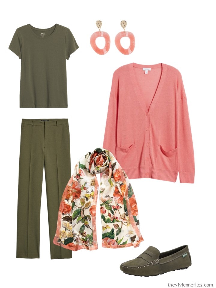
Tee shirt – Banana Republic; pants – Banana Republic; earrings – Tasha; coral cardigan – Nordstrom; scarf – Elizabetta; moccasins – Eastland
If you’re someone who likes bright colors, this is your cardigan! I wouldn’t wear ALL of the accessories with this outfit, but to each his own, right? And it’s nice to have options – those days when you absolutely MUST wear waterproof boots, or a warmer shoe, it’s nice to be able to grab your wee fuchsia purse and feel coordinated…
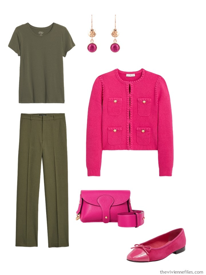
Tee shirt – Banana Republic; earrings – Latelita; pants – Banana Republic; jacket – J.Crew; bag – Betsy & Floss; shoes – Jeffrey Campbell
Honestly, I’m sharing another idea in turquoise because I could NOT fail to show you this jewelry! This is a case in which a simple cardigan, with classic tee and pants, stand back and let the jewelry and the snazzy boots be the focal points:
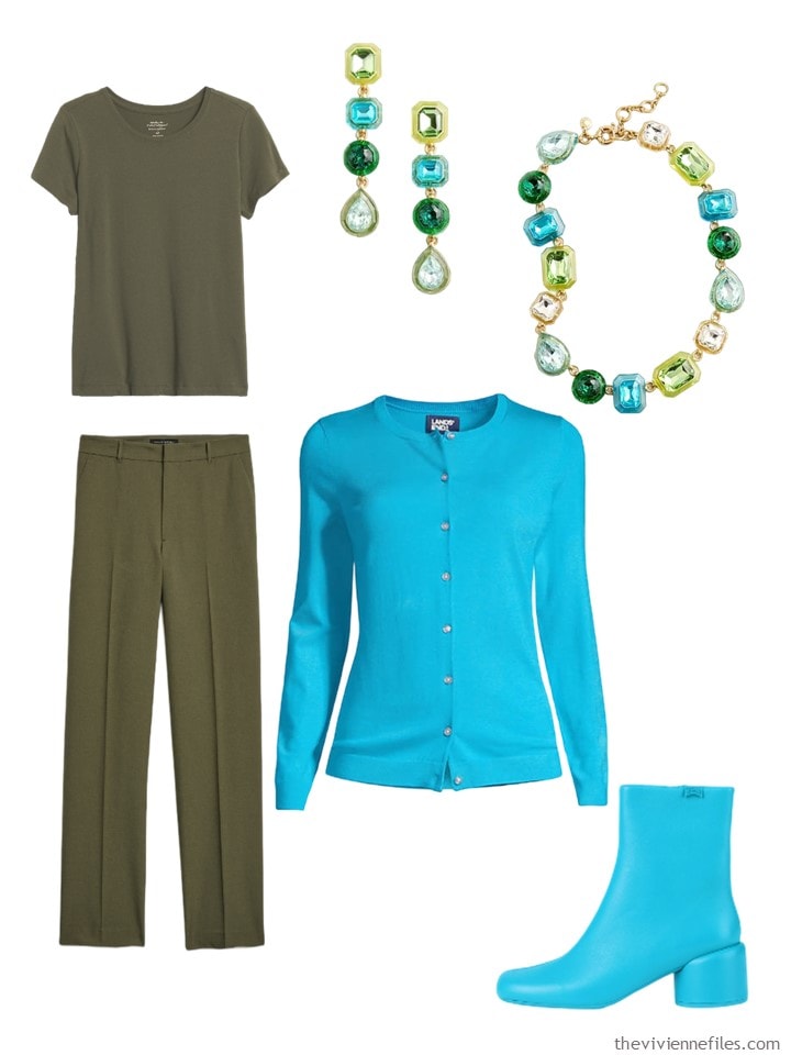
Tee shirt – Banana Republic; pants – Banana Republic; earrings – J.Crew; necklace – J.Crew; cardigan – Lands’ End; boots – Camper
Yes, burgundy is really a neutral! But I wanted you to see this sweater/blazer, and this scarf, which is available in about twenty color combinations. Sometimes, an outfit will start with the 2nd layer, or the scarf, especially here on The Vivienne Files.
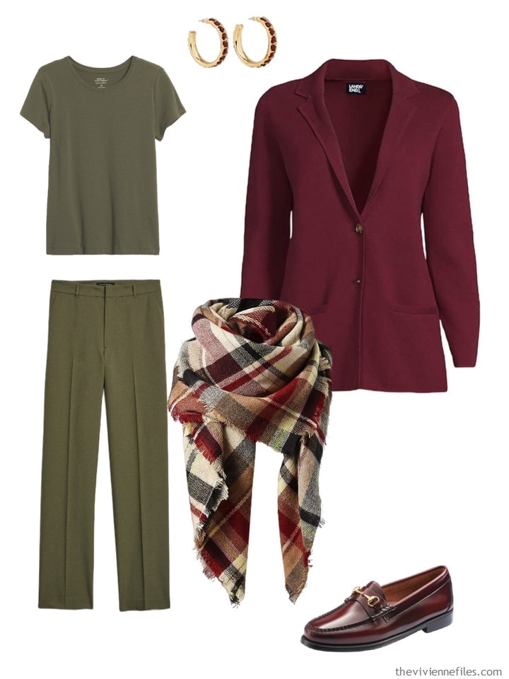
Tee shirt – Banana Republic; earrings – Kenneth Jay Lane; pants – Banana Republic; burgundy blazer sweater – Lands’ End; scarf – American Trends; loafers – G.H. Bass Originals
And yes, this is a camel cardigan – I’ve included it again because it is COTTON (it’s not easy to find camel in non-wool fabrics), and because I wanted to show that jewelry with a bit of visibility and heft can easily pull an outfit together. Gold and camel are a natural…
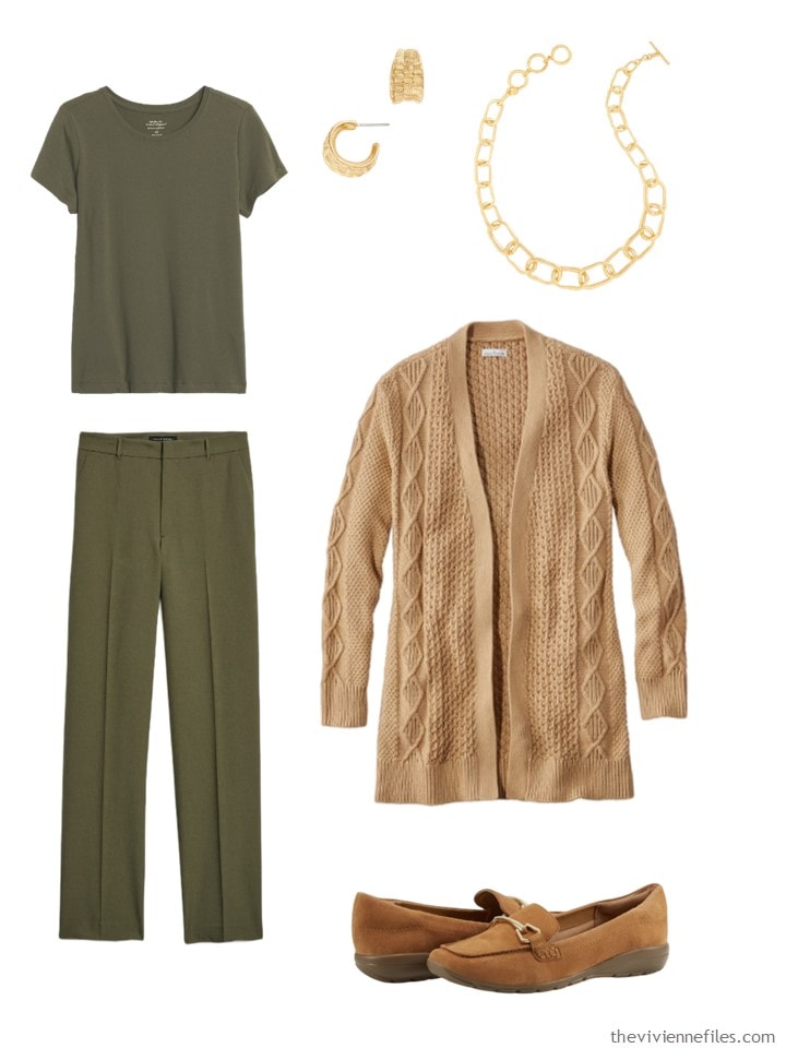
Tee shirt – Banana Republic; earrings – Talbots; necklace – Talbots; pants – Banana Republic; cardigan – L.L.Bean; loafers – Easy Spirit
And finally, I found a lovely little cashmere bolero cardigan, which would be perfect with the small neckerchief and enamel earrings. Talk about drawing attention to the upper half of your body!
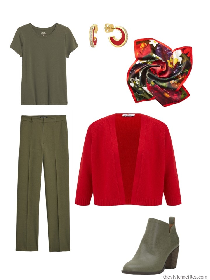
Tee shirt – Banana Republic; red earrings – Odda75; floral neckerchief – The Met Store; pants – Banana Republic; cashmere bolero – Peraluna; boots – Lucky Brand
Are you ready for navy? I’m looking forward to the work!
love,
Janice
Like this article? Save it to Pinterest!
I still like true red with the olive. Second favorite is rust.
I love it & I wear most of these combinations! Olive is my main neutral, with turquoise, & I go from coral & to rust to burgundy depending on the season–can go from soft coral for summer to deeper rust/burgundy in fall/winter.
And I like that you included Camel in there. I wear Camel with these colors too. Camel & amber & cognac!
In a previous post you showed some lovely quilted olive green ankle boots. Please could you tell us where to find/buy them?
NB I prefer dark forest green to olive because my colouring is pale (‘Winter), and the olives or khakis only suit me when I have a bit of a tan – impossible here in UK this cloudy damp summer. Please could you also show some wider-legged trousers for us?
The link to the olive boots can be found in the January post I think.
Also, depending on the tone of the Olive, turquoise set in silver works too, &/or coral set in silver as in beautiful Native American jewelry. I’m just so happy to see the colors I love to wear featured!
I’m enjoying these posts a lot! It’s a nice exercise of noticing the combinations I like and why. Here I like coral, rust and burgundy combos the most. I added olive about 3 years ago thanks to you Janice, with a wardrobe from an aspinal scarf. Although I own about 5 pieces, they are workhorses over the summer and autumn.
Can’t wait for the navy!
Cheers and blessings!
I like the orange the best. I have more of a rust color cardigan I wear with my olive. I don’t have a lot, just a couple of things. These last two posts on olive have been very helpful in showing me other options in color to wear with what I have. Looking forward to the navy.
oh, forgot. I couldn’t get the link to the blanket scarf to work. I did find it on Amazon – just type American Trends Blanket Scarf into the search bar.
I fixed the link; I’m always very grateful if you use links, because I get the commission from the sale! That’s how I keep my mother in pretty summer dresses…
love
Janice
I guess I’m just so entrenched in my traditional approach….that the hot pink and turquoise colours just speak to summer….not with a fall olive green…..just had to say!
BUT cat the same time it’s good to go outside the box thinking! Cheers!
Who wouldn’t want to wear those turquoise boots! They would be amazing in any bright colour like PINK💕
Regina
Having a lot of red in my hair and skin, olive green is one of my favorite colors. I love these combinations!!
Love the turquoise and coral they ate two of my favorites anytime of year in the northeast.
Absolutely love these combos except pink, I don’t DO pink. 😂
Love these ideas. A cool drab olive works well for me and goes with so many colors as you have shown. You do find the most amazing accessories! I had forgotten about the Romaine Brooks until the look back. I may use that as my plan for my November trip!
And now I’ve looked at several of the Start with Art looks. I am definitely going to choose a color theme and options from them! Just playing with options is so fun Thank you Janice!
Now you’re talking! I especially love the orange and turquoise color schemes. Yummy! I would bring in black and golden beige for a little more contrast.
I love olive green, but I’m really more flattered by forest green. So I have a question – why is olive green a neutral, and not forest green? I know darker cool greens are often difficult to find. But assuming you could find the right pieces, it seems to me that it would actually be a lovely neutral.
Well, I think any color can be a neutral if it works in a wardrobe in that function. I know that the magazine editor Diana Vreeland used red as her neutral, which was striking, and perfect for her. Listen to your instincts and do what feel right for you! And if I can find photographs of available forest green things, I will try it as a neutral!
hugs,
Janice
That’s an exciting possibility! I love forest green and have actually also wondered about using it as a neutral.
I totally agree – anything can be a neutral if you choose to use it that way. The main “neutral” in my wardrobe at this point is blue. Not navy, which is too dark for me, but more of a royal/cobalt blue. I wear it with turquoise, all sorts of aquas and teals, cream, lighter or darker blues, coral, chartreuse, and lilac/periwinkle.
I’ve seen forest green lumped in with burgundy, rust, eggplant, dark teal, etc. as a “colored neutral” and used very well as such, so I 100% think it can work!
Unfortunately the link to the American Trends scarf has broken again.
Turquoise, Coral Pink and Burgundy are my favourite combos. I can’t wear olive so I imagine grey instead.
It’s broken for me too! Amazon is NOT my best business partner… sigh…
hugs,
Janice
I like olive best with the more muted colors. The intensity of the bright pink, bright turquoise (the second one), and saturated red are a bit challenging to my eye; I definitely think they can work but it doesn’t feel like a natural combination to me. A softer pink, a dark teal (or greener aquamarine), and a softer red (or a darker red like maroon) would be spot on for me with olive. But my own coloring is also soft/muted to that could be skewing my preferences here!
This particular olive looks very warm/yellow-based on my screen, and I think it would pair beautifully with saturated/bright accents that have a warm tone like bright orange and yellow.
My favorite olive is a bit lighter and more sage-y than this one, so I lean toward accents that have a bit of white and/or grey in them so that they are toned down in a similar way to my olive-with-a-hint-of-grey. Obviously this isn’t some kind of necessity, but in general, I do find it easier to pair colors when they share underlying toning.
My wild card pairing with olive is a rich saturated magenta, which I think works because Yellow-Green and Red-Violet are opposites on the color wheel. (We call olive a shade of green, but on the color wheel, it always looks like a darkened yellow-green to me.)
I love the look back, though my black would be navy. We went to an art and craft show this weekend. I bought a couple of bead necklaces – lilac and navy which would go well with the look back and shades of pink and plum.
.
I was today years old when I came across the term “coloured neutral”. That is the concept I’ve been looking for! For me neutral has always meant black, white, grey, or beige.(Think OCD.) I reluctantly came to accept navy or denim, because it is socially acceptable to wear denim with any colour. But to me they were always “blue”. Olive, burgundy and the like jar my sense of “neutral” since they are obviously shades of green, red, or whatever. Now I can comfortably think in terms of “coloured neutral” or “neutral neutral”. This opens up a whole new range of possible neutral capsules in colours I love but was having a hard time incorporating into a limited palette.
Thank you Sally In St Paul.
Olive is one of my best colors, but I have never thought about pairing it with turquoise. Excuse me while I go shop my closet.
I absolutely love the coral and burgundy. Those are the ones that make me sigh with envy. I think a plummy/jammy purple would also be so pretty with the olive. A light buttery yellow is also so pretty with olive (thinking about your Start With Art). I also have a soft spot for what I would call a ‘tea rose’ color with olive.
The camel one falls firmly into the ‘love it on someone else’ category for me.
In terms of the orange, I might as well wish to be a millionare. I think I’d stand a better chance at that than of wearing the orange. I’m so jealous of people who can wear these classic autumn colors.
I love the fuchsia, but not with olive. I’m kind of undecided about the red. I think if it went a shade darker, into more of a cranberry, I’d be on board, or if it leaned a bit more orange… I think I can conceptually get behind olive and red, but I don’t think I like that red with it. Maybe some people would look stunning in it, but I’m struggling with it. I’m also not liking the bright turquoise here. I feel like it’s not so much clashing as jarring. I do love the darker one.
I’m officially giving up my olive pretentions. I think that in and of itself, I can handle it, but I’m coming to accept that it’s a very limiting color for me instead of expansive.
I can almost remember the day I had that epiphany.
Personally, I think of these colors as ‘semi-neutrals’ and I reserve ‘color neutral’ for one color every season that I wear with the same sense of ease that I wear black and denim.
I made an executive decision one day that I was going to wear red as though it were a neutral and no one could stop me. That opened a whole world of possibilities for me. I realized that I have to maintain high contrast, (which is something I generally have to do with my neutrals as well– like I can’t wear black with deep burgundy or white with pale lavender either, even though all four of those work for me on an individual basis) but as long as I mind the contrast, I’m up to about six colors that I can just declare neutrals.
I love a cool olive green and like to pair it with any shade of purple, blue, denim, coral and off-white. The olive here looks very warm on my monitor so I wouldn’t wear it, but of all the combos, my favorite is the burgundy.
I enjoyed this exercise. What I noticed is that if the olive paired with a warm fall – rust and camel – I liked the pairing. Otherwise it just didn’t appeal. Not that I think the others are bad, just not my taste. The more explorations we have with pairings like this, the more we all benefit by seeing what we like, love or not. Now I know why the fall several years ago when pink and ‘army green’ was kind of a thing, I was just turned off by it. I know now that I like only warm fall colour pairings with certain greens thanks to this particular post. Please keep repeating these great
colour exercise posts. They are so instructive.
What a great post — so many lovely combinations … olive is definitely a wardrobe favorite. Years ago when I was working retail, a co-worker paired an olive dress with a red belt — and I thought it was the most amazing pairing ever. Janice, your blog always has something new to discover! Thank you.
Yay for olive and fuchsia, turquoise and orange. I wear these combos all the time! Unexpected but amazing…the faint heart can try the rust, teal or magenta which work too. Red is pretty but not for me and the camel is better on another.