May 31, 2023
When we left these five accent colors, from the Pantone London Autumn/Winter 2023-24 colors, I think we had determined that many of us like all sorts of different combinations! But the question was posed that different neutrals might make a difference in how we felt about the various accent colors.
Good question!
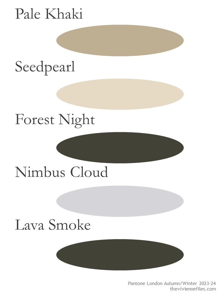
The London neutrals were the following five colors:
I made the executive decision that I am NOT going to try to find Forest Night at this time of year! I don’t know if I could tell it from Lava Smoke, unless the description of the item specifically mentioned that it was green and not grey…
When you look at the colors – especially when you look at the digital description of each of them – you quickly see that Pale Khaki and Seedpearl are pretty much the same color, except that one is darker. Same with Nimbus Cloud and Lava Smoke – enough Cloud, and you get Smoke!
So for our purposes, I’ve combined some colors:
Big recommendation for these Birdies loafers! They come in a ton of colors and fabrics, and are as soft as bedroom slippers. They are, in fact, lined in satin just like posh slippers might be!
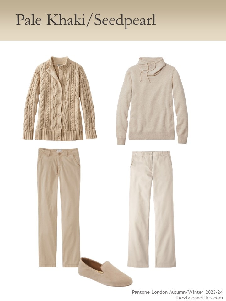
Oatmeal heather cardigan – L.L.Bean; cashmere funnelneck sweater – L.L.Bean; boulder jeans – L.L.Bean; heritage stone pants – L.L.Bean; latte suede loafers – Birdies
I have to confess that I had a LOT more trouble finding these colors than I expected; a lot of clothing is already sold out in many sizes! So I went with classics…
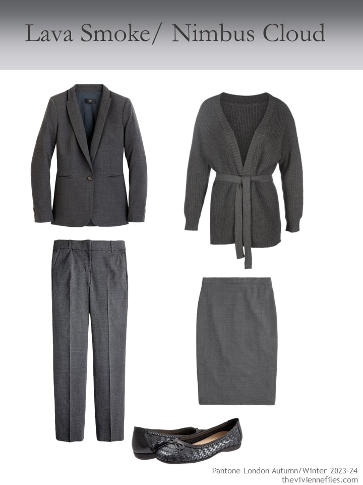
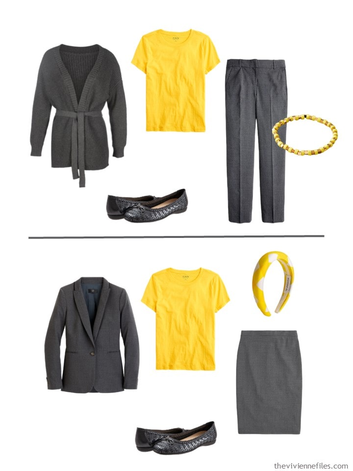
heather coal blazer – J.Crew; heather coal pants – J.Crew; cardigan – In Our Name; skirt – J.Crew; ballet flats – Trotters
Now, let’s look back at the five more “difficult” colors from London Fashion Week, and see how they look with these 2 neutrals:
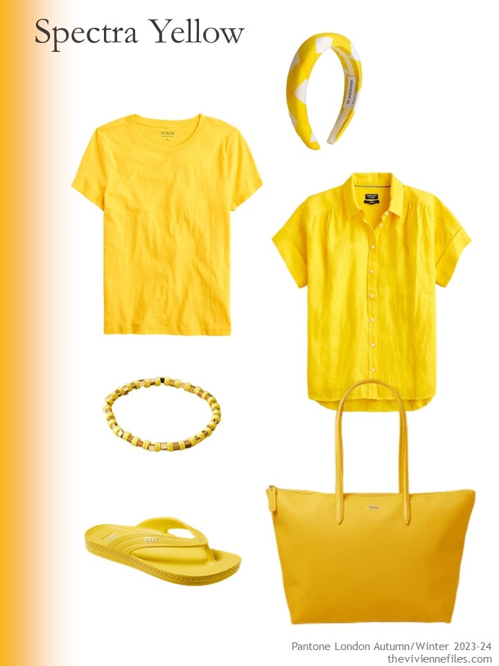
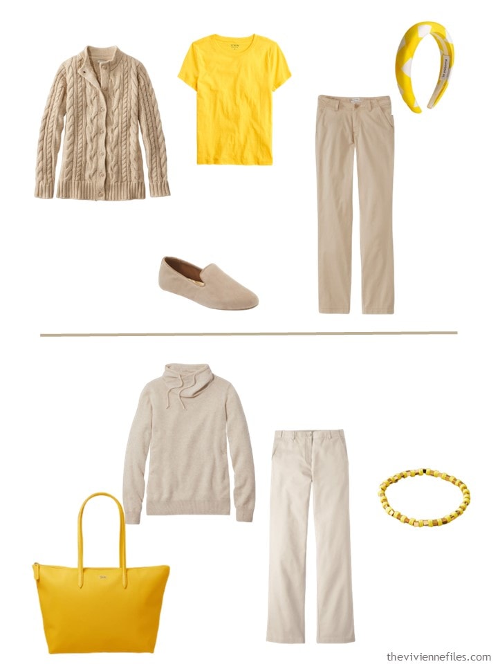
Tee shirt – J.Crew; headband – J.Crew; short-sleeved linen shirt – J.Crew; bracelet – Anthropologie; flipflops – Reef; tote bag – Lacoste
The styles of things don’t always work as well as I would want, but I think we can get an idea of how well the colors work together…
a silk blouse in Spectra Yellow might be glorious with the dark grey!
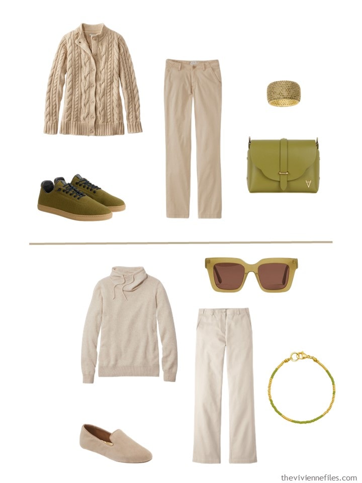
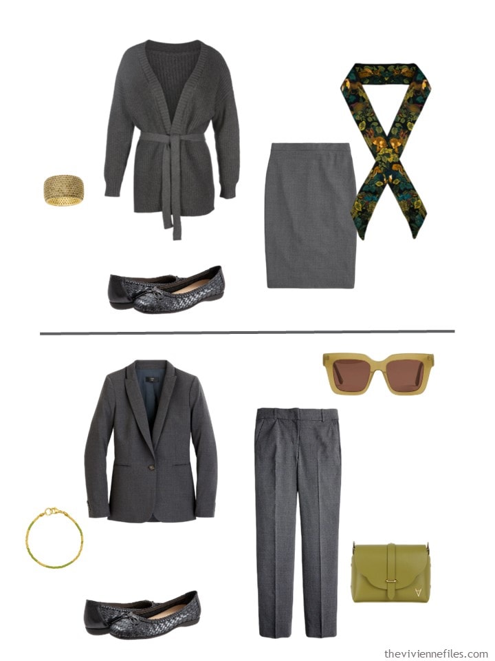
Ah… Olive Oil! I think that the degree to which this color looks good with a neutral depends on how much you like this shade of green!
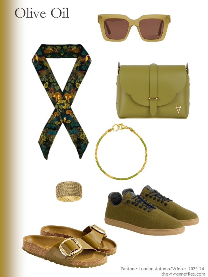
Sunglasses – J.Crew; silk skinny scarf – Ilona Tambor; bag – Hiva Atelier; bracelet – Stay Salty; peridot ring – Native Gem; wool sneakers – Baabuk for Alex Mill; sandals – Birkenstock @ J.Crew
I personally am not crazy about either of these; I’m not sure what color I would wear with Olive Oil!
Ah, my favorites!
Another recommendation – the necklace is amazing! I’m not wild about the gold fastener, but the 4 strands of beads are heavy, vividly colored, and very beautiful…
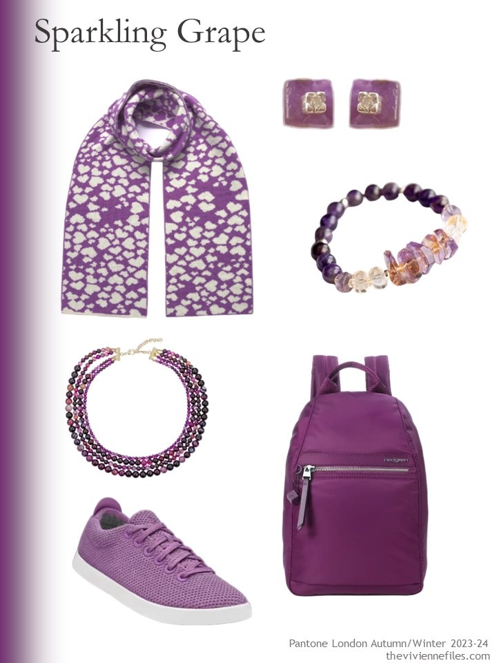
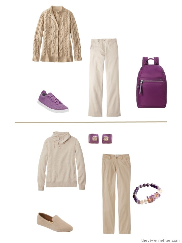
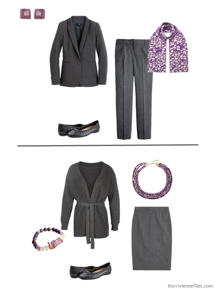
heart scarf – Ingmarson; amethyst earrings – Lily Flo Jewellery; ametrine and citrine bracelet – Fierce Lynx Designs; amethyst necklace – Eye Candy LA; sneakers – AllBirds; backpack – Hedgren
I feel like the purple is too heavy for beige, but it’s glorious with grey. Your opinion may be very different…
Was Blue Atoll the most popular of these 5 colors? I think maybe…
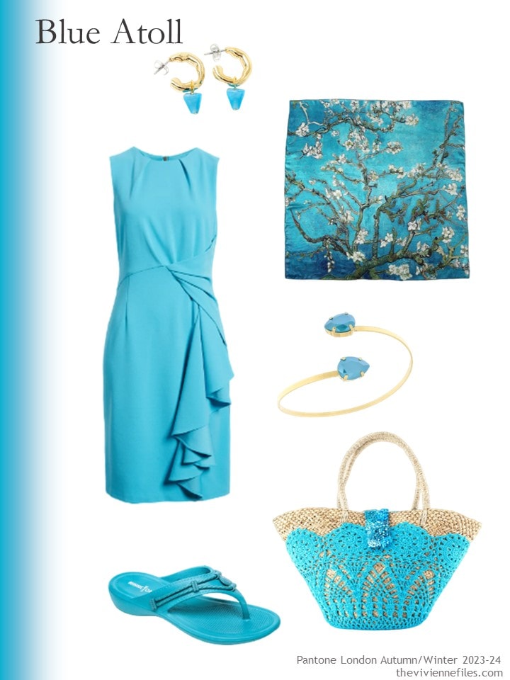
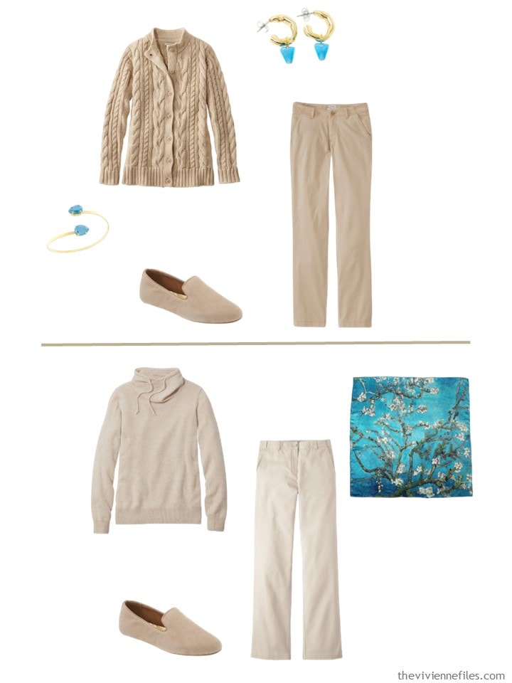
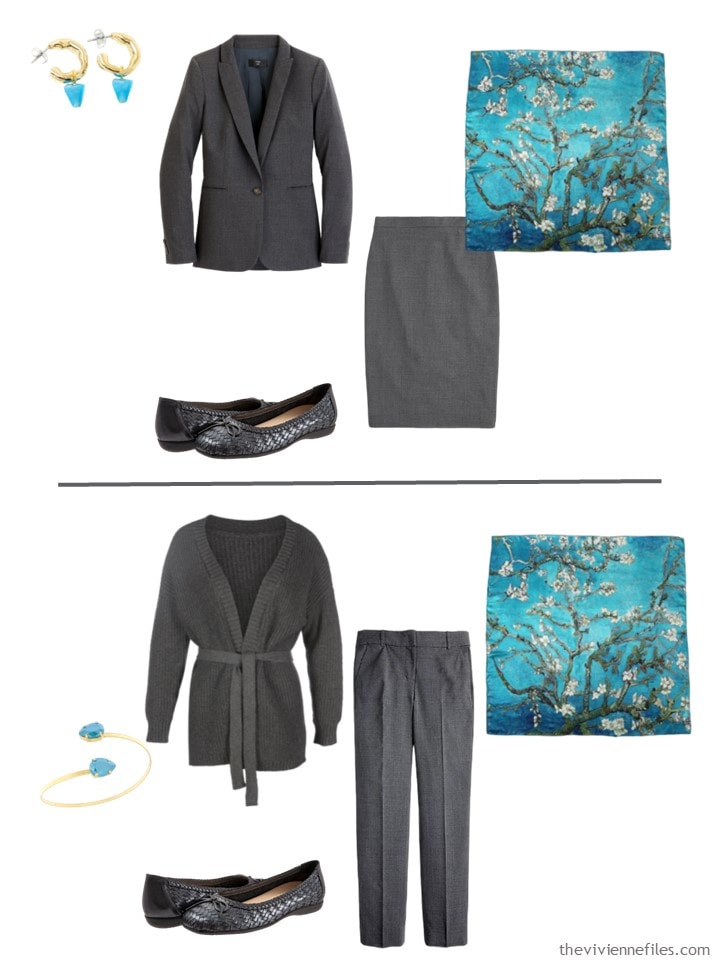
Blue glass earrings – Anne-Marie Chagnon; Van Gogh print scarf – Soft Strokes Silk; dress – Tahari ASL; bracelet – Rosaspina Firenze; flipflops – Minnetonka; beach bag – OhSun
The sandals and bag are WAY too summery for these clothes, but the jewelry and scarf are lovely with both neutrals:
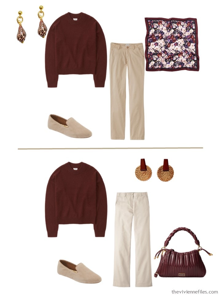
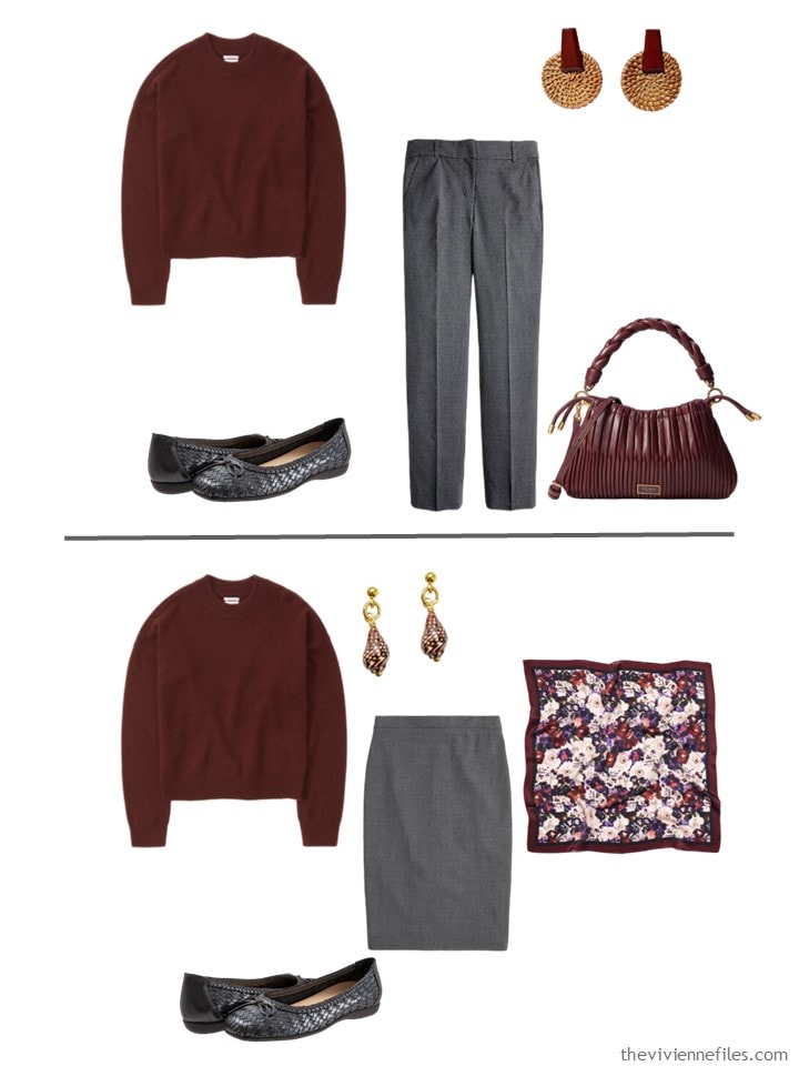
Ah, Fired Brick… A nice pair of loafers in this color would go a long way, wouldn’t they?
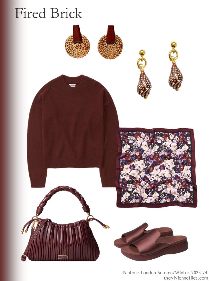
Wood & rattan earrings – Volsew Paris; seashell earrings – Smilla Brav; cashmere sweater – Abercrombie & Fitch; scarf – Luna & Avery; bag – Kate Spade New York; sandals – Vionic
I kind of think that this colors works with both neutrals – what say thee?
The interplay between neutrals and accent colors is complicated, and fascinating; which of these appeal to you?
love,
Janice
p.s. Ten years ago, I reached a pretty important conclusion about what I should wear…
Janice, I’m not sure why but none of these colors speak to me. Even blue atoll, which is weird since I like turquoise and teal shades. I guess they are all a bit too bright, or shady, or tuned down… The one that looks more pulled toguether is fired brick, but thanks to your blog I realized I like wine shades in a glass cup, not in my outfit.
That being said, the look back post is pure gold to me! I red all the comments too and is a real piece of advice. I guess we all readers feel the same: your blog has helped me getting to know ME better and reflect that in the way I dress / shop. Thanks a lot ❤️
Cheers and blessings to all!
Going to piggy back off Arwen’s post – I can look at (and enjoy) your blog and not want to run off and buy clothes because you have taught your padawans well! Although I disagree with your last statement from the looking back post, if you want to swan around Chicago in a lace blouse and brooch, do it. But the post from 10 years ago made me think how you’ve helped me.
I would often read about your heroines looking at their wardrobes and feeling happy. I never fully realised that until this week. I do 6-7 week capsule wardrobes: long enough to wear everything, short enough to not get bored or in a rut. For the last year, I have written down my favourite or key outfit for the Japanese season and what I did wearing it. This year, for the same time period, I pulled out the four outfits my 7½ weeks is going to cover. And I looked at the 12 items of clothing and 3 accessories and just thought… yes. This makes me happy. I could wear just these for the whole wardrobe season. Well, no, I’d need to wash things more than I physically can and have more than 3 work outfits BUT the principle is there.
Your blog not only showed me how to organise a decent capsule but also how to find out what clothes I actually want to wear, do wear, and feel good in. Thank you.
certain shades of pink/coral; certain shades of blue/turquoise; certain shade of white/cream.
The “certain shade” is because each individual is going to want that shade in the most “flattering to them” tone, and will probably tone their neutrals the same way
(I am also a fan of the burnt orange/ lime green – i think there was a start with art of a matisse painting of fruit on a table, with a fabulous original post/wardrobe PLUS a bonus extended wardrobe where the (blue-eyed) heroine becomes a manager and expands. colors were grey, blue, white; green and orange)
(To echo everyone else, Janice, your blog has helped me be more satisfied/creative in my own closet too – many many many thanks for that)
Zaidie I love your idea, smaller slices of time and a key outfit! Brilliant idea!
I love these neutrals. I am searching for The Universal Accent Color. To go with navy, grey, tan and black. And denim, of course. Not too warm, nor cool, and a bit muted. So far the best accent color is another neutral, to my eye.
I’ve found that a subdued burnt orange goes with all neutrals! Not too red or orange, with a touch of brown.
Thanks, Nancy. Sounds interesting.
Same! I find that many of my favorite outfits are all neutral.
Red is probably too warm, but pink or blush would work. Also, white goes with all your neutrals. I love all of these!
Thanks!
I think teal goes with everything and is a pretty universally flattering color.
Since I personally prefer the dark gray to the lighter color I find myself liking those outfits the best. I do also agree the fired brick is the color seems to look good with both. I haven’t read the look back yet – probably should have before I commented. I admit I’m still a work in progress as far as my wardrobe, but I’m really getting it pared down to things I like to wear and will reach for on a consistent basis. I have missed none of the clothes I’ve donated over the past year plus. I took another four bags down this last weekend. Thank you for all your hard work.
Your look back to 10 years ago was such a good reality check for me! For years I waffled between classic business suits and bohemian flowy outfits with a little hippie chick thrown in, which led to an overcrowded closet. I am still weeding out items to which I had an emotional attachment! I also have to say the style of writing you showed in this post in bringing your heroines to life is why I fell in love with your posts, and I miss them!
So who did you decide you would be? I know I have a particular style/look that serves me 99.99% of the time, and I am not sure what it would be called! But every now and again I need something else (like a pencil skirt and kitten heels for example). I am working on getting rid of all but a few of the items that no longer suit my lifestyle.
Janice the look back art work is gorgeous and I’m so glad you brought it back. Please consider using it sometime as inspiration.
And to the brilliant observation of Olive Oil and Antipasto I was already thinking of eggplant and some Feta. With the right scarf it would be lovely on someone (just not me)
When it comes to “Olive Oil”. I think of a terracotta dish of mixed olives, both black and green stuffed with pimento. For me, a black column is the starting point( but the right shade of grey could work), then olive shoes and bag and a dash of pimento…Maybe small scarf or earrings, bracelet or brooch.Your base could equally be pimento with main accessories in olive and a larger scarf that features black/olive/ pimento to bring it all together. Can’t go past a scarf to bring things together. Woman as antipasto!
OMG! The pimento is totally what is missing. I loved your description, and I would love a black, olive, and pimento outfit, although I would prefer a somewhat darker and cooler olive – sort of like those sneakers.
I enjoy these forays into mixing neutrals with the Pantone accents. Honestly there are few combos here that really speak to me but the accessories are lovely. I reread the ‘looking back’ post and think it’s something worth reposting a few times a year just as a reminder. I read fashion blogs and find myself succumbing to the (often) over priced ‘link dumps’. Thanks to you I now ask myself if the item will work in MY life, do I really need to spend $$$$$ on a bag or pair of shoes, do I REALLY like it etc., OR am I just being over influenced? As a result I continue to ‘shop my closet’ before making a now, well thought out purchase.
Style bloggers appear to be in the business of selling ‘stuff’ much of which can be found in better thrift shops at a fraction of the price or on saIe on the manufacturer’s site. It never ceases to amaze when I read the comments on some sites from readers who ‘buy everything you suggest’ ‘my closet is filled with your suggestions’ how much of it the commenters actually wear? I’d hazard a guess (experience talking here) very little of it hence my suggestion to check out those thrift shops!
Thank you Janice for the reminder to focus on the present and the lives we really live when planning purchases for our closet.
I really like that ‘fired brick’ colour with all the neutrals. I do already have burgundy in my closet which I wear all year long, with black in the winter and white in the summer. I disagree about the purple – I quite like it with the lighter neutrals.
My favorite is still the blue atoll, but the only neutral I would wear it with is the khaki, since I don’t wear gray. As for the look back post, I wasn’t happy with my wardrobe until I realized that I was EXACTLY the soft of person to swan around in a lace top and brooch (metaphorically) and got rid of most of my neutrals, partially thanks to your blog. Now I’m going to don my turquoise, lime, and sky blue floral outfit and head out into my day, feeling great!
Mary, your comment made me smile. I think I am similar. I found a scarf with exactly those colors on white and I’m looking forward to wearing it this summer.
That sounds amazing. Good for you.
Your 10 years ago post was— wow— much to consider. Thanks for reposting.
Janice,
I’m thinking that perhaps your preference for higher contrast is related to the fact that you color your hair so that level of contrast is still flattering for you.
Shopping in women’s wear has always been a challenge for me because that much contrast just doesn’t suit me. I find it easier to find the more flattering muted hues in the men’s department. There is comparatively much less pressure on men to color their hair so it is easier to find something that works for me there. This has only increased since I’ve gone gray. I guess that is why my wardrobe is becoming mostly neutrals, it’s just so hard to find the flattering muted “colors” I need in womenswear.I wonder if others here have noticed this problem.
I think you don’t care for “Olive Oil” because it is more low to medium contrast and you have a preference for more contrast. That level of contrast is about right for me, though, so I thank you for including it.
Overall, I think the red shade worked the best here. The other colors were far too bright for me, but I do see their appeal for those who can wear them. You did a brilliant job, as usual.
Many thanks!
Beeebeee, I also have softer coloring, not from going grey but having a light skin tone and medium blonde hair that are very similar with almost no value contrast and more muted than bright. I don’t always wear muted colors, but I do very much like it when I do, and there are definitely some brands that do a lot more muted tones than others. I’m also plus size, so that rules out some of the brands that do a lot of muted colors (e.g., Garnet Hill) but not others (e.g., Coldwater Creek, Christopher & Banks, J. Jill, Eileen Fisher). Many of these brands have styles that slant more natural/relaxed/coastal chic, so that can be an issue if your own style is very different. I also like to look for fabrics that soften the appearance of colors (e.g., linen, some cottons) and prints with colors that blend into each other in a watercolor-y way (e.g., ombre, tie-dye) rather than have more distinct areas of color.
I think a lot of muted low-contrast outfits *can* look blah when the items are just laid out like we see on TVF because they do not themselves have a lot of brightness, energy, and excitement. But put on a person with the right coloring, everything is in harmony and they look wonderful. That’s one of the downsides of building and seeing outfits without the context of the heroine’s own appearance, and it requires us to develop an ability to imagine how the items/outfits/colors will translate on ourselves (which I am definitely still working on as I fall in love with YET ANOTHER bright, high contrast look suited for a Winter heroine instead of me).
You are right, Sally, too low contrast can be boring. I find that a relatively small bit of color in a necklace takes care of that problem when I have it. Also, the right eye liner can really help too. I strive for medium contrast.
Olive oil is definitely a color I love and neutral colors I choose to go with it are chocolate brown, a yellow that is more butter a softer yellow or warm vanilla, a caramel and lastly a warm dark olive. a scarf to tie it all together always helps.
That olive oil color is a “sweet spot” color for me. I love it both with the dark grey and with the navy from your post a few days ago. I wish the bag was in my price range. I am definitely going to look for something similar!
This series has been a real eye opener for me on why I still feel so stuck about my wardrobe: My neutrals aren’t working well with my accent colors. Seems like such a basic thing, but it never occurred to me before
Chiming in here for a 2nd time – see, I told you I should have read the look back before I commented! I do sometimes purchase things for a fantasy life (not so much since I started reading your blog), but what overwhelmingly occurred to me was all the wardrobes I’ve gone through as work/life events have happened. Different for working PR in San Francisco than when I was traveling doing art shows. Different at a Naturopath’s office than corporate HQ for a Telecomm company, different as a stay at home mom and then working in the school (actually, these are pretty close! 🤣 ) However, let me say that since I started reading TVF I have become much more true to myself and knowing what that is. For this period in my life anyway! Future TBD!
I liked the yellow + charcoal and both burgundy combinations best…because I liked the mix of neutral and accent clothing better than the neutral clothing with just accent accessories. Honorable mention to the aqua + beige, though I’d prefer to see more aqua in the outfit.
There are just so many factors when combining neutrals and accents: the specific shades of each color, the relative amounts of each color, garments vs. accessories vs. both in the colors, how colorblocked vs integrated the colors are, the other colors in the mix, one’s own coloring…we could go on and on.
As for the look back, I am happier with my clothes/outfits because I have embraced my personal natural/relaxed/rough around the edges look rather than aspiring for the polished/sophisticated/everything perfect look that is so often presented as the “grown up chic” ideal but that I can neither achieve nor maintain for any length of time. My hair is never going to be gorgeously cut and sleek, my makeup (to the degree I wear it) is never going to be flawless, I’m not going to do manicures/pedicures, etc. I am naturally not very “kempt” looking and I have no interest in spending the time, effort, and money to do a poor version of meticulously groomed.
Given that, no matter how I dress, I am not going to have that elegant, refined, and polished look. So I have embraced a style that works with rather than against myself.
Sally, I feel so reflected with the last part of your comment! I’m convinced nothing suits a woman best than feeling good in her own skin, no matter the age! I mean also embracing your style and life stage as someone else commented too. Just run away from the “I should look like… ” thoughts.
Thanks TVF for putting this all together with the neutrals and accents.
Would the Forest Night be Eileen Fisher’s Seaweed colour and the Lava Smoke be her Graphite?
Thanks
Absolutely! That’s a good way to think about these colors!
hugs,
Janice
Thinking about Olive Oil as yellow with a little black, how about contrasting the yellow element with its opposite, purple? For example start with an Olive Oil linen trouser suit with maybe a bright-purple or iced-lilac or muted-purple top? Scarf or jewellery (bangles, ear-rings) in red-violet (a neighbour of purple) eg fuchsia? Bag and shoes in navy leather/rattan. Sounds like a Mediterranean evening to me! Or maybe a navy suit with Olive Oil top, fuchsia bag and shoes?
I love your ideas for the Olive Oil. I think that the Olive Oil may be more suited to being a neutral, instead of adding it as an accent to other neutrals. Thus, a linen trouser suit in Olive Oil with an accent color sounds much more appealing.
Many thanks!
Janice,
I love the Olive Oil, especially the mud green sandals. I could wear this color sandals with my Wool& Sierra tank dresses in Forest Night and Heather Grey. The travel capsule on the Wool& website in olive green and Heather Grey would look lovely with this. I bought the Olive travel capsule in the Sierra dresses with the tee shirt and leggings and your Olive Oil accessories will look beautiful with it. This color, Olive Oil, just like plain yogurt is an acquired taste.
I agree that the red brick goes best with both of these neutrals, bith blue atoll second. I do not like Olive Oil, but I do like a cooler, darker army-green color as an accent. I have a fabulous long cardigan that I always get compliments on. It goes well with neutrals and brighter accents.
After reading this post I am starting to question why I got rid of most of my gray. It does go well with a lot of accent colors, and combines well with both black and navy. Is it okay to have several base neutrals and a handful of accent colors that work with all of them? I may have just realized something about myself.