March 10, 2023
One last visit with these 10 colors – this time with both beige/taupe and olive green!
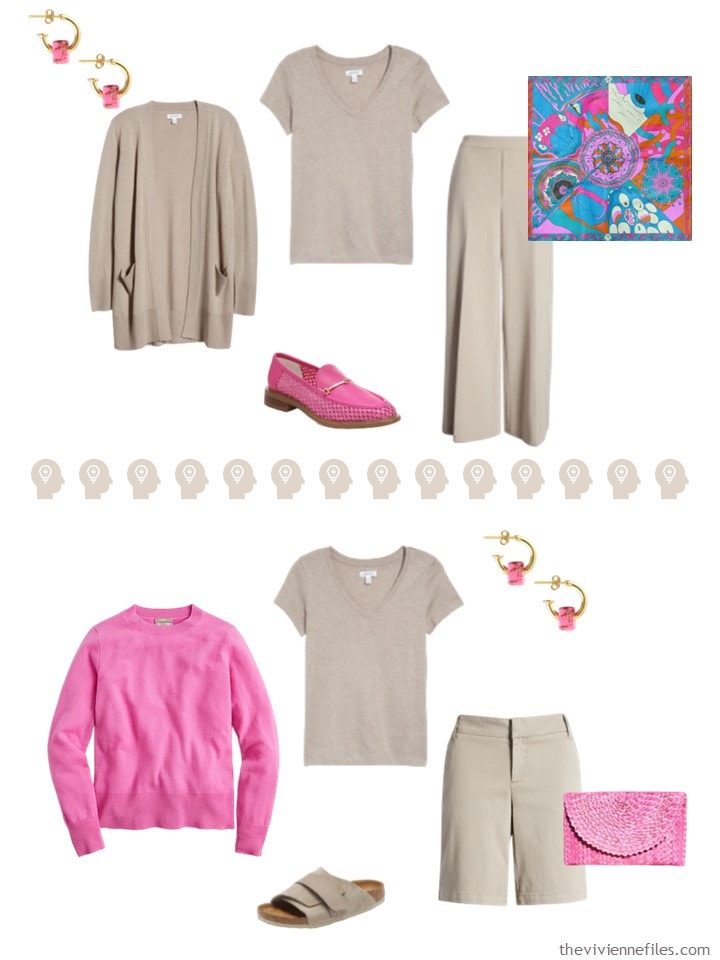
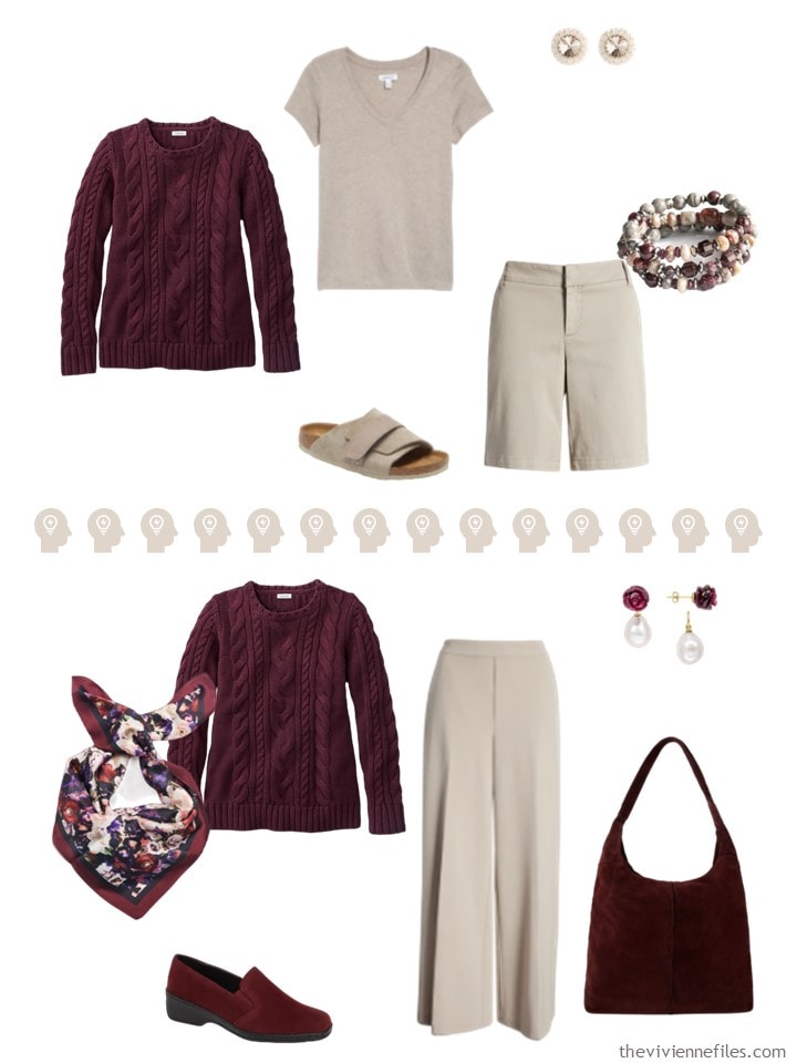
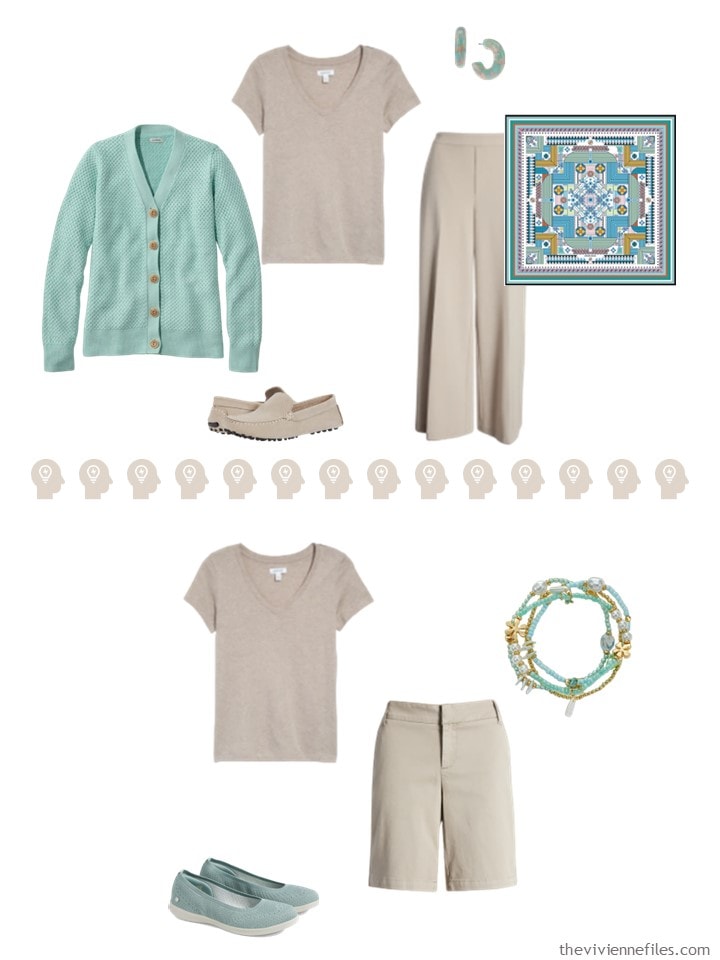
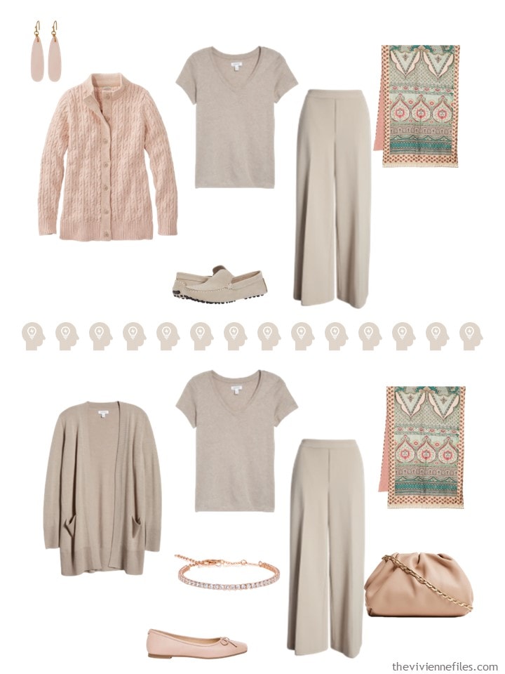
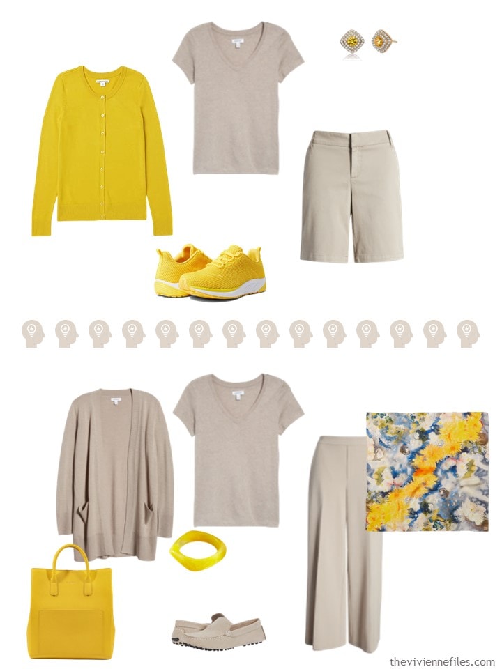
The first neutral grouping is mostly described as Cobblestone; Eileen Fisher regularly carries this color, and it’s a consistent, excellent taupe. Other cobblestones may fall short, and look more beige… Sigh…
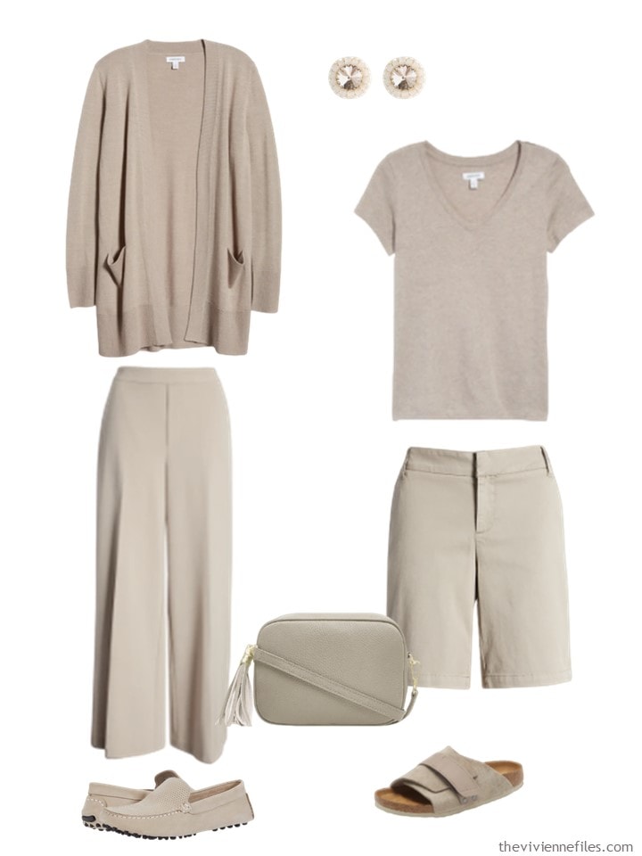
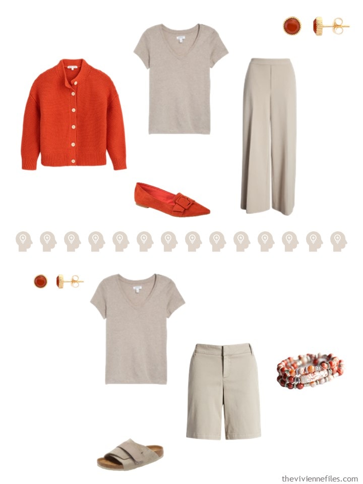
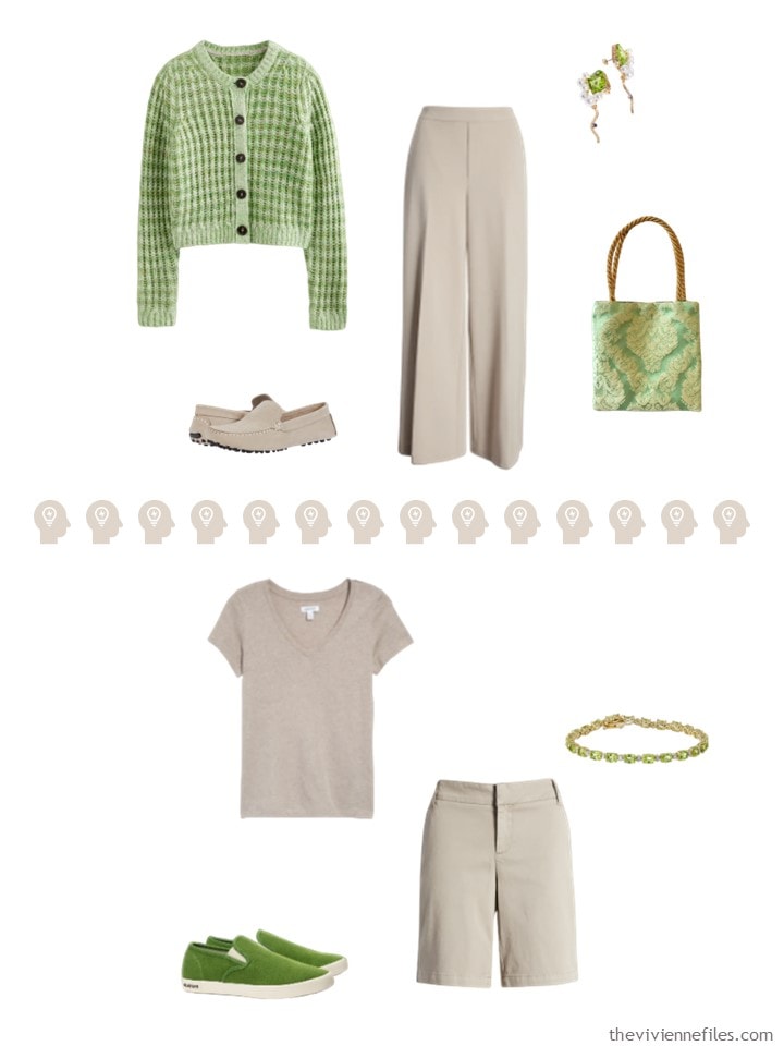
Cobblestone cardigan – Nordstrom; earrings – Saule Label; tan cobblestone heather tee – Nordstrom; pants – Nordstrom; tan cobblestone shorts – Caslon; bag – Sosster; loafers – Massimo Matteo; sandals – Birkenstock
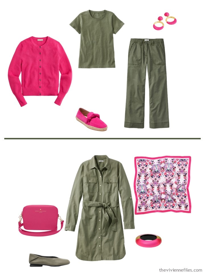
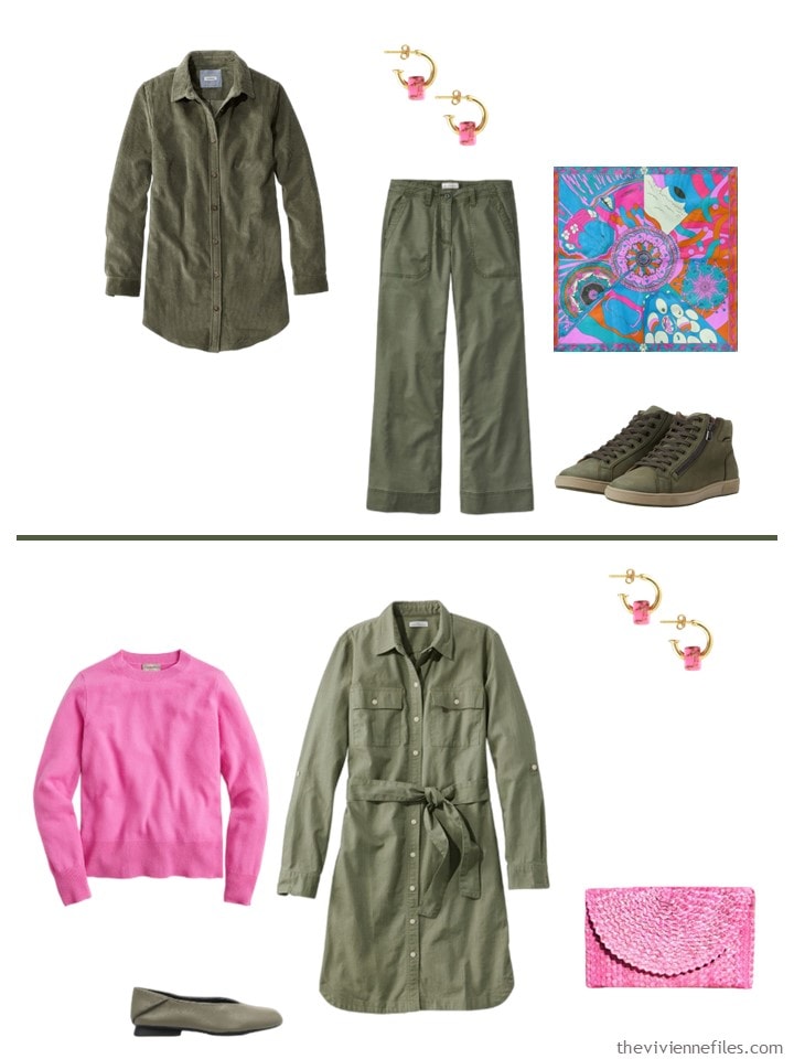
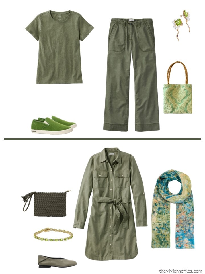
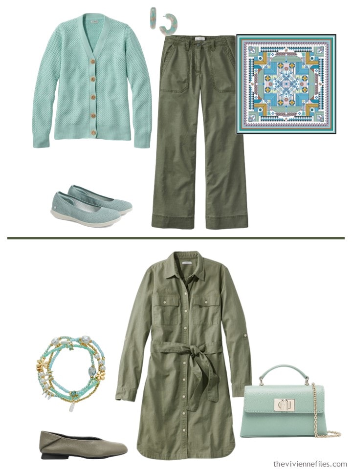
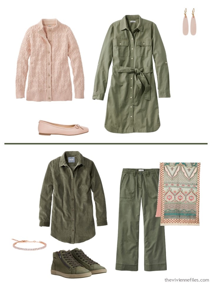
Conversely, olive green was simple to find; I’m assuming that this heroine isn’t quite ready for warm weather!
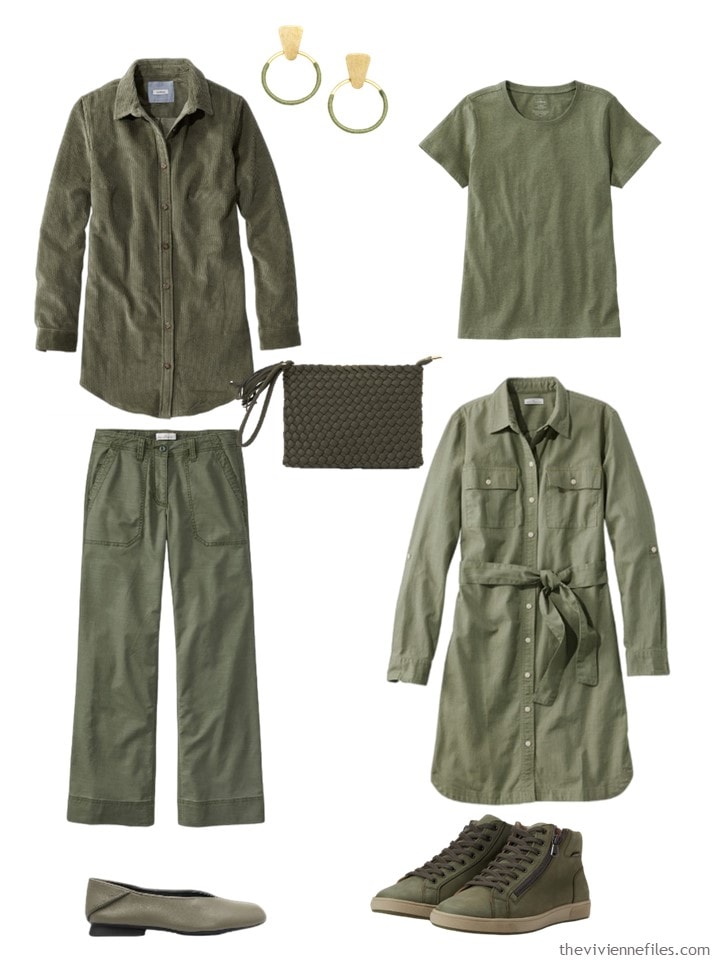
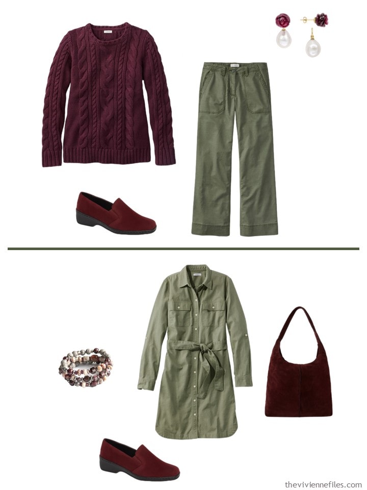
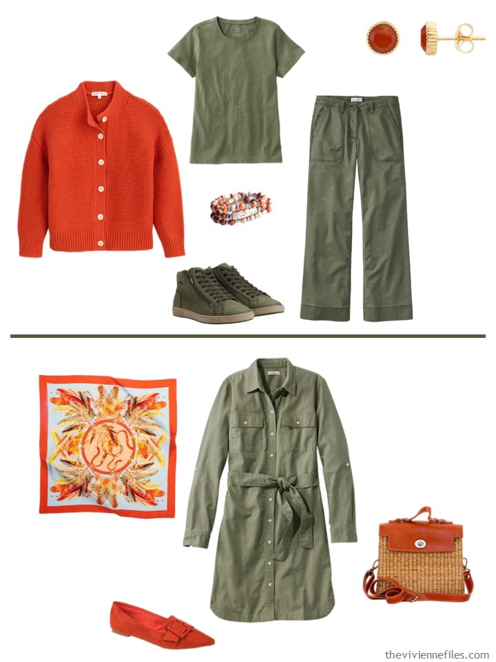
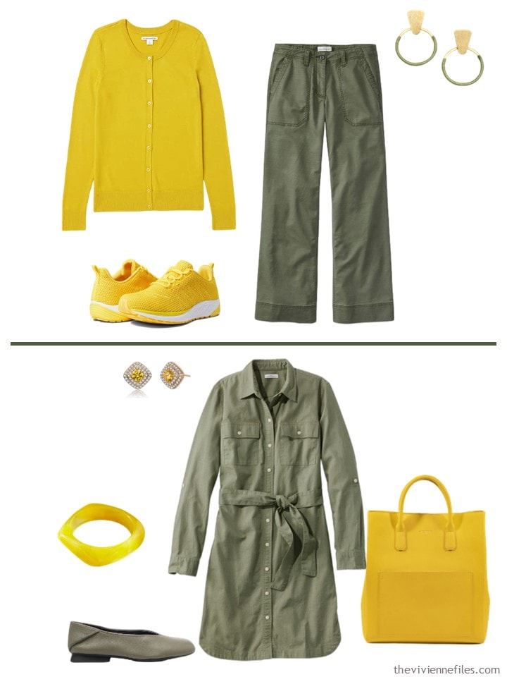
Olive corduroy tunic; earrings – Matr Boomie; tee shirt – L.L.Bean; wristlet bag – Arms of Eve; pants – L.L.Bean; dress – L.L.Bean; ballet flats – Camper; sneakers – Mephisto
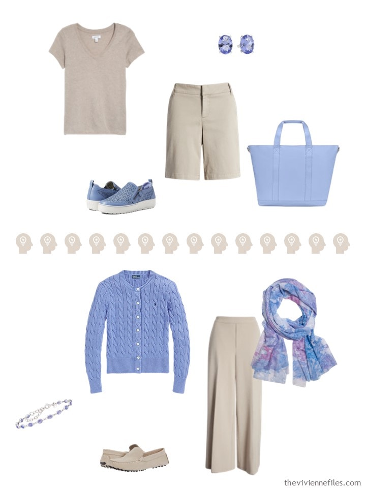
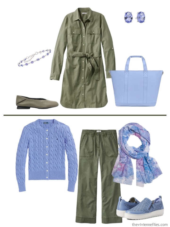
From here to the end of this post, I’m just going to show you each of the 10 “Accessory Families,” and then a couple of outfits using each of the 2 neutrals as base. I don’t need to editorialize about what combinations I do and don’t like!
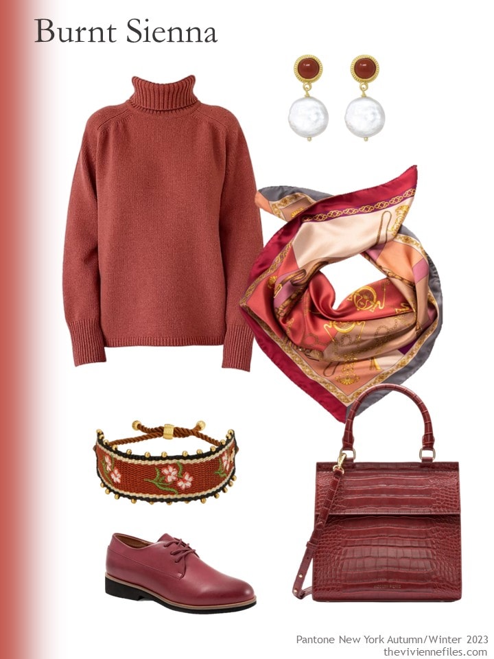
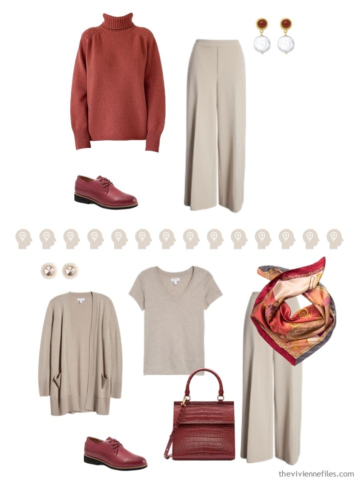
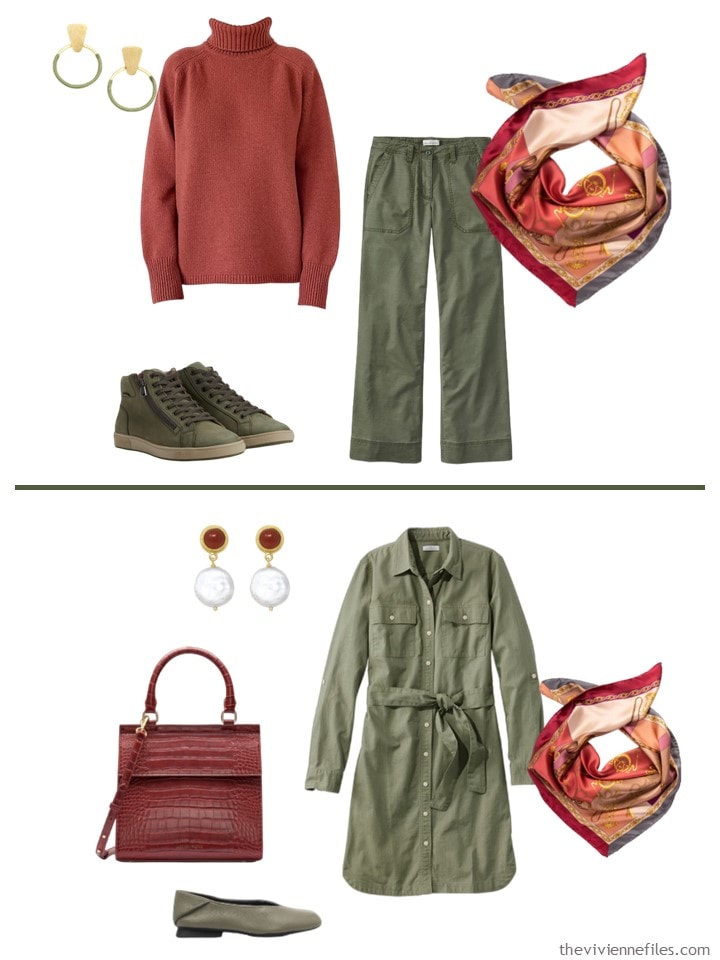
Dark red turtleneck – The Knotty Ones; earrings – Vintouch Italy; scarf – Elizabetta; bracelet – Tory Burch; shoes – SoftWalk; bag – Modern Picnic
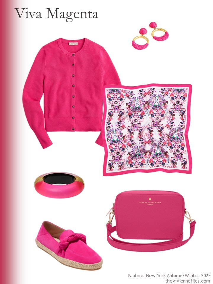
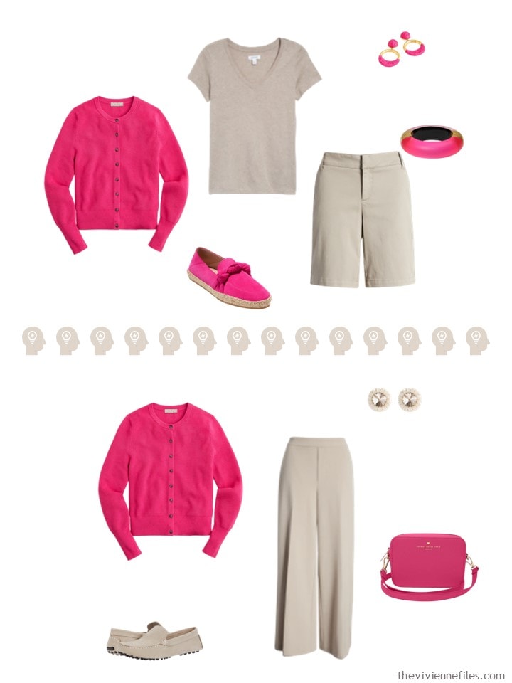
Festival Pink cardigan – J.Crew; earrings – J.Crew; scarf – Luna & Avery; bracelet – Alexis Bittar; shoes – Cole Haan; bag – Johnny Loves Rosie
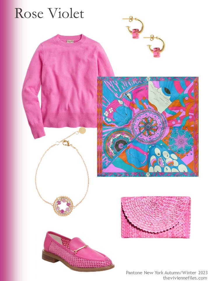
Vivid fuchsia cashmere sweater – J.Crew; earrings – Kris Nations; scarf – Mantility; bracelet – EDEN + ELIE; shoes – Sarto by Franco Sarto; clutch – OhSun
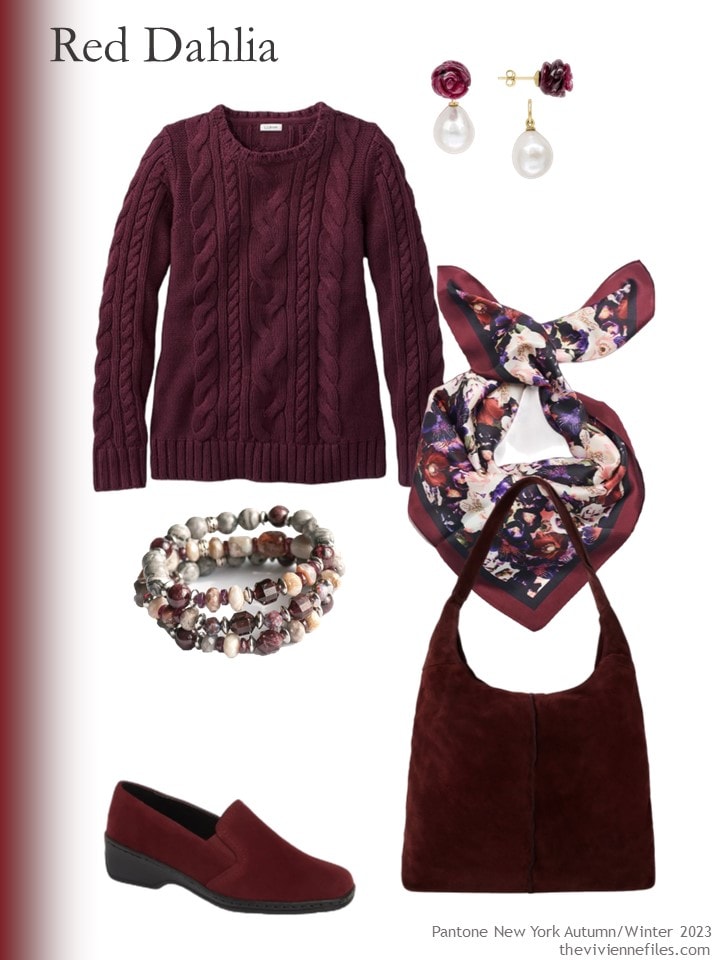
Deep wine cotton sweater – L.L.Bean; ruby earrings – Pearloir; scarf – Luna & Avery; bracelet – Fierce Lynx Designs; shoes – ARA; maroon suede bag – Sostter
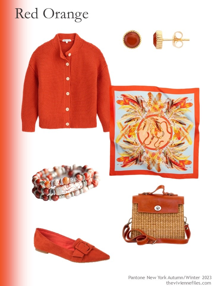
Paprika cardigan – Alex Mill; earrings – Auree Jewellery; scarf – OnebyOne Design; bracelet – Fierce Lynx Designs; shoes – Journee Collection; bag – Sea & Grass
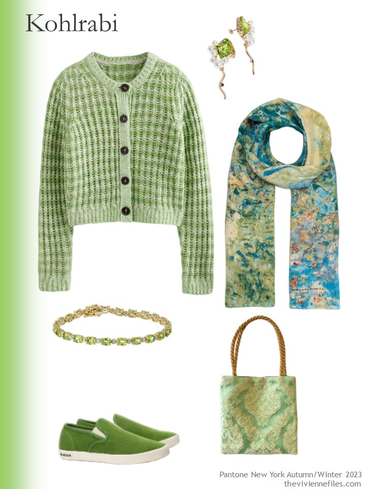
Sweater – Boden; earrings – And Other Stories; scarf – The Met Store; peridot bracelet – Amazon Collection; sneakers – Seavees; bag – Found Thread
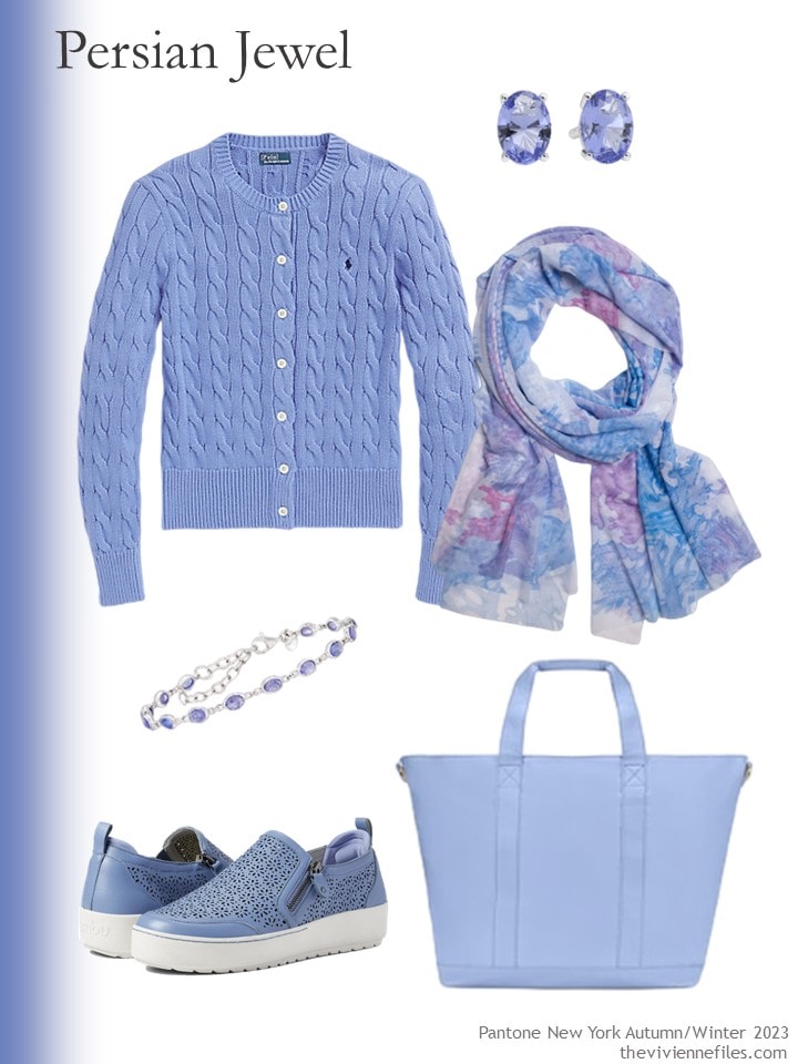
Cardigan – Ralph Lauren; earrings – Tishavi; scarf – Ala von Auersperg; bracelet – Ross-Simons; sneakers – Jambu; tote – Stoney Clover Lane
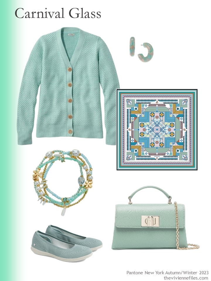
Cardigan – L.L.Bean; earrings – INC International Concepts; scarf – Jessie Zhao New York; bracelets – Style&Co.; flats – Skechers; bag – Furla
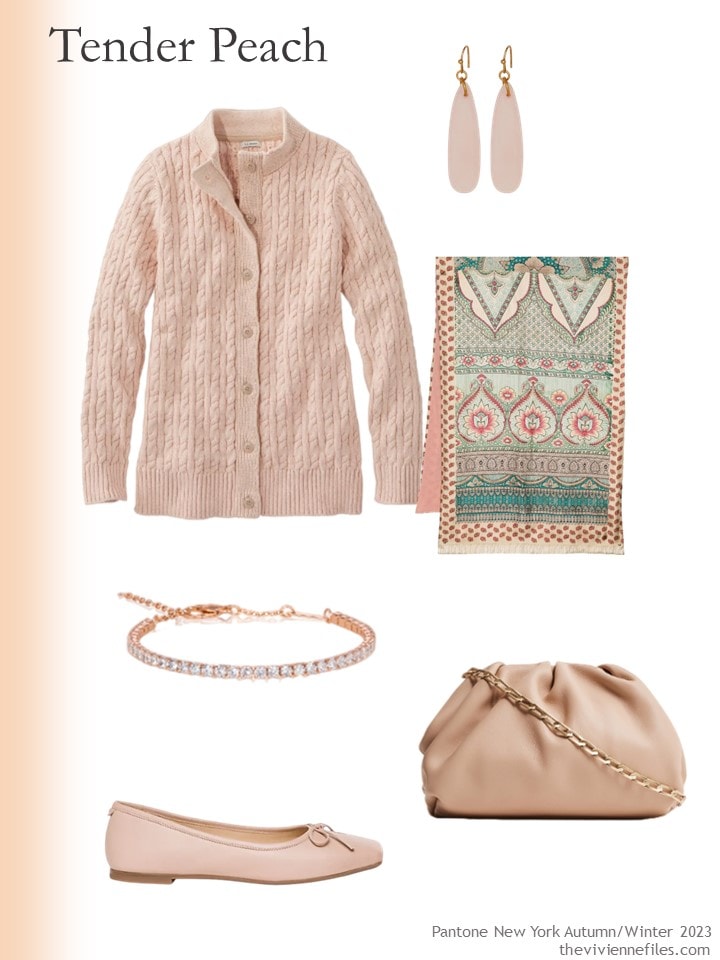
Woodrose marl sweater – L.L.Bean; rose quartz earrings – Universal Thread; scarf – Pierre Louis Mascia; bracelet – Anna Zuckerman; shoes – Bernardo; bag – Reiss
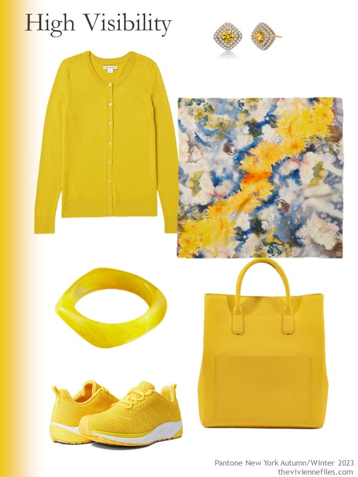
Cardigan – Amazon Essentials; earrings – Genevive; scarf – The Met Store; resin bracelet – Arden Jewelry; sneakers – Propet; tote – Campo Marzio
After being immersed in these colors for over a week, all I want to wear is black and white!
love,
Janice
p.s. Three and a half years ago, Pantone gave us new colors for Spring and Summer; if you don’t like any of this year’s colors, you can always choose something else!
Like this article? Save it to Pinterest!
Wow, I”m not sure if it’s just me this morning, I don’t like any of these combinations. Just not feelin’ it. The Via Magenta hurts my eyes. Maybe the Peach and the Carnival Glass with the Cobblestone? I could see that. Very illuminating… Thanks Janice have a good weekend.
The olive green is an unexpectedly interesting neutral, to me anyway. I don’t love it with all of these colours but it looks surprisingly great with all of the red/orange tones. I guess it makes sense but I just would never have thought of it. I might be looking for some olive pants or shorts now!
Hmmm. To me, taupe is the most neutral of all neutrals. It can run dark or light, and is neither very warm nor cool. But it definitely isn’t working with some of these colors! It is almost too neutral to stand up to the brights. I do like the blue and carnival glass with the cobblestone. Olive seems to look good with a lot of these, but sadly does not like me very much
WOW. This is such an enlightening post. You combine two of my favorite naturals (stone and olive) with different accent colors. Some are clear winners to eye. Some, although I adore the color, just do not work to my eye. I am saving this post so that in the future when I desire to add in more color, I can refer back and see how I feel about it visually. Thank you.
I like the olive with tender peach and carnival glass, combinations that work with my red hair and blue eyes.
As a big fan of olive green, I have a closet full of it. What a surprise to see it in these combinations. The only one I really like is the Olive with Kohlrabi. Green with green. In contrast, I think every one of the beige combinations work really well. This is going to be interesting going back into my olive wardrobe. I do think of Olive as a neutral but maybe it’s not. I wear it with blue, brown, gold and cream. These Pantone colours just seem like too much to me. Thanks for a great eye opener. It’s always about “why does this appeal to me and not that?” “What is it about a combination that works for me or doesn’t ?”
This was very interesting to see such unusual colour combinations. I’m pushing aside the fact that neither taupe or olive are colours I enjoy and can still say that few, if any, of these colour pairings sing for me.
Tender Peach + olive, Persian Jewel + taupe, Red Dalia + taupe are fairly good combos. Burnt Sienna is still my favourite of the lot. It is equally good with today’s neutrals.
Happy weekend. All!
I LOVE that red-orange and olive combination. The red-orange is excellent with the taupe as well. I bet it would be great with a tan color as well.
I found myself surprised I didn’t go for the red dahlia + olive combination – I do like a red + olive but apparently this one reads a little too purple-y to my eye. I think I prefer a more neutral red or one that leans orange, with the olive.
I need more olive in my wardrobe!
I’m amazed at how brilliant these combinations are. Thanks for doing this – it’s been a real eye opener. I like both the taupe and the olive green and to my eyes they look spectacular with most of the Pantone colors. They are “universal solvents” in the colour world.
Love this post. Very helpful with new ideas. Keep ‘‘em coming!
I like taupe, and the cobblestone is a nice lighter beige-taupe, but wow, I *really* didn’t like it much with these colors. The burnt sienna, mint green, and blush peach were OK, but the others did not work for me. I don’t think this light muted neutral stands up well at all to the brighter accents. But I think it would be terrific with the softer accent colors of the Mountain View capsule (which remains my favorite!) either as an addition or alternative to the light grey in that wardrobe. I also think it has potential with other neutrals. How great would it look with the olive pieces shown today?
But the olive (which is probably my 2nd favorite neutral after navy) looks great in most of these combinations! This particular saturated light blue looks off with the olive, even though a less intensely saturated light blue is a favorite combo of mine with olive. The green mint is interesting…I think I would wear it with olive, but I’d need to be careful in how I’d do it.
I don’t love the Pantone colors, but I love them with the cobblestone and olive neutrals. Loved almost all of the combinations. As someone else noted, I learned so much from this post. Thank you!
Ooh, I agree with Sheila. I’m just not feeling these combinations. The Burnt Sienna and the Carnival Glass seem to be the least offensive with both taupe and olive, while the Persian Jewel with olive just hurts my brain.
Interesting – I like almost all of these better with the olive, despite not having much olive in my wardrobe… ideas!
This really was an eye opener. I love Taupe and have several items in that color. I consider it a neutral but I agree with several that it just didn’t seem to “go” with all of these Pantone colors. Thank you Janice for showing these neutrals. Definitely interesting!
The bright pink/violet are too harah and the wrong tone to be worn with soft and muted colours like taupe and olive. The blue, aqua green, orange and yellow are borderline. Persian blue and Carnival glass look nice with taupe (I wear these combinations). The orange and yellow look nice with olive. I’m not sure about Kohlrabi with olive. Burnt Sienna, Red Dahlia and Peach are the only ones that look good with both.
I’m looking forward to seeing the London fashion colours. Lilac could be one. The look back coming from 2020 reminds me of the year that never was. Clothes manufacturers are still churning out the same colours three years on.
Yes, please! Show us a heroine who needs needs to cleanse her palette with some black and white!
I was getting the posts, but awhile ago I stopped receiving them. I have signed up again, 3 times and still not receiving them. What is going on??
The posts of the various neutrals with the colorful accent colors have been some of my favorite posts.
I guess I am a minority but I love the bright yellow with the olive and also the paprika. I am warm toned though.