February 24, 2023
While the rest of us are just barely getting ready for Spring 2023, the crafty people at Pantone have already found colors that they’re predicting will be BIG for Autumn/Winter 2023/24!
The first thing I noticed about these colors? Fully half of them were some variation of red! I wonder if this is really going to be popular, of it is just their assessment of the future…
Nonetheless! These colors suggest to us possibilities for a fresh accent in our wardrobes, and that is always interesting. Let’s see:
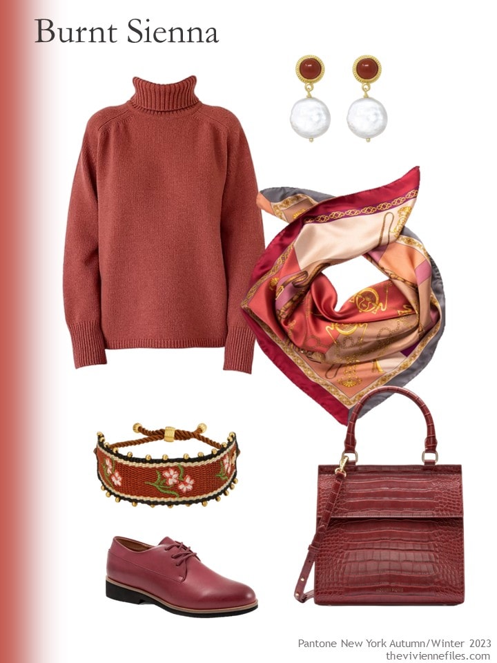
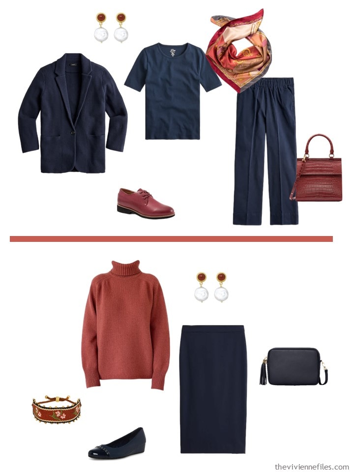
Dark red turtleneck – The Knotty Ones; earrings – Vintouch Italy; scarf – Elizabetta; bracelet – Tory Burch; shoes – SoftWalk; bag – Modern Picnic
What a wonderful color! But it’s hard to really evaluate an entire page of things that are all the same color, so I’m going to toss in a simple navy core wardrobe, for mixing purposes…
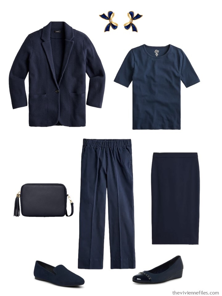
Blazer-cardigan – J.Crew; bow earrings – Milou Jewelry; tee – J.Crew; navy bag – Betsy & Floss; chinos – J.Crew; pencil skirt – J.Crew; navy loafers – Birdies; pumps – Anne Klein
Yes, the above might look very familiar; if you have a core wardrobe in navy, it’s NOT going to change every season!
I love the way this color looks with navy; I suspect it would be lovely with beige or olive, and stunning with brown.
I imagine that by now we’ve all heard that Pantone’s “Color of the Year” for 2023 is magenta. Hmm…
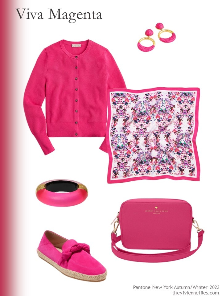
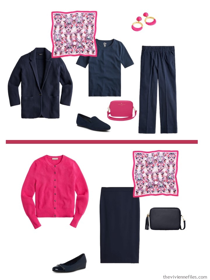
Festival Pink cardigan – J.Crew; earrings – J.Crew; scarf – Luna & Avery; bracelet – Alexis Bittar; shoes – Cole Haan; bag – Johnny Loves Rosie
You KNOW this is going to be beautiful – bright and cheerful for Spring – worn with navy. Yes, these colors are meant for next fall, but I think they’re lovely for right now!
If Magenta is a little bit intense for you, maybe you’ll like Rose Violet more?
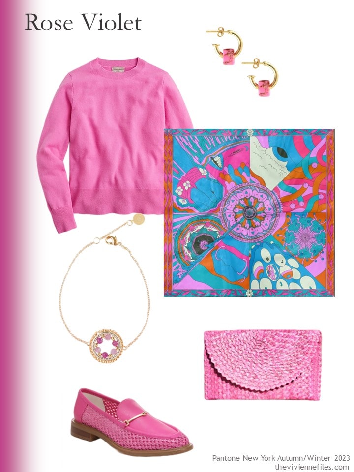
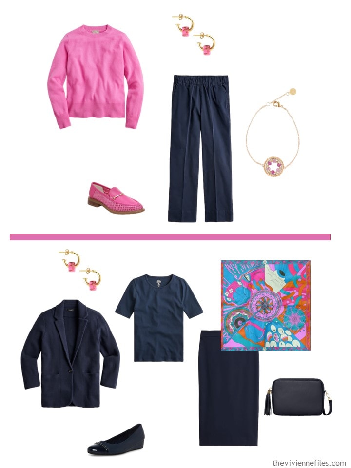
Vivid fuchsia cashmere sweater – J.Crew; earrings – Kris Nations; scarf – Mantility; bracelet – EDEN + ELIE; shoes – Sarto by Franco Sarto; clutch – OhSun
This is perfect together, although I could see Rose Violet with grey, or beige, or white!
I call this next color Maroon. I don’t work for Pantone, so I have to look for what retailers call the color when they describe products…
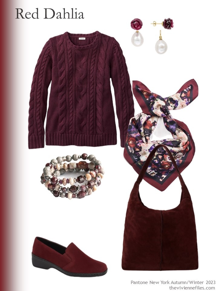
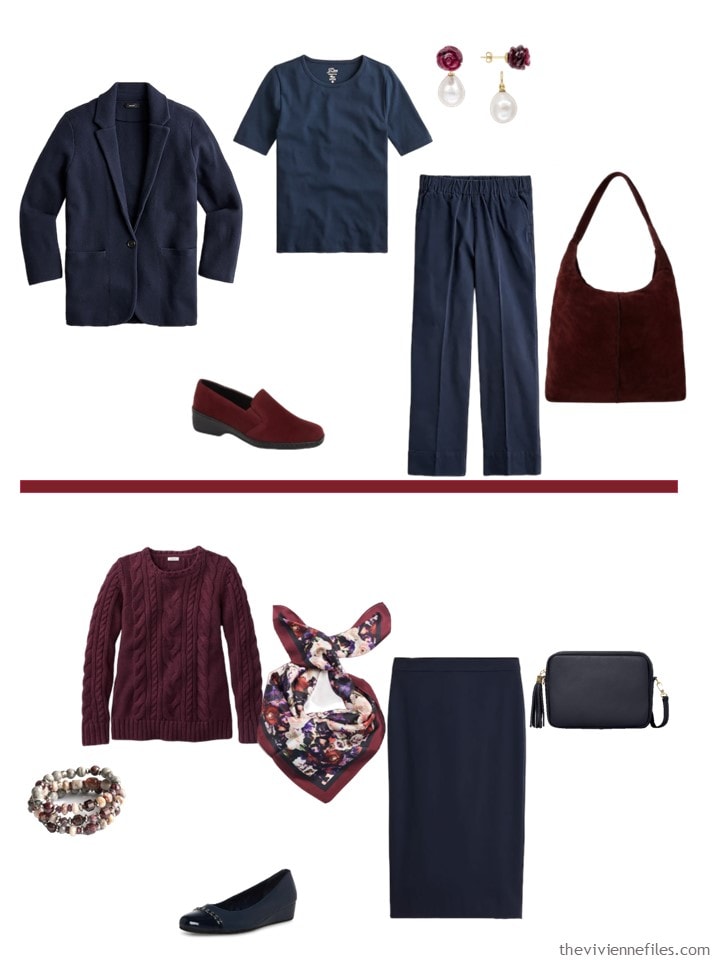
Deep wine cotton sweater – L.L.Bean; ruby earrings – Pearloir; scarf – Luna & Avery; bracelet – Fierce Lynx Designs; shoes – ARA; maroon suede bag – Sostter
This color feel VERY like Autumn to me…
This next color is great for any time of year, if you look good in orange! I would wear this with brown, or beige, or olive…
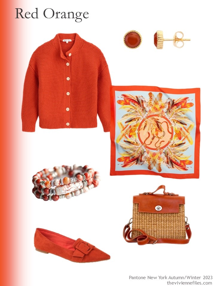
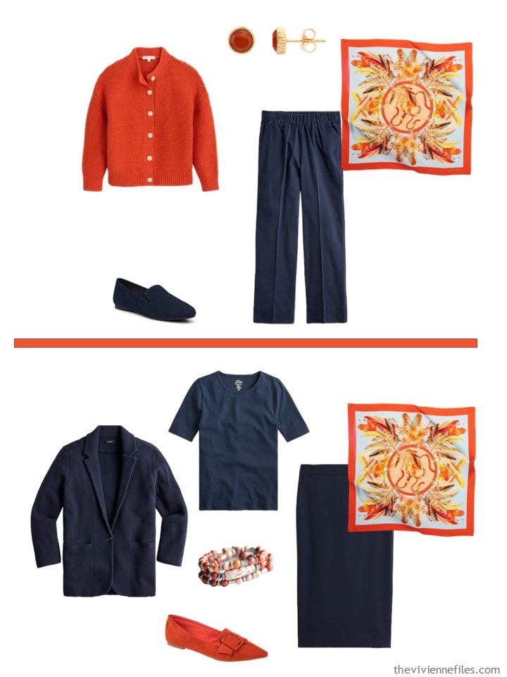
Paprika cardigan – Alex Mill; earrings – Auree Jewellery; scarf – OnebyOne Design; bracelet – Fierce Lynx Designs; shoes – Journee Collection; bag – Sea & Grass
Of course, since orange and navy are opposite each other on the color wheel, they will look good together. (at least that’s what we’re told…)
We have five more Pantone colors to style – I will probably show them with navy too. But I’m probably going to do a 3rd post with these colors, and a variety of accents…
love,
Janice
Like this wardrobe? Save it to Pinterest!
I could live in that red orange! For me, a color this bright is essential for February days when the wind chill tears at you and the clouds darken the sky at midday.
Red orange is beautiful with tan, dove grey, oxford blue, & cream.
Love Love Love the Burnt Sienna, and yes, the magenta is way too intense for me! I’ll look forward to the next posts. Happy Friday everyone!
Omgosh I want them all!
I have the paprika Alex Mill sweater and the color is fabulous! I get so many compliments on it!
These are great colours but the shade of maroon surprised me. I think of something deeper and calmer when I read “maroon”. I just found two lovely maroon items on sale after Christmas – a lightweight duster/sweater and a flattering long-sleeved top with shirred princess seams in the front. It was fun and all I could think was that I was on my way to building my first French 5-piece wardrobe! Oh my…the things that get us excited, huh!? I’m still on the hunt for two more items (I already have some maroon booties). One will surely be a scarf.
Even though “my” maroon items aren’t the same shade as Pantone’s maroon, I’ll smile and enjoy the notion that I’m early with a trend. I’m usually two years late, which is fine with me!
The Burnt Sienna is so appealing. It could be an option for those of us who shy away from wearing items in the orange family.
Ooh, I’ll take both the magenta and the bubblegum pink – I mean “rose violet”! Guve me all the deep pinks!!! Both look great with black too, btw. Heck, throw in the maroon while you’re at it – It’ll go great with my maroon “Moc” Martins.and leather crossbody. I’ve already got all three of these accent colors in my wardrobe, though less maroon, and I’m looking forward to finding nice additional pieces in each of them. It’s so nice to actually be “on trend” for a change!
When I first saw that bright pink panel, I thought, ‘I can’t go around like that.’ Then laughed at myself. I’m old enough to ‘wear purple and red hats’. Is that still a thing? Anyway, interesting colors.
The poem Warning by Jennie Joseph. I had forgotten it. Thanks!
https://www.scottishpoetrylibrary.org.uk/poem/warning/
That’s the theme of my life! Well, it will be soon…
hugs,
Janice
Thank you so much for the link to the author declaiming her poem! It absolutely sparkles when she speaks it!
Gotta say, none of these colors really appeal to me, though the items are lovely. Maybe I’ll find something in the next set…
Wait, the red-orange color is called “Red Orange”???? How did that one sneak through Pantone’s color-naming process? “Red Dahlia” is a strange name but at least it’s better than oxblood!
The two pink colors get my vote, especially the less intense Rose Violet that I think of as candy pink.
Overall, too dark, too bright, too warm toned for me, personally. I do like the Burnt Sienna capsule, however.
The two pink shades are wins for me and already in my palette so I’m ahead of the game I guess! :)
I have a navy base wardrobe and wear colors basically equivalent to viva magenta, rose violet, and red dahlia all the time! Glad to hear I’m on the right track. Red dahlia/dark burgundy is also very nice with charcoal neutrals.
One of the many things I’ve learned from you over the years, is that you don’t need to bonkers over buying new colors. Buying a few keys pieces can jazz up your neutrals. I love this post and I adore the journey I’ve taken with you!
Even though my heart said the burnt sienna and red orange would look great in the fall/winter, my next thought was how it would highlight the skin issues. Bad enough to have unsightly red patches, but to wear colours that make it show up more? Sorry to Pantone, but no thanks, I’ll pass. I hope the next installment has a green, gold or blue. If not, I predict that I will not have any purchases until the colours change out.
I love these, Janice – especially the burnt sienna and the red dahlia/maroon.
How differently we see colours? I’m wearing a “Rose Violet” jumper but I call it Orchid Pink as it’s the same colour as the petals on an orchid I’m growing. I had a lengthy discussion with my family as to the difference between burgundy and maroon – it’s still not resolved! I have a cardigan that colour which I wear with a shade lighter plum cords. I have seen dahlia’s that dark with dark purple leaves. They look magnificent in a bed with brighter coloured flowers. For me Magenta has to be a deeper, richer colour. Viva Magenta is more like a Hot Pink.
Da Bears ;)
Cannot help but think of that with orange and navy.
An unexpected pairing is orange with a clear true grey. That combination never fails to elicit compliments when I wear it (blonde Summer). I rarely do since earth tones don’t really work on me. Although, my nephew’s soccer team’s colors are navy, white, and orange, and a true pumpkin/almost safety orange is ok.
And my first thought was “go get ’em, Tigers”! My high school’s colors were also orange and blue. Love that combo.
Navy is my core neutral and I love all of these colors. I am a true Winter, though, so I do have to wear some of the warmer tones more strategically.
Do you by chance remember the name of the Burnt Sienna Tory Burch bracelet? It linked correctly a few days ago but now it’s gone!
Floral Webbing Bracelet. The Burnt Sienna appears to be sold out; Saks still has it in beige!
Wow, that went fast…
hugs,
Janice
Thank you!!