March 16, 2022
“New” colors! Well, we’ve had this conversation at least a dozen times…
But for those of us who have a pretty good idea of what we’re going to wear when the weather warms up (in the Northern Hemisphere, of course!), it’s always fun to consider adding a fresh accent color to go with our signature neutrals…
Please note that I (obviously!) can’t guarantee that these items will all go well together if you get them into your home. Between the variations in the colors of the items themselves, coupled with the variations in the rendition of color inherent in computers, all sorts of issues are possible! But we do the best we can…
First up – I would wear this color more in the autumn or winter than in summer, but to each her own!
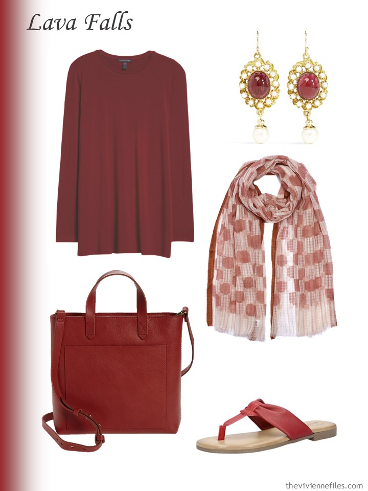
Tunic – Eileen Fisher; earrings – Ben-Amun; scarf – Echo; bag – Madewell; sandals – Easy Street Shoes
OH, I can always entertain a pretty shade of pink… Except for the bag, I opted to choose lighter shades of this color, because I felt that they might be easier to wear; they were CERTAINLY easier to find!
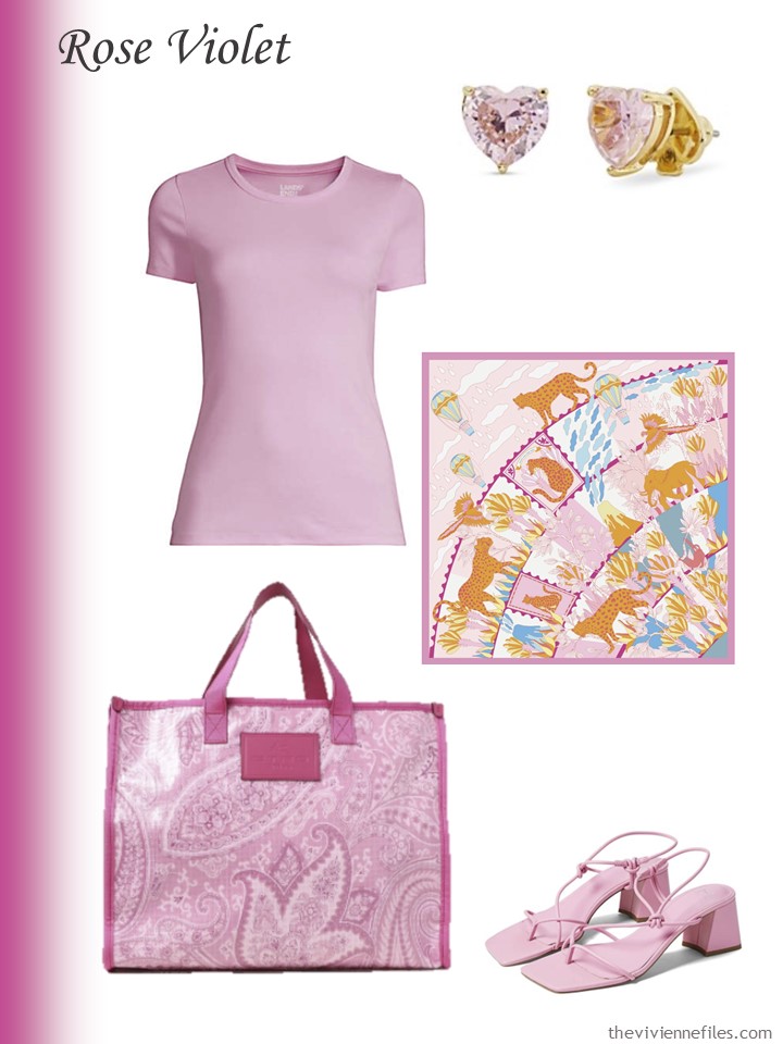
Earrings – Kate Spade New York; wild blossom tee shirt – Lands’ End; Around the World scarf – Jessie Zhao New York; bag – Etro; sandals – Marc Fisher
While I could never wear this yellow and look like a living woman, I think that it’s very lovely… Imagine this with navy, or white…
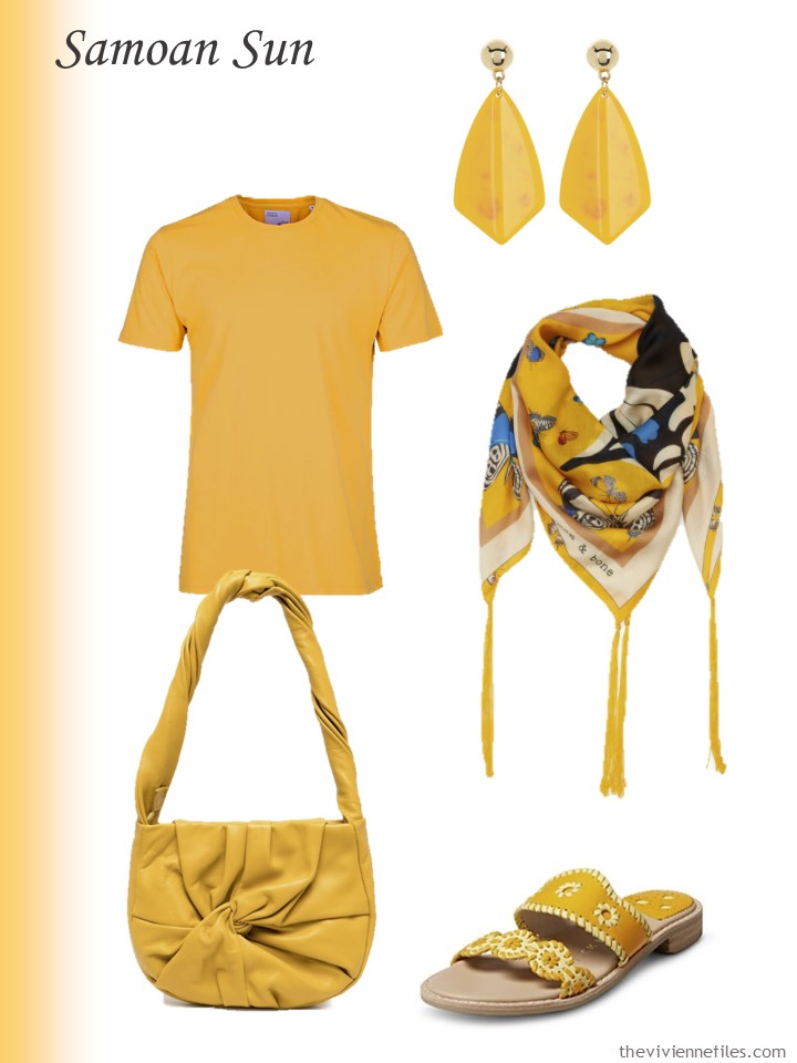
Earrings – Area Stars; tee shirt – Colorful Standard; scarf – Rag & Bone; bag – Hereu; sandals – Jack Rogers
Here’s a color I could grow to love! I can’t believe that I was actually able to FIND things in this color – who can ever tell?
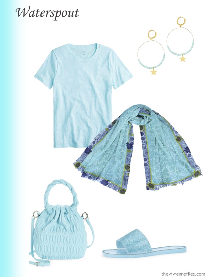
Sky heather tee shirt – J.Crew; earrings – Tess + Tricia; scarf – PJ Studio Accessories; bag – House of Want; sandals – Olivia Miller
I think this orange is delightful! I can’t picture wearing it too close to my face, but I could definitely wear sandals, and carry a bag…
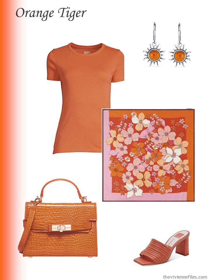
Earrings – Bling Jewelry; papaya orange tee shirt – Lands’ End; tossed flowers scarf – Talbots; bag – Steve Madden; sandals – Dolce Vita
Here is a color that I think is lovely – and I want to REALLY warn you about this tee shirt. Lands’ End describes this as “mauve,” which means that in real life we have NO IDEA what it may look like. But the images seem to be a lovely soft brown, so I ran with it.
And the earrings are deliciously pretty…
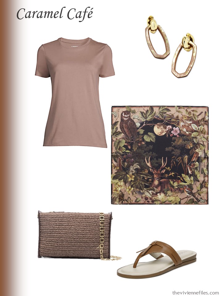
Brown mother-of-pearl earrings – Kendra Scott; mauve quartz tee shirt – Lands’ End; scarf – Fable England; bag – MANU Atelier; sandals – Lifestride
This next pink color is so flattering…
I was thinking about leather goods in this color, and I’ve concluded that it’s probably going to be extremely tough to find leather this shade unless it’s been processed to pieces.
Wouldn’t leather have to be lightened to pretty much pure white and then colored to this pink? Doesn’t sound like it would be great for the environment… So we may have to settle for colors that still have a touch of the natural beige “leather” color – which I think we can do!
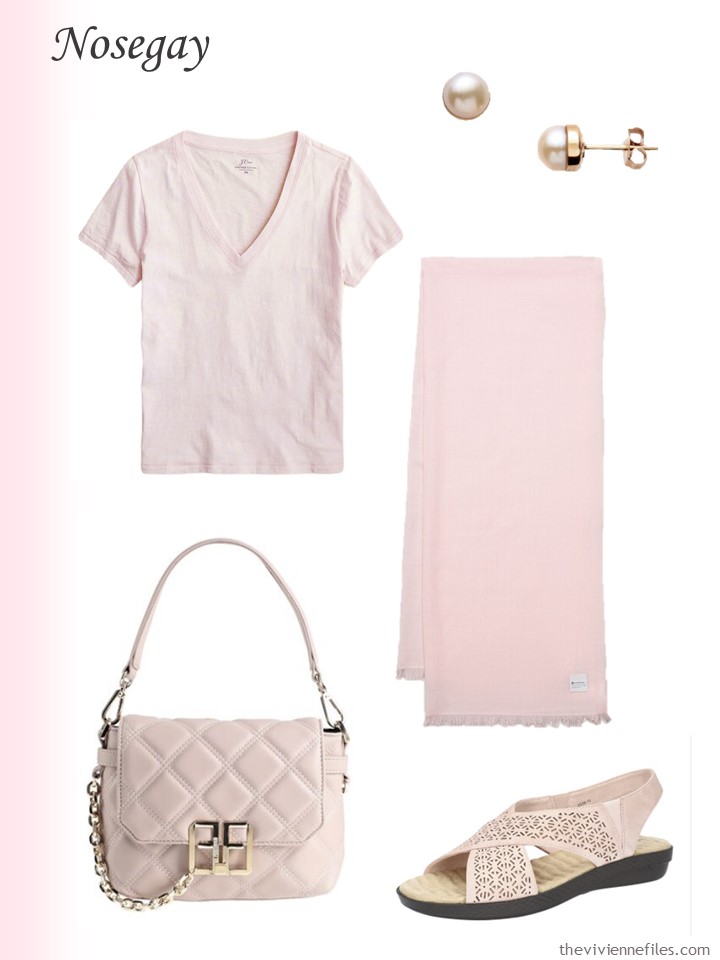
Pink earrings – Cynthia Rybakoff; blossom tee shirt – J.Crew; scarf – Lululemon; bag – Francomina; sandals – Easy Street Shoes
I think that this emerald green would be a great accent color for all year – it would be glorious in a velvet dress for the winter holidays, or an oversized cardigan to wear with navy in the autumn…
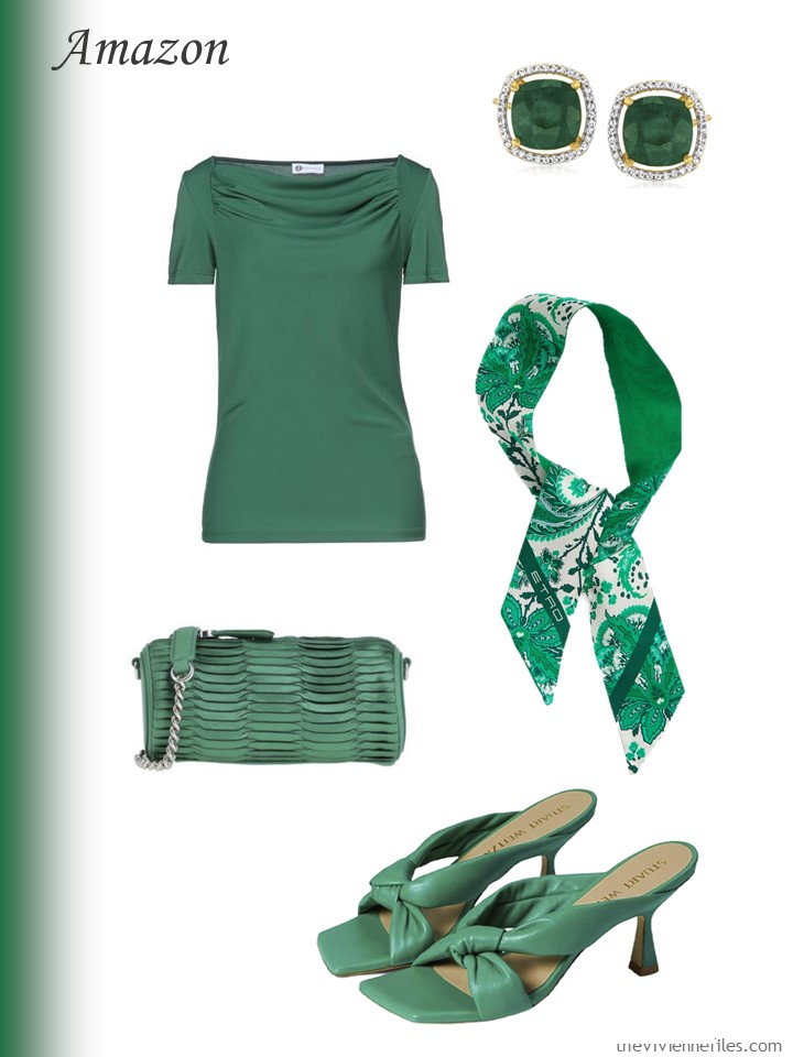
Emerald earrings – Ross-Simons; green top – Diana Gallesi; scarf – Etro; bag – Pinko; sandals – Stuart Weitzman
Peacock blue? Another color with “all-year” potential. I think it’s sufficiently different from navy that they would compliment each other well…
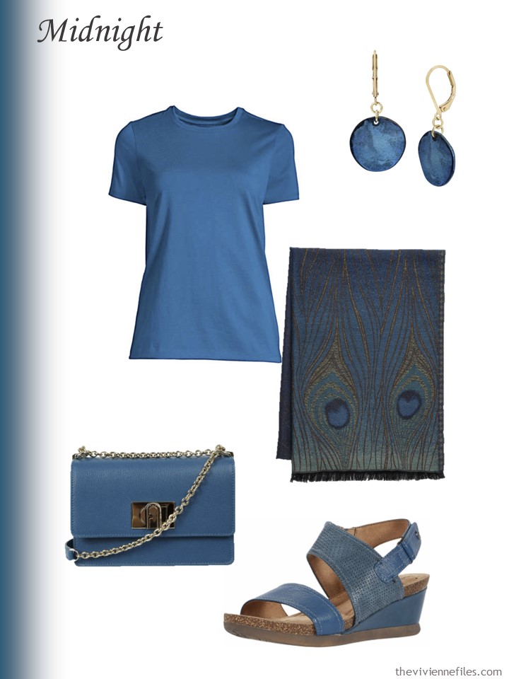
Earrings – Robert Lee Morris; baltic teal tee shirt – Lands’ End; scarf – The Met Store; bag – Furla; sandals – Cobb Hill
Frankly, if I saw an olive this color in a martini, I would think that it was well past it’s prime! But it’s a lovely subtle color – almost a neutral – that I would pair with the taupe in the scarf for a very sophisticated combination…
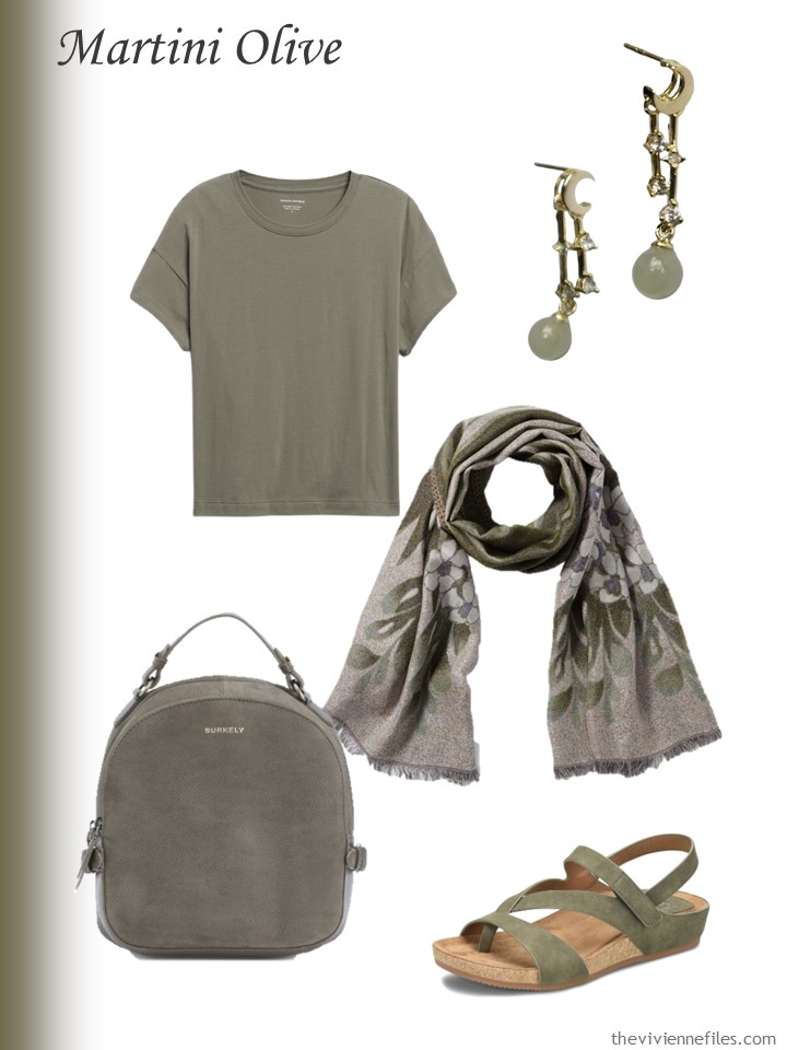
Earrings – Seree; tee shirt – Banana Republic; scarf – The Met Store; bag – Burkley; sandals – Eurosoft
I think on Friday I will take each of these “Accessory Families” and pair them with a VERY neutral outfit, just to see how they might work…
What do you think?
love,
Janice
p.s. Just about 3 years ago was the FIRST bracelet that was created for us by Fierce Lynx Designs! A lovely wardrobe of beige and white, accented with shades of soft great and apricot was our project…
Like this article? Save it to Pinterest!
I agree, the Caramel Cafe is lovely, and of course that scarf is amazing. Not sure i could wear it, but lovely to look at!
Love the Rose Violet (in its darkest form), Emerald, and Midnight. I’d wear them all year round. I hope there will be some clothing offered in these colors!
Ah, the Pantone new colors. The midnight and caramel stand out to me. Love the red, too. The scarf with the caramel is really something. I didn’t pay much attention to the scarves before, but since I got my one scarf, sunflowers, I am drawn to them. Oh, noes I am becoming a scarf person.
I always look forward to the Autumn/Winter Pantone colours. Its wet and cold today, though it’s supposed to warm up later in the week.
My favourites are Rose Violet and Midnight. The latter serves my quest for dark blues that are lighter than navy which can be used as an accent or neutral. My third would be Caramel Cafe as I continue my quest for browns that suit me. However, it would have to be a pink or purple based brown. I look forward to seeing these mini wardrobes on Friday.
Nosegay and Waterspout are too icy for me. There also isn’t a proper purple which is disappointing and only one proper green. It will be interesting to see which colours make it into clothes collections. I hope it’s not the rich red, green and yellow that have dominated for the past five years, at least.
Thanks for the look back to the first of the Fierce Lynx bracelets. They are stunning. It would be good to revisit some of them with different seasons or heroines in mind.
Caramel Cafe and Martini Olive are gorgeous! I could find any number of ways to incorporate these colors into my wardrobe which consists of black, camel and khaki.
I love waterspout. For some reason the color really spoke to me. I loved the bag so much that I purchased it. I think it will go with all my summer clothes.
Janice – Oh the places you take us with your delicious creations, websites never heard of, etc.,….beautiful. You put so much effort into your selections; all are appreciated more than you could imagine! Thank you for allowing me, especially, to go along on your venture(s).
Thank you for taking the time to leave a comment – your words have officially MADE MY DAY!
hugs,
Janice
Hi Janice and Everyone! For me, Orange Tiger wins by default but as far as ‘Best New Color’ I’d have to go with ‘waterspout’ (which I think Crayola crayons would have called ‘ice blue’ back in the day). Don’t ask me how or where I would wear it, but it stands out to me.
Seeing there are readers who are south of the equator, I’m sure they appreciate being fashion forward.
Janice, I’ve had my eye on the scarf from the Met store for months!! just gorgeous!!
Oh, the samoan sun appeals though in a cardigan (I have one that color and love it) and accents, but not right next to my face and midnight… for some reason I’m partial to all things peacock. I just wanted to let you know I look forward to Mondays, Wednesdays and Fridays to see what you have put together for us. :) And in the between times reading old posts, I have learned so much!
The harvest moon scarf and the olive sandals are beautiful though I don’t know why I am so drawn to them as I have nothing of those colours in my wardrobe. Magpie moi?
Midnight (peacock) and Caramel Cafe are the ones I find most appealing of this set…for the caramel, I would love the medium rosy brown/taupe color that the T-shirt looks like on my screen anyway!
I especially enjoyed today’s offering, thank you!!
Almost all of these colors have been wardrobe staples for me at one time or another, except the yellow. Which brings me to the realization that these colors seem to be chosen with an eye toward accommodating both those of us, including me, who have chosen to embrace our gray locks, and those of us who have not.
On that note, I feel like I’m ahead of my time as 4 years ago I bought items in several of those colors including water spout, midnight, and rose violet. I loved the rose violet so much that I bought it in several sizes!
I dislike when my palette becomes trendy because it will also soon become dated. It’s happened to me several times before :-(.
I hope to be able to add some items in caramel cafe. We shall see 🙂.
Ignore the trends and wear what you love – trends are for those among us who don’t know what THEY love and enjoy!
I’m often caught being very “on trend” (a phrase which I abhor), and I just don’t worry. I dress to please myself and those who love me, and if others feel the need to judge, they can judge me and leave other people alone!
hugs hugs hugs,
Janice
It’s always nice to see a brown like the caramel cafe in this sort of lineup, hopefully I’ll have an easier time finding it to wear!
Hmm…a pretty selection. I am drawn to the icy blue, the green and yellow. However, those fall in my range of colors. The orange is gorgeous & I would love to try it paired with a hot pink and white for summer, but can’t wear anything with pink or red tones anymore due to roseacea. But maybe someone could wear that…and it would be striking.
Wanted to mention how lovely Allison of Fierce Lynx designs is. I ordered the Mardi Gras bracelet set a few months ago (how could I not, living in Louisiana?) and though I have six other designs of her bracelets, this set was too tight. She offers free resizing, but I didn’t know when I ordered that it would be slightly smaller. She offered to fix the set if I sent it back, but the cheapest shipping I could find was $30 (almost half the price of the set). Since I’m crafty and dabble in jewelry making, she very generously sent me some matching beads and elastic so I can resize it myself. What a lovely artist. I’m so pleased you introduced me to her and her work.
The new Autumn/Winter colors are definitely not for me, except possibly the blues. I’ll stick to the colors I have, but I like the way you put things together.
Thank you for doing these layouts. I always enjoy them.
I love the rose violet! It is one of my favorite colors (similar to bubble gum pink?), so I will be snapping up whatever I can find. Possibly some of the Amazon green as well, as I’ve been thinking about trying a good, bold green. The rest of the colors are too light or muted for me.
I’ve quite lost my heart to the caramel and midnight scarves and look forward to seeing more “waterspout” in the shops
I love the amount of thought you put in to picking out the pink sandals! They are perfect! The caramel cafe is the most tempting new color for me, love all of your pairings!
I can easily spend an hour looking for the right accessories…
hugs,
Janice