January 20, 2021
She’s decided to plan a Garde-Robe du Mois, based on the clever and very useful suggestion made by Fiona Ferris in her recent book, The Chic Closet. (Fiona is VERY chic…)
She knew she wanted navy and white – they’re her favorites! But beyond that, she was stumped! Something warm? Something with a bit of an organic feel, and a sense of radiance, to combat the darkness of deep mid-winter?
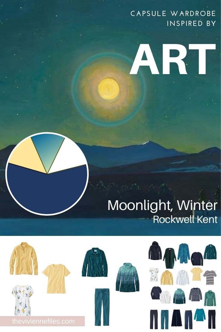
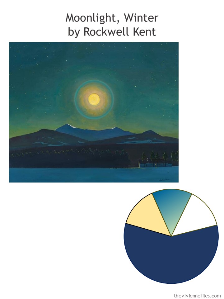
She scrolled through all sorts of museum websites, and art websites, and WHAP! – there it was:
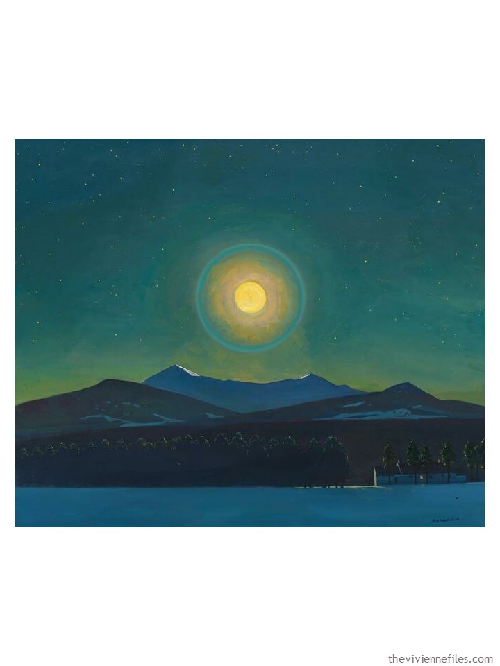
The colors were obvious, if not something that was usual for her:
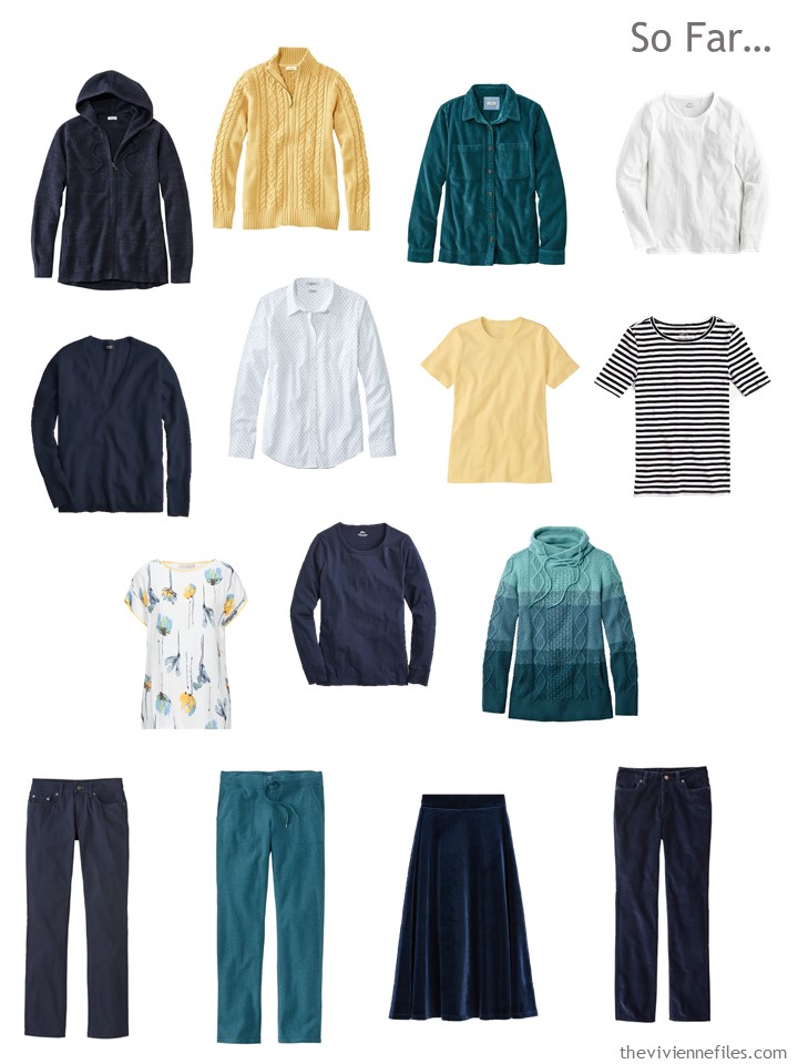
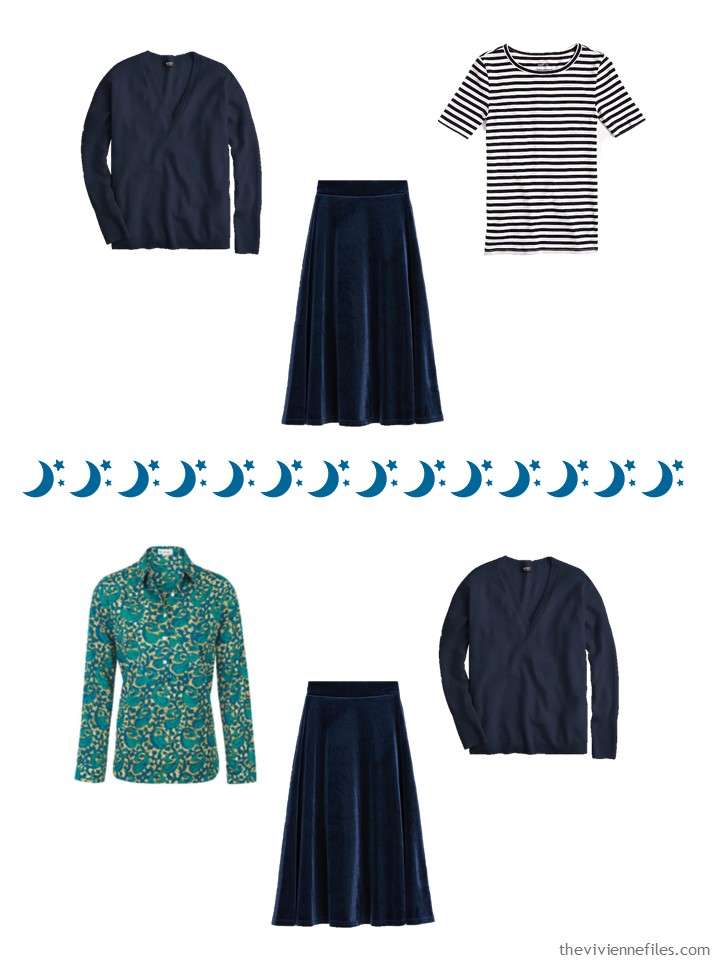
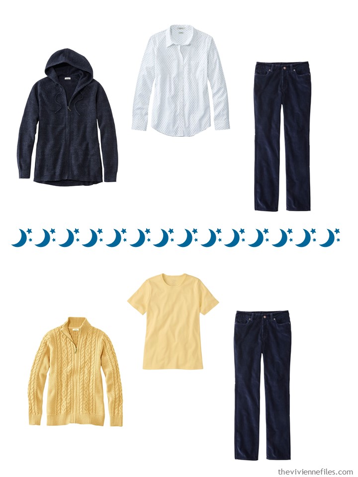
This is going to be a process that takes a few iterations, so she starts slowly – a small, 9-piece Common Wardrobe that includes all of her favorites – a dotted shirt, a striped tee, and her velvet skirt!
She’s kept wearing her skirt, at least once a week, for date night at her house…
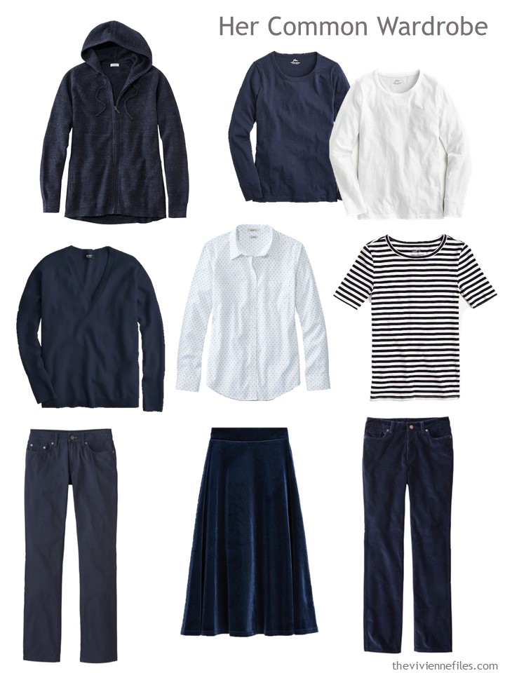
Hoodie sweater – L.L.Bean; long-sleeved tees – J.Crew; navy cashmere v-neck sweater – J.Crew; dotted shirt – L.L.Bean; striped tee – J.Crew; canvas pants – L.L.Bean; velvet skirt – Marks & Spencer; corduroy pants – L.L.Bean
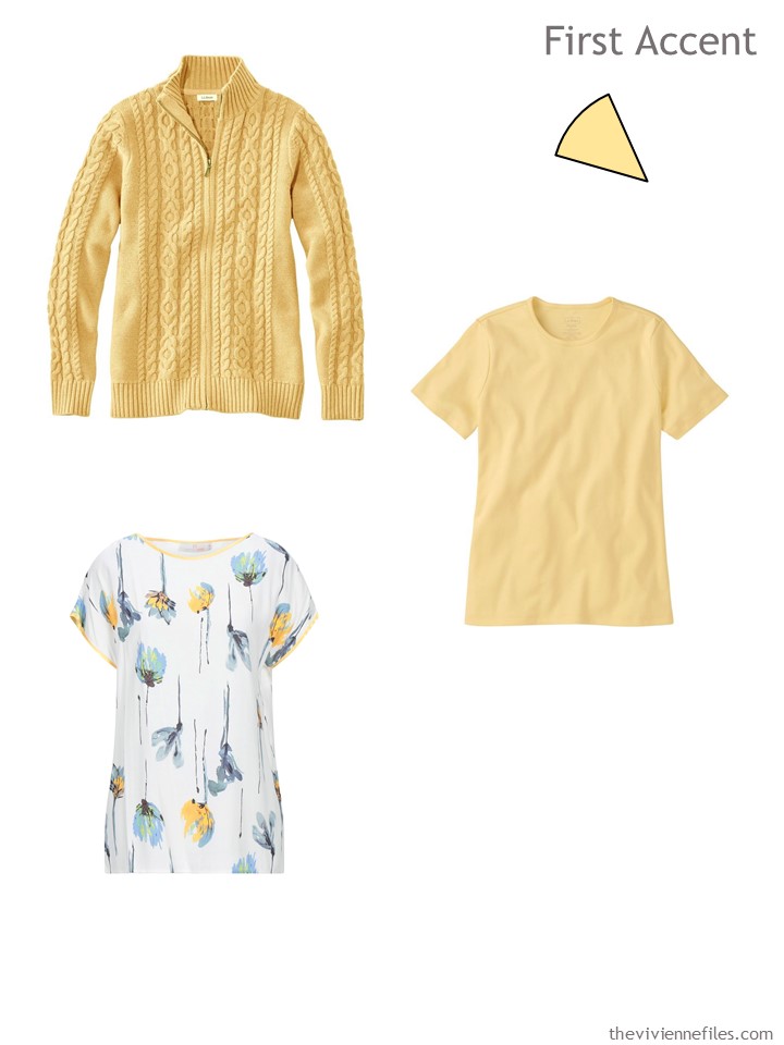
She’s quite eager to choose some accents! L.L.Bean is reliable to have a lovely shade of butter yellow in stock, and then she stumbled upon a really lovely printed tee shirt – these are going to be fun to wear:
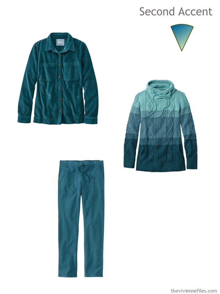
But OH, that deep dark blue-ish green color… It feels like deep water, or a thicket of pine trees, or the night sky!
At this point, her 15-piece capsule wardrobe would be excellent for travel…
She makes a cup of tea, grabs a bite of something tasty but nutritious (you can choose your wardrobe while eating ice cream, if you’re in that mood!), and then takes a look about for her last 6 pieces…
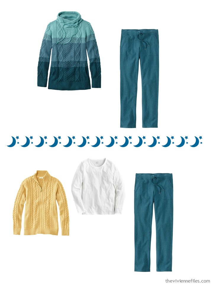
She knows that – unless she wants to do laundry frequently – she should grab a few more tops! And in the dark and cold of January and February, snuggly sweaters could be a uniform:
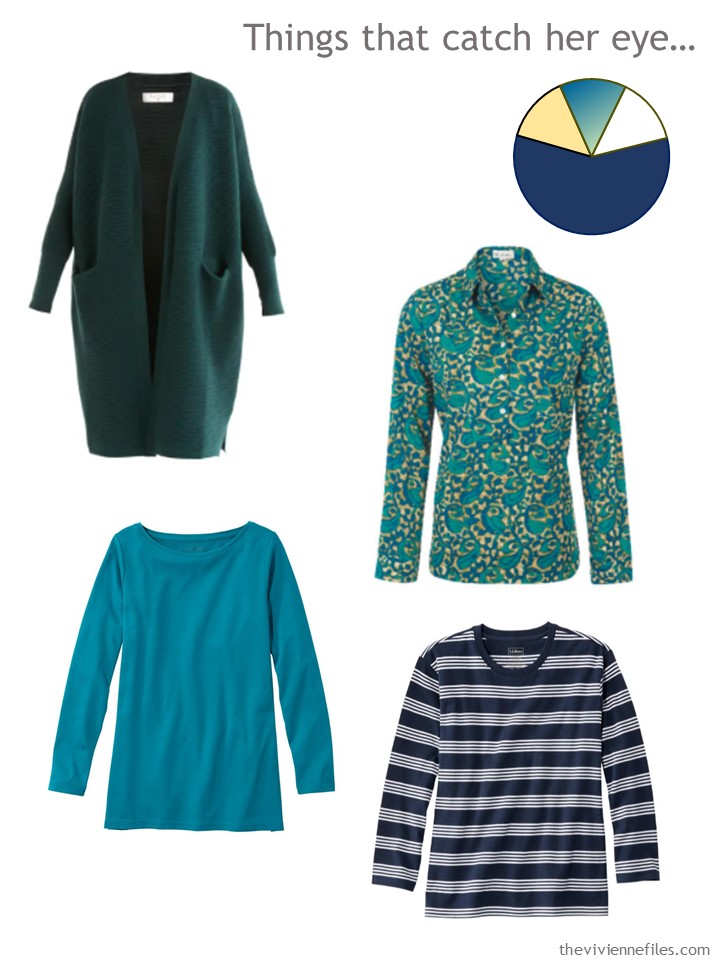
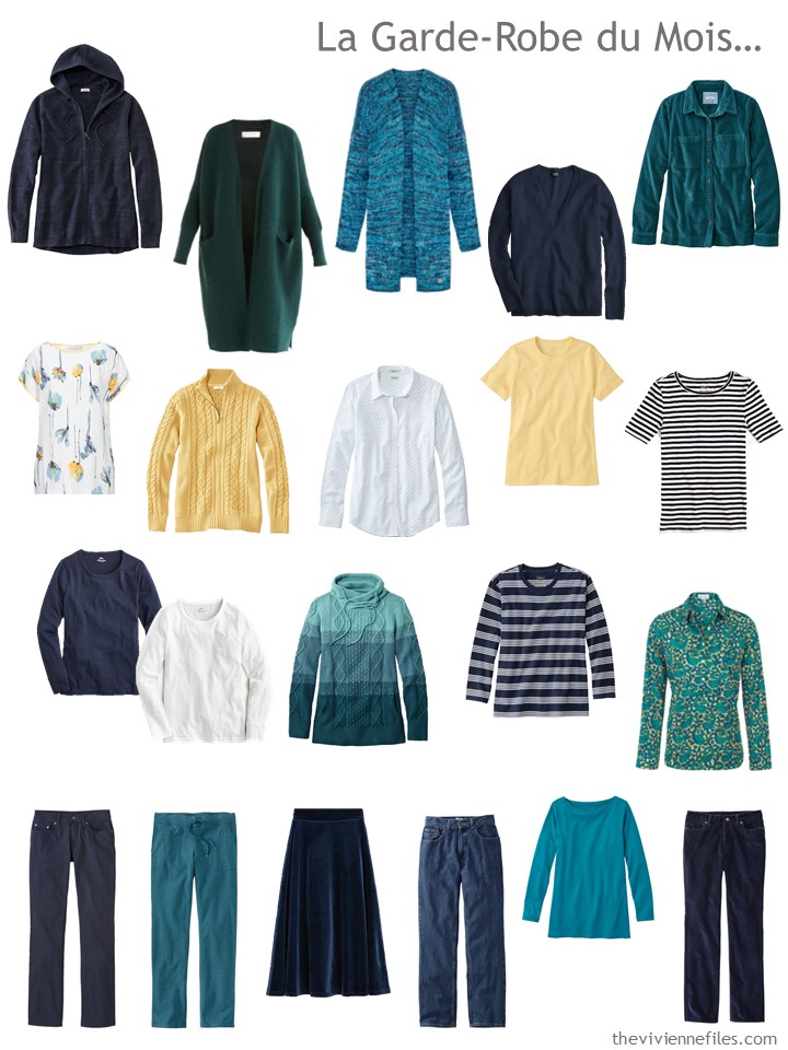
Green cardigan – Paisie; print shirt – At Last…; deep lagoon tunic – L.L.Bean; striped tee shirt – L.L.Bean
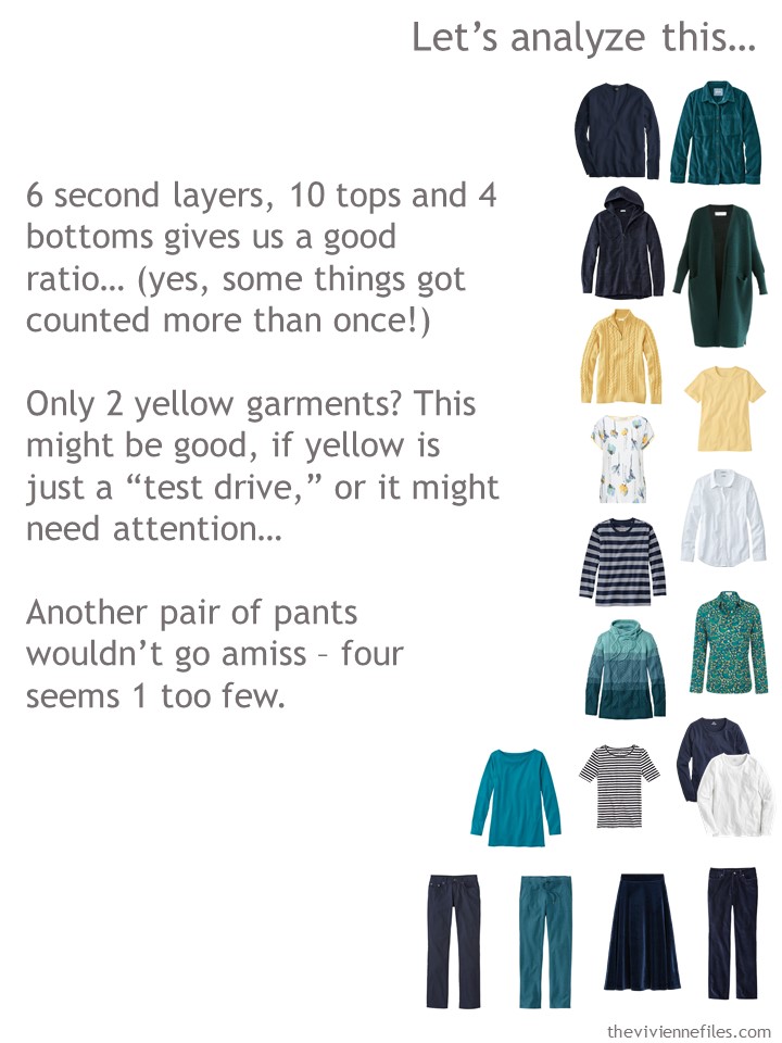
Almost there! But she take another thoughtful look at what she’s chosen:
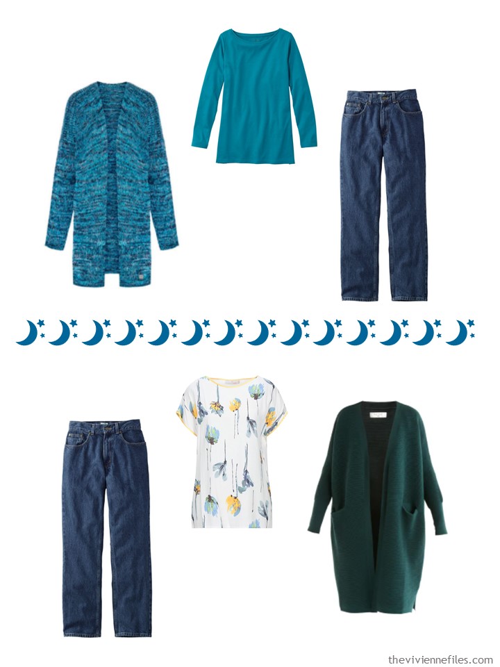
And she realizes that the cardigan she’s been longing for, and a simple pair of jeans, are what she needs!
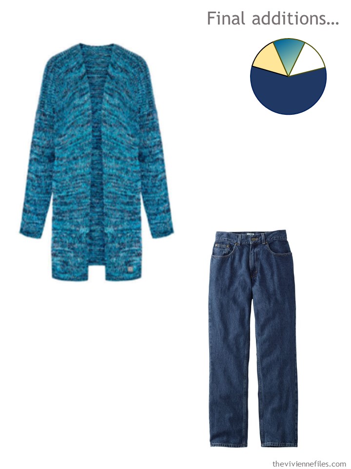
Cardigan – You by Tokarska; dark wash jeans – L.L.Bean
NOW! She’s ready for the next 30 days… possible a few more – she’s got no fabulous plans for Valentine’s Day, so she might just keep this wardrobe through February:
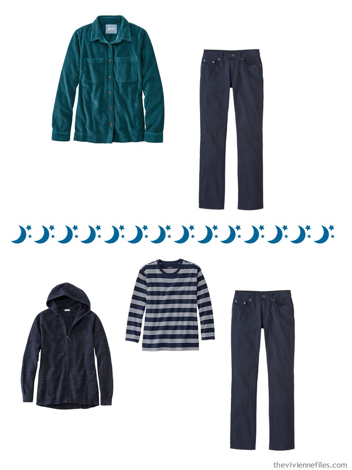
As always, our heroine takes a good look at finding enough outfits to feel secure about her chosen wardrobe:
I think I might chart out a new Garde-Robe du Mois for myself starting today!
love,
Janice
p.s. A couple of years ago, one of the Pantone colors was “Lovet Green.” I still don’t quite know for sure what a lovet IS, but I know that it was pretty with navy…
Like this article? Save it to Pinterest!
My inspirational moonlight artist is the Yorkshireman, John Atkinson Grimshaw 1836-1893.
I love all the blues and teal together. Sadly the colour block jumper is no longer on the website ☹
Velvet and velour are my favourite winter fabrics because they can be dressed up or down. The subtle sheen adds glamour every day. I have lots of velvet in navy, teal, grey, plum, burgundy, purple and black.
I can certainly ‘shop my closet’ except for the yellow. My ‘yellow’ would be reflected with a bit of gold touches of jewellery. White seems a bit harsh as moonlight has a soft ivory glow. I would add a teal or navy satin blouse, a subtle sparkly top to reflect the light and a velvet top or cardigan. Soft fluffy jumpers and cable knits are perfect with velvet.
Please would you accessorise this wardrobe? Perhaps moonstones and pearls would be appropriate stones? Faux fur and soft sparkly scarves.
OMG I gasped when I saw the teal blue selections. This is just a gorgeous wardrobe. Love the yellow floral top. The painting is just awesome. I’d love to place that in my “new” living room (hopefully) this year once we paint. This is a keeper! Thank you Janice!
I am wearing the teal sweatpants from LLBean right now and love them. I also have them in the navy blue. However, I have the same problem with LLBean tops as you do! They don’t have enough plus size top options and their fits seem best for trim figures. I tried several “admiral blue” tops but only kept a flannel plaid shirt. I did find at a Lands End store a long cardigan in their Aegean Sea color that is almost a perfect match (I think it actually matches better than some of the LLBean Admiral Blue tops that I returned).
Thanks for the heads up about the Aegean Sea Lands End color, Jackie! LE has better plus size inventory, so I will check it out.
I love this palette (though for me it would be more of a summer palette) and appreciated seeing the darker teal (“deep admiral blue”) items. I would really like to have a set of core items in that darker teal but it’s extra challenging in plus size. It’s interesting that even drawing examples from the same brand, same time, same colorway doesn’t guarantee that the garments will match the way you might want them to (though clearly screens can impact the perception of them). Both the dark green cardigan and paisley shirt veer more green than the other, bluer teal items, for example. But if I mentally modify the palette to split the teal into a “teal blue” and a “dark green,” then I can see how it fits.
It’s too bad that versatile and lovely striped sweater has sold out (though they didn’t even make it in my size AS USUAL LL BEAN). By having a range of related teal blue colors, it would be a handy way to blend across various shades.
I just realized I left out a couple sentences there…I meant to say:
It’s interesting that even drawing examples from the same brand, same time, same colorway doesn’t guarantee that the garments will match the way you might want them to (though clearly screens can impact the perception of them). The “deep admiral blue” corduroy shirt and sweatpants seem a bit off from each other, with the shirt seeming a bit more green. And it seems that there are multiple, possibly incompatible colors represented by that bluish-green palette pie piece. Both the dark green cardigan and paisley shirt veer more green than the other, bluer teal items, for example. But if I mentally modify the palette to split the teal into a “teal blue” and a “dark green,” then I can see how it fits.
I did not intend to suggest surprise that the dark green cardigan and paisley shirt were greener than the blue LL Bean items. :D
Also, I’m realizing suddenly…OH when the palette pie piece shows a range of colors, I’d always taken it to represent compatible versions of a color (e.g., a lighter teal and a darker teal that have a pretty similar green/blue quality)…but perhaps it really does just mean that there are a range of colors in the inspiration photo that could show up in the wardrobe, regardless of their compatibility. That must be why I find it easier to mentally separate that swirl of blue-greens into a couple distinct, separated pie pieces.
Just learned this about teal: Teal combines the calming properties of blue with the renewal qualities of green. It is a revitalizing and rejuvenating color that also represents open communication and clarity of thought. For Tibetan monks, teal is symbolic of the infinity of the sea and sky, while it is the color of truth and faith for Egyptians.
Janice,
There is plenty for my craved variety in this one, great job with so few pieces ! The sunny yellow would start Springtime wear for me in later March when the cold winds still blow, but with the days getting longer, the yellow color reminds me of sunny and warmer days ahead, once again ! I appreciate you breaking down the 21 pieces by function !
I really enjoyed this and am busy thinking of which pieces of my own, in my own colors, would make a similar wardrobe. Sometimes I think I like THINKING about clothes more than actually wearing them…
Oh my!! These are the colours that I wear all the time. The painting is gorgeous, I feel peaceful just looking at it. I would love to see accessories for this one; expecially scarves. Thanks, Janice, for this one.
Thank you Scottie for sharing about the marvellous properties of teal which we could all do with in spades:
Calming
Renewal
Revitalizing and rejuvenating,
Represents open communication and clarity of thought.
Symbolic of the infinity of the sea and sky
The ancient color of truth and faith
Wow! It is also one of the universal colours that anyone can wear. Perhaps teal should be the colour for 2021?
Sally, I’ve also had the same challenge of matching or coordinating the range of shades of teal from teal blue to teal green (I also have the same problem with shades of lighter and pastel blue-green).
Most of my teal is ‘my green’. However, some items veer more towards the blue end. Today, I’m wearing a more teal blue top with navy trousers and a grey sequin-striped cardigan. It did seem to be a oddity but regarding it as a separate item that won’t go with teal green has made it easier to wear. I’m wearing it with a moonstone necklace.
Yes, I agree, most of my teal tends to the “green” end, except for ONE SWEATER!! And it is becoming more difficult for me to incorporate it because it’s clearly the blue teal, not the green of everything else I have. Also, monitors just don’t always show the color as it really is. The blue sweater Janice featured with the Mountain View Scarf in her 12 months six scarves shows as kind of a blue-gray on my monitor, but when it arrived it’s very much brighter, and for me “on the edge” of whether it REALLY works with the scarf or not. I’m trying to be less picky, so I’ve made it work, but it was kind of a shock when it arrived and was so much different than what I was expecting.
It sounds like I have good company on the blue vs green teal issue!
Beth T, I think your approach of treating them as separate colors makes a lot of sense. I’m hoping that adopting that mind-set will help me stop having unrealistic expectations that all things “teal” should work together.
Sheila, oh yes, that one sweater. We all have that ONE SWEATER, don’t we? The color changes from reality to computer monitor to other monitor is such a difficulty! And I think the problem of “item appears much softer on monitor than it does in reality” is more common the reverse, in my experience. For those of us who are seeking less-bright colors, that’s frustrating. I’m thinking of a scarf that looked like a nice, mid-saturated coral-pink with narrow ivory stripes on the screen that should have been a great complement to my coral-pink pieces. When I got it, it was an ultra neon coral-orange-yellow with stripes that are…there is no better description, I’m sorry…a blend of Gatorade yellow and urine. I even tried to give it a chance, but when I saw it on myself and all I could think of was Gatorade urine, it was a no-go.
I have been photographing items from my own closet to help me “paper doll” outfits, and it’s an interesting thing…some items that are really close matches in reality appear kind of iffy on screen. Part of that is the fact that I am NOT AT ALL a professional photographer, and I know that even with all the windows open in my living room photographing by natural light, things photographed on different days might look different even when they’re not.
I saw a thing recently that blew my mind on Nancy Nix-Rice’s web site: for the fabric that she sells, each listing is accompanied by the specific thread brand and color that matches it. I assume that’s partly to help sewists pick a closely matched thread, but it also means that if you have that thread in hand, it can help guide you in figuring out what color you’re dealing with. It might help with the “is this a green teal or a blue teal” type issues.
Gorgeous! I love the painting and the colors in the wardrobe! I would probably make the yellow items a little more lime or spring green but this one makes me happy!
Imagine my surprise on opening today’s post and thinking to myself, “that looks like “my” mountain! I live at the base of Mount Mansfield in Vermont. I assumed the painter was British but no he painted it in Plattsburgh in 1940! Just across the lake from me! My goodness!
That is so cool!
I humbly disagree about Valentine’s Day. The velvet skirt and the leafy/paisley blouse would be a lovely date night combination.
Michael Ann Griener, the reply button didn’t work for me, but I wanted to say: WOW, that is amazing. What a delightful surprise!
Sally, I also have to take into account I do not see shades well to begin with. If I truly want to match something, I virtually have to take it with me and have someone give a 2nd opinion. That’s why I’m working to being “less picky” and acknowledge items might really work even if I think they don’t and vice versa. AND why usually I’ll buy same brand/same color/same time if I can. That gives me a fighting chance. I’d almost rather be full blown color blind that this horrible in between. And one of my boys is even worse with shades. Every school year in elementary I would have to give the teacher a note to disregard his coloring choices!
I really liked that the core portion of the wardrobe was ‘non-standard’ i.e. striped tee, dotted shirt, velvet skirt. Can we see a little bit more of that? i struggle a bit in fitting personality into the core neutrals….
Amazing job as always Janice :)
Last night I was pondering on the green teal v blue teal discussion when I caught sight of my teal striped scarf on the hall chair.
Perhaps it was the way that it was lying because I noticed that it had blue teal (as well as light teal) in the stripes. Why had I never noticed that before? So I could wear that scarf with the blue teal top.
Then I remembered another scarf which is in my Spring wardrobe selection that I’ve just got out of the loft. This is a floral scarf in a range of soft blues and grey including soft teal blue and a soft turquoise on a soft white background. Today, I’m wearing yesterday’s top today with the floral scarf and a bead necklace in various shades of turquoise and blue/green. The scarf lifts the deep colour of the top.
I’m now shifting the teal blue top into my Spring wardrobe and will wear it with grey as well as navy bottoms.
Another orphan has found it’s true place in my wardrobe. ?
Beth T, so glad to hear your orphan found a place! I cherish my multi-shade garments and accessories that can coordinate/blend with a range of shades in a basic color category. A monochromatic multi-shade scarf in a stripe or ombre can work magic. This is an area I have been interested in building up ever since I bought a pink-of-many-shades striped scarf that seems to go with every pink I own.
I can also wear the blue teal top under a chiffon blue-grey floral dress with blue teal flowers. I already wear the floral scarf with the dress topped with a pale grey suede biker jacket and dark grey snakeprint ankle boots. Now the blue teal top along with thermal tights could also mean I could wear this outfit in the autumn. Job done! ?
Janice,
This Went right to my heart. We retired to the Adirondacks 13 years ago and this is a perfect ADK wardrobe. When you get to the accessories, and I know you will, we need plenty of hats, scarves, gloves, socks and waterproof footwear, yes even in the summer. Once the sun drops behind the mountain, the temperature can drop 20 degrees. No one puts their flannels away around here!
The Rockwell Kent painting wasi done at his home, Asgaard Farm, in AuSable Forks,NY. It is still a working farm and is famous locally for opening to the public in the spring so we can all see the baby goats. They have wicked good cheese at the farm store or at least they did before the Covid lockdown.
Thanks for this and all your wonderful posts. I live and dress much better because of you inspiration.
Stay safe, stay healthy, and keep smiling, even with the mask on.
Your devoted reader,
Peggy in the mountains
Whap! You got me with this color scheme. I know I would add a top- a bit dressier…and definitely a few accessories to dress up that velvet skirt. I like the way stylists have lately shown us how you can put a really pretty top with a pair of dark wash jeans to dress them up. So, if we find one that looks good with the jeans AND the velvet skirt, it’s a great working piece.
This is absolutely the smartest, best guide to wardrobe planning I’ve seen across the web! It’s full of so many excellent ideas and is like donning armor against silly impulse buys! There’s a lot of overdone fashion out there that drains the wallet and seems to fill closets with wear-one-time mistakes! Thanks so much, Janice.
Hi Janice and Everyone! I looooooooove the long cardigans in those beautiful colors?.
I guess I think of teal as a straight up separate accent color that can flip into any set of Common Wardrobe Colors. I do lean toward the blue side if I were to match them on me.