May 18, 2020
Oh, if ONLY it was warm enough to wear summer clothes! I know, I’ll be griping that I have to run the air conditioner too often… But these colors appeal to me right now…
The nice thing about these tops is that you can pretty much always find something in a color that you like, and then you have an easy, inexpensive accent for almost any outfit!
It wasn’t tough at all to find tops that look good with our favorite (current favorite?) 6 scarves:
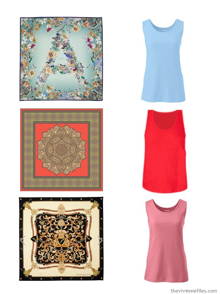
mint green “A” Floral scarf – Aspinal of London; soft lake blue tank – Lands’ End; Earth Mandala scarf – GISY; red tank – Loft Outlet; shield scarf – Aspinal of London; dusty apricot tank – Lands’ End
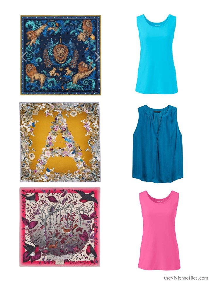
navy lion and peacock scarf – Aspinal of London; sea mist blue tank top – Lands’ End; mustard “A” Floral scarf – Aspinal of London; blue tank – Banana Republic; Magenta Robins scarf – Aspinal of London; pink phlox tank – Lands’ End
As you probably can assume, by now – I have some ideas, suggestions, thoughts, observations…:
I love navy with bright green; in cooler weather I might turn the green “down a notch” into forest green, but I could still see navy, green and white as a lifetime color palette…
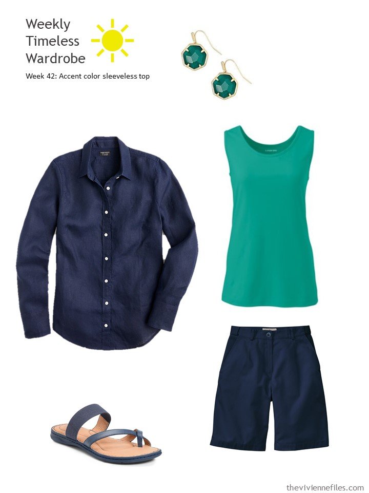
Earrings – Kendra Scott; navy linen shirt – J.Crew; aqua green tank top – Lands’ End; navy shorts – L.L.Bean; sandals – Børn
I managed to find our essential green garments – it is NOT easy to scare up a soft, neutral green, especially for warm weather. But this forest moss, with soft peach, is lovely…
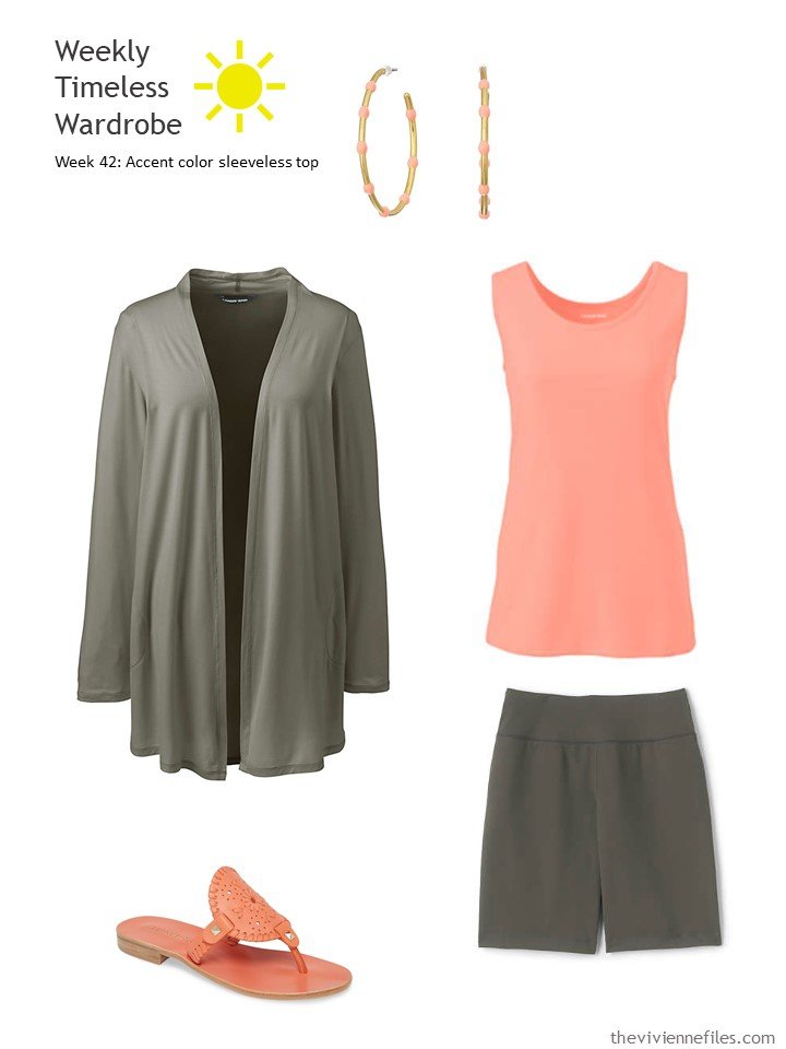
Earrings – Madewell; forest moss cardigan – Lands’ End; desert peach tank – Lands’ End; forest moss shorts – Lands’ End; sandals – Jack Rogers
You can even use a fun accent color when you’re exercising – speed walking the neighborhood, with a mask, perhaps?
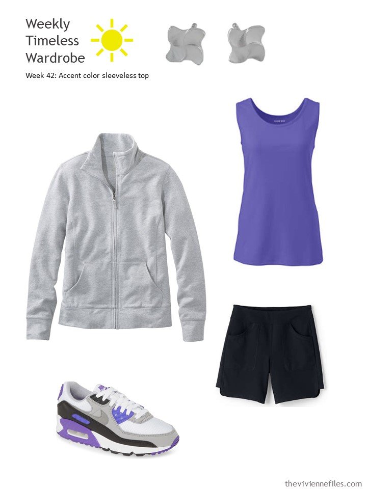
Earrings – Sarote Lochotinunt; sweatshirt – L.L.Bean; purple aster tank – Lands’ End; black shorts – Lands’ End; sneakers – Nike
For those of us who were enjoying the “lemon” theme of the other day, don’t look now – I found a lemon scarf!
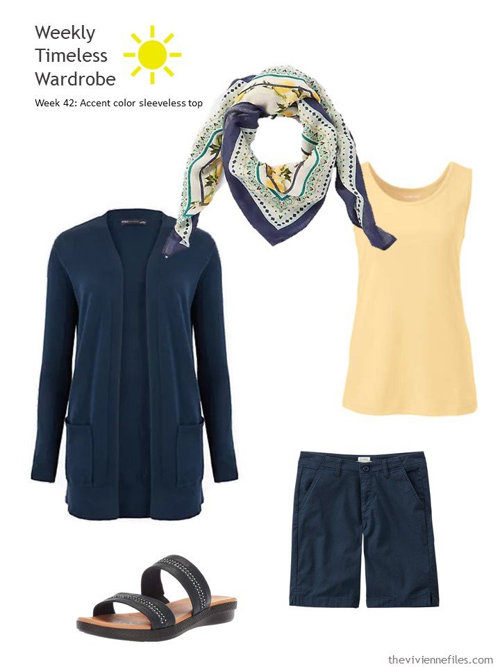
Scarf – J.Jill; cardigan – Marks & Spencer; soft butter tank – Lands’ End; navy shorts – L.L.Bean; sandals – Easy Street
Grey is almost as hard to find for warm weather as brown! Although there is often grey linen somewhere… I love the way this is sort of feminine, but still just shorts and a top, without a lot of frills…
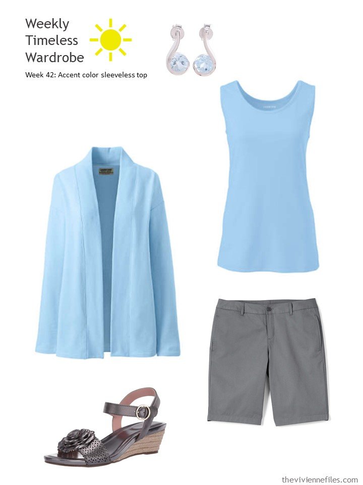
Blue topaz earrings – Alok Jain; soft lake blue cardigan – Lands’ End; soft lake blue tank top – Lands’ End; arctic gray shorts – Lands’ End; gunmetal sandals – Taryn Rose
If you’re going to wear red and black together, you really should have sparkly ladybug earrings, right?
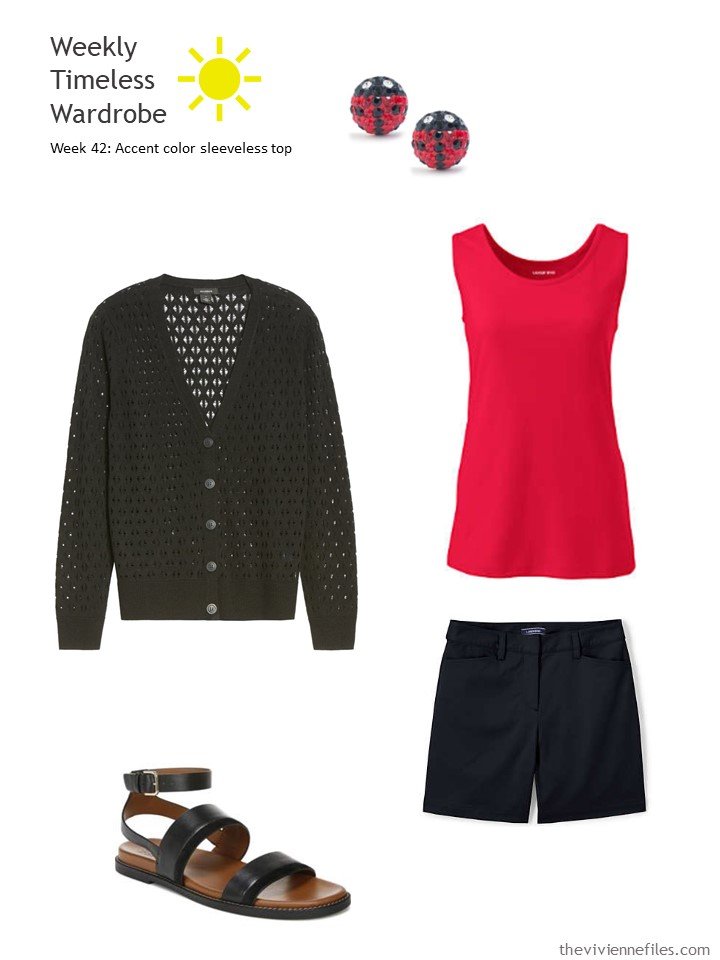
Ladybug earrings – Giani Bernini; pointelle cardigan – Halogen; cardinal red tank – Lands’ End; black shorts – Lands’ End; sandals – Naturalizer
The following is a perfect example of having to compromise sometimes… The obvious top for me to add to this wardrobe would be a soft pink, that could be worn with the soft pink cardigan. But I couldn’t find one with a good photograph, so I substituted a different pink. The retail world doesn’t revolve around us, so sometimes we have to work with what’s available…
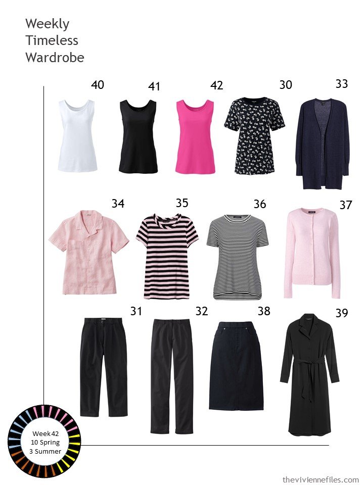
White, black and pink tanks – Lands’ End; floral tee – Lands’ End; linen cardigan – Halogen; shell pink linen shirt – L.L.Bean; striped tee – Banana Republic; striped short-sleeved sweater – Max Mara; pink cotton cardigan – Lands’ End; black cropped pants – L.L.Bean; black pants – L.LBean; black skirt – Lands’ End; shirtdress – Banana Republic
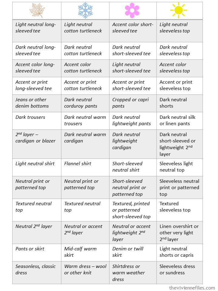
For your review and use, I always include the “mistress” (no master here!) list of 52 garments:
I’m working on the accessories list – it’s a challenge, but we need to be challenged these days!
love,
Janice
p.s. 2 years ago, we revisited The Jack Pine by Tom Thomson, and imagined a travel wardrobe in olive and accents of red and orange…
Like this article? Save it to Pinterest!
Janice,
Referring back to “ The Jack Pine” painting color scheme, I have a pair of dark dusty olive green culottes that I have had trouble pairing with coordinating green tops . I have found that lime green can seem too yellow against the dustiness of the bottom olive piece and that the more toned down sage green tank top seems to work better with it . Do you suppose that this might be because of the grayed aspects of both hues ? The other colors that play well with it are soft golden yellow, light slate blue, and either a soft peach or apricot . I have not yet found just the right olive green top to wear with this culottes, but by the time that I do, it shall be too worn out anyway !
I think of that as a color’s intensity – the degree to which a particular color is (or isn’t) muted by the addition of grey or some other colors that makes it feel more “dusty.” I’ve never really been able to show how that works, because there are so many possibilities, but your experience seems to be exactly this! There are so many possibilities…
hugs,
Janice
Even in Minnesota summer, having at least a few tank tops is essential for my wardrobe. It’s a perfect warm weather layering piece. But this post mostly reminds me of being in my 20s, living in Texas and having a bunch of simple knit tank tops in an array of colors to wear with black shorts and canvas shoes every single day through the summer. I had hit the jackpot on a good-quality, inexpensive tank top that fit me perfectly so I stocked up and wore them over and over (throwing on a lightweight chambray button-up shirt for extreme AC conditions). That was a time/place/stage of life when a super easy casual outfit formula worked splendidly (I wasn’t winning any fashion awards but was correctly dressed with almost no effort, which I really needed at the time). And in retrospect, I see how keeping the other wardrobe pieces in the most basic of coordinating neutrals (black, chambray, white) meant that I was free to go wild with accent color tops–none of them had to match each other.
I recently purchased this light pink tank top from Lands End, which would enter the sample wardrobe seamlessly (and might work with that pink cardigan), but it’s somehow available in plus sizes but not straight sizes (!).
https://www.landsend.com/products/womens-plus-size-cotton-tank-top/id_329427
Also the green tank in the navy outfit is labeled LL Bean but goes to Lands End, FYI.
Oooh, THAT’S the pink tank top I wanted. I don’t suppose it’s worth it to buy one and cut it down to fit me – that would be a bit nutty, but if I had a sewing machine…
I love your tale of the tank tops – that’s a brilliant way to dress when you want a lot of colors, but don’t want anything complicated. Thanks for taking the time to share…
And I’ll hop on that green tank top link right now and fix it!
hugs,
Janice
Shrebee, I know what you mean about coordinating with olive green. I have an olive utility jacket that noting seems to go with. I like a tonal/ monochromatic look. I found a print I love. Much more forgiving with matching.
I am ISO the Goldilocks of tanks. Not too low, not too high. Not too loose, not clingy. Something that will last more than one season. Can anyone attest to the fit/quality of the Lands End tank?
Lily,
I would love to find more prints to go with that olive bottom as well as other prints that pull together a neutral plus “ my colors “ ! Yes, I was looking to create a tonal look with the culottes , but shall have to remain on the search, though the sage green is working better than anything else that I have tried thus far to accomplish that goal.
I have figured out that to go with a neutral bottom or even a muted one like olive green or medium denim blue, I can wear tops or toppers as the following in color type :
In a print. Off white. Tonal monochromatic. With an analogous accent color. With a topper in a complementary color, worn with either the print that repeats both that complementary color as well as the bottom color, or separated by a white top. A topper in one of the triad colors of the bottom color, either with the multi color print top or a simple white top.
I have a couple of these tanks. The fabric is substantial enough not to be clingy and the shape is not boxy. The scoop neck is high enough not to show cleavage. Straps easily cover bra straps. If I hold my arms straight at my side the hem reaches about to my wrist. Hope this helps
The mint A scarf and blue top are lovely together – I was wearing blue and green today. I prefer the blue top with the mustard A than the bright pink you’ve had before. I like light blue and grey, especially the topaz earrings, but it can be an insipid combination on me, so I need to experiment a bit with tonal qualities. Perhaps a self-pattern in blue might be more interesting?
Have been meaning for a couple of years to thank you specifically for introducing me to Lands End. As a “lady of a certain age” I find so many clothes are just too “cutsy” and young for me, but now my closet is full of Lands End dresses, pants and tops. They all fit well, are well made and seem to last forever. (The first dress I bought is now a couple of sizes too big, but i can’t bear to part with it, so it’s morphed into a belted jumper! at least until they offer sometimes very similar again.) And, I just placed yet another order for tanks in many colors
As I lost significant weight over the past year, I turned so often to your blogs to decide what to replace and in what color. Today I have half the clothes and twice the outfits as before, and overall I am happier with my wardrobe choices. I’ve been a fan for years, but it took needing a whole new wardrobe for me to get first hand experience in how liberating “the Vivienne system” is! Many, many thanks.
Oh you’re welcome! This made my day…
hugs,
Janice