I have no idea why they have multiple color groupings for autumn… Pantone does things their own way, no doubt!
I love these posts, but they take ages to do; just because Pantone thinks that these colors are going to be popular does NOT mean that they’re easy to find. But in all fairness, these colors aren’t just intended for clothing and accessories – they could be for automobiles, decor, restaurants – whatever…
Still, these are lots of fun, and would be a great way to bring some personality to a Weekly Timeless Wardrobe, wouldn’t it?
This first color is closest to what I would indulge in:
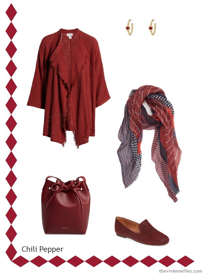
cardigan – Caslon; earrings – The Met Store; scarf – Treasure & Bond; bag – Mansur Gavriel; loafers – Gentle Souls by Kenneth Cole
This darker red might be lovely with brown, wouldn’t it?
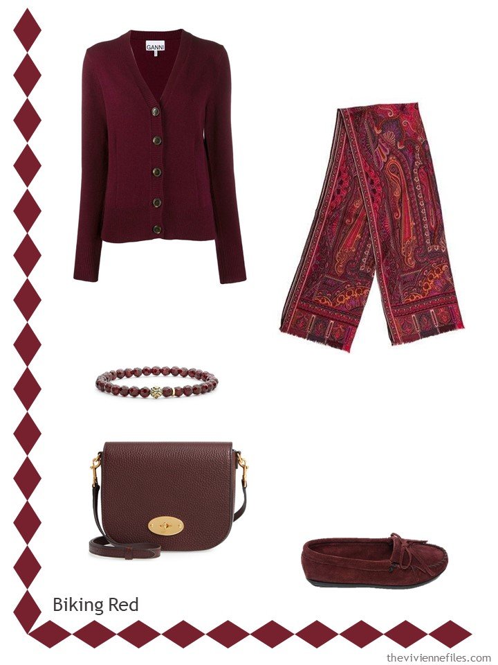
cardigan – Ganni; scarf – Etro; bracelet – Lagos; bag – Mulberry; loafers – Minnetonka Moccasins
If you like beige or grey, this peach would be beautiful…
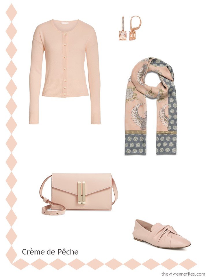
cashmere cardigan – Vince; morganite earrings – Kohls; scarf – The Met Store; bag – Demellier; loafers – Vince
There’s SO MUCH orange this year… This is a pretty shade of true peach:
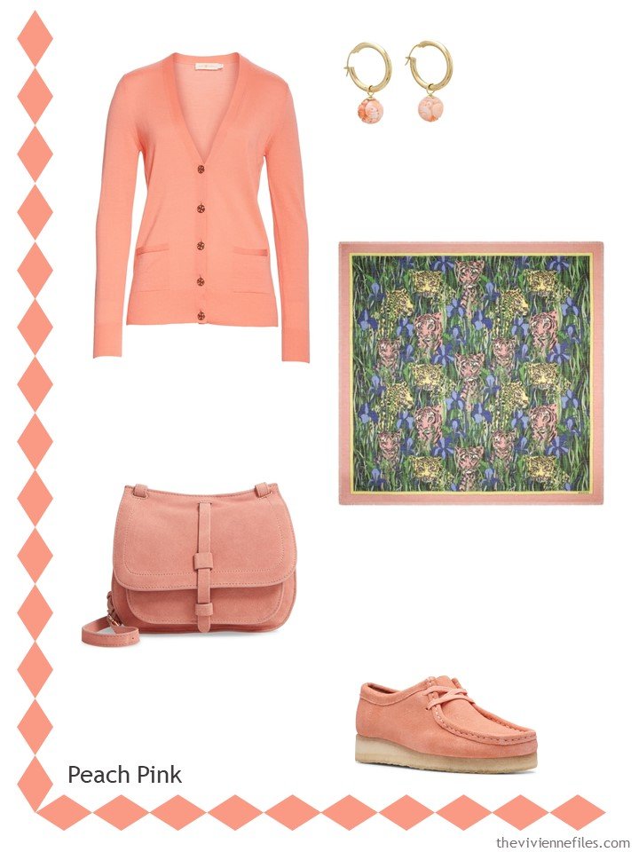
cardigan – Tory Burch; earrings – One Kings Lane; scarf – Gucci; bag – Leith; boots – Clarks Originals
This brown is so close to black; finding anything in this color was a challenge! I hope for all of you lovers of brown that these become popular!
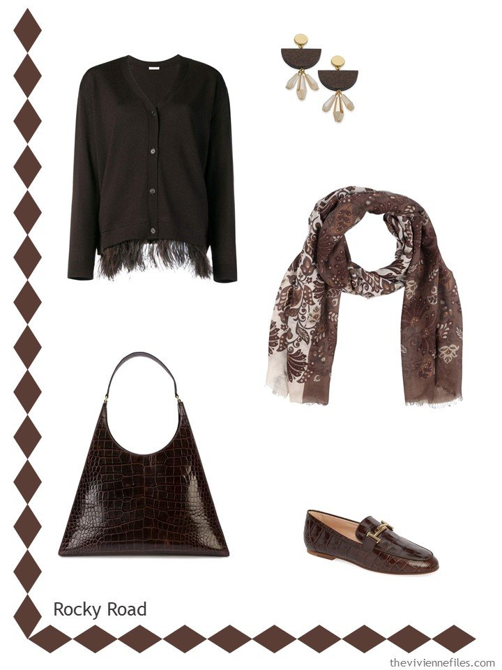
cardigan – P.A.R.O.S.H.; scarf – Barba; earrings – INC International Concepts; bag – Staud; loafers – Tod’s
Yes, there is a bird called a fruit dove! And the patch on their head is this color! Who knew?
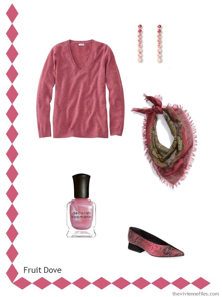
sweater – L.L.Bean; earrings – Sheebee Gems; scarf – Free People; nail polish – Deborah Lippmann; shoes – Yuul Yie
THIS brown is so beautiful; it would be lovely with black and white… (coming from me, that’s quite the admission!)
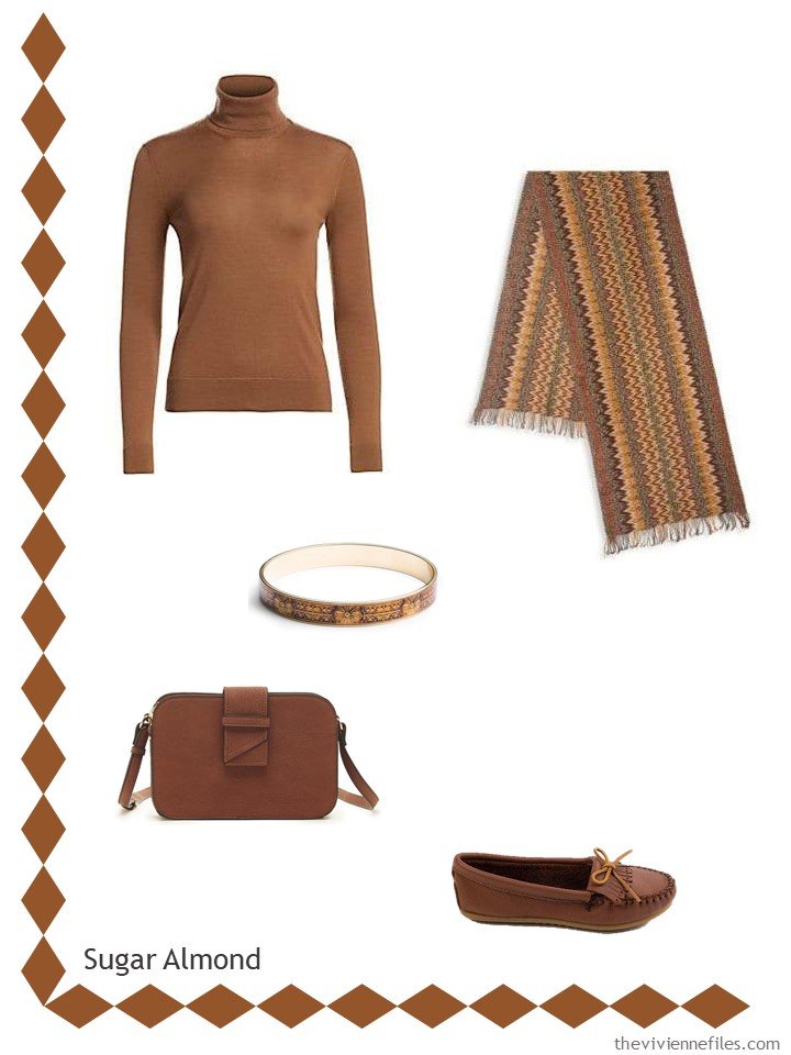
sweater – Ralph Lauren; scarf – Missoni; bracelet – The Met Store; bag – Sole Society; loafers – Minnesota Moccasins
Oh, if you fall in love with this next color, I counsel great patience in your shopping…
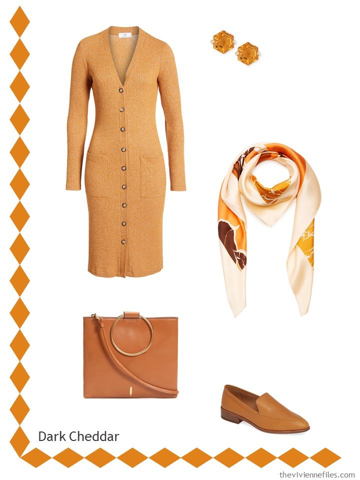
cardigan – Socialite; earrings – Suzanne Kalan; scarf – Johanna Ortiz; bag – Thacker; loafers – Madewell
This is such a tough color – so many retailers want to just stick with navy blue, rather than explore the range of colors available… But it’s so pretty!
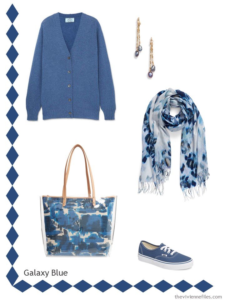
cardigan – Prada; earrings – Marida; scarf – Nordstrom; bag – Sondra Roberts; shoes – Vans
And this subtle shade is lovely! I’m crossing my fingers that Eileen Fisher might come through with something near these shades. For those who love green, it’s worth keeping an eye on her monthly offerings. And DO check all of the major department stores; she sells different merchandise to different stores…
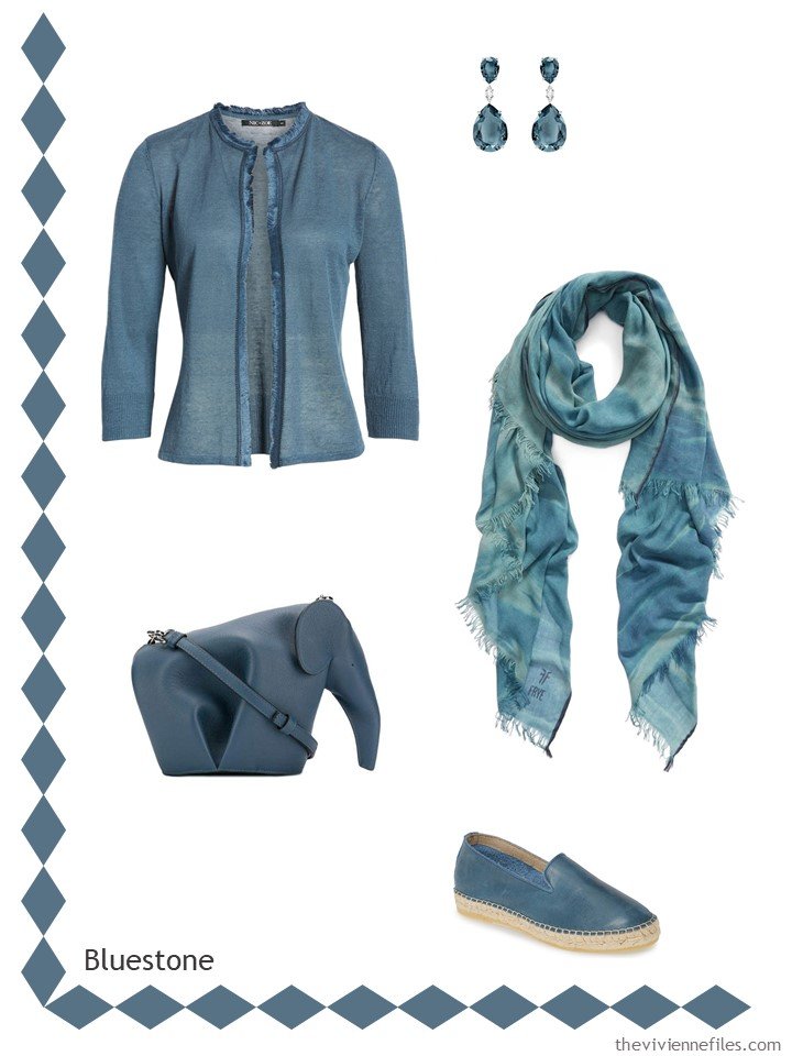
cardigan – Nic + Zoe; earrings – Swarovski; scarf – Frye; bag – Loewe; espadrilles – Free People
THIS is orange. If you love orange, enjoy! And if you don’t love orange, just imagine for a moment that you do, and think of how lovely this could be with navy, or grey, or brown…
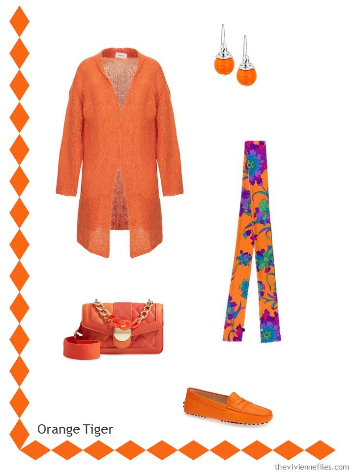
cardigan – Vicolo; earrings – Hagit; scarf – La Double J; bag – Knotty; loafers – Tod’s
And this last dark, dark green cries out for some navy and white to balance it… or some brown…
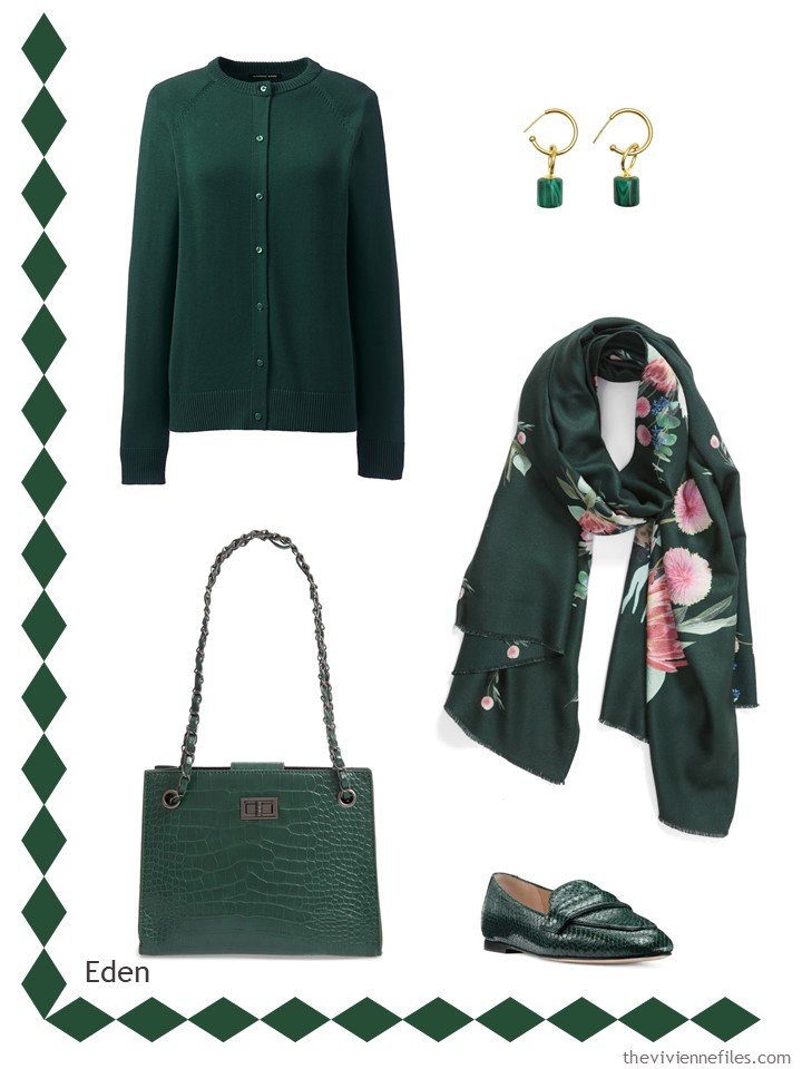
cardigan – Lands’ End; earrings – Farra; scarf – Ted Baker London; bag – Knotty; loafers – Stuart Weitzman
Yes, some of these items are quite expensive, but I tried quite hard to match the colors as well as I could. With time and patience, these colors will eventually turn up. I wanted to show you what CAN be done, not what you must do!
love,
Janice
p.s. 7 years ago – back when I was a rookie blogger – I tried to visualize what the advice was in the book French Chic…
Like this article? Save it to Pinterest!
Chili Pepper, Rocky Road, Sugar Almond and Dark Cheddar look to be already represented in wardrobe in prior year iterations – which is good! (Is it a surprise that there are so many foodie references?)
Rocky Road and Sugar Almond look to be cooler versions of the browns I enjoy. I’m glad that browns promise to be represented in retail again this year – a couple of years ago browns were pretty scarce in the stores!
Dark Cheddar looks like a lighter version mustardy yellow – I hope to round out that accessory group that isn’t quite there yet.
And, just saying that your post from 7years ago looks current, relevant and reproducible today! The value of a classic wardrobe in neutrals!!
That dark green is gorgeous!
Eden, the dark green, is really pretty and the only one of these colors that look good on me. Bluestone reminds me of denim.
It’s funny to me that there are so many oranges for the fall. Four years ago there was a lot of orange in the stores. That year it was great because my daughter would be starting at university in the fall an the schools colors are black and orange. (They joke that it is always Halloween.) This makes me wonder if the basic 8 crayon colors rotate every 4 years.
Oh my, that Bluestone elephant handbag!
Yes!
*drooling*
Yes!!!!
It’s hard to think about autumn when we haven’t had summer yet in my neck of the woods. These are gorgeous, sophisticated muted colors! You found numerous, lovely pieces. Bring on fall!?
Those colours offer something for everyone! I’ve been trying to stick to one capsule wardrobe for 6 weeks. The clothes get lots of wear and dressing is easy. If something wears out, a piece in a new accent colour can be brought in. I really like the green and the blue. Eden and bluestone are just deeper versions of my summer accent colours.
I agree, the bluestone looks like denim and is very pretty and would be great with grey. One of my favorite sweaters is this color. I hope this color is easy to find. Janice Collins Coyle, Washington DC
Your accessories posts are among my favorites, and I always enjoy seeing the new Pantone colors. My picks are Galaxy Blue, Eden, Rocky Road, and Orange Tiger. BTW, I think J. Jill’s Kona looks quite a bit like Rocky Road.
Would you consider revisiting the Pantone colors a couple of months from now to highlight those have become a little more available?
Nag me… I’d love to do that, and I’ll put it on my schedule, but I’m getting a bit daft…
hugs,
Janice
I love the Chile Pepper color and I’m thinking of ordering the sweater and scarf. I have all the components to the green Eden set in a similar green that I love to wear Nov-March here in Southern California. Great post!
Surprisingly, there’s none of these colors is catching my attention. I typically tend to go for brighter colors and not the muted tones. I guess that means I can focus on my neutrals this fall which is good since that’s where I really need to concentrate my purchases and I’m usually tempted by the colorful items out there.
Galaxy blue is the exact color of my laptop/work bags (I have a larger — in the link — and a smaller) and not an easy color to exact match. I hope this color appears in clothing in the fall!
https://laptopbaglifeline.com/wp-content/uploads/2018/05/6a00e55083d2c5883301a73d9f6a1a970d-200wi.jpg
Unfortunately now out of stock, these bags have been all over the world with me and weathered wonderfully.
I look forward to the posts. Thank you, Janice.
Ooh, I love that “Fruit Dove” color! It looks very similar to what I would have called raspberry twenty or thirty years ago. Back then, I had a lovely cotton cardigan in that color. I would LOVE to find some good accent pieces that color. Thank you, Janice, for this wonderful post!
I love all these colors!
Great job Janice. Very interesting and inspirational.
Thank you!
Oh my goodness…I just googled fruit dove! I never would have guessed that a bird I have never heard of would have so many beautiful and colourful varieties. Please consider writing a “start with a bird” series or, better yet, “start with a fruit dove”. This colour speaks to me.
I think she started with a pigeon once, which was beautiful. Iridescent ones always delight me.
Love the fruit dove and sugar almond and the denim blue the name of which I am forgetting. I just bought a cashmere sweater this year in that color.
Oh yes, the pigeon! I abhor pigeons, but I still think they can be very beautiful; that’s one of the joys of city living!
https://www.theviviennefiles.com/2017/07/can-you-build-wardrobe-around-pigeon.html/
hugs,
Janice
I love that one. Similar to the Abalone shell wardrobe that I still go back to for inspiration. Quietly elegant. I’m going to save that Dove one alongside the Abalone shell in my Pinterest folder for inspiration.
Nice to see the blues, green and fruit dove, for us fair-skinned Irish roses. Earth tones are the usual fall fare, so this is most welcome. These have enough depth to look good in the datk days of winter.
Pantone! What woman wants to look like a wedge of cheddar? Still, I like to see colours that are not the harsh, screechy reds and blues the big retailers seems to push. Grown women don’t want to look like they play for a pro sports team, unless they do.
re your French Style post, taupe looks gorgeous with baby blue or just slightly deeper, like robin’s egg, or pale to cyclamen pinks. My first French friend at university wore those combinations, when the rest of us were all in black.
I fell for Chilli Pepper, Biking Red, both the blues, and Eden. The accessories would all be lovely with a basically neutral wardrobe and a good way to update such a wardrobe. What a lot of research Janice, thank you.
On the subject of French chic, I also enjoyed this amusing interview with Carine Roitfeld in the Guardian the other day: https://www.theguardian.com/global/2019/jun/23/carine-roitfeld-rules-for-chic-french-vogue
I look best in color soft, or even “muted” shades. But of the “dark” deep shades I can wear well I love the deep green-blue ones, like the greens you shared here. Off to the Lands’ End site for an early birthday present!
So excited about the Tiger Orange! That’s a year round color for this Clemson family!! The green is lovely too.
Love that fall look ahead. I have a little collection of accent groups- those 5 piece French Capsule ideas.
They rest on top of my basic fall winter base of black, grey, white & cream.
I’m going to use my cranberry group (close to the chili shade) and my honey beige & brown group close to sugar almond and the dark brown.
I have a scarf that combines those 2 groups of tones with a dark forest or hunter green similar to the Eden shade so maybe I’ll use it as my key overall.
Fruit Dove is incredibly pretty and fresh looking. It would play nicely with chili to cranberry shades without clashing. That would bring a fresh unexpected accent to some otherwise very usual fall tones.
I like the 2 blues very much but I will think about them as winter tones. I always like a creamy white & grey accented with aqua, teal or some blue for my winter icicle group.