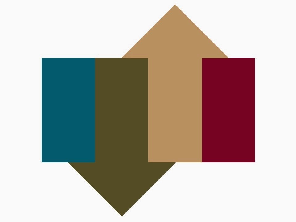
Camel and olive are pretty versatile – here’s a much more subtle use of these two neutrals, compared to the vivid gold and red from last week.
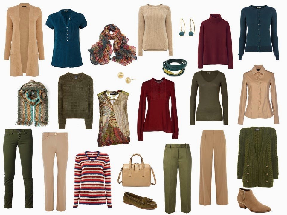
olive jeans – Dolce and Gabbana, olive crew sweater – Marc by Marc Jacobs, olive cropped trousers – Isabel Marant, olive cotton and cashmere tee shirt – Majestic, Sweater – Weekend Max Mara, jeans – Viyella, shirt – Mauro Gasperi, camel trousers – Dorothy Perkins, Camel cardigan – Jaeger, striped sweater – Tulchan, sleeveless wrap top – Desigual, olive cardigan – Balmain, Wine turtleneck – Uniqlo, teal tee shirt – White Stuff, floral scarf – Molly and Pearl, brushed gold stud earrings – Marco Bicego, teal silk earrings – Doris Mhor, chevron scarf – Missoni, leather wrap bracelet – Hariyono, tan booties – Aquatalia byMarvin K., loafers – Sperry Top-Sider, satchel handbag – Fossil
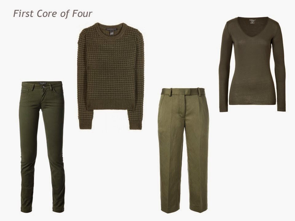
Jeans – Dolce and Gabbana, crew sweater – Marc by Marc Jacobs, cropped trousers – Isabel Marant, cotton and cashmere tee shirt – Majestic
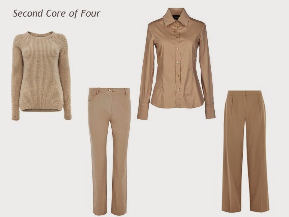
Sweater – Weekend Max Mara, jeans – Viyella, shirt – Mauro Gasperi, camel trousers – Dorothy Perkins
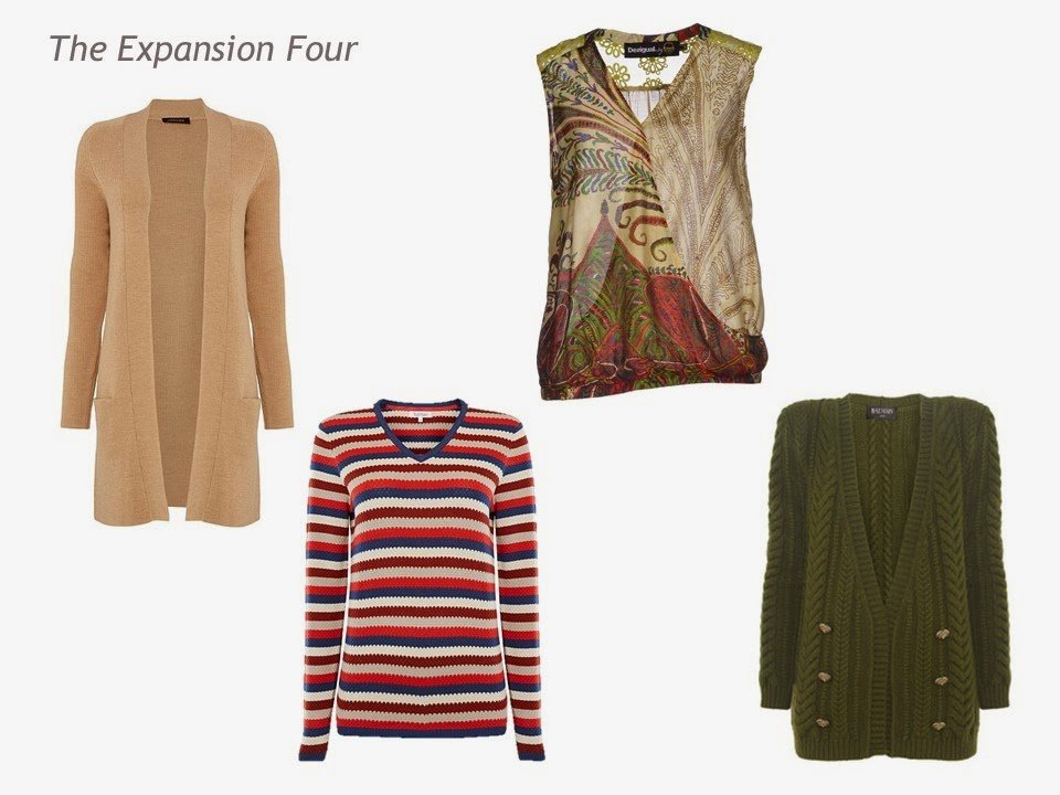
Camel cardigan – Jaeger, striped sweater – Tulchan, sleeveless wrap top – Desigual, olive cardigan – Balmain
These deep red/burgundy/wine colors – the names get muddled together, but the colors are lovely.
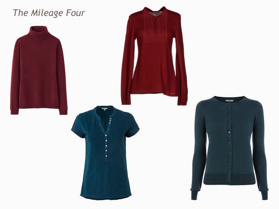
Wine turtleneck – Uniqlo, teal tee shirt – White Stuff, wine shirt – Timeout, teal cardigan – Oasis
I can’t suggest it often enough – if you’re really stuck finding a scarf that combines unusual or uncommonly mixed colors, look at Missoni. I’m not say that you should BUY one – I don’t ever tell you what to buy – but their way with combining colors might spark your imagination. And if you do want to buy one, The Real Real.com always has tons of them 2nd hand…
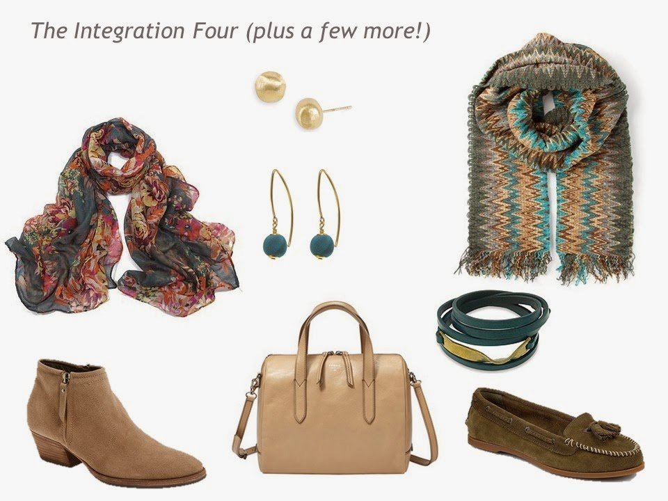
floral scarf – Molly and Pearl, brushed gold stud earrings – Marco Bicego, teal silk earrings – Doris Mhor, chevron scarf – Missoni, leather wrap bracelet – Hariyono, tan booties – Aquatalia by Marvin K., loafers – Sperry Top-Sider, satchel handbag – Fossil
love,
Janice
I am loving this teal, camel, olive plan. I have teal and camel in my palette (Taupe, black, brown with teal, camel and rose)
AS you describe teals are hard to match and I could not trust my eye so I took my favorite teal scarf and tank to the paint store and got paint chips to carry in my purse. Now my teals are "my" teal:)
This morning I was thinking about where to get color swatches that are easy to carry around. You just gave me the solution; Paint chips!!
Great idea! I was so into cloth samples that it didn't occur to me.
bravo !
I've always used embroidery floss, but paint chips would travel much more easily – genius, indeed!
thanks for sharing,
Janice
What a great idea on the paint chips! Thanks for sharing.
You, madam, are a genius. I can't wait to borrow this idea.
I really love this wardrobe. Very nice.
This is gorgeous! Add in a camel or cream turtleneck and a skirt or two and I could be all set!! :)
Lovely! You have me toying with warm and cool mixtures. Would love to see what you could do with pale gray, rust, plum and green inspired by this scarf: http://m.nordstrom.com/Product/Details/3748260?origin=keywordsearch
I was going to ignore the rust and use gray and black as my neutrals. Now I am seriously considering gray and rust. BTW, the background of the scarf is a pale gray, not white as it might appear in the photo.
Thanks for all you do. I would never have considered some of these combinations and I am loving them.
I just ordered the Desigual sleeveless top the second I clapped eyes on it. I have this whole khaki, olive, loden, burgundy, wine, plummy collection going and this pattern the pattern is so gorgeous. It will be a great layering piece and the price made it impossible to pass up. The Power Pause had to be turned off on this purchase. What a great, great layering piece!
I don't know why I didn't think to put these colors together. But I just LOVE this!!! Thanks <3
I don't like to wear light colors on my bottom half, so which color, teal or red, would look better as a column of color?
I really enjoy reading your blog. I'm a fair bit younger than you, but I work in a very conservative environment so I found your blog more useful than a lot of the street fashion blogs that are geared for my age group. My only friendly comment is that you almost never feature belts. Maybe just not your accessory of choice, but would love to see them in the mix on the integration segment sometimes.
Feel free to talk about teal for more than a second, it is one of my favorite accents! I like variations of teal mixed but usually reserve it for tops with a camel, navy or grey bottom. Olive I can wear as a column of color because it feels softer and more muted than most teals so it seems to mix as a bottom with nearly everything so it is a good accent with or substitute for some camel bottoms to mix in a heavy camel capsule.
I love your web site – and especially this colour combination. Usually fashions and combining clothes leaves me stymied – but since I discovered your website it starts to make sense to me.
Thank you so much