What a cool painting! It shows the World War 2 damage to the church, and the “reveal” of the interior structure of the church is fascinating. So sad that such a lovely piece of art is the result of destruction…
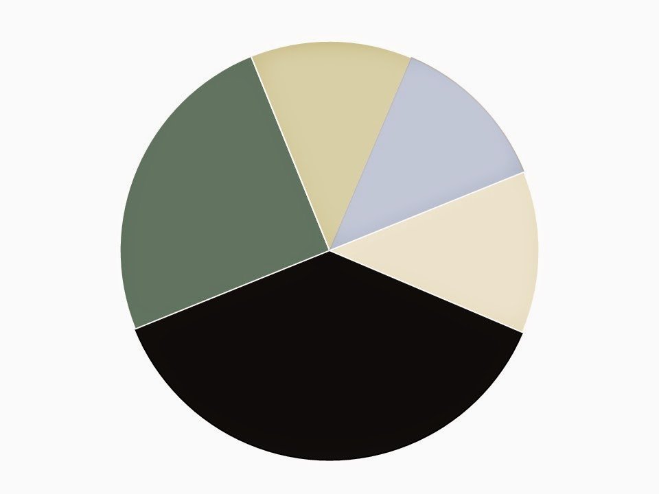
From this, I selected two relatively minor colors in the painting as the neutrals, and then used the gorgeous pastels as the accent colors. The black is clearly visible, but I grabbed the sage green from the shrubbery that’s relatively obscured on the left side of the painting.
I think what I’m trying to show here is that, although the painting itself is very light with muted pastels, it’s still possible to pull together a wardrobe from these colors without enriching your dry cleaner. Capturing the overall mood of muted softness and clarity can still be done, even if the relative prominence of the colors is somewhat shifted.
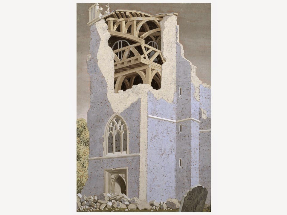
The Church at Coggeshall, Essex by John Armstrong
These colors could be prioritized in any way you choose; there are also lots of other colors that could be pulled from this painting!
With just these two ensembles, you have at least four different combinations – almost a “whatever’s clean” collection.
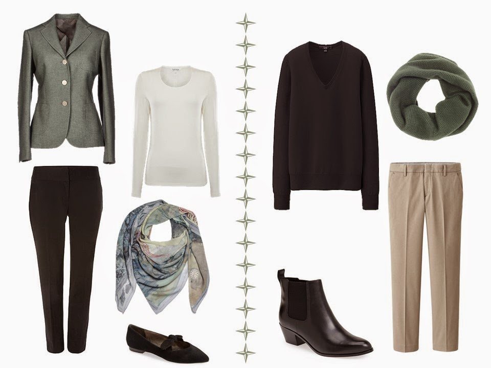
Blazer – Tonello, ivory tee – Tulchan, black pants – Vince Camuto, scarf – wrq.e.d, black flats – Jeffrey Campbell, black sweater – Uniqlo, cashmere infinity scarf – Ralph Lauren, chinos – Uniqlo, ankle boots – Via Spiga
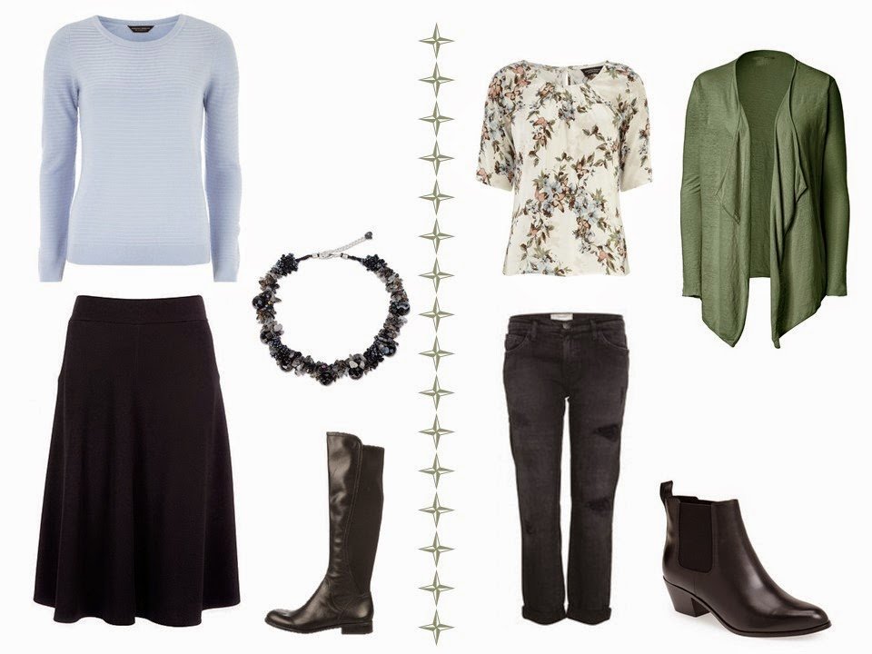
Blue sweater – Dorothy Perkins, black skirt – Wallis, agate and quartz necklace – Nareerat, riding boots – Franco Sarto, green cardigan – Majestic, floral blouse – Dorothy Perkins, black jeans – Current/Elliott, ankle boots – Via Spiga
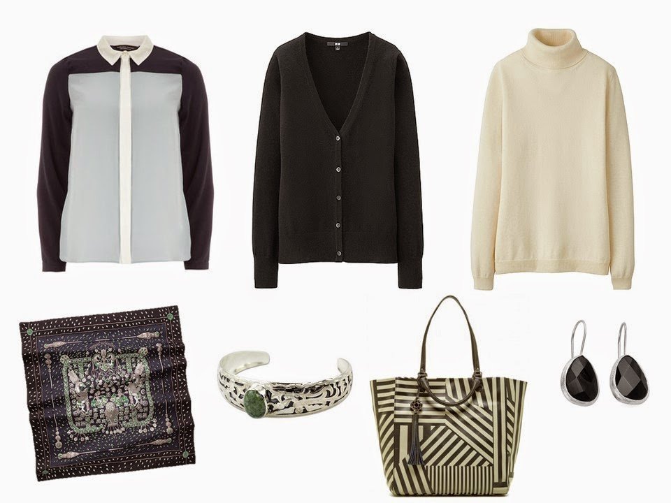
Color-blocked blouse – Dorothy Perkins, black cardigan – Uniqlo, ivory turtleneck – Uniqlo, square silk scarf – Hermes, jade bracelet – Gabriel Silva, tote bag – Rafe NewYork, onyx earrings – toosis
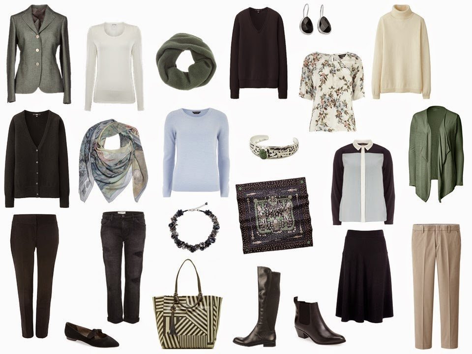
Color-blocked blouse – Dorothy Perkins, black cardigan – Uniqlo, ivory turtleneck – Uniqlo, square silk scarf – Hermes, jade bracelet – Gabriel Silva, tote bag – Rafe NewYork, onyx earrings – toosis, blue sweater – Dorothy Perkins, black skirt – Wallis, agate and quartz necklace – Nareerat, riding boots – Franco Sarto, green cardigan – Majestic, floral blouse – Dorothy Perkins, black jeans – Current/Elliott, ankle boots – Via Spiga, blazer – Tonello, ivory tee – Tulchan, black pants – Vince Camuto, scarf – wrq.e.d, black flats – Jeffrey Campbell, black sweater – Uniqlo, cashmere infinity scarf – Ralph Lauren, chinos – Uniqlo
love,
Janice
Beautiful!
I will forever prefer a wardrobe of beautiful neutrals, even though I have been told numerous times that 'a pop of color' or high contrast dressing suits me. This is stunning.
This is really beautiful, my favourite so far! I love the soft effect of mixing the deep colours with cream/ivory (I never get on with black/white; but love dark charcoal/cream). And muted green is my favourite colour! I'm already dreaming of my winter/spring capsule, and I've hardly started wearing my autumn one yet….
Agree with Cornelia that I'm not always convinced about the 'pop' of colour, as a result I've decided NOT to buy any more expensive bright accessories – I'll limit 'pops' to fun items, and save my money for neutral shoes/bags etc
Very inspiring, you have such a wonderful eye.
Alice
Love how the tote/bag you chose mimics the structural lines of the painting, and the scarf the trees/rubble. You really have an exquisite point of view.
Much for thought.
Thank you for all you do.
What a gorgeous palette!! Love this….and that first blazer is stunning (Tonello).
What a gorgeous, sophisticated palatte. The bag is maybe a little too literal for my taste and I would replace it with something really luxe in one of the mid-toned neutrals, but overall this is fantastic. I'll echo anonymous, above: it is my favorite so far.
Thanks for a beautiful start to my morning!
So beautiful! I can use a sage green scarf that I already own with cream and charcoal. Each day you offer new possibilities. Merci.
Since I'm fair skinned I would have chosen brown/tan as my main neutrals. The sage accent is lovely.
my first husband was from coggeshall!
Would it be possible to summarize with some detail your categories for core of 4, mileage, enhancement, etc.? I am not clear on how to build the pieces and colors for each category, particularly the enhancement and mileage choices. I enjoy your work and have dramatically changed my closet and sharpened my way of thinking about clothes. Thank you.