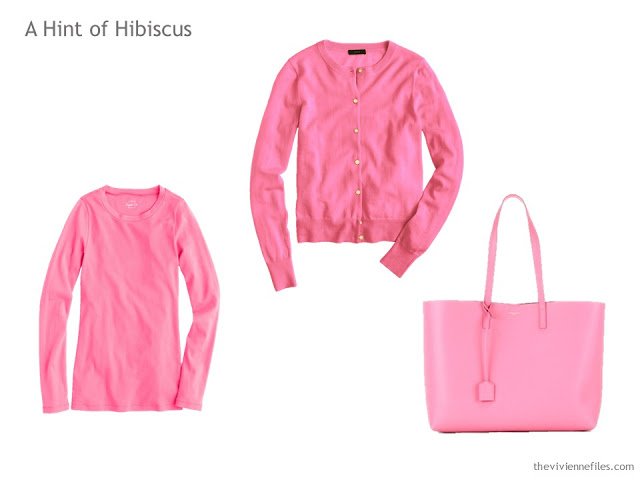
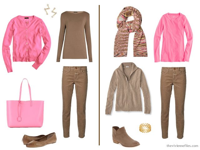
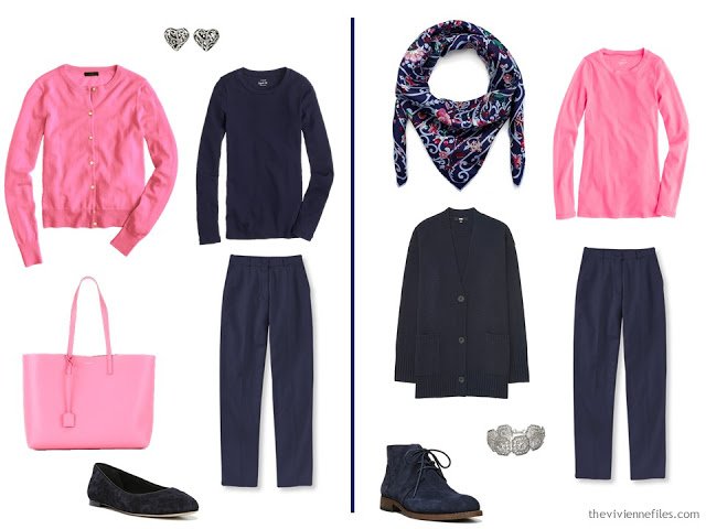
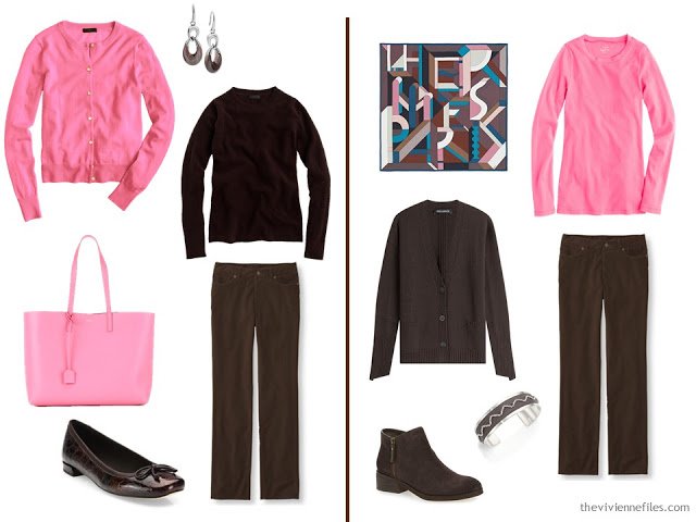
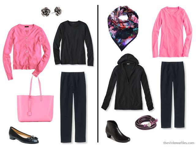
The manufacturer calls this “Neon Geranium,” but I’ve never seen a geranium this color! And I have seen hibiscus, at my mother’s home, exactly this color…
It’s easy to see how a fondness for this color could start with a sudden desire for a beautiful tote bag… And for what it’s worth, this isn’t a bad color to love; it looks good on a lot of people, and I found it pretty easy to combine with all of the neutrals in question. So if you’re tempted, it’s worth making a plan!
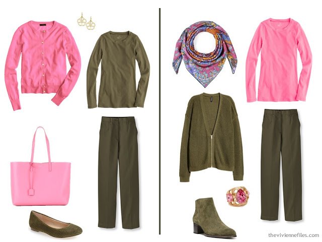
This is such a natural color combination – flower blossoms are always nestled into leaves of green!
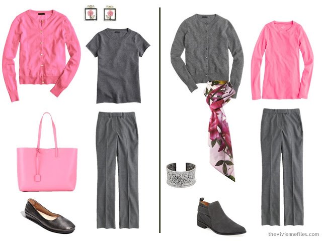
And I loved this – I keyed the choice of jewelry to the extravagant flowers in the scarf – the earrings and the bracelet echo the floral idea, on a much tinier scale.
For these ensembles, I took the zig-zag motif from the Missoni scarf and looked for jewelry that had that same styling…
And here, I focused on the scroll-like patterns of the scarf to help choose jewelry that has similar curving filigree details.
When I was choosing these accessories, I started with the scarf; for some reason, it suggested brown and silver to me, rather than the more expected gold. So I found a combination of rounded and angular, but always geometric, shapes to echo the sensibilities of the scarf.
Here I returned to a floral idea, with the striking, vivid scarf. Smaller, less intrusive flowers for the earrings and the wee bit of metal on the bracelet, and it all comes together nicely!
After visiting these neutral cores, with 10 different accent colors (!), I hope you’re encouraged to experiment a little bit more with using accent colors that you find attractive!
love,
Janice
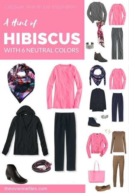
Like this article? Save it to Pinterest!
A beautiful shade of pink.
Bought a J. Crew "neon" coloured cashmere, in turquoise, and it about put my eye out, but fun relief from my usual. However, it does make me look bigger and wider; god gave us black for a •reason•. This pink looks good with charcoal grey and also a deep bitter chocolate. Thanks to your photo sets, I realize Kelly or hot pink plus navy will always look '60s preppy to me, it was the country club standard where I grew up.
Yes, this pink! The exact shade I love! (Along with a deeper fuchsia as an alternative). I'm so particular about the specific tones I like – gets frustrating sometimes.
– Kaci
One thing I learned from this remarkable series: it takes only a few things to crete an entirely different look. And I always love your attention to detail (floral in scarf and earring or geometric etc)
This has been an interesting series, Janice. It made me realize the accent colors I don't like (on me) regardless of their pairings with neutrals, as well as the accents I like with every neutral. Being able to eliminate colors is helpful!
Janice,
What these posts have demonstrated to me is how well a twin set works, and can be used to assist either an outer or an inner column of color by the neutrals. While I wear a warmer, more coral pink, this post has been my favorite with the various neutrals. I think part of it is the level of value contrast , as compared with some of the other accent colors shown.
I take it back — I liked the scarlet too.
This has been such a great series. Even after studying your blog and determining my neutrals (khaki, charcoal, ivory, and olive with mid-wash denim), I still wanted to only but the pretty accent pieces in the pretty colors. These posts have convinced me beyond any doubt how important and versatile the neutrals are, and how just a few pieces of an accent color make such an impact. Now I can have all my favorite accents (coral, turquoise, red, purple) without having a huge wardrobe. This blog has literally changed my wardrobe for the better. Thank you so much!
This so pretty, and while this is not a color that I wear, I gained a lot of new insights. And for me that means mostly to look at combinations of accents outside of the tried and true. Great series, Janet. ~ Cornelia
I'm really enjoying these posts. It's so fun to see how the different colors look with such different neturals.
Excellent series! Thanks for your patience in showing all those individual color families and how they work with so many neutrals. Sure makes it easier to visualize color combinations that I'd like to include in my wardrobe as well as those that I'll avoid. Now that my core neutrals and accent colors have been determined, my next phase is to decide what scarves I will invest in to tie everything together. Your examples are always so inspiring. And, it's a pleasure to take this journey with you and TVF community.
Wonderful series, Janice. Makes me determined to get a twin set . Love how you coordinate the outfits with so little to purchase! A friend uses twin sets to advantage and uses the sleeveless shell as a vest over shirts. just one more way to expand the wardrobe. love this pink color though it's too bright for my pale coloring, so beautiful! Thank you soooo much for this inspiring series! Janice Collins, Washington, DC
Yes, this has been a very useful series. It has reemphasized for me to pay attention to my core neutrals ( cores of 4), to buy better quality there and then buy or make the fun pieces. I have tended to pay more attention to fun pieces first. Also, it became so clear to me where my colour love sits, last week not this week.
Deb from Vancouver
I appreciate how you point out the thinking that went into choosing these selections – which accessory you chose first, followed by outlining the details in that piece that you focused on to make the next decision(s). This is the kind of reverse-engineering help that your posts offer that are particularly genius and very, very TheVivienneFiles.
Your taste and style are always a joy, and I enjoy the charming back-stories of your fictional characters a great deal…but the occasional addition of these how-to pieces are what help me most when trying to upgrade my own style. The PROCESS can be applied to wardrobe once understood. Thanks for making it so clear. : )
Yes, yes, yes to everything you said! This series inspired me to purchase a burgundy LS tee, 3/4-sleeve cardi, dress, and two very different necklaces that include burgundy for the fall/winter. So versatile, and I'm getting constant compliments as I use them with my navy and grey neutrals.
Janice, thanks for this series.
It made me rethink some of my wardrobe choices and combinations and it encouraged me to do more research in accessories.
I just bought hibiscus colored shoes, and I love them. I wear them with a charcoal or medium grey or navy outfit and plus a scarf which picks up the color, too. Fun!
As for colored shoes making us shorter people look even shorter: I found wearing a low-vamp style really helps.
Now I´d like to explore the idea of brooches as accessories in varoius colors…
Thanks again!
Inra
This series has been so informative and helpful! I love how you describe and explain the process! I'm sure I will re-visit this series many times! Thank you Janice!
just adore this color! Thanks for choosing it.
Always, reading about your thinking is useful! There has been such a lot of useful strategy in this series – thank you for the ideas and careful documenting. Like Deb, I've learnt that for me concentrating on quality basics, and then having fun with accents and accessories (homemade or op-shopped) is the best way. You've also opened my eyes to colour combinations I wouldn't have considered before and helped me rethink my colour preferences.
I'm also grateful for the insights and revelations of TVF community that you have stimulated. I wish we could have a conference some time … Imagine the care we'd put into packing for it!
Robyn in Tasmania
This has been a great series; I enjoy hearing how you make your choices. Choices have often been difficult for me because they were based on emotional things such as did I "like" this outfit, rather than how many ways can I use this item, is a classic style that will last, etc as you have pointed out to us. It has eliminated a lot of impulsive purchases. Thanks for your help and your humor!
Nice combinations. I love pink and will now try it with khaki which is a colour I am experimenting with.
Thank you so very much for this series! For a while now I have thought that proportion was important for me, but could not say how. I love color from bright to subdued and contrast from high to low, but being short with muted coloring, I could not conceive of wearing many of your examples. Now I see that I can use the ideas by keeping the proportion of brighter colors and higher contrast items small, as in jewelry or, maybe, a layering tank. Thank you, again!
Thank you for this series! It has been eye-opening! I see how I can add a pop of color to my wardrobe with just a few pieces. I'm inspired to update my wardrobe this fall.
I so enjoy your creativity and attention to detail. Thank you for taking the time to describe your thought process as you assemble the wardrobes. It is a lovely way for me to learn basic styling concepts. I also appreciate your use of templates. It makes creating function, beautiful wardrobes easier and much less intimidating.
Fantastic series! I have an extra large wardrobe but it lacks the neutral core of 4's lol. I do not normally plan my purchases, I just go out and buy whatever jumps at me. However this has made me realize I should get my core of 4's together an plan my extra groupings for maximum impact including accessories which I never do. Thanks for all you do and this really does need a tab of its own lol. Hugs!
I love your attention to detail, and it made me realize why I have trouble wearing a certain scarf, which I should theoretically love (perfect colors, nice soft fabric): the floral pattern is big and voluptuous, and comes out as too “womanly” for me and my overall youthful wardrobe.