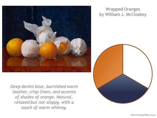
It would be easy to say that this color scheme works because orange and blue are opposite to each other on the color wheel, and thus compatible. I think there’s more to it than that, though! The white in this wardrobe turned out to be key…
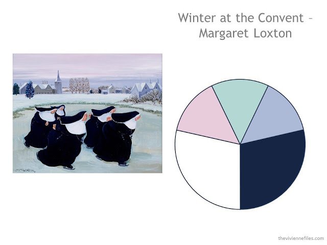
One of you sent me the link to the painting, and I’m SO glad that you did! The best part of writing The Vivienne Files – no question – is getting to know you all, and to share your ideas, knowledge and excellent taste. What’s not to love about these whimsical nuns? In “real” life, I’m sure that they’re wearing black, but this image looks very navy, so I used navy as an accent. I still love this one…
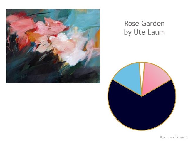
Another suggestion from one of you – and WHAT a painting. These little touches of camel made this travel wardrobe really unique, but easy to assemble, and tremendously versatile:
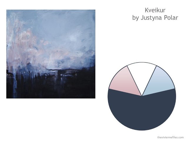
Oooh, I love me some cool, soft colors. And when you find them in an evocative and subtle painting like this, there’s everything to adore. This color scheme could be a life-long project:
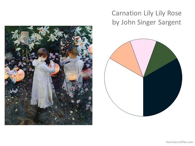
One of the great oversights of my education, and of my adult life: I had NEVER seen this painting until one of you send me a link to it! I just love these little ones, and their beautiful garden; who wouldn’t want to dress in a way that was inspired by this? The wardrobe that I assembled was for warm weather, and abounds with feminine, graceful details…
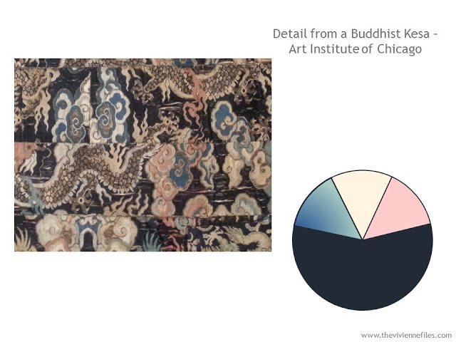
This is a fabric sample from a Buddhist garment that I saw at the Art Institute of Chicago – another set of lovely soft colors grounded in the versatility of navy as the neutral. The story with this wardrobe is fully of life and adventure..
I hope you’re enjoying this look back at some of my older posts; I’m certainly having fun re-reading them!
love,
Janice
Janice, I loved every one of those posts and I still do … but … what strikes me looking at them all together is that the blues do not seem to be all the same shade of blue. Certainly they are all dark, but I find myself thinking indigo on the last two and blue grey when I look at the Polar picture ( the fourth one) and also the first one, with the oranges, although this is a little bluer. But still with a grey. So, the only ones I would call a true dark french navy are the second and third. I would love your take on this.
On a practical level, navy is hard to match. Already blacks can look a little different depending on the way the fabrics reflect or absorb light, but navy is even tougher. I love navy and white but in reality black is so much easier.
I do love seeing these pictures again. Especially the nuns. Especially the children with lanterns. Especially the….all of them.
Janice has said it before and it is so true – if you're concerned about colors matching, whenever possible get all the core pieces from the same place at the same time. Especially with navy. I have just joined a local sewing group and have learned about SWAP (sewing with a plan). Maybe with my new plan and the support and advice of the sewing group I will finally have the basic pieces that fit and flatter. I'm hoping to conquer one item a month including a pencil skirt, ankle pants, sheath dress, and a blazer – all in a beautiful navy Super 100 wool. Lots of tailoring involved so I'm glad I'll be working in the company of so many experienced women willing to share their knowledge. And to be on the safe side, I've purchased double the amount of fabric required :) If things go well there will be enough fabric left over to make a pair of trousers too.
Lena: I also sew and it's so great to have core pieces in the same fabric. After many years of complicated alteration work ( I'm one size on top another -larger- on bottom) I decided it would be easier to just make them myself. Once you have a set of customized core patterns that fit (pants, skirt, tee shirt, jacket), it is easy to change them a bit for variety. Change necklines, flair of skirt, etc. I like simple lines on everything as I'm petite, so the garments go quickly. I don't make button down shirts due to the time involved and I have been purchasing knit tops which I prefer. If I want a match with the knit, I get the knit first then order swatches online to match the knit. I've been fairly successful with this. The darkest navy is the easiest to match. With my tan/taupe basics, an exact match is not as important to me and the subtle difference, I think, is attractive. Right now I'm making a teal pants suit with a colllarless asymmetrical simple swing jacket and my very easy side-zip pants design. Being able to see and alter things has been a blessing as clothes on the rack are not cut for my body!!! Good luck with your sewing – it will be fun. Janice Collins, Washington DC
Janice — I love your posts from the past.
Thank-you! I found unexpected help with my current dilemma in this post, as well as wonderful art. I've got a 3 month long trip (2 months in France, 1 month in the UK) ahead of me in the Spring and I'd like to take as little luggage as possible. There was lots of helpful advice in these older posts, which were 'new' to me, because I just discovered you a few months ago. So I just spent a happy hour in the black hole of internet time looking at old posts instead of making pies. Such fun.
I hope your Thanksgiving is full of things to be thankful for.
Oh.! Love these so much as navy is my main neutral. What a treat also to see these paintings again. I too browse thru Janice's older posts for inspiration or to just relax and enjoy the beauty whether they are colors I wear or not. They are so beautiful. She is a genius! Janice Collins, Washington DC
Janice, what do you think of "Dressing your truth" ? Dressing for our "energy type" which has a strict color pallette that has nothing to do with skin tones. I'd love you to weigh in. Your blog is the first thing I check out in the AM every day! I Love you!
Hmmmm looks like a real sales pitch to me- not giving anything away about the whys and hows until you pay for it
I love navy as a neutral with soft pink, light blue and apricot or peach.
Dear Janice, you are reading my mind again! I was just thinking that I could start thinking about my navy-beige based spring capsule soon. I partially rotate my colors during the year and that was my first capsule I made, so maybe I can tweak it, reconsider my accent colors etc. (couldn't decide so narrowed down to 4 accent colors LOL – and that was the hardest part, took me 3 weeks of thinking), and you pulled out these gems that are so perfect!! Who knew I'll become fashionable, ever. 50s are new 30s!
Greetings from Zagreb
Thank you for these lovely repeats. Happy Thanksgiving!
Carnation Lily Lily Rose was one of my favorite pieces of artwork hanging in our house as a child! My mother had many posters from art exhibits in the various museums across Europe and the US, and a poster featuring that particular piece held a special place of honor in our living room.
I made black and gray my neutrals, then was surprised to find out that I cannot do without navy! My favorite of these paintings is Winter at the Convent. Happy Thanksgiving!!!
Sargent is amazing and Carnation Lily Lily Rose is my favorite painting in the Tate Britain. – nancyo