December 30, 2024
I always love these, even though they are difficult – just because Pantone says that a color is going to be popular does NOT mean that anybody actually sells something in that color. Maybe I’m just ahead of the curve…
But this is interesting – no pink, no dark or medium blue, and an offensively named (at least to me) shade of brown.
And I must share – on the Pantone website, there’s a recurring typographical error that calls this first color Windsor Wind, rather than Windsor Wine! Maybe it will be fixed by the time you read this, but still – someone should be proofreading these things.
Does anyone still proofread?
Let’s go!
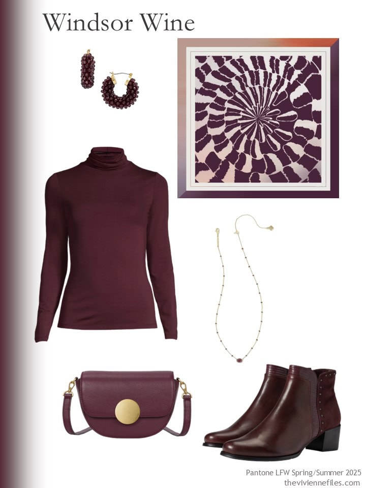
Earrings – Talbots; scarf – Delinor; turtleneck – Lands’ End; necklace – Kendra Scott; bag – Oryany; boots – Spring Step
Why yes, I’m quite smitten with this next color!
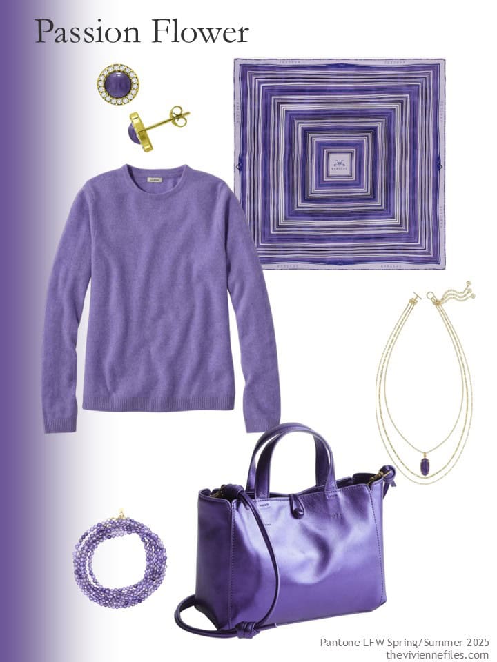
Earrings – Giani Bernini; scarf – Kargede; cashmere sweater – L.L.Bean; necklace – Kendra Scott; bracelet – Share Oke; bag – Vera Bradley
I was surprised how difficult it was to find teal…
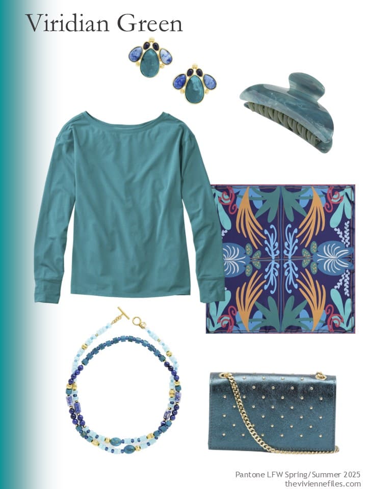
earrings – Talbots; hair claw clip – Machete; pleat-back tee shirt – L.L.Bean; scarf – Tudadesign; necklace – Talbots; bag – Persaman New York
If you can wear this next color, I encourage you to do so! It’s not something you see every day…
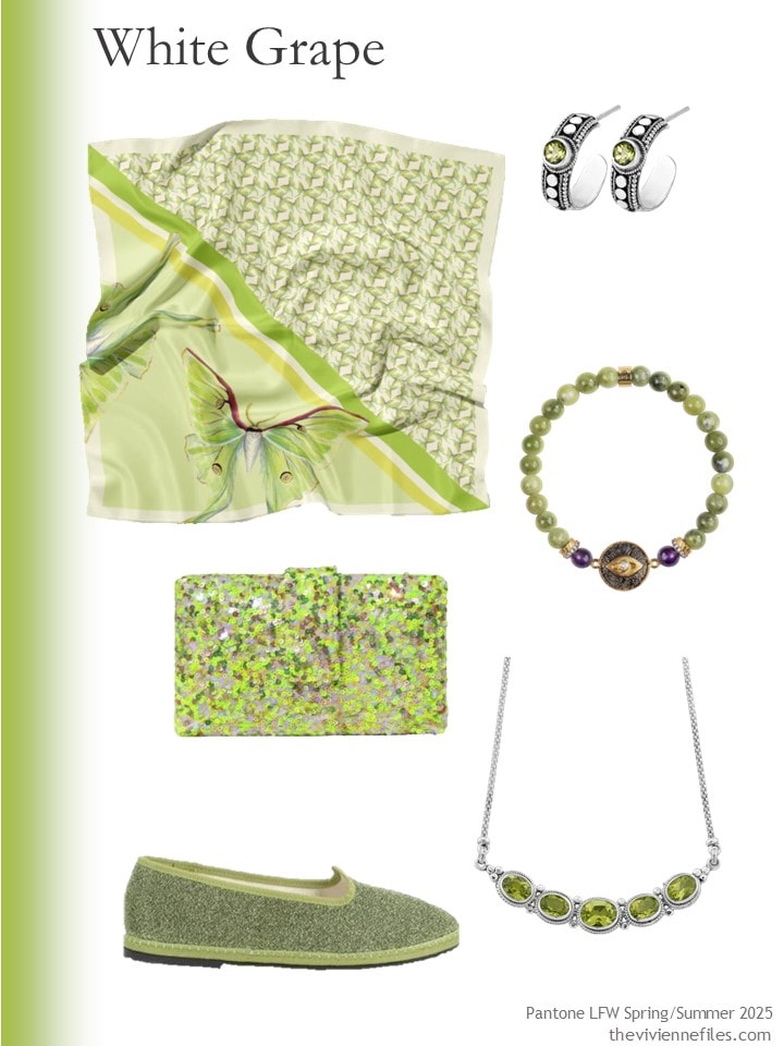
Scarf – J6R6; earrings – Samuel B.; bracelet – Karma and Luck; bag – Simitri; necklace – Samuel B.; loafers – Oseree
I love Camellia – it’s orange, without being too yellow:
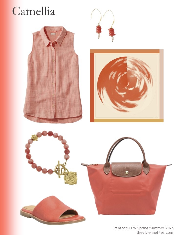
Gauze sleeveless shirt – L.L.Bean; earrings – Way To Chic; scarf – Delinor; bracelet – Susan Shaw; sandals – Sofft; bag – Longchamp
This next color can be found by searching for “cherry”.
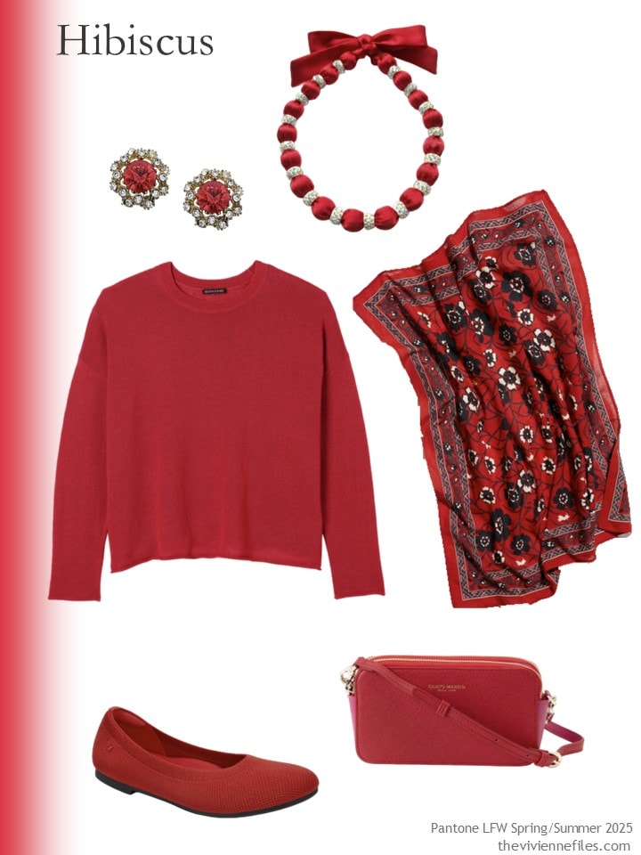
Earrings –Sohi; necklace – Deer You; scarf – Free People; sweater – Eileen Fisher; flats – Vivaia; bag – Campo Marzio Roma 1933
This light blue is delicious…
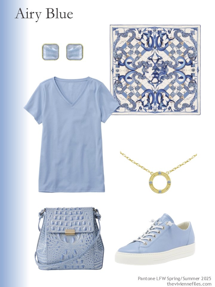
Earrings – Marcia Moran; scarf – Kargede; tee shirt – L.L.Bean; necklace – Marcia Moran; bag – Brahmin; sneakers – Paul Green
How cheerful is this?
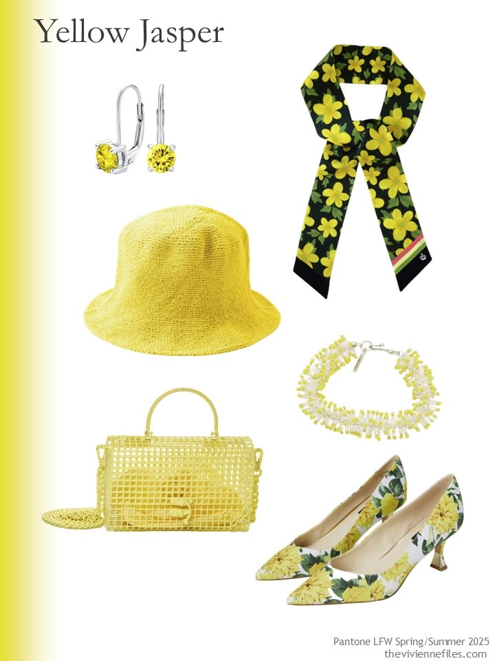
Earrings – Bling Jewelry; scarf – Kueen; hat – Brunna.Co; bracelet – Isabel Marant; bag – Myth House; shoes – Nine West
Pear Sorbet can also be found by searching for “cream”. While Pantone can make up snazzy names all day, retailers are a little bit more prosaic…
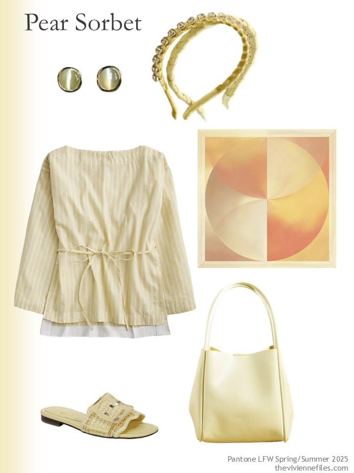
Chrysoberyl earrings – Jewells Of Queens; pair of headbands – Anthropologie; cotton top – J.Crew; scarf – Delinor; sandals – Sam Edelman; bag – Anthropologie
Maybe I’m over-sensitive, but I wouldn’t have chosen this color name. That said, a handful of items in this warm light-ish brown would be beautiful with just about any neutral you like!
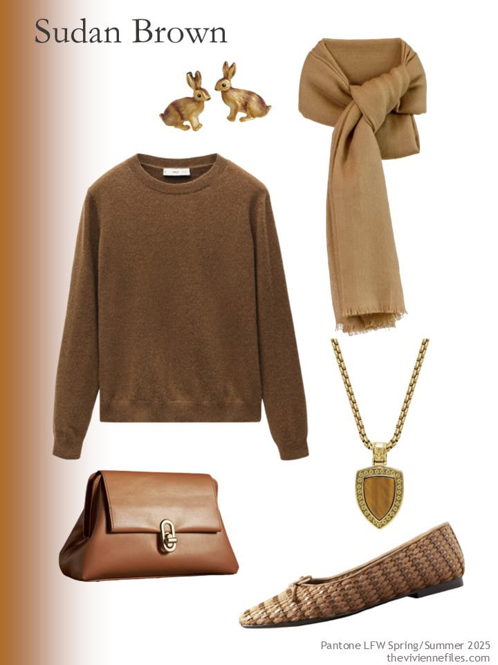
Bunny earrings – Fable England; scarf – Scarves by Franci; sweater – Mango; necklace – Nialaya; bag – Jules Kae; flats – Schutz
And that wraps up 2024. Let’s cross out fingers for next year…
love,
Janice
p.s. Ten years ago, I was helping out some friends in retail by showing an “all-black” wardrobe. It still appeals to me…
Like this wardrobe? Save it to Pinterest!
Windsor wine, passion flower, viridian green and the hibiscus/cherry seem quite heavy for spring and summer. Airy blue seems lovely. And the oddly named brown is a delicious neutral. I’ll happily grab some of that yellow. It’s fresh. And I’m one of the lucky ones who can wear it like a neutral. Not mustard, not golden, but that clear, sunny yellow.
I absolutely love the brown sweater and accessories but yes, ‘Sudan Brown’ is indeed offensive. What world do these people inhabit I ask.
Goodness! I love most of these. I know you’re a huge fan of purple, Janice, as are many people. But, I just cannot wear any shade without feeling like Willy Wonka. These are GORGEOUS colors, but I imagine most of these as “perk up” for winter colors, rather than spring tones. I’m especially drawn to the wine and green…I do love my Christmas colors in all variations.
While I cannot get behind the name of Sudan brown, I do believe it’s in reference to the natural color of the dark sandy desert there and not in reference to anything else. That being said, if a name of a color needs a caveat, it should not be included. Why not Dark Desert Highway (as a reference to an Eagles song) and not something that could be taken as pejorative?
I wholeheartedly agree with you. Spending just a moment to think about being respectful of others isn’t difficult or exhausting. It’s just good manners.
I might have just ordered those boots in black. As much as I love the Bordeau, the burgundy currently in my closet is slightly purple.
That said, I love the first two colors as they’re right up my alley! My accent colors are burgundy/rose/pink and purple/lavendar. I’ve tried to add teal over the past year or two and it is hard to find. I wonder why that is?
Interesting… my closet is currently overpopulated with teal because I see so much of it and the other mostly neutral colors I see don’t suit me. Maybe specific brands tend to have more of certain colors?
Hello! Beautiful job! I believe the Sudan brown refers to the landscape and not the people. If you google Sudan, a picture of the all brown landscape will come up. Keep up the good work. I enjoy you so much! Debbie Somand
I’m from the other end of the spectrum where about the only thing that offends me is an over-the-top attempt to avoid offending someone. If I were from Sudan, I’d be proud to see the name of my country associated with such a gorgeous shade of brown! But regardless of how we react to the chosen names, there are a few beautiful colors included here. I’d never choose Windsor wine as a spring and summer hue, but there are plenty of appropriate options. Camellia is my favorite but I could wear white grape, too.
I agree with you, Deb.
As for the colors, Airy Blue is beautiful for Spring.
I agree! I can’t see anything offensive about the name. Sudan is a desert country, just take a look at pictures of its famous sites and you’ll see rocks, land, and amazing ruins made of stone that color. It’s a great name imho.
Sign me up for passion flower and airy blue! I’ll be delighted if I find these shades in clothing I can wear.
The amethyst sweater https://www.llbean.com/llb/shop/78419?page=classic-cashmere-crew&bc=&feat=Amethyst-SR0&csp=a&attrValue_0=32392&searchTerm=Amethyst&pos=3&imgt=41
Thanks, Abigail!
There are colors here I could love, but in a more muted hue. You have done an amazing job in curating these wardrobe ideas.
These are lovely and I would wear most of them with the exceptions of Wine, Pear Sorbet, and the Brown. Teal is just a tough color. I love teal, but there’s blue teal and green teal and all the shades in between, so by the time I try and combine any of them they don’t work. If I buy a teal it’s got to be something to combine with a neutral or stand alone. I did buy what I consider to be a teal puffer coat from LLBean earlier this year. I don’t think they even call it teal, I think it’s a green, but to me sometimes it looks blue, sometimes teal, sometimes green. I get so many compliments on that coat. Have a lovely day everyone!
Ah, Sheila, you describe the common experience when it comes to online shopping. Screens differ in what they show… pretty cool that your coat serves up varying shades of teal, though. I have a nail polish that seems to compliment warm pink and red and coral! Go figure!
I’ve had red/burgundy in my closet for years. I also love teal.
I hope to see olive green in stores next year.
Camellia and pale pear are my favorite light colors for Spring and Summer.
I’ll take the airy blue and passion flower, please and thank you!
I’m on board with the Passion Flower, Viridian Green, and Camellia, but the White Grape is my absolute favorite color! I have multiple things in this color, but it is typically so very hard to find, so hopefully it will be making more of an appearance this year and I can stock up on things!
It’s good to know what colours might appear in the shops in a few months. Come spring, I put wine away till late summer. I absolutely love the Passion Flower and Viridian Green which looks like teal. Camellia pink is perfect for spring/summer too. The Airy Blue is too pale and insipid for me.
What I have realised is that I would like to wear a bit more ivory/light cream. Sometimes I’m just not in the mood to wear two/three accents together. I only have one ivory poloneck but I can only wear it once or twice before it needs washing.
English is not my first language, so correct me please, but for my ear “Sudanese brown” would be offensive (as related to people), while “Sudan brown” is more like ‘French blue”, “Irish green”, “Indian red” or “Russian red” and refers to the country (it can be a landscape, it can be a flag, a traditional dye etc). But if sounds political incorrect to You, You are probably right. As for hues – it would be lovely to wear sudan brown and viridian green together, with some accents in pear sorbet! Thank You for inspiration!
Your language analysis is spot-on, and I think maybe I’ve been too sensitive. I’m never sure, so I err on the side of being really careful about what I say and write. I’m glad that we were able to all have a discussion about this; I really value everyone’s thoughts and opinions.
love,
Janice
I’d wear that hibiscus color all year round! But I have pale rosy skin, dark hair and dark eyes so it suits me. I’d probably look for a scarf that has a white background in spring/summer to lighten it up. Perhaps a floral?
“When in doubt, wear red.” -Bill Blass
Weighing in late on the end of year posts. (Dear one and I were at the lake which has no internet and just chilling). I love the paintings you have chosen! Magill, O’Keeffe, and Klimt are my favs. I am blessed with many clothes and so I’m going to try and create the wardrobes from what I own. I may add some of the Seibel tennis shoes and a scarf or two. Will just have to see. The “Annunciation” picture is gorgeous. Always a treat to discover a new picture. Finally, I liked the explanation about Sudan brown being like French blue or Irish green. Makes perfect sense to me. Happy New Year to all of TVF readership. May 2025 be good to you.
L. L. Bean has some sweaters and tees in “Storm Teal” that are on the greenish end of the teal spectrum. I recently bought a Fair Isle yoke sweater in that color that I love, but it seems sold out already
I’m relieved there was some discussion of the brown, as I couldn’t imagine what would make the name of a country offensive. Maybe they were thinking to bring attention to the massive humanitarian crisis there.
I actually have a dress I bought on impulse in a shade very similar to the grape! (I called it “highlighter lime green” at the time …) At the time I grabbed it because it was 1) a unique color 2) works with my skin 3) A Bargain, but it is semi-sheer so I need to figure out a good outfit for wearing it in public. Clearly this means I need to do so in spring 2025.