October 7, 2024
Yes, this is MY Project 2025… Nobody’s rights get tramped in this project!
FWIW, I’m flying back from New York today. I had intended to have a normal wardrobe post ready for today, but on Thursday before we left town, my computer decided to refuse to “scrub” the background from images of garments and accessories. I can remove backgrounds by hand – I used to do it every day – but I just couldn’t face it…
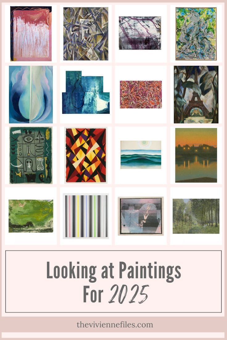
So I’m showing you the 20 paintings that are in the running to be included in next year’s wardrobe plan!
Chime in with opinions, thoughts, criticisms, etc. Bear in mind that I am morally obligated to include a range of color palettes in this program each year – I don’t want to do six paintings with black as the primary neutral! (well, for my own personal amusement, I might…)
Here you go – brace yourself!
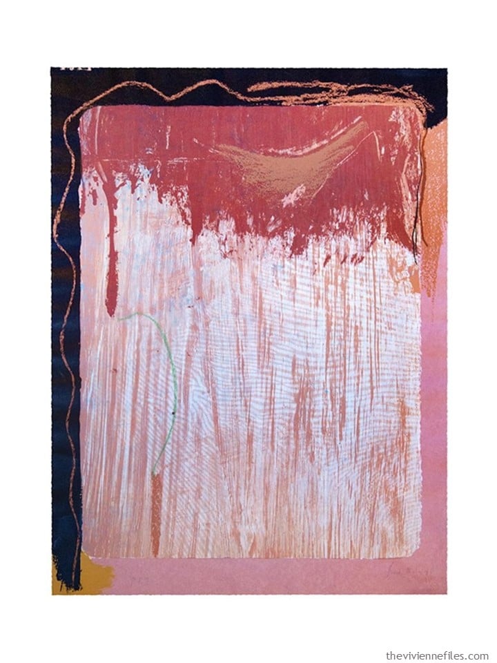
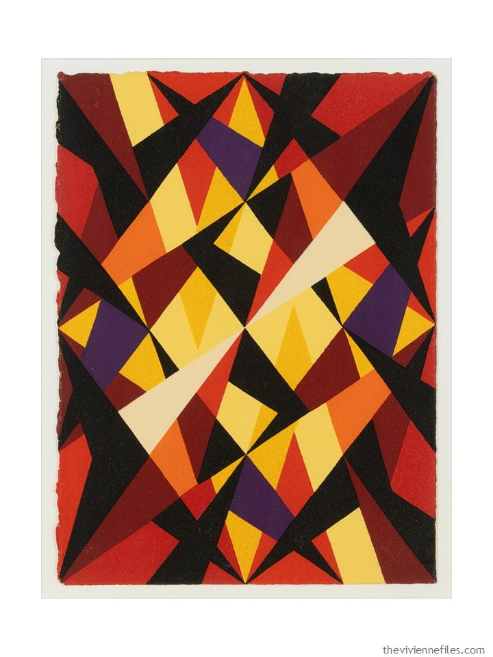
1. Tribal Sign by Helen Frankenthaler
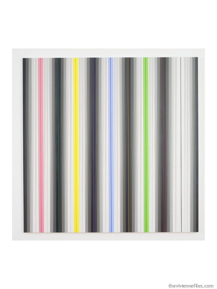
2. The Black Room by Gabriele Evertz
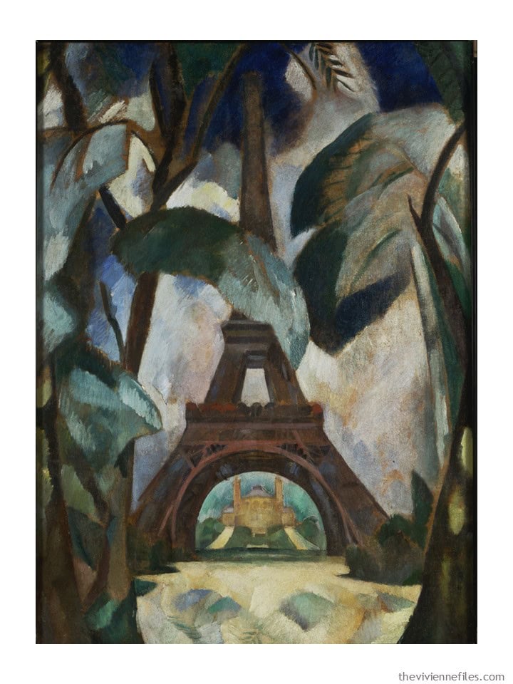
3. Eiffel Tower by Robert Delaunay
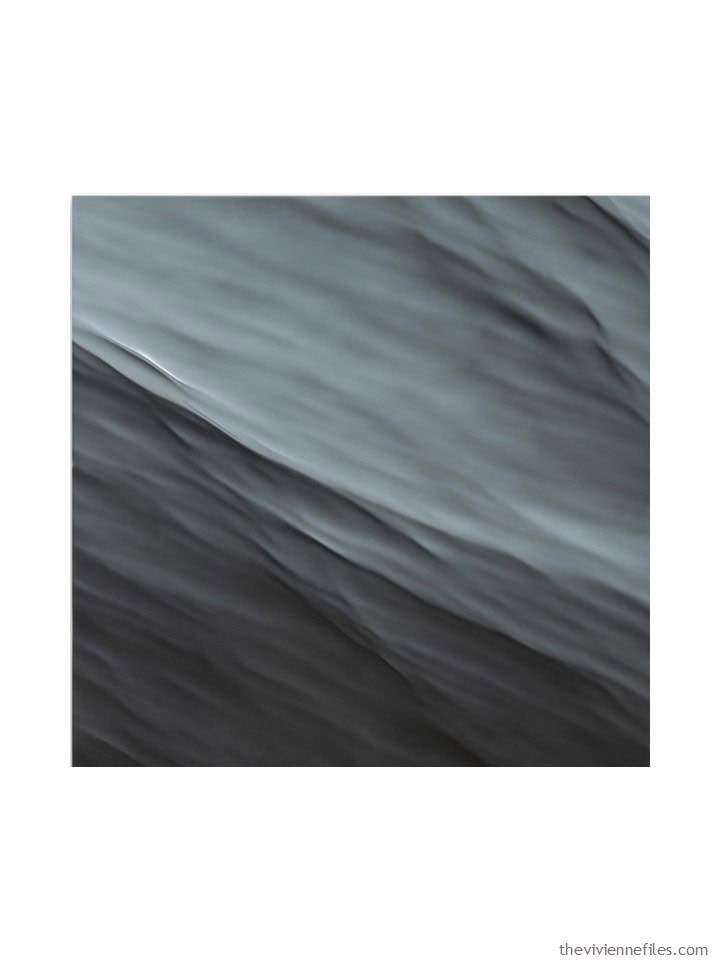
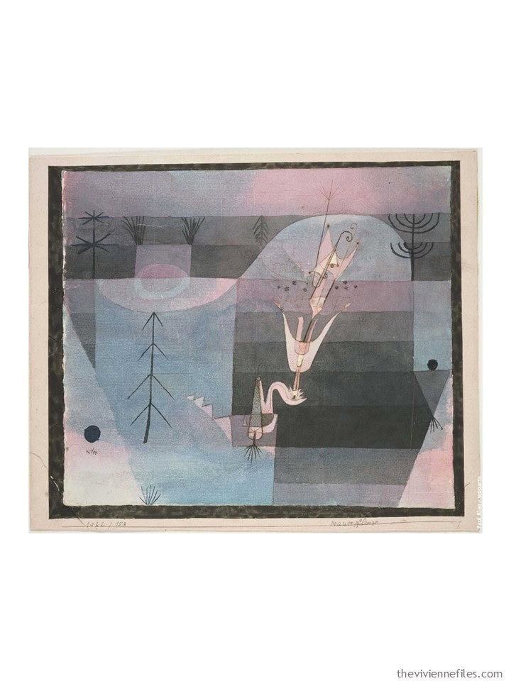
4. Night by Alex Rasmussen
5. Wallflower by Paul Klee
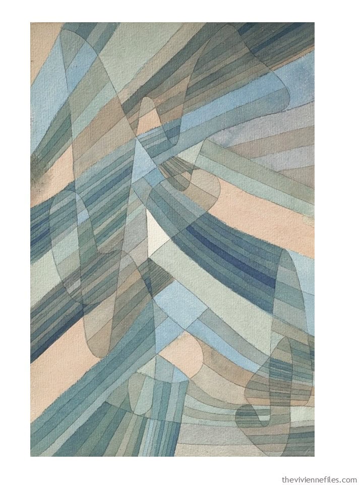
6. Watercolor on Paper by Paul Klee
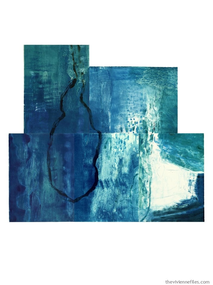
7. Map of Water 1 by Susan Osgood
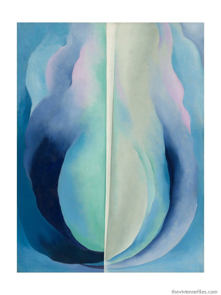
8. Abstraction Blue by Georgia O’Keeffe
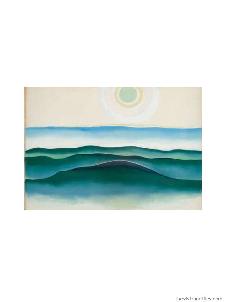
9. Sun, Water Maine by Georgia O’Keeffe
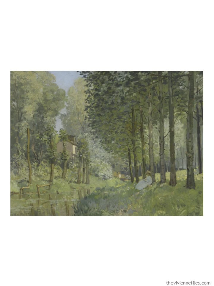
10. Rest Along the Stream by Alfred Sisley
11. Icarus by Lee Krasner
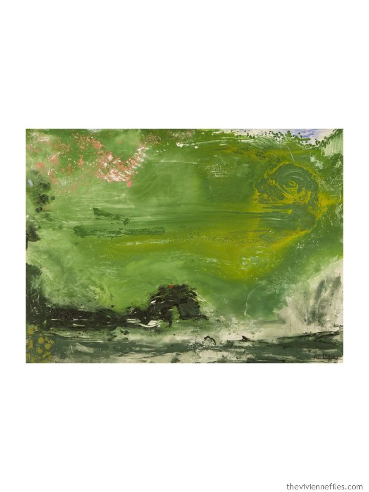
12. Overture by Helen Frankenthaler
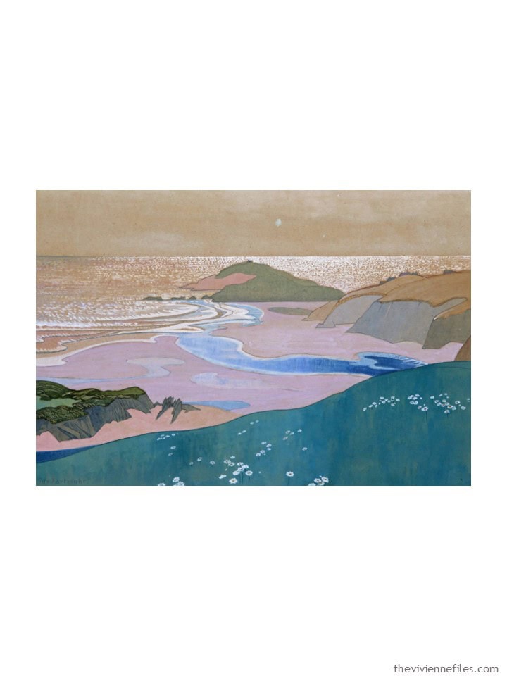
13. River and Sea, South Devon by Reginald Guy Kortright
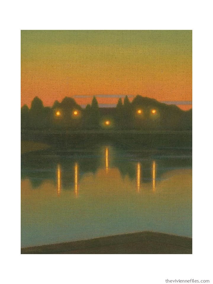
14. Street Lights along Klarälven River by Stefan Johansson
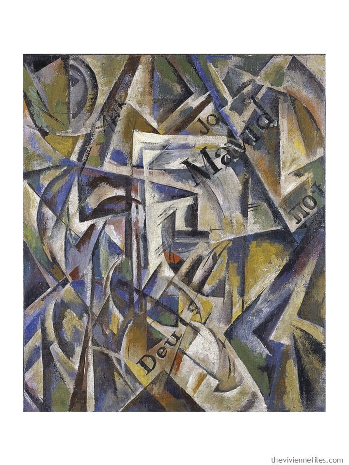
15. Cubism by Nadeshda Udaltsova
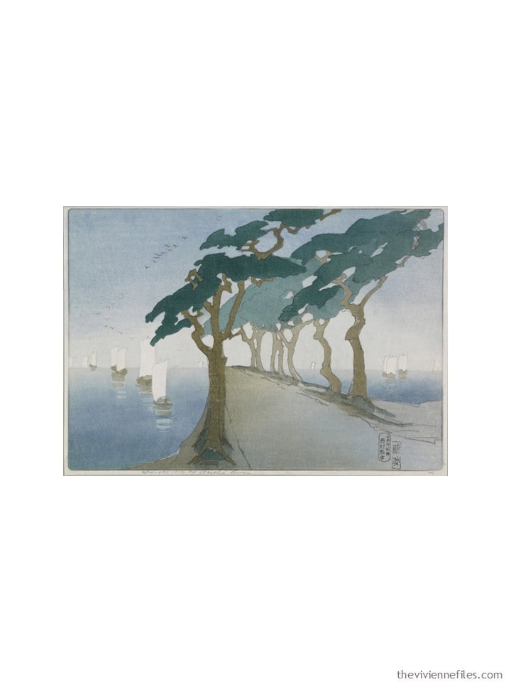
16. Pines by the Sea by Bertha Lum
17. Composition by C. Göran Karlsson
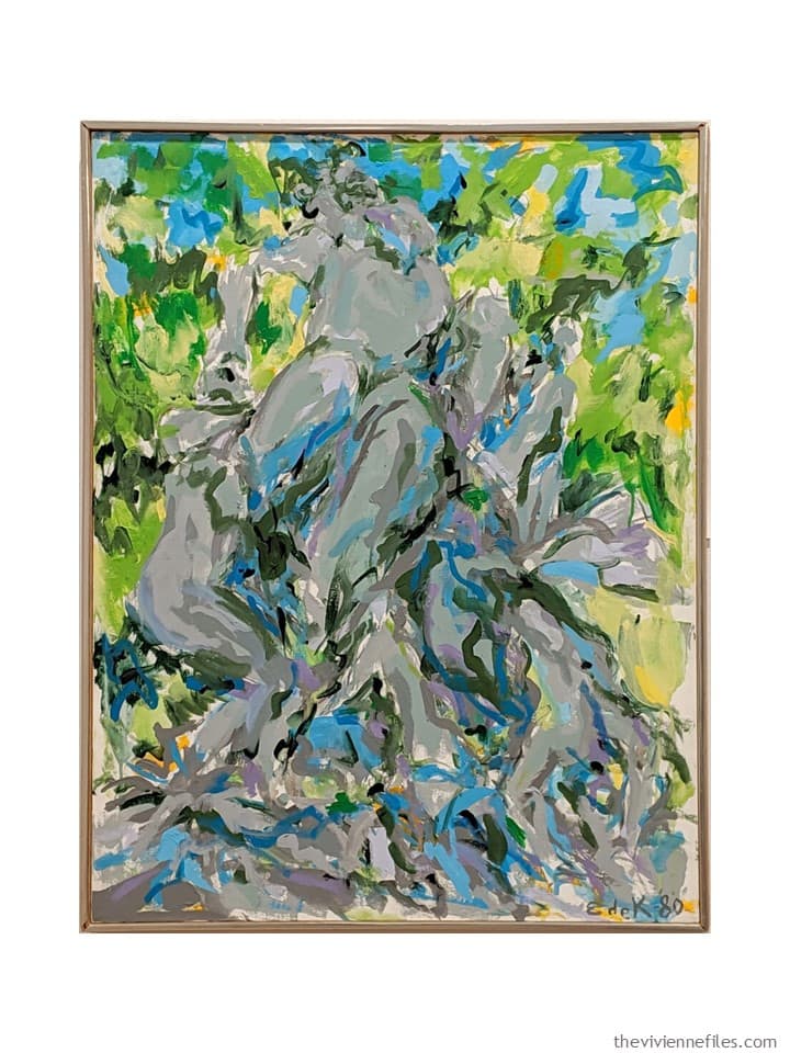
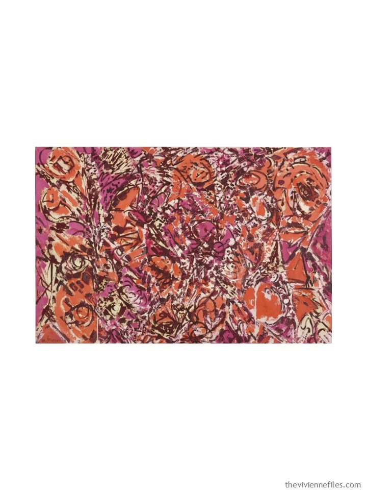
18. Bacchus #10 by Elaine de Kooning
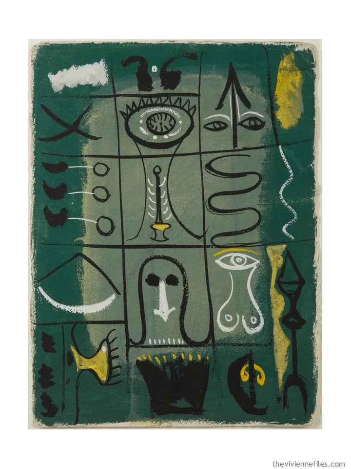
19. Hieroglyph by Adolph Gottlieb
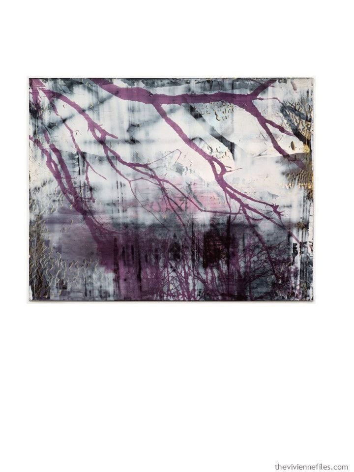
20. Of by Elizabeth Magill
love,
Janice
Like this wardrobe? Save it to Pinterest!
Wow! There are a lot of colour options in that painting collection. I think I’d rather see what you’d like to do! rather than choose for myself :) Always nice to see outside the square.
After sleeping on it, Bacchus! And Map of Water 1; Icarus; Sun, Water Maine; and Night. And Of, beautiful colours but I’m a bit worried about that yellow on the border :)
Good morning all
I would be hard pressed to pick the six paintings. Right now I am preparing for the second major hurricane in two weeks to impact us. We have been fortunate so far. Many of our friends in nearby communities have been flooded and are trying to recover. And now, Milton is hurtling towards us.
While I wait for daylight to finish my storm prep, I’m trying to remember if you’ve done a post about emergency packing. I think you have, but I can’t remember when. Something like this would be so helpful for these times when we are trying to think of everything we need to do and, even with lists, can’t remember half of it.
If anyone knows where this post is, I’d appreciate a link. I’ll print it out and keep it with my hurricane prep supplies.
Everyone stay safe and have a great week!
I found a link I was looking for.
https://www.theviviennefiles.com/2021/06/are-you-ready-stress-dressing-for-warm-weather.html/
How fun to see your considerations! I love the greens and the warm color schemes. I particularly like #12 and the idea of minimal black/charcoal and using dark olive as the basic neutral.
jeri b ,
Thank you so much — great post by Janice and refind !
Oh my. YOU stay safe. My heart and prayers are with you this morning. Good job finding the list. I shall also save it for my emergency kit. By the by, I keep a backpack with necessary items ready to go at all times. Easy to grab. It is also ready in case of a shelter in place situation.
Good planning, joancecile!
I did have a go bag but life has been so crazy this year I haven’t kept it up like I should have. I’ll rectify that soon.
I am lucky to live in a temperate climate – although even here in SW France we have had crazy weather the past couple of years with flooding and some scary fires last year – and I am lucky to have reached my 70’s without any hospitalization. However, I had a scare last year and thought I must have a ‘hospital bag’ ready. Needless to say it didn’t happen but I really must do it!
Hope you stay safe, and thank you for the reminder that we never know what might happen and we need to be prepared…
There was another post around bug-out-bags that inspired me to write a list. I cant find the post to save my life, but I have my list. The categories were : important documents (birth cert. passport, ID, bank stuff); important electronics (phone, external harddrive, + chargers); overnight clothes; toiletries; and daily meds… under the clothes one, I added a good bath robe/PJs – a little unusual, but if I end up crashing with other people, a bathrobe just makes me feel more appropriate in my PJs. Fingers crossed for your safety!!!!
6 and 12 please!
Hi Jeri
Fellow Tampa Bay-ite (is that a word?) here. This has not been a fun couple of weeks. We are far enough inland to not have to evacuate but we are nervous about the wind. Stay safe.
8,9,11 and 15
Ooh, I think numbers 1 and 7 are the two I like best…
How do you choose your paintings? I know what I like but then sometimes I am surprised by a striking image which is a bit avant-garde for me and I’ll stop and stare. So here goes. I’ve put a red heart ❤️ next to the ones that I particularly like and ✔️ next ones with possibilities:
1. Tribal sign – Frankenthaler -Pink and orangey colour scheme is a bit of a repeat of the Rothko that you are doing now.
2. ✔️Black Room – Evertz -Makes me dizzy to look at but it would appeal to people who like contrasts – several accents with black, grey and white.
3. ❤️Eiffel Tower – Delauney – a painting to hide in. Moody colours that have softness but give a sense of strength and protection. It evokes a place of safety in which to look out onto the world until you are ready to come out into the sunshine. I could look at this painting for a long time.
4. ❤️Night – Rasmussen – shades of grey – an interesting concept. Ideal for stress-free dressing.
5. ❤️Wallflower – Klee – I love these colours and I’m wearing similar today.
6. Watercolour on Paper – Klee – prefer no. 5!
7. ✔️Map of Water 1 – Osgood – Another take on variations of blue, like the current Magill, but more blue-green/teal. I’m experimenting with different blues.
8.❤️Abstraction blue – O’Keefe – love these colours – reminds me of ice cream.
9.❤️ Sun, Water Maine – O’Keefe – Love the deep blue-greens in this – prefer this over no.7
10. ✔️Rest along the stream – Silsey – olive dream with a hint of pale blue – lovely picture but limited colour scheme.
11. ✔️Icarus – Krasner – not sure what this has got to do with a chap flying too close to the sun but purple and burnt orange is an intriguing combination which I would like to see.
12. Overture – Frankenthaler – if this green sludge is the overture then I hate to think what comes next.
13. ❤️River and sea, South Devon – Kortright – another painting to lose myself in. I would be sat on that cliff watching the sun go down. We really do get some incredible sunsets (and sunrises in the UK).
14. ❤️Streetlights along Klaralven River – Johansson – Sunset and streetlights – such a lovely glow. Not my colours but I really like this. Reminds me of the nocturnal paintings by Atkinson Grimshaw.
15. Cubism – Udaltsova – spiky
16. ✔️Pines by the sea – Lum – another on the shades of blue that aren’t navy. I like the painting with it’s restful blue-greys or is it grey-blues but no. 7 has more depth.
17. ✔️Composition – Karlsson – Startling but this would appeal to those who like vivid colours.
18. ✔️Bacchus – de Kooning – fresh colours
19. Hieroglyph – Gottlieb – I’d walk on by.
20. ❤️ Of – Magill – variations of purple and grey – love this.
The Delaunay and the de Kooning stood out to me as well.
Ooooh!! Fab mix of everything!! Looking forward to our heroine’s 2025 adventures with these palettes! Stay safe! ❤️
Very exciting and such a lovely project to look forward to, thank you. I hope number 13 stays in the running. Have a safe trip home.
3, 6, 8, 10, 14, 16
My favourites are 3,6,8 . I am a sculptural ceramicist and so that is why , I guess , I go for shapes more than colours ?
1 Frankenthaler: So many possibilities! But most different from this year would be a navy wardrobe with yellow & white as accents (and maybe pink) I think
3 Delauney : brown/beige/cream as neutrals with green and blue
15 Idaltsova: so many possibilities for a color palette! and interesting to look at…
20 Magill: a greyscale wardrobe with accents of soft purple
I think you could work your creative magic with all of these interesting paintings. The one that is staying with me is #4, Night, by Rasmussen. I can see an older heroine with long silver grey hair and gorgeous jewelry in these shades of grey. No black, just grey.
1, 3, 20, 11, 13, 5
Please use (at least) one of the Georgia O’Keefe paintings!! They are both beautiful.
Another vote for those two!
YES – I way prefer these two over the one that was used this year. Despite the wardrobe for the red O’Keefe being quite fantastic.
1,3, 6, 7, 9, 19
These are all amazing and it will be very hard for you to pick, but those above are my favorite. Stay safe and be well!
I like Eiffel Tower and Street Lights the most. I can see all my usual neutrals with nice accents. But how you would combine them remains to be seen.
What a great variety of pictures! I would choose 3, 9, 10, 11, & 12 but I’m sure your choice will represent the different heroines and colour groups in a more balanced way :-)
Safe journey home!
I have always loved green and blue so unlike Beth above, I love ‘Overture’ by Helen Frankenthaler! Also ‘Bacchus #10’ by Elaine de Kooning. However, as I am now embracing grey hair I think ‘Sun Water Maine’ by Georgia O’Keefe would be very inspirational too in the spring.
I keep banging on about it here, but only the other day I was looking at my treasured copy of ‘Georgia O’Keefe Living Modern’. Her sewing and wardrobe were absolutely exquisite and I am sure hold lessons for many of us.
Packing done, so on to a fun exercise before sunrise . Beth t, I love your in-depth insights. You always make me think a little bit more.
3 has enough color to hold my interest
I think 6,9,& 13 have similar colors but 13 has much greater variety. 13 would suit my senses better. 18 would be my choice for a gray core wardrobe. I’d love to see how to work in the bright colors. While all gray can be beautiful, it overwhelms me sometimes. The lovely blues, yellows, and greens would make a huge impact to me. 8 would be a pretty, soft wardrobe. I would enjoy seeing how the colors in 11 and in 15 would come together in a cohesive group.
So my picks 3, 8, 11,13,15,18. I always enjoy seeing what you come up with, even when it’s not something I can wear.
I always love Beth T’s analysis as well. Thank you!
3,8,13,20! Thank you, Janice for such a gorgeous start to the day.
I adore 8 and I love that bright green in 18!
1, 4, 7, 8, 9, 20
Good morning, Janice.
You weren’t kidding about looking for neutrals other than black. I thought I would have a hard time choosing favorites but I must say that i had a hard time finding more than 2 that I liked. After looking at them again I decided that I liked #’s 1, 3, 5 and possibly 15.
But I would be hard pressed to design a wardrobe using these save for number one.
I am trying to build a capsule wardrobe based on black, camel/beige and off white. With the popularity of animal prints, it seems like a good choice. I’m in the process of cleaning out bins and bins of clothes in a variation of sizes that I’ve accumulated as a result of my never ending battle with the scale. It is an overwhelming task. But this time I’m throwing out the plus size clothing since I’ve come to the conclusion that saving them is a subconscious message to my inner self that I will once again fail to keep the weight off. I’m also chucking the work clothes I’ve been keeping for the past 7 years after I retired.
Down 34 lbs and another 20 to go. I love fashion and planning clothes especially for travel. This time, though, I am trying to be more disciplined in my choices for both what I keep and purchase.
One question is do we keep the same colors for all seasons? This past summer I used navy instead of black for my base as well as bright white. I enjoyed using the tighter palette and hope to continue streamlining both my summer and winter clothing.
Congratulations on winning the battle of the scales. I chucked out my plus size clothes to give me encouragement when I lost 38 pounds by Dec 2019 with 28 to go.Then UK Covid lockdowns with lack of exercise, too much to eat and an operation in 2022 piled the weight back on. I had to buy plus size clothes again. Chucking out the work clothes is a good idea.
I would love to see what you come up with for 1, 3, 9, 11, 14 and 18. I think it is a nice mix of murky and bright, warm and cool, color and neutral. Thank you so much for all you do, I look forward to every post!
Fabulous colors in these! I vote for 3, 4, 6, 10, 16 and 19. I love my greens, blues and yellows!
Safe travels home!
I’m in love with the shades of green in Bacchus #10 by Elaine de Kooning!
I like #3- Eiffel Tower, #9-Sun, Water Maine and #16-Pines the best. I’m finding my wardrobe is having more chocolate brown, dark gray and green (not olive or Kelly green, more of a soft medium green). If you ever find something that ties those together in interesting ways with a suggestion of another accent color, that’d be great :)
3, 4, 6, 7, 9, 10, 13, 16
Number 1 is similar to the Rothko, but more color choices so I’m hoping you include it.
I adore number 3 with it’s balance of black and brown.
Number 9 would be fun for the coastal, beachy vibes.
Number 11 with its mix of brown and cream for neutrals also has my vote.
I would love to see 14, but wonder if those colors would be hard to find in clothing.
Number 20 is lovely also.
Well, there’s my 6. I feel like we’ve seen a lot of blues and olive and sage green this year. I’m hoping to see a blue green instead of the yellow greens next year. Which is another reason for 3.
I’m glad that I am not the one who has to make the final cuts. These are all beautiful and, thanks to you, I can pick the different styles of each of the ladies represented by these paintings.
Wow Janice! So impressive. I don’t know how you will choose. FWIW, here are my quick thoughts:
• The Frankenthaler painting feels too much like the Rothko from this year – black, white pink and touches of orange.
• Love the Black Room by Gabriele Evertz. It also has a sporty feel to me (maybe the colours but also the stripes reminiscent of a ref jersey) – maybe this heroine owns a gym, or is a soccer coach, or a professor of exercise physiology who spends half her time in the gym and half her time in the office?
• Love the Eiffel Tower by Robert Delauney, maybe has similar colours to Watercolor on Paper by Paul Klee? I’m loving the smoky blues and greens.
• Love the Street Lights along the river. Gorgeous colours.
• Definite yes to the Hieroglyph by Adolf Gottlieb. The teal, black and white are great, with tiny touches of yellow.
Can’t wait to see your Project 2025! Ha!
You’ve found a gorgeous grouping and I’m sure you’ll choose six great paintings.
It would be wonderful if we could follow one heroine who lives mostly in skirts and dresses and who wants a dressier wardrobe than most.
Just a thought!
Seconding Wendy!
Another vote for skirts and dresses here!
What a lovely and varied bunch! If I were choosing — based simply on the ones I’d like to see a wardrobe made out of — I’d pick:
– 5 Klee Wallflower (my absolute favorite of the bunch)
– 8 O’Keefe Abstraction Blue
– 6 Klee Watercolor on Paper
– 4 Rasmussen Night
– 20 Magill Of
– 16 Lum Pines by the Sea
If I choose strictly by color palette:
#2 For the variety of accents
#3 Love the greens
#6 Creamy and dreamy
#8 Love the pastels with a dark color – I hope it is navy
#13 Great colors and contrast
#14 Unusual palette for clothing
#18 Again, great colors with gray
#20 A striking contrast
Too difficult to choose six! I do have a request that one of the heroines live in a warmer climate.
Thank you for assembling these paintings. And a great study for myself as I dislike some paintings, but enjoy the colors!
oh, very nice selection.
(1 would be too close to this year’s painting for me.)
My favorite is 3 (Eiffel Tower) with brown, gray, dark blue and dark green.
I would also like to see:
20 purple, gray, b/w.
19 green sage, b/w, yellow
17 black, purple, curry, reddish brown
11 orange, pink, brown, beige
8 pink, blue, turquoise, but there are some that have a similar pastel color scheme.
So 3, 8,11, 17, 19, 20
There would be something for everyone.
Wow, so many fabulous choices! But FWIW, here are my picks:
#1: it is similar to the Rothko color wise, but different in terms of feel, so it would be fun to see a different take on that wardrobe
#3: the brush strokes are so bold and the palette is so lush, it’s amazing
#4: my ABSOLUTE FAVE, simple and elegant, but not sterile in any way. Would love to see but with no black in the wardrobe
#5: Very light and delicate
#8 & #9: I love both O’Keefes but if I had to choose, the edge would go to #8
#18: LOVE THIS! Bold and energetic but somehow the palette strikes me as very light and airy
Hope you enjoyed New York, Janice!
The softness of 3, 10, and 16 appeal to me.
I’m currently wearing a lot of navy so would especially love to see Abstraction Blue this year.
2, 3, 8, 18, 20.
Oooh, what fun! I like 8, 12, 14, 17 … and Night (since you’ve done a “shades of blue” and “shades of brown”… why not a “shades of black/gray”).
What a lovely selection of paintings!
Thanks as always for all that you do :)
River & Sea, The Pines
I love #11- please do that one 😁
5, 6, 8, 13, 14, and a wild card!
My favorite are Sun Water Maine and Map of Water 1
I love any shades of blue and green, with a navy (or gray) neutral.
So excited for new pictures!
Thank you Janice.
Frankenthaler always. Klee for sure. Gottlieb. Udaltsova, Krasner!
Tribal Sign, Cubism and Of.
As a soft summer (coolish, medium light to medium dark, and muted), I would choose 5, 6 (the Klees – you could even combine them), or possibly 16. I won’t try to speak for anyone else. I was just thinking the other day that I would like to get to neutrals of blue and gray shades (with a natural linen-ish off-white for summer as well) with colors ranging from muted green through blue to purple, plus pink. Blue works both ways, depending on how it is worn. I HAVE to have variety in my closet; I would cry if I didn’t have options within the necessary grayed down tones!
15 – Udaltsova – fabulous colours, and suggests interesting angles and patterns!
19 – Gottlieb – love the mix of soft greens with black, white and yellow highlights – + swirly shapes!
My vote is for 3 and 17!
Ok, so I got down to 7… so many interesting colors to play with!
3 eiffel tower
9 sun water maine
12 overture
13 river and sea
14 street lights
17 composition
20 heiroglyph
3 and 10.
Favourite paintings for colour combos for me for clothing are 2, 4, 10, 11, 17 & 20. I too like 1 but think it is very similar to the recent Rothko.
My wardrobe is primarily a lighter navy with accents of cornflower blue, white and medium pink so #8 is my favorite. I am looking to add another accent which makes #7 and #20 appealing. The Eiffel Tower painting is stunning and I am sure the colors in it would translate to a gorgeous wardrobe. I find #4 depressing, but an all gray wardrobe has not been done so I can see its appeal. #19 reminds me of the green and gold that were my highschool colors, so no vote there. Whatever you pick will be fun and an adventure for your followers! For instance, the Magill suits my closet best this year but I absolutely love how the Rothko is turning out. I am just glad you put so much time and effort into the stunning work you do! So much appreciated! It is a nice reprieve🤗
Nice! Three, Three, Three. Six, 8, 10, 15, 16.
I like both by Paul Klee
There are very few of these paintings that I would want to look at more than once. I find most of them ugly and garish.
Instead, how about focusing on the dark semi-neutrals as bases? Each painting mostly gray, brown, burgundy, dark green, dark purple, or navy.
We who do not wear black often have no inspiration to look at when it comes to creating a wardrobe that is based on a different dark color. Or two dark semi-neutrals together.
Thanks for all of the inspiration that you provide! You are an amazing woman. I appreciate your posts and your ability to pull out colors and their proportions, even when based on color schemes I would never use.
I skipped to the bottom of the comments and will go back to read what others said after I type. In no particular order, I am drawn to both of the Klee paintings. I like both of the O’Keefes, but the one with pink gives a little more variety. Of by Magill, River and Sea by Kortright, and Overture by Frankenthaler also all make my cut.
…and Eiffel Tower – can’t leave that one out of my picks.
I absolutely love number 20 – Of by Elizabeth Magill, and really hope it’s one of your choices. But I give a big “no thanks” to number 12 – Overture by Helen Frankenthaler. This post was great fun!
Here are my choices: 1, 3, 7, 9, 11, 12, 13, 14 (fave), 15, 16, 18, and 20.
I find that my favorites are those which offer cool and warm options, so could appeal to both sides of spectrum. Through your educating and discerning, I also find I’m looking at base colors other than black!
Well, you got me with #1, and then just got better and better with each successive painting. I love Georgia O’keefe paintings but I am also a huge fan of abstract I.e. Cubism. #2 makes my vertigo remind me it’s still around, lol but I think you wil come up with fabulous items with that one. #14 & #17 bother me only because they are not my colors so I will be curious to see what you come up with. You must have spent a lot of time looking at paintings to come up with this wonderful selection. Thank you for your efforts and I’m so excited to see what you do with them.
Abstraction Blue is my favorite (navy is my neutral.) Love a watery palette.
The Black Room interests me but I don’t know how it would translate for year-round wearability. So could be fun or frustrating to do.
Immediately drawn to 7. Map of Water because these are my favourite colours of blues and aqua greens.
I like the patterns of 15. Cubism, but unfortunately not a fan of muddy colours like ochre and olive.
16. Pines by the Sea evokes memories of my Island childhood.
And finally, 20 Of. A hauntingly beautiful picture with my other favourite colours of plum, silver and grey.
I hope 7 and 20 feature in the final selection next year.
Of, Sun, Water Maine and Map of Water 1 are my top 3! :) But I love anything you do.
I love “Icarus” – what beautiful colors!!
My favorites are 8, 9, 16, and 20. If I could only choose one painting, it would be #8. Simply gorgeous.
I couldn’t stand it, I did a little compilation of what the opinions are so far – 3 seems to be a run away favorite, followed by 8, 9 and 20. 6 seems to be next, but there’s a close pack right in the middle. 2, 12, 17 and 19 have the least. For right now.
So did I but that was when there were 50 or so comments; now there are nearly 100! You’re right about no 3 being the favourite. I think it appeals on many levels as well as colours.
All beautiful choices, we will be hard to pick, my favorites are 5, 8, 13, 18 and 20. However runner ups are 2, 4, 10, 14 and 15. How on earth do you choose!
For all of you preparing for the next hurricane, my heart and prayers go out to you and your families. Stay safe.
8 & 13 for the cooler colors – pink, blue, green, gray and brown. I wish I could pull off the other colors as much as I love them and very much enjoy seeing the capsules that are created.
Let’s see…we should have a range of neutrals that work for cool toned heroines and warm toned ones. Those who like lighter colors and darker, and who like clear versus muted. And packing them into just six paintings.
So for darks we’ve got Black, Navy, Charcoal, Dark brown, Olive, and Khaki usually. Light neutrals are usually something like White, light heather gray, denim blue, stone, cream, and beige.
Boy oh boy do you have your work cut out for you Janice! LOL! Having to do this for a living would probably boggle my mind on a daily basis and yet you do it so beautifully.
For what it’s worth, here are my views on the current paintings under consideration.
1. Tribal sign. I think it looks like stationery. I’d probably pass on this one out of personal preference.
2. The Black Room. Also a pass. This looks like someone was running an ink test on their printer.
3. Eiffel Tower. I really like this one. There are a lot of things going for it. One, it’s the tower and Paris is a FEATURE here hehe. The muted colors are lovely. You could go either warm or cool with this pallet, depending if you based it on the deep browns or the deep blues, and if you chose the more blue greens or the more yellow greens for accents.
4. Night has a very delicious idea to it. As you’ve done with the monochrome browns and blues, you could do one in shades of gray that could be lovely. Everything from shimmering pale dove to deep charcoal in a gentle gradation would be lovely.
5. Wallflower by Klee just calls to me. These are exactly my colors. grays and blues dusted over with pinks and purples are utterly lovely.
6. Watercolor by Klee is less appealing than the previous one but could provide a very serviceable pallet for khaki, tan, and shades of muted green and blue.
7. Map of water. This pallet of vivid blues and teals would be lovely on a winter lady who could support the brightness and depth and clarity of the colors.
8. Abstraction Blue. This one reminds me very much of the red and gray O’Keeffe that we have going this year. I LOOOOVE these colors! they are the brighter, clearer versions of the Wallflower painting. Can you tell I love pink and blue? hehe
9.Sun, Water Maine is a lovely study in pale yellow or cream as a base, with those deep jade, pine, navy and blue washes.
10. Rest Along. This would be a great start to an olive based wardrobe. But ohhh would it be hard to find this many shades of green that would actually go well together in clothing lol. Maybe with a base of deep forest green as the “neutral” instead of olive? Could that be a thing?
11. Icarus. hm. I’m not at all fond of the colors in this, personally. But for a golden skinned lady with very bronze or rich reddish brown or deep cocoa colored hair it might work. A base of dark brown and pops of coral and purplish magenta. I could see it, but oh would it be hard!
12.Overture. um…Is it bad that looking at this one makes my nose crinkle up?
13. River and Sea, South Devon. I could see this one as a wardrobe. Kinda. some of the colors clash to me though.
14. Street Lights along Klaralven River. I actively dislike all of the colors in this painting lol. But I could see a fall toned lady being able to pull them off.
15. Cubism. This one is kind of interesting. I could see this lady’s accessories being very linear, lots of squares, rectangles and cubes, and maybe some round hoops as well. Maybe a black and white base with pops of purple and olive?
16. Pines by the sea. This again will yield a lovely, soft and muted blue and green toned wardrobe, but i think there are better offerings in this list already.
17. Composition. Wow, this would be a lovely contrast to the majority of current paintings. I’m not a fan of wearing yellow, orange and red personally but these fire like shades, with those deep dark purples, browns and black are really striking. I would love to see the wardrobe that would come from this painting.
18.Bacchus #10. This painting screams spring to me! Lime and bright blues with a hint of yellow on a warm gray backdrop could be very interesting.
19. Hieroglyph. Erm. It has too many figures that resemble the anatomical scribblings of high schoolers on bathroom walls for me to get past it enough to appreciate the color scheme. Sorry!
20. Of. This painting is LOVELY. the high contrast black and white, and the slight blurring of grays, combined with the purple and just a hint of soft pink and muted green with that sort of Japanese or Chinese type of style makes me think of silk and mandarin collars and lovely embroidery in a wardrobe.
So my favorite picks for this year would be numbers 3, 4, 5, 15, 17 and 20.
There are muted browns and greens with navy, soft blues and pinks, a range of grays, some sharply contrasted black and white with soft purple, a startling fire and night sky offering, and a nice juxtaposition of lime and purple as well.
I can’t wait to see what YOU choose for 2025! Thank you so much for all of your hard work Janice!
Bravo! What an impressive analysis!!
Great analysis. I was worried that I’d be the only one to be so deep. I was keeping a running tally of choices. A couple of hours ago, there were 58 comments and now nearly 100. I’ll have start again with a bigger piece of paper! Perhaps its the different time zones or maybe folk have been taking their time to contemplate. We think alike as well as liking the same colours. I was amused by your descriptions of Overture and Hieroglyph! I’m glad that you had the courage to think of the positives with the Cubism picture – I ran a metaphorical mile. I naturally swerve away from the colours in 14 but I have grown so used to my husband and daughter wearing browns and greens, that I think of them.
I love the variety of these paintings! Sun Water Maine by O’Keefe and Rest Along the River keep calling my name. Bacchus #10 is interesting, too.
I will cast a vote for #17. This is the one that stood out for me and I love the idea of not playing it safe when is comes to wardrobe color choices. I wonder if I could be that bold? I am not sure that I could, but I have great respect and admiration for any woman who can! You could work wonders with all of the other choices I am sure, but to me they are all fairly the same in color intensity and are pretty interchangeable.
I am absolutely in LOVE with #10 — so peaceful that I want to walk right into it this very moment. So I would love to see you use that one, of course. As for others, I liked #s 3, 6, 8, 18, and 20. Thanks for asking for our input!
Hi Janice. It is always interesting to see what artwork you are drawn to and these paintings are all fabulous (even though not all are to my taste) but each would look great as a wardrobe on the right person. For me I would love 4 (for the challenge!), 5 (my ultimate favorite),16 and 20,
One by Georgia O’Keeffe and #18 by Elaine de Kooning. I think I may be the only commenter who knows there are two f’s in Georgia’s name – but that might be because my journalist son once left out the 2nd f in a printed story!
I left out the f once in an early blog post; I had my head handed to me by a couple of readers. Mistakes happen, if you do anything at all…
Hugs,
Janice
I have a friend with the same spelling as O’Keeffe who had an O’Keeffe painting of.a.flower.
Knowing my friend for over 40 years, it looks odd to me when I see one ‘f’.
19, 16, 13, 12, 9 are my favorites. Looking forward to seeing the winners. My choices are personal and it’s fun to see what other people choose.
I so look forward each year to your choice of paintings! In descending order of preference (colorwise, of course):
Overture
Watercolor
Wallflower
Street Lights
River and Sea
Tribal Sign
This last spring I had my colors professionally read and I am Earthy Rich which is basically an autumn – no black and pretty much no navy. I have had to compile bits and pieces of your suggestions since you almost always have black or denim in your groups. I would like to see an all autumn pallet. To that end, I vote for: #14 Street Lights along Klarälven River by Stefan Johansson. Thanks for your consideration.
In 2023 you did have a brown based wardrobe that I went back and reviewed in total. Of course it was after the fact and I could not avail myself of the links. But I did get ideas which I appreciate. I do love your emails and posts!!
I’m also Earthy Rich (hi, color sister!) which means no pure black, no white, greenish blues (petrol/teal) not navy or indigo (which makes jeans a challenge, but possible), warm spice or jewel tones. Looking at these purely from a color point of view, and very selfishly “my” colors, I’d choose :
#3 Eiffel Tower – brown base, maybe petrol/teal as other base, with pops of other blues/greens and a few wild cards. I’m glad this one seems to be a favorite.
#11 Icarus – surprising, I know, but pale beige/ivory and brown as base, with accents of spice/orange and plum/magenta is actually very ER
#14 Street Lights – very Earthy Rich hues, but maybe a hair too intense for my personal coloring
#12 dark olive with beige, bright green, and a tiny bit of pink
#16 Lone Pines – brown and teal/petrol, different feel than Eiffel Tower
#19 Hieroglyph – I love the moody blues and greens with sage and pops of yellow-green, but would have to avoid the black and white in my own wardrobe
I’m very much looking forward to what you choose – it’s always inspiring to see your choices and learn some of your thinking!
Wow oh wow what a fun morning activity!!! It has been so interesting looking at the choices of everyone. There are some not to my choice, but would still be interesting to see come together. Lilbear and I have similar taste.
My number one is 12 Overture, I really want to see how all the different greens work together. I agree that Eiffel Tower 3 will be very striking! And the unusual colors in 14 Street Lights… just grab me. I really want to see how Janice makes them cohesive.
Thank you Janice for inviting us in to play this morning. When you make your decisions; please share your thought process with us. 2025 looks to be off to a great start!!
I really like 4 – Night by Alex Rassmussen, 5 – Wallflower by Paul Klee and 8 – Abstraction Blue by Georgia O’Keefe. Thank You.
My favourites are …
1. Tribal sign – i think it’s different enough from the Rothko as it has pale blue and what looks like white along with beige and a tiny hint if green – it could be really good
9. Sun, Water Maine – O’Keefe – is my preferred blue shade
13. river and sea – lovely colours and depth of colour
14 street lights beautiful
20. Of, Magill has a gorgeous feel about it
That’s only 5 but i I cannot choose a sixth.
Some are too dark, or too busy for my liking.
Best iof good luck making the selection.
Susan
3, 4, 9, 13, 14, 16, 18
I go with my gut here. Analysis isn’t my strong suit, so thank you to those who give great insight.
As a soft summer, The Pines is exactly what I’m looking for as it brings in the heathered hues that are most becoming on me.
I think #20 is fun as well, but again it’s the muted tones that draw me.
I think the variety you have to consider is exciting and I look forward to whatever you choose. I always learn something, regardless of whether the colors suit me or not.
Love best 1 & 12 (always have loved Helen Frankenthaler). Then 7 and 20. Will be fun to see which you decide on, and what you do with them.
3, 9, 10, 12, 13 (LOVE), 14, 19
Your work is amazing, I look forward to every post.
2 (but i would switch the black to navy) and 8. I don’t have your vision, so I cannot wait to see which six you pick.
I would have to say my top three are 2, 5, and 8. Can’t wait to see what resonates with you. These are always so much fun. I’ll look forward to the reveal!
I love 5, 10, 12!
#1, 4, 6, 9, 11, 14, though these are all great and it is a hard choice.
7, 8, 15 and 20. :-)
So many great options! Just for fun I made a list: 8, 5, 9, 16, 7, 3, and 14, in order of preference. Can you tell I am a summer? I know these won’t work for everyone but no matter which ones you choose I know I will learn something from each.
Interesting selection of paintings! Love the lighter and brighter colors, especially 1, 3, 7, 8, 9, 12, 13, 14, and 20. How about black as an accent in painting #12? Or a selection of blues
in my favorite #8?
Well, hard to find some I liked…the colours in most were nothing that grabbed me. Finally decided that 10, 12 & 18 were closest. I like med brights and pastel in yellow, green & blue with white, ivory and a med copper brown. However I am experimenting with the reversible botanical vest and rose flare leg cords from Talbots this year. Still unsure how to mix with my brights.
Hi Janice,
These are interesting choices. The only one I actually dislike is #1. I had an extremely negative reaction on seeing it. #s 6 and 11, look like something you’ve done before. I think you will find #s 4, 10, 12 and 19 will be difficult to find clothes for in certain months. Too monotonous. My favorites are #s 2, 3, 5, and 18.
Good luck. Carla
I have long hoped you’d revisit Eiffel Tower. I’m excited that you might be considering it.
Other personal favorites:
Pines by the Sea
Sun Water Maine
If this were my project, I’d also want to include:
Tribal Sign
Of
Composition
3, 4, 8, 10, 11, 17.
I find 4 (Night) the most intriguing and would be sad to not see 3 (Eiffel Tower) included.
How on Earth do you manage to make your selections each year? New R-E-S-P-E-C-T for the hard work you pour into TVF. Would love to have you post about how you made your final choices.
Some interesting options! Some would simply be different –
14 with the orange and greens is intriguing.
20 with lavender and grey could be very striking.
I love both 8 and 9 – both seem very wearable. 8 seems the best option for getting navy as a base neutral (and navy is mine). But I love the idea of the blue-greens in 9.
3 with the browns is a solid choice
19 with the dark green, black, white and yellow accents is also intriguing
Beautiful! My favourites are #3 and 14. I think a lot could be done with both of them. Looking forward to see what you do with the “winners”. Thank you!
11-14 and 20 speak to me. Any of the colors in each work for me as a winter blending into autumn with cores of black and denim.
Please use at least one Georgia O’Keeffe. I really love number 4. And anything with a bit of orange. Thanks!
I like 3, 9, 10, and 16
I like 3 and 14 because they look like colours I would wear. I like the bright colours of 17 too, I think that would be a fun colour palette.
Harmony, balance and contrast guided my choices, that is, the colors in each painting create a pleasing palette for a capsule wardrobe. My list includes both cool and warm palettes along with options flattering to personal, seasonal colorings. So here goes in numerical order…
# 2 The Black Room by Gabriele Evertz. Bold, and colors play off each other well.
# 5 Wallflower by Paul Klee. This would be a quintessential Summer palette.
# 9 Sun, Water Maine by Georgia O’Keeffe. Lovely warm weather palette for us Springs.
#14 Street Lights… by Stefan Johansson. Warmth and contrast for an Autumn palette.
#19 Hieroglyph by Adolph Gottlieb. This is interesting, don’t recall this color combo featured before.
#20 Of by Elizabeth Magill. Would like to see this one, nice choice for a Winter palette.
1, 7, 11, 12, 14, 17, and 18 are favorites
Hi Janice, and what fun!! After trying to select my favorites, I finally had to give up and go with the ones that I like the least, which are: 2, 4, 5, 7, 17, 18, 19. The palettes on the first 4 are not as intriguing to me as others, and the last 3 are paintings I rather dislike.
That said, I can’t wait to see where you land and how these wardrobes come together!!
Overture, Bacchus
I would love to see what you would do with # 13. I just can’t stop looking at it.
I think I could live in 13 or 14 or 16. I don’t feel inspired by a lot of grey, for me it’s school uniform, linoleum corridors and overcast weather…
Great selection Janice. Thanks for letting us into the game!
I like to have black as a base colour, so my picks are biased towards that. I also like to have lots of colours to add to black.
So my favourites are 3, 6, 9,13,15.
I can see black and lots of complementary colours in those paintings – but you have a much better eye than I do, so I look forward to living and learning when you make your final choices.
11 and 20
The Maine piece by Georgia O’Keefe is stunning. Would be lovely as one of your ombré color schemes with fewer colors and a range of intensities.
Even if it doesn’t make the top six, I will be rooting for it for a start with art.
The paintings by number that caught my eye are 1, 3, 11,12,13,15,17,19, and 20.
Numbers 4, 7, 17 and 20 Please!
A quick tally based on 131 responses:
TOP SIX
3 – Eiffel Tower, Delauney – 45 votes
9 – Sun etc, O’Keeffe – 38 votes
8 – Abstraction Blue, O’Keeffe – 37 votes
20 – Of, Magill – 35 votes
14 – Streetlights – Johansson
13 – River Sea South Devon, Kortright – 25 votes
(However 8,9 and 13 have similar colours so you might wish to consider the middle ranked paintings)
Middle ranking:
1/12/16/18 – 21 votes
5/6 – 20 votes
4/11 – 19 votes
Under 20 votes
7, 10, 15, 17, 19 – between 12-17 votes
Least favourite
2 Black Room – 9 votes
So there you have it Janice. Needless to say, I’m sure we’d like to see them all at some point during next year!
#11, 12 and 18 include colors thar I wear often
7, 9, 13, and 20 caught my eye for colors..
I suspect 4 will be popular for the monochromatic crowd.
I am leaning toward the jewel tones, excluding yellow. Pastels are bleaching me out now.
I also seem to like the cooler jewel tones from this art group.
3, 10, 11, 16. But they are all lovely!
What a beautiful selection of paintings! Interestingly, the paintings I find most intriguing aren’t necessarily the ones I want to see built into wardrobes. My favorites are 7, 8, 9, 12, 13, 16, 18, and 19, mostly based on the color schemes.
Janice,
Here are my suggestions: 1, 3, 5, 6, 9, 11, 12, 13, 17, 20
I love nearly all of the paintings. I would like 6, 9, 12, 17, 18 and 20. Love both the Paul Klee ones. Looking forward to whatever you choose.
I love 8 and 16. But I do not want navy or cream or white as my neutrals. I would love to see what you can do with no 16 using denim as the main neutral, and white as just an accent. I love to wear the denim colour (petrol blue), and I wear skirts and dresses a lot, but not many jeans and never a denim jacket. How’s that for narrow criteria? I will love to see whatever you come up with, your wardrobes are always pretty.
My third choice would be no 2(? I think) it’s the grey and white one with 4 vertical bands of colour. because I’d love to see another wardrobe with four accent colours, as you have done a few times in the past.
Oops, I said 8, but I meant 9.
#7 / Map of Water has whappage for me. It’s got the blues and greens that I love, ranging from darker jewel tones to lighter brighter ones.
Look at Sue’s other art work – she’s very gifted. She’s also one of Belovedest’s cousins!
hugs,
Janice
Wow – when I read through (many, not all) the comments I thought « Janice is a brave woman to sift through all those responses and then choose ».
I think I respond more to paintings I like rather than thinking of them as wardrobe palettes but here goes in no particular order:
#1 Tribal…
3 Eiffel Tower
11 Icarus…
14 Street Lights
16 Pines
20 Of
If i had to choose my top three for wardrobes, I’d say #1, 3 and 16
Thank you, Janice!
I like 15, 16, 19 and 20. But I LOVE #11. Don’t know why, but it speaks to me.
I see it that way too. It’s like this year’s pink/orange painting, with warm brown and cream. I’m excited to see what Janice conjures up with it.
16 I like the painting and it would make a lovely pastel coat rack.
No matter what paintings Janice ultimately chooses, I look forward to 2025.
I love all the Moody Blues, and as a dedicated blue girl, I’m guaranteed to follow along very closely with most of those. I’ve been toying with mixing in more greens, so the #8 Georgia O’Keefe really appeals to me right now. I love that little bit of orchid pink/purple in there, which I think is a universally flattering shade.
7. Map of Water is also very appealing. Love all the shades of blue and cool greens with that off white sand color..
The vibe of 3, the Eiffel Tower, is very appealing and I can see those browns combining with the blue and green hues making a very niece wardrobe, though I probably wouldn’t wear it, personally.
But overall, 8 is my eary top pick and I really hope you choose it!
18 is my favorite, happy colors, realistic for a wardrobe
17 love the drama
8 for the people who wear pastels
3 for some trendy brown
I think my favourites are numbers 3, 10, 20, 13, 17, 5, and 4. I like the style of the paintings, as well as the colour combinations I can see. :)
2,11,17,18 please.
Wonderful options – I adore 16
#3#7#11#13#14#15
3 – Love the moodiness
4 – Have a personal interest in the all gray palette
8 – Beautiful colors
14 – Though I’m concerned about color availability
16 – Like the colors and the misty, almost mysterious feel
18 – This one feels joyful to me
19 – Just like the angularity and feel of this one.
To be honest I can see all of them working well for different palettes, but I especially like the range of colours that could be pulled out of Eiffel Tower. Good luck with choosing!
I’ll bet you are having fun collating these responses! My choices were 7, 16, 18, 20 but I considered 3, 5, and 13 pallets I could do too! Good luck and best wishes for a good recovery from that thing. I’m nursing beat up knees and head from an electric bike event
Hmm…some interesting color combinations. My favorites are 7, 8, and 9 (I’m partial to blue given my cool leaning coloring). Maybe 1, 13, and 20, though probably not in my color wheel, could be interesting.
My tally so far, in order, top six
3. Eiffel Tower, by far!
20. McGill
8. Georgia O’Keeffe
9. Georgia O’Keeffe, both O’Keeffes in a tie and far ahead of the next group
13. River, sea
14. Street Lights
I think I’d wear the snot out of wardrobes based on the last four, so I’d really be happy to see these!
6 & 16 strike me as similar palettes.
I look at them and think sunnier days, costal colours and stripes.
I’d love to see either one of them included.
3. The Eiffel tower picture is intriguing and rich.
4. I kept looking at the greys. Perfect for basics as well as dressier functions and I’m undecided if I’d love a whole wardrobe around it but I imagine it would be easier to wear than blue tones that don’t pair as well as you have found during this years scarf.
I can’t see you resisting the black with stripes 🙂
#1, 5, 20
My top 6, in order of preference: 1, 7, 18, 9, 17, and 20
1. Tribal Sign by Helen Frankenthaler
As Art – Cool Painting.
As Wardrobe – Love that it has Navy with some fun contrast colours.
2. The Black Room by Gabriele Evertz
As Art – AHH I can’t look at this. Horrible and repellent.
As Wardrobe – Lends itself to super useful colour schemes with grey base.
3. Eiffel Tower by Robert Delaunay
As Art – Oh wow I love this so incredibly much. Sends my imagination off in best way. The Eiffel Tower which is such an urban and industrial icon is reimagined in a tropical paradise.
As Wardrobe – Fantastic blend of colours, lots of useful neutrals and some accents like Turquoise. Would love this painting to influence the clothes and the accessories.
4. Night by Alex Rasmussen
As Art – Nurp
As Wardrobe – Nurp. Though I’m sure Janice would do amazing things.
5. Wallflower by Paul Klee
As Art – Oh so very pretty and appealing in the Gen Z tattoo style of scribbling over their bodies like one did on a pencil case in our school days.
As Wardrobe – It’s pastels on a grey base. Not my taste or style but useful I guess. Would be great for the clothes and accessories to follow the theme of the painting.
6. Watercolor on Paper by Paul Klee
As Art – Kind of interesting.
As Wardrobe – Possibly very attractive warm peach with cold blue and green neutrals.
7. Map of Water 1 by Susan Osgood
As Art – Interesting and thoughtful.
As Wardrobe – Could end up a very one note and one dimensional.
8. Abstraction Blue by Georgia O’Keeffe
As Art – Really quite gorgeous and lovely to look at again and again.
As Wardrobe – The colours just fly off the page. Would make for fabulous scarf print. Would be amazing for wardrobe inspo.
9. Sun, Water Maine by Georgia O’Keeffe
As Art – Unusual O’Keeffe. It doesn’t appear like her usual style but I love it.
As Wardrobe – Again gorgeous and interesting colour combinations.
10. Rest Along the Stream by Alfred Sisley
As Art – Sweet and pleasant traditional painting. I’ll always make space for this.
As Wardrobe – A limiting colour palate I think. You’d struggle for basics and neutrals. I’m very happy to be proven wrong.
11. Icarus by Lee Krasner
As Art – Vibrant and fun
As Wardrobe – Would always get ideas from such strong and brilliant colours. Very 50’s though to 70’s vibe.
12. Overture by Helen Frankenthaler
As Art – Second favourite painting. Those GREENS are just so stunning. I really love this.
As Wardrobe – Is such a heavily green / olive wardrobe going to work and be practical? The coral and pale blue peaking through are delightful though.
13. River and Sea, South Devon by Reginald Guy Kortright
As Art – Oh so restful and gorgeous. All the memories of coastal holidays wrapped up in this one.
As Wardrobe – This could be really stunning tan/beige neutral base. Lots of useful and wearable colours in here.
14. Street Lights along Klarälven River by Stefan Johansson
As Art – Truly special and a great atmospheric find. I want this for my walls at home.
As Wardrobe – If this was used as the Brown base wardrobe it could be wonderful but there are lots of greens too.
15. Cubism by Nadeshda Udaltsova
As Art – Not my thing though I do enjoy the font included.
As Wardrobe – Great range of colours even if not my taste.
16. Pines by the Sea by Bertha Lum
As Art – Super sweet art nouveauesque water colour
As Wardrobe – Great range of neutrals and colours.
17. Composition by C. Göran Karlsson
As Art – So strong and graphic. Prickly.
As Wardrobe – Some purple at last. Would love to see a black wardrobe with such vibrancy.
18. Bacchus #10 by Elaine de Kooning
As Art – Quite good. Lovely colours.
As Wardrobe – I love the intensity of the colours in this painting. Not washed out but you’ve still got some pale colours. If we have a grey wardrobe this would be my choice.
19. Hieroglyph by Adolph Gottlieb
As Art – Absolutely fascinating. So much to look at and explore.
As Wardrobe – I’m not sure how it would work. Include metallics??
20. Of by Elizabeth Magill
As Art – I love mixed media type art with a spooky and dreamy quality.
As Wardrobe – Lets see what you do! Black with grey and pink/ purple is a classic for a reason.
Bacchus and Sun, water Maine appeal to me for wardrobe planning
My top three are 7, 9, and 10. Can’t wait to see what you choose for next year.
So many good choices, and so many responses with comments! I’ll just list the numbers I like:
5, 7, 8, 9, 10, 13, 18, 19, and 20.
Thank you for all these great ideas, and all your posts all year long!
My six picks would be either 1 or 11 (I like how salmon looks on me); either 3 or 5 (a “jeans” wardrobe would be great in these colours); either 10 or 12 (Similar colours, but I love the restful feeling of 10, while the vibe of 12 is more energetic); either 13 or 16 (both would be gorgeous with a beige/cream core); 20 (a fabulous silver and purple year-round holiday wardrobe); and my favourite 14 or 19 (a shaft of sunlight in a forest, with 14 at the forest’s edge or 19 a little deeper into the pines).
I really enjoyed the blue wardrobe this year, so I’d love to see how you would reinterpret that concept with a different painting like Abstraction Blue. I think Night could be a really interesting wardrobe, particularly if you used the slinky, watery feel of the painting as inspiration, not just the colours. And I like 20, 13 and 3.