May 3, 2024
I’m really quite happy with the way these three wardrobes turned out this month – as always, I’m eager to hear what you think of our progress!
First, this oh so elegant painting:
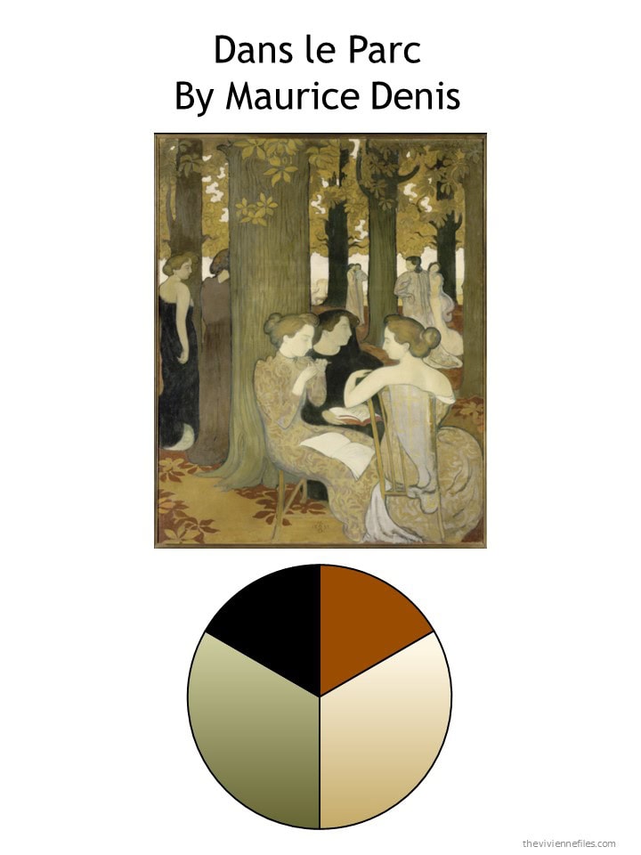
Her wardrobe at the end of April was practical and versatile, if a bit short on the color rust! I get infinite pleasure from that stack of four long-sleeved tee shirts…
It seemed obvious to look for rust – at least rust tops. A second pair of shorts (which could of course be a skirt, a pair of cropped pants, or long pants) and lightweight linen pants finish up her garment purchases. While we were in the “rust mode,” Our heroine grabbed coordinating accessories too!
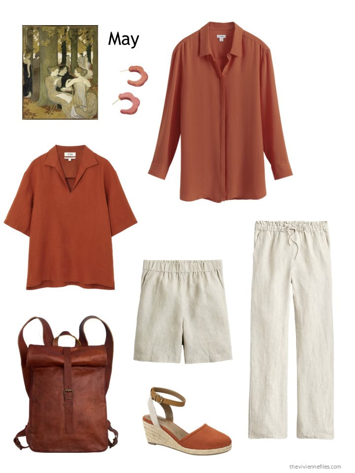
Rust top – COS; mango wood earrings – Binky and Lulu; tunic – Cuyana; flax linen shorts – J.Crew; flax linen pants – J.Crew; backpack – Vida Vida; espadrilles – Style & Co.
If you’re not familiar with COS, I recommend them highly. I’ve been wearing a tweed dress from them consistently for five years…
Her new wardrobe looks a bit brighter, with the light bottoms and accent shirts:
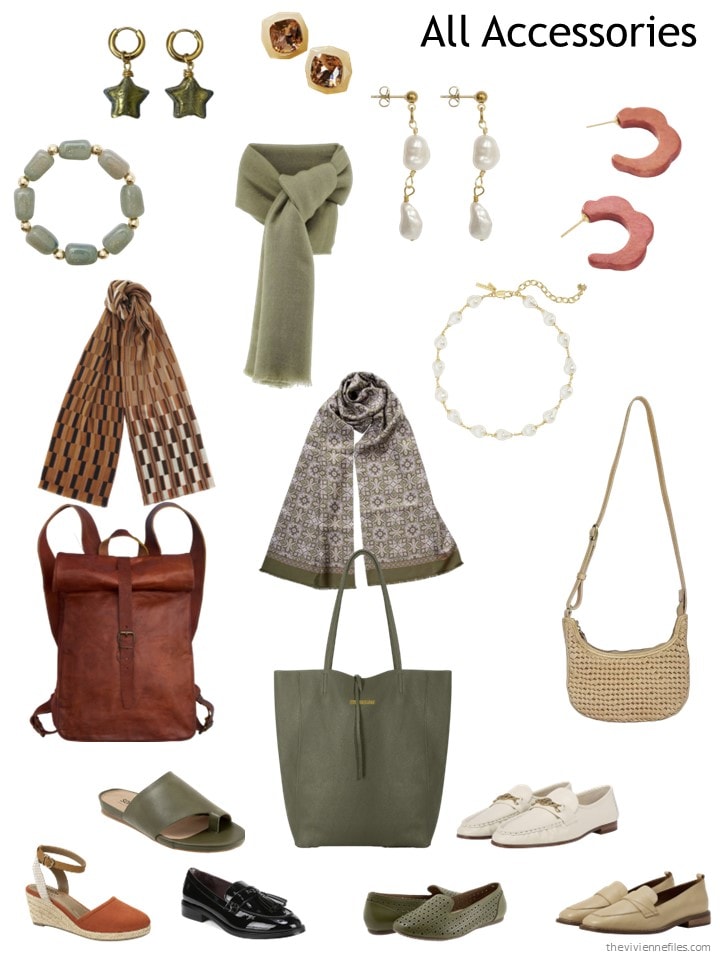
And her accessories are delightful – not every heroine has three bags in the first 5 months, but each to his own taste, right?
New outfits abound with these four new pieces of clothing:
Next up is a painting that I love – although in fairness, I love all Rothko! This palette would have suited a younger me quite well… But those were the ’80s, and I wore navy suits… sigh…
Her wardrobe from the first four months of planning is versatile and lovely, albeit very very pink…
So our heroine decides to really fill in her light neutral garments for warm weather, and grabs an expensive but irresistible tunic. This is the kind of thing that you plan to own for a long, LONG time… Paired with a lovely small scarf and beautiful (expensive, but classic) earrings, she could wear this when she is 94…
Heck, maybe she’s already 94!
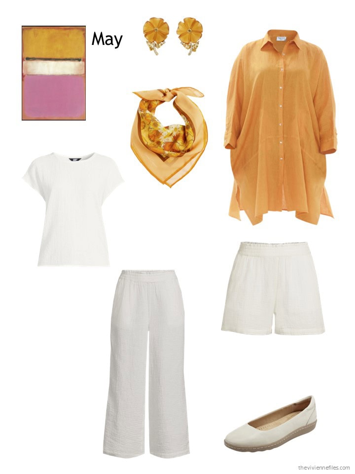
Earrings – Artisan; silk bandana – Henelle; orange tunic shirt – Haris Cotton; ivory gauze tee shirt – Lands’ End; pants – Lands’ End; shorts – Lands’ End; ballet flats – Earth
Now her wardrobe is still bright, but a wee bit less PINK. I can clearly see this heroine buying four black garments when the autumn/winter clothes start coming into stock!
Her accessories delight me – yes, she has two pairs of orange shoes. Yes, if she had found orange espadrilles, she might have bought them too! Sometimes, you really love a color…
Her new clothes put this heroine n a good position for the transition to warm weather, and well into the summer months:
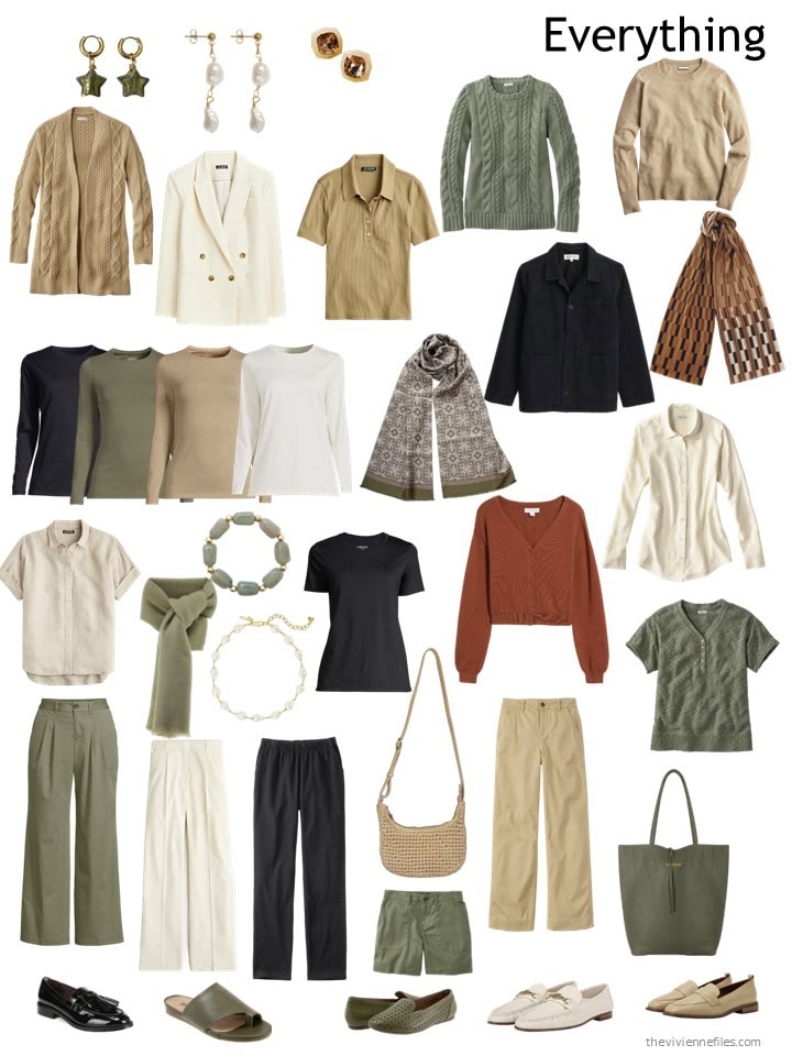
This month’s last wardrobe is one that I feel like I would emulate if I were forced to start from scratch! Maybe it’s all of the stress, maybe it’s the maturity to know that I don’t have to wear black even though I live downtown, maybe it’s the idea of matching my eyes…
A lot of appeal, to put me in mind of such a big change!
Her four month wardrobe is softly, warmly appealing…
Yes, her shades of green are a bit askew – that happens. Sometimes things aren’t all going to match… These aren’t Garanimals!
Our heroine already owns a couple of pieces of “soft blue haze” clothing from Lands’ End… and they are so perfect in her wardrobe that she decided to add some more! She picked up a nice green tee shirt too…
I also highly recommend that “wee family of metallic accessories” that she grabbed this month. There is nothing in her wardrobe that won’t look great with gold…
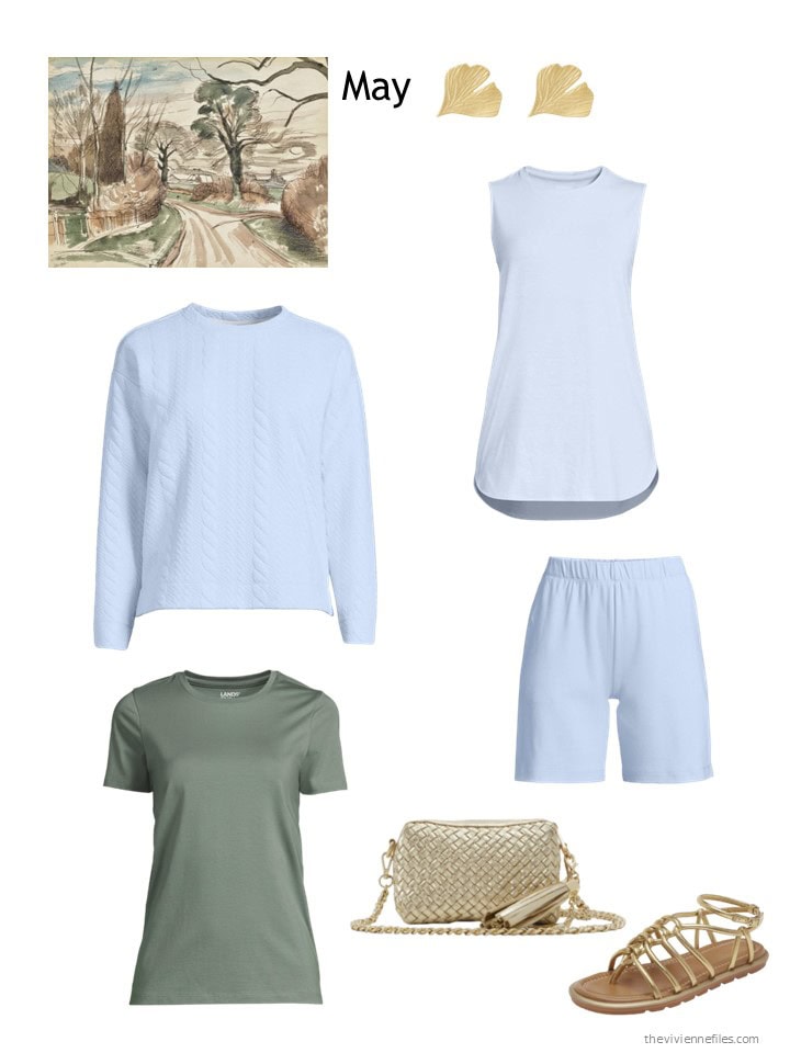
Ginko leaf earrings- Inês Santos; Soft blue haze sleeveless tunic– Lands’ End; quilted sweatshirt – Lands’ End; lily pad green tee – Lands’ End; shorts – Lands’ End; crossbody bag – Aldo; sandals – Nordstrom
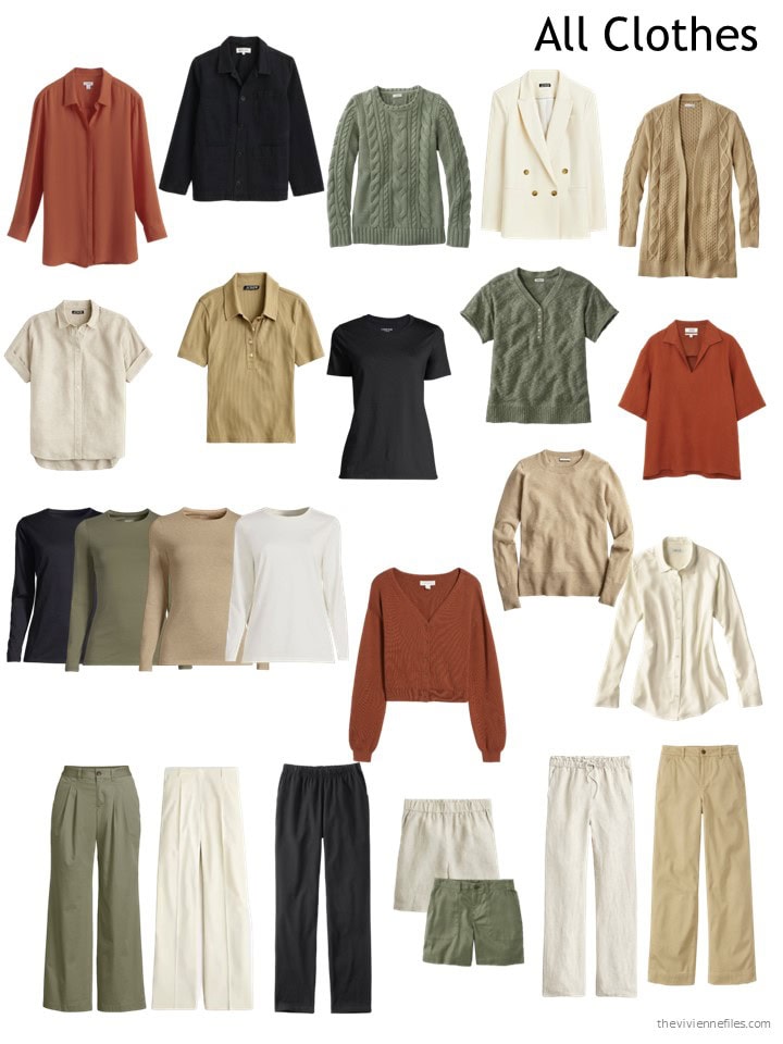
So here’s her clothing now – the large amount of light blue and beige feel like she’s ready for summer:
Her accessories give you a feeling for what she’s like – at least to me. Do you sense that?
And of course, she’s trying on outfits and making certain that her new purchases will be well used and appreciated…
I really like this textured sweatshirt – it’s something I’ve not seen before…
If you had to wear one of these for the 30 days, which would you choose? I’m still thinking maybe this last wardrobe – subject to change!
love,
Janice
Like this article? Save it to Pinterest!
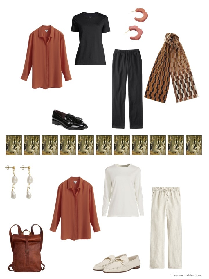
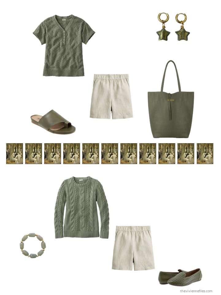
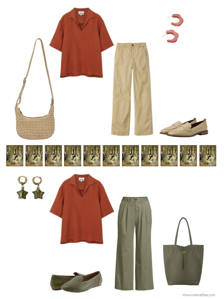
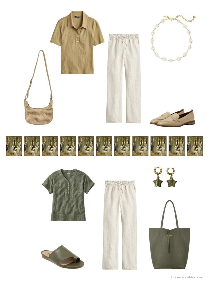
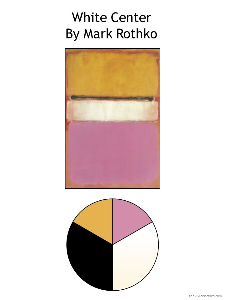
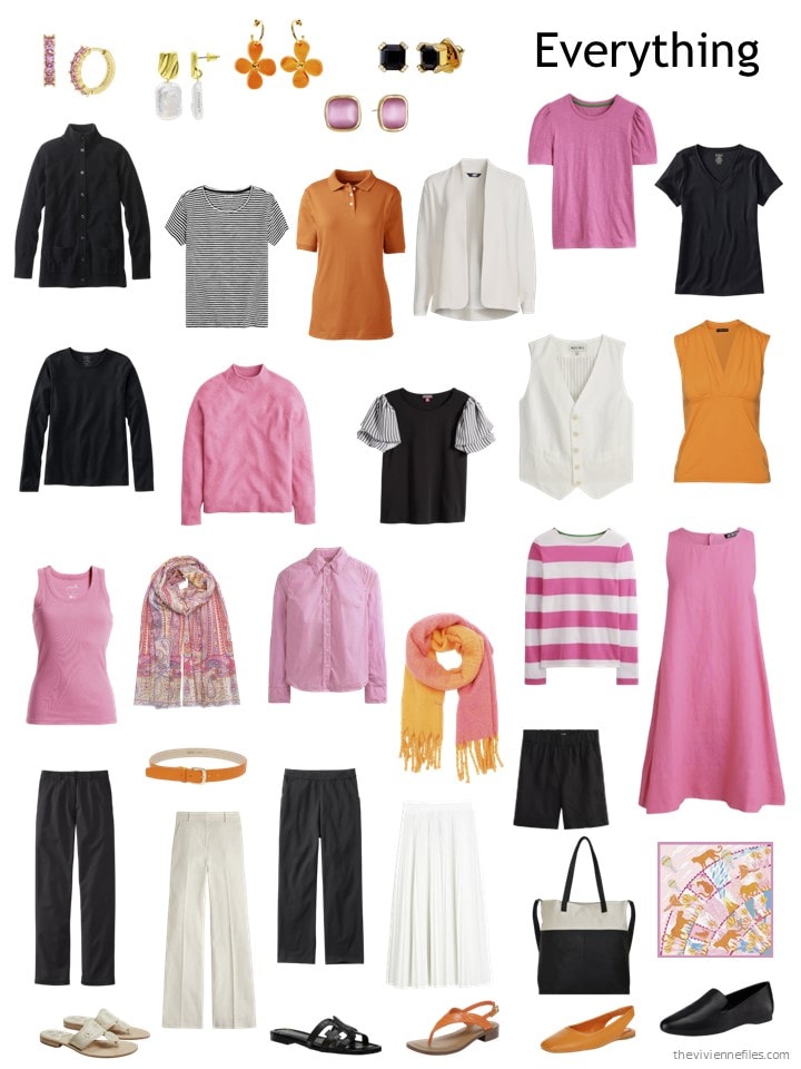
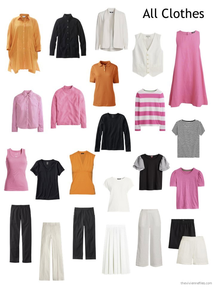
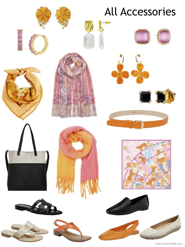
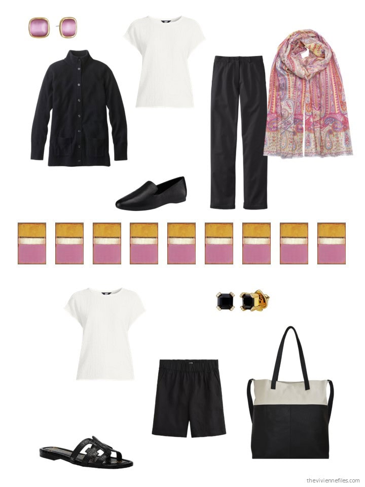
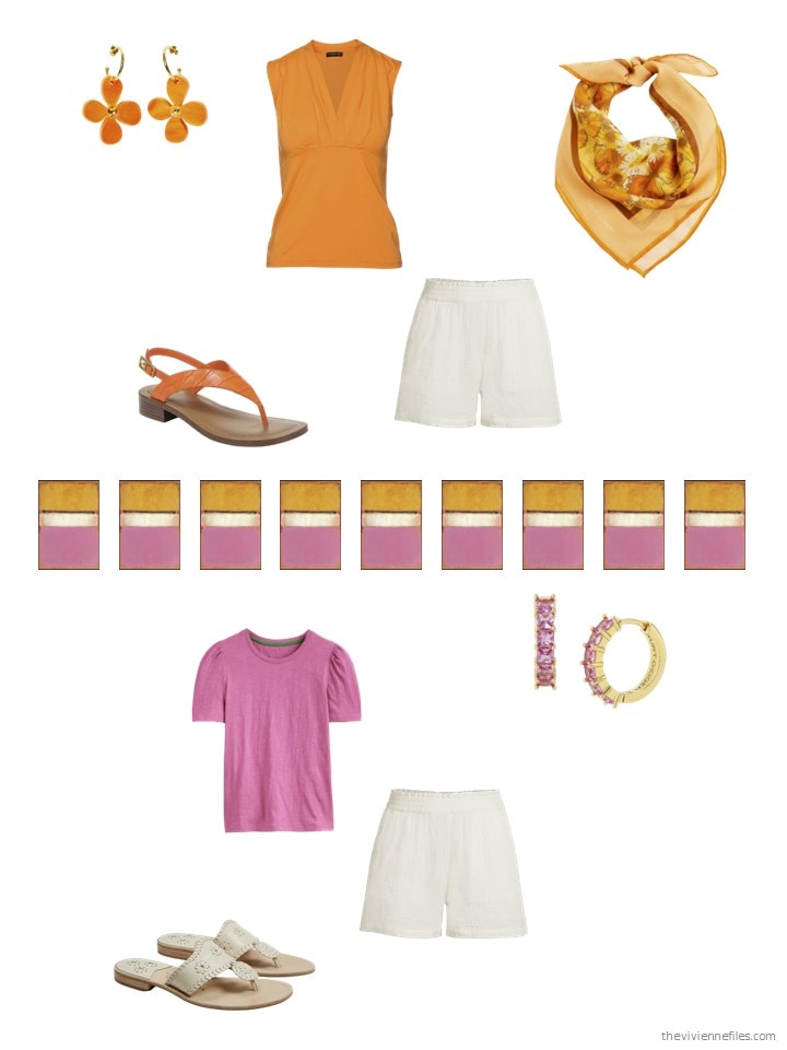
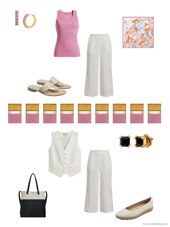
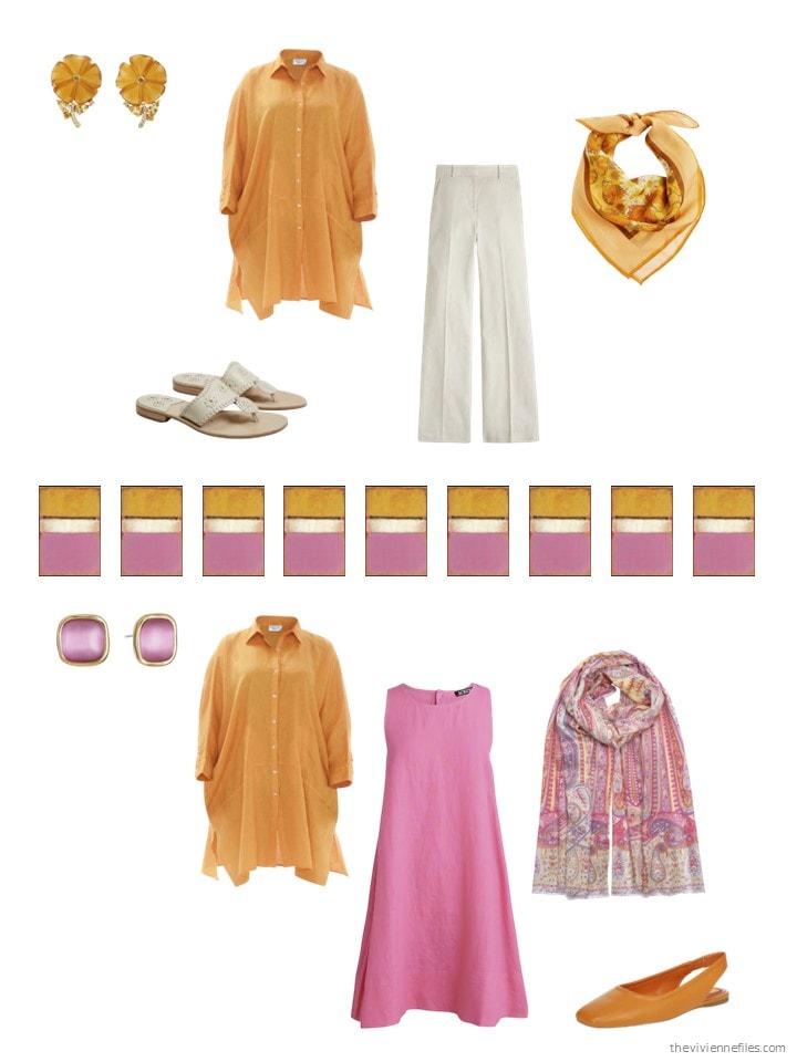
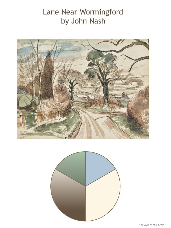
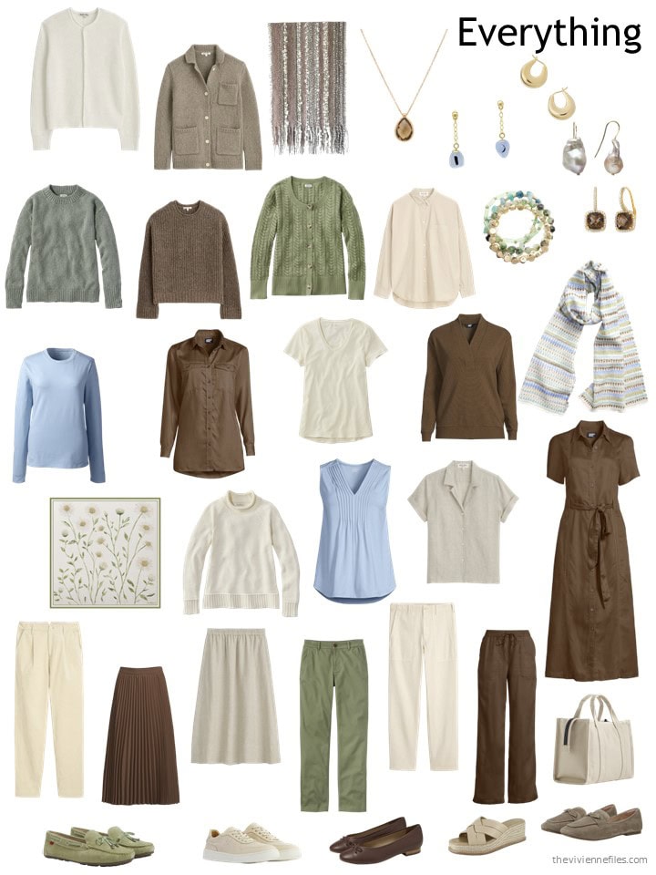
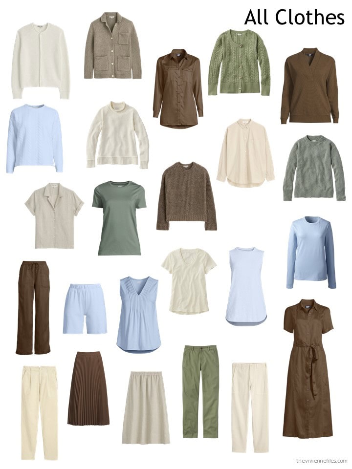
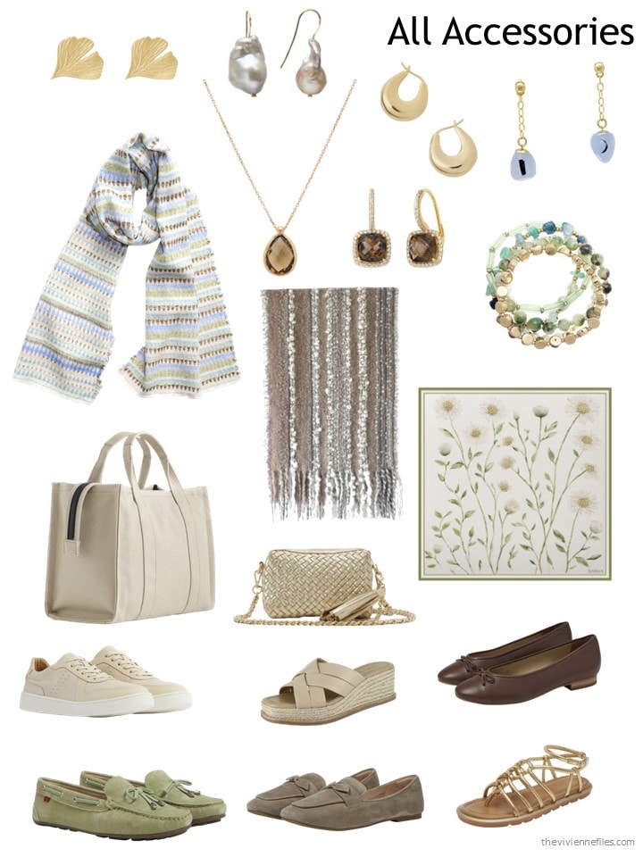
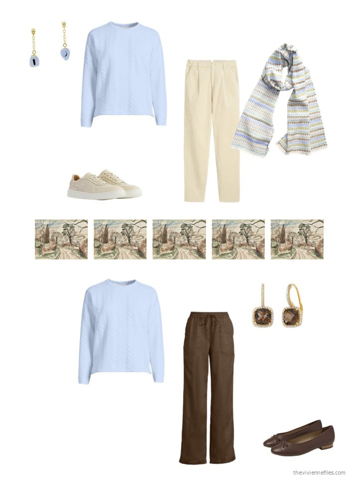
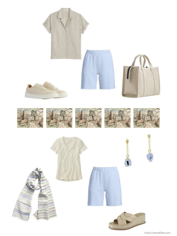
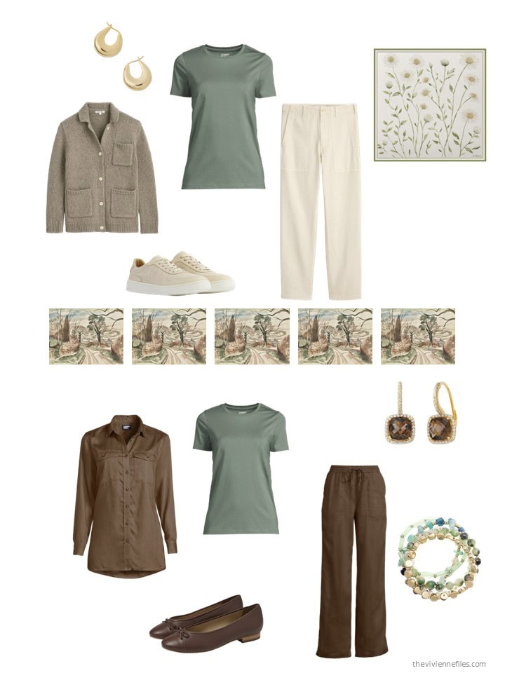
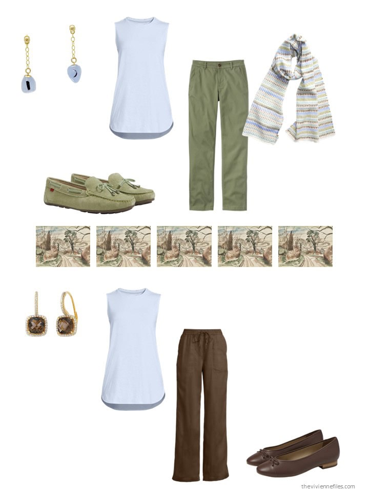
The Nash painting (#3) – both the image and its palette – calls to me. Even the level of the wardrobe’s dressiness clicks for me. It’s delightful to see its development.
Janice, as always I love your posts. It’s interesting that you fantasized about dropping black from your wardrobe and switching to a palette that matches your eyes. That’s exactly what I’m doing. I’m losing weight and planning my new wardrobe in olive green (my eye color), blush, apricot and salmon. I’m inspired by a recent floral phone cover I purchased. It’s my inspiration and I’m loving my new wardrobe! I’m 67 years old and yes I can drop the black!
My favorite is the first. In fact , it’s what I’ve packed (color wise at least) for my trip to Italy!
Good morning!
I simply enjoy looking at these so much! I was wondering if you might post a link that takes one back to the original post when you’re doing a part two follow up. I can’t possibly keep all the posts but would like to go back to the post of The White Center where you have the source for the long pink paisley scarf.
It would be helpful to be able to have the source of the original items.
Again, I love looking at the various wardrobes.
Good morning Margo-
I searched for 2024 Six Paintings 12 Months and found it here: https://www.theviviennefiles.com/2024/03/march-2024-six-paintings-twelve-months-part-2.html/
Then I noticed that Janice provides tags at the bottom of the post and one is 6 PAINTINGS – 12 MONTHS. That takes us to all the posts.
Another approach is to do a search by the artist’s name or painting title to see all the related posts.
Forgive me, but when I look at the Rothko wardrobe, all I can see is a Dunkin’ Donuts sign! 😆
Thanks – I needed a good laugh! That’s why everybody gets to choose their own favorite things in life – one woman’s art is another woman’s donut ad!
big hugs,
Janice
Truth, truth, truth!
I would definitely go with the Rothko, at least for the summer.
Janice,
I would marry the Parc and Lane groupings, but drop the black. It’s funny, but I kept feeling the need to balance all of those warm colors in Parc with blue ! Looking at it this way, you are seeing my wardrobe colors , with Lane for “quieter mood” days
Love the colours of the first one. Will work wonders with my new copper hair :)
Happy Friday Everyone! I tried the colors of the Denis – which I really like – for my own wardrobe back when you did the tree of life scarf. I still have the scarf, but not very many of the clothes. I just couldn’t do what felt to me like all neutrals. I’ve even verged into the colors of the Nash – the light green and light blue. I still have some of the light green – LL Bean calls it bay leaf – love that color – but only one item I think in the light blue. Oddly enough, I got compliments every time I wore that dress, which is probably why I kept it. LIght blue with yellow lemons on it. Anyway, I very much like both of those wardrobes, while acknowledging they aren’t for me personally. Sometimes you just don’t know until you try it! Have a great weekend everyone, can’t wait to see what Janice has in store for us on MOnday!
I like the Rothko especially for summer. I’d just swap the black for navy. And I do have 2 pairs of orange shoes! Orange isn’t really flattering on me but it’s great in accessories. It’s amazing what those orange sneakers do to a white skort and Astros t shirt!
From one Astros fan to another…that sounds like a great game day look. I also absolutely love orange in accessories because it’s not a flattering color for me either, and it provides such a wonderful complement to the blue-green and blue colors I like and wear well. I feel like I have a lot of orange accessories but I do only have one pair of orange shoes (ballet flats) so it’s clearly not excessive at all! ;)
Oh, the Lion and Peacock scarf on the look back are my colors… loved that one!! And I seriously debated getting one of the A scarves (my last name starts with A), but it was too big of a splurge. Thanks for reminding me of this!!
Kristi, I agree. I just loved that scarf.
I would definitely go with the Rothko, as it now stands. No black for me and I don’t miss it one bit. That gold/ honey? color could easily be a warm, clear honey color that I do wear.
All of the wardrobes are exceptional, especially the accessories.
I loved seeing all the additions this month. Great job
The Rothko is the one for me, and I have been building this wardrobe
this year. I checked the post early today to find that the main addition,
the orange tunic is sold out. Why include a sold out item? Very disappointed!
It wasn’t sold out when I included it – I would NEVER do that to you! These are small companies, on Wolf & Badger – send them a note to see if they can find one for you…
apologies,
and a big hug,
Janice
I’ve put items at Wolf and Badger on a wait list/wish list before and they did notify me when one was in stock.
Will do! Thanks
Should have added sometimes I do a search and can find it elsewhere.. sorry.. my brain is mush today.
Bolstering the light blue has really improved the Nash wardrobe for me. I can now see a version of that capsule that would work for me: substitute the beige pieces for an ivory short-sleeved T + cardigan (that light barely-ivory that is almost indistinguishable from a soft white) and chambray/denim/navy. I love the light blue with both the brown and the olive, but the cool clarity of the color makes the beige look dull and dingy when paired together.
I know that it seems almost irresistibly logical to put brown and beige together in a wardrobe to provide a range of values in the brown family, and in this case, it’s one of the inspiration painting’s dominant colors, but a light barely-ivory or even a true white is just as nice with brown in my opinion and is easier and/or more joyful for some people to wear. I can’t 100% tell whether I want my beige substitute to be “cooler” in undertone than these pieces, or just lighter in value, or some combination of the two! But logically, as one lightens a color by adding more and more white, the tints of that color will eventually converge on almost-white, the whitest color you can get that still has a drop of the original color in it, so I’m not sure you even have to start with a darker brown that has a cool undertone to create a brown value spectrum from dark brown through almost-white. Of course, it may be that liking a light barely-ivory color is correlated with preferring cooler brown/taupe to begin with…which is probably the case for me, though when a brown is dark enough (has enough black in it), the undertone of the original brown seems to matter less.
But beige, light barely-ivory, or white…frequent readers know that I will substitute pants/shorts in those colors for chambray/denim (and navy if it fits the overall palette) right away! :D
I love the colours in the Rothko! Black and pink with some true orange are my signature colours, just took delivery of a pink cashmere travel wrap and a black cashmere tunic, shop for fall now when prices are 40-50% off! I have the wrap in black as well as the sweater in orange. If one has strong contrast colouring black always looks good. As my black hair gets more streaks of white black apparel with a strongly contrasting accent colour suit me. I don’t do ivory but prefer white.
I have been watching Palm Royale on Apple+ and the Rothko fashions ( minus the black) do look like they are straight out of 1969 Palm Beach especially the orange tunic.
If you wish to compliment your eyes NEVER wear clothing the same colour, I have intense blue eyes and rarely wear blue.. but when I wear strong pink or orange my eyes pop.
My DIL has dark brown eyes and is stunning in purple, a friend of mine with green eyes looks great in reds. People seem to think that what they wear is reflected and intensified in their eyes, it is not, wearing the same colour can drain your eyes making them look flat. Hense blue eyeshadow does nothing for blue eyes yet taupe and plum wine shades bring on the colour.
Check a colour wheel for complimentary colours you’d be surprised!