March 1, 2024
Even with the extra day yesterday, I’m still not quite sure that I’m ready for March. But she will arrive regardless of my degree of preparation, right?
After a 50 degree overnight temperature drop, I’m not sure what season we’re in, nor what to wear on any given day…
But let’s look at art, and the wardrobes intrepid heroines assemble based upon their favorite colors and paintings!
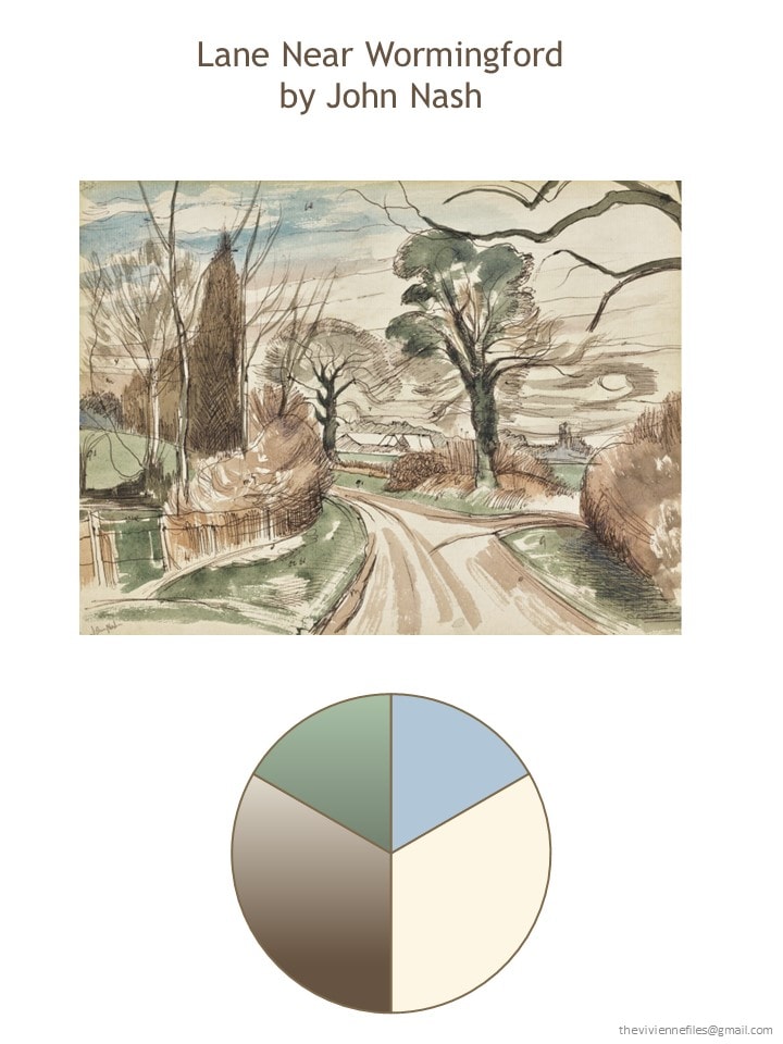
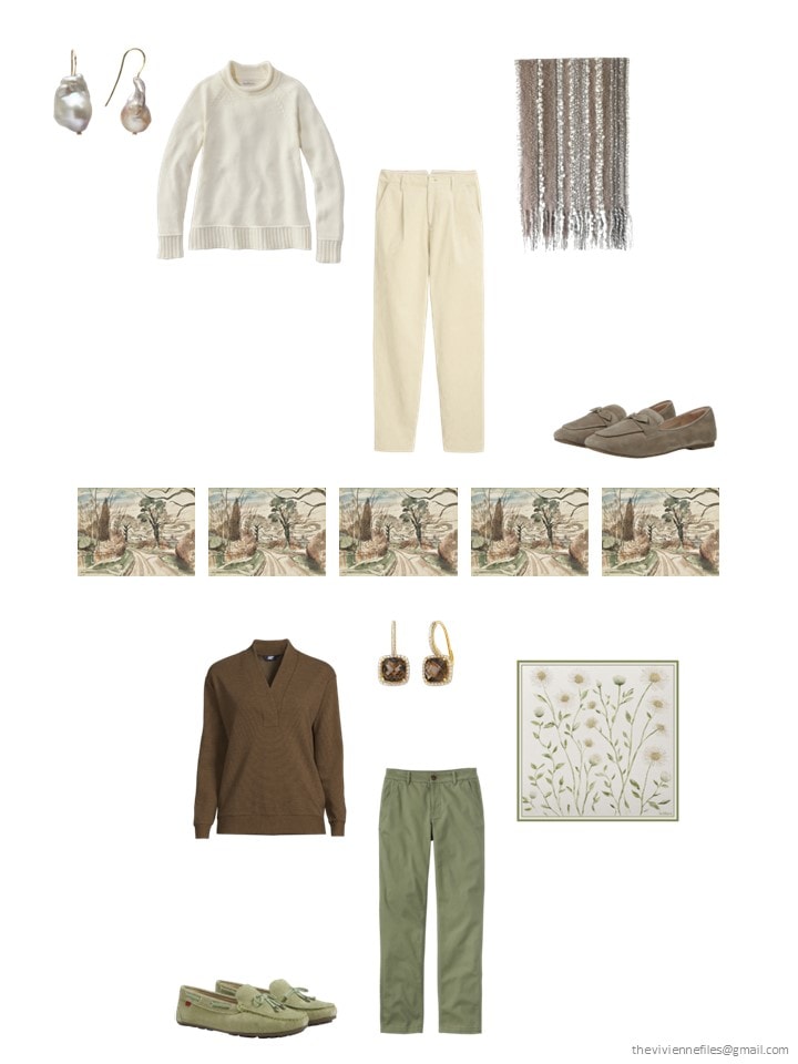
So restful, calm and classic. I could walk for hours down this lane…
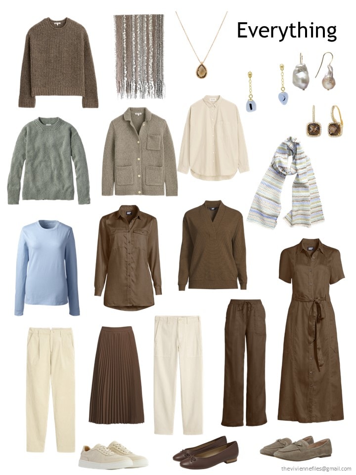
At the end of February, our heroine has this 12-piece capsule wardrobe:
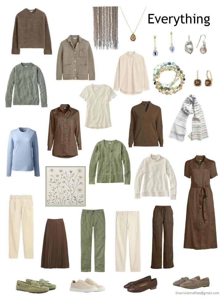
As she’s thinking about what to add, the burgeoning spring warmth suggests to her that maybe some green would be pretty!
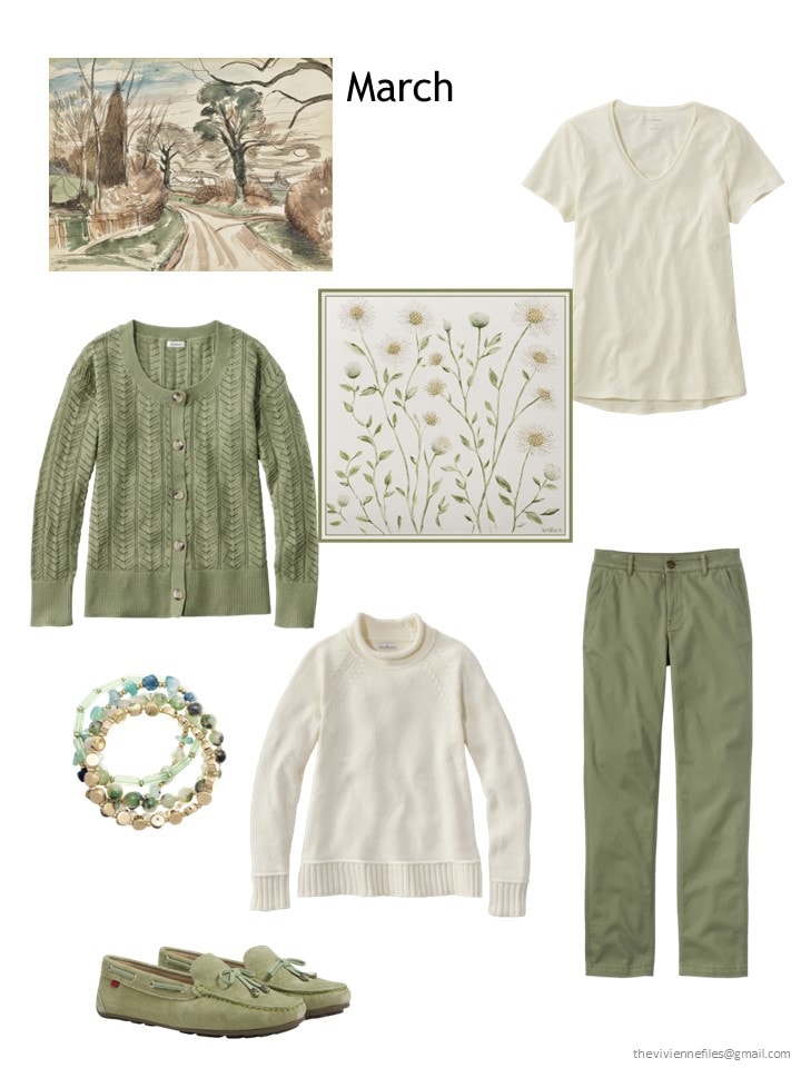
Sea grass cardigan – L.L.Bean; scarf – Artifact.; sailcloth tee – L.L.Bean; bracelets – Style & Co.; sweater – L.L.Bean; chinos – L.L.Bean; loafers – Marc Joseph New York
Still a couple of sweaters – warmth doesn’t mean HOT quite yet! And a classic tee shirt is long overdue for her – almost all of us can use these…
Yes, her bracelet has a dash of some bright turquoise blue – she chose it anyway, because of the greens and golds that are so perfect. A little touch of a new color every now and then is good for the heart!
Her wardrobe now is a bit more color balanced – I suspect that next month she may be looking for just the right shade of blue…
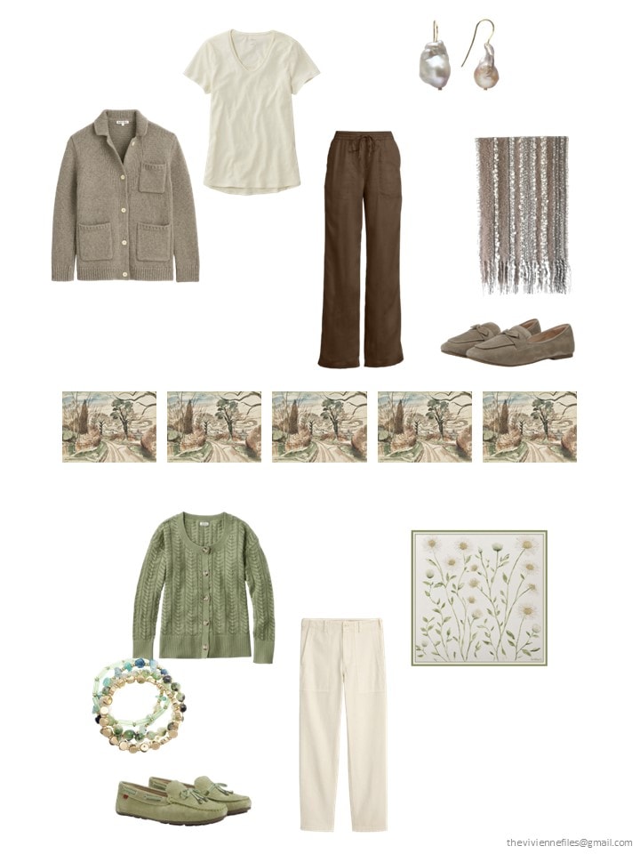
It’s really pretty obvious how she can wear her new clothes, but let’s take a quick look at a few outfits, just to visualize more clearly what her possibilities are:
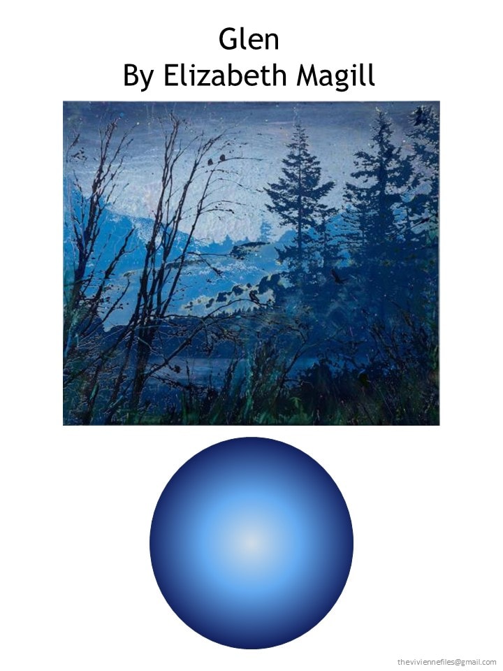
Our next heroine – the woman with blue eyes? has fixed upon this beautiful work as her inspiration, and why not?
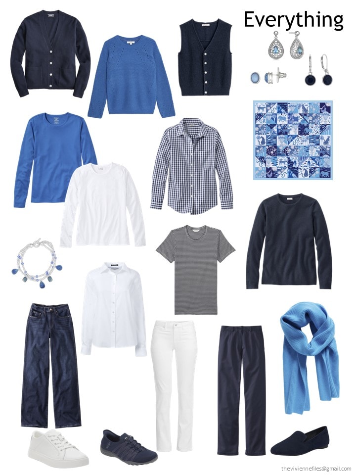
At the end of February, her twelve-piece wardrobe was a timeless assortment of navy and white with just a touch of bright blue:
Frankly, she approached this month’s shopping without a clear plan – she was thinking that she might find more navy and white things – spring is the time of year when all things nautical (in the fashion sense of nautical – NOT what real sailors wear!) becomes available.
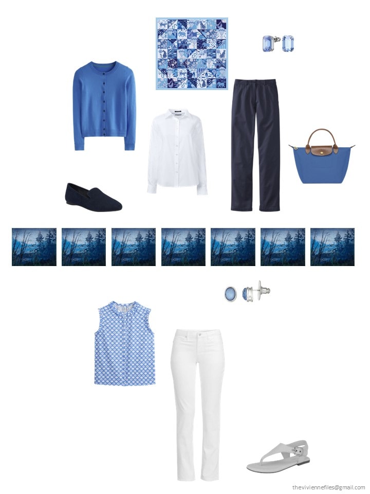
But then she took a look at Boden, and she was decided!
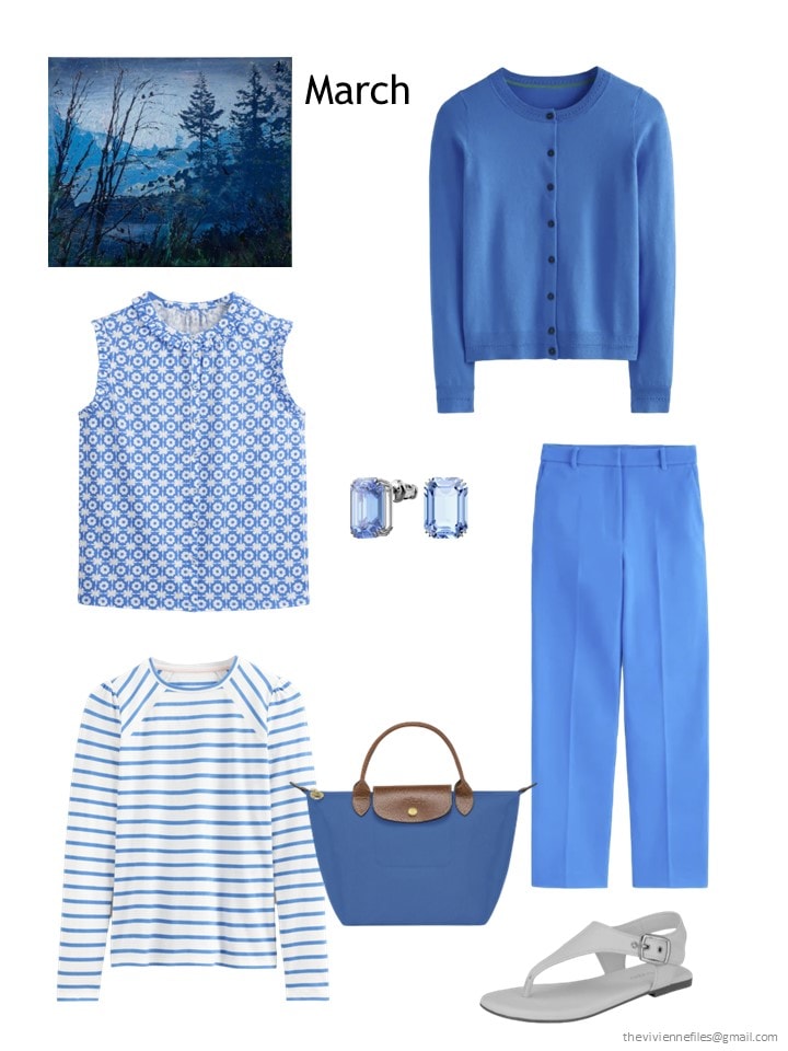
Print sleeveless blouse – Boden; cardigan – Boden; earrings – Swarovski; striped top – Boden; bag – Longchamp; pants – Boden; sandals – Calvin Klein
Oh MY YES! Rumor has it that these are all the same shade of blue – our heroine knows better than to believe images on a computer screen, so she will order and see how things go…
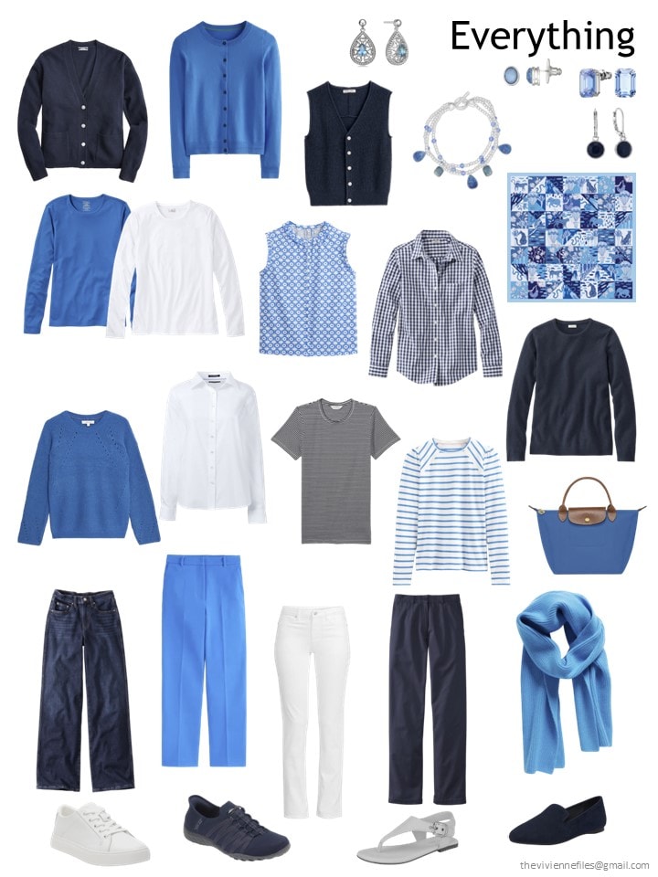
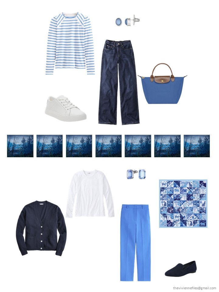
But her 16 piece wardrobe, with these additions, looks like this – bright, but still so practical:
It would be difficult to dress badly from this assortment – but let’s take a look at a few outfits, just for fun:
If you love blue, you’ll be happy with this, I’d say!
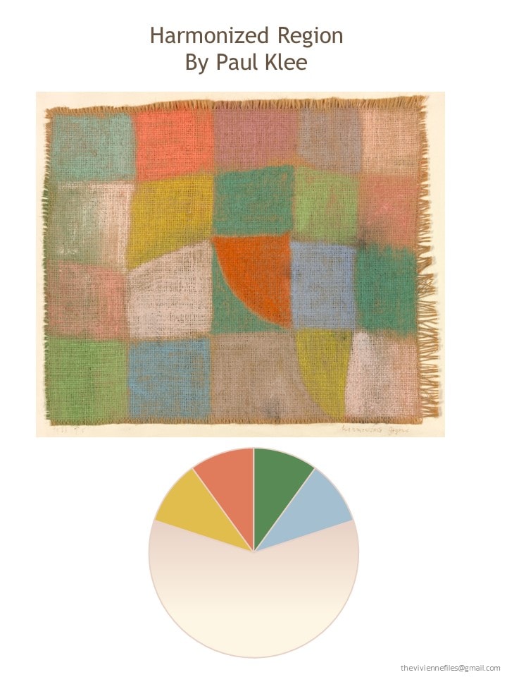
And today’s 3rd and final heroine is inexplicably smitten with all things Paul Klee, but especially this colorful work:
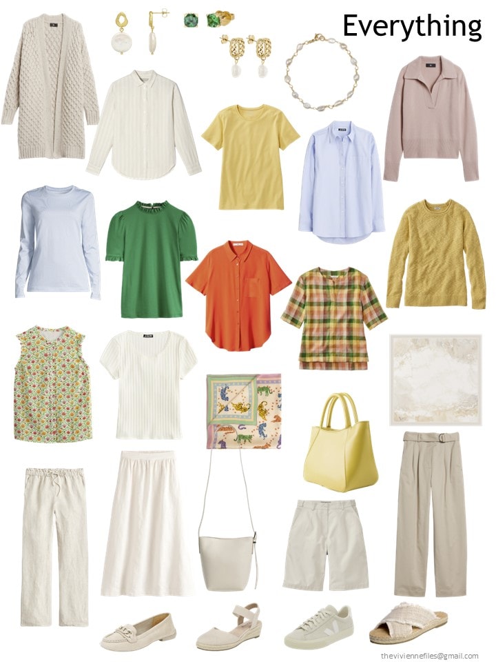
She has – so far – focused on a good grouping of beige and ivory pieces, with a few accents. She starts March with this capsule wardrobe:
She was browsing one day when she saw a plaid top that felt SO MUCH like her favorite painting that she had to stop and look! From there, she wandered into a world of yellow, green, orange and a nice neutral skirt to ground everything.
And a yellow tote bag! Just right for Spring…
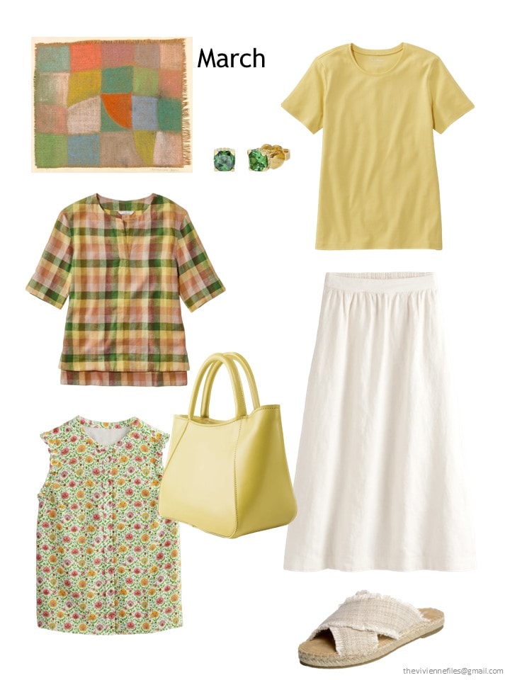
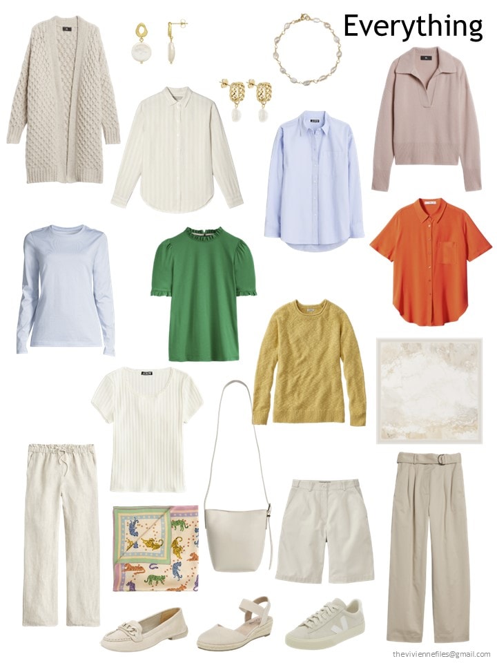
Plaid linen top – L.L.Bean; green earrings – Kate Spade; beeswax tee shirt – L.L.Bean; floral top – Boden; yellow tote – The Dust Company; skirt – Boden; sandals – Minnetonka
NOW, her wardrobe is brighter, but still easy to wear and versatile:
She’s probably going to be shopping for blue and pink next month, I’d guess!
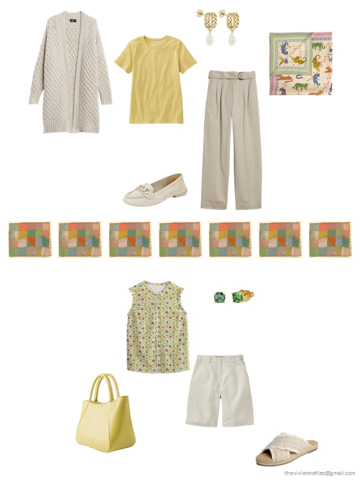
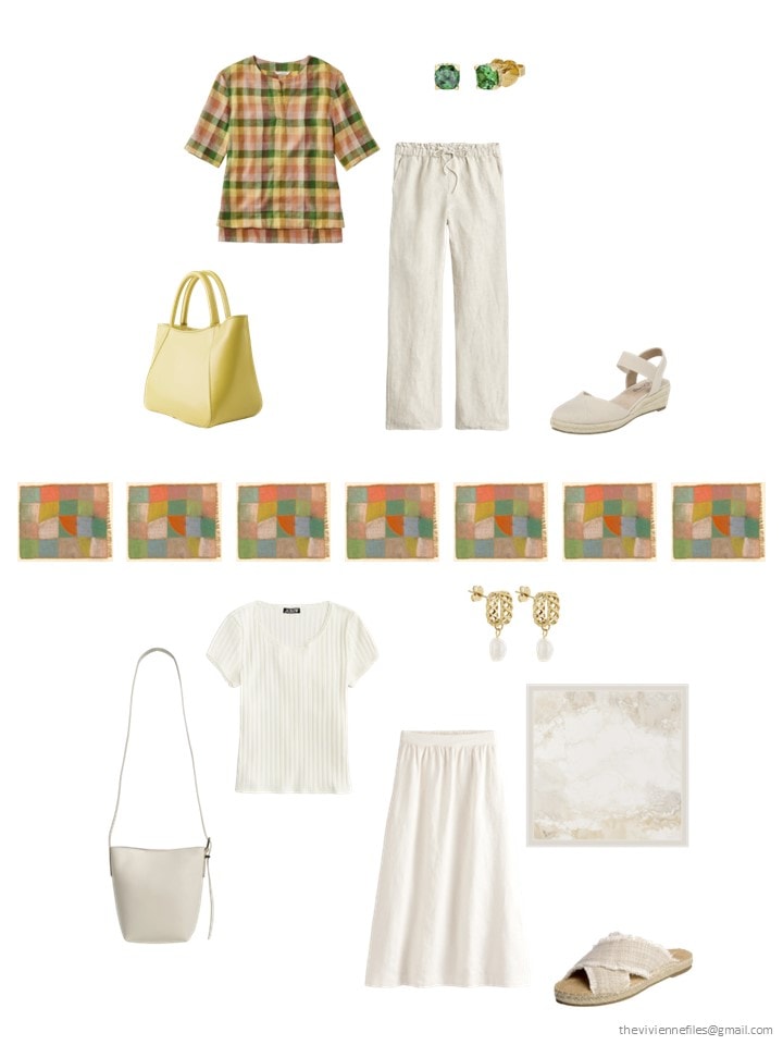
What new outfits does she have, after her lovely shopping adventure?
I have to admit, I’m amazed by how much the “all-blue” wardrobe appeals… There’s something to be learned there!
love,
Janice
earlier posts in this series are:
Like this article? Save it to Pinterest!
Janice, could you hint to your friends at Echo to make a scarf of Harmonized Region? I’d buy it in a heartbeat.
The new additions are great. So much fun to see everything pulling together. Have a wonderful weekend everyone, looking forward to Monday’s continuation.
I was loving Glenn but I just didn’t mesh with the blue on my skin tone for the March. But I can do what I desire so that’s alright. I don’t wear pants so I already adjust for this by wearing different types of skirts. Makes things interesting!!!
Love the Boden pieces. Their garments always have a little extra detail that elevates an outfit.
Loving the blue wardrobe so much! Great find on the Boden pieces too. A 50 degree overnight drop is just crazy!
Well I shall look forward to the addition of more blue/chambray to the Nash and a lighter brown/taupe would be nice too. I’m just wondering whether boredom might set in with the Magill. There is a limit to the blues that you could use because they are all quite fresh and cool in tone. There isn’t the broad range of muted subtlety that grey-blues have. I’ll be interested to see how it develops from April to December. Yellow isn’t my colour but just the addition of yellow/pink/green prints to the Klee wardrobe elevate it to the next level. Second layers or bottoms in the accent colours would add variety as would a chambray or pink/green. A print dress in the summer would be sensational.
The look back is also a good lesson in how prints tie accents and neutrals together. I have very few plain tops but the ones I have harmonise with the colour groups in my wardrobe. If a top is plain, I prefer it to have texture rather than be smooth knit.
The Klee…I adore the neutral base, and the little inclusion of blue, but I just can’t enjoy green, orange and yellow together like that lol.
The MacGill wardrobe is amazing! I love all the blues and they all look so clear and fresh together. I agree with Beth T that it would be difficult to integrate muted blues into this wardrobe. Cool and bright doesn’t necessarily go with cool and muted. But then the painting isn’t muted either so let’s give our bright winter and bright spring heroines some of their blues to enjoy!
And I think my favorite of this set has surprised me. The Nash wardrobe has that soft, summery, hazy, sweet sort of look about it that reminds me of late August days when the grass is slowly fading from green to brown. It makes me want to cozy up in one of the sweaters and nap in the sunshine. Normally my preferences are for really cool muted colors, but I could very easily wear this wardrobe for a good long while.
Such a wonderful assortment of wardrobes today! Thank you for all your hard work Janice! And I’m very much looking forward to your next, as always. This is the best part of my M W F mornings.
More soft green…yes. More bright blue…yes. Multi-color prints that tie the color palette together…HECK YES. After two months of laying the groundwork of basics, March’s more colorful additions are singing my tune.
I’m hoping April brings an accent color (solid or print print) bottom and shoe to the Klee wardrobe. She could also use that light blue color to pull some denim/chambray into the mix. The Nash wardrobe needs more blue in general…and denim/chambray would be helpful here too.
I really like all the bright blue in the Magill wardrobe but do wonder how I’ll feel about it as this wardrobe continues to be so all blue all the time. As I imagine growing it from here, more and yet more blue starts to feel very one-note for my own preferences. I actually find this wardrobe after only 3 months incredibly versatile and well done, with good representation of her 3 colors (navy/dark denim, white, and light blue) so I’m starting to think ahead to diversifying rather than shoring up the basics. Like some other commenters, I’m not seeing a place for muted or greyed blues to play a big role in this wardrobe. However, there are some lighter blues that still have a good amount of clarity and saturation that could fit into the capsule easily. This heroine might enjoy adding some French 5 or similar in accent colors that would work well with the bright blues. Green, yellow, orange, and bright pink/magenta are colors that come to mind immediately.
Love all of these wardrobes!! I do think this year of start with may be my favorite. (Do I say that each year?) Regardless of whether they are my colors or not it’s so much fun and informational to look at what Janice has found and what the comments are. I go back and check the previous postings to make sure I don’t miss some insight. Great look back, too. Basics do not have to be basic! Neutrals come in all forms silk, cotton, linen, textured, etc.
The all blue wardrobe is my clear favorite, and very much like how I already dress. I’ve definitely clicked a few links! (And the COS scarf is sitting right here with me.)
The Magill is also my favorite. There was another Magill featured a couple weeks ago that had more white and for me that’s needed. It reminded me of the “Blue” by Hoffman series a couple years ago. That really is what I aspire to but…..I really need the colors too. So blue and white with French 5’s is just about perfect.
Adding light blue to navy feels tricky to me and blue is my favorite color. While I can put any color with my darkest denim, putting it with navy feels more challenging. These blues almost feel too bright and clear. I need a more muted blue to feel comfortable. But these brights would be great for the winter and spring complexions.
A close look at the Magill would show that there is a lot of blue/grey in various shades and tones in the upper portion of the picture. The pine trees on the right suggest how these more muted tones can be incorporated with the brighter blues. So, difficult but not impossible. And navy, of course is a neutral, so there’s that. Prints with many shades like the animal scarf (Jessie Zhao?) always make it easier.
I can’t get excited about the Nash or the Klee because the colors are so wrong for me. Except for the pleated skirt nothing really grabs me.
The wardrobes are all so perfect. I wear all of the colors some of the time. I would choose the Blue wardrobe with a few accent colors from the other two. I like to wear blues with a pop of orange. Lately, I’ve been wearing brown and green with a scarf that has tiny birds with green and yellow. It all works for me. Thank you for the beautiful additions!
I am loving the Magill and the blues Janice is selecting. I am definitely following along and fine-tuning my wardrobe to correlate with Janice’s selections. I ordered a couple of things yesterday. I am excited to see how well they play with what I already have since a large part of my wardrobe is already blue. I love the fresh, clear blues. When I add a gray blue to the mix, it definitely appears out of place.