December 15, 2023
Have you reached the point in the autumn/winter (or spring/summer, depending on where you are!) when you’ve worn ALL your clothes for the season, and feel the need for something to brighten up or refresh your wardrobe?
Or maybe you’ve been thinking that a different accent color in your wardrobe might bring something delightful to your mornings…
Pantone’s ALWAYS got ideas – I’m finishing our look at their New York Fashion Week colors today, but in the next week or so, I will visit the London colors too! I’m never quite sure how they choose these colors, and I certainly can’t explain how they name them. But I can find lovely things to give us inspiration, and ideas:
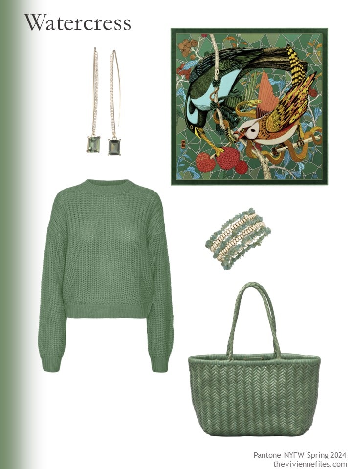
Earrings – Lauren Ralph Lauren; scarf – Pig, Chicken & Cow; sweater – Noisy May; bracelets – Style & Co.; bag – Rimini
I think this Watercress green is lovely, and might flatter many of us…
And Marlin is a subtle variation on navy – if you don’t like navy, but are interested in something dark-ish blue, this might be just the ticket:
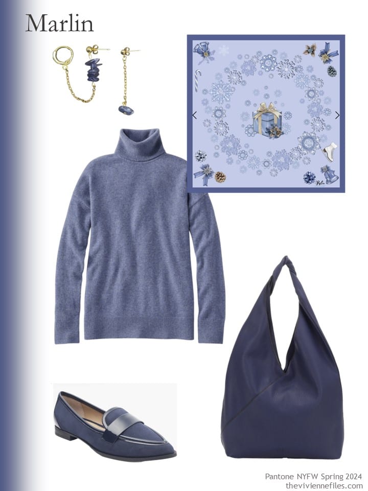
lapis earrings – Tête d’Orange; scarf – RaluFineArt; sweater – L.L.Bean; bag – Mali & Lili; loafers – Me Too
Was this sort of turquoise blue one of the “universal colors” that are flattering to most people? I think maybe… It’s shocking how much stuff you can forget in 40 years!
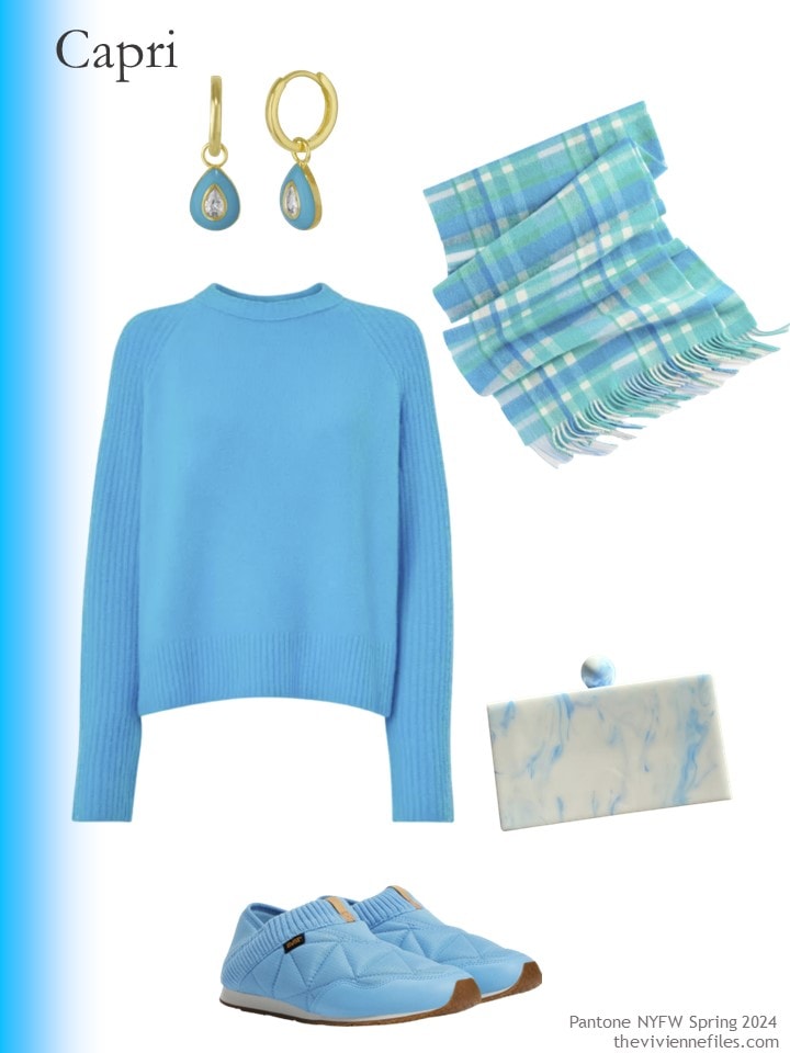
Earrings – Spero London; scarf – Talbots; sweater – Whistles; shoes – Teva; clutch bag – Closet Rehab
Who doesn’t like Chambray? (actually, one of my best friends does NOT like blue – I love her anyway!) I think a chambray shirt is among the 3 or 4 most useful garments any person can own…
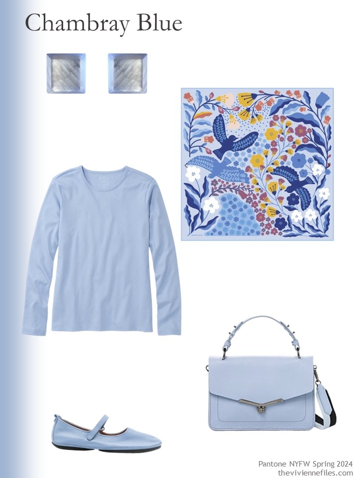
Square earrings – Michael Nash Jewelry; scarf – Jessie Zhao New York; Lake blue tee shirt – L.L.Bean; flats – Camper; handbag – Botkier
If you’re looking for a pretty accent color for navy or grey, I heartily recommend this:
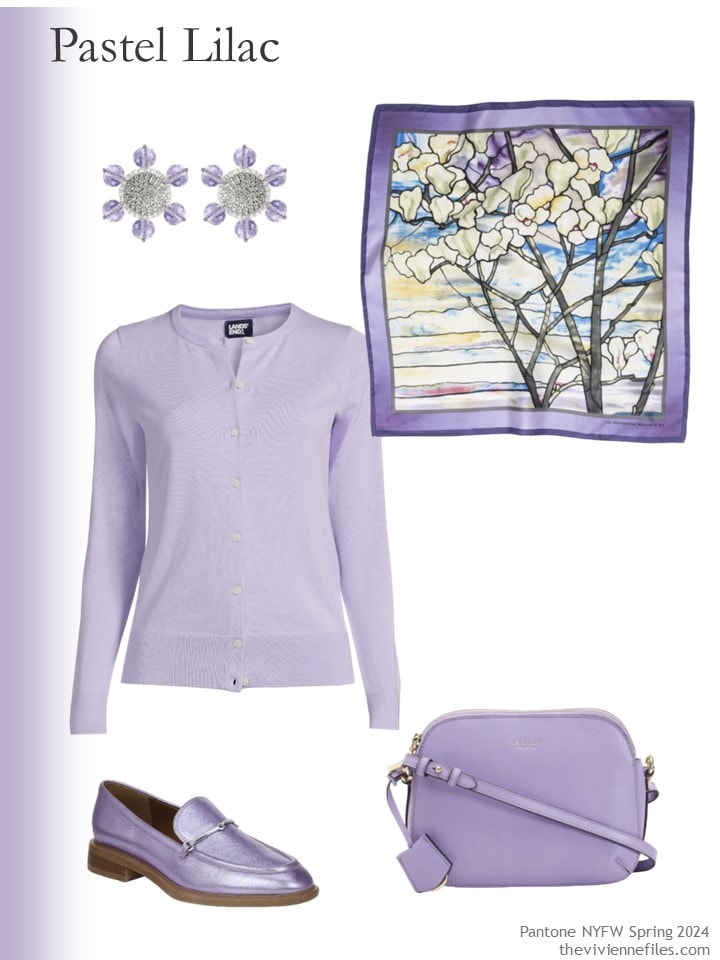
CLIP-ON earrings – Saule Label; scarf – The Met Store; cotton cardigan – Lands’ End; shoes – Sarto by Franco Sarto; bag – Radley
Did you find a color you love in these 10? I’m still sticking with purple right now, but I’m always open to try new things. You have to be open-minded, right?
love,
Janice
p.p.s. Are you familiar with the concept of Enclothed Cognition? It’s the phenomenon in which the way we dress affects our self-image and feelings. I love Oliver Charles sweaters (they have no seams – seriously – it’s like wearing a miracle…), and their website is very interesting. They post all sorts of musing from people who wear their sweaters – what an idea!
Like this article? Save it to Pinterest!
Capri! The challenge with any designated fashion color is finding it in a style you’ll wear in a garment you actually need. Enclothed cognition, indeed. Any beautiful color is meaningless if it’s in a style that makes you feel inauthentic. There are some fashion styles so pervasive I’ve felt like racing out of the store screaming (even though I acknowledge they look amazing on others.) Looking forward to the London colors.
Love the first color and that scarf! Pig, Chicken and Cow have the most amazing scarves, I just wish they were quite so dear. Today is Ugly Christmas Sweater Day at school and I’ve got mine all lined up to go. My Dad was a great believer in “you behave how you dress” I had strict limitations on what I was allowed to wear in high school. Given what I see now with a plethora of pajama bottoms and barely there halter tops being worn in the school and the behavior being exhibited there’s certainly some merit there. Have a great weekend – shall look forward to Monday, as I look forward to every Monday, Wednesday, Friday.
were NOT quite so dear.
I think you’re a genius…I truly do!
And I found Enclothed Cognition fascinating!
Thank you for doing what you do !
PS I’m not fond of blue either but I hope you still like me 😘
I love you very much! I’m not one to judge my friends on their tastes and preferences; individual variations make the world MUCH more interesting…
hugs,
Janice
Capri! My best and favorite color. I have the shirt from Talbots in the same plaid as the scarf. Hope to see more Capri in the stores.
I have that shirt, too. It’s gorgeous with gold accessories.
Capri for me too.
I had a pair of white jeans that took up a beige tinge in the wash and looked old and horrible. I bought a DYLON die and made them that exact shade of bright turquoise.
The jeans have faded since to a paler shade and only last week I bought another turquoise die to bring them back to the gorgeous colour again.
I get great wear out of this colour.
It brightens up chocolate brown in the autumn goes beautifully with white, burnt orange and looks really good with my turquoise V neck skinny rib jumper.
I agree with the others the colours you wear make you feel better. If you have a nice vibe in something and feel like yourself you are in a better mood.
When i say burnt orange I don’t mean the colour that Pantone called ORANGADE as shown in tour earlier post. That colour too much. Too stark. Too bright. It clashes and is jarring with the bright blue.
Janice,
That Marlin color might just be my answer to “ how to wear gray or blue family colors that look right on me “ ! Despite my warm light coloring, the toned down quality of the hue looks like something that could work . Navy is almost too dark for me and most grays feel “ too cool ” .
LL Bean has several different “Indigo” shades. Light, Dark, Heather and Vintage I think. They are (to me) kind of a range of denim blues and I have found all of them to be very versatile. One of my favorite LLBean colors.
I would wear these all! They seem to be cool based.
I think so too.
I LOVE that capri and white clutch. I wish I was going somewhere tropical so I could justify it.
Like Marilyn, I would wear any and all of these colors…and do, haha.
The stand-outs for me are the bird scarf (it feels brighter than the muted watercress green but I think would still work beautifully with) and the soft navy/indigo (“marlin”) flats. I’m looking hard at those flats. The light blue Jesse Zhao scarf is gorgeous too – not sure I’ve seen a scarf from them I don’t really like (which makes sense given the vividly drawn and colored nature motifs they use).
I hope we see a lot of that wonderful neutral-esque “marlin” (which I call “soft indigo”) blue in stores this year. I actually have a good supply of it personally but I think there are a lot of heroines whose wardrobes would benefit from a softer alternative to navy that isn’t straight up blue denim.
The “pastel lilac” is *almost* my very favorite shade of purple, a light but still impactful color which I think of as “saturated lavender” and is represented in my wardrobe in only one piece – a thrifted t-shirt that I wear as a pajama top in summer. Wouldn’t it be wonderful if some pieces on the market this year have a version “pastel lilac” that hits my sweet spot? I have pretty much spent my entire life wanting to recreate the absolute awesomeness and delight I felt in about 3rd grade when I wore a pair of knee-length knickerbocker pants and a smart matching jacket in the perfect saturated lavender. That style would no longer by my preference (haha) but I would love to wear that color again. Of course I now have darker blonde hair than I did then (it was very light in those days) so perhaps even a bit darker version would my perfect saturated lavender now.
It’s funny that my reaction to “peach fuzz” was a bit “ugh, the 80s are back, next” but “pastel lilac” gives me a “oooh, yes, the perfect light purple I wore in the 80s” feel. Color associations can be so strangely personal.
I am glad not to be a handbag person because this is a gorgeous round-up of colorful options.
I love the accessories as always!!! Marlin seems like a color that would be very good with clothes I own. I enjoyed the look back and re-read the other one about tops to take you from work to dress events. Since retirement and as I get older I seem to have fewer dress events. However, I have 7 pairs of velvet/velveteen pants. Seems crazy, but I will say the newest pair and the only slimmer leg is at least 10 years old. As wider legs are back in style, I’ve pulled them all out and I’m wearing one everyday through the new year. I think I’ve had the oldest pair 30 years.(I have several items this old. Is that normal?) Some are “jean” style so not too fancy. It’s been fun and my dear husband has said how nice I look & was I going some place special? (Costco or Target maybe) This coming year I am going to continue to revisit pieces in my closet and see if I can resurrect or do I really need to get rid of.
I have quite a few pieces that old, and some older! One thing about having lots of clothes is that the wear gets spread around and they last longer. So I don’t know about “normal,” but you do have company.
You most definitely do have company! Some of my favorite souvenir tshirts from the early 90s are just now starting to give up on me , and I’ve got a 20 year old black wool suit jacket that’s still one of the first things I reach for when packing for business travel…
I love this story.
I have a dress from thirty years ago, when I was fifteen, and a few items which were Mum’s, or even Gran’s (scarves) and therefore older. Some are in regular use, some aren’t.
If it’s not normal, it ought to be. Obviously, fast fashion is awful for the planet, plus the memories attached to something you’ve felt happy in for decades can’t be replaced.
Marlin, chambray and pastel lilac…oh my gosh I love these so much! They are definitely spot on part of “my”colors. Yay!
Marlin! I have a sweater this color from LLBean and it is perfect for me. Oddly, as much as I wear blue, chambray is too washed out for me. On the other hand, I only wear lighter navy. I really look best in mid tones.
Definitely Capri for me!
The piece on enclothed cognition was fascinating. I’ve been trying to grow my extremely curly hair out (which takes forever), since others thought I looked a little better that way. But when I had super-short hair, I felt way more confident, since it was never messy. Now I feel like a hot mess, and I’ve been debating if the growing out is worth continuing.
I’m gonna go home and cut my hair now. Peace out!
Love, love, love Watercress. The whole capsule, actually. I have grey green eyes and that shade of green isn’t easy to find.
Pastel lilac, lemon drop, and mint (both the one Pantone calls mint and the one I call mint) are already spring staples in my wardrobe. I do like bold bright colors. Capri is a New Year’s resolution for me. My life doesn’t have enough turquoise in it.
Desert Flower and Watercress are literally two of my favorite colors. I delude myself into thinking I can wear them and will probably continue to do so.
Orangeade and Rooibos Tea have stern ‘no’ notes next to them for me.
Chambray and Marlin are fine in the form of denim but they aren’t really bold enough for me to wear as tops. Unfortunate, because I do like them.
Capri for me! And perhaps Pastel Lilac accessories. Orangeade, Rooibos Tea, and Peach Fuzz are a hard “No!” Lemon Drop I can and do wear, Desert Flower and Mint are sort of meh. While I don’t wear Marlin or Watercress those are the colours of my eyes. Not blended but mixed. Today they are trending Marlin. Tomorrow they might be Watercress. I just never know.
The enclosed cognition was very interesting and I’ll have to spend some time pondering those tenets.
Purple is my favorite color.