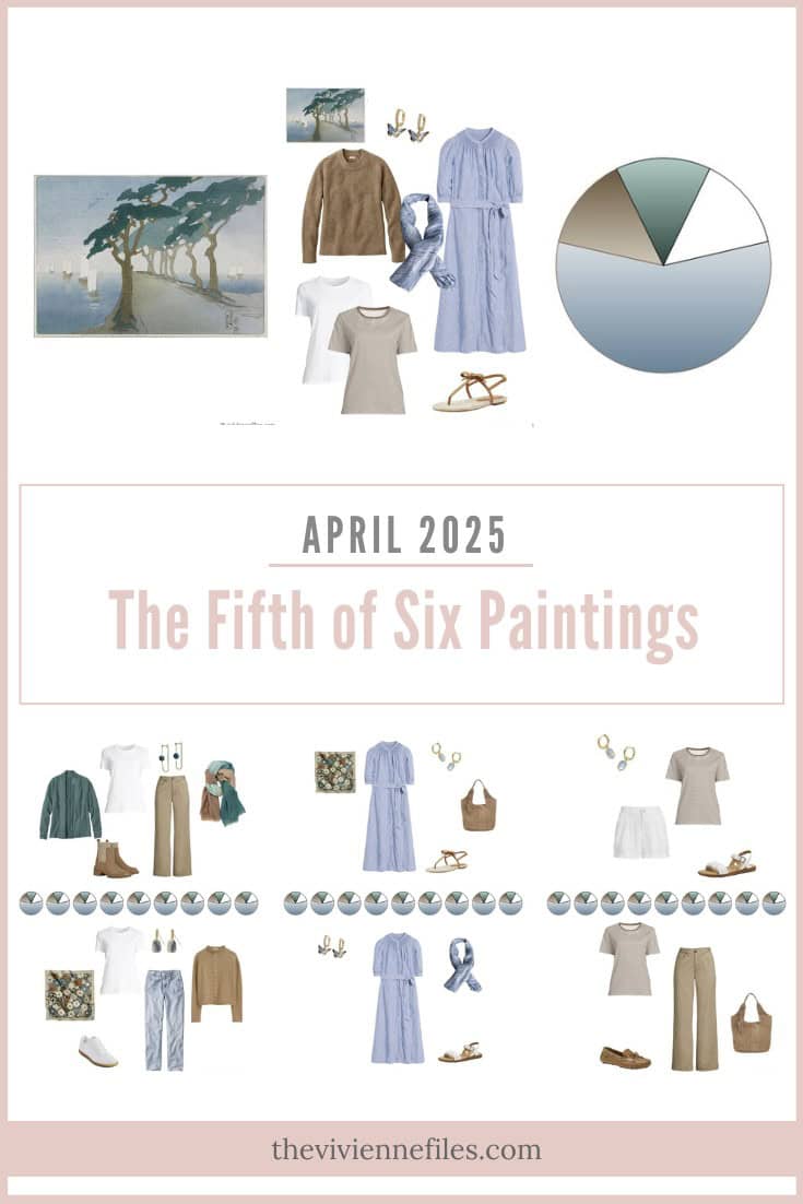
April 7, 2025
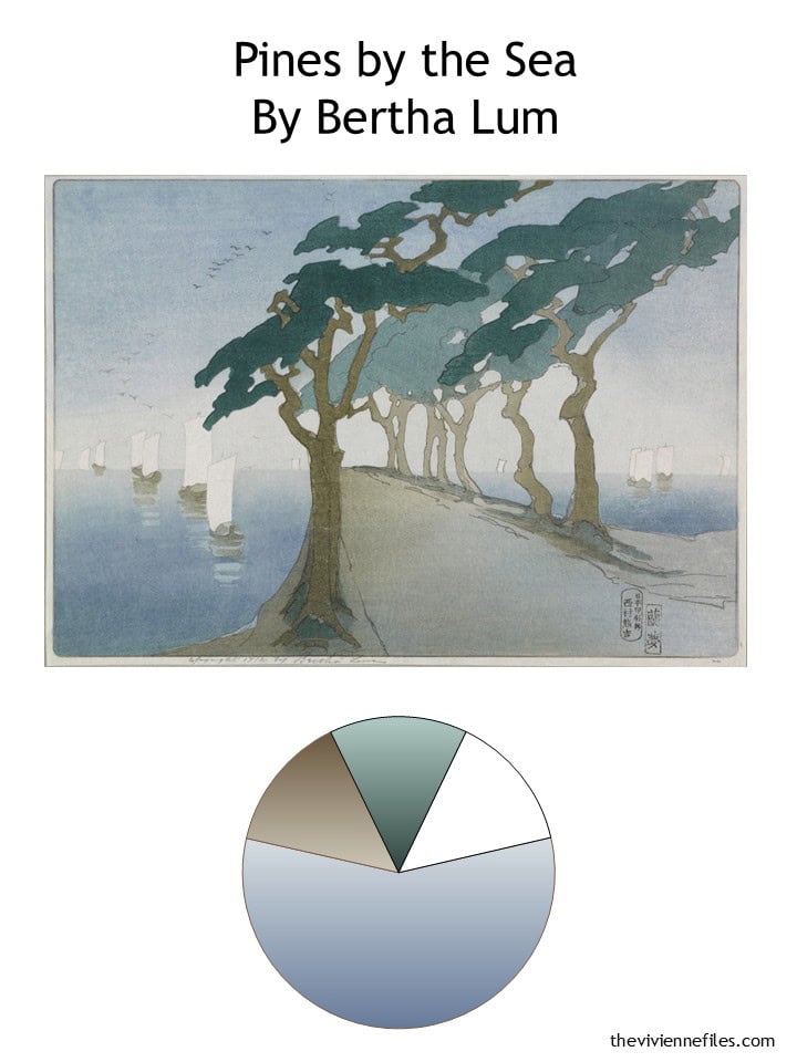
I think I say the same thing with every painting – if I were starting from scratch, THIS color palette would really tempt me…
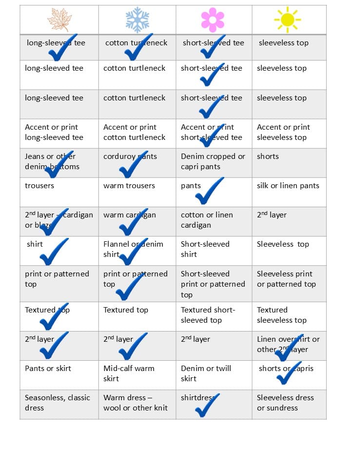
One of the things that always attracts me are the 16-piece wardrobes. This is a level at which you’re looking at an appropriate number of garments for travel – wear 3, pack 13. This wardrobe would cover you – literally – from cold weather (a down jacket stuffed into the outside pocket of your suitcase?) to quite warm days – a tee shirt and shorts, with sandals.
I’m just itching to travel… Which is good, since we’re leaving for Ireland (Fingers crossed!) at the end of the month!!!
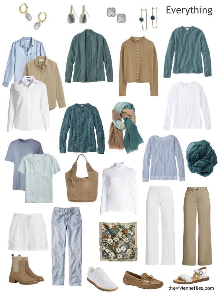
Our heroine’s current wardrobe has three teal sweaters, which is a lot! But this happens sometimes when you’re building a wardrobe, and you stumble across a LOT of one of your favorite accent colors. It’s not wrong to stock up when things are available.
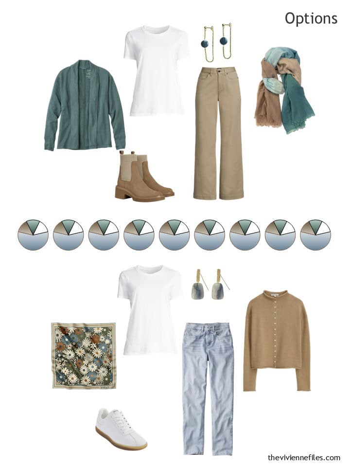
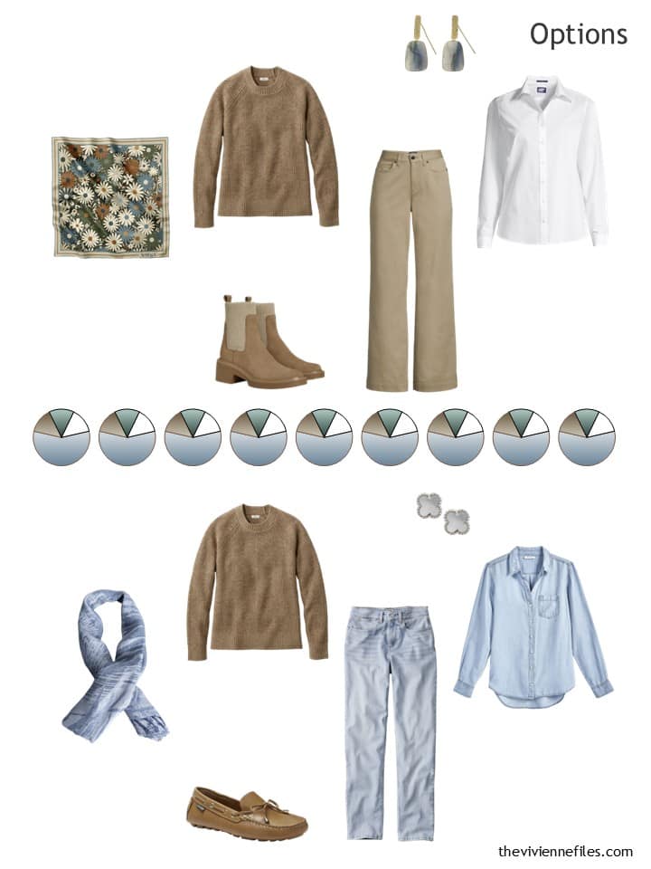
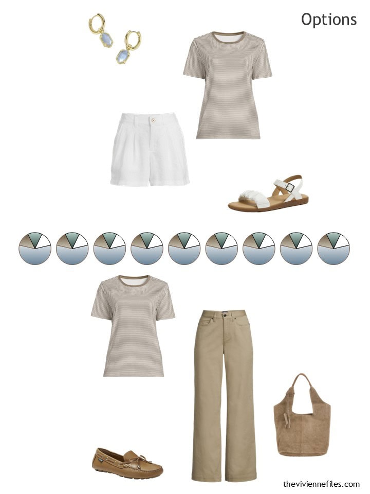
So this month, our heroine was thrilled to find a brown sweater, as well as a brown and white striped tee! She’s know for a while that she should grab a simple white tee shirt, even though it’s far from an exciting purchase. Everything you buy can’t be exciting…
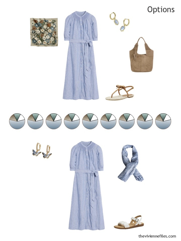
And a chambray dress! Brown sandals are obvious, and she’s flat-out copying our navy dress heroine from a couple of week ago, and buying the blue scarf and earrings that she also had…
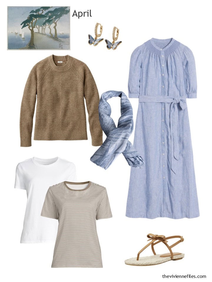
Earrings – Fable England; field khaki marl sweater – L.L.Bean; scarf – Pashmisy; dress – Boden; white tee – Lands’ End; brown striped tee – Lands’ End; sandals – Stuart Weitzman
How’s her wardrobe look, now that she has 20 pieces?
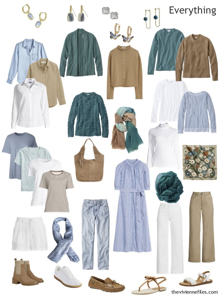
This is a good all-season wardrobe, and her Weekly Timeless Wardrobe reflects that.
Her new clothes are easy enough to wear, as we would expect!
I love the softness of these colors – even the teal is more deep or intense, and not really what you could call bright…
What do you think?
love,
Janice
p.s. Ten years ago, we were STILL looking at proportions; the addition of scarves and shoes makes even the most unbalanced of outfits a little bit more wearable!
Like this wardrobe? Save it to Pinterest!
I do like the dress but I suit sky blue better and the brown would be taupe for me. I’d also use light grey. This wardrobe would fit as a variant of the Nash from last year.
I completely agree. As a cool toned person, I also look better in sky blue and taupe
Oh I really like this. This may be my favourite painting wardrobe currently. The colours are muted and soft, not what I am usually attracted to but something is working for me. The items are fab too. Well Done Janice!
My favorite seems to vary by the month. I still like the colors of the Delauney set, but the Af Klint is really growing on me with all the neutrals plus pink. So much so that I recently bought two pink tops and a few black pieces to see how it would work with my navy and grey. Now we are getting into warm weather, at least where I am, I am wanting the lighter colors.
I love it! I especially love the chambray dress. I can just see this dress, worn with the sandals, at a Winery in Napa (or France or Portugal!) at a wine tasting afternoon event. Well done! I think this could use a bit more pattern, and the scarf in teal, brown, tan and blue adds a bit of this. While these aren’t my personal colors, I’m incredibly attracted to the idea of this scarf, which can be worn throughout the capsule.
In terms of owning multiple sweaters in your favorite color…I’m all for it. If you love the color, go for it. I have many in pink and navy. Each one is different, but these are my favorites. You honestly never know when you will see it again.
In the next round of this painting, I’d love to see a skirt (or pants) in a pattern that contains all of these colors too!
So far I have been drawn to the colors from the Paris painting, but when I went to try on some brown clothes I couldn’t find anything that suits me so I think I might have to redirect my search to this brown. Are there some names to more easily find this color online?
Janice, I’m with you. With each painting I think “wow, I could do this one” I’m not sure about the Taupe for me and might would switch it for something else – not sure what – but I absolutely adore the green. I wear a lot of green – all different shades – except lime. Well, I take that back. Sometimes I wear lime with turquoise thinking the turquoise makes it acceptable for me. IN any case. Well done.
I also love green in all shades, and yesterday I wore olive and turquoise. I also love petrol, dark green, and sage.
I still photograph my outfits every day… very interesting.
That may be the frumpiest looking dress I’ve ever seen. I had to go to the website to see how they styled it, and it looks like the best they could do was unbutton from both the top and bottom.
This wardrobe is leaving me flat, and I think I’ve figured out why – it’s that shade of light brown. I just don’t like it! It’s OK as a pair of pants but I don’t like it in the tops. The new sweater and striped T confirmed this for me. This is not to say that it’s WRONG or anything, obviously – just my personal taste! It’s interesting because looking at the color palette, I didn’t have a negative reaction at all; it required seeing it in the clothes to realize I don’t care for it. (On the right person, I bet the color really comes to life though!) I don’t own anything in this color, and now I know that I’m happy with that. I would consider substituting navy and/or grey pieces for the light brown to suit myself better, and I think I’d go a little bit darker in the denim; not dark, but just a bit more saturated than these very faded pale blue denims.
I love the colors. Finally a Wardrobe that doesn’t have black or dark Items!!! I wouldn’t have taken this many Sweaters. I often only use a 16 piece Wardrobe when traveling. The truth is, nobody knows if you’re wearing the same clothes for 2 weeks.
I love those butterfly earrings, I have been eyeing them for sometime now lol. Beautiful soft wardrobe. These colours would not suit me but I have a friend who dresses like this and she looks fab! Great start to the week.
I’m loving the teal with the white and beige….which currently would fit with my colours for spring and summer here in Canada…if it ever gets warm …here’s hoping I can wear these offerings soon.
Thanks so much Janice
I’m liking this one so much! My colors very much run to this Colorado much so, that I may consider adding a bit of sage and taupe into the mix with my pink/baby blue/periwinkle/navy/grey/cream wardrobe. Hmmm. Am I gaining too many colors though? We shall see I suppose!
Colorway! Not Colorado. Sigh sometimes my phone thinks it knows better what I want to say than it really does. LOL!
You can never have too many colours in my opinion!
Really pretty. Not necessarily my style or colours but I bet it would look fantastic on the right person.
I like your selections for this month; they bring us into spring without being summery. It’s one day cold, one day warmer here in coastal BC, you could also wear the dress with tan cardigan and white sneakers. We are not into sandal season yet, but it’s coming, and it’s good to get your sandals while there is still a selection in shops. Love the tan sweater with light jeans combo.
That greenish color is absolutely gorgeous. I really love this one, and the style of clothes is close to what I wear, too, which isn’t the case with most of the others. I love jeans and t-shirts. I don’t wear the heavy sweaters or button-ups because it’s warmer here, but I could sub tanks, nicer sweatshirts, and thinner cardigans.