April 11, 2025
Why yes, all five of these are some sort of red or brown. I don’t know what Pantone’s got in mind here, but I think anybody with some red or brown in their wardrobe is going to be very “on trend.” As if we ever cared about trends – those are for people who don’t know their own style!
Some of these colors are lovely; I’m eager to know which of these you like:
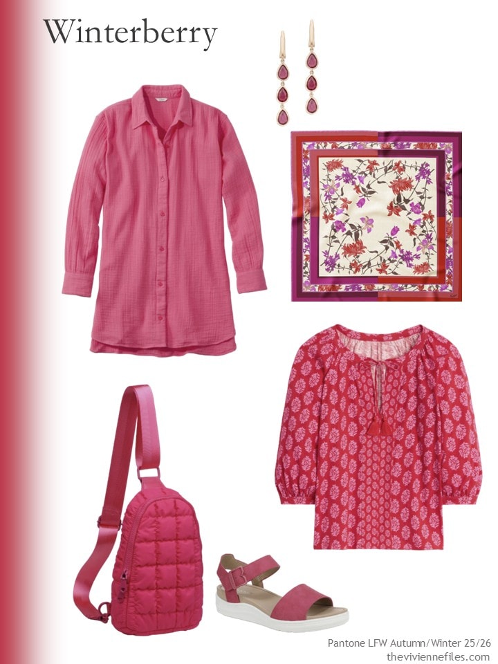
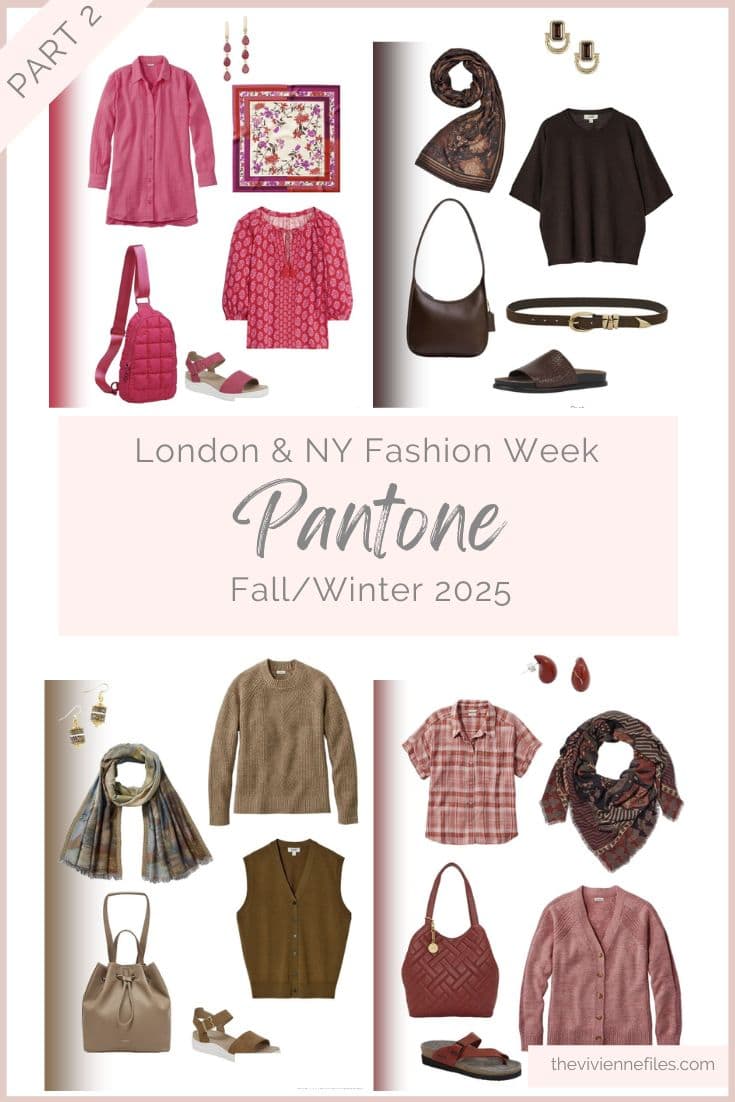
Ruby coral gauze tunic – L.L.Bean; pink tourmaline earrings – Latelita; scarf – Elizabetta; backpack – Sol and Selene; sandals – Dr. Scholl’s; print top – Boden
I’m quite smitten with brown these days – is this just finally embracing having brown eyes?
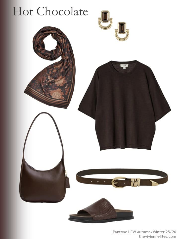
Scarf – Fable England; earrings – Retro Chic; merino wool tee – COS; bag – Coach; belt – Madewell; sandals – Vagabond Shoemakers
Chili Oil seems to be like a color that will look good any time of year…
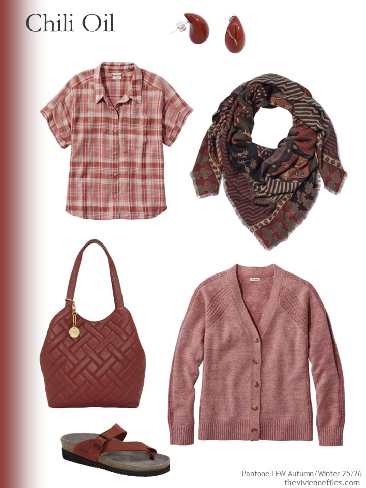
Plaid top – L.L.Bean; jasper earrings – Gosia Orlowska; scarf – The Met Store; bag – Vince Camuto; cardigan – L.L.Bean; red scr 34 sandals (no, I don’t know what this means) – Mephisto
And I clearly see this color more suiting autumn rather than summer, but what do you think?
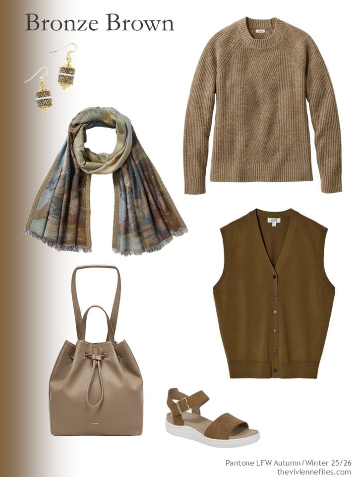
Earrings – EDEN + ELIE; sweater – L.L.Bean; scarf – The Met Store; bag – Pixie Mood; vest – COS; sandals – Dr. Scholl’s
This color is wonderful….
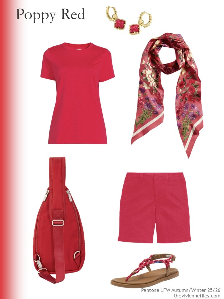
earrings – Kendra Scott; berry rouge tee – Lands’ End; scarf – Nordstrom; shorts – Lands’ End; sling bag – Baggallini; sandals – Sperry
What’s your favorite, if any? I think I’m going to take a look at the New York Fashion Week colors next week…
love,
Janice
p.s. Ten years ago, I built a spreadsheet that would calculate your cost per wear! It’s still free – if you click through and the Weekly Timeless Wardrobe worksheet is automatically added to your basket, just zero it out…
Like this wardrobe? Save it to Pinterest!
Poppy red. The other “reds” are … odd. If you’ve already got red in your wardrobe, these versions might be difficult to blend into a well-curated closet.
Nice colors this year! I would mix hot chocolate with chili oil, but I’m a soft type. For brighter types winterberry & chocolate would make really stunning combination! As for bronze brown – it looks a bit sad alone, but imagine it with summer cream (safari vibe)… What do You think?
I agree. I could totally see bronze brown in the summer with cream or ecru, or even a butter cream yellow or pale teal. Think wide leg gauze pants in the brown and then a ribbed tank or a short sleeve tee in the accent color.
Bronze! A color I could actually wear! Although the chocolate & chili are nice too. Now I want to go find a chili chocolate bar… 😊
Winterberry is my choice – a rather dark raspberry, particularly the Elizabetta scarf. The other colours are too autumnal for me. I look forward to the New York selection.
Well, call me a Smitten Kitten! I am MAD for ALL of these. But, then again, I adore warm colors. Red and brown (and all the iterations that they include) are just PEACHY to me! I’d be BLUE without them.
Okay, enough with my silly puns. I have to say that, overall, I much prefer these colors to the last set, with the exception of Lyons Blue. I think they are richer and just speak to my soul. I could honestly stock up on most of these pieces and they’d fit right in with my wardrobe. I’m particularly drawn the Winterberry (or in my definition, Warm Raspberry) tunic from Bean’s. I may try to scoot down to Freeport this weekend and pick it for my upcoming trip to Santa Barbara.
Whoops! I was mistaken. It’s the Winterberry blouse from Boden I was taken with…and just ordered! Thank you for the heads up, Janice!
Winterberry and Poppy Red for me!
I have a Pixie Mood convertible backpack (not a Leah, a Kim style, but they’re similar), and can recommend them.
Is that the hot pink one? Can you comfortably carry it in front of you? I am seriously considering it and the Dr. Scholl sandals. I love all these colors.
I haven’t seen the Leah in person, only the Kim, but guessing the convertible strap part would be the same for both. I wouldn’t rate it 100 percent as a shoulder bag, only because it’s a bit slippy, but it’s not bad. I like the convertible option for stores that won’t let you in with a backpack. As far as quality goes, I have that one and a Pixie Mood clutch/crossbody, and I think they’re quite well made.
Oh, my mistake in responding to your question: the Pixie Mood bag is with the bronze things, not the pink ones.
Winter berry and chili oil for me, please. And I really like the hot chocolate leather goods! I like the bronze brown, but as mentioned, it would suit the dark half of the year best.
Chocolate for me, please.
The other colors will be difficult to find in the store.
I have the Land’s End Poppy Red/Berry tee-shirt and it is a lovely shade of red with a hint of pink to it. I’d wear some of the other colors as accents, but probably not as my main color(s).
Janice,
The softer hues for me — Bronze Brown ( I have been waiting years for some bronze colored items), and Chili Oil . The Hot Chocolate is now too dark near my aging skin, and the other colors are too bright, for the same reason. Though I once lived on Winterberry Lane and I have that shrub planted in the landscape . Love its bright ted berries on the Winter !
* In, not on
Grooan —. Need coffee — red berries, , not ted berries
Yes to Poppy Red and Hot Chocolate. This red was a very flattering color when my (spring) colors were done a la Color Me Beautiful, still have the swatch book. Glad to see Hot Chocolate as it is much warmer than the dark, coffee color that has been around the last few years. Agree the Bronze Brown would pair nicely with cream. Winterberry is a also maybe for me, Chili Oil not appealing.
Pantone colours for me is meh, i can pass this year. I dont mind the poppy red but I wont be running out to buy anything in these trends this year. Always fun though to see how you can always come up with interesting choices Janice, just love these posts.
I love the Winterberry and Hot Chocolate!
I’m a 77 year old “autumn” with brown eyes and graying brown hair. I was immediately drawn to Hot Chocolate and Chili Oil. I wear a lot of red but the two here just donuts speak to.me and I’m afraid the Bronze Brown would wash me out. I’m anxious to see you pull together for these wardrobes.
The shade of Winterberry in the gauze tunic is my favorite of this set – the more saturated tones in that grouping are also lovely but I like the somewhat muted version for myself. I’m looking for a neutral dark brown multi-season cardigan (that works with my other brown pieces) this year, so I hope that Hot Chocolate catches on and shows up in a version that suits my wardrobe. The hint of pink in the Poppy Red shorts takes that color from “I admire it but it doesn’t work well for me” to “oooh, nice!” Chili Oil is meh, and Bronze Brown is a big ol’ NOPE from me.
I am very impressed with the cohesiveness of the two red groupings here! I feel that those colors might be difficult to match to create e.g. a Poppy Red top/pants/cardigan set. (I’m not 100% sold on the T + shorts even though they are from the same company but screens are notoriously unreliable; the Chili Oil plaid shirt + cardigan from LL Bean looks wonderful together.) But I can see building a tonal set or a French 5 with pieces used to accent outfits.
If I were to do Winterberry, for example, (which I am not in reality) I would ideally find a top (like the tunic shown), a print scarf (probably not the exact one shown but that kind of idea), ballet flats, and some jewelry, with a print garment I could wear with the top as a bonus. That’s more than 5 of course :) I’d probably look to pair Winterberry with navy as the key neutral and that would guide my choices of print pieces. I think some variant on Winterberry would be gorgeous in a solid scarf as well with that gauze or linen texture that makes it look a little softer and less saturated. The problem is finding those things that all actually work well together (as Janice knows better than anyone!).
Brown is not in my current color palette but I am wearing a brown waffle knit shirt today and I like it. I think it makes my dark blonde hair look lighter. I have just been on a search for brown clothes and I can see how well it works with different colors. You are continuously opening my mind to different possibilities. This is so interesting.
I love the Winterberry and the Poppy Red, as well as the Hot Chocolate leather goods. I have a pair of Eden + Elie beaded earrings; nice to see them here. They’d go well with my bronze ankle boots, which are more metallic than most of these bronze items, which seem more like soft brown on my screen.
Chili Oil for the win worn with Hot Chocolate! Eeeeehhhhhhh!
I can picture you in those colors!
love,
J
Winterberry!!! A photo finish with poppy red! 🙂
Vicky, those are my choices as well. Of course, I already have tops of every conceivable type and fabric in red, but that winterberry scarf is tempting.
Janice, Thank you for all you bring to your site – which I discovered 10 years ago. At the time my ‘work uniform’ was efficient and workable. But my casual attire was a mess – I often felt I didn’t have the appropriate (style, occasion, fit) clothes to wear. Since then (with your guidance) I have curated a winter, spring, summer, autumn wardrobe. I always have something to wear and I enjoy turning over my wardrobe every 12-13 weeks! Packing for short or long term travel is a breeze! My accent color for spring includes poppy red – so I’ll be on the lookout this season for something that will blend into my wardrobe. All the other colors I was admire from afar!
Amazing coincidence, but I recently saw a Purple Finch on Instagram and ever since have been thinking about an autumn capsule in those/these colors (also creamy white, as on the bird). Thanks for the additional ideas!