January 3, 2025
Here are ALL of the “cool” toned wardrobes – in the randomness of life, the warms and the cools got split down the middle. No wonder Wednesday’s post left some of you out in the cold… or rather I guess I should say the warm!
I have to warn you before next month – I suspect that we’re going to start moving right into spring clothes. It’s absurdly difficult to find winter clothes right now that don’t cost the moon, are decent looking, in the colors we like, that are available in the full range of sizes. I will NOT include something for which there are only 7 size XXXS available…
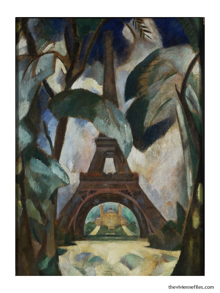
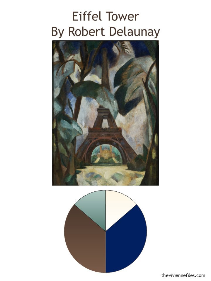
Let’s start with a warm/cool wardrobe, and a wonderful favorite painting:
Such lovely, classic colors…
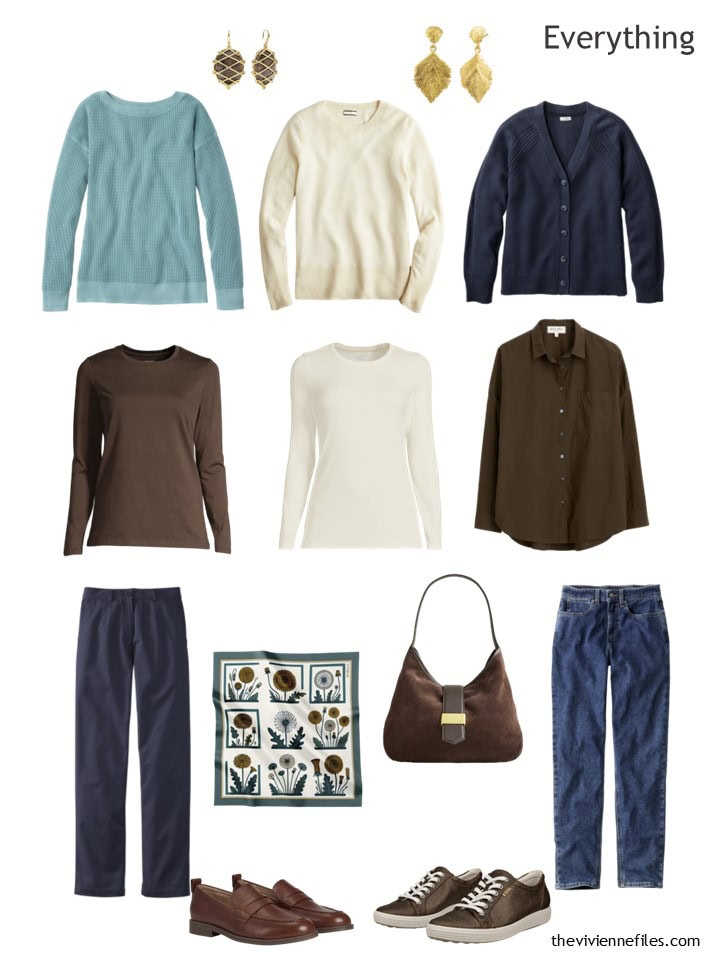
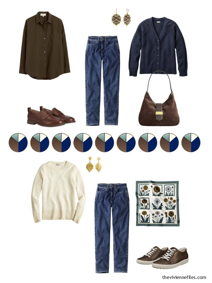
Back on Christmas Day, our heroine picked up some brown and ivory to go with her blue jeans, so for January she’s putting together a navy “suit.”
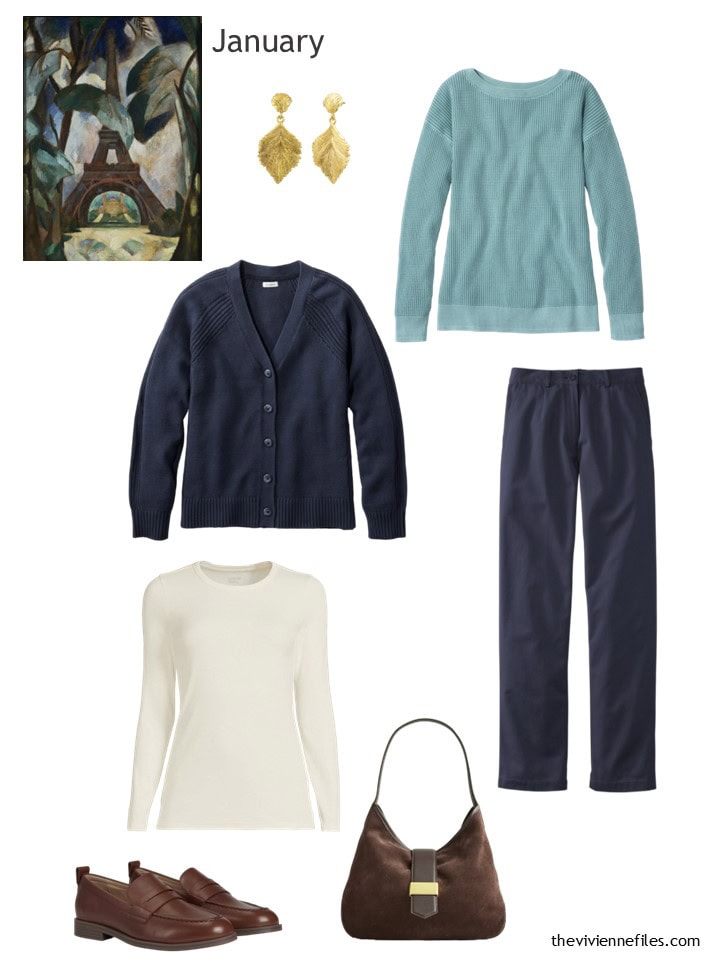
Earrings – Milou Jewelers; cardigan – L.L.Bean; dusty teal sweater – L.L.Bean; ivory tee – Lands’ End; navy pants – L.L.Bean; loafers – Cole Haan; bag – J.Crew
Wouldn’t this be perfect to pack for a 3 or 4 day trip?
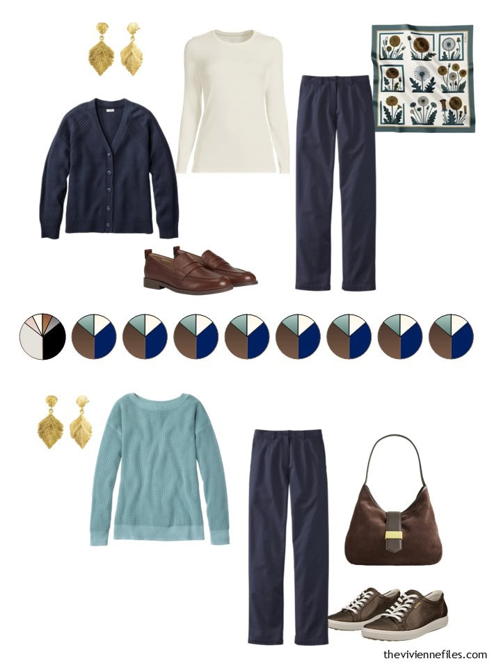
I think that this wardrobe is foolproof in that one can’t assemble a truly bad outfit from it, but let’s look at some possibilities, just for fun:
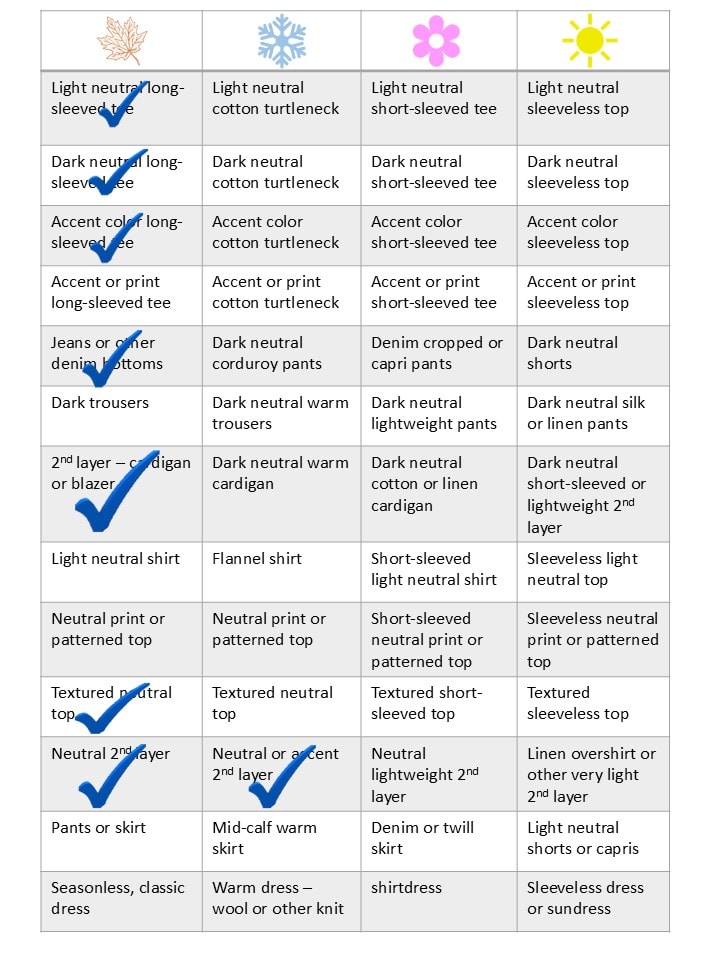
And how does this fit into a Weekly Timeless Wardrobe?
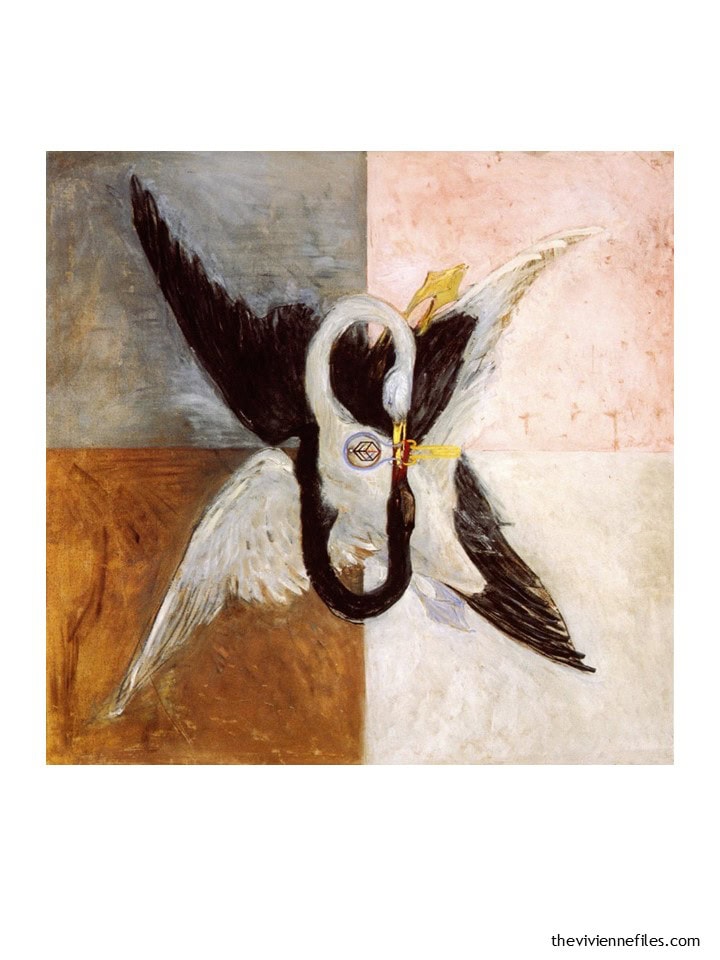
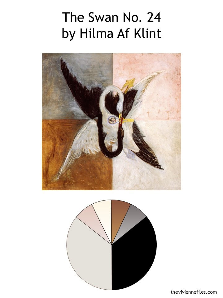
Next is this really wonderful, intriguing, somewhat enigmatic painting… What IS that symbol on the breast of the white swan? Af Klint’s art is full of symbols and mysticism – it’s kind of her signature!
I’m still pretty chuffed that she just GAVE ME four accent colors – one for each season. Very kind of her…
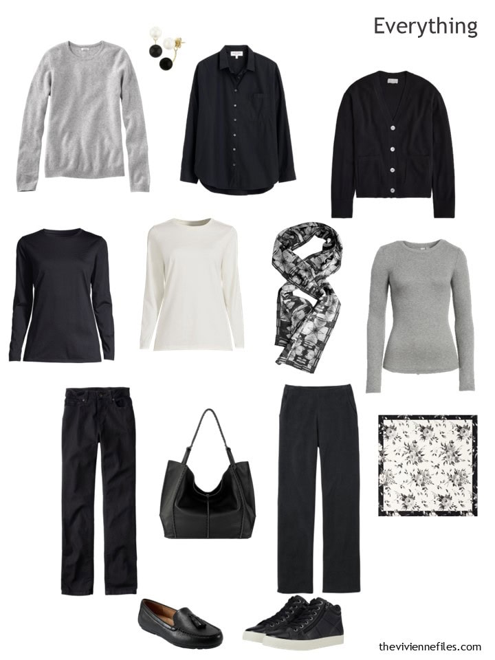
In the Christmas Day reveal, our heroine stocked up on the essential black classics; this month she’s filling in a few more black pieces and adding some of her accent grey:
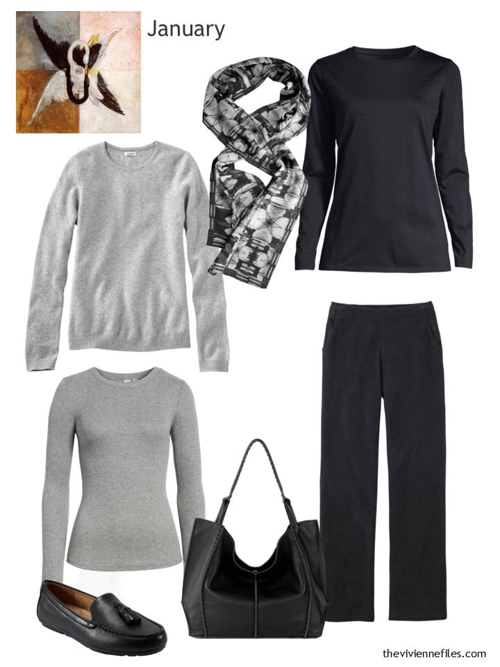
Gray cashmere sweater – L.L.Bean; silk scarf – Baby Boutique NYC; black tee – Lands’ End; grey tee – BP; bag – The Sak; knit corduroy pants – L.L.Bean; loafers – Easy Spirit
These knit corduroy pants are wonderful – I even SLEPT in mine in Paris one night when I couldn’t get warm…
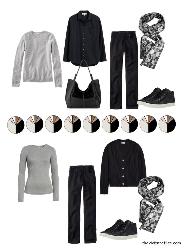
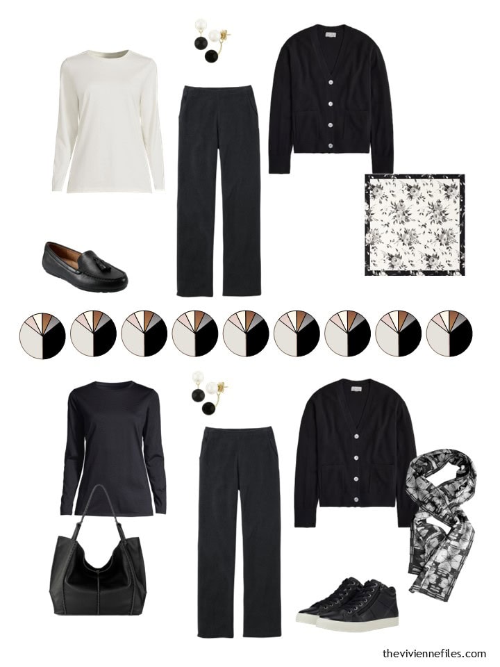
Her wardrobe is pretty monochromatic, but almost infinitely versatile. This would be a perfect wardrobe for someone with a passion for jewelry and/or scarves:
Our heroine has lots of choices – roll out of bed and wear whatever’s clean!
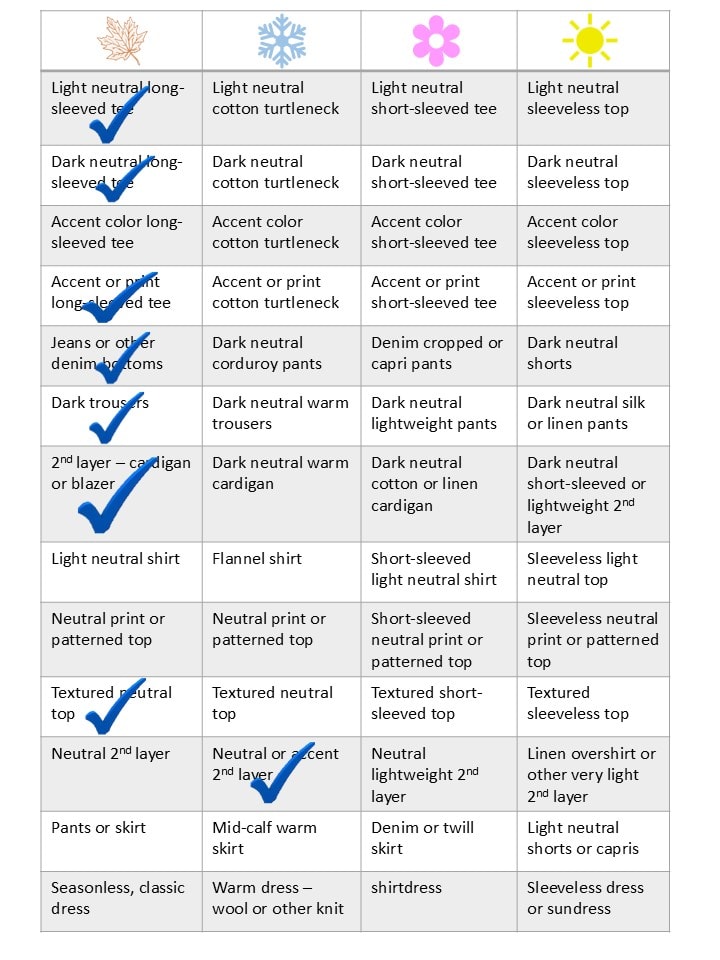
This wardrobe easily aligns with the Weekly Timeless Wardrobe because it’s pretty much all neutrals, so far…
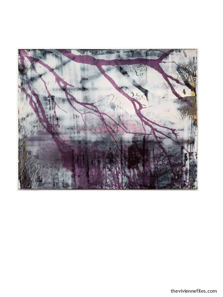
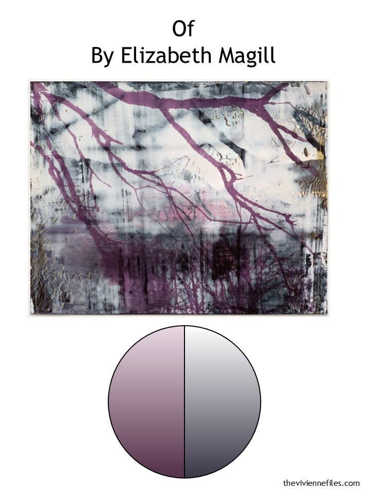
Ah, the search for this shade of plum is going to drive me crazy before the end of the year, but I’m going to really stick to the plan! I’m very eager to find the perfect scarf (or scarves) for this heroine:
The gold accents really make a difference here; at first I didn’t even notice them, but now I feel like they’re central to how this painting “works.”
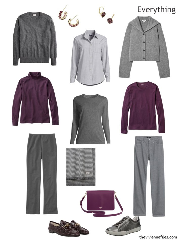
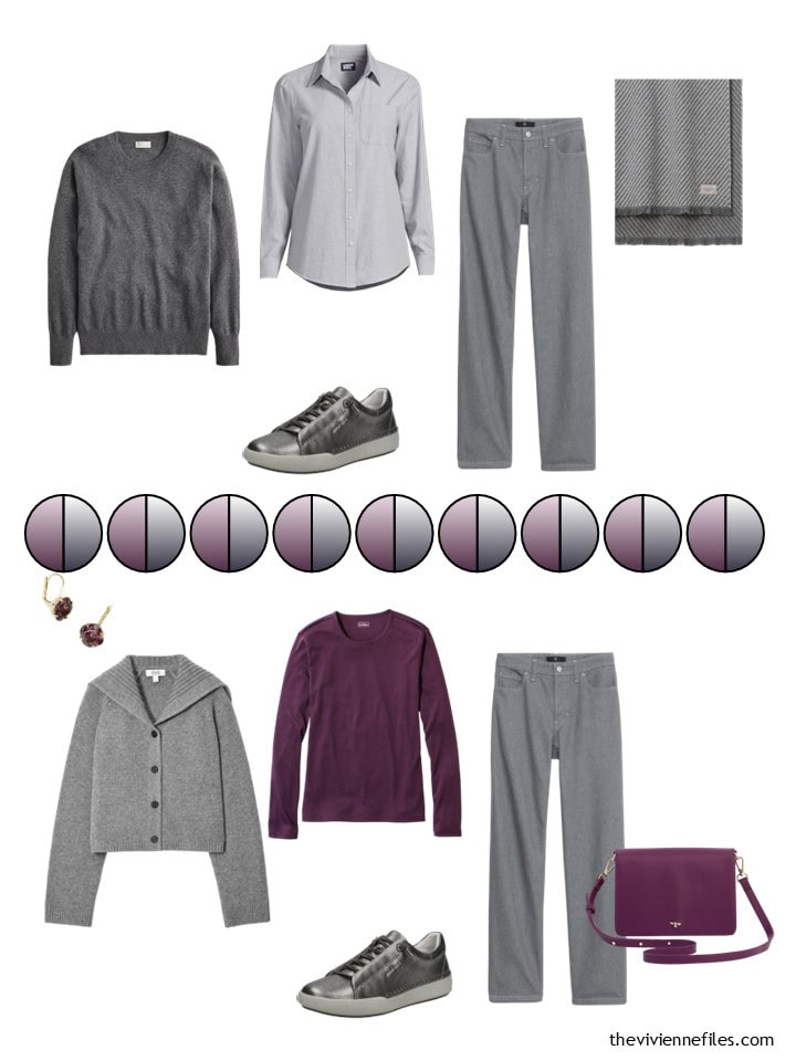
After finding four grey wardrobe essentials in the Christmas reveal, this heroine is now adding a couple of plums! Important to remember – if you find ONE thing at a company that’s in the right color, SCOUR the store or the website – there almost certain will be more.
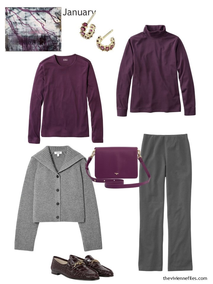
Earrings – Kendra Scott; plum tee – L.L.Bean; plum turtleneck – L.L.Bean; cardigan – COS; bag – Fable England; grey pants – L.L.Bean; loafers – Sam Edelman
Another foolproof travel capsule wardrobe – the right plum brooch or necklace, and that elusive scarf would really make this sing:
I just realized – if you’re not opposed to second-hand clothing (and you shouldn’t be!), look for the color “cassis” in her clothes. I have a wee cluster of it, and it’s VERY close to this color…
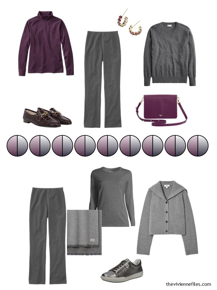
Some outfit possibilities? Heck yes!
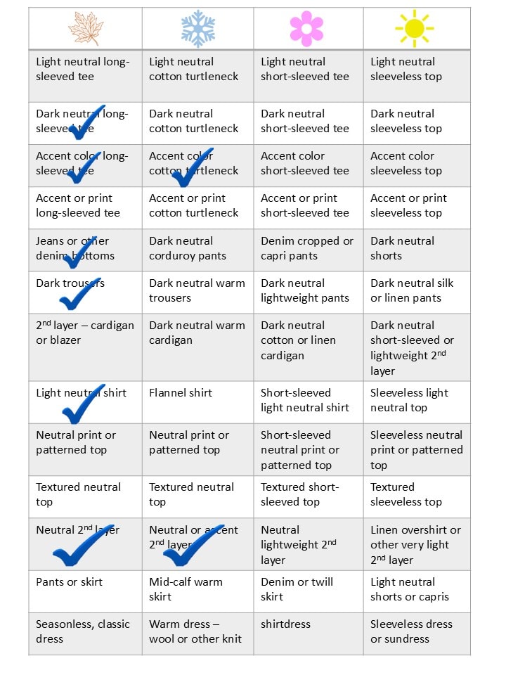
Her Weekly Timeless Wardrobe is coming together nicely so far!
Whew! That was a chore, but a fun one. After seeing all six, where does your heart land?
love,
Janice
p.p.s. I just finished Karla’s Choice by Nick Harkaway. It fits into the “George Smiley” series of novels, taking place a year after The Spy Who Came in From the Cold. I read it in ONE DAY…
Like this wardrobe? Save it to Pinterest!
I’m interested to see where these six wardrobes will go. I love doing the WTW check off with each of them. I really should try that with my clothes.
Janice, thanks for including looking back posts. I can get lost in them. And I get so much information from them. I love the one you referenced today and scrolled through all the subsequent posts of accessorizing monochromatic wardrobes. I may have to try grouping my jewelry this way. After 42 years of marriage to a lovely man that gives jewelry whenever he’s at a loss for a gift, I have plenty to try.
Thanks for your reading list. I read Siddhartha in junior high and I’ve thought of revisiting it.
I recently read The Women by Kristen Hannah. Right now I’m reading fluff. I like to change up the genres or I get burned out. I love seeing what others are reading. They give me such great ideas.
What fun these are! I have to say that even though I am drawn to warm tones, the Delauney and Klint are my favorites of all six of the paintings and inspiration. Personally, I have think that beginning Spring clothes in a bad idea….for those of us who live in colder, northern climates, it’s fun to daydream about warmer days ahead!
In terms of the plum, while I’m not a purple wearer, I do think lilac would look magical for those who partake too. It’s close enough and it might be a bit easier to find for spring and summer pieces. What do you think?
Ohhh – lilac is a great choice. I like burgundy/wine/cassis from September through Jan/Feb and then I get bored with it but trading it out for lilac is an excellent idea. I might have to try that come spring.
Well, this is interesting. I normally think of myself as a “cool” person, and I like all these paintings. That being said, much to my surprise I like the “warm” wardrobes of Wednesday better than these cool colors. And I was so excited about the Magill painting, yet the wardrobe leaves me a little “meh”. This may require some thought! 😂 Have a lovely weekend everyone.
My heart is with the first one, the O’Keefe …. This is my wardrobe as a light spring, although I have added tones of orange red, chartreuse green both bright and light …. I look best in clear colors with my Spring coloring. Very excited to see where this goes. Living in a tropical climate, whites are my dominate neutral. I am sure to find some items in this wardrobe to buy new. Many of my clothes are thrifted, amazing what you can find in mint condition! Please include necklaces! Scarves are too hot and are almost never worn here, even on a purse or pony tail!
Grace
The grey COS cardigan in the Magill set–that has a very nice cut, different from traditional (meh) cardigans.
Yes, I love the grey cardi. Such a nice collar.
Isn’t that a nice, classic update on the usual plain neckline? Nothing radical, nothing that will date or go out of style, but not something you see every day. I was delighted to find it!
love,
Janice
I have a lilac cardigan with the same collar. It makes it a bit smarter and could be worn instead of a jacket.
I love the swan painting so far! I’m a sucker for grey and black. It looks so chic to me.
These paintings are wonderful! I especially like the Eiffel Tower and Pines by the Sea. The palettes are almost the same, but different in intensity. At the moment I could combine both these wardrobes and be extremely happy with them. I look forward to seeing them develop.
I like both the warm and cool wardrobes. I lean more toward “bright spring” colors, but sometimes need some cooler neutrals. I’m excited to see how they all develop before deciding on a favorite.
Janice,
Happy 2025 !
On the Klint — my monitor is seeing the dark value as a deep brown, rather than black , which would work much better for me, although I have had to temper all dark values as I continue to age .
I am looking forward to your development of all of these groupings !
Hi, could you post a fresh copy of the Weekly Timeless Checklist, minus your checkmarks please and thank you? I find it a great tool but would like to add my own comments as I create from your suggestions.
Many thanks and Happy New Year.
Denise
If you want Janice sells the PDF for 99 cents with room to write your own clothes in each category! https://www.theviviennefiles.com/the-vivienne-files-document-store/
The Delaunay is my favorite.
But why does the Eiffel Tower only have 4 colors? I can still see the dark green of the tips of the leaves and a bit of gray in the background.
I’m looking forward to all of your growing wardrobes, especially the Klint one will be exciting…and the Magill one in the color plum (I can imagine a pinch of b/w there).
I adore the first palette but I will do it with instead of the green with a pinky peach color and probably more coral for the Summer!! Just a Beautiful Combo!!
Happy New Year. I pray for you to have a healthy, productive year.
Love seeing you in my inbox.
Really enjoying the bonus reading recommendations.
Thanks for all you do!
I would love to see some color injected into the Hilma af Klimt-inspired wardrobe. The pale pink, ivory and caramel from three of the four background squares would look great together.
I hadn’t really considered navy and brown together but they seem to play well.
After seeing all these beautiful wardrobes, I think that the O’Keeffe is still my favorite this year. I’m just a sucker for warm blues and greens!
I love the first one! I’m using navy, grey and white with soft blue green and soft blue for accents now. That brown is calling my name! It looks so rich with the navy. And that green sweater may just have to live with me.
Happy New Year to all and thank you Janice for providing such incredible posts for us. I never tire of seeing new ideas.
I’m loving the grey and plum wardrobe! The plum isn’t a colour that I have in my wardrobe but I’m considering a small accent cluster in this colour. Thanks for links.
If the plum is impossible to find in spring/summer, perhaps a lighter lilac/lavender would fit with the grey?
That’s my thinking too – I don’t know that plum will be around much in warm weather, but lighter shades of it – sort of a cool pinkish thing – might be where we go.
Great minds!
love,
Janice
I can see me using inspiration from all except the Johansson. Beautiful just not colors for me. Of course I still might get some style inspo from it! You are a genius at that. I really love the Magill and I can see where that shade of purple/plum will be tricky. Surely somewhere there will be a scarf! Looking in my closet (which I sort by garments and color) I see really different shades of it. Tracking everything with clothes I already own and mentally sorting them into WTW using 2 seasons instead of 4. It works for my climate. So looking forward to the 2025 posts. The book recommendations are a bonus. Big reader here and several mentioned I have read but also learned about some new.
OMG I love those burgundy loafers! But how do I justify a third pair of burgundy flats?😁
I have more than a couple of pairs of black shoes… Put them in your shopping basket for a day or two and mull it over…
love,
Janice
Love the reading recommendations. For those who want to support a local bookshop, here’s a link to Karla’s Choice via bookshop.org. You can choose your favorite bookstore to receive the full profit from your Bookshop.org purchases. I have made many purchases and am happy with my transactions.
https://bookshop.org/p/books/karla-s-choice-a-john-le-carre-novel-nick-harkaway/21035352?ean=9780593833490
OMG, I love the painting by Elizabeth Magill!!!! I already have pretty much all of the items in gray and plum. I have “secretly” loved plum and purple for years. Recently I leaned very heavily into gray as a neutral in my wardrobe. I have all of the items plus a few more laid out on my bed and will be creating an area of my closet for this wardrobe as it gets added to throughout the year.
I use the app Open wardrobe, and have created a wardrobe of this painting and am looking forward to what you find through out the year, ( scarves, I am looking at you.)
My only change is that my metal of choice is silver and that won’t change.
Happy New Year!!
All great paintings and wardrobes. This second round of choices really improves them. I love Pines by the Sea and Eiffel Tower. As Lesley, above, noticed they are a similar palette. And both suit me just fine. I am thinking of working Eiffel Tower in cold weather and Pines by the Sea for warm weather. I have been searching for a second neutral to go with my navy since I quit charcoal and grey. I browsed some year end sales and found various dark brown items, inexpensive in case this is a mistake, lol. And I had been trying to work olive into my plan, but just wasn’t feeling it. Teal, however is just the ticket! So I’m starting the year, hopefully, with a workable plan, thanks to Janice! I look forward to seeing how these develop. And find the book recommendations interesting!
It’s been years since I bought a new silk scarf. The Artifact. Dandelions scarf arrived last week and oh my goodness it is beautiful! And so beautifully packaged, I’m still enjoying looking at the box…and the envelope with its wax seal… I’m waiting for my brown shirt and tee to arrive, and now I’m eyeing that handbag from J Crew. Yesterday I found a glossy shoulder bag in that perfect metallic bronze colour at the thrift store for $8! Thank you Janice. The Eiffel Tower wardrobe is delightful and so very different from anything I’d have ever come up with.
I was so happy you showed the Brooklyn Bridge scarf. The assistant (and then head) engineer went to my alma mater, and I love the design, so I bought it before finishing the post. Thank goodness it’s very reasonably priced.
Well I shall be spoilt for choice this year – O’Keefe, Lum, Delaunay and Magill. The first three will continue my adventures with blues other than navy, teal and taupe/brown. I’m intrigued by new colour combinations. The Magill is perfect. I’ll be ticking off items on the WTW list.