November 7, 2024
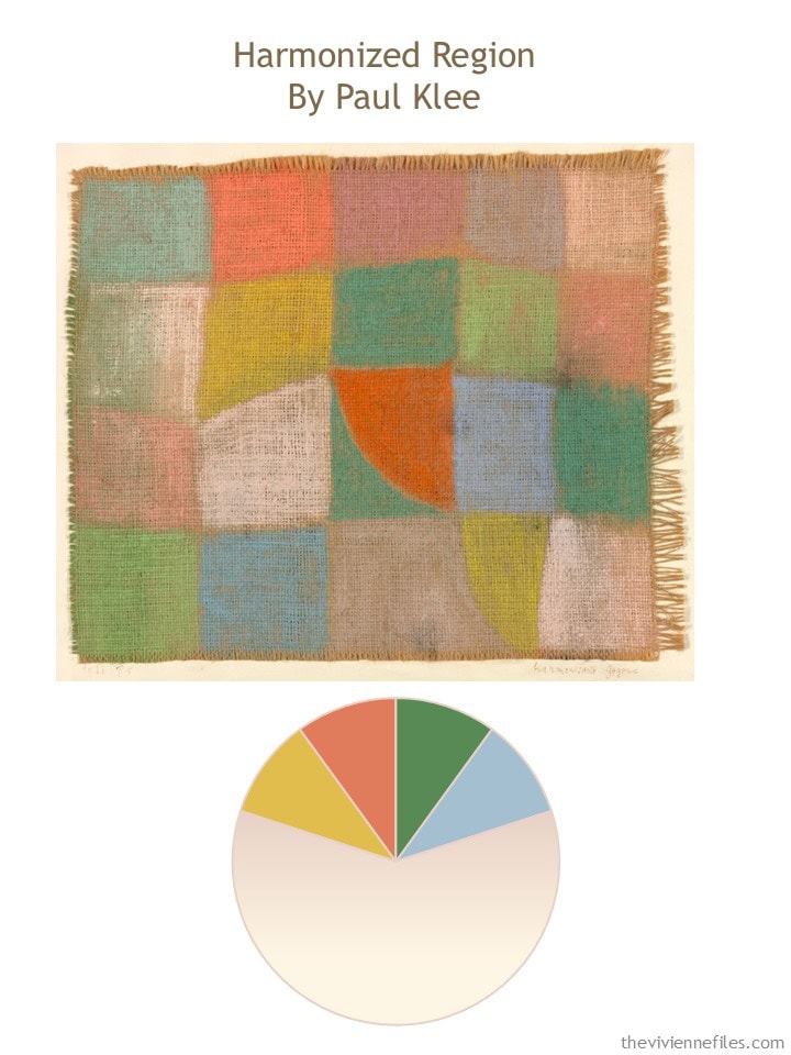
This painting both delights and confounds me; I think that’s good!
This heroine is committed to the beige core of her wardrobe, and her unusual assortment of accent colors – two soft ones, three bright ones.
But there are no rules about this kind of thing, so it makes sense ONLY to choose what delights you.
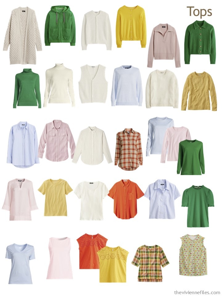
Coming into November, our heroine has a lovely, wide-ranging assortment of tops:
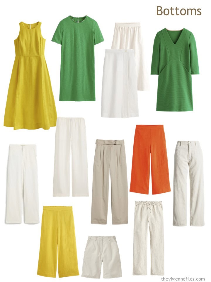
And she owns three dresses! Maybe sometime, she’ll come across a printed dress, or a pastel one, that speaks to her. And I’m sort of tickled that she has the same pants in yellow AND orange. If you love something, there’s no reason to avoid a duplicate…
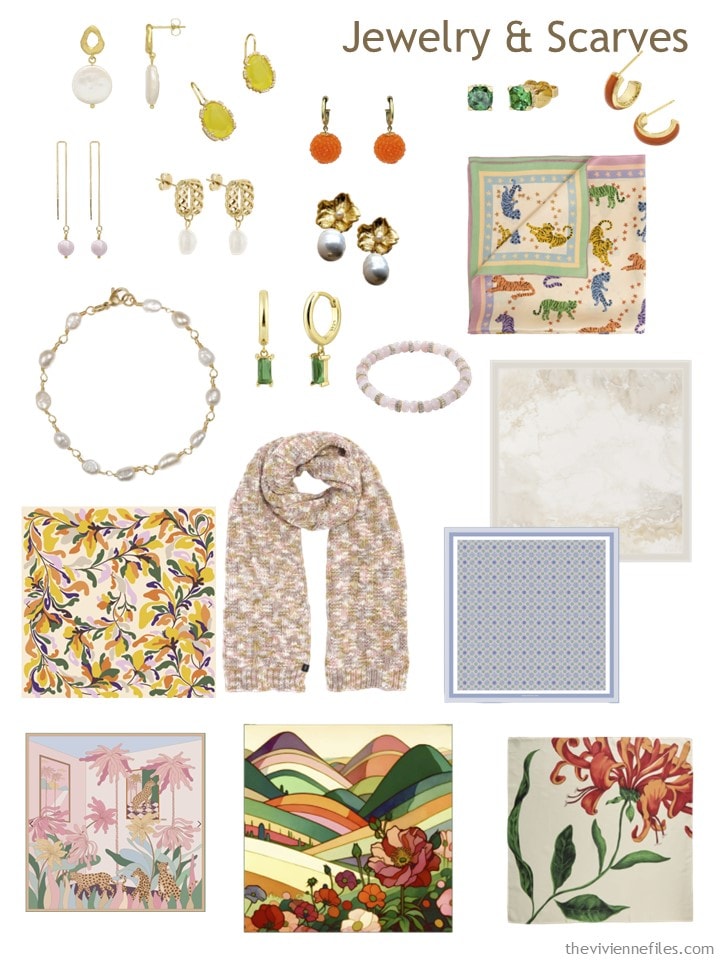
Her scarves and jewelry are pretty delectable:
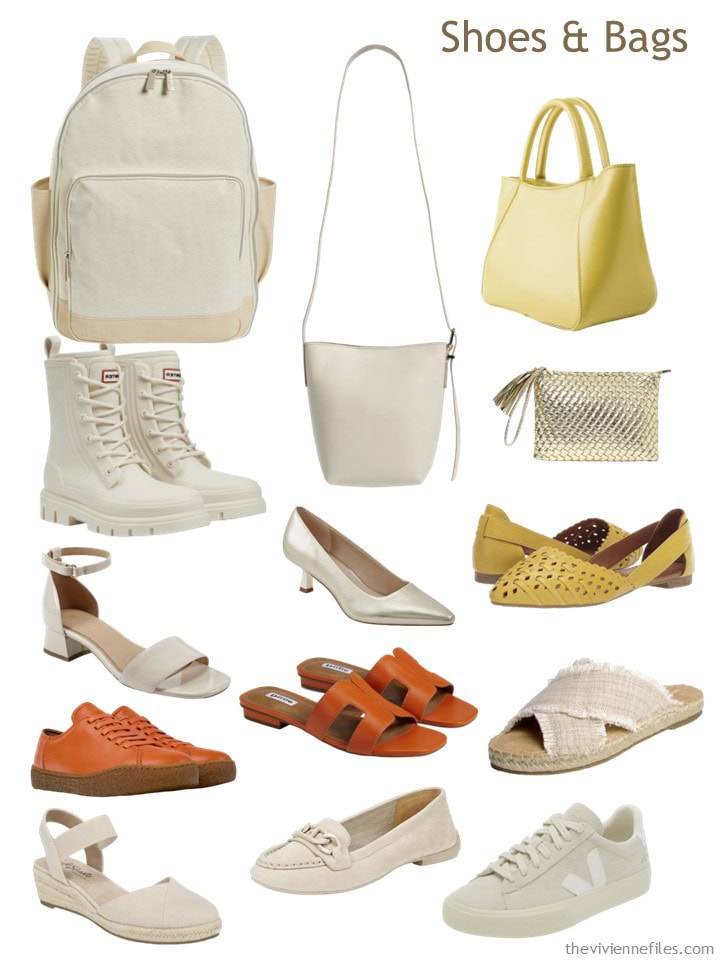
And she’s the rare woman with TWO pairs of orange shoes. They’re quite different styles, so why not?
When she sets out to make necessary additions to her wardrobe, she has only some vague thoughts… a bright accent or two, something WARMER (even for a heroine who lives in a warm climate, sweaters and such might be necessary).
For accessories, she just keeps her eyes open, and her “whappage meter” turned on full blast…
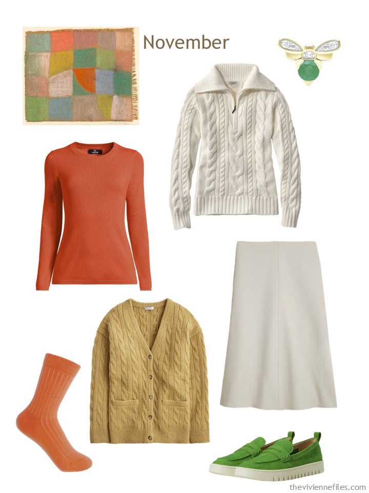
Papaya cashmere sweater – Lands’ End; cotton quarter-zip sweater – L.L.Bean; bee emerald brooch – Gemondo; socks – Peper Harow; honey brown cardigan – J.Crew; ivory skirt – J.Crew; green loafers – Vionic
For some of us, it might make a lot of sense to focus on one “need” at a time, like buying a dressy suit and tops all at the same time, like yesterday’s heroine did.
But if you can remember all of the various things that you need, you can get all of your shopping done at once!
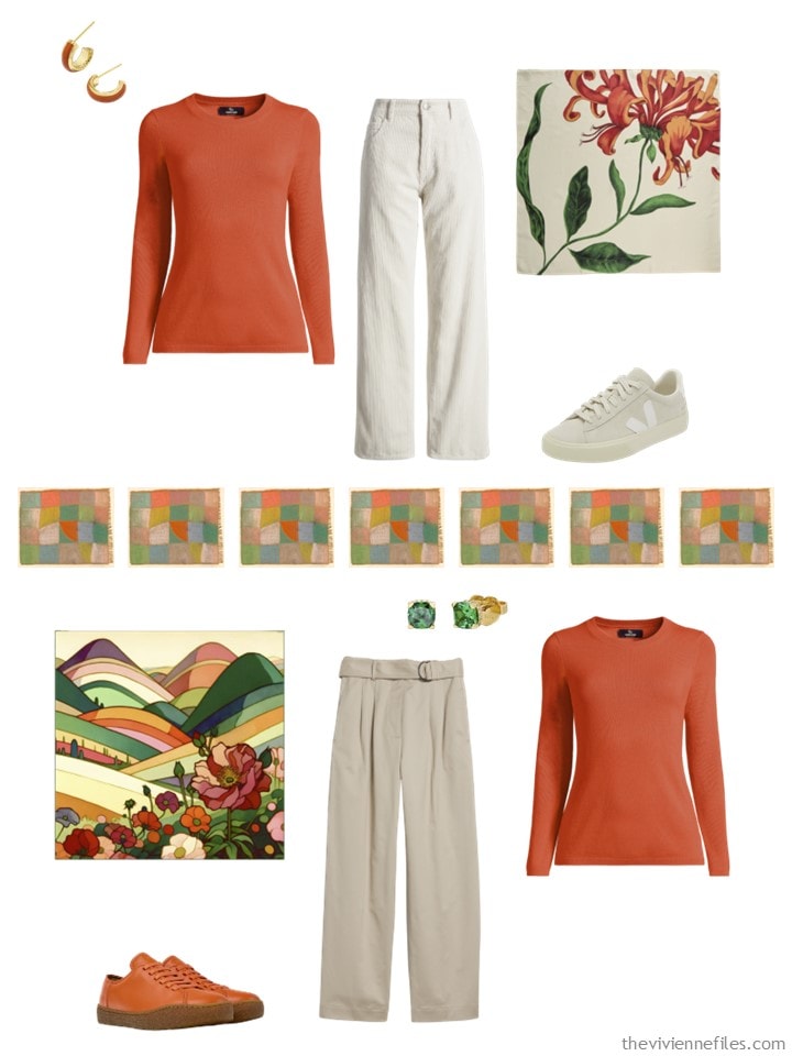
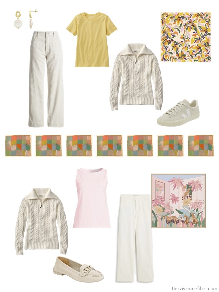
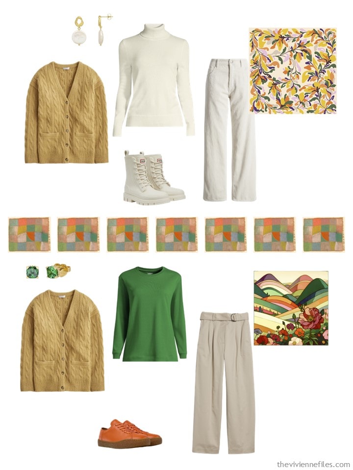
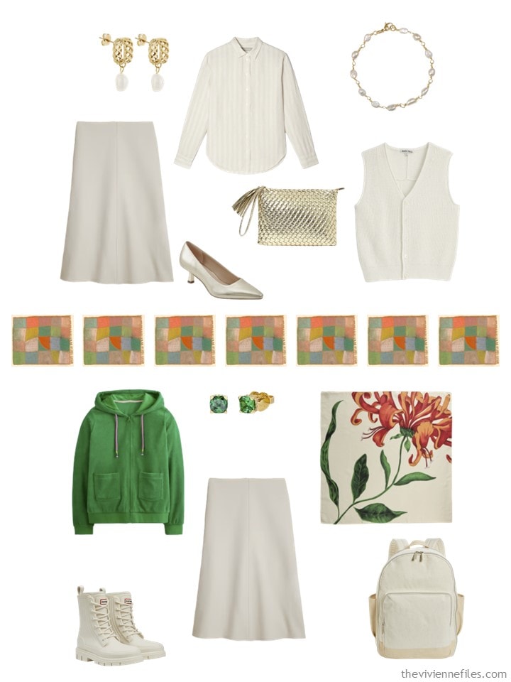
Her new clothes give her at least eight new outfits, but I will only show you eight…
Of all of the wardrobes we’re looking at right now, this is the one that would drive me crazy – I do NOT want a bunch of different colors in my wardrobe. Maybe I’m an exception?
love,
Janice
p.s. Ten years ago, I started with a photograph of books, as the inspiration for our wardrobe of the day! It’s a lovely photo…
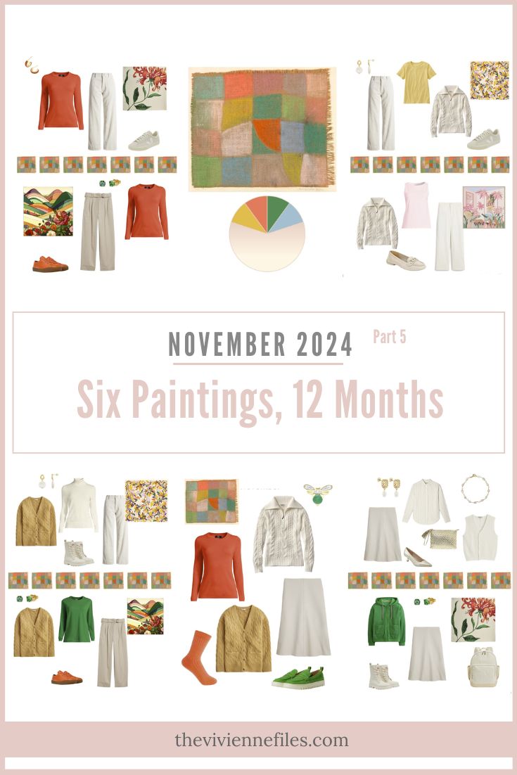
Like this wardrobe? Save it to Pinterest!
I don’t know if you are an exception, I do know I have a closet of many colors. Somewhere here referred to a “crayon” closet? The thing that drives me crazy on this is having both bright and pastel colors. To me that doesn’t make sense. However, it doesn’t have to. I like the overall feel of this one better than yesterday’s “dressiness”, and the one flower scarf is just amazing.
someone here – not somewhere. jheez.
I’m sure you’re not a rare exception, Janice, but I would guess there are loads of women like me who need more colour. I could probably quite happily live with a wardrobe built on today’s template, only using my preferred colours: navy, white and the cool colours on the colour wheel (plus a couple of shots of pink or magenta).
All of my bottoms and second layers are solid colours as are many of my tops. But I find I need pattern and that comes out in my scarves and tops. Paisley, stars, a few florals, polka dots and a couple of very different striped dresses all keep it interesting – yet surprisingly interchangeable – for me.
Single or dual-toned wardrobes make me feel like an exception but I know that no one is an outlier. Vive la difference! 😄
My wardrobe is primarily blue, white and like Wendy, has a bit of pink. I plan to start eliminating the white as those items wear out The brassy tones of my white hair is most evident when wearing white. So I have very little variation in color in my wardrobe and I wear only solids. A real oddball! For some reason though, I feel like chucking my whole beautiful blue wardrobe and wearing all black lately.
You could try replacing the white with a warmer undertoned cream. My grandma did that when it turned out her white hair was sort of brassy. She looked lovely in cream or antique white and ghastly in pure white.
Thank you, Pepper! I can’t wear warm tones at all; I guess my coloring is on the really cool spectrum. White is not too bad worn under a layer as long as just a bit of it shows.
Oh, Janice, I love what you do but we are so different! First, I avoid black, especially above the waist, but I also think I’d wither up and die if I only had four or five colors in my wardrobe. I look at the wardrobes with only one accent color and admire the woman who is content like that. But I’d be depressed within a week. Color and variety are extremely important to me. I doubt I have ever worn an all neutral outfit more than once or twice a year. So, while I’d only consider wearing the green in this wardrobe, the feel of it appeals to me.
I love colors and wear with my green base red orange purple and turquoise. But I’m not crazy about the pastels with these brights in today’s wardrobe. Love the brights, just the mix feels awkward. Maybe it’s the combo of the pastels being pink and blue. I wonder how it would feel if the pastels were green yellow and orange.
I have to agree that this wardrobe is the one that appeals to me the least. Mixing bright spring colors (if you’re using seasonal color analysis) along with light summer pastels is really jarring. I don’t know if anyone would be able to fit both styles. The basic values of those two seasons are so completely opposite as to boggle any attempts at mingling them satisfactorily.
If I were to redo this one, I would look at the undertones of the person wearing it. If she looks better in cool colors, we would drop the warm and bright tones like a hot potato. If she has warm golden tones in her skin, the pastels would be gone in a flash.
Then we would do the same for her neutral. Focus more on warm creamy beiges if she’s going for warm colors, and softer more muted cool beige if she’s going with the pink and blue.
If we still wanted the wide variety of color, you could translate them from one season to the other.
For a summer, the bright green could become a muted jade or soft mint. The orange could be shifted to a soft pinky peach, and the bright yellow to a pastel lemon.
For a spring, the pink could become a hot fuschia and the baby blue could become a vibrant turquoise.
Either way, I think it would tie the wardrobe together more harmoniously and make it much more joyful to look at and to try to wear.
It’s really fun thinking through what I would do to tweak it for different people!! Thank you so much for making this one such a challenge!!
It’s a good analysis. While this wardrobe doesn’t work for me, I also crave the color variety. In my case, I tan very easily – enough to change my contrast significantly in the summer (low contrast) vs winter (high contrast). So I really can wear colors that don’t at first glance appear to belong in the same wardrobe for one individual! The hard part for me was trying not to buy summer clothes that suit my winter contrast…
I would call this wardrobe “difficult”. And really, isn’t life difficult enough without having a “difficult” wardrobe on top of things?
I’m trying to remember that one person’s difficult wardrobe is another person’s ideal. I know that a lot of you would HATE getting dressed in my closet, if you don’t like wearing a metric ton of black, black & white prints, with dashes of purple or brown. Some years, I pick paintings that feel like they go off the rails, but then I remind myself that THERE ARE NO RAILS!!!
love,
Janice
It’s so fun watching these wardrobes come together! And hard to believe one person does it all. I bet you have to keep your plotline straight for each character or the collections would go off the rails. Your collections have challenged me to think more cohesively about my wardrobe purchases and I have weeded out items as they lose their practicality. Shoes are forever a work in progress! It’s a pain finding exactly what you want versus what you need AND having them be comfortable!
I enjoyed reading all the perspectives in this thread. Like Cindy, I have had an urge to wear all black lately. And I weeded out every black item a long time ago! Dark grey will.have to do. This ‘week of wardrobes’ has been instructive. Even the ones I could never wear challenge me to see my own clothes in new ways.
I am a warm spring in coloring. Beige, Black look terrible if near my face. I love lots of color, bright and warm, bring it on. I also have a love of prints and happily mix them, within some rules so they relate to each other. My neutrals tend to be white, beige and navy mostly not near my face, lol. They can wash me out. The bright green is among my very best colors and I would wear any of those garments.
I love the fact that there are no rails here – it’s wonderfully liberating after all the “perfect capsule” content out there! It’s also allowed me to admit to myself that I’m just not fond of neutrals. Period. So I’m phasing them out of my closet and am so much happier for it! The closest I come to a neutral these days is kind of a cobalt or royal blue, and the rest is color!
and I’m already thinking about combining the lighter colors in the Nash with the darker Eiffel Tower painting.
With around 52 pieces you can combine around ten French 5s.
🌈
In this capsule, the heroine just likes all these colors and has a preference for this skirt color. (maybe one with a floral pattern).
Of course I know a lot of people who wear black and we also have a green lady here.
I’m a Florida resident and this wardrobe inspires me to think about a late fall style with a off-white neutral base. It’s still hot here so it’s hard to dress by the calendar. I may not go with the citrus colors but I think there’s an opportunity to retire the flamingo colors of summer and introduce other color options.
Interesting to me is my need for a variety of colors, but those colors all being neutrals! Black, white, navy, grey, and olive. The only other colors I have are pink and burgundy. And I have only two items in each of those colors. My sister says I’m boring, but I feel comfortable and like my authentic self, so I can justifiably ignore her comments. 😁
Absolutely! Do you – I’m convinced that at least 80% of style is how we feel in our clothes. If you’re comfortable and confident, you can be your best self! 😁
Colour is so important to me, so I love that you’ve included 4 accent colours. I know people who are spring-summers so these colours would work for them.
For myself though, I’m a dark summer, and I look great in those pastels and cool beiges. I would definitely drop the yellow. And I would change the warm orange to the coral colour at the top left of the painting.
Even though I’m a summer, I look great in that green, I think maybe it’s a “transitional” colour that crosses both cool and warm palettes, the way turquoise, chocolate brown and olive green do.
And for my fourth accent, I would choose a dusty pink as seen elsewhere in the painting, or a cool lemon yellow, leaving me with 4 colour options: lemon, coral, green and blues.
It could really work for me.