September 23, 2024
Ah, one of my favorite projects! “New” colors are always fun…
I feel like the Pantone people had a meeting at which they decided that their work needed to be more “green,” and that someone misunderstood the assignment. Lots of shades of green in this list!
But let’s start with Orangeade, which I kind of interpreted in a more rust direction, for autumn:
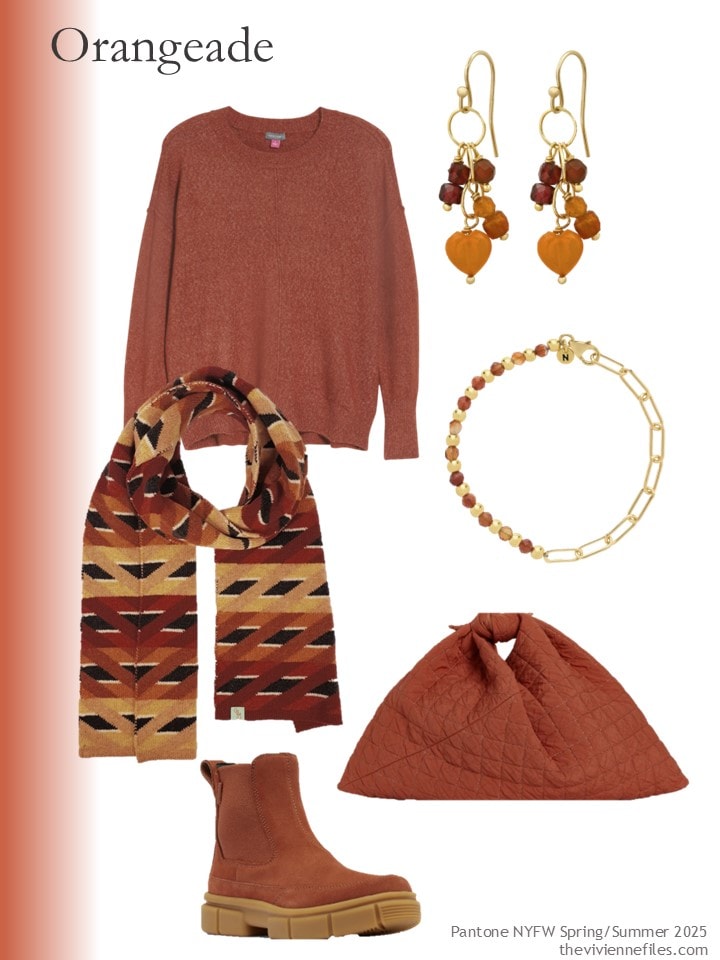
Sweater – Vince Camuto; earrings – Soul Journey Jewelry; bracelet – Nellou Jewellery; scarf – Otto & Spike; boots – Sorel; bag – Niran
I like this warm light brown, but I might have tried harder to give it a more appealing name than Bran…
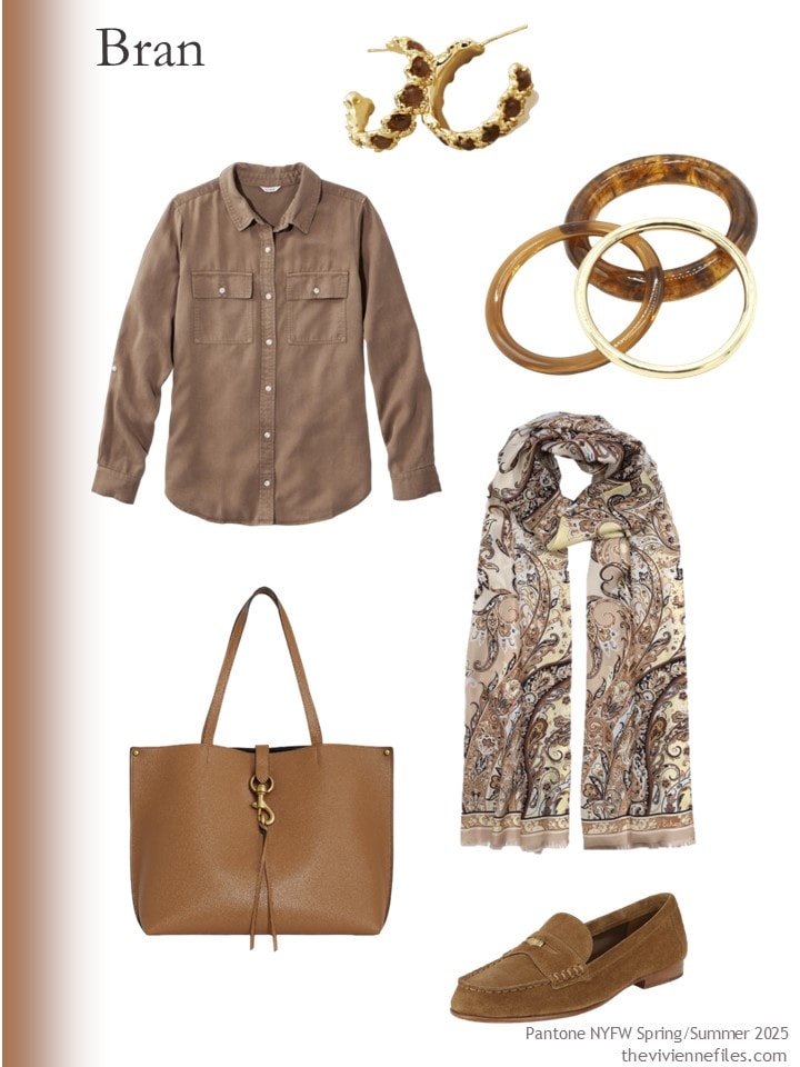
Shirt – L.L.Bean; earrings – Anthropologie; bracelets – Sita Nevado; scarf – Echo; bag – Rebecca Minkoff; loafers – Veronica Beard
I don’t know why you’d take a nice shade of light camel and give it a slightly greenish cast…. OH WAIT, this is the green season…
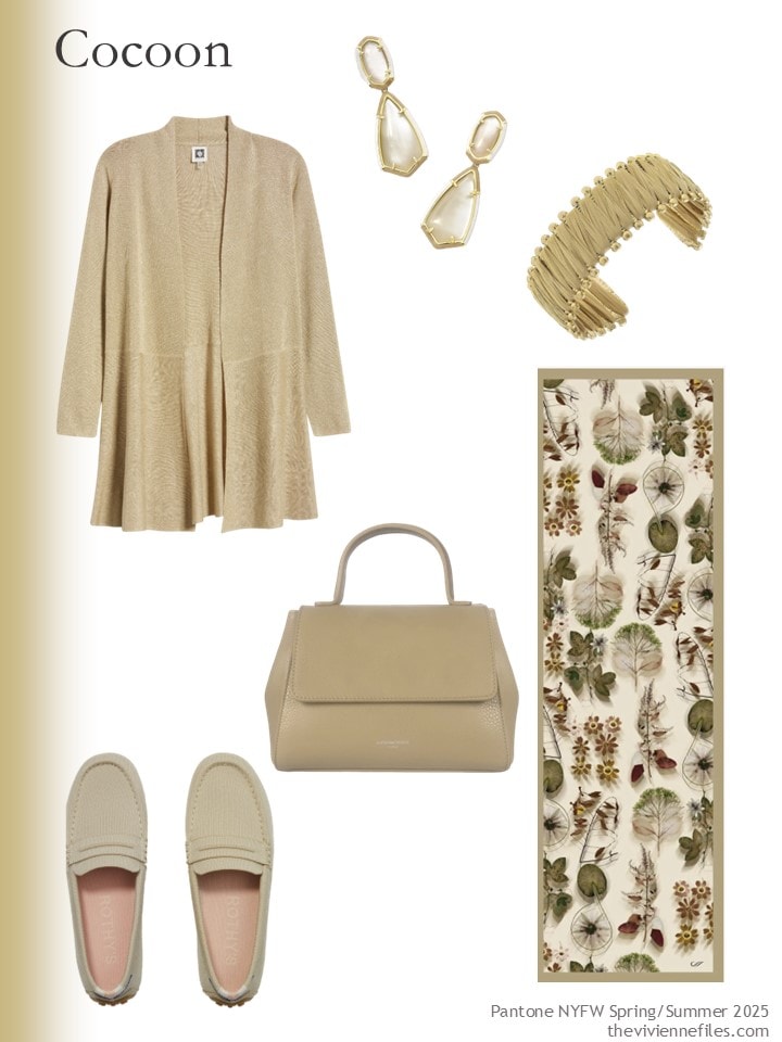
Cardigan – Anne Klein; earrings – Kendra Scott; bracelet – Canvas Style; bag – Le Parmentier; scarf – Elizabetta; driving loafers – Rothy’s
I wish I could think of any legitimate reason for me to own this next scarf, but it would be fiction! If you wear these colors, look closely at this scarf. Heck, look at all of the Artifact. scarves. I just found this brand this year, and I think their work is amazing.
Sweater – Paisie; jade pumpkin earrings – seree; bracelets – Arms of Eve; scarf – Artifact.; boots – Miz Mooz; bag – Oryany
Now we plunge into “green-ville.” This White Grape is pretty, and I really like these earrings… And if you’re at all tempted by scarves from Otto & Spike, I can highly recommend them. One of my very favorite winter scarves is from there – a Fair Isle pattern in shades of grey from 3 years ago!
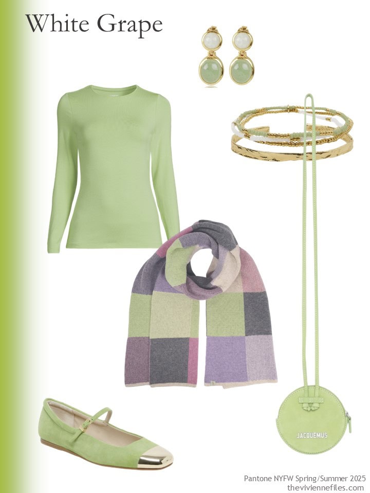
Tee shirt – Lands’ End; earrings – Lila Rasa; bracelet – Arms of Eve; scarf – Otto & Spike; bag – Jacquemus; flats – Dolce Vita
Here’s where I’m confounded. This Lime Cream is indeed a different color than White Grape, but it’s not THAT different. Did Pantone really see things at New York Fashion Week that persuaded them that both of these colors needed to be included? Oh, to be a fly on the wall at Pantone, eh?
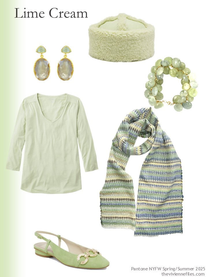
tee – L.L.Bean; earrings – Meshca; hat – Jakke Arella; prehnite bracelet – Lori Kaplan Design; scarf – Kelpman Textile; flats – Dolce Vita
Hey! Green! I rather love this shade, and here’s another gorgeous scarf…
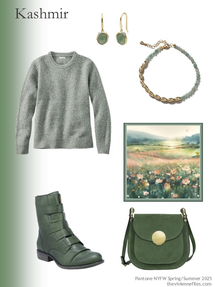
Sweater – L.L.Bean; jade earrings – Gemondo; bracelet – Muru; scarf – Artifact.; boots – Miz Mooz; bag – Le Parmentier
This next color is lovely, but I don’t know that I’ve ever seen a limpet this color… But then again, I don’t know if I would recognize a limpet if it walked up to me and shook my hand…
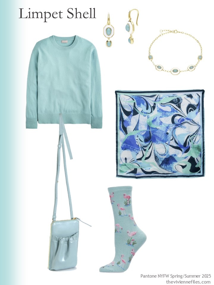
Sweater – J.Crew; earrings – Gemondo; bracelet – Gemondo; scarf – Pasmisy; bag – Sclarandis; socks – Me Moi
Oh look! It’s almost navy! I feel like we see this color EVERY YEAR. Maybe that’s why they called it Deja vu Blue…
If you search for petrol blue, you will come close to this.
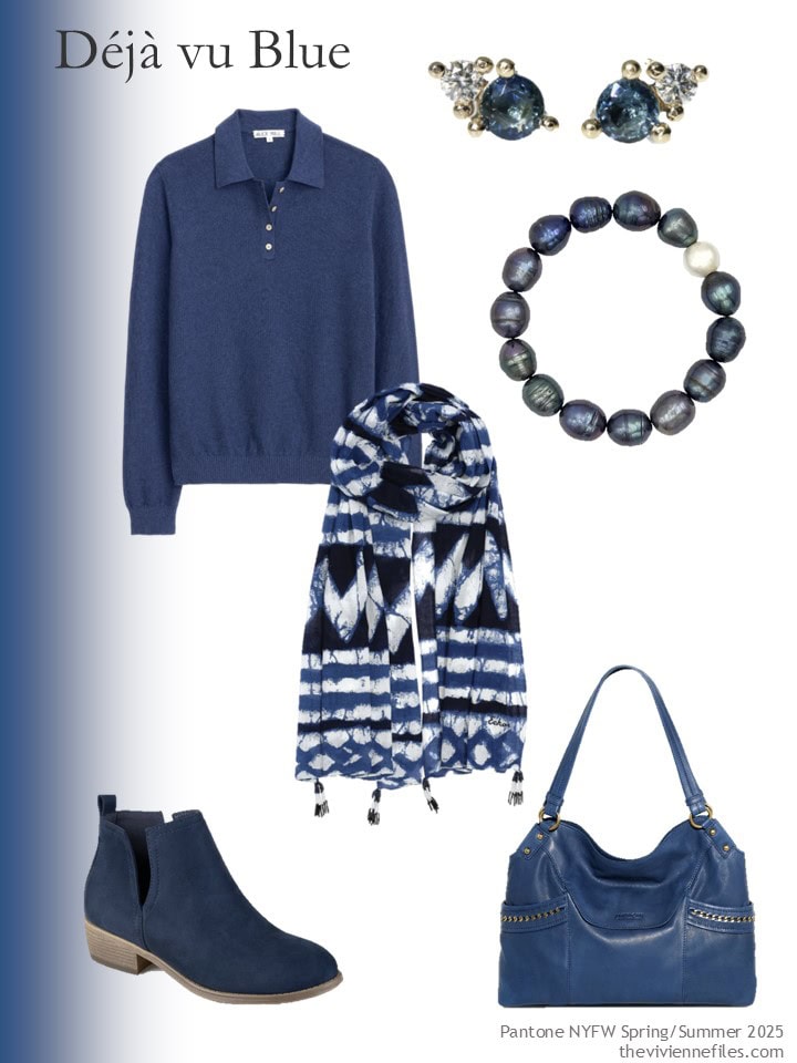
Polo sweater – Alex Mill; earrings – Caelia Jewellery; bracelet – Tory Long; scarf – Echo; boots – Journee Collection; bag – American Leather Co.
And Pantone’s last color from this list is the beautiful, but oddly named, Crocus.
Have you ever seen a crocus this color? We crave the crocus sightings every spring here in Chicago, and they are always dark purple, gold, or white. A pink one would be nice…
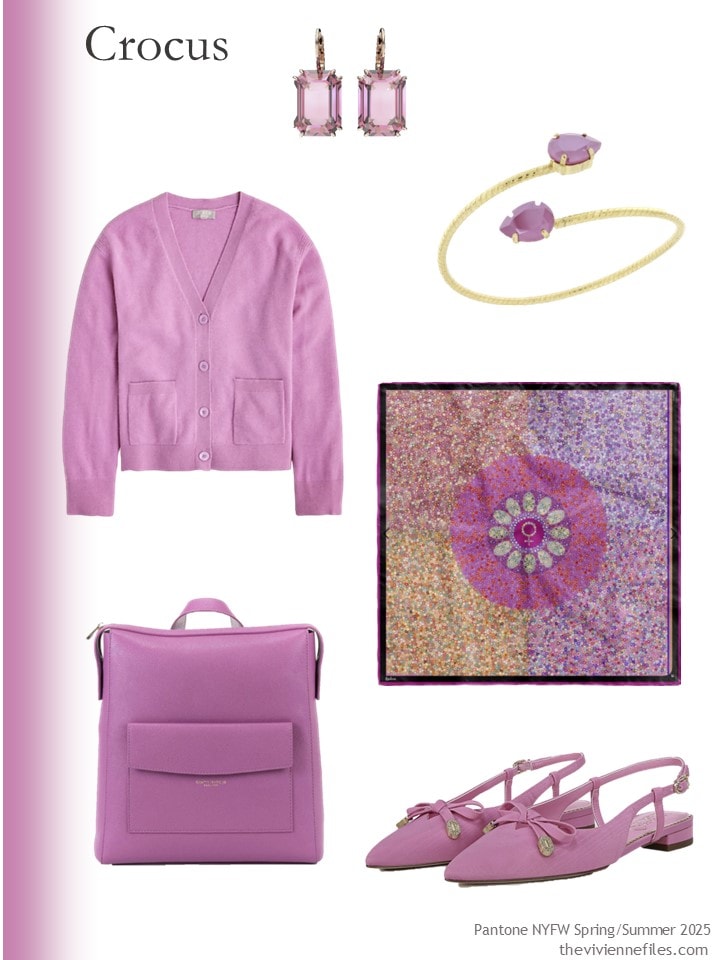
Cardigan – J.Crew; earrings – Swarovski; bracelet – Rosaspina Firenze; scarf – Kueen; backpack – Campo Marzio Roma 1933; flats – Circus NY by Sam Edelman
So does anything here make your heart sing? I really love Kashmir, and Bran, but my closet is in a state of emergency, and if I buy anything at all right now, I may cause structural damage to my 55-story building…
love,
Janice
p.s. Ten years ago, I started with a delicious plaid coat, and built a wee travel capsule wardrobe around it! When you travel in cold weather, you spend a huge amount of time in your coat, so this isn’t a crazy thought.
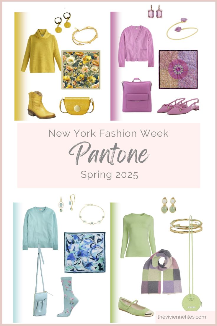
Like this wardrobe? Save it to Pinterest!
Love these browns! A nice change from muddy ones.
Is it just me, or do these colours feel very 1980s? I’m thinking particularly the pale blues and greens. I don’t know that I would wear any of these, although the things that you have picked, Janice, are very lovely.
I’m curious to hear more about the ‘state of emergency’ of your closet.
I’m with you on these colours – I personally would only wear the blue. The rest are meh.
Yeah, most of these colors are just blah, except for the navy. I might consider wearing them only in small doses.
It’s possible I might chime in again later, but at first glance the scarf with the Kashmir grouping is the thing that really makes my heart sing! Not quite sure on any colors yet. Though I did see a preview of a spring line which was showing a lot of a color similar to Crocus combined with a peachy color and it was very pretty. Also, I live in Seattle area, and I think we get lighter colored crocuses….
I live just north of Seattle and double checked out my window, my fall crocuses are that color. I think the spring ones are too… but I’d have to wait until spring to double check. I of course love the petrol blue color and the rust and tan. But those all seem very neutral to me and not very colorful. Oh, well!
Okay, pink crocuses are real! We need some of those in Chicago…
hugs,
Janice
Our fall crocuses in Idaho are somewhere between Pantone’s version and lavender. Pinkish lavender! They’re a color that would make a lovely cashmere sweater. Or boots!
I tried to comment 3 times Friday. We’ll see if I have better luck today. The only color cool enough for me to wear would be the Kashmir. It seems like a lighter version of the evergreen we saw last week. And that was a color I used to wear. The shirt in the Bran set seemed very similar to the fair isle sweater of a couple weeks ago. So I could potentially wear that too. I do like the darker of the 2 greens, but it would do me no favors.
I loved the groups and method of last week. The groups with beige/winter white are the most appealing to me. And I liked both the evergreen and burgundy. My wish for the next set would be navy and dark denim along with white/cream/beige. And as I have a few pieces in mustard and rust (even thought they don’t flatter, I love them). And maybe a true purple. Not plum. Not lavender or orchid.
How about revisiting this in another month with true red and green as the accents, and then revisit the method again in the spring for the lighter and brighter colors?
I don’t know if I wish you had thought of this method 20 years ago, but how about 8? I’ve been following since 2016. Thanks for your work. I try to guess how you’ll combine pieces. Sometimes I guess correctly and other times I wonder why I missed such an obvious combination!
Ps. We used to have crocuses at the ranch when I was growing up. They were the first sign of spring, sometimes blooming up thru the snow. Ours were yellow like miniature tulips!
Be still my heart the earrings on the blue and orange!!!! Gorgeous. most of the earrings are lovely that you’ve found Janice, but those two….
Show-stoppers.
I think the blue ones would go well with the fancy lady who was told she looked like a countess in a portrait (one of your start with arts; settlement made history and she bought a place in Paris)
They are quite her style…
hugs,
Janice
The only color from this set that tempts me to wear it is the De Ja blue. The rest would look nice on Easter eggs lol. And when I’m thinking Halloween, Easter is a far off idea.
I am finding that I agree with you on your color choices Pepper. We must have similar coloring!
The scarf in the Limpet group really calls to me. I could easily see a travel wardrobe based on that combination!
I was thinking the exact same thing. I rarely see a scarf I love but this one is fantastic!
The scarves are, indeed, beautiful. And those yellow Miz Moo boots! Being a classic in a western state, these boots are never out of style. The toast brown looks like it has a touch of pink in it. I like the white grape. Knowing how retailers aren’t going to get exact about these colors, I can hope I find a version that’s just a touch clearer and brighter. And the “almost navy.” It’s a pretty solid basic for those of us who really don’t like navy so dark you have to haul it out of the closet and into daylight to discern it from black!
Janice, you are historical. All your tongue-in-cheek comments about the names and colors made me chuckle.
We’ll, these colors are pretty, but not many would work for me. Being a Clear/Bright Winter can be very challenging for shopping. I do like the almost-navy. I think it would go very well with the darker of the two light greens (aren’t they both lime-ish?). I love the scarf from the light aqua collection. Obviously that color would work with the dark blue as well, though it is too light for me.
Any version of Mustard is my daughter’s favorite color, so she should be happy this spring. She just sent me a picture of herself at a friend’s wedding. She was wearing a mustard floor-length gown. I have never seen a formal gown that color before, but she looked great in it!
Regarding crocuses: I grew up in the mountains of Norther. New Mexico, and my favorite sign of coming spring was finding the first crocuses popping up out of the snow. We had white, purple, and a slightly bluer version of this color.
Ha, I said you are historical. I meant “histerical”, but I think historical works too.
I can be both!!!!
hugs,
Janice
This choice of name again…
Amazing Janice that you found the right colors and the accessories. 🤩
I like the first two colors and the kashmir and dark blue.
I think I like all of these and have several tabs open to look deeper at purchasing. Your choices are spot on!
Hi Janice, I love the jewellery you’ve put with the greens, particularly the bracelet with the lime green. And I love the marigold boots, in a different colour. (An aside, in the last couple of weeks I am never able to click on links and go to the site – I am always redirected back to your site. I haven’t seen anyone else comment on this problem, so probably it is me, I will try to figure it out. I could just look at e.g. Nordstrom direct, but I assume that if I do that, they won’t know I’m a “referral” from you.) Re the colours themselves, the kashmir is nice, and the petrel blue is beautiful. Surely the bran should be re-named, perhaps after a small brown fluffy mammal?
I love the limpet shell, lime cream, and white grape. The lighter yellow-greens are s9me of my favorite colors, especially for spring, but are usually SO hard to find! Maybe this is my lucky year…
Pantone can like them, doesn’t mean I will wear them. Green (except for Kelly green), beige, yellow and orange are not my colors. Good thing there will be blue and pink in the stores.
Crocus is my favourite, though it also reminds me of the colour of wild pink winter cyclamen that bloom in UK woods at this time of year. I have a winter wool coat this colour. The colour makes me happy. My family say that it’s easy to spot me in a crowd of dark coloured coats.
hi Beth, your pink coat sounds lovely! When I lived in London decades ago, I had a cherry red wool winter coat. It made me happy amidst the sea of black on the tube.
What a hodgepodge of colors. What were they thinking? All I can say is I won’t be spending much on a Spring wardrobe!
I like the pinky crocus, aqua (“Limpet shell”), and all the greens for spring.
A couple new pieces in these fun spring colors will go great with my existing capsules (navy, fuschia, olive). I’m looking forward to freshening up some old looks!
These colors are all too yellow for me, I suppose LLBean (almost every garment there is yellow-based except the navy and black ones, and occasionally deep purple) will have t-shirts in all of them next year! Can’t say I’m a fan of any of them.
Lime Crema, Limpet, and Crocus are so so pretty. But Deja Vue is the only colour here that looks great on me. Great post as always. You consistently find such beautiful pieces.