April 24, 2024
These are “new” colors for Autumn/Winter upcoming – maybe we can get a head start on having these in our wardrobes?
I’m very curious to know which of these you like and dislike… As always, I have a certain fondness for all of them – after spending hours looking for things in these colors, if I didn’t love them, I would throw my computer from our very high windows!
Let’s go!
First up – I would almost certainly wear this dress, and I would certainly have Skimmies under it!
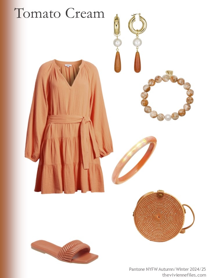
Dress – Rails; red aventurine earrings – Rodela; red jasper bracelet – Soul Journey Jewelry; iridescent bangle bracelet – Gold & Honey; sandals – Open Edit; round bag – Jelavu
This next dress looks MUCH better on a human being than it does like this – when the top part of the dress is “filled out” by a human torso, it balances the skirt much better!
yes, these earrings are very expensive, but they’re exquisite…
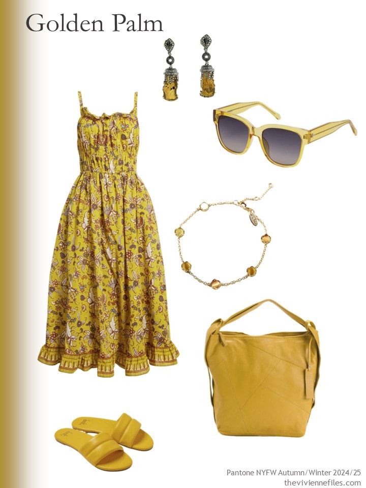
Dress – Cleobella; tourmaline and diamond earrings – Artisan; sunglasses – Fossil; bracelet – Anthropologie; sandals – Beek; tote bag – Tano
For someone legitimately planning for cooler weather, I would jump on all of these next pieces! The earrings are a touch light, but I couldn’t resist sharing them with you – they’re so nice…
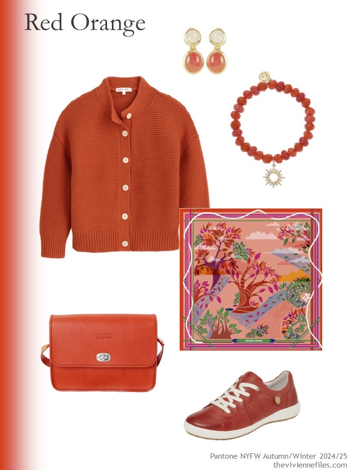
Cardigan – Alex Mill; red carnelian and moonstone earrings – Lila Rasa; bracelet – Liz Claiborne; scarf – Jessie Zhao New York; bag – The Dust Company; sneakers – Josef Seibel
This next color has a silly name, but it’s really lovely…
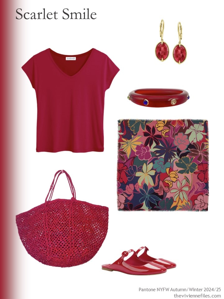
Top – Kettlewell; earrings – Ross-Simons; bracelet – Michael Nash; tote bag – Zantany Concepts; winter garden wool scarf – Echo; shoes – Larroudé
Here’s another color that I would cheerfully wear in cooler weather. The scarf is definitely for cold weather, but this is another item that’s such nice quality – such a subtle pattern! – that I had to share…
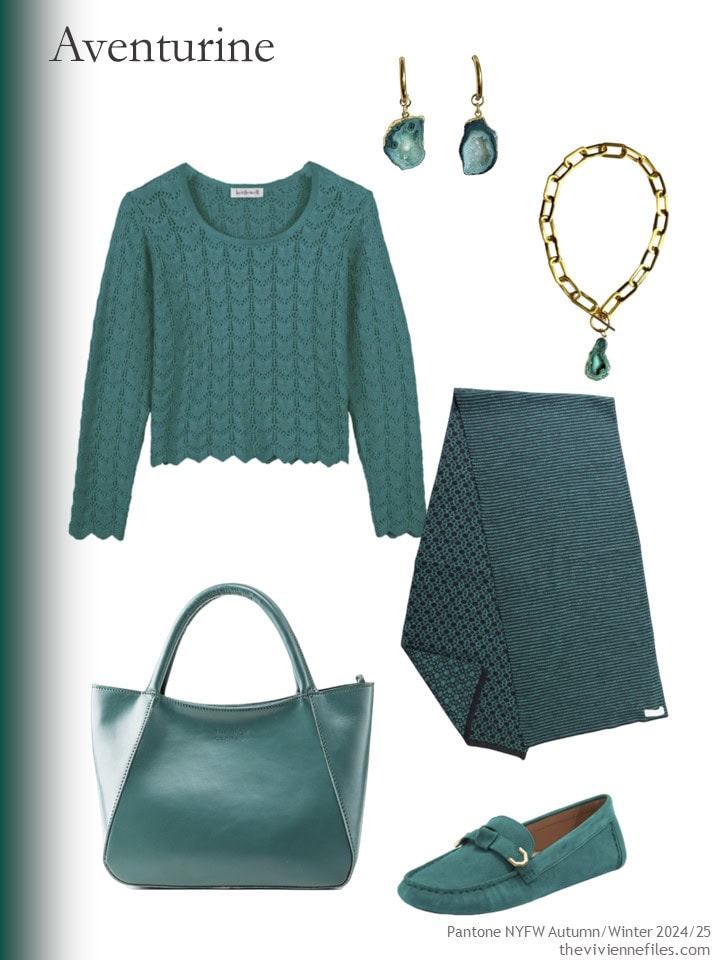
Catherine top – Kettlewell; earrings – Magpie Rose; bracelet – Magpie Rose; scarf – Maria Aristidou; tote bag – The Dust Company; loafers – Cole Haan
Fern would be lovely with warm neutrals any time of year… and the tote bag is made from recycled fish nets!?!
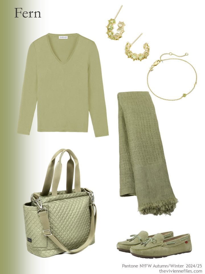
The Classic V – Kettlewell; earrings – Kendra Scott; bracelet – Kendra Scott; scarf – Heritage Moda; tote – ASK Scandinavia; loafers – Marc Jacobs New York
Well yes, I do want everything that’s Italian Plum!
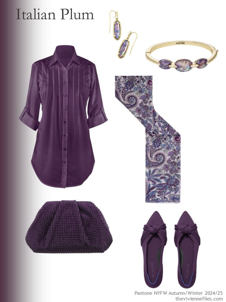
Tunic – Collections Etc.; earrings – Kendra Scott; bracelet – Napier; scarf – Gerard Darel; clutch bag – Nina; flats – Rothys
To me, Moonstruck is just taupe – not that there’s anything wrong with taupe! But to consider it an accent color is… interesting…
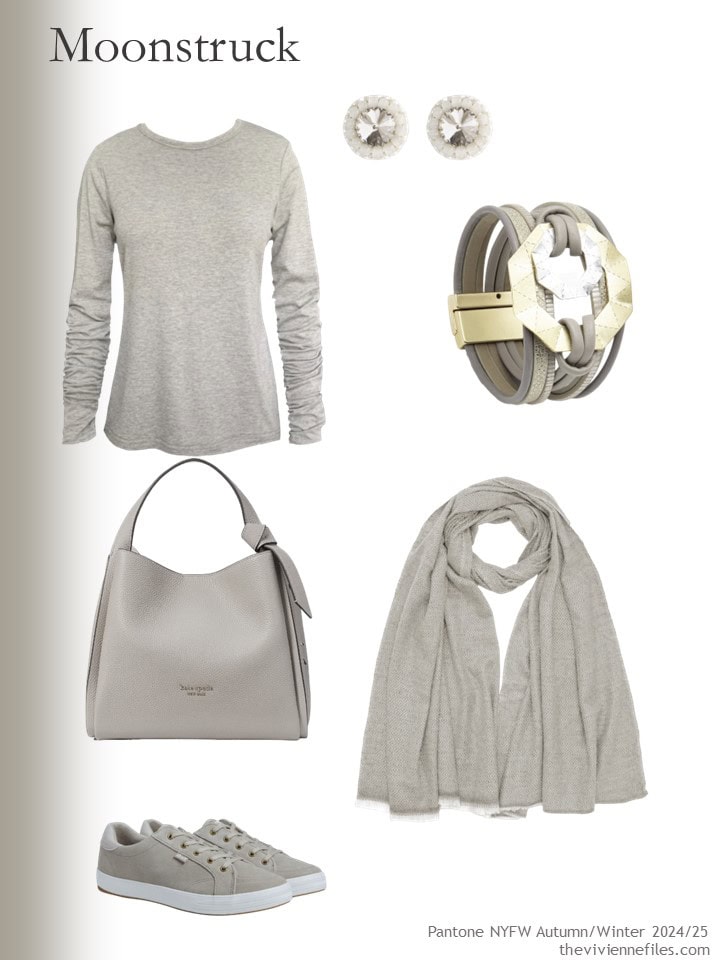
Oatmeal tee – Frock Tales; earrings – Saule Label; bracelet – Saachi; scarf – Antra Designs; bag – Kate Spade New York; sneakers – Keds
I found this last color very difficult to find – it’s subtle!
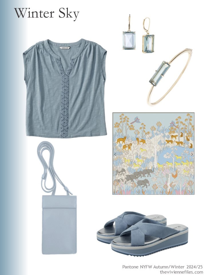
Embroidered top – Orvis; earrings – Lauren Ralph Lauren; bracelet – Lauren Ralph Lauren; scarf – Jesse Zhao New York; phone bag – godi.; sandals – Johnston & Murphy
Actually, Pantone’s last accent color on this list was white. Yes, white. You know how to find white things… What an interesting idea – white as an accent…
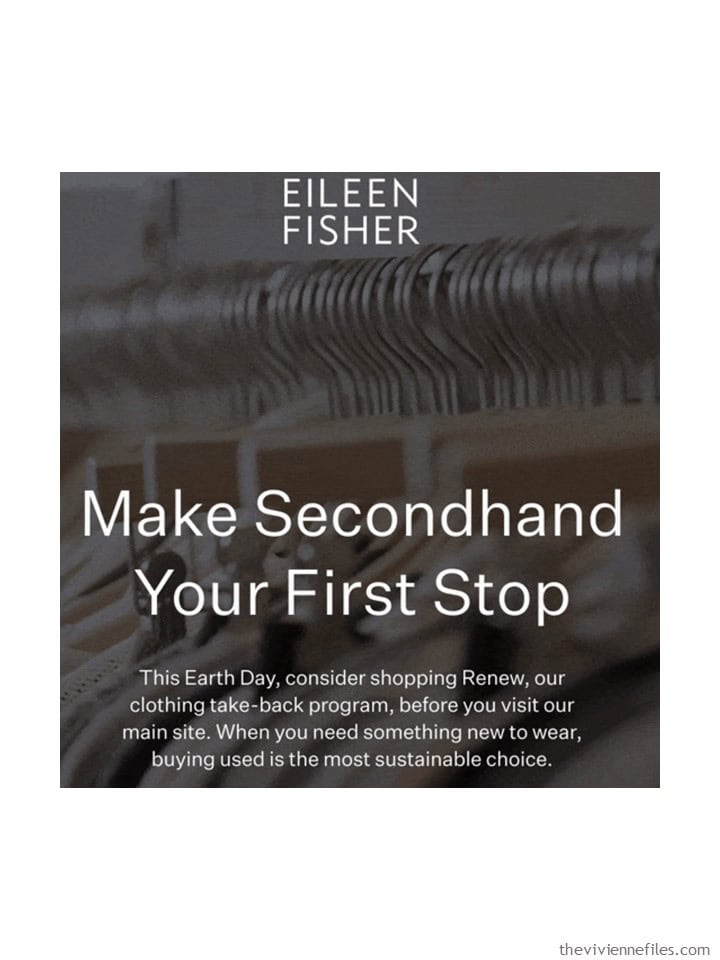
While it might be somewhat self-destructive of me to include this last clipping from Monday’s email from Eileen Fisher, I still think everyone should see it. Can you image if everyone started the shopping by looking for something used, and only after exhausting the possibilities, THEN shopped for new things? Not just clothes, either.
love,
Janice
p.s. Ten years ago, someone asked me what shoes to wear with navy clothes! It’s still not an easy thing to settle…
Like this article? Save it to Pinterest!
Beautiful colors
What are “skimmies?”
An undergarment that comes down onto your thighs, to keep you both modest and comfortable – no thigh chafing with these things! I think if you click on the word Skimmies in the post, it takes you to a place to buy them. I’ve worn them for years and wouldn’t be without them!
hugs,
Janice
Scarlet is my favourite of these. The others are wishy-washy to me. I love saturated colour.
I agree. I would possibly also wear the teal, if it was the right amount of saturation and clarity.for me.
I’m loving Winter Sky (the greyish aqua), Italian Plum and Adventurine (aka “teal” 😉) and would happily add these colours as accents into my navy and grey-based wardrobe. (Which has diversified out of necessity but I’m hoping to steer it back on track).
It was delightful to see that the silk square scarf in the Winter Sky accent group is double-sided. The print is in shades of pink on the reverse side!
I agree; the other colors are all too warm for me. Aventurine is my favorite.
I also like Italian Plum and Winter Sky. Those colors would fit in my wardrobe nicely.
I am loving the red-orange (and the great scarf with the pink/mauve in it too), and the ‘scarlet smile’, which I would call berry – lovely warming colours for the cooler months, including the present one here in Scotland! The Fern to me is more of a summer colour.
I so agree with Eileen Fisher about trying to source from secondhand before buying new. Until I worked as a volunteer in a PDSA charity shop, I had always donated but never browsed. Now charity shops and eBay are where I turn to first for any clothes – and I try to adopt the ‘something in, something out’ principle so as not to overfill my wardrobe. (That doesn’t apply to scarves of course!)
What shoes to wear with navy? If not wearing navy shoes, burgundy would be my first choice. Also, I think black and navy are fine together.
Red Orange, Scarlet Smile and Adventurine for me. Apparently I’m all about bright saturated colors at the moment. Like these much more than the last set of Pantone colors.
The Kettlewell Cara v-neck top–was that their Cherry or Deep Claret shade? It is hard to tell on my screen.
Pretty sure it was Cherry, but if you have a favorite, I’m sure the colors are close enough that it won’t be a problem!
hugs,
Janice
First reaction was meh. So I went to the Pantone website to view all 10 colors just to make sure.
https://www.pantone.com/articles/fashion-color-trend-report/new-york-fashion-week-autumn-winter-2024-2025
Still not that excited as only the Red Orange and possibly the Aventurine would work for me. But 7 of the 10 colors would be great for those with Autumn coloring.
Always amused by the color names and descriptions, especially “Dark Gull Gray, a solid and dense gray that is forever relevant.” I initially read it as “Dark Dull Gray.” And “Baritone Blue, a deep blue hue with a dark and rich quality.” Makes me wonder if someone connects colors with certain sounds. It would be fun to be in the room where the wordsmiths come up with these.
I am an autumn and I love all of these colors. I think I could, and would, wear everything but the scarlet smile. I am not sure about a couple of them next to my face (golden palm) but I still like the shoes and bags.
I love all these colors. Colors like fern and moonstruck are so muted yet tomato cream and scarlet are so bold. I wear a basic black/white capsule, so I love experimenting with new colors.
I wasn’t too excited about any of these colors, except, hold on to your hats girls. The white! Yes!! A couple weeks ago when we looked at the Pantone colors with the different neutrals, I felt they all looked a little uncomfortable and how a little white would have made them more wearable for me. For example, instead of a solid navy outfit with the light accent colors, how about a white/navy stripe to lighten things up first and then add the light accent colors?
So if white is an accent, yes I can wear accent color pants! Or other colored printed skirts. But yesterday I came across a pair of ankle pants in a bright medium blue similar to the bright blue in the blue wardrobe for this years 6 paintings collection. No idea how long those have been hiding in the closet. I really like the thought of accent pants but in reality I feel goofy. So I guess I can’t wear an accent “color” on the bottom unless that accent is white! Weird huh?
Very muted, minor key 🎶 colors. A bit somberish like a cloudy day. I find the colors intriguing but rather pessimistic. I feel they will be a one-off for the season…then hard to find again.
Isn’t that always the way it is with trendy colors?
I didn’t weigh in on the accent color on the bottom discussion last week. I guess I can now. After wearing primarily neutrals on the bottom (with the odd accent color or maybe a print) for years, this spring I have embraced the color. Partially it was a necessity in trying to find material my skin would tolerate, and then I found THE pants. I now have them in cobalt blue, the same orange/red as the Alex Mill Paprika sweater, and MAGENTA of all colors. Surprisingly enough I’ve been able to those colors into my wardrobe. In order to not “feel goofy” I’ve been wearing them with other bright colors and then tying everything together with scarves. So far so good. I am way more colorful than most of my coworkers, but as long as it works for me I don’t know that I care.
I think life is complicated right now for many of us – maybe the simple clarity of white is a nice relief?
hugs,
Janice
April, your comment nicely pulls the conversation about white vs. accent color to white AS accent color, which sounds like a great idea for lightening up an outfit with light accent colors!
Sheila, such an interesting experience where finding the right pants means you find you can wear many more colors on the bottom! Maybe there are women who just haven’t found the right pants to make this work for them. This gives me hope that perhaps one day I will find my white pants, which I’d sort of given up on; your observation has me thinking it’s time to open myself to that possibility again.
Give me all the aventurine and Italian plum, please! Love them both and wear them often.
I concure. Would love to try the Winter Sky. The Scarlet Smile beckons but probably too strong. How fun is this!
Nope. Nope. Nope.
Golden Palm, Italian Plum, and Winter Sky speak to me the most. Thank for sharing!
Oh, scarlet smile, adventurine and Italian plum with accents of golden palm! I’m loving it!! :) I mainly wear navy as my neutral but I don’t love black or navy shoes. I always wear a cognac leather color. Just feels right to me. Thanks for the look at these pretty colors!!
i like cognac leather or grey suede shoes with navy pants. (or colored shoes – pink, yellow, burgandy…)
I was surprised at how well grey went, especially if the overall coloring was cooler toned (i can swing cool and warm colors).
I dont mind black shoes with navy though.
I’ll take all the Italian Plum, please!! Next would be Scarlet Smile and Adventure.
Some years Pantone colours are more of a hit with me than others. The only one I can get really excited about is Horizon Blue, but thats just me. Love how you have found so many lovely pieces to go with these colours.
I agree with you that Janice has found some really lovely accessories. I actually like everyone of the colors this time I personally wouldn’t be able to wear all of them but I like them.
Janice, thank you for introducing me to The Dust Company! I looked at their website to see if the jade tote bag came in other colors (yes: black, brown, light bright blue) and was so impressed with all their products.
This Pantone group was fun to consider. Ever since my very dark brown hair turned completely white several years ago, I’ve needed to drop some colors that used to look great on me: the equivalents of moonstruck, Italian plum, aventurine, and red orange among them.
Tomato cream, golden palm, fern, and winter sky have never worked for me, but I’d enjoy seeing them worn in person by someone they suited!
That leaves scarlet smile as my favorite from this group. I already have pants and a cardigan in a similar color, Old Navy’s “red, red wine”, so I’ll take a closer look at the accessories you’ve suggested.
And finally – thanks for the reminder about Eileen Fisher’s Renew program. I haven’t checked it in several months, but I will right now.
Colors come and go. If you look especially good in any of these, get as many items as you can in your color when you are filling wardrobe gaps. I may be in for a long dry spell of being unable to buy, since I won’t add any of these trends to my closet. I’m old enough to have tried many of them.
Remember to check links if you see a piece you love, but prefer another color. The Kettlewell knit top comes in a range of colors!
White, secret smile, and moonstruck for me
Winter sky and Aventurine are long-time favorite colors of mine, and not that easy to find, especially Aventurine. I hope more of both show up in stores!
I love quite a few things in these selections that aren’t my colours – just the shape, cut or pattern. I mostly shop in local charity shops just to find things in the colours I like, rather than what’s ‘in fashion’ or trendy. Also it’s a trek into town, expensive to park and the clothes are boring and expensive for what they are.
This week in charity shops, I bought:
Sky blue textured coat with silvery buttons – £6
Three necklaces for about £2 each.
Of these colours, Aventurine, Italian Plum and Winter Sky for me. Scarlet Smile is about the only true red I can where these days. Moonstruck is intriguing but I would regard it as a neutral. I do wear accent trousers – burgundy, plum, purple, marine blue. For me white/ivory is an accent as I have so little of it in my wardrobe.
I wanted to but now I have to comment! I clicked the link to the kettlewell top and found the “customers style” shows a lovely triad of women of a certain age 😻! Total fan of this.
Then, I don’t hate any of the colors this time, but golden palm and fern seem to be hard to pull. The ones I like are aventurine and winter sky (or teal and soft blue). The name that strikes to me is the one in the pantone page called “baritone blue” which guess what is… navy! Thanks Janice, these post are lovely for your perfect finds and for the laughs I get from the color names these people find.
I also want to wade in on white as an accent. I think that’s how I use it, mainly because I love a white top/shirt almost with everything and own several in different styles. But I don’t have any white toppers and just a pair of summer pants. Then black is another accent for me now, which I keep because it’s practical and heck, I do like some black, especially for pants and leggings. I’m enjoying the last posts discussions. We’re definitely interesting creatures gals!
Cheers and blessings!
I am struck by how much I love the Saachi leather bracelet in the Moonstruck collection. Maybe it’s the combo of cool and warm neutral colors side by side, especially the mixed metals. I can imagine how easily I could pull each of those Moonstruck color items into my existing wardrobe. They would look fabulous with white jeans (my summertime favorite)!
I haven’t been tempted to buy EVERYTHING in a vignette before – but there’s always a first time…
I thought that bracelet was amazing – good design, interesting colors – sometimes I see things that really catch my eye! There’s a world full of horribly unnecessary stuff, but there are also real gems to be found…
hugs,
Janice
I would be most happy with Moonstruck and white, winter sky, Italian plum and Scarlet smile. I think those would make a really lovely wardrobe. No need to add other neutrals! They are built in! Hehe.
Scarlet Smile and Tomato Orange have my names all over them. I’m hoping for tees, sweaters and scarves in these colors. I love wearing these this spring and hope to continue when the temps turn cooler!