April 12, 2024
It’s always interesting to me how difficult it is to find some of these colors! One would imagine that a reasonable range of ALL colors should be available, given the literally hundreds of thousands of products I see…
Let’s jump in and evaluate what I DID find!
The next color on Pantone’s list was the beautiful Sun Orange… It wasn’t terribly hard to find things, except a scarf that was mostly orange. So I decided that I would share with you this really pretty, bright, versatile and cheery scarf from Echo, which includes the orange and a bunch of other summery colors:
don’t you like the way that the pattern of the earrings echoes the pattern of the headband?
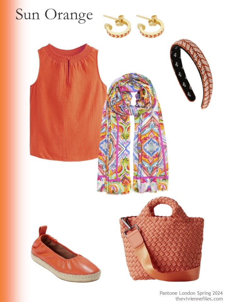
Top – Boden; earrings – Après Youth; headband – L.Erickson; Lisbon tile scarf – Echo; espadrilles – Cole Haan; tote – Naghedi
They call it Fiesta, but I called it coral. This is one of those colors which is often suggested when you need a color that will flatter just about anybody; I can’t picture someone who wouldn’t look at least reasonably good wearing this color! And if you really like this, Lands’ End has a TON of things in “Wood Lily”, which is their name for this:
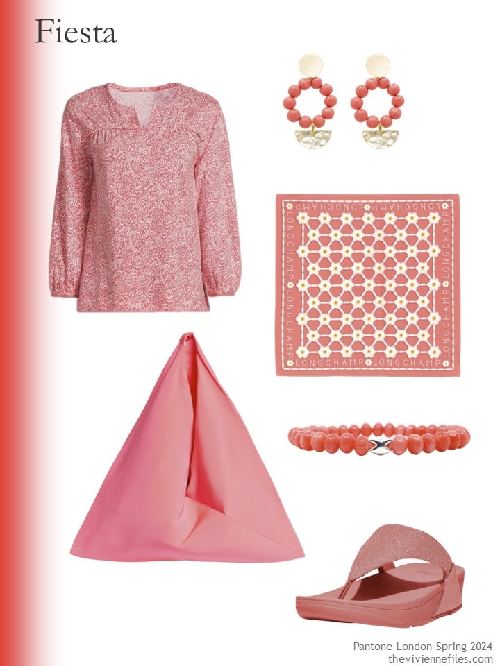
Wood lily top – Lands’ End; earrings – Soli & Sun; scarf – Longchamp; bracelet – Shar Oke; bag – Niran; sandals – FitFlop
Here’s a color you don’t see very often. Too bad, because I like the subtleness of this green – it might be fascinating to wear with navy! Of course white would be great, and the right beige… That might be tricky, but it could be worth finding something – just a pair of shorts? – that looks right.
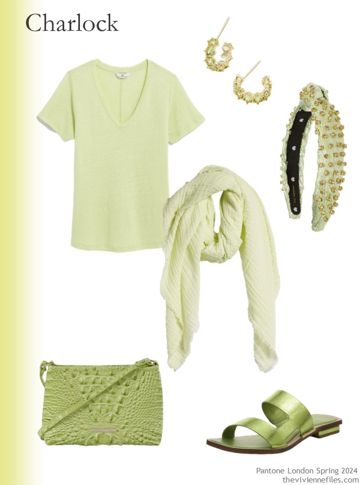
Tee shirt – Vineyard Vines; earrings – Kendra Scott; scarf – Rag & Bone; headband – Lele Sadoughi; bag – Brahmin; sandals – Sarto by Franco Sarto
Burnished Lilac sounds very… artistic? but if you want to find this color in the wild, just search for mauve! Adding these pieces to a white base wardrobe would bring a soft prettiness to your wardrobe…
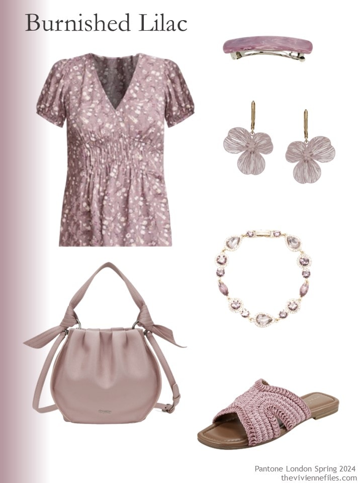
Top – Lucky Brand; barrette – Machete; earrings – Lonna & Lily; bracelet – Givenchy; handbag – Oryany; sandals – Marc Fisher LTD
Lastly, if you like colors of earth and nature, adding this to your wardrobe could be great fun – picture Tarragon with brown, or tan, or camel, or even navy! And the dress is a classic:
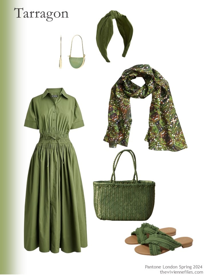
Dress – J.Crew; earrings – Style & Co.; headband – J.Crew; scarf – Benni Marine Designs; bag – Rimini; sandals – French Sole
So if you were FORCED to add one of these colors to your wardrobe, which would you choose?
I’m surprised to realize that I would probably want the Chutney from Wednesday… I can picture it with black, looking warm and rich and luscious!
love,
Janice
p.s. Ten years ago, I tore the socks off of a “Spring 2014 Must-Have List.” There is NO SUCH THING a a “must-have list,” and that’s a hill on which I will cheerfully die!
Like this article? Save it to Pinterest!
I enjoy this so much, even when the colors are sometimes not for me. This time I’m surprised to enjoy the mustard and mauve more than my former usual coral/turquoise. Interesting! This is partially due to the selection of items, that I see more close to my taste in these colors. Also, these were my colors for many years and sometimes you’re just done with that.
I enjoyed the look back too, especially because of your comments and reluctance to accept any of these ‘one-list-to-fit-them-all’ (please read it Gandalf’s style!).
Cheers and blessings!
…*and in the sameness and monotony bind them! * lol
“One list to fit them all, and in the sameness and monotony bind them”. LOVE it!!
Ohhh that rounds the phrase, ‘that now only the look-back fire can reveal! XD
Which one would I choose? It’s a tie between two colours from Wednesday’s post: Bistro Green and Horizon Blue. They’re both gorgeous! Having said that, the Chutney also really appeals to me.
Would it be crazy to pair the Chutney with dove grey?
Heck no! I think it would be lovely – they’re both soft, low-intensity colors…
good thinking!
hugs,
Janice
What a lovely, colourful post on an overcast spring morning. Re Charlock, Marks & Spencer is doing a similar, although slightly more yellow colour this season. They call it Onyx, to my mind it’s a soft yellow lime. It too looks great with navy, but also chocolate brown, dark green and charcoal. It’s proving to be a really versatile addition to my wardrobe.
Horizon blue! It’s a favorite. Mustard and mauve make me want to run screaming from the shops. My mother once painted my bedroom in that green Pantone calls Charlock. It was a light and fresh room! ❤️ But, what’s a charlock? A Pokémon?
Honestly I’m not really a fan of any of these colors. But if I were FORCED to pick, and given I just recently added some items of close to the same color I’d have to go with strong blue. But very sparingly. Have a lovely weekend everyone
Today’s colors are gorgeous! I’d love to have a long-sleeve t-shirt is every color here!
I’d have to go with Bistro Green and Burnished Lilac. All these new Pantone colors seem like they’d be really hard to find in stores.
Sun Orange and Tarragon for me – once upon a time I bought a printed flowy shell and matching solid short-sleeve summer cardigan in each of these colors (although i called them orange and sage) – they made me so happy. I dont fit them anymore; have an operation coming up and an unintended side effect is likely to be weight flux (i’m hoping down, but who knows)… once that stabilizes I may look into getting the tops adjusted. [Really, I’ve been itching to adjust my whole closet for MONTHS and keep forcing myself to wait…]
On the “makes me happy” note: another thing that made my day was the comments today – a Pokemon reference and a lord-of-the-rings reference!?!?! This community is so awesome :) Happy Friday all!
Given that I have a very decidedly cool skin tone and look best in true summer and soft summer colors, I cannot actually see myself wearing any of this year’s colors. At all. I would look truly ill in all ten of them.
All that means though, is that I will be thrifting more and buying new less. I’m still in the process of slowly building my wardrobe after a weight loss journey, but I have enough things now that I can be patient.
Summer will come around again! It always does. And other seasons need their time to shop for their colors too.
I love them all! But Bistro Green and Burnished Lilac seem like they would not compliment my complexion very well. Cobalt, Mustard and Tarragon are my favorites.
Love this time of year…all the colors from this and the previous post would work for me except the Burnished Lilac and Spicy Mustard. The chevron pattern repeat in the Sun Orange feature is a win, so fun when pieces reference each other like that.
BTW, Charlock is an invasive wild mustard found in Europe, Africa and Asia. It is a great color choice to give me an “instant tan.” I’m a natural blonde with warm, not pale skin tones, but Charlock would probably have the same flattering effect on some with other color profiles.
Another true and soft summer here! I almost said I would choose Horizon Blue if I were forced to pick one color. But it sadly would not work for me. I too will wait for better colors to come on the scene.
Janice,
Thank you ! You’ve helped me to identify a green in my closet that is not as warm as what I call olive green , which is an army green to my eye. The Tarragon color here represents what I am talking about , and is a welcome relief to the much warmer olive green, and yet still has a level of warmth within it . I already have a jacket in a sort of tarragon color — now on to finding 2 tops to go with it !
I am appreciating former posts here for this changing temperatures season , especially those that refer to a rolling capsule, introducing some warm weather garments , while at the same time pulling others out for storage once again. I am doing this on a bit by bit basis with both neutrals and accent colors. Within the accent color groups, I am selecting the darker versions first, such as coral vs peach, golden yellow vs lemon, teal vs aqua, etc.. As the season warms up, I’ll rotate those darker versions out for the lighter value ones. I have a lot of accent colored clothes ( who am I kidding — I have a lot of clothes, period) and I want to get more wears from them all, so I thought this values as well as seasonal colors rotation might make that happen, as opposed to just dramatically paring down, which I really don’t want to do . If I find that I am favoring some garments over others and not getting around to wearing them all, then some shall get shared.
Someone once posted here that they rotate their seasonal wardrobes every 2 months — I wish that I could find that post again ! I thought that I had done a screenshot, which I do for posts that I want to think about again, but I cannot seem to find that particular one, darn !
I like this approach plus we wear the same accent colors and have a lot of clothes. (smile) I’ve played around with seasonal capsules and use broad color categories – warm, cool, neutral – to arrange tops, sweaters, wraps in my closet. So it would be easy to break out by season as in coral, peach, rust, red, although there would be some overlap.
Such helpful, interesting comments today!
I have a few clothes and accessories in colors close to or identical to Sun Orange and Charlock that I bought in the past two years.
Even though I’ve always been a “summer” or “winter”, I love wearing these shades occasionally.
I love both the blues from the previous post, and also today’s Charlock, which I would call celery. I’m a different “color profile” from the previous poster, having dark hair and pale skin (somewhere between Bright Spring and Light Spring these days…) and I love all the yellow-y, green-y colors. I usually wear them with bright navy, carbon gray, oatmeal/beige, or teal. Teal works surprisingly well as it ends up looking more blue in contrast to the yellow-green.
Love this! I am really into the bright orange right now. Talbots has some beautiful pieces in this color this season.
From today’s post, the Tarragon green is the one I like best. I can see it playing a utility position as sometimes-a-neutral, sometimes-an-accent, depending on the outfit.
Sally in St. Paul,
I am glad that you posted today because I wanted to tell you that I just “ found” your Spring 2023 , 21 piece template concept — great ideas there ! I’ll be reviewing it again , as I like to mull over various templates as they fit , or not, my personal preferences and wardrobe .
Shrebee, thanks for letting me know – it’s always good to consider a lot of different ideas and see what resonates (or doesn’t) from each!
One more thought — the Tarragon and Charlock might harmonize together in a tonal way, if used on various garments together. Would you call Tarragon a deep version of sage ?
Thank you for showing the J Crew Tarragon dress in black last month. I’ve recently lost weight and needed a couple of dresses for an upcoming vacation. I’m pleased to say that J Crew offers it from size 00 to 24. It was so flattering on even my apple figure that I got two. I even stumbled across their linen popover dress BEFORE you included it in your April 1 post. It’s rather short, but the Tall version falls just below my knees and is also very flattering. I’m so happy to have some lovely dresses to wear on my vacation and for several years to come.
From this list the Tarragon for sure. It’s a good color on me and would coordinate with my navy basics.
Sun Orange is one that would tempt me to try something I know for a fact does not work for me. I must remain strong.
Fiesta/soft coral is a question mark for me. I may be deluding myself, but I think I can get away with this color even if it is rather warm and soft for me in theory. Besides, I like it, so there.
Chyarlock is an interesting one. I could see myself going nuts with this and then having a nice fat bag to donate a year from now. I agree, though, about navy. I also like it with charcoal and, here’s my hot take, fuchsia (especially in the form of hibiscus-type flowers with plenty of white to break it up).
Burnished Lilac is very pretty but not for me.
I love tarragon. I just love green. This is sooo pretty and it’s such a bad idea for me. I love the scarf. I’d wear this with cream and fiesta, maybe with a little bit of burgundy, in a heartbeat if it wouldn’t make me look ill.
All in – I may be on the hunt to add some of that fiesta.