April 26, 2024
Now that we’ve taken a good hard look at the Pantone New York Fashion Week colors for Autumn/Winter 2024/25, we still have to decide if any of these colors actually look good with the majority of clothing in our wardrobes. No accent is useful if it looks icky with all of your best pants, sweater and jackets…
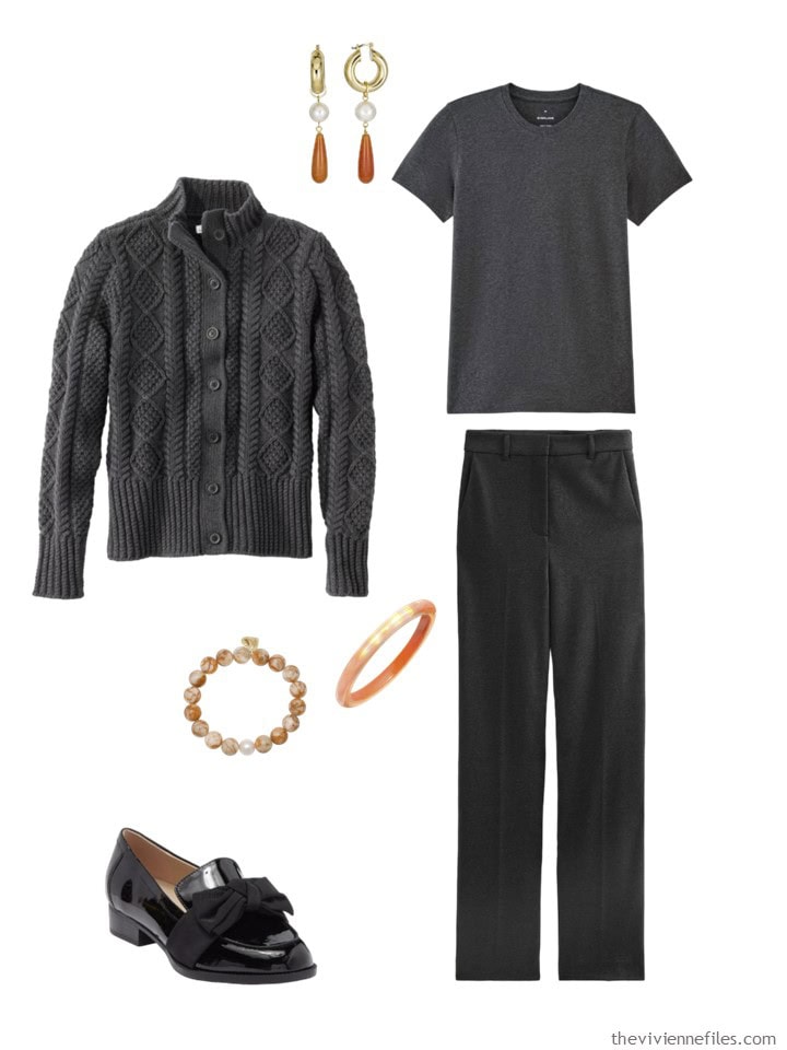
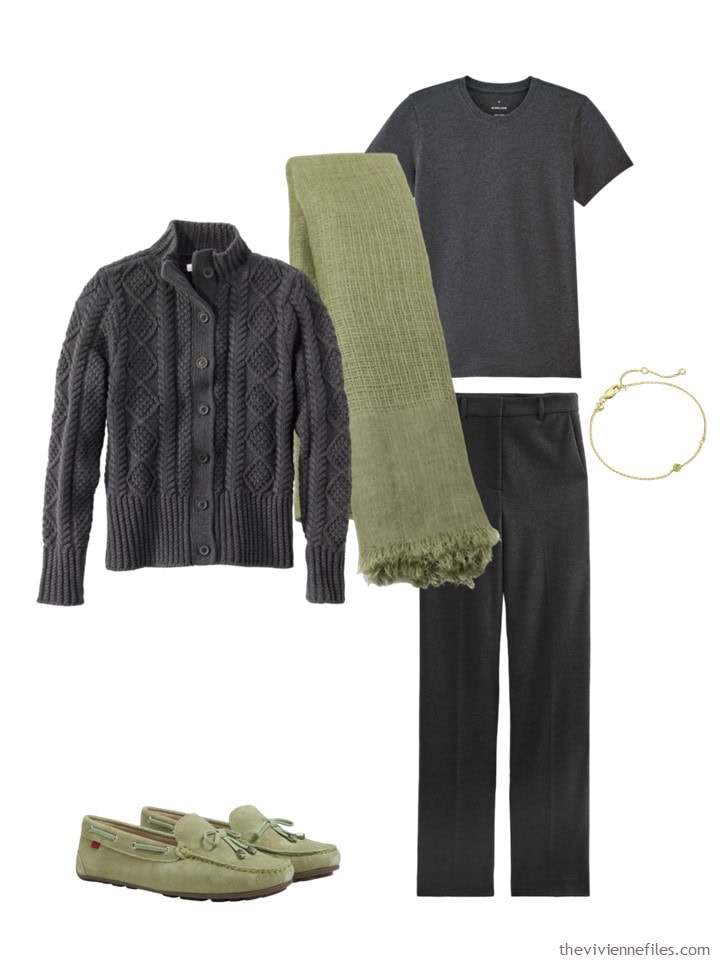
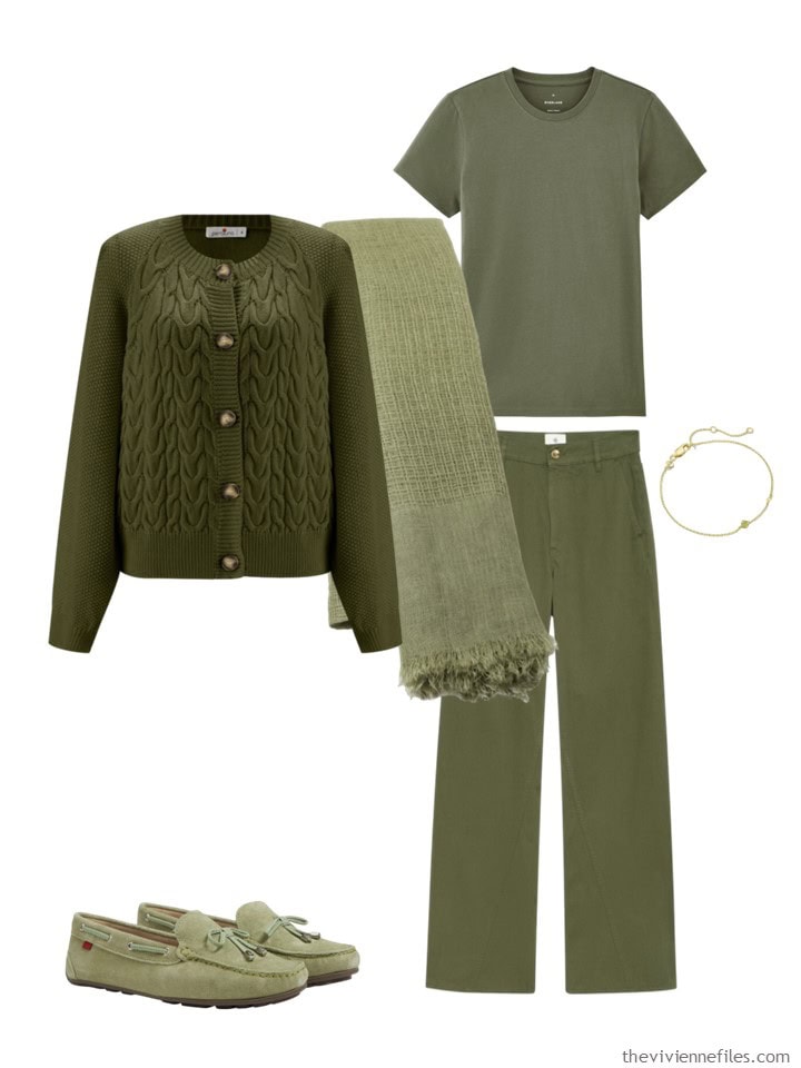
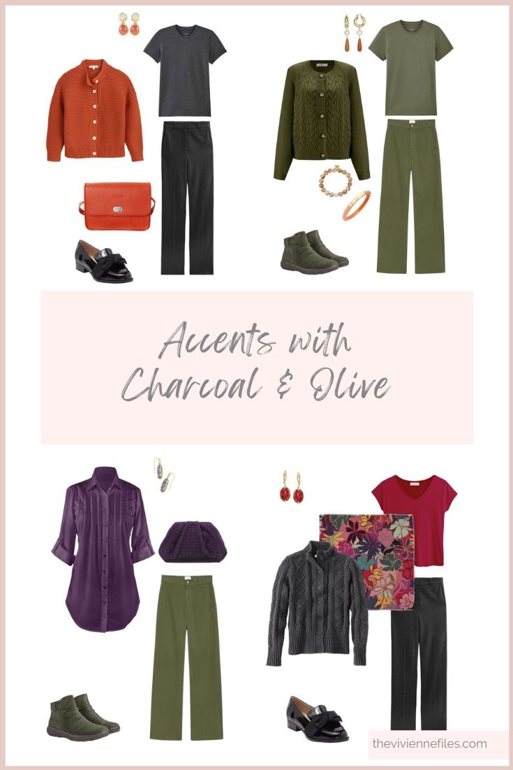
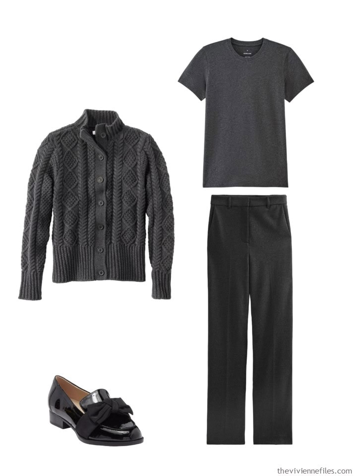
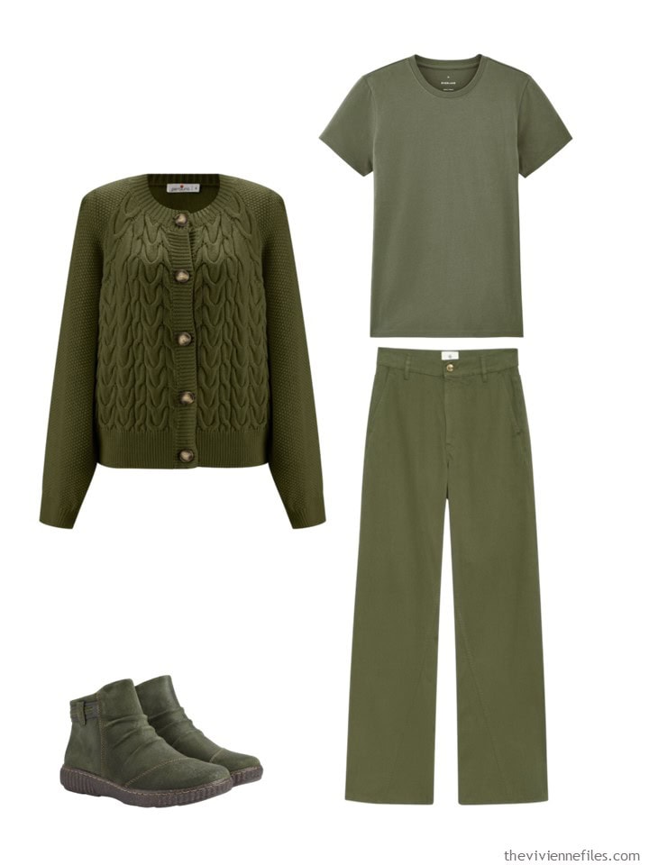
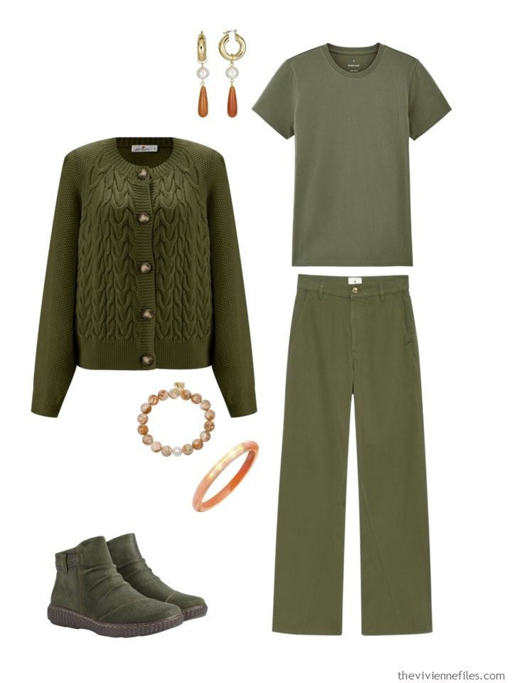
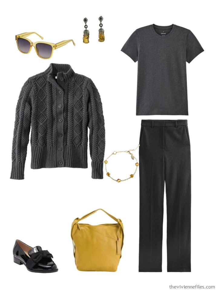
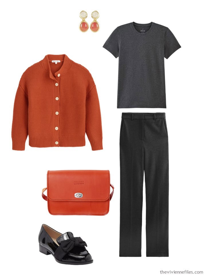
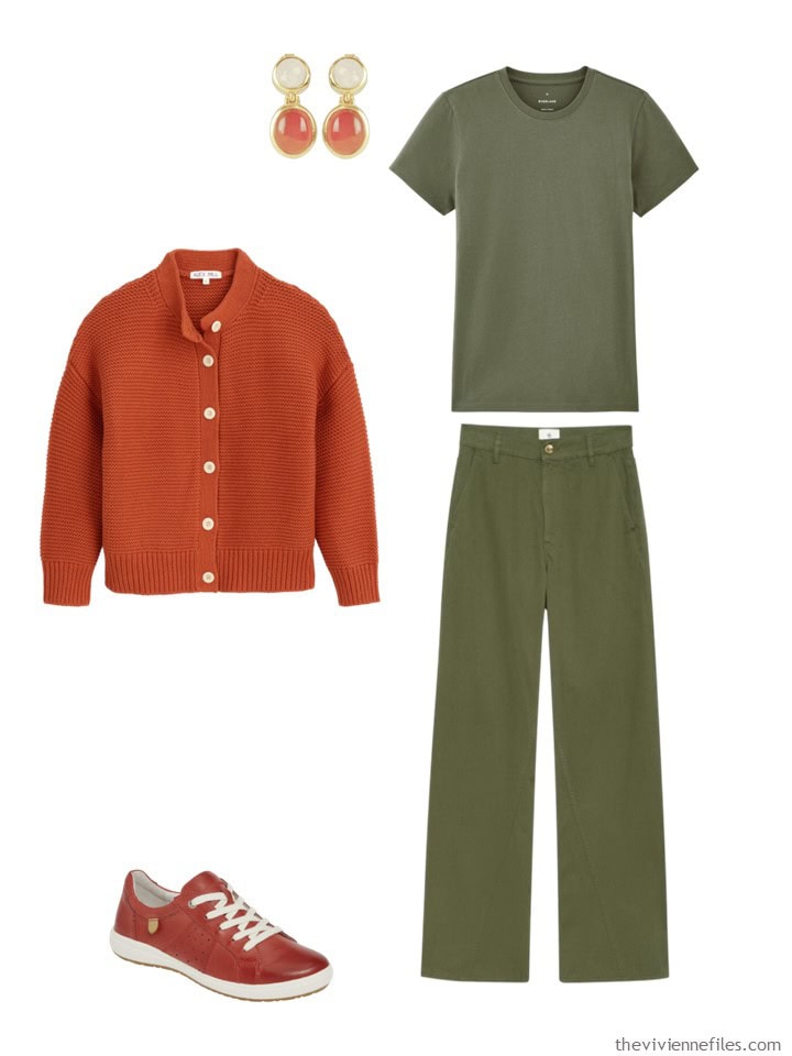
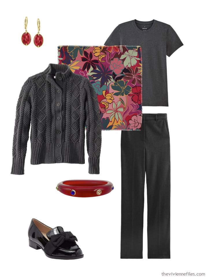
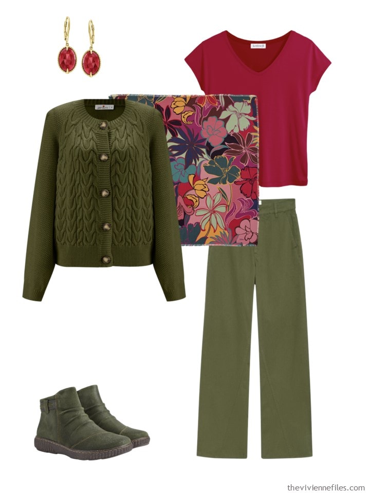
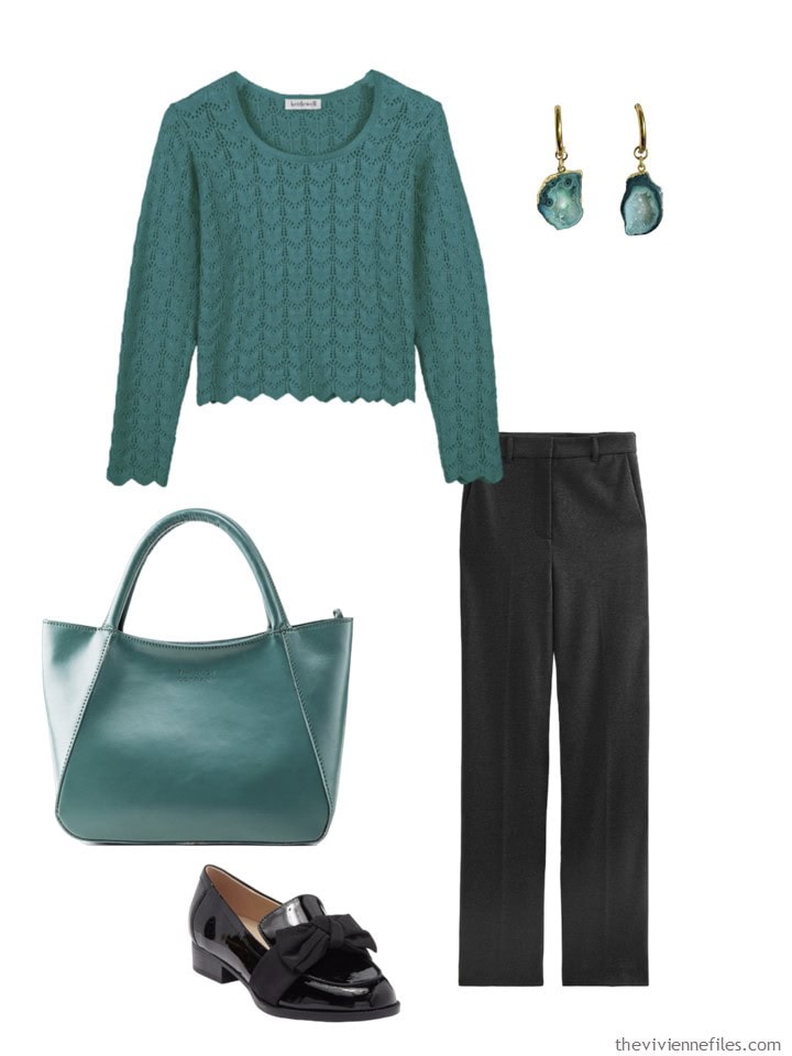
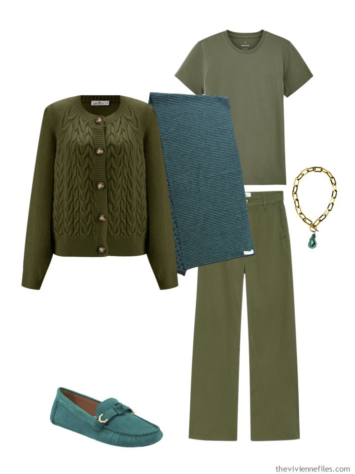
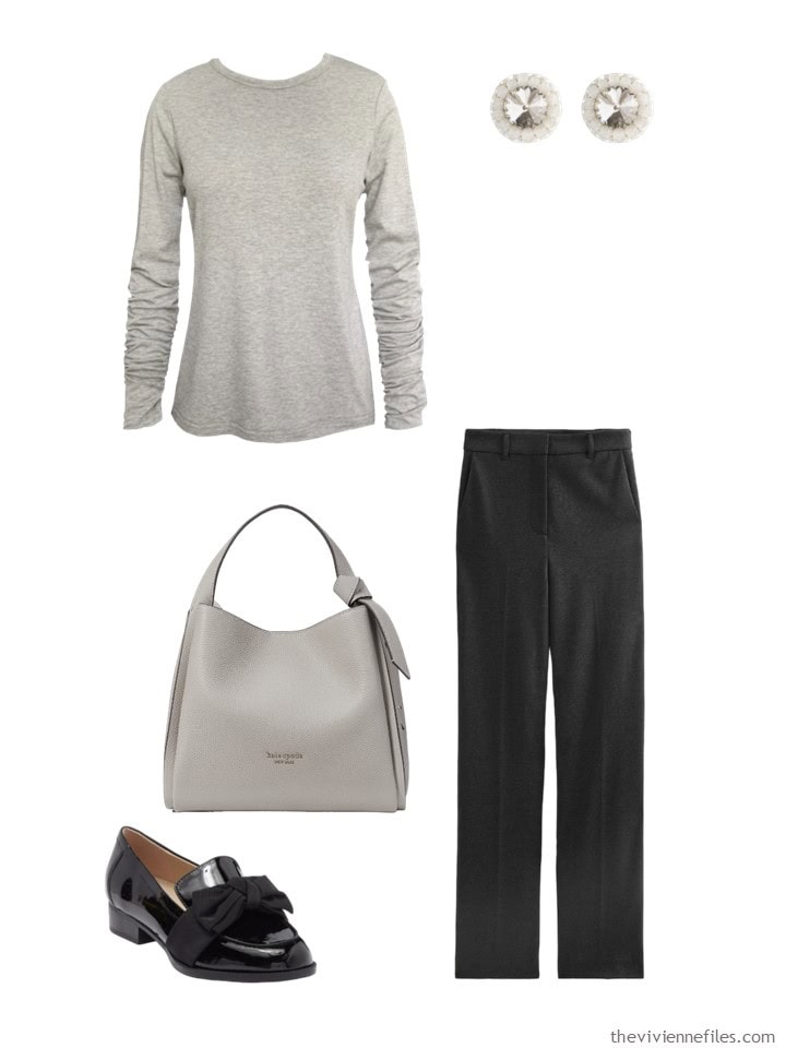
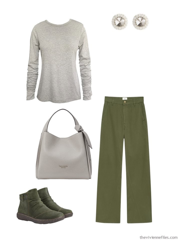
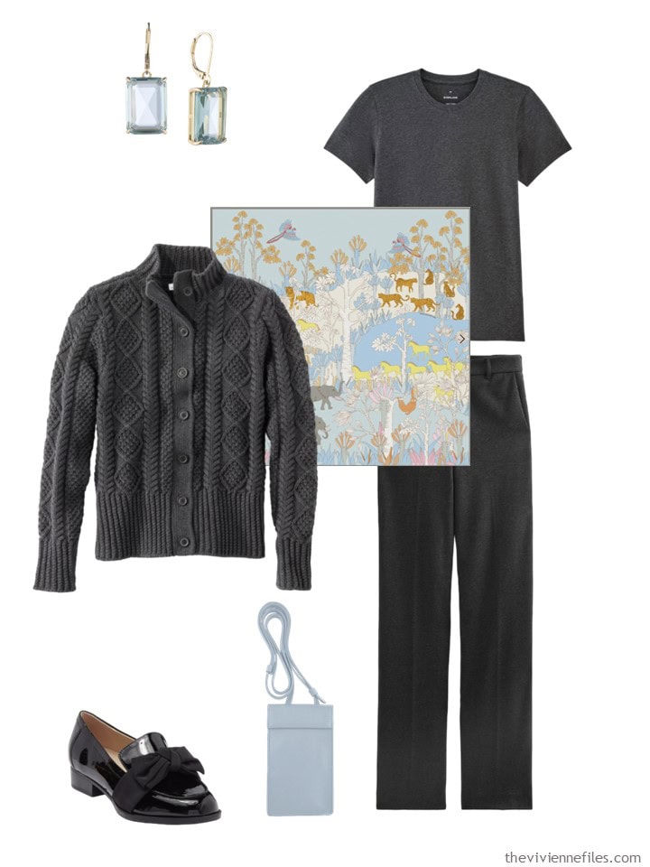
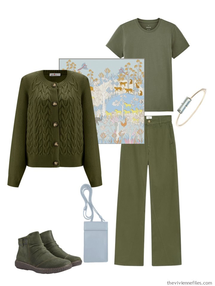
I wanted to look at some somewhat different neutrals than I usually use – no black, navy, beige or white this time! Instead, I’m thinking of Autumn and Winter, and I grabbed us two simples outfits, in charcoal grey and in olive green:
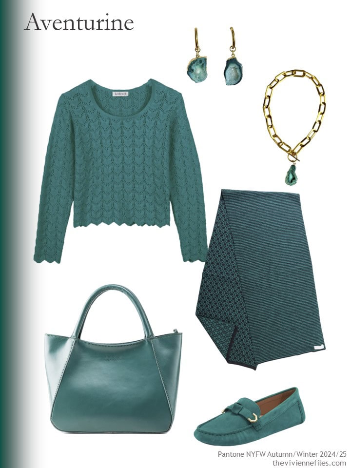
From here, it’s pretty simple – I’m going to show again the colors from Wednesday, and then show our neutral outfits accessorized with each of the colors.
Some colors show up twice, because the top that I included works with cool-weather clothes. But often, little summer dresses and sandals just don’t fit with the neutral outfits I’ve chosen.
You’ll get the gist of it as you view this tremendous assortment of images!
Some of these work beautifully; some fail pretty completely. I’m eager to hear your thoughts!
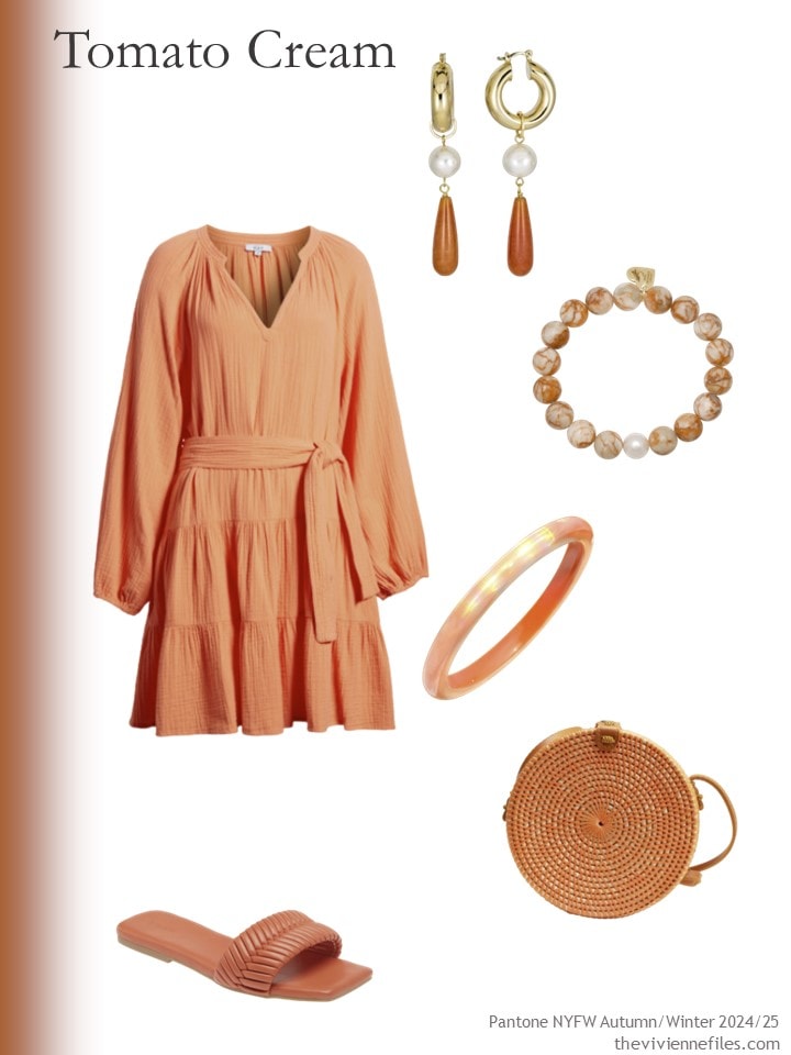
Dress – Rails; red aventurine earrings – Rodela; red jasper bracelet – Soul Journey Jewelry; iridescent bangle bracelet – Gold & Honey; sandals – Open Edit; round bag – Jelavu
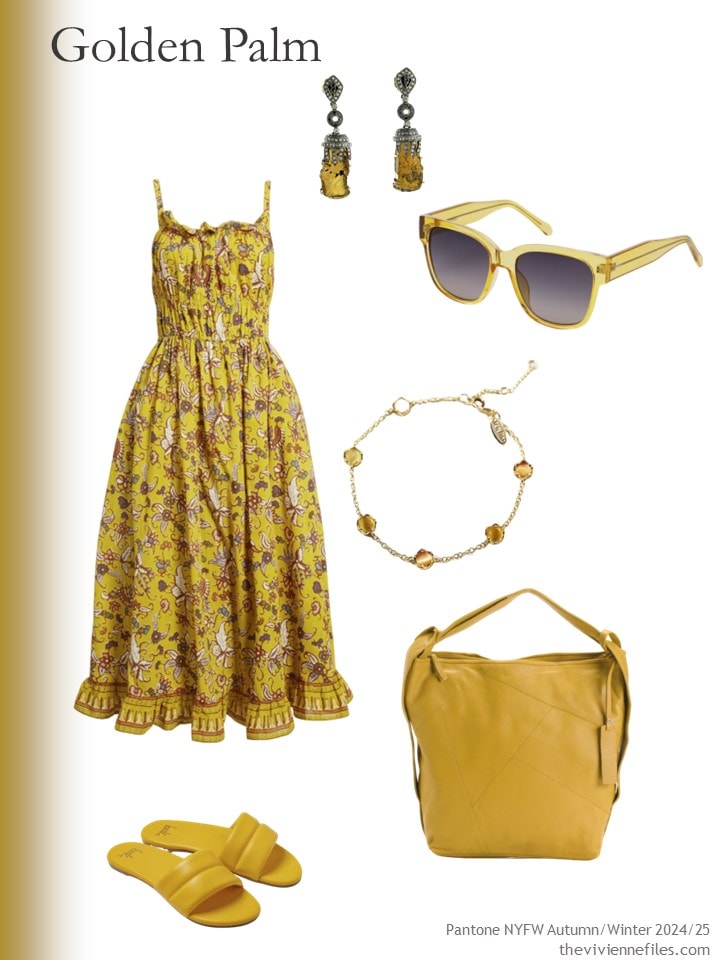
Dress – Cleobella; tourmaline and diamond earrings – Artisan; sunglasses – Fossil; bracelet – Anthropologie; sandals – Beek; tote bag – Tano
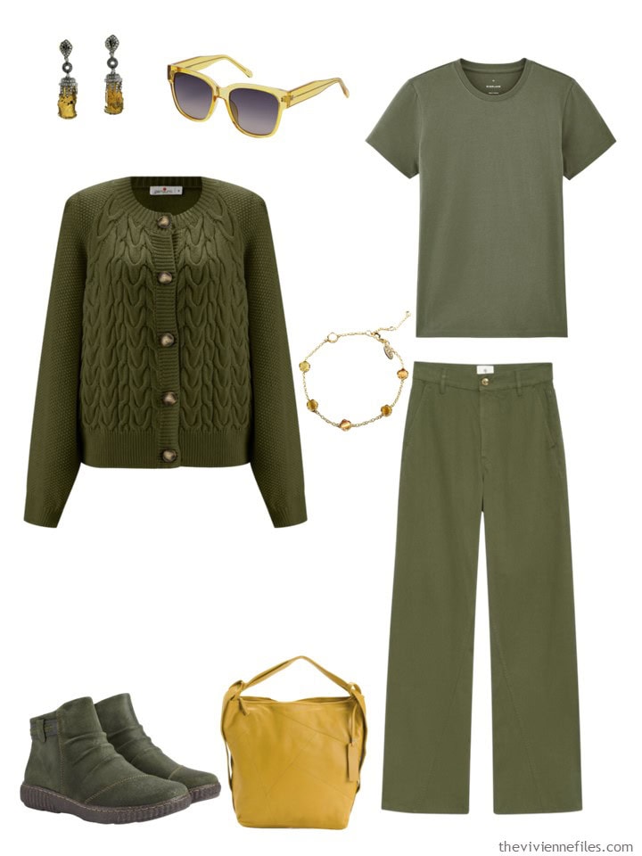
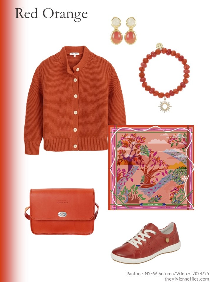
Cardigan – Alex Mill; red carnelian and moonstone earrings – Lila Rasa; bracelet – Liz Claiborne; scarf – Jessie Zhao New York; bag – The Dust Company; sneakers – Josef Seibel
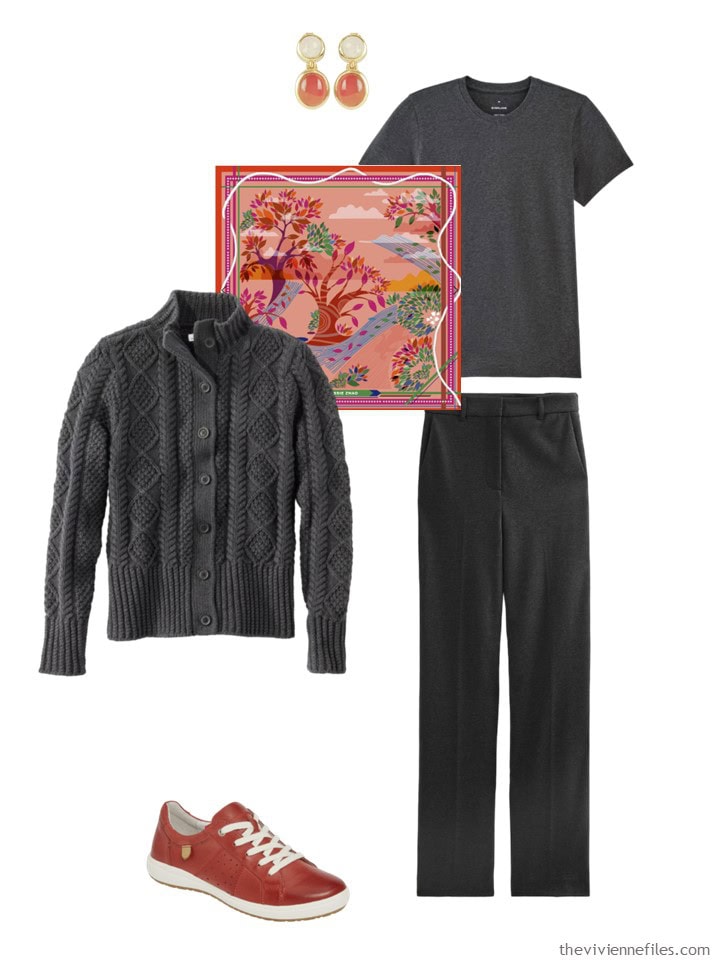
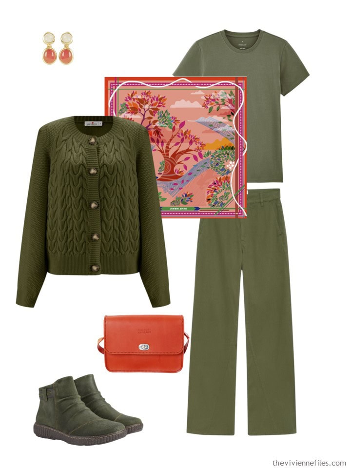
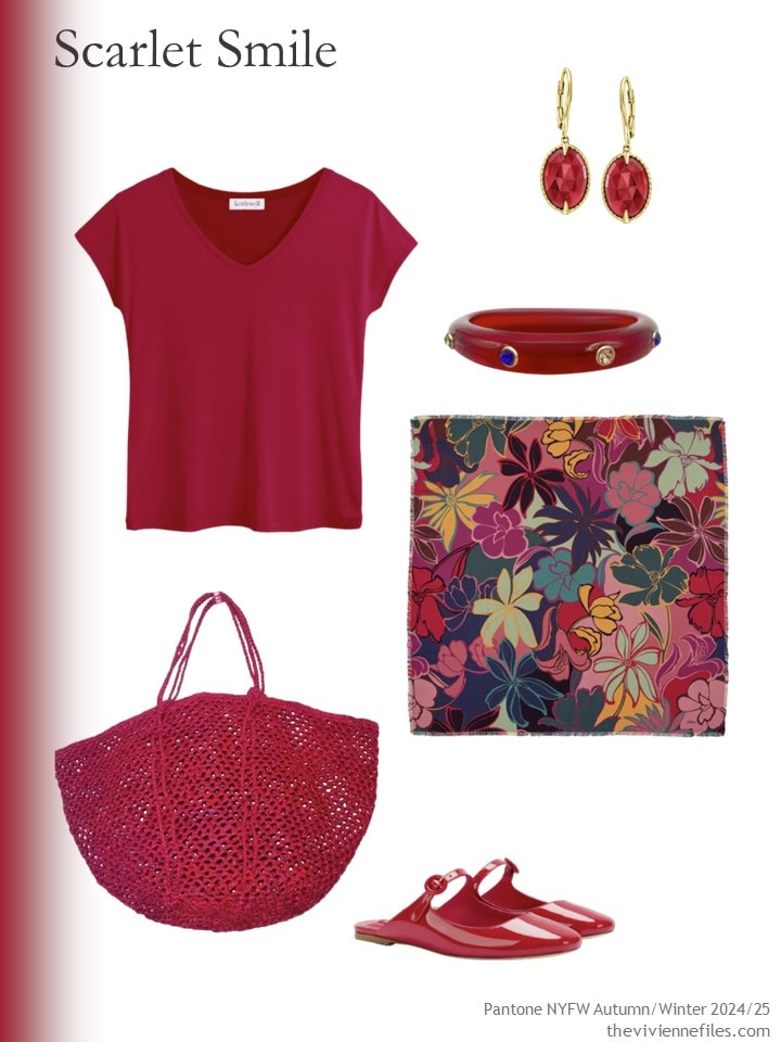
Top – Kettlewell; earrings – Ross-Simons; bracelet – Michael Nash; tote bag – Zantany Concepts; winter garden wool scarf – Echo; shoes – Larroudé
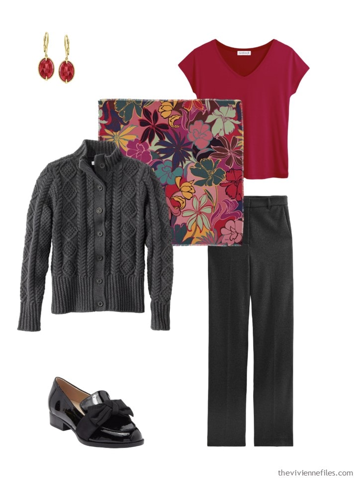
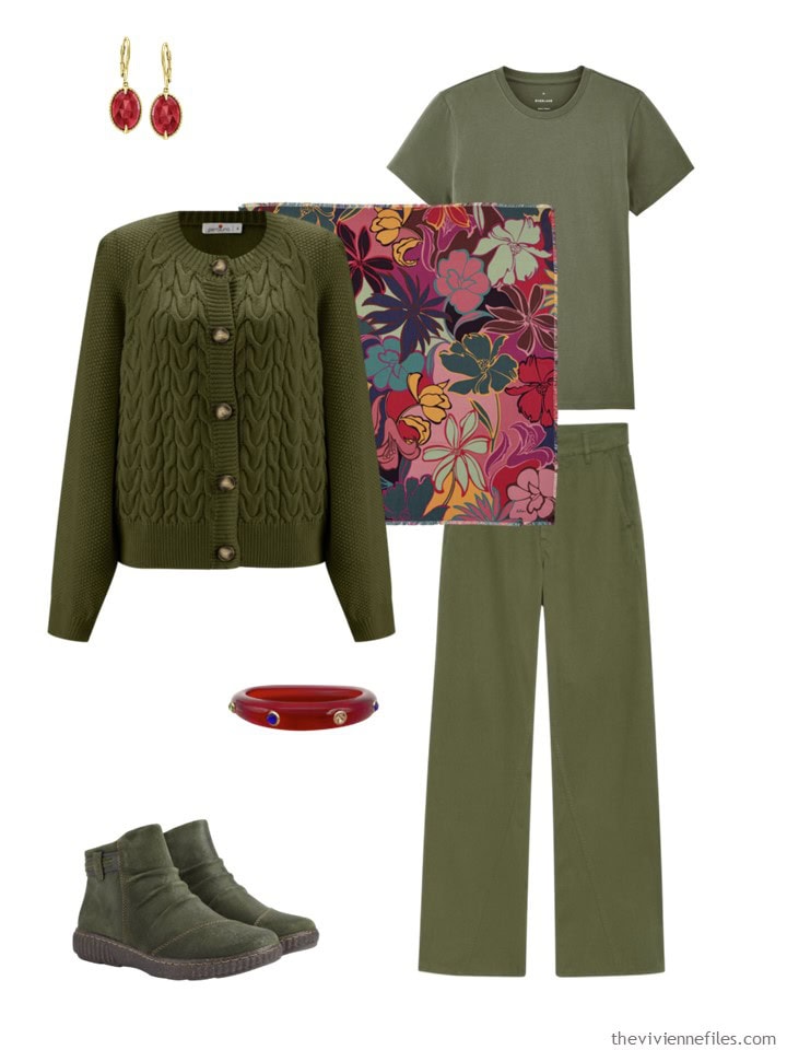
Catherine top – Kettlewell; earrings – Magpie Rose; bracelet – Magpie Rose; scarf – Maria Aristidou; tote bag – The Dust Company; loafers – Cole Haan
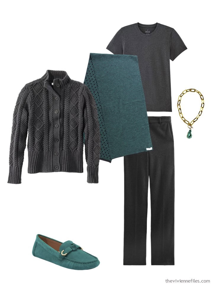
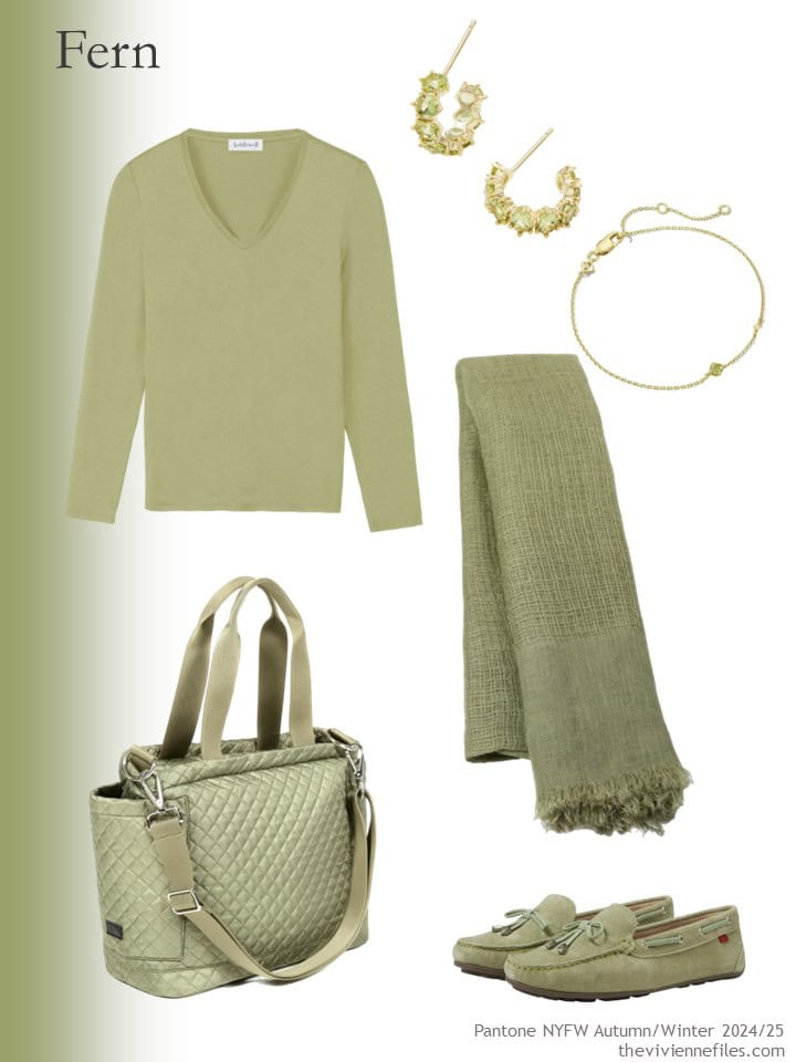
The Classic V – Kettlewell; earrings – Kendra Scott; bracelet – Kendra Scott; scarf – Heritage Moda; tote – ASK Scandinavia; loafers – Marc Jacobs New York
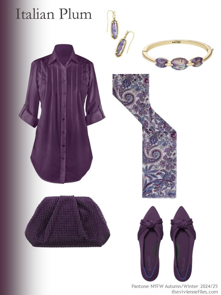
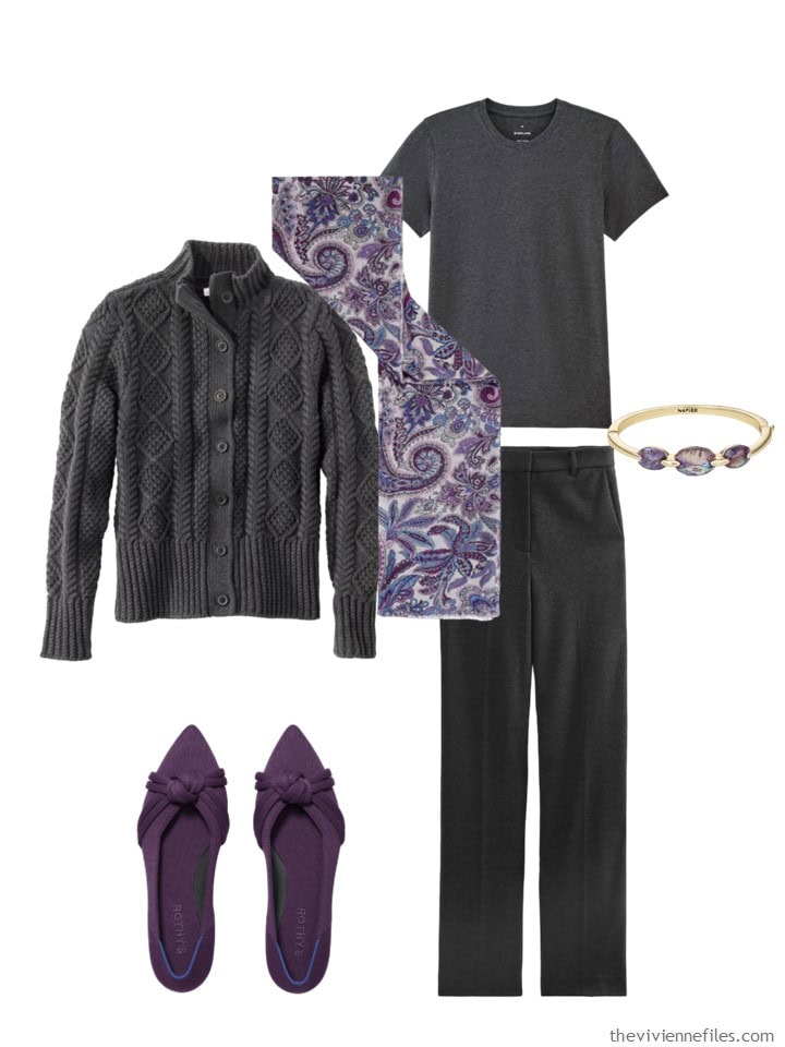
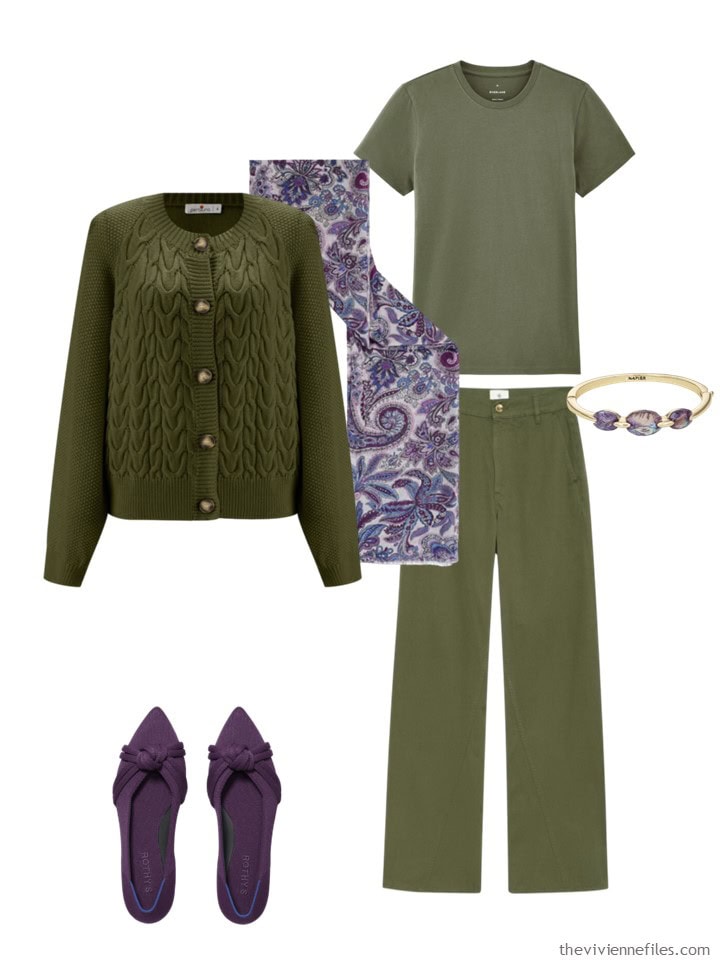
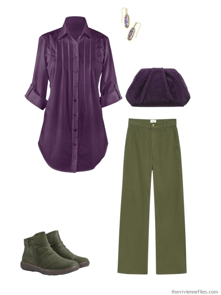
Tunic – Collections Etc.; earrings – Kendra Scott; bracelet – Napier; scarf – Gerard Darel; clutch bag – Nina; flats – Rothys
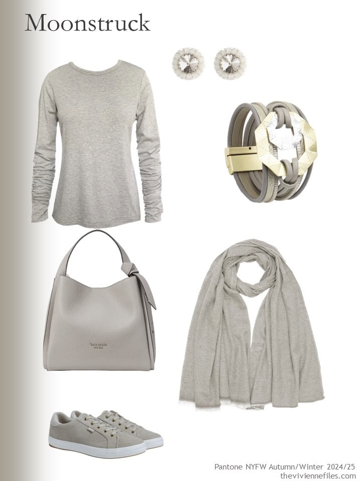
Oatmeal tee – Frock Tales; earrings – Saule Label; bracelet – Saachi; scarf – Antra Designs; bag – Kate Spade New York; sneakers – Keds
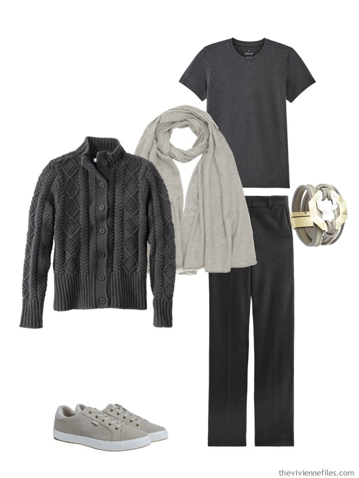
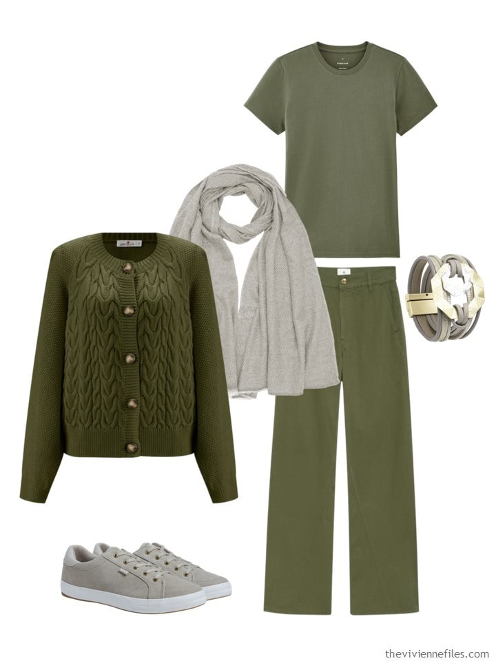
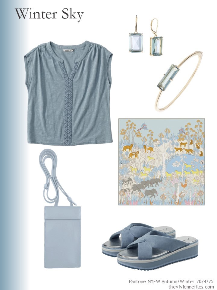
Embroidered top – Orvis; earrings – Lauren Ralph Lauren; bracelet – Lauren Ralph Lauren; scarf – Jesse Zhao New York; phone bag – godi.; sandals – Johnston & Murphy
Whew! Which of these absolutely grated on your sensibilities, and which looked lovely to you?
love,
Janice
p.s. Ten years ago, I was caretaking, and managing pretty well with nine garments…
Like this article? Save it to Pinterest!
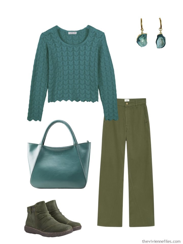
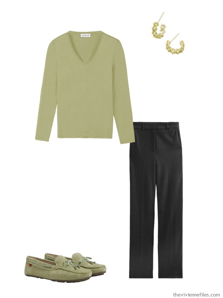
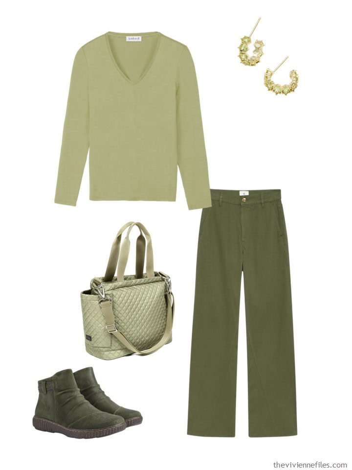
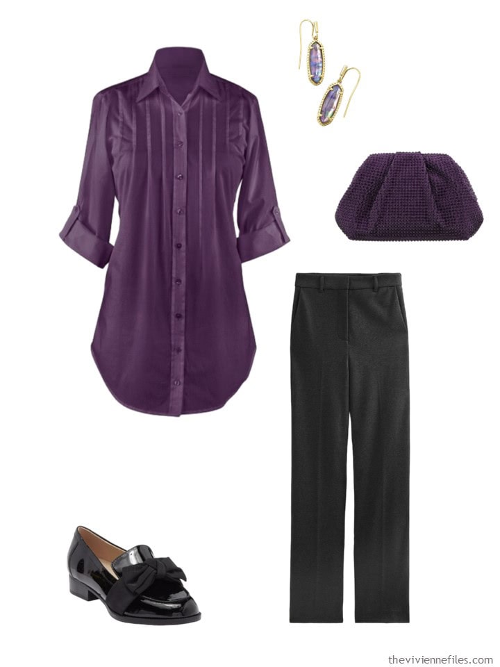
I love your analysis of colour. All the Pantone accent colours worked to greater or lesser extent with grey basics but none with the green. Though in the 1970s I would have worn purple and dark green
My dislike of the accent colours with the dark green is almost visceral, horrid. And this dark green ( khaki in the UK ) is one of my core colours so thank you for doing this exercise.
I felt similar, JANW, as my best colour is also “khaki” (am South African of British extraction) and if I must mix it I pair it with black or medium grey as I look freakish in white. (For belts/shoes/bags I go for black, brown or tan.) I was born in 1979 but would probably have worn the orange from this post with the olive green as I do sport an orange top sometimes (with black or denim bottoms.) Am also super grateful for this exercise so I don’t lose focus and waste money on garments that will not do anything for me. (PS In the UK what ddo you call that dark beige colour that everyone else calls “khaki”? Here it is called “stone” and although I think it’s beautiful I can’t wear it because then I look beige from head to toe. :-)
Thank you for this – it is nice to learn more about the combination of accents and neutrals. I like most of them, but the last one, winter blue, was perhaps too cold for these neutrals..?
I adore the tealy Adventurine but it doesn’t work with either of the base neutrals in today’s post. The charcoal and teal share the same colour saturation so it seems very heavy and the Aventurine mixed with the olive green makes my eyes twitch.
Most of the other combinations work for me – especially the Italian Plum and Scarlet Smile.
It is so interesting to see the colours juxtaposed with the various accents.
oh, that’s my contribution.
Since I have gray and olive (along with dark blue) as neutrals, almost everything works for me.
The ice blue would need a lighter gray. And here you can see again that an accent color just in accessories is not enough for me.
I wish you all a nice weekend.
You have done a LOT of work here, Janice. It seems to me the manufacturers are going to try to get us to buy entire wardrobes of a certain color. Many of the colors selected do not mix well, as the Aventurine and Olive. I think we would be ok with our navy, black and white basics, however!!
Thank God for those!
This is so valuable to me as I often struggle with color combinations. I recently read an article about high vs. low contrast in creating outfits based on the degree of contrast in your own coloring (hair & eye color, skin color/tone, etc.). I don’t have strong contrast coloring but I’m drawn to the higher-contrast outfits in your post. Thank you!
That was an interesting exercise. I think the Olive Green looks nice with Fern, and I think it could work okay with the Tomato Cream and Golden Palm if you had the right pieces. I think the Charcoal Grey looks okay with just about everything except for the Golden Palm and (surprisingly) the Winter Sky.
I like Italian Plum with Charcoal Gray the best.
Great work coming up with these options. At first glance, few of the combos seemed doable. But I think the neutrals are going dark on my monitor. Also, the more I look at Tomato Cream, I think this is a color that would be flattering for me, a Clear Spring.
Here are the combos I think could work: Either Gray or Olive – Tomato Cream, Golden Palm, Red Orange, Italian Plum; Gray – Scarlet Smile, Aventurine, Moonstruck, Winter Sky; Olive – Fern. Sitting on the fence about Winter Sky working with Olive.
I had to write these down as I scrolled through. Also, my opinions biased towards the colors I most liked in the first place!
Tomato Cream and the Golden Palm just so-so in any combination
Red Orange and the Scarlet I liked with both the gray and the olive
Adventurine I liked w/the gray, not so much the olive
Fern is a hard no for either one
Italian Plum with both the gray and the olive
Winter Sky and Moonstruck I can see with the gray, not so much the olive.
Have a lovely weekend ladies! Can’t wait to see how everyone else weighs in.
Several years ago you featured a wardrobe that combined teal (or aventurine) and green. My initial reaction was “ugh” but then I found a sweater in the back of my closet which I loved but had barely worn but had barely worn. I managed to pull together a travel wardrobe from my closet of greens and blues and, for once, loved every outfit I wore over the 5 day trip. Here I also like the red orange, moonstone, fern and winter sky with the green. My least favorites are the scarlet smile and Italian plum with the green.
Wow this must have taken you some time! Thank you because it does make me look at color combos in a thoughtful way. For me I preferred the looks with a larger presence of the accent color. I like the pale blue but not with either of the neutrals. It seems to be a wash out. As was said a pale gray would work and I love icy blue with white or black. Yes, thankful for those neutrals. I have charcoal gray as a neutral but only one piece a topper in that olive/sage color. On another note, my ECHO scarf arrived! I got the architectural taupe, mauve, gray one from last week. It’s gorgeous and will go with so much.
The cool colors fought with the olive.
Moonstruck and Scarlet Smile with both the charcoal gray and the olive are hits for me. I also like the fern combos but probably would never wear that color myself. And I wanted to lime the Winter Sky combos – I found them appealing but somehow “off” at the same time.
I liked all of the pairings except for the olive and aventurine, and the olive and Italian plum. I often wear olive and plum together but I must have some kind of connector piece (like both colors in a scarf or necklace). I don’t see any olive in the plum scarf so I think that’s why this one bothers me. The olive and aventurine combo is just too warm with too cool and not enough contrast.
I’m surprised how adaptable olive green is. I really liked it with tomato red, fern, and even winter sky blue. Nice to have my ideas readjusted.
I jumped over to the blog to see comments. Thanks for the perspectives, especially those that say too saturated or too cool. Apparently I don’t see cool/warm. Probably make people groan wherever I show up. Smile! But red orange and green are my staples. I will be so happy if red orange is everywhere this year.
Favorite: Italian Plum with the Charcoal Gray
Least favorite: Aventurine with Olive Green
(I do like the Aventurine as a color. Maybe with Light Gray or Navy?)
Wow, Janice, they all look great as accents for those neutrals – pretty impressive:)
I’m not sure that I really like any of these combos very much, but the accent colors themselves are all either too cool and/or too muted for me. I don’t wear olive green at all, and rarely wear charcoal, so I was surprised that comparatively, I preferred the olive combos to the charcoal ones. Maybe because olive is also muted?
But on the bright side, if they’re not selling colors I like, I’m saving money!
My favourites are the orange red and scarlet smile with both neutrals. I think the scarves from those two accents are lovely with the neutrals as well. The violet and olive are actually quite pretty but that would depend on the tone of the olive. The charcoal is also pretty with the violet accessories. The aventurine sweater with the olive pants is actually very interesting though my aventurine earrings are a very different green not teal at all, a different shoe would have upgraded that look quite a bit. The other combinations are un peu quelconque…
Well, I haven’t commented lately…hectic life. However, the golden palm and fern got my attention. I just don’t wear either neutral shown. The combo I thought nicest was fern and olive. The one that I thought no was the plum-olive and hard on the heels of that was the aventurine-olive. Frankly, I would use the fern and winter sky as neutrals. Maybe accent them with the golden palm? I doubt that I will be tempted if these are what we see for winter.
Yay for charcoal grey!!!
I was surprised how badly the golden palm went with the gray bassics.
I like Jewel tones with olive. The purple and red, don’t know the Pantone colors. Olive is my neutral for my Alaska trip. I think burgundy and or garnet will serve we well. Fascinating how everyone reacts differently. I thought no way to some of the combos that others like.
Works as designed – no surprises that I see this working
* Tomato Cream and olive
* Golden Palm and olive
* Scarlet smile and gray
* Italian Plum and gray. I think switching the metals to a silver tone would make a noticeable difference. It’s a detail that I don’t think always matters much, but here I think it would.
Surprisingly inoffensive – I had to see it to believe it would work so well
* Tomato Cream and gray
* Golden Palm and gray
* Fern and gray
* Scarlet smile and olive. I was expecting it to look Christmassy, but it’s giving bromeliad and I think I’m here for it
Living up to my low expectations – I wouldn’t have thought this would work, and I still don’t.
* Aventurine and olive – I just don’t think olive and teal do much for each other
* Winter sky and olive – it may be that I don’t think olive and blue do much for each other
I expected better – I really would have thought those colors would work but seeing them together made me change my mind
* Red orange and gray: chthonic vibes. seriously, this looks like cooling lava
* Red orange and olive: jarring. maybe literally. like pimento-stuffed olives.
* Fern and olive. I tried but I can’t and it’s not just because I don’t really like monochromatic palettes. that’s just too much green at once.
* Moonstruck and gray – this reminds me of junior high gym class when the t-shirt got washed with some colors that tainted it. there is some warmth to moonstruck that I didn’t see originally.
Mixed feelings:
* Aventurine and gray: study in balance. the first look – mostly gray with a little aventurine – is disappointing. the second one with more aventurine is better, but I think this is another place where metal tone matters, and I would want silver. I think just a little silver would give it enough contrast to look stunning.
* Italian Plum and olive: Rationally I don’t think the colors themselves are bad, but it has an Olive Garden vibe I can’t quite get past. I have dishes in this color combo with an olive motif on them that I acquired in the early 2000s. I would feel like I was wearing a pasta bowl.
* Moonstruck and olive: I think I could be talked into this, but it would have to be done very carefully. The moonstruck top is leaning a little too athleisurely for me to take seriously with the olive trousers, but the purse and earrings are surprisingly refined looking. I think a silk blouse in that moonstone would work. I also think it would also be easy for this combo to look like a marine decided to borrow hubby’s army t-shirt for her morning run.
* Winter sky and gray – It looks like a drab and cloudy day. It may be the yellow and orange animals on the scarf, though. I’m finding it hard to look away from the scarf. Honestly, I think that blue might be best realized as light wash denim.
You describe things so well – are you a writer? If not, you should be…
hugs,
Janice
Only as a hobby :)
Thanks though!
Wow! Between Janice’s color combinations and your assessment, I am gobsmacked. I noticed the warmth in the Moonstruck only after seeing it in combination with the other colors. While I know some of the above combinations would look better on me than others, I only cringed at the golden palm and charcoal.
Maybe it’s my monitor, but to me, moonstruck is basically pale gray, another neutral not an accent color. I wear olive and grey trousers in the winter, but prefer brighter pieces on top, like the tomato cream, scarlet smile and red orange. For golden palm, my favorite combo was olive green with the golden palm sunglasses and bag. As someone else mentioned. it would be interesting to see aventurine and winter sky as neutrals.
I mulled this over for a bit, and realized I can do without accent colors altogether. I thought about the colors, how warm leaning went better with the olive and cool leaning went better with the grey. And decided what I really liked was the basic clothes Janice picked out for us, the charcoal and the olive.
I liked the Scarlet Smile (beautiful shade of red) and the Aventurine (already one of my favourite accent colours) with the charcoal. Also the Moonstruck, which I did see as an accent colour rather than just another neutral. Probably because it’s so much lighter than the charcoal. And reads to me as silvery, rather than grey. I found it so difficult to appreciate the olive combinations at all, as I don’t warm to olive in the first place. But I’m sure there are some nice combos there for olive lovers. This was interesting to me actually, as I love a lot of greens, but not olive, and not the Fern accent.
This was an especially interesting exercise for me as I know from experience that
(1) most of the featured colours flatter me and I would look like a dream in the aventurine as my eyes change from grey to green to blue depending on what I’m wearing but…
(2) my absolute best colour is the staple olive green and the darker orange featured also suits me, but not at the same time, so it confirms that I should stick to my wardrobe plan and not be derailed by trends.
Regarding the suitability to season of the core colours, it is a challenge but living in Subsaharan Africa it is possible to accquire lightweight shirts/tops, skirts and shorts in olive green and then mix and match to create the desired effect. (Have never attempted with charcoal grey or summer weight trousers/pants but it may prove possible too.)
So when my husband asked me out on an impromptu dinner date last night (in a heatwave of 35 degrees Celsius/Centigrade) I put on an olive green viscose blend knit top with crew neck and short sleeves and a matching (rather old but still good) olive green linen blend straight knee-length skirt with a black handbag and shoes and enjoyed my meal in style and comfort. (I could breathe and still received compliments as the ensemble fit well and almost gave the effect of a dress.)