April 15, 2024
So once you’ve studied the Pantone Colors from London Fashion Week, (found here and here), you have to decide if you like the colors, if you would be flattered by wearing any of them, and how they might look with the neutral clothes you normally wear.
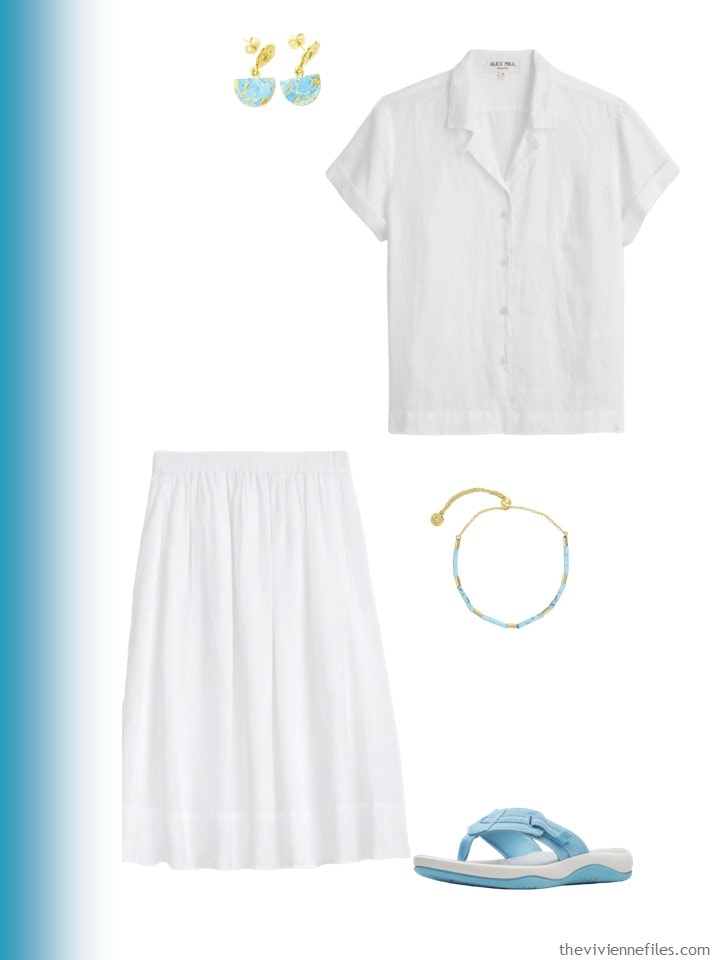
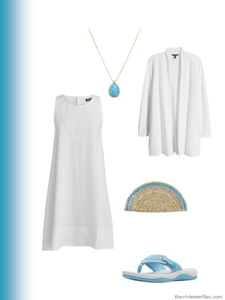
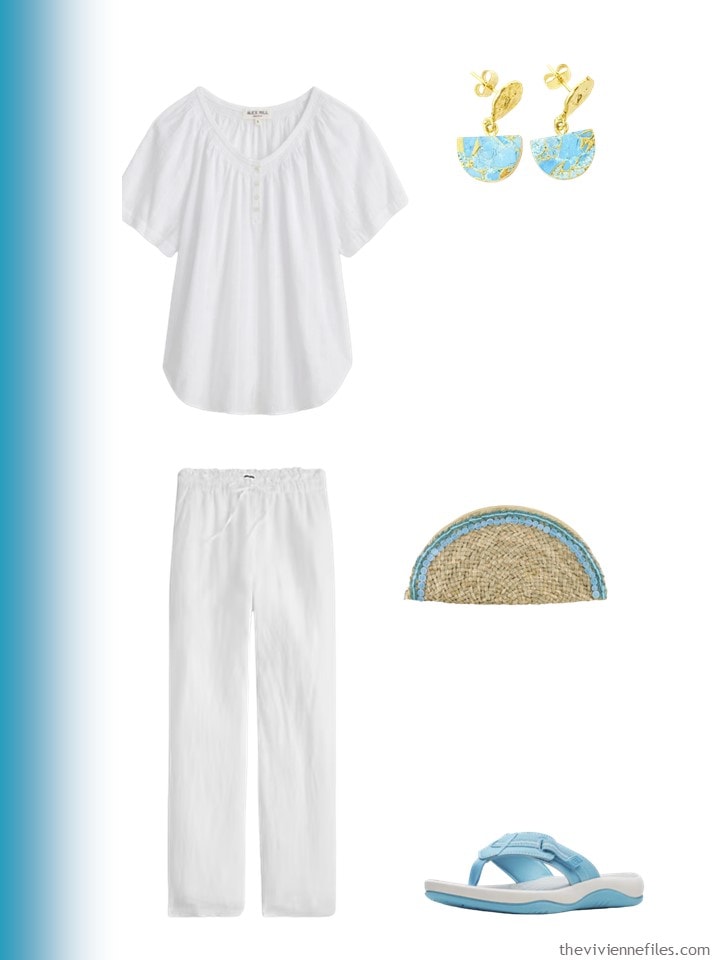
I can’t answer the first two questions for you – obviously – but I can give you some visuals to help you picture how the accent colors might work with your existing wardrobe…
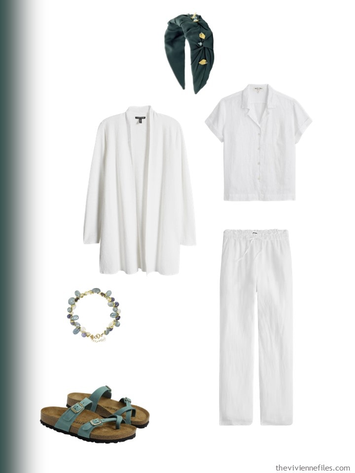
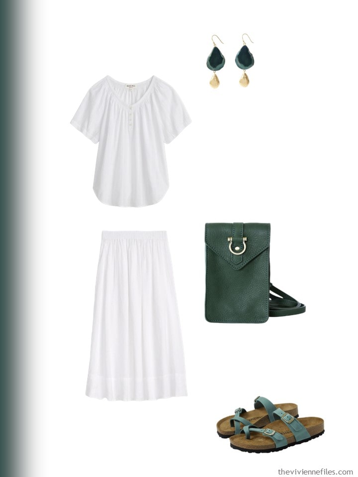
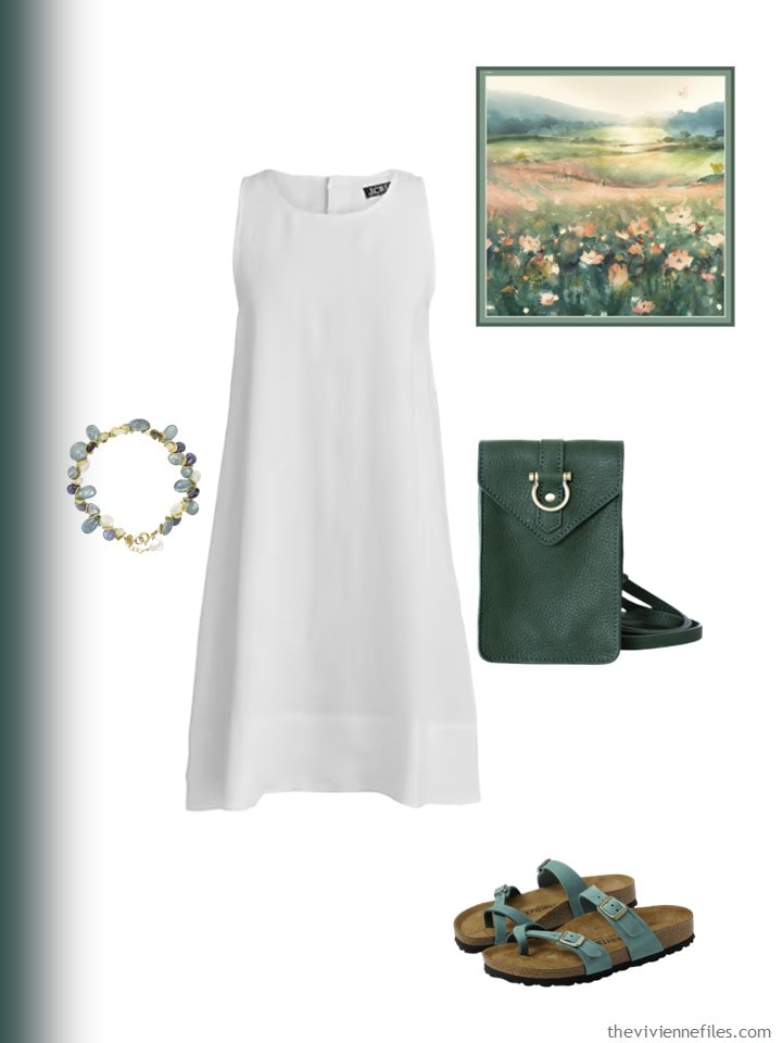
I’ve assembled four “core wardrobes” in white, black, beige and navy, in varying degrees of dressiness. The level of dressiness is going to be more important than I had realized – you’ll see what I mean.
Here are the four Wardrobe Cores:
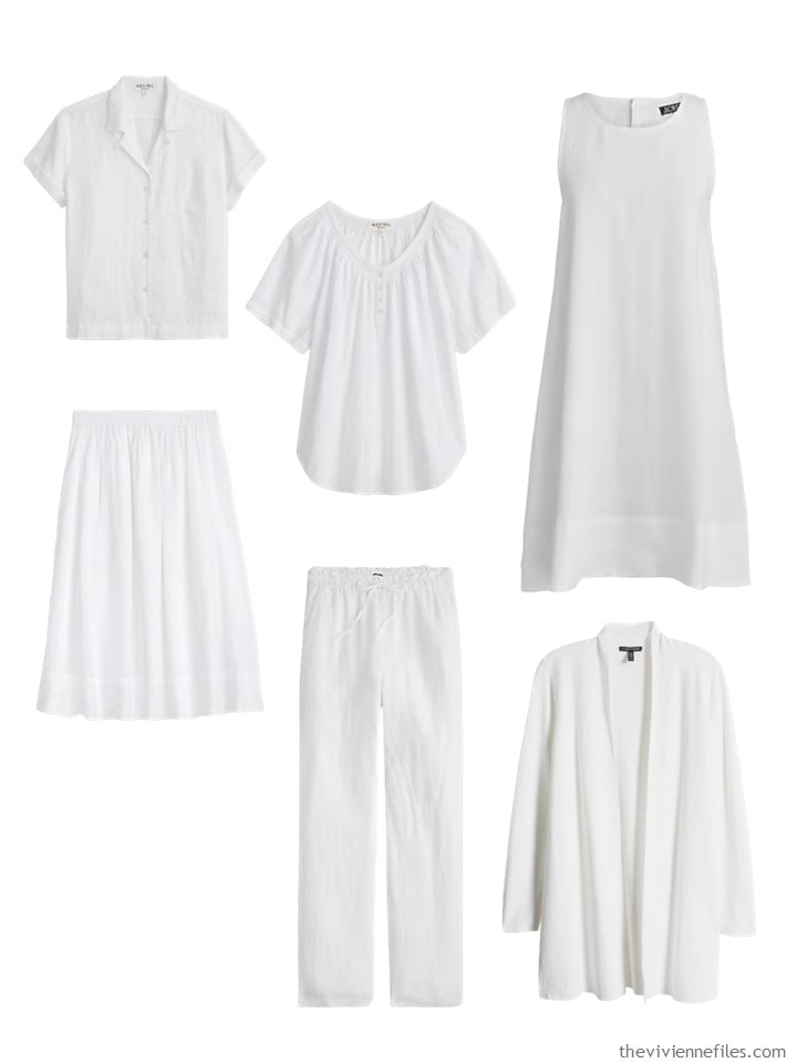
Shirt – Alex Mill; smocked top – Alex Mill; dress – J.Crew; skirt – Alex Mill; linen pants – J.Crew; cardigan – Eileen Fisher
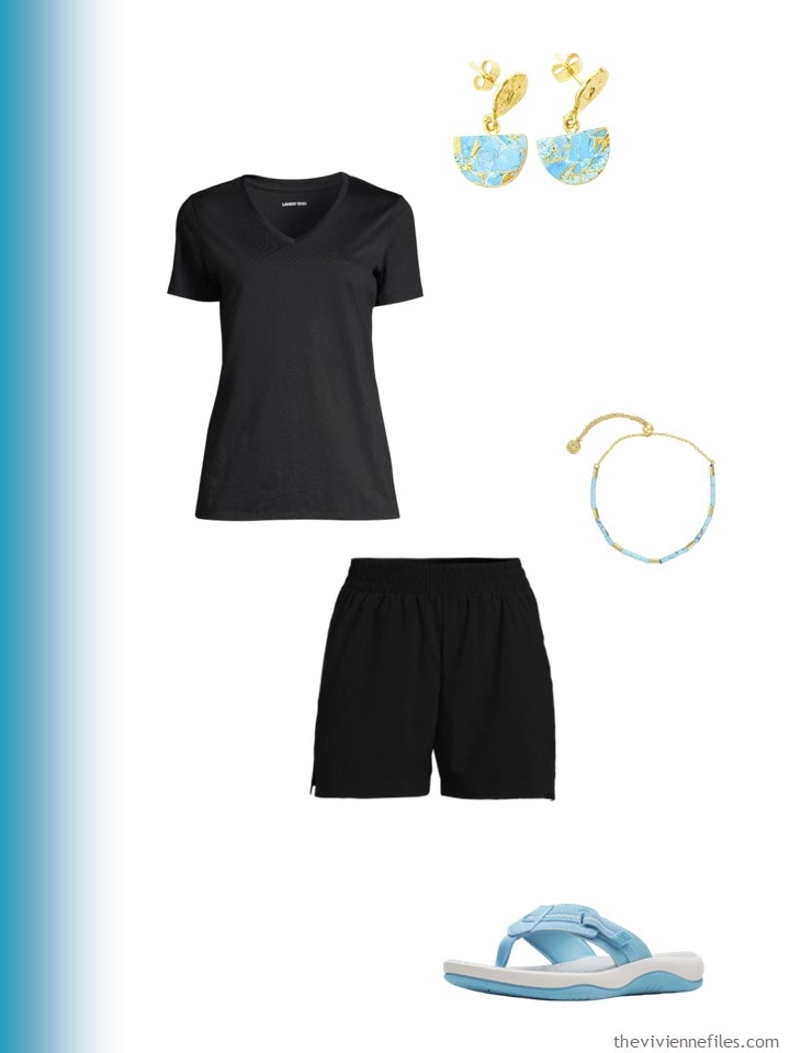
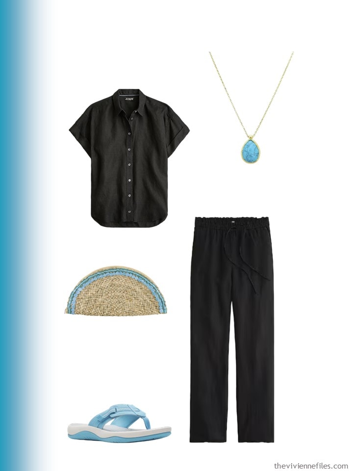
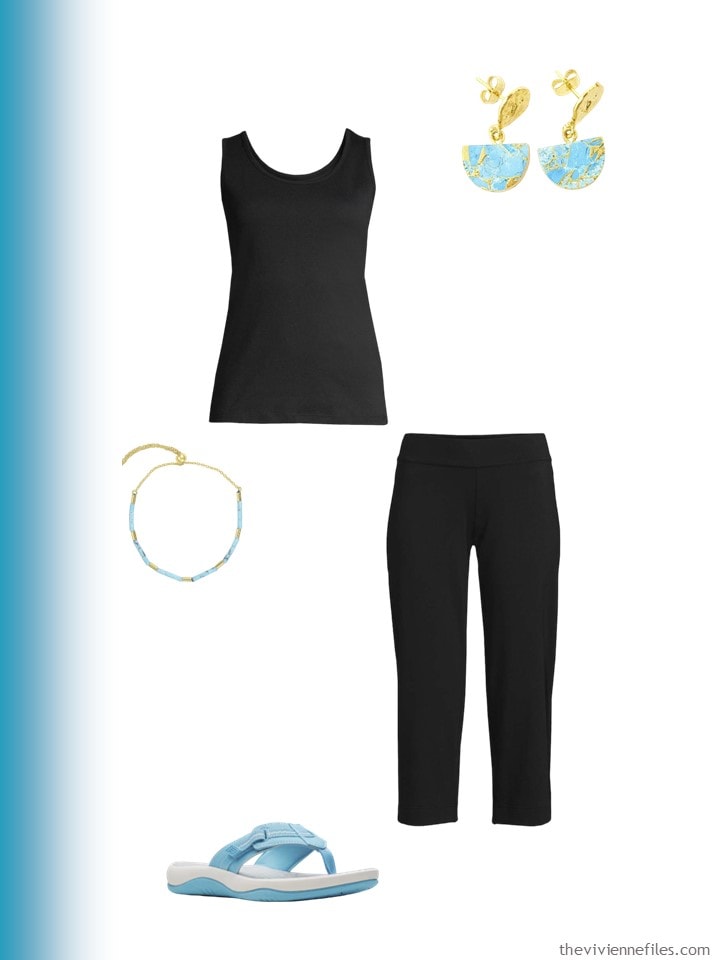
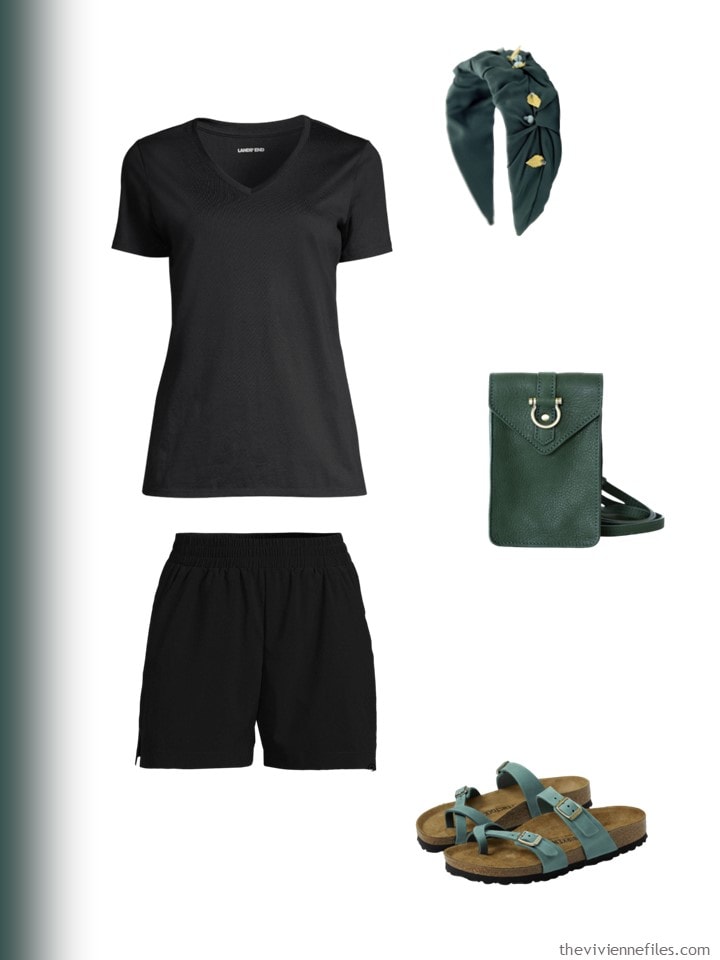
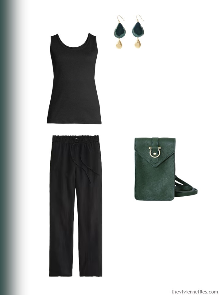
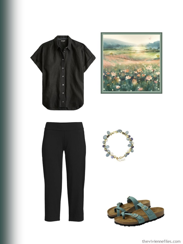
The black core is pretty casual:
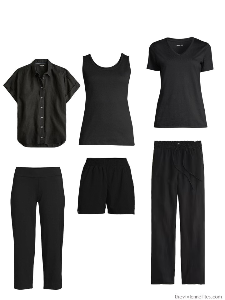
Camp shirt – J.Crew; tank top – Lands’ End; tee shirt – Lands’ End; capris – Lands’ End; shorts – Lands’ End; pants – J.Crew
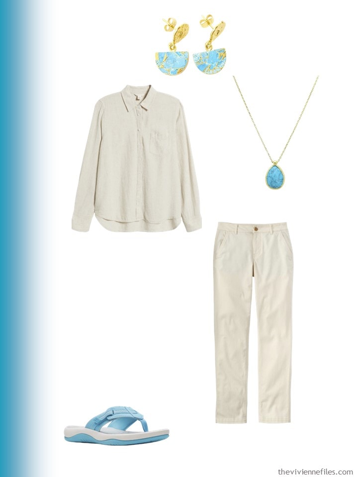
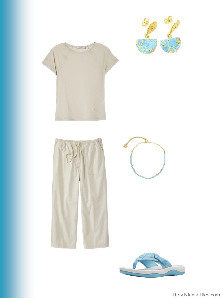
The beige core spans relatively warm to almost cool weather – a long-sleeved shirt is always hand when weather changes!
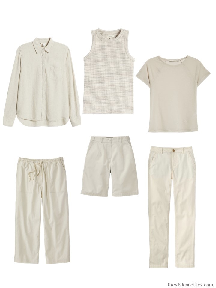
Linen shirt – Caslon; tank top – Madewell; tee shirt – Paloma Wool; cropped pants – L.L.Bean; Shorts – L.L.Bean; stone chinos – L.L.Bean
For some reason, I felt that navy was dressy – this is the kind of cluster that I would have had when I worked in advertising…
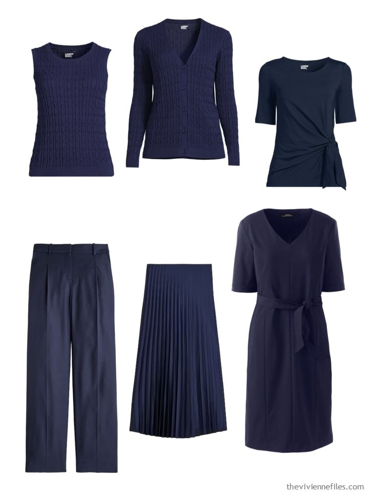
Vest – Lands’ End; cardigan – Lands’ End; tie-front shirt – Lands’ End; pants – J.Crew; skirt – J.Crew; dress – Lands’ End
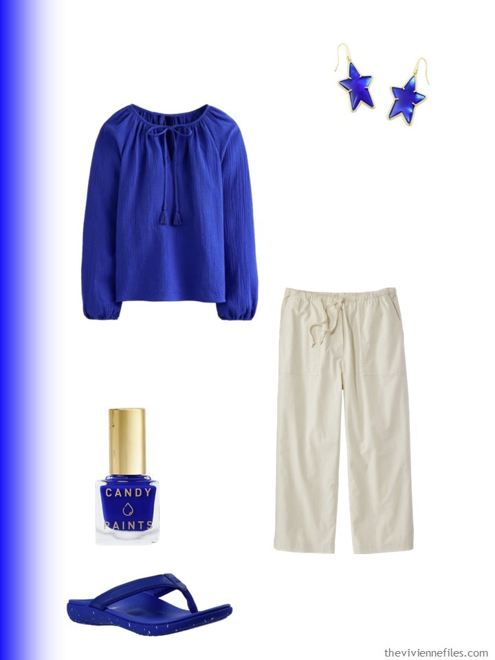
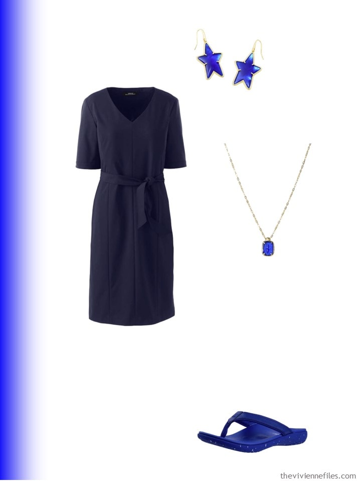
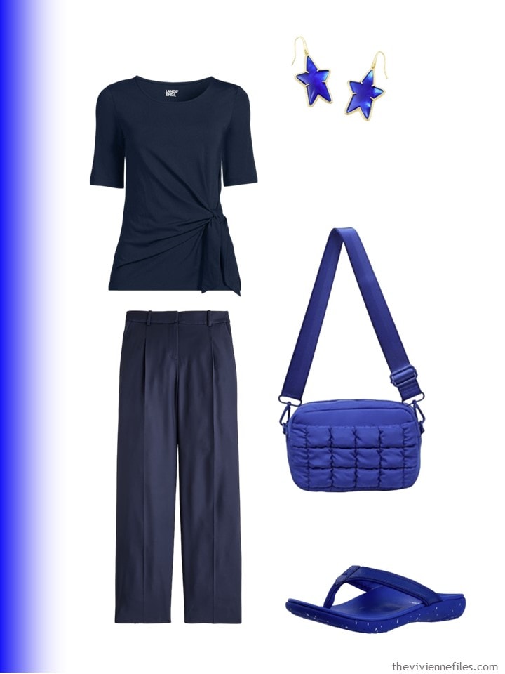
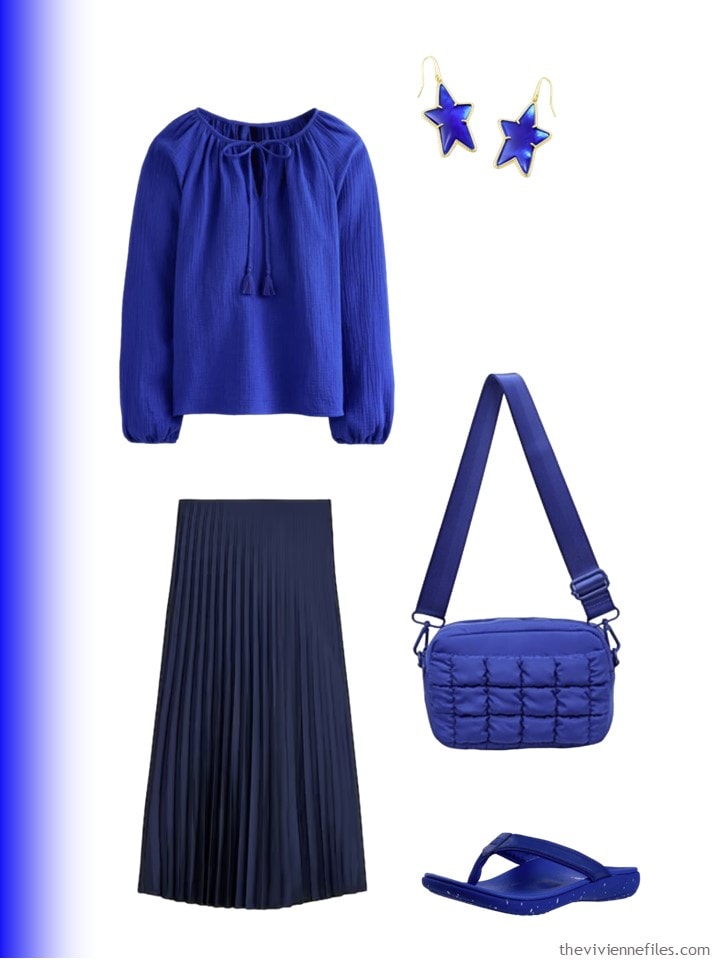
From here, I’m just going to show the original first three accent colors that we looked at on Wednesday, and then I will share three outfits in each neutral, accented with each of the three accent colors.
In other words, lots of pictures!
And I’m going to shut up and just show you images, and let you draw your own conclusions. I’m hopeful that there will be an interesting and robust discussion! You will clearly see a big mistake that I made, as well as maybe learn something fun.
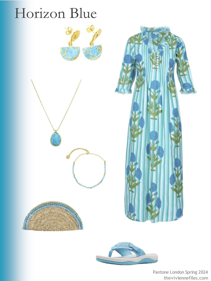
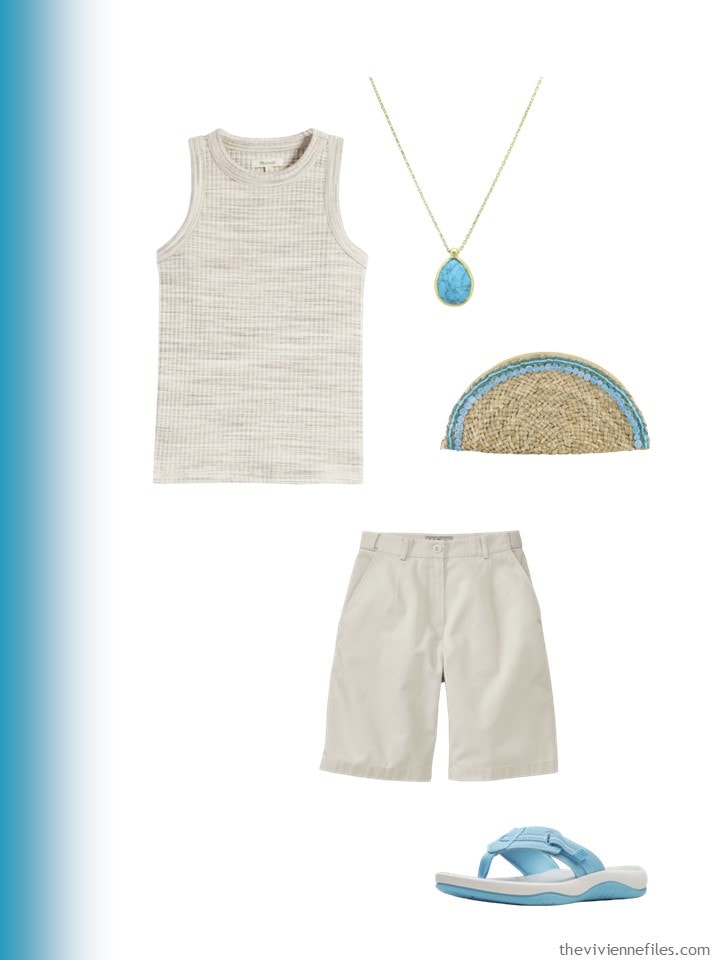
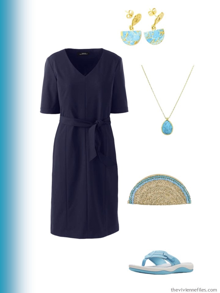
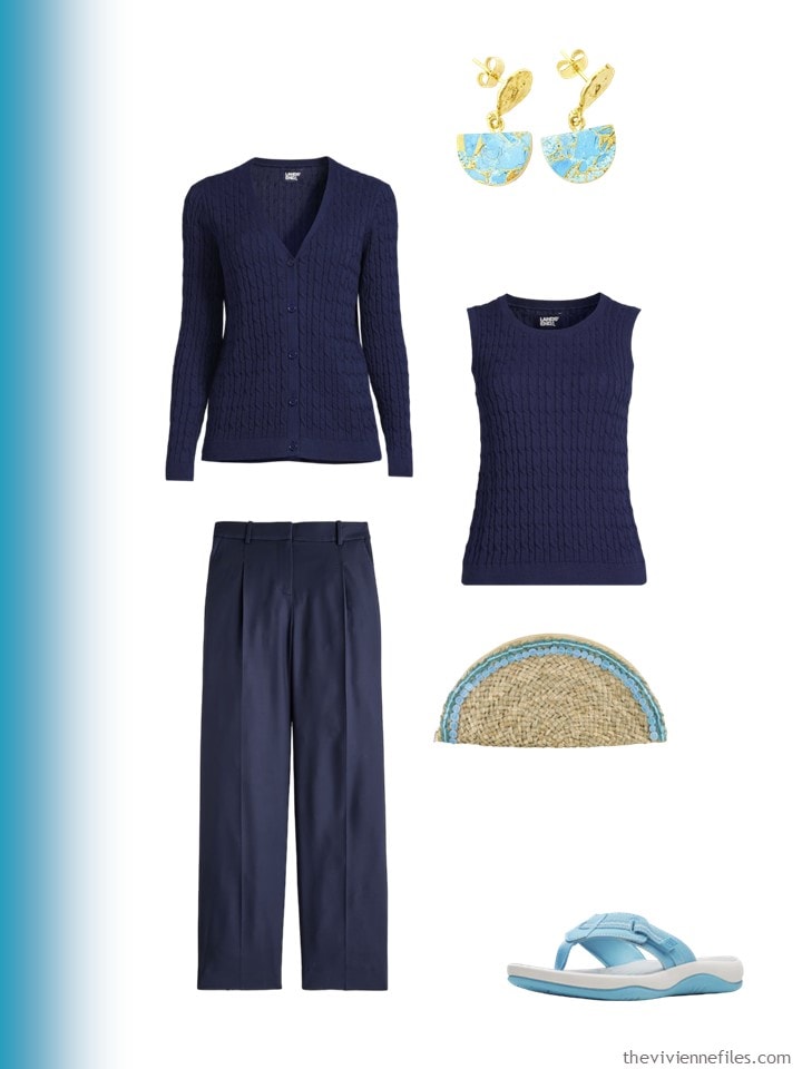
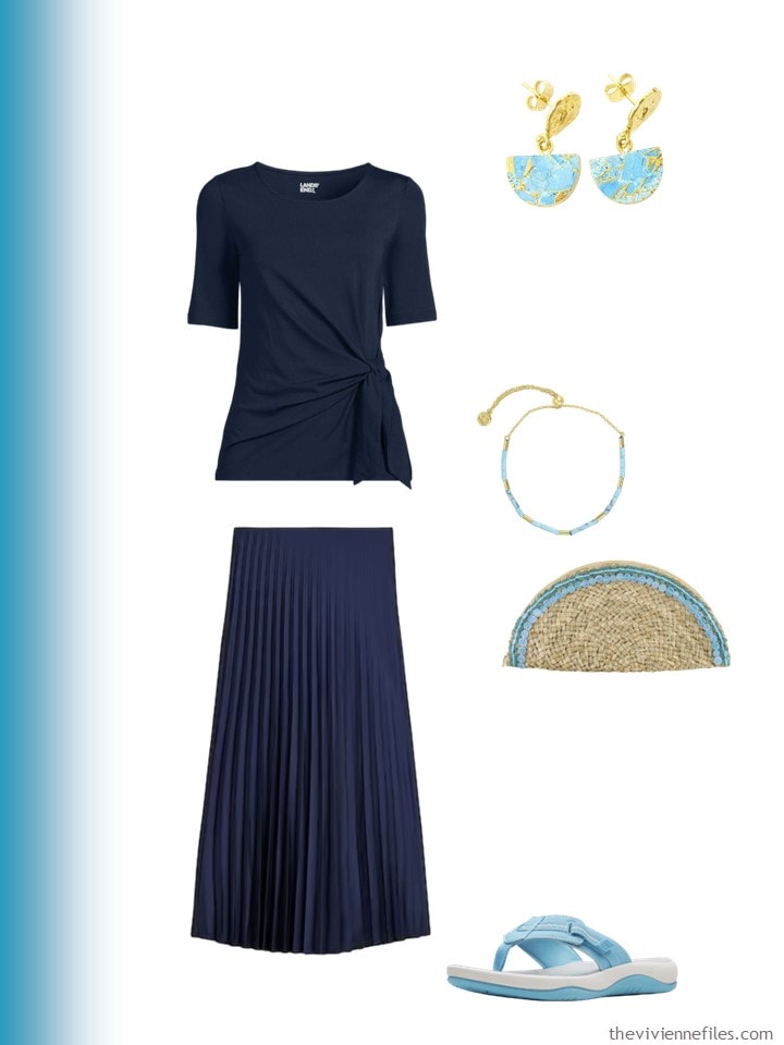
Earrings – Harfi; dress – At Last…; necklace – Latelita; bracelet – Gorjana; bag – OhSun; sandals – Clarks
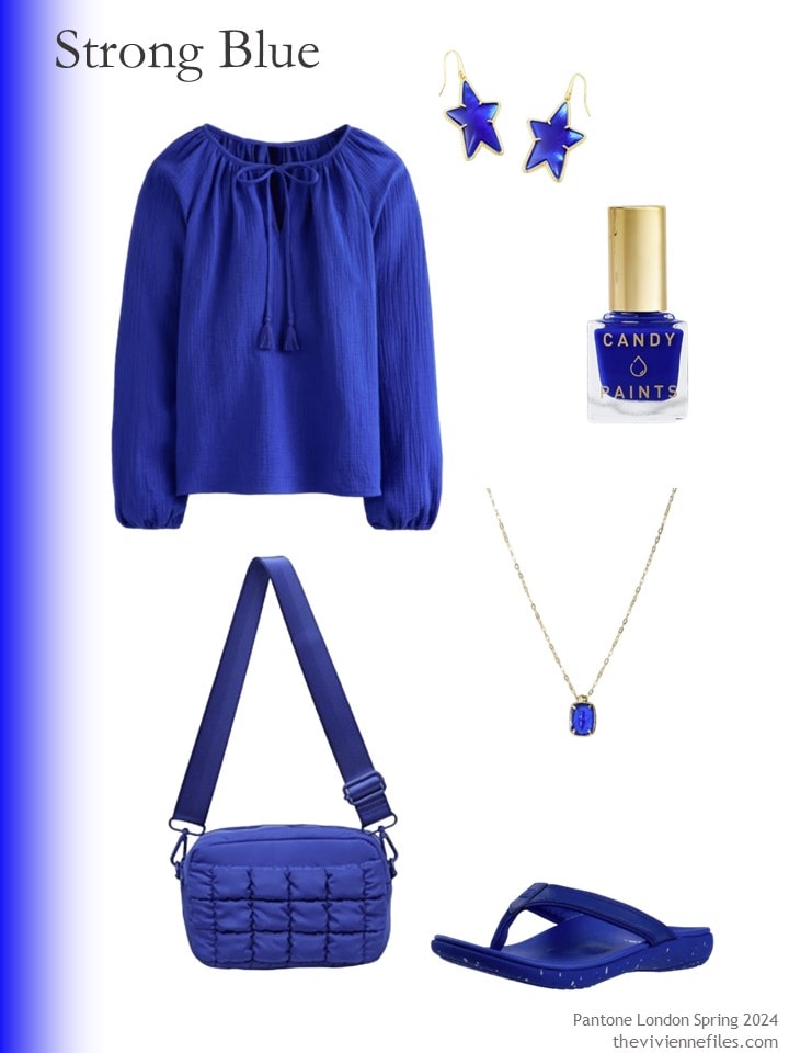
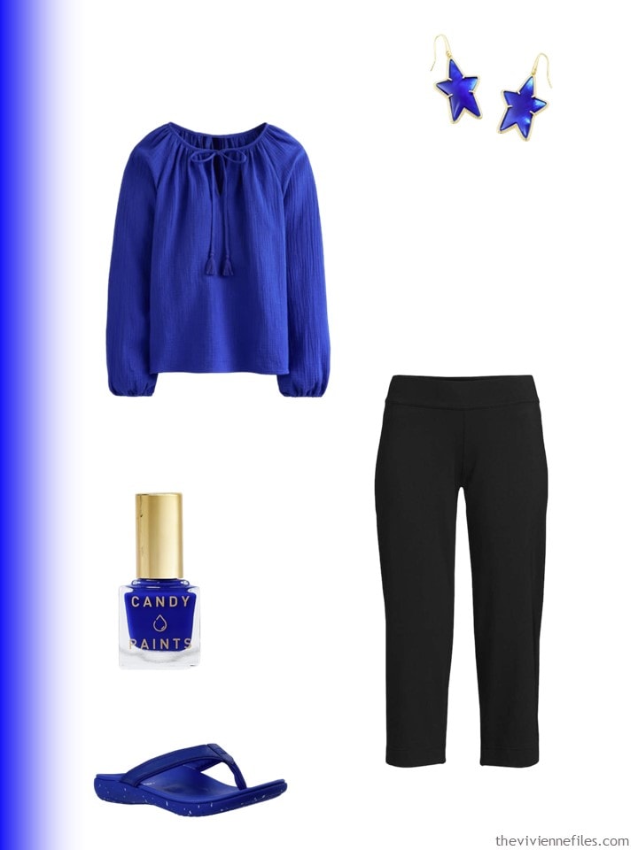
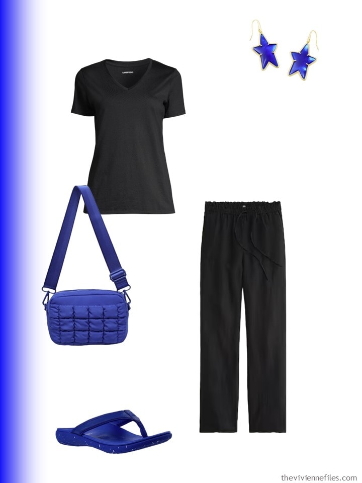
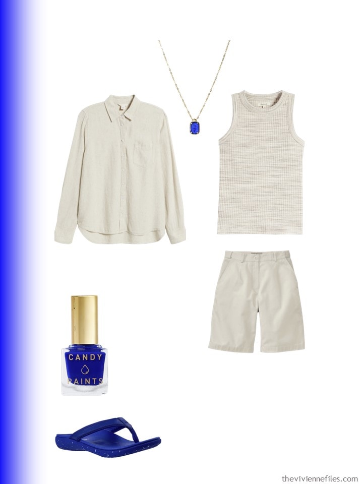
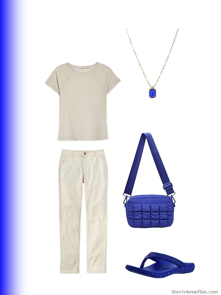
Blouse – Boden; earrings – Kendra Scott; nail polish – Candy Paints; chalcedony pendant – Golden Horn Jewellery; quilted bag – Sol & Selene; sandals – Spenco
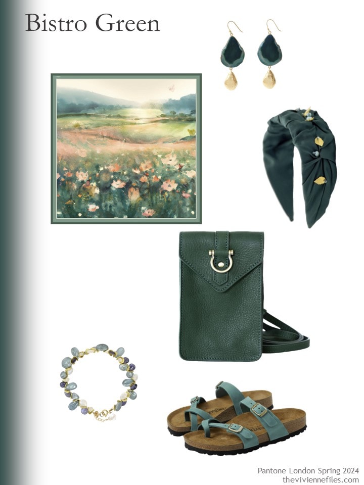
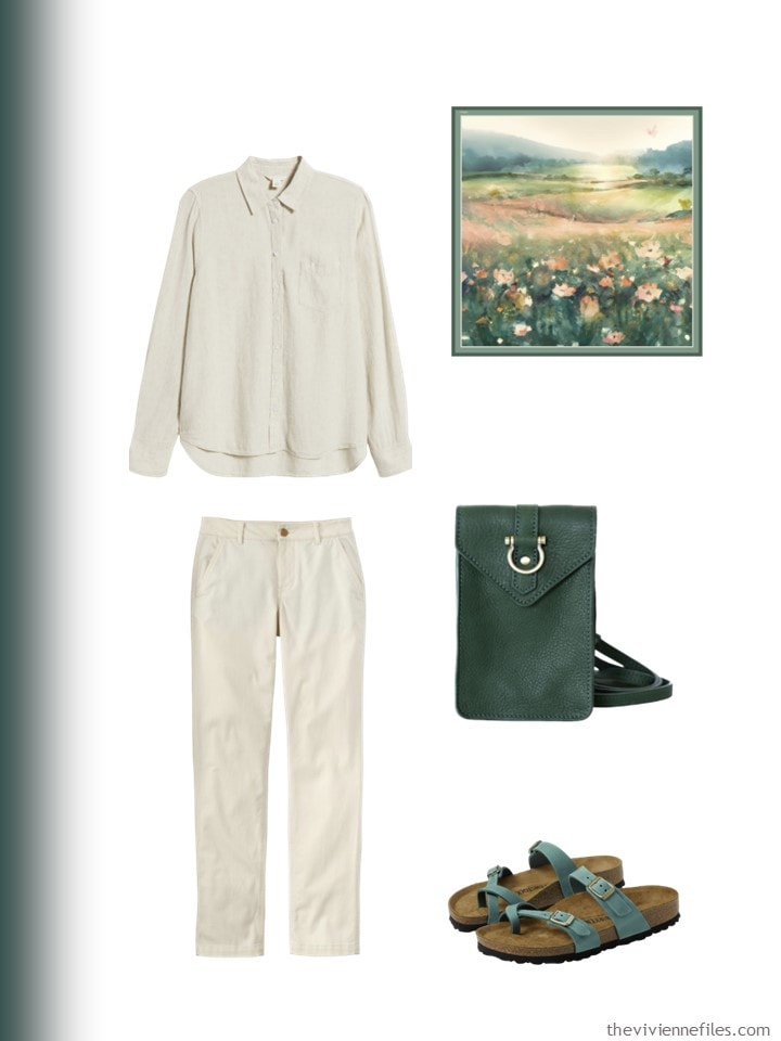
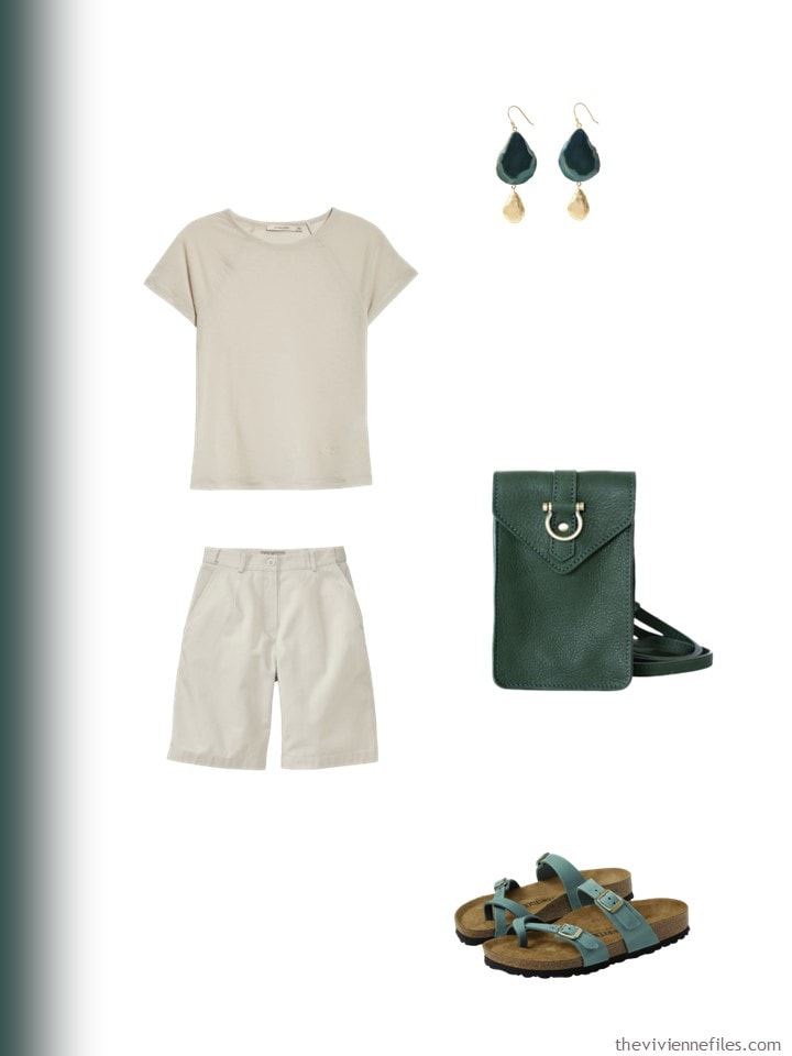
Scarf – Artifact.; earrings – Yaa Yaa London; headband – Adiba; bag – Sapahn; bracelet – Lori Kaplan Jewelry Design; sandals – Birkenstock
If you wish to print any of these for future reference, I think you can just “right click” on them and Print should be an option. At least that’s how the Internet works on my old, monster laptop…
And I’m just saying – you can’t wear flip flops with a dress like the navy one…
love,
Janice
p.s. Ten years ago, I saw some people wearing DOTS on the street in Chicago… The outfits still look pretty good!
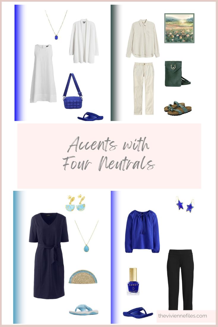
Like this article? Save it to Pinterest!
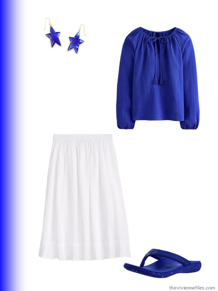
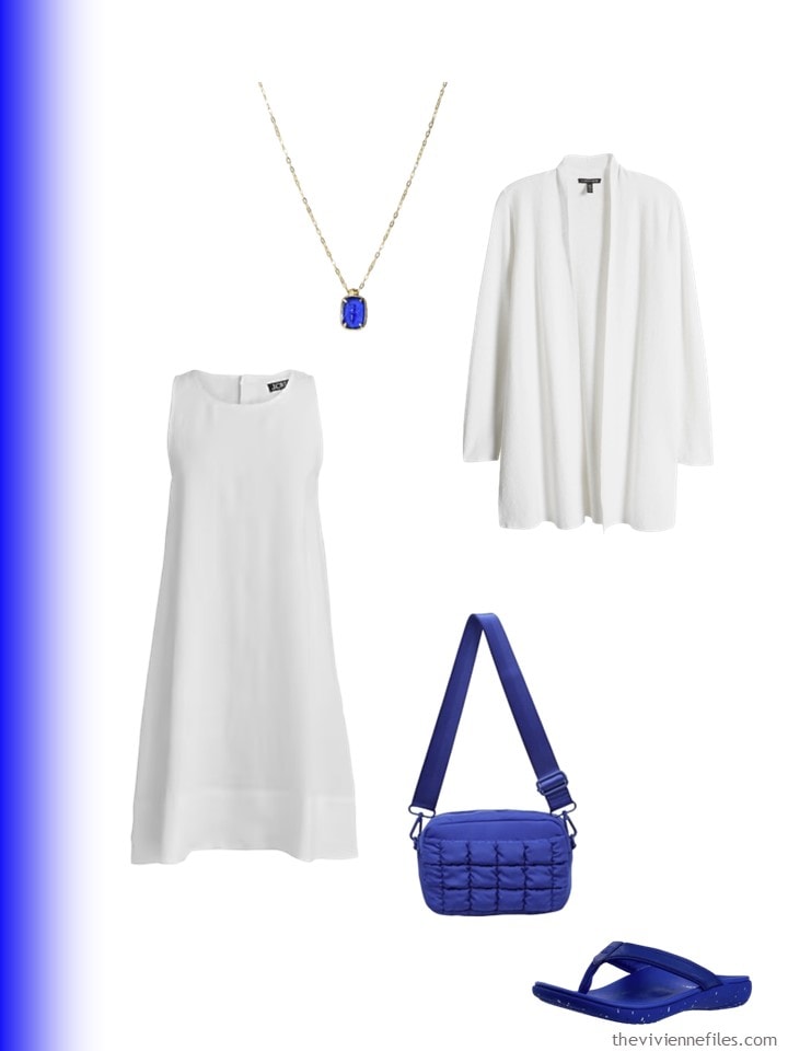
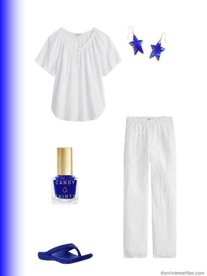
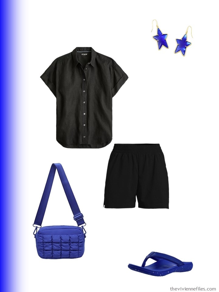
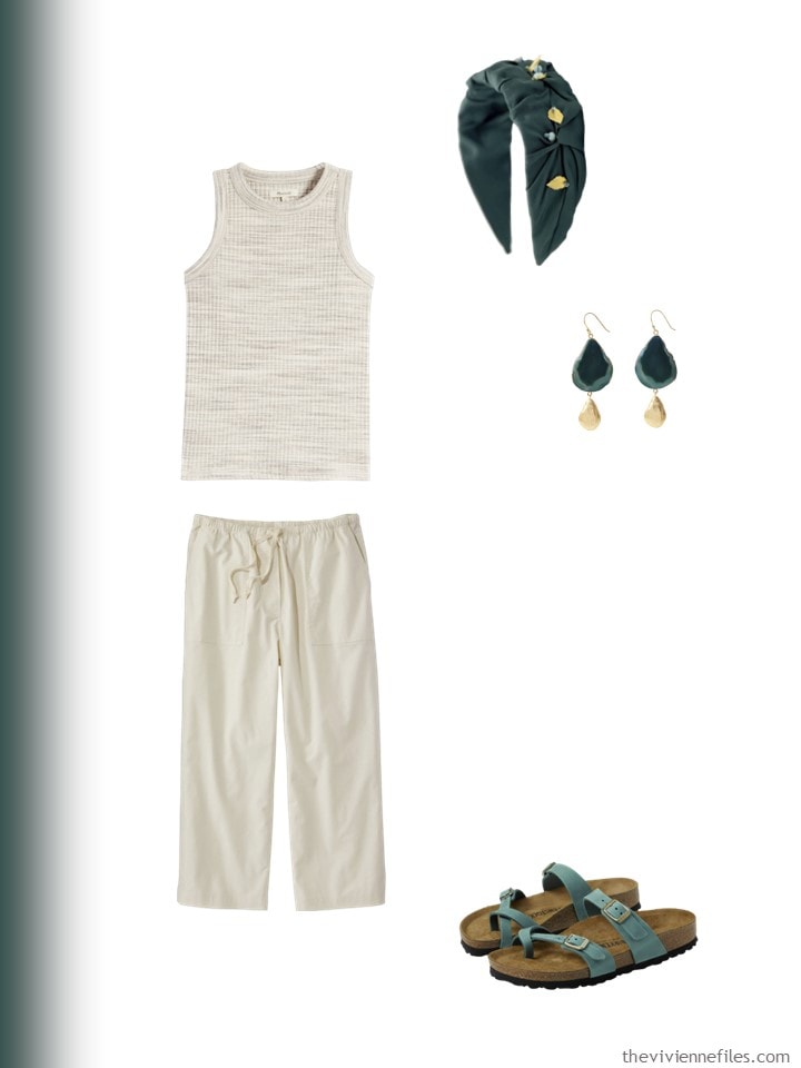
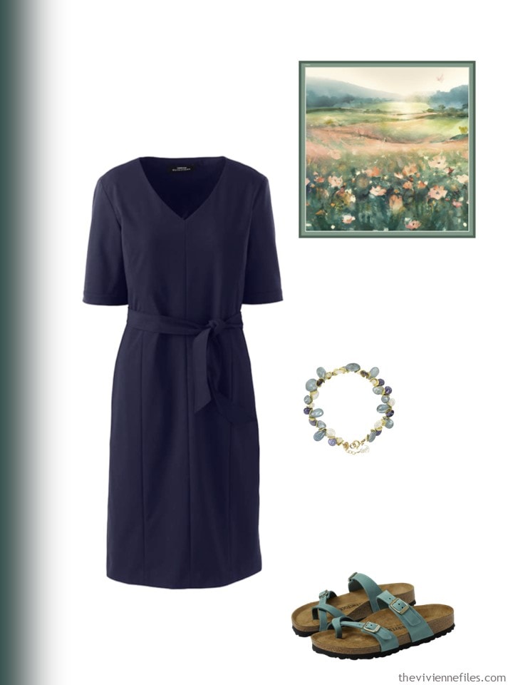
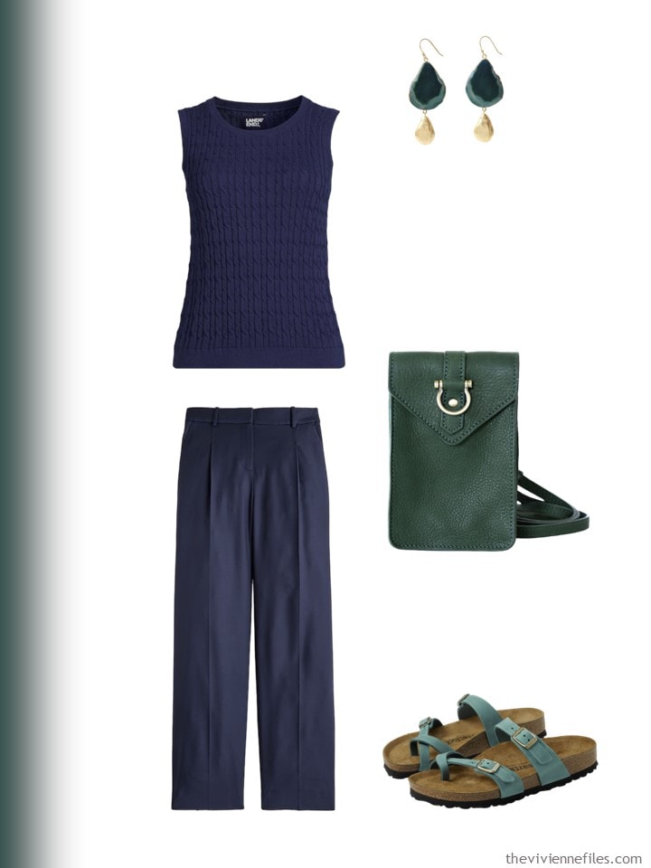
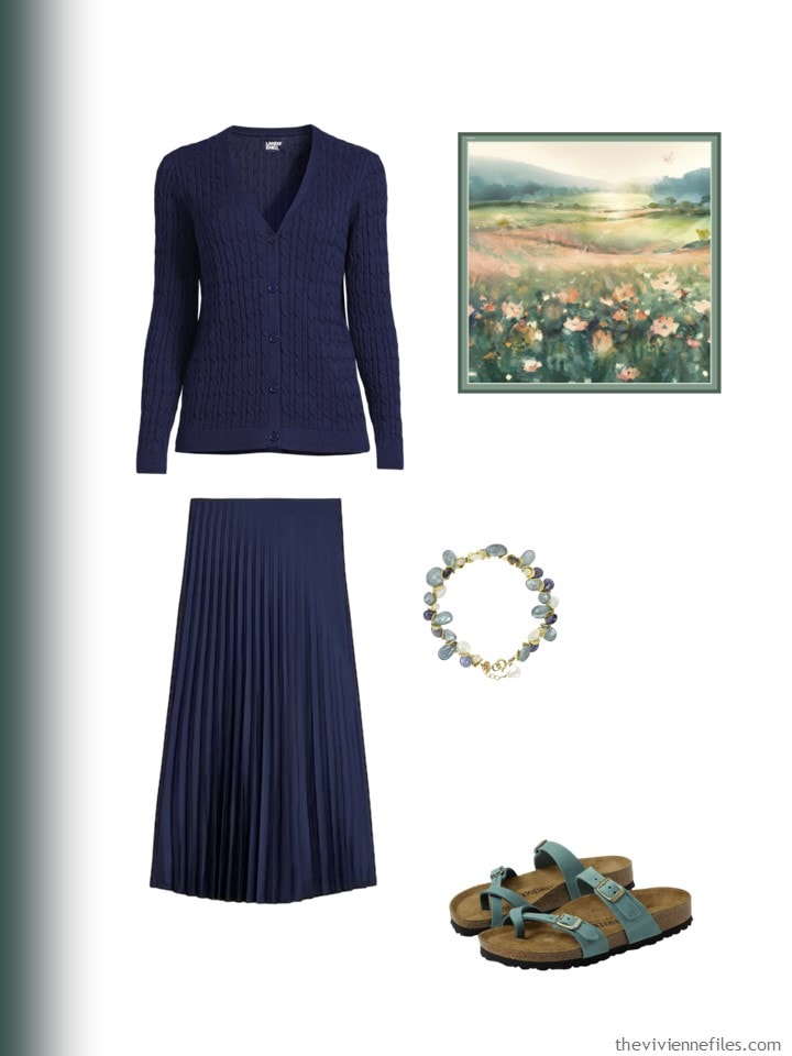
I have no objection to the Birks with the navy dress! Ditch the belt, maybe use the scarf as a sash, wear dangly earrings, and there you go—how to “dress down” a sheath.
Strong Blue is robust enough to pop with navy or black. Bistro Green almost disappears.
Yes, I love those green Birkenstocks. But I definitely didn’t like the jandals with the navy dress!
I like where you are going with this but the green needs camel or rust to lift it. I would have liked light grey as a neutral as I would wear Horizon Blue with light grey in summer
Sorry but all the sandals are the pitts for me. You could just about wear them with shorts or casual trousers or the Birkenstocks with a maxi boho skirts. Formal dresses and skirts need stylish footwear.
I agree. I don’t think these sandals work with any of the dressier outfits. Maybe less chunky ones would.
I dislike sandals pretty much categorically (and I loath flip flops), so add that to the level of refinement mismatches between them and most of the outfits and I had a very hard time evaluating the various neutral outfit + accent color accessories options. (The sandals thing is a personal idiosyncrasy of mine; if you love ’em, more power to you!)
I love a nice sandal, but the flip flops, which appealed to me SO MUCH when I was thinking of Spring accents, now look WAY too casual with some of the outfits. You have to know what you’re going to accessorize when you choose shoes!
hugs,
Janice
The black and white core wardrobes are the ones for me, and I like the both best with the bistro green – especially the black + green.
I could wear the white core for three seasons. And I would change the black core to navy and wear it too. The navy core is lovely but too dressy for my area. I could happily mix the beige core in to expand my wardrobe.
I like how Dame Eleanor suggests dressing down the dressier outfits. That world definitely work here in Florida. Everyone wears flip flops with just about any outfit. And Clark’s are wonderful. They are comfortable and come in a multitude of colors.
To me, the green needs the light neutrals. They make it pop. It gets lost in the black and the navy. Maybe if our heroine could find a top in the bistro green it would work.
The two blues are my favorites and colors I’ve had in my wardrobe for years. I especially like the accessory pieces with the white and beige wardrobes.
I am lusting over the white linen J Crew dress. But I’m afraid it would look like a tent on me and make me look even shorter than I am.
Clarks flipflops are my go-to around the house shoes ALL year (Texas) because on most of them the width can be adjusted for my bony feet! I think I have about 10 colors right now. LOL.
Still not liking any of these accents. I’d switch the casual black core out for navy and be done. I’d do the strong blue in a print, but don’t like the solid. Anyone see the mistake? I don’t!
I absolutely love the bistro green!
I just love what you do for us! I’ve been following you so long you’d think I could do this on my own…but I can’t so I truly thank you ! Oh and I love the green 💚
Probably not what you set out to do with this post, but you totally convinced me that I could never exist with my accent color only in my accessories. The only outfit that appealed to me in the least was the blue top with the white skirt. I crave color and contrast. Neutrals are simply a necessity to showcase color and little hints of color just don’t do it for me.
I thought the same thing! Several times, I found myself thinking that there was so little of the accent color in the outfit that it really didn’t make much of a difference which one it was.
Especially in the summer! I dont want to layer so much in the hot weather, so pattern really works for me, especially in my tops. and to help guide which colored accessories i want to add… sometimes a blank canvas is paralyzing with all the options.
It’s a neat exercise! As a core alone, I love the navy … but it just looked “wrong” with all the accents – mostly due to the footwear I think. That level-of-formality just needed a different shoe, so it didnt look right in ANY of the accents. The black core, on the other hand, must have had the right formality because I liked it with ALL the accents. The white was OK except the silhouettes weren’t my personal style (the blue peasant top with white skirt for example…); and beige looked fine but isn’t a neutral that suits my coloring so I have a bit of a negative bias there.
SO much more to think about when putting clothes together than “do these colors play well together – style lesson 101”. It’s style lesson 201! I think I have understood 101 – I need to work on the lessons from 201 – silhouettes, fabrics, and levels of formality.
Post pandemic I’ve been loving wearing sneakers to work… but I may have to assess if they are giving the “sandals-with the navy core” vibe… (not the look I’m going for).
Thanks as always!
PS – horizon blue worked the best for me with the navy. Those shoes remind me of my mom, and I just read that combo as ” my feet need the support, and I’m retired. My style has remined what it is, a touch dressy, and I will do what my feet need to do in order to keep me well”. And I love it.
I love that green! And because of that, I clicked the links and it appears the headband is tied to the Birks. Thanks for the momentous amount of work this posts obviously took.
I think it’s fixed – the only thing that made this REALLY difficult was doing it on a laptop, ON MY LAP!
Why are they named laptops? You can’t really use mine – huge thing that it is – unless it’s on a table…
hugs,
Janice
Janice, I want to say thank you for doing such a great job showing us so many interesting ideas, while clearly under difficult circumstances.
Black, white and navy are my core colors, along with some gray. I already have the two blues as accent colors, SO i love all of these. I’m going to have to find those sandals! I do choose dressier sandals, in the matching neutral or a metallic, to wear with dressier summer dresses, but I agree that even the shift dress could be dressed down with the right accessories.
Made a mistake?! Not you, Janice.
☺️Camille
Come hang out with me for a few days – your head will spin!
hugs,
Janice
😂 I’m sure it would be a normal day for me.
Hugs!
Camille
I once saw a print with navy, strong blue, aqua on a white background. You could easily combine the white and navy core capsules the the strong blue and the aqua. I still don’t love navy which is so dark you have to carry it outside to discern whether it’s black or navy.
Bottle green struggled with the black and navy and seemed dull with the white. It’s pretty good with beige. But, overall, I think someone would struggle bringing it in as a key accent color. It’s like someone wanted to extend olive as one of the trendy colors so they added ??? Something to it and called it bottle green. Exactly how are these colors selected anyway? It all seems designed to keep people spending.
The print you described…now we’re talking! I think some prints would make a huge difference in pulling the outfits together.
I do think the “add accent accessories to solid outfits” approach is a good one, but I think it may be harder to pull off in warm weather when we wear less in the way of layering and accessories. I always find that my clothes do more heavy lifting in spring/summer compared to fall/winter – I turn more heavily to color and print in my garments for warm weather.
In St Paul, I can still wear many scarves in the all-but-hottest days of summer, which is an opportunity to introduce a good sized swath of an accent color, but for those in very warm climates where that won’t work, I think it could be hard to get enough of the accent color into the outfit to have an impact. A sneaker/trainer shoe, a larger scale statement necklace, a tote bag…those are possibilities. But a sandal and a small pair of earrings just doesn’t add much color oomph compared to all the neutral color in the clothing. With these specific accessory pieces, I think many of the outfits would have been more flattered by metallic sandals and accessories, and I say that as an avowed color lover.
My take-aways are:
-The “lots of neutral clothing with tiny dabs of accent color accessories” approach is likely to yield the wrong balance of color for me.
-A spring/summer French 5/etc. accent color addition works better for me if there is a garment (e.g., solid accent color t-shirt), a print (e.g., lightweight scarf or button up shirt), and a larger statement piece (e.g., bold necklace) than all small accessories.
-Man, I really DO NOT LIKE flip flops, haha!
Combos I like: Horizon Blue with white, navy or beige; Strong Blue with white or black; Bistro Green with beige. Bistro Green is more of a neutral, is too dark to work with black or navy, and seems blah with white. But it would be lovely with some of the softer accent colors in the Artifact scarf, Horizon Blue, or the other lighter, new Pantone colors in the previous post.
I vote for a pop of bright pink, it goes well with everything and makes me happy!!
Wow, this was enlightening! I love the two blues, and have a lot of blue in my wardrobe, but I really didn’t like them with any of the colors except white. I’ve been using beige as one of my go-to neutrals for a while, but I really dislike it with the blues although it looks great with the softer green. This explains why I just can’t seem to work neutrals into my wardrobe effectively – I just don’t like my chosen neutral with my accent colors. Most of them at least. It’s all deeply personal, but I just realized that I’m just not feeling the combos I currently have and tend to wear all-color or all-neutral outfits. This is great information going into the full-blown closet evaluation I have planned for the end of the month.
I think both blues work well with all the neutrals. Like many others, I find the bistro green gets lost with the navy and black. I think it could make an awesome core colour on it’s own, almost prefer this to olive green. For myself, I prefer light and bright so would go with the horizon blue, but I do have a bit of cobalt in my winter wardrobe. This was so interesting looking at the shoes as well. Goes to show what careful planning of accessories can do for your outfit. Thank you Janice, always helpful to see how these can actually work in ones wardrobe.
Great post! It has me thinking more about the neutrals than the accent colors. (Accent colors are the bane of my sartorial life.) I also think my impressions are skewed by the season. It’s 80 degrees F outside right now. My personal preferences and opinions are just that. The black seems too heavy, although it would work for some people. And I think the bright blue works the best with it. The navy is great, if dressier than my life requires. And the light blue is a great accent. I’ll say nothing about the flip flops…. The white would be great for the season for someone who wears white. And again the horizon blue looks lovely with it. Vacation at the beach colors, to me. The beige, light beige really, is most appealing to me. I like how horizon blue works in a low key way. Bistro green I think is a great color, and as someone already said, it could be a neutral. But again, consideration of the season enters in. It looks a bit fallish to me. As to using accessories for the accent colors, it is an interesting idea. I think I could be more comfortable with accent colors in small doses. Earrings, and flip flops! Lol.
I can’t see the Big Mistake either, unless it’s some of the heroines are barefoot?
As a green eyed blonde, I’m going to have to vote against the majority by applauding the bistro green combos (light and dark) – for some of us, a touch of green is always welcome! Although I do like the navy group in general – I’d just grab a pair of low heels or ballet flats to make it work. :)
Hi, Janice, Longtime reader here. I’m going to London and East Sussex at the end of May, and looking for a black cardigan or jacket that will go over tops like this: https://newmoonboutique.com/inoah-black-modal-simple-hi-low-top/
Nothing too structured (I just bought an Eileen Fisher crinkle material jacket on ebay and discovered it is too “officey” for my usual travel look), something easy to pack, fairly lightweight (it’s always warmer there than I think it’ll be), something that goes over loose tunic type shirts. Can you please help? Thank you very much!
You might take a peek at the Lands End cardigans – I have several of the longer cotton ones that have done well over the last few years. They also have a couple textured ones that might be a similar but softer look to the Eileen Fisher.
Thank you so much! I’m off to take a look.
Also, LL Bean has a Pima Cotton Cardigan with Pockets. More of a Pima T shirt material.
I think the horizon blue with white is my favorite except for the flip-flops that I do not like at all! I expected to like the strong blue with black because I’ve worn that combination in the past. But, as someone said, maybe it needs a scarf or something in a print to work. The green reads Autumn to me. I don’t care for it with these clothes. Maybe it needs to be with wool, corduroy, suede? In summer I tend to wear casual printed maxi-dresses, quite colorful because they seem to go with the hot weather. Or I wear all white or white with pale blue, also hot-weather staples. The fact that these are “London colours” may indicate that they do not translate well to the Midsouth of the United States for summer wear.
Love this post! I think you wrote it for me. Possible? It made me feel at home.
My core/neutral colors are black, navy, and ivory plus white in the spring/summer and gray in the fall/winter. My accents are blues ranging anywhere between the two above and pinks ranging anywhere between pale blush and deep cottage rose. I have almost all solids with a handful (about four?) shirts that fall into the artsy category. Otherwise it’s pretty classic and never small prints. My multicolor pieces are mostly scarves and an occasional cardigan. So yeah, I loved all the outfits. Thanks.
Ah, you should feel at home with this group – we’re very friendly, opinionated, and supportive! The best thing about writing The Vivienne Files is “meeting” all of my digital friends…
hugs,
Janice