April 3, 2024
Back again with one of my favorite posts of each month! Our heroines diverge this month on what they want/need in their wardrobes, which is to be expected. Many of us can share the same core of classic garments, but we’re still going to assemble our very personal wardrobes in a specific order…
Our first heroine feels like she needs to add some navy and white to her wardrobe. As we enter April, with 16 garments, only 37.5% of her clothes are her accent color – that might not be a troubling ration for many of us. But she’s ready for more neutrals!
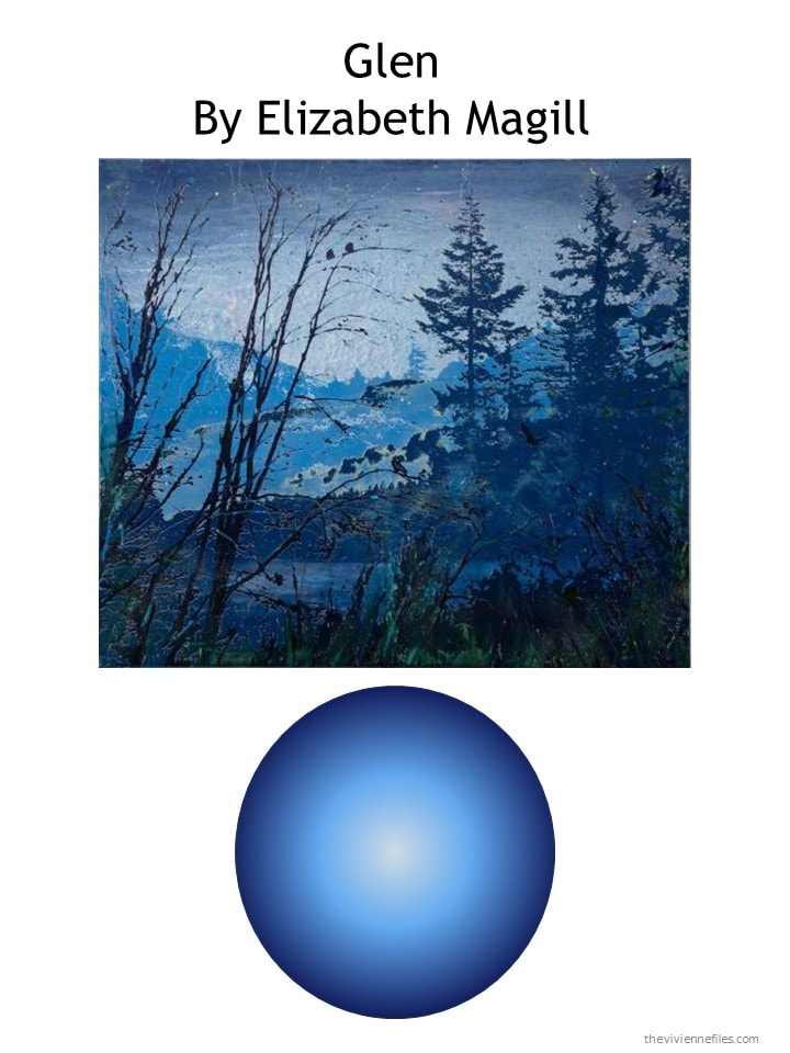
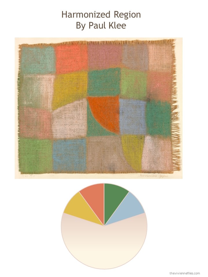
Let’s pause for just a second to enjoy her favorite painting:
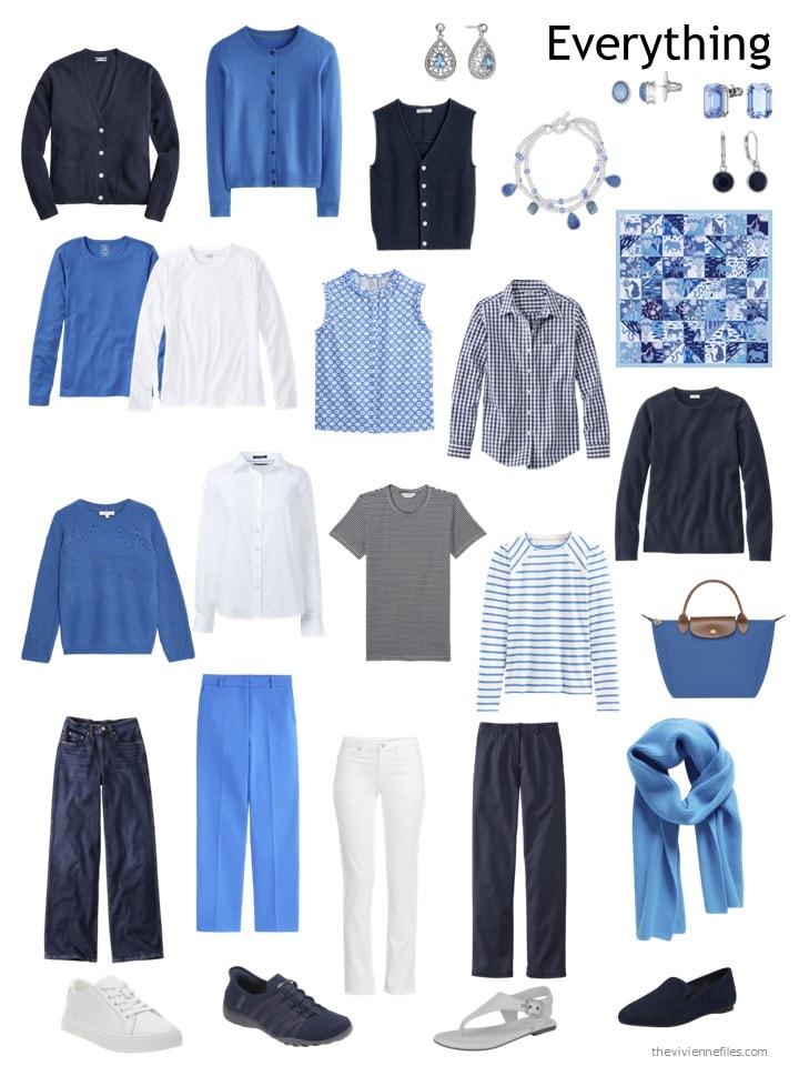
This is her wardrobe at the end of March; yes, there’s certainly quite a lot of bright blue here…
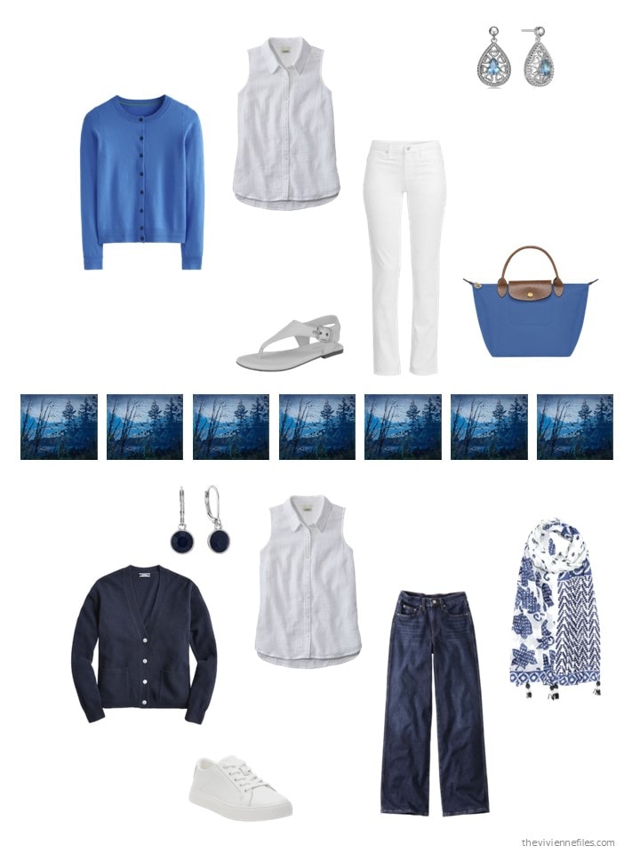
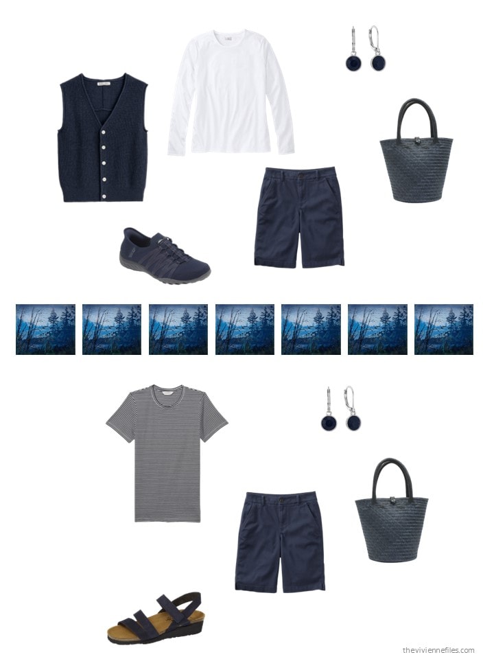
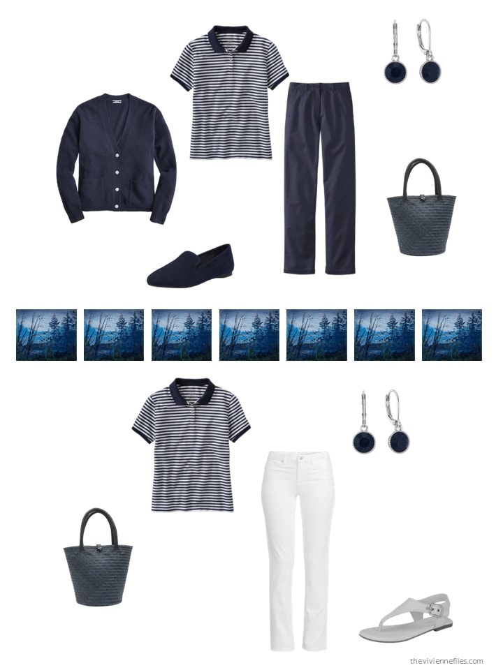
For April, she chooses classics – you could picture all of these worn by a starlet of the ’50s…
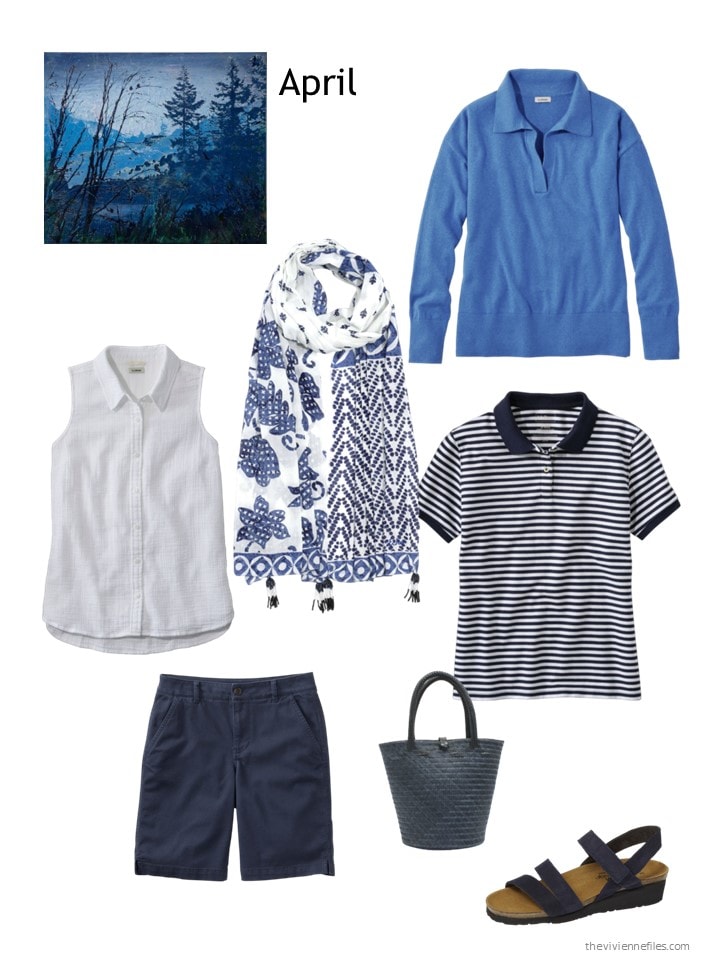
White sleeveless top – L.L.Bean; patched batik wrap – Echo; light ocean heather polo sweater – L.L.Bean; striped polo shirt – L.L.Bean; navy shorts – L.L.Bean; straw bag – Washein; navy sandals – Naot
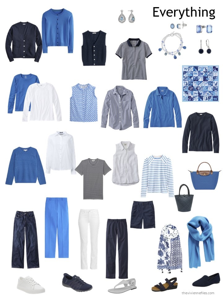
With these additions, you can see that the bright navy is a bit more balanced in her wardrobe. This is one of those groupings that surprises me by how much it appeals!
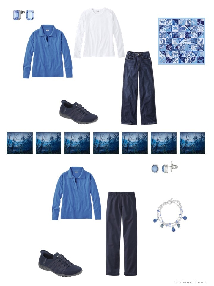
As always, let’s take a look at how our heroine can wear each of her new garments. This is always one of my favorites parts of these posts; buying new clothes is fun, but integrating new things into your wardrobe and finding that you’ve been a smart shopper is better!
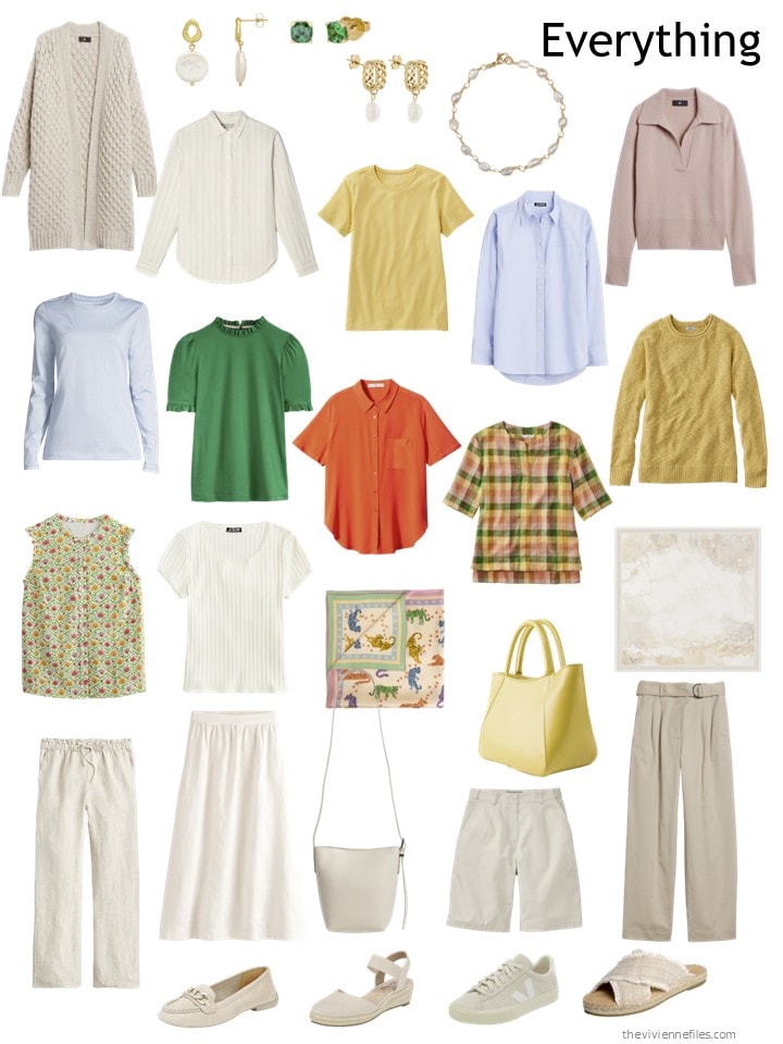
Our next heroine is committed to using beige as her preferred neutral, but she’s given herself a range of accent colors – too much beige is too much for her!
This was her wardrobe at the end of March – she was starting to feel a bit… neutral with this!
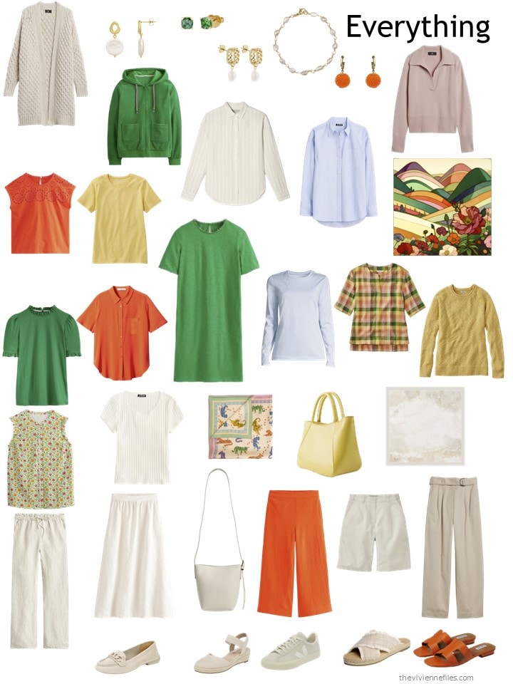
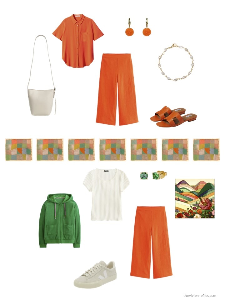
So she went shopping for accents, and did she ever find some amazing things!
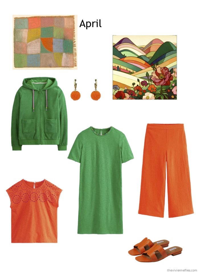
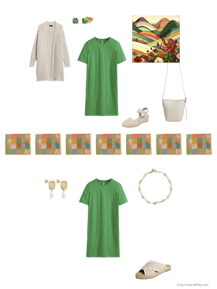
Green hoodie – Boden; earrings – Michael Nash Jewelry; scarf – Artifact.; orange broderie tee shirt – Boden; green dress – Boden; orange cropped pants – Boden; orange sandals – Dune London
Her wardrobe now is quite a bit more energetic, just as she wished!
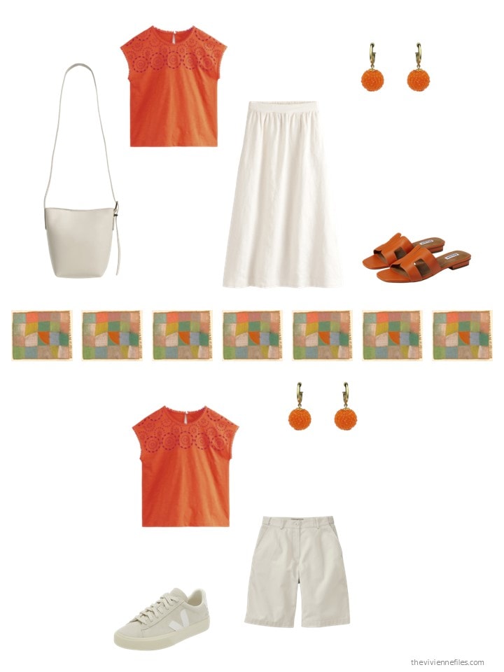
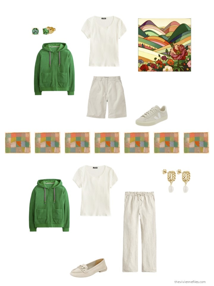
She has some bright options now! With the weather warming up (some day!), these outfits will be perfect…
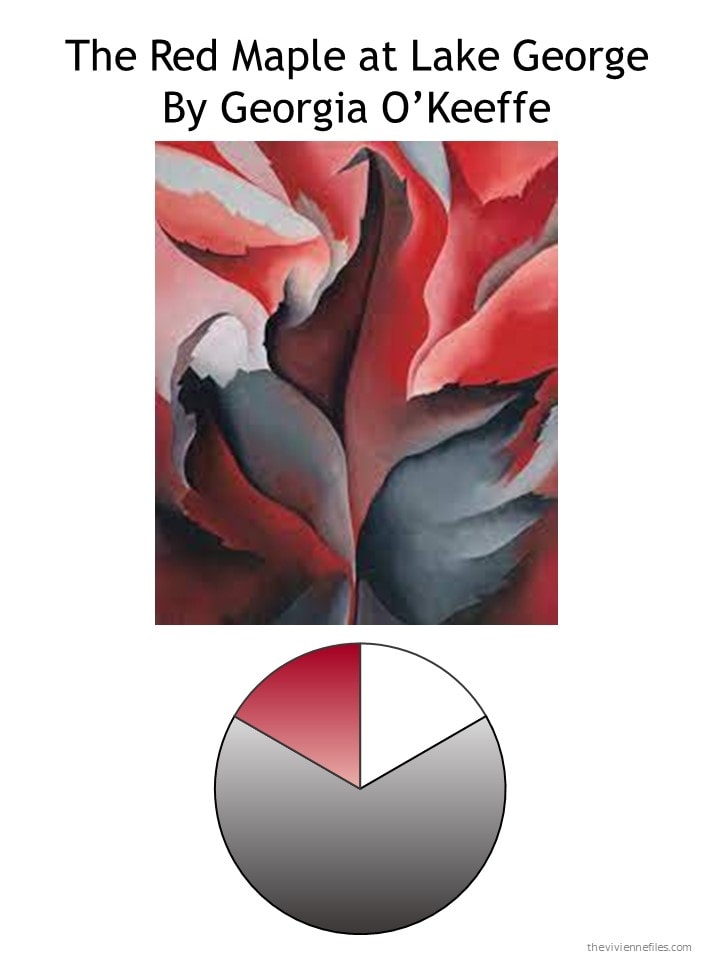
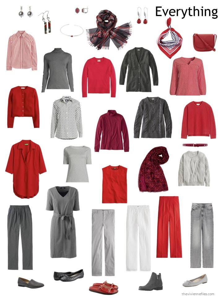
Today’s last heroine has thrown in her wardrobe lot with Georgia O’Keeffe. Why ever NOT???
Until now, she’s not picked up any white clothes; with the advent of Spring, she thinks that should change!
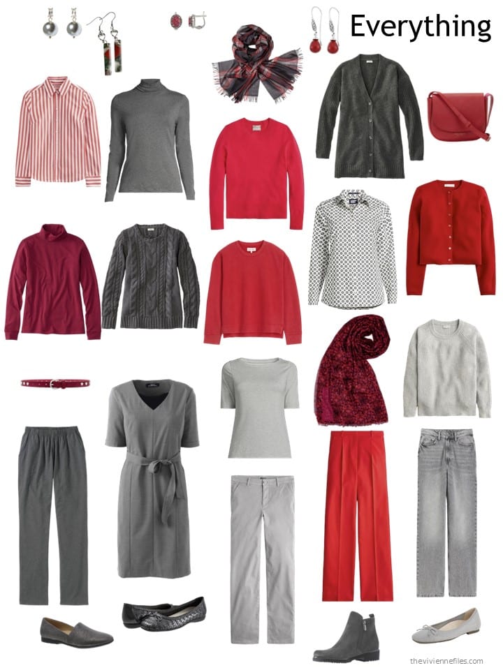
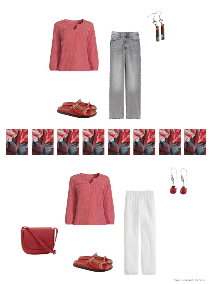
She’s still looking mostly for red – this heroine is REALLY committed to a signature color! Maybe she has a highly visible job, in which the public expects to see her wearing red? These things happen…
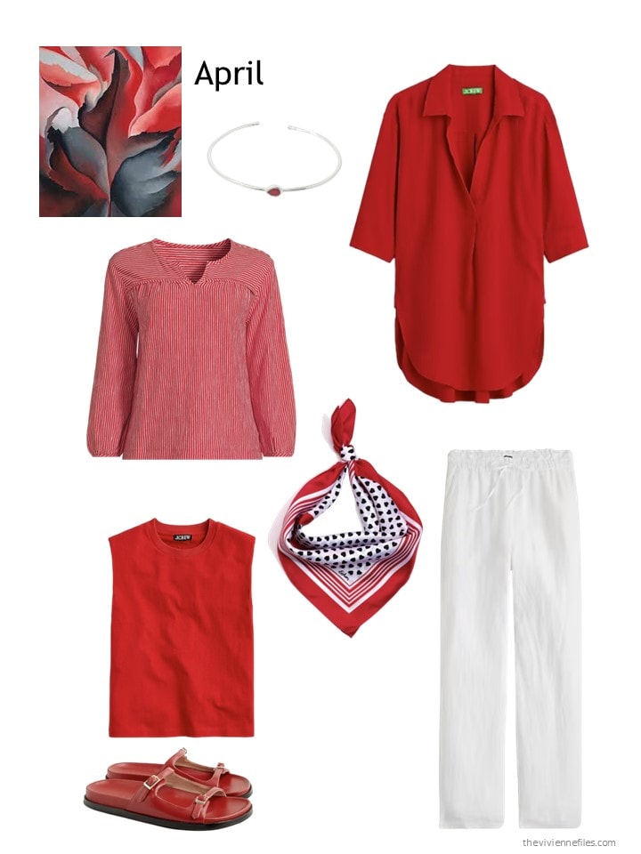
Garnet bracelet – Harfi; red tunic- J.Crew; striped top – Lands’ End; red sleeveless top – J.Crew; “Love You” scarf – Echo; white pants – J.Crew; sandals – J.Crew
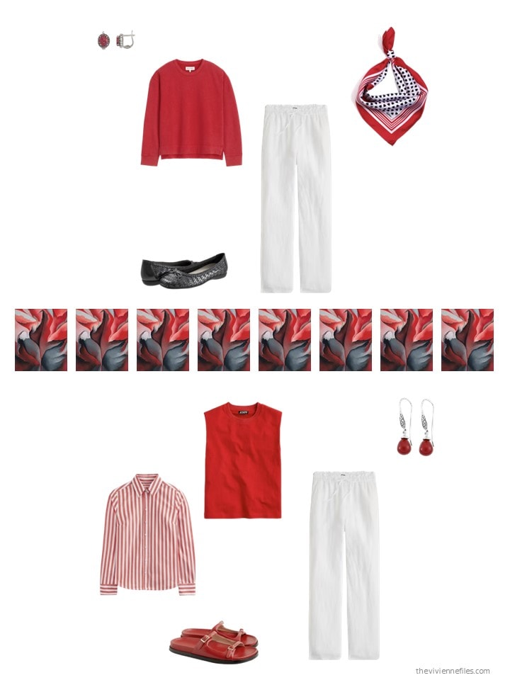
It’s interesting how one pair of white pants can make a difference! But this is still a distinctive wardrobe, for a highly visible heroine!
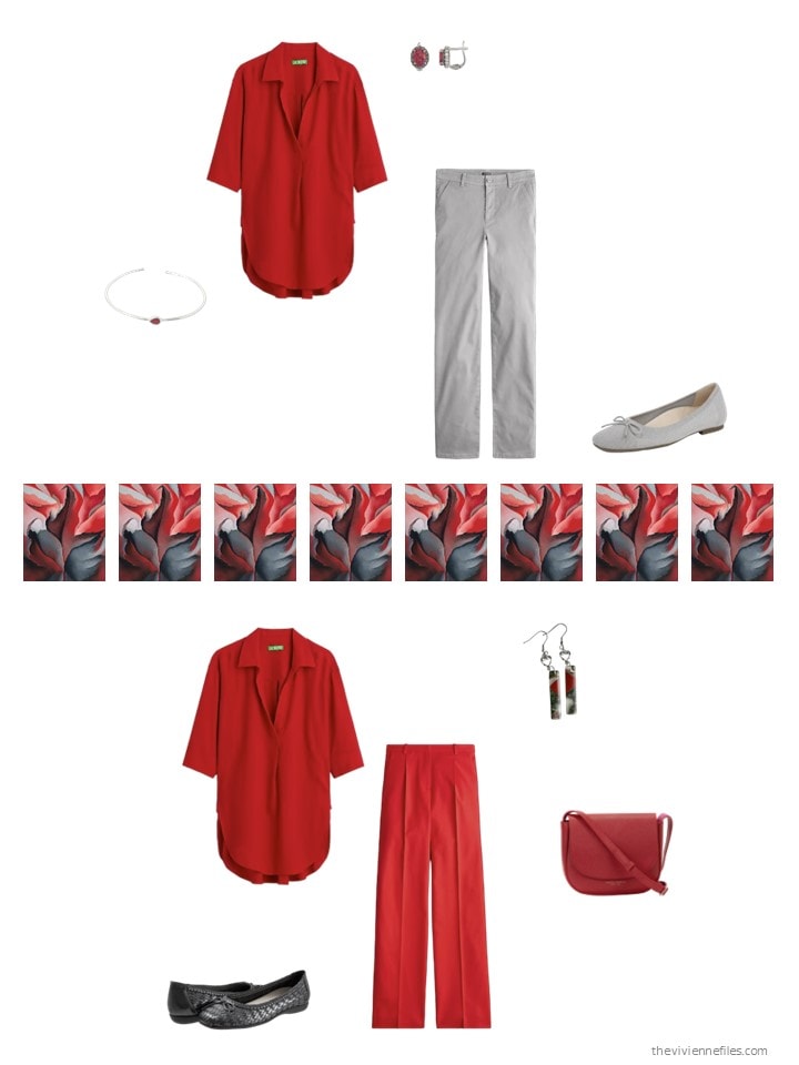
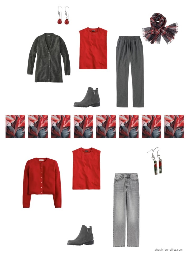
She knows that her new items will slot into her closet seamlessly, but one should never neglect this step when shopping. If you don’t find good ways to wear new items, they should go BACK…
I’m stunned to say that – so far – my favorite of these three wardrobes is the first. Maybe it’s the really classic nature of the navy and white pieces…. hmm….
love,
Janice
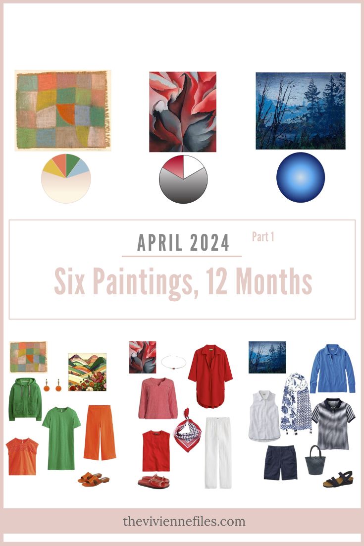
Like this article? Save it to Pinterest!
The blue first wardrobe is me to a T!
Just a heads up that the link for the red sandals don’t go to Jcrew but take us to some orange earrings at Wolf and Badger.
Ah, the problems with working on a laptop ON MY LAP. Things more easily go awry….Thanks for letting me know!
hugs,
Janice
This is a happy way to start the middle of the week.
have my own rendition of the Magill in my closet now. This helps me create new outfits and see where my wardrobe has holes.
The O’Keefe is very interesting to me and if I felt comfortable wearing that much red I would embrace it completely.
I was excited about the Klee when you introduced it. I’m personally steering towards colorful tops or second layers after wearing primarily blue and white for the past years.
Well the Magill is becoming a favourite and I’m creating new blue combinations in my wardrobe. I would like to see more blue patterned tops.
Today, I’m wearing ocean blue trousers with a blue paisley shirt – several shades of mid to light blues plus green and taupe. This shirt would be wearable in the Nash wardrobe that you’ll no doubt feature on Friday. My cardigan is sky blue which blends with the lighter blues in the shirt. The mock horn buttons pick up the taupe in the shirt.
The multicoloured Artifact scarf in the Klee wardrobe is stunning and so versatile.
Although I like the grey/red/white of the O’Keefe group, this would be a mini-robe or holiday-robe for me. Too much red might be boring. Perhaps our heroine might introduce patterns to lift the plain.
Morning Beth T, I also am wearing blue pants today – only more of a royal blue/cobalt blue with a navy tshirt and a Larkspur (LL Bean color) sweatshirt that has navy trim. My closet is turning more and more into what I imagine yours to look like – except I’ve limited myself to blue, lavender, and the odd rust/pumpkin orange and emerald green. Have a good day!
Hi Sheila
I might try the navy column with a lavender or periwinkle cardigan. Today I’m wearing ocean blue trousers again, a mid-blue tee with white floral sprigs and a pale lilac jacket-cardigan.
I think you’d be shocked and/or awed at my wardrobe! I must go and sort it out again. 😂
Morning. My own closet also most closely looks like the Magill – although not so much bright blues but more denim/chambray with the navy. The Artifact scarf is just amazing. The Klee (much to my surprise) just seems to be “too much/too busy” for me. And to think of all those years my husband referred to my “clown closet” because of all the various colors. I like the O’Keefe, and as Jeri said, if I were wearing red I could be all over that one. Looking forward to Friday and the rest of the wardrobes.
This is my favorite week of the month! I am really liking the Magill. Seen as a group in the picture it looks only okay, but when I see outfits put together from it, it really shines. This is something I have been doing with navy, in a limited way for a couple of years now. I have not been using various other shades of blue until recently. Too much navy made my wardrobe rather dark and gloomy. And I see that patterns are invaluable in a limited palette. The Okeefe is also very appealing, but I don’t think I could carry off that much red. Like Beth T, I would use it as a small holiday group.
Yay, the O’Keeffe-based wardrobe is getting better and better. It’s giving me some fun ideas for what to sew next.
Our O’Keefe heroine must surely live in one of our northern states! Yes, all that red works for a high-vis career. I’m retired from my tv career, and I leaned heavily into red for it. When she draped me for color, my consultant said red was outstanding on me. About a year or so later she came to my home to do a closet audit with me. She looked. She turned to me and said, “You have enough red.” 😀 but, she did get me to add bright blue and lemon yellow, which looked wonderful with red. Red with navy, camel or grey! Red with ivory! It looks amazing with chocolate brown, bright blue, lemon yellow, turquoise, bright & clear violet and spring green. But you’d want to have the coloring to lean into such brights and if you feel comfortable in brights.
Janice,
The Klee for me, but in very toned down options. Those bright colors would drown me out . We are all so very differently colored ! Like a bouquet of wildflowers !
And yes, I always appreciate you showing the individual outfit options — thanks for that !
There’s lots of light blue and soft pink in that painting – I’m going to have to look for some of those soon! It’s such a wide-ranging painting, color-wise. Klee is pretty amazing….
hugs,
Janice
Janice,
I am trying to come up with a template ( or two or more ) for my own color selections on a year round basis . I wear tan, brown, olive green and medium denim blue as my core colors pretty much year round but adding navy in the cool and cold months, but then dropping it and adding pale denim blue in the hot months. I also wear very little brown in the Summer. So how do I allow for those seasonal changes on a template ? Simply make more than one ? One for each season ? I was trying to fit my formula into Lena’s rotating neutrals formula, but my color deviations were not fitting in . I also seasonally change accent colors . Any suggestions would be welcomed by your readers too . Thanks !
Unless you have clothes in your “switchable” colors that span the seasons, I think it would be easier for you to do multiple templates. For many of us, the overlap between our cold weather and warm weather wardrobes might only be 2 or 3 things. To me, that means the wardrobes are two different animals!
It’s sort of a mindset question – is your cold-weather wardrobe a functionally and fundamentally different body of items from other seasons? If so, then a different template is logical.
Make sense? I’m not at my tip-top best brain power this morning…
hugs,
Janice
Janice,
Yes, that seems to be the logical conclusion, as I have introduced so many variables ! Thanks !
Just thinking here . Keep my 4 basic colors of olive green, tan, brown, and medium denim blue for year round , and use the seasonal variation of navy and pale denim as accents added to the basic 4 core colors . Hmmmm ! I do tend to emphasize the olive, tan and brown combinations in the Autumn . I guess that I am pretty much of a seasonal colors dresser ! The actual number of garments is a variable too, as I have more layers in the cold months within each neutral , but for now, I am just dealing with the major wardrobe colors , color chameleon that I am !
Color chameleon made me smile, great descriptor to those of us who like variety.
Last word on this, I promise ! I don’t want to belabor or hog reader space here ! Still thinking in terms of Lena’s clever rotating neutrals box idea, from July 5, 2017, I divided a main box into 4 sections for each neutral or basic color, with perimeter accent colors, one on each of the 4 edges of the big neutrals box. So I drew 4 templates in that format . One for general year round and Fall colors — olive green, tan, brown, and medium denim blue. I made the accents hue families, with all of the varieties within a hue family , like all of the yellows for instance, included on one side of the big box. On another edge of the box, say along the bottom, I did another accent color family, as in peach through rust , and so on for each of the 4 edges of the box. That was followed by 3 more separate seasonal templates.
I drew up one for each season’s colors that I emphasize, switching out any colors that I don’t wear for that season and including ones that I do, but keeping it to 4 core basic or neutral colors within the big box and surrounding the perimeters of the big box with the appropriate seasonal accent color families. I am able then to choose a variety of outfit color schemes from those colors for that season. So instead of rotating neutrals within a given single format seasonally, , which requires a tighter group of coordinating neutrals , I rotate a seasonal template instead . That then satisfies my need of color changes for the seasons . I have no rigid timing of what I call a season, it’s based more upon the weather and temps . What might vary are the sleeve lengths of the tops and hem lengths and the values , plus the warmth or cold undertones of each accent hue . Sometimes golden yellows work better with the warmer other colors, and sometimes the paler lemon yellows work better with the blue family colors . Yes, I have more than 52 total pieces of clothing, but it all fits in my closet or in marked seasonal rotating storage bins in the garage, and I am quite content with that !
I’m finished, Janice, I promise !
Shrebee – Awesome idea to create seasonal templates and then rotate the templates rather than the neutrals in just one template.
I’m going to give this some more thought and give it a try – I think I like that plan better! I’m aiming for fewer items in my closet without resorting to items in storage. But I do prefer more neutrals and accent colors for variety, so this should be a fun experiment. Thank you!
Great ideas! The part I have to remember for myself is that if I only wear color X in weather Y … only buy clothes in color X for weather Y! Example: Only wear yellow in the summer? Buy a yellow tank top, not a yellow heavy knit sweater! (Hard for me to do with black, as I seem to prefer black in the winter but somehow have plenty of summer-weight black tops…bought before I made the connection…)
I think I have a palette for “high summer” – that temperature where if its not linen or cotton or a blend, it won’t do – of navy, white or cream, light grey, pink, olive. Probably my most “cohesive” wardrobe cluster since we only have that weather (historically) for 3-4 weeks. I may need to build it out a bit more with the way the weather is going, but it is kind of neat. I also have a “holiday winter” palette (black, red, green, white, velvet) for … the month of December. If it works for us, it may not be so bad to have small capsules (10 pieces? 15 pieces? 2x French Five?) for certain short-but-annual occasions.
The Magill palette suits my 97-year-old mother, the Klee palette features my colors, and I appreciate the boldness of the O’Keefe palette. Wasn’t sure about the palettes at first, but I like the direction each is taking. The Artifact scarf is a lovely addition to the Klee capsule.
The are not really my colors, but I just love how the Klee is turning out! It makes me happy just to look at it!!
Love all three and can’t wait for Friday. That being said I think the Magill is my favorite. As others have said the O’Keefe for me is more of a winter travel/holiday group. The scarf in the Klee is amazing. Kudos to Janice with her lap top on her lap for finding that!
I have a tie today between the blue and the red wardrobes. The accessories tip my favorite to the blues. I have decided I love color too much to have just one capsule revolving around a tight palette. I’m going to do mini capsules around pieces I love.
I love blue but I noticed the 2 polo / rugby style collared shirts. I have been informed from another fashion blog that polo shirts are kind of “out” for women and the “Johnny collar” that is wide spread and 70s-like is more “in”. Usually these Johnny collars lack buttons, too, more pullover style and often a sweater
I wasn’t sure if you or your heroines had noticed this style change and if it affects you / them / their wardrobe choices
I’m sure polos are still popular for golf or sailing, activities, but not as popular for fashion, and risk looking frumpy rather than fun or funky.
My heroines don’t care what’s in or out. They are NOT defined by external adjudicators of what should and should not be worn – they decide for themself!
And if these things are out, why are they new releases in a lot of stores? Somebody on store design teams must think that they’re going to sell them somehow.
I’m pretty militant about things like “in and out” lists – insofar as I (and my heroines) don’t care about them. We know what we like and we stick with it!
hugs,
Janice
I like all those blues, but can’t see having that wardrobe. That said, I ordered the blue and white batik scarf (making sure to initiate with the link here) and will ponder building a travel wardrobe around it. We’re traveling around Great Britain and Ireland in July/August and blue/white seems a better base than black/white, my “normal” travel option.
Thanks for all the inspiration, Janice. Thinking of you and yours.
The blue wardrobe is basically my wardrobe, except I have a few plum/pink things, and a handful of green. But it’s 80-90% shades of blue with navy as my basics. I’m going to buy the LL Bean sweater now!
Today I was all O’Keefe with charcoal pants, a red, burgundy and black print tank top and stainless steel jewelry. Relying on the weather forecast of mid 60’s I didn’t bring my burgundy cardigan. The actual weather was windy, rainy and never made it out of the 50’s. Brrr. But I couldn’t do an entire closet of red, black and grey. Too limiting for my rather eclectic taste.
Same with the Magill. Beautiful, but too… what? Not monotonous but predictable maybe? It might be all those small, repetitive stripes, checks and tiny patterns. For myself I’d like to see tops or skirts in the scarf patterns.
That Artifact scarf is fabulous! Would be fun to see how you’d build out a 13-piece dressy to casual summer travel wardrobe around it. I’d also enjoy seeing the addition of accessories to that travel wardrobe in a follow up post. Pretty sure it would be amazing, especially if those orange earrings and sandals were included!
I like all the addition groupings this month, but for me, the Klee definitely wins “most improved” with the bright accent colors joining the capsule. I’m starting to see the warm golden heroine who wears that wardrobe. It’s funny, I’m looking forward to later in the year when she adds a solid accent color scarf/pashmina to make the too-cool-seeming sweater in the upper right corner work better for her. While the cool mauve-taupe color is very pretty and exists in the artwork, I don’t particularly see it working for the same heroine who wears the warm bright accents colors in the capsule. (This reaction is really strong when I compare the golden yellow T-shirt and the mauve-taupe sweater, for example.)
I love the Magill wardrobe, but like others I’d like to see some bolder prints in there. I wear a ton of blue myself, about 50% of my wardrobe, because that’s what I like! I tend to rotate my shades of blue through the seasons, and winter has more bright navy and Klein blue, spring is forget-me-not and iris, summer is bluebell and sky blue, and in autumn it’s back to bright navy with petrol blue. The one thing that has really helped me out is to coordinate the shades with the weather I’ll be wearing them in, which is why I have no light-weight navy clothes, for example.
I guess I am the odd- ball, but I actually prefer solids in the blue Magill. I hardly ever wear prints.