March 4, 2024
First three paintings can be found here…
Let’s visit our other 3 heroines, and their paintings! It’s funny how much I love these paintings when I come back to them after almost a month…
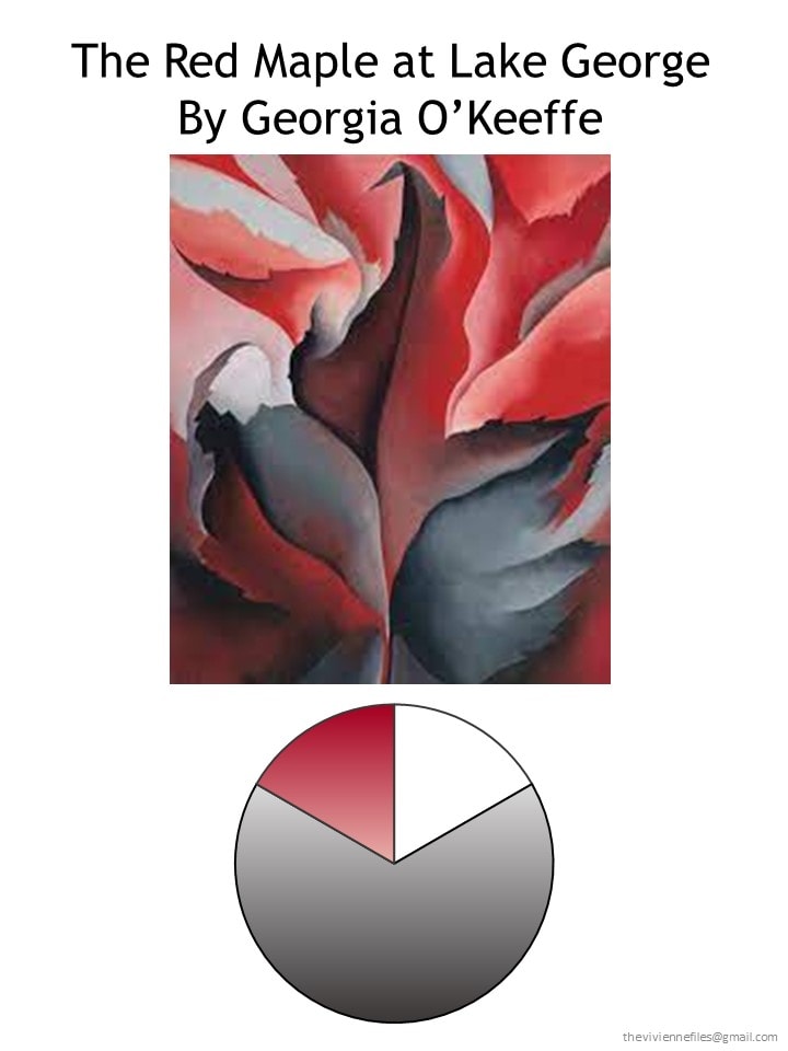
At the end of February, our heroine had a cheerful and very practical 12-piece travel capsule wardrobe:
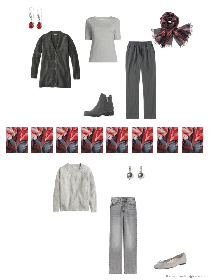
I fully expected to be adding white to this wardrobe at this point, but then I stumbled onto some lovely light grey, and decided it was wise to grab it! Gray in the summer can be really difficult to find, so avail yourself of it when it’s around.
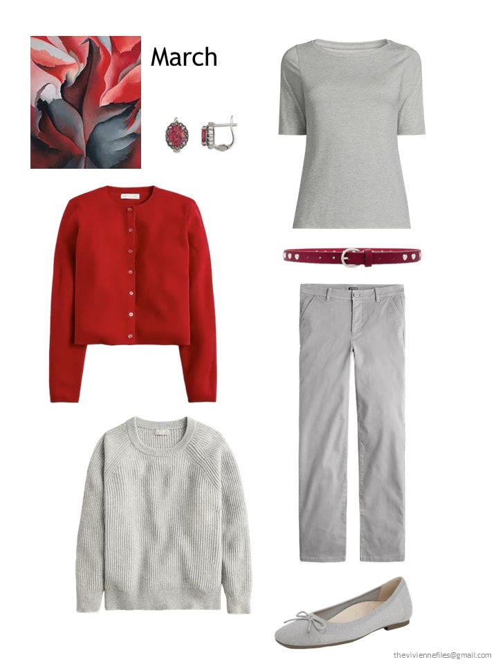
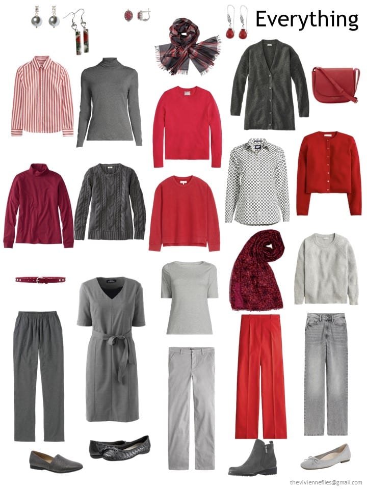
Red opal earrings- Spero London; tee shirt – Lands’ End; red cardigan – J.Crew; belt – Petite Moments; cashmere crewneck – J.Crew; grey chinos – J.Crew; ballet flats – Vionic
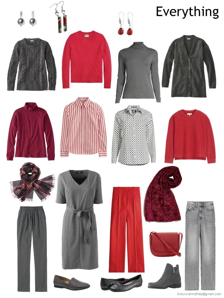
Her wardrobe now looks more like she wants to include a range of shades of grey – up until now, she’s been pretty dedicated to charcoal… And the red is still wonderful!
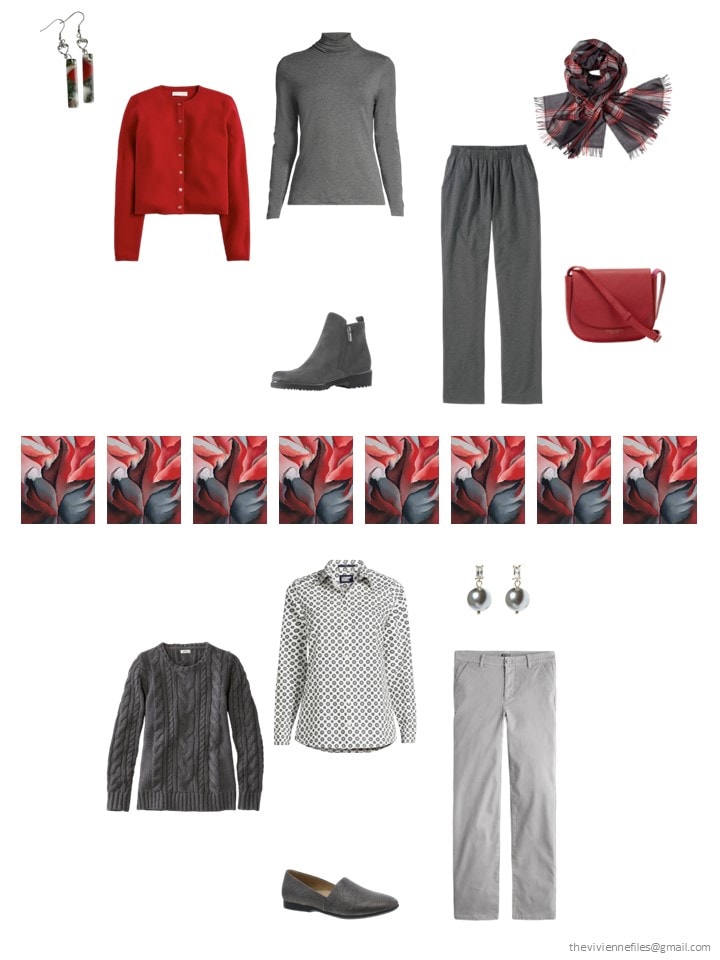
Obviously, she’s going to be able to get dressed without even really looking! That’s such a nice feeling…
The more time I spend with this painting, and this wardrobe, the more I feel like this could be the most versatile color palette of all!
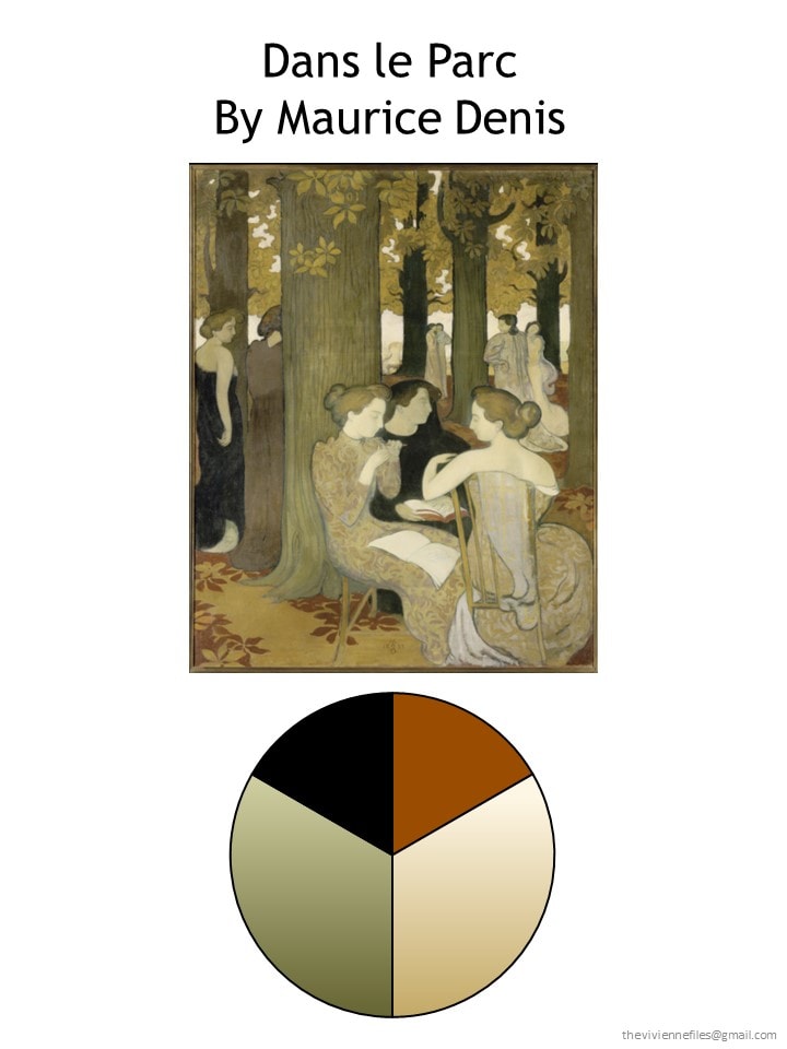
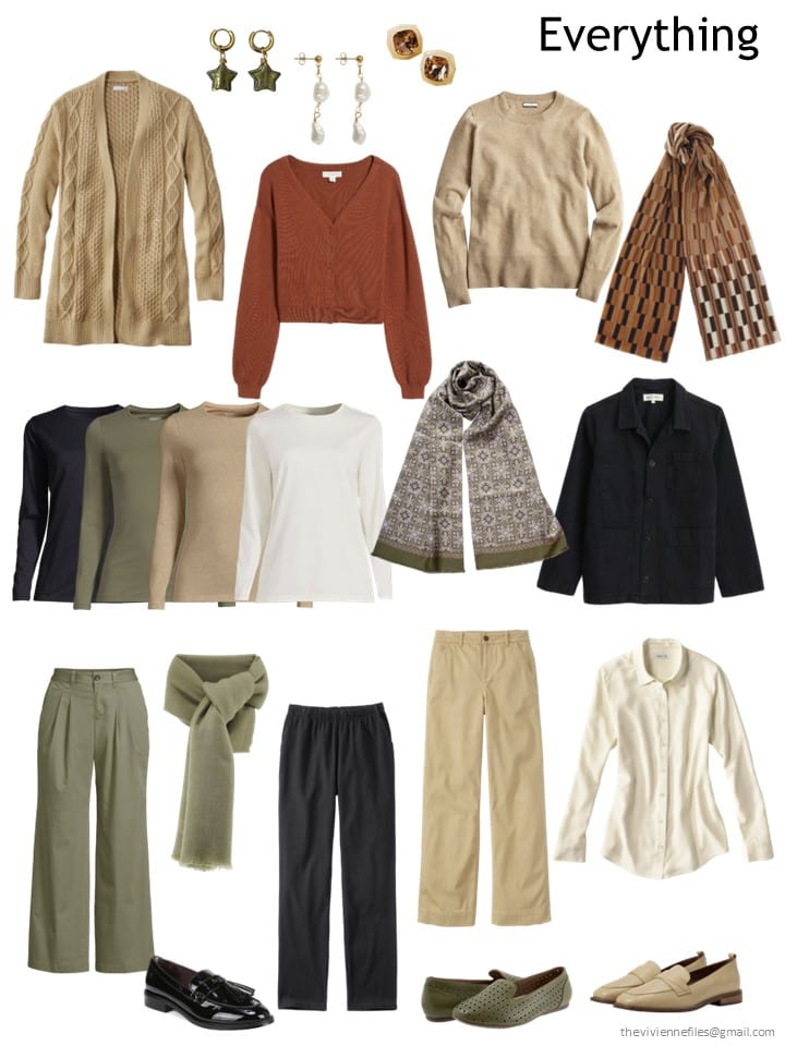
These are four neutral colors – admittedly, rust is difficult to find, but it’s still essentially neutral, and goes perfectly with the other 3 colors. The only challenge (also an opportunity) is to figure out if our heroine wants essentially equal amounts of each color in her wardrobe, or if she prefers to emphasize the beige, or the green, etc.
At the end of February, our heroine had this very tidy capsule wardrobe, with the full range of tee shirts! One could imagine buying four cardigans, four pairs of pants, four v-neck sweaters etc. and then going nuts with scarves and jewelry…
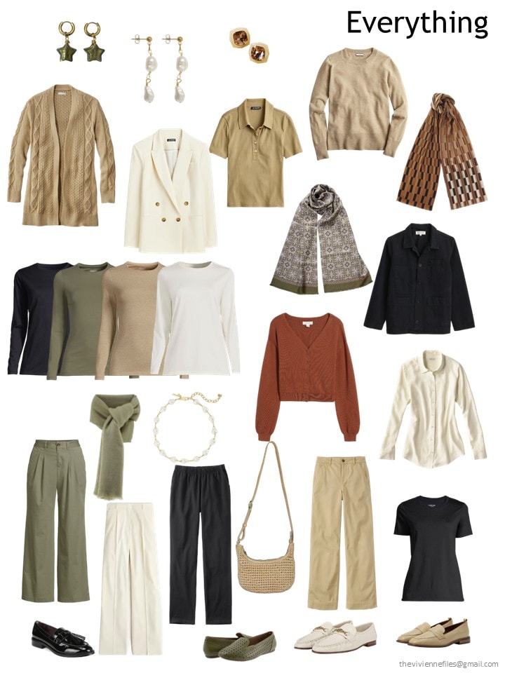
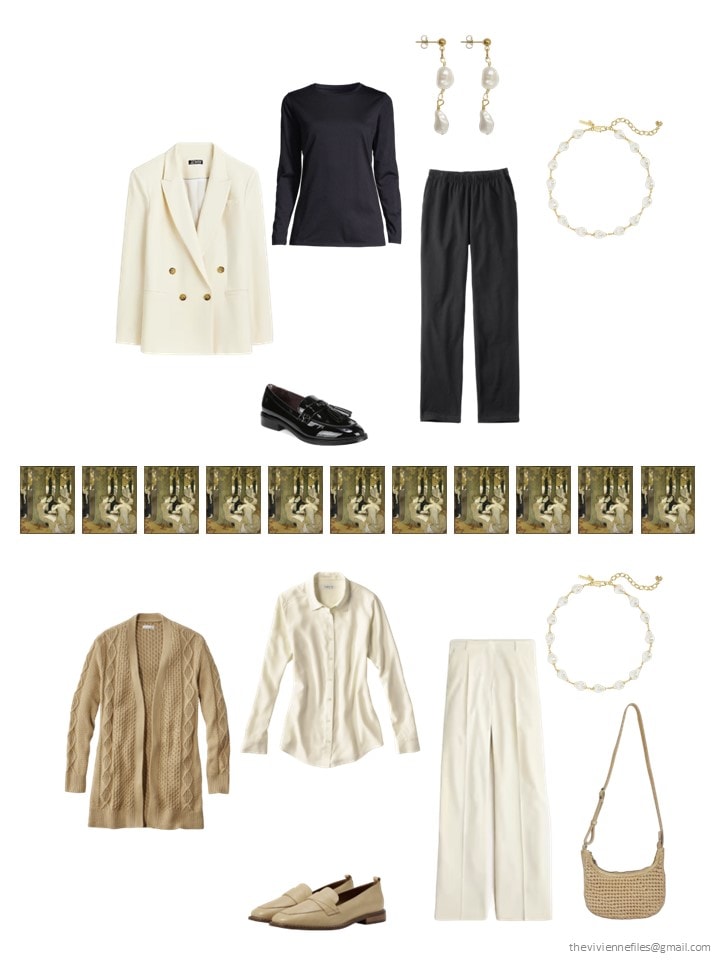
Since the weather is – in theory – warming up in March, our heroine thought that a suit in a light color would be delightful. The camel sweater wasn’t going to be missed, and a black tee shirt gives her a short-sleeved version of her black column:
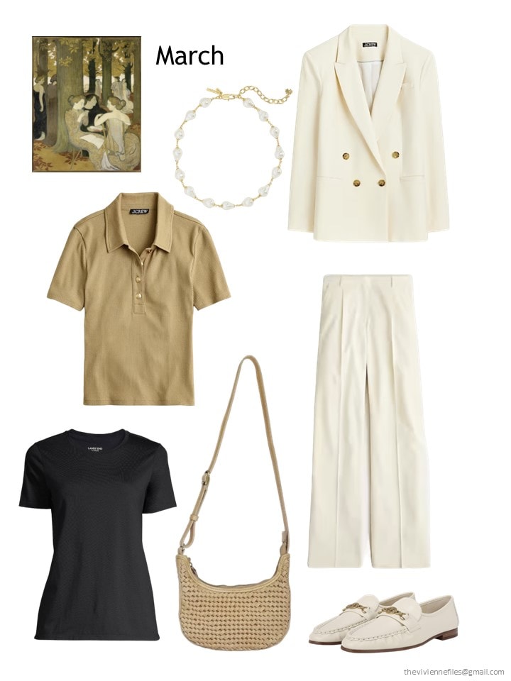
Pearl necklace – Lele Sadoughi; blazer – J.Crew; Camel polo shirt – J.Crew; black tee – Lands’ End; bag – J.Crew; pants – J.Crew; loafers – Sam Edelman
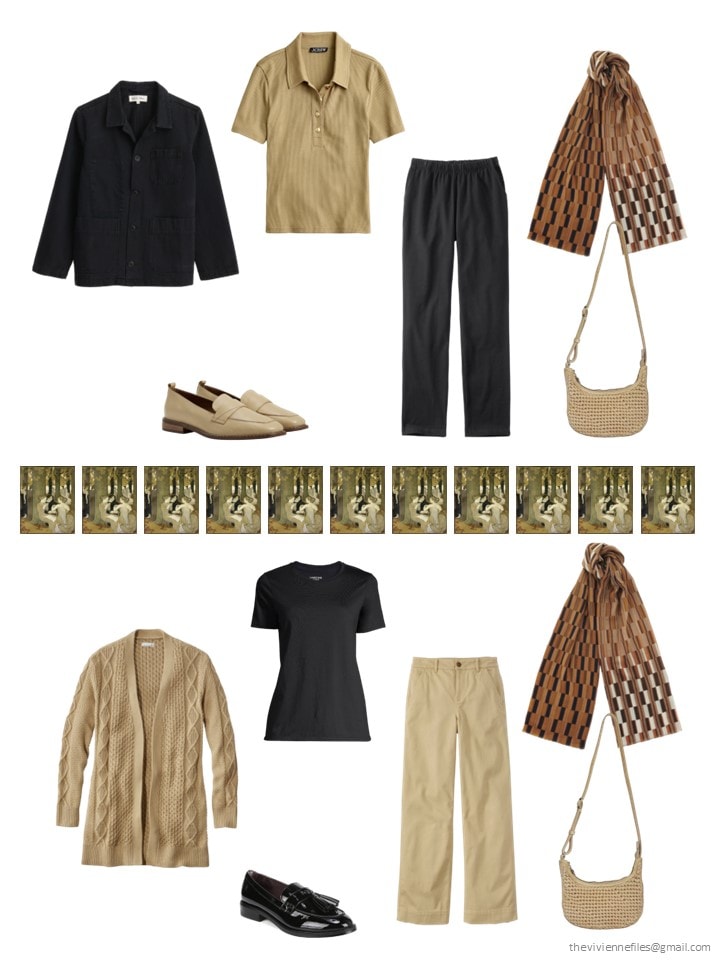
It’s becoming conspicuous that she’s struggling to find rust! But overall, this wardrobe is another in which getting dressed is effortless:
As is always the case with a suit, our heroine has no real need to wear the two pieces together:
And she can wear a black “suit” with camel, or a camel “suit” with black… Her rust scarf and camel bag work equally well with each outfit!
Next, my favorite. I think.
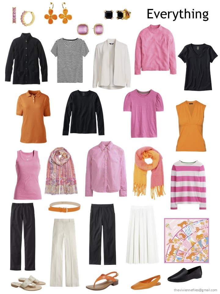
At the end of February, our heroine’s 12-piece capsule wardrobe was cheery, with options for cool or warmer weather – perfect for traveling to a handful of destinations on the same trip!
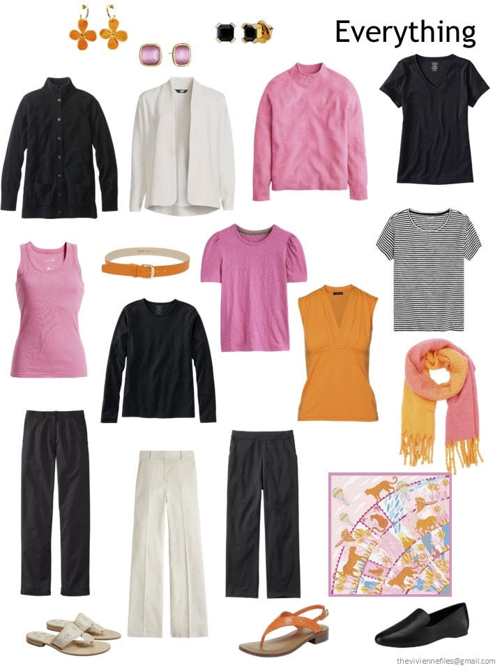
This heroine has a real weakness for pink!
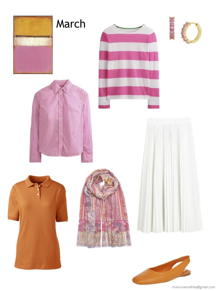
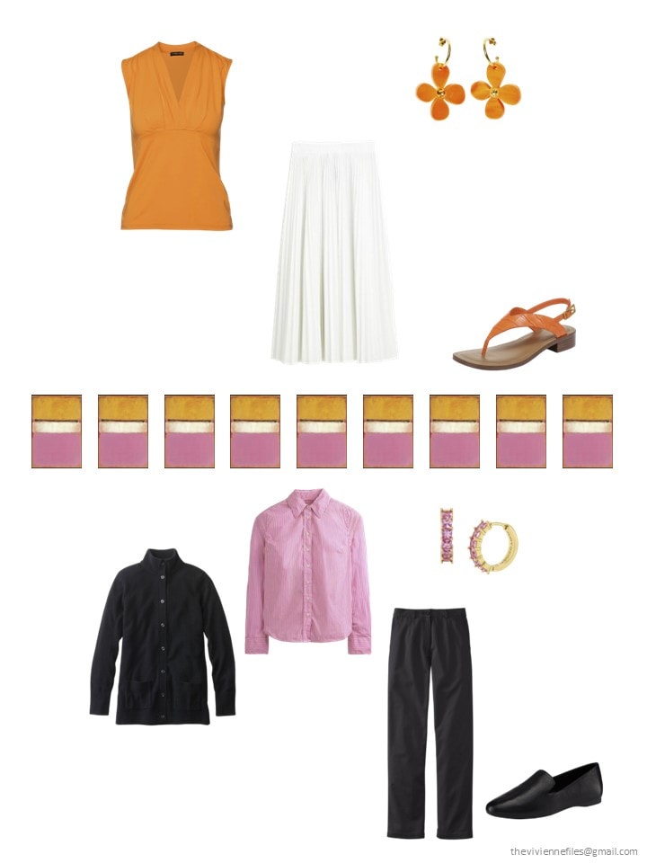
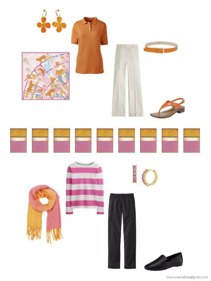
Striped shirt – Boden; striped long-sleeve top – Boden; earrings – Kurt Geiger London; polo shirt – Lands’ End; Palermo paisley wrap – Echo; skirt – J.Crew; shoes – Sarto by Franco Sarto
At some stage this heroine is going to want a pair of black shorts? Maybe white ones? But for now, when she sees pink that captures her heart, she grabs it! Wise…
I wouldn’t mind having all of this in a suitcase for about a month, and go someplace warm-ish, and then someplace with true Spring weather…
So, after all six of these, which do you like most? Did you learn anything fun or interesting? I continue to be fascinated by the way the Glen wardrobe comes together…
love,
Janice
p.s. Ten years ago, I tried to answer the recurring question “What If I Don’t Wear Black?”
Like this article? Save it to Pinterest!
The O’Keeffe is just amazing. As partial as I am to blues and lavenders at the moment, if I were starting all over from scratch this might be very tempting. Thank you!
Dans Le Parc is a winner for me.
Love the pops of orange in the second look. I’ve been obsessing over orange sling backs.
This month the Rothko is my favorite. I love the simplicity of the Denis. It would be easy to get dressed every day. I mostly wear variations of blue, so the Magill could suit me. But at present m I’m drawn to multiple accent colors. The Rothko has the variety in color and silhouettes I am currently craving.
Happy Monday to everyone!
All three of these capsules make a strong case for neutrals. I can’t say why, but the red/grey palette is most cohesive. If this heroine decided to scrap the red tomorrow and build in another accent color, the list of possibilities would be quite long.
That said, there are beautiful items in each of these capsule. The classic ivory pantsuit is elegant!
Because I love blue, the Magill is my favorite. You have put together blues before, but this one is the best of them all, in my opinion. I think it is both the crisp colors and the style of this heroine that really appeals. That said, if I had to select one other than the Magill, I can’t do it. They are all lovely!
I still like Wormingford, Glen, and this last Rothco. But really, you are compiling an outstanding wardrobe for each of the heroines!
Janice,
Dans le Parc for me — no surprise there ! When I think about packing ( which is where my mind travels when it comes to clothes, though these days it is my mind that is actually doing the traveling ) , I am loving your 4 toppers, 4 tops, and 4 bottoms in mix and match colors ! While black is in this
lovely soft painting, it is not in my wardrobe, so a substitute might be brown or a light navy blue or even a medium denim blue . My constant struggle with a dark navy blue is that when I wear it in a suit format, all of that dark color overpowers my fair coloring. I guess it’s more of a color value concentration . However, when wearing navy as an inner column , topped with camel or ivory, it all settles down, especially if adding a camel based patterned scarf with a minimum of navy in it . I need that lighter level of value near my face .
If I would pack with this happy group, I would probably add a 5 th top, most likely in a pattern with all or most of the colors in it . Or perhaps a striped one color plus white top . The trick would be in finding the multi- colored patterned one in the marketplace !
I am thinking how this group might interplay well with The Lane at Wormingford , though the greens in Dans le Parc are warmer .
It’s unfortunate that so many retailers offer only a deep, dark navy (which is barely discernible from black.) A lighter, brighter version of navy is incredible if you can find it.
The addition of the light grey added some lovely depth to the O’Keeffe wardrobe, and I think some white in with it will be perfect as we move into warmer seasons.
The Denis wardrobe is not my color palette, but the way the wardrobe is developing with repeating basic pieces in each of the colors suits my way of thinking about capsule wardrobes. I hope the heroine eventually gets her rust pants, and I think cognac leather would fit in beautifully.
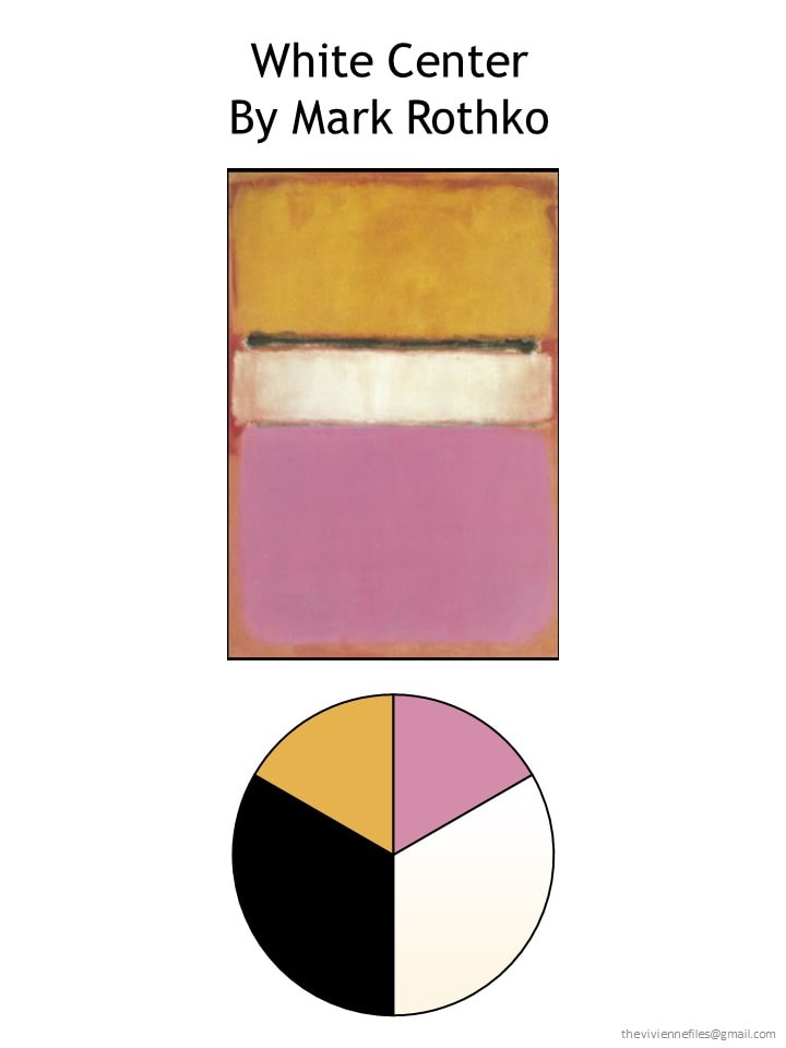
I continue feeling ambivalent with the Rothko capsule. I do like the color palette (even though the orange would not suit me personally as a dominant color). The last example outfit is a good representation of what I don’t like about it: the black pants and shoes with bright pink/white striped top and more muted pink/orange scarf look so disjointed to me. It feels like an “I’m wearing black pants and shoes because that’s what I/people wear” default rather than a deliberate choice. But even substituting white pants, I’m not sold on it.
I think we are still lacking on pieces that pull the Rothko colors together in a cohesive way. All three scarves feel a little off in my view – too soft in color and print. I think we need some bolder multi-color scarves to match the stark optic quality of the garments. For me, that last outfit would look marvelous if the scarf mixed the black, white, and bright pink (and could include other colors) in a high clarity print. By that I mean, clearly delineated areas of color – the opposite of colors that blend or wash together. E.g., classic Mondrian separate color areas vs. a blended watercolor. I would prefer to see some prints that can stand up to the intensity of the color palette and links the various colors. I happen to have an oblong silk scarf with a mix of prints that is mostly bright pink with orange, black, and white (plus a bit of yellow and a tiny bit of brown), and when I substitute it for the muted scarf, the outfit gels for me. The black pants suddenly make sense.
I do wonder whether the clarity (for lack of a better term) in prints/patterns is something other people think about and react to in outfits/capsules.
Lands’ End is carrying a color called “russet brown” that suits the rust family. There aren’t many items in it (mostly a few pairs of pants), but it might help the Dans Le Parc collection.
Also, I’ve been following your blog since shortly after I graduated from college over a decade ago. I appreciated it so much that at that time I went back and read your entire backlog and have been following it closely ever since. I enjoy the heroines you create and the wisdom you provide about how to curate a wardrobe. Thank you for everything you write here!
I love them all! You are so talented. Where I live we don’t wear sweaters or clothes like this (I’m on a small tropical island), but if I ever move to a place where I would dress this way I would definitely wear all of the things you put together! That white suit is classic and gorgeous.
Or surprised myself by preferring the O’Keefe wardrobe. I love the gradients of grey and that different shades of red are included. Blue is one of my favourite colours- and navy is my dark neutral – so the all-blue should be my favourite. I’m not drawn to the bright blue notes and my eye needs a variation of colour. I guess I bore easily.
The cream suit is stupendous and it suits my slightly dressy aesthetic (although I would want a skirt suit).
I love the Rothko wardrobe. I don’t think these are my colors, but at random moments I find myself daydreaming about a wardrobe in a suits-me pink and yellow/orange plus neutrals.
I also love the blue painting and, especially this time of year, find myself gravitating to an all-blue wardrobe.
I have finished analyzing these wardrobes (and by analyzing I mean I have a point system) and believe it or not I have four favorites. The Rothko and Klee come in dead last by a mile.
I like to imagine what the owners of these wardrobes are like. For example, the O’Keeffe woman has gray hair, cut in a modern style. She is always fashionably dressed in well cut clothes, in gray and red, of course! She’s active in her community and loves the arts. I can’t imagine the Rothko woman. Anyone “know” her?
The heroine with dark hair lives in the Mediterranean, perhaps on an island? And has a gift shop and is a cheerful, popular woman.
A set of black clothes is actually enough for her. She would add some beige and colorful printed dresses.
I’m such a blue girl, I’m all in on the shades of blue wardrobe, but I must say that grey and red is really appealing.
Oh, me too, RB, 100%!
The groups are moving along! The Dans le Parc is pretty close to perfect and really appealing to me. I’m always a fan of the blues too. However I chose to concentrate on the Rothko.
I agree that something is very about the black. I think it is because there is hardly any black in the painting. I have chosen to make my pie the orange the warm gold the cream and the pink in equal slices. I see the darker hues as a dark khaki not stark black. I have been putting a wardrobe together with this plan. It is great!
Amazing how it gets the feel of the painting which I love. The painting is very muted even with the vivid colors. Just my take on things. I am the Rothko girl 😊
I waited to see all 6 before responding to be fair in my response. I am still not all in for any of these though I like blue, brown, green, yellow and white/ivory. The brighter greens helped with the Nash and it is beginning to feel warmer. I couldn’t imagine the blue one for me…too confining. The Klee is better with the yellow though if it were mine, the coral would have to go and the new prints would become white and yellow stripes. The offerings today are definitely not me though the Rothko has an appeal if I swapped the black for more white, made the orange a bright yellow mustardy-gold and the pink either a yellow-green or a pale turquoise. I am very fond of light neutrals and ice cream pastel-type brights for most if not all events. My colour choices are a bit darker in cold weather, but nothing extremly dark like the navy we generally see. My navy is very clearly a dark blue…even my brown is lighter than the ones here with a warmer golden amber hint. My mom would probably like the blue or the O’keefe if it were blue instead of red. I am trying to encourage her to wear other than white and navy by giving her irresistible pieces in softer blues, cream and soft gray. She finally caved and wore a pale blue jacket the other day…and even touched the sleeve of a blue top when shopping.
Red Maple is my favorite, and I like this post because when I saw the light gray, to my eye, at least, it looked enough to me like it could almost stand in for the white. I wear cooler colors and hadn’t considered any alternative to white like this (I don’t really wear white); camels and beiges and the like just don’t look good on me, but a very light gray might be a good alternate to white for me in some situations. Red Maple is definitely my favorite wardrobe… it’s very striking.
I love the red Maple! The lighter grey really does add depth to this wardrobe. I wouldn’t wear the red pants but everything else is great.
I like the colors of the Magill but it’s a little too monochromatic for me. I need more variety.
I love the Red Maple. It is an excellent example of a predominant grey based neutral wardrobe. You could add in any accent – lilac, pink, purple, green and this wardrobe would take you anywhere.
I love the O’Keeffe; it’s pretty much my palette. I do have grey hair in what I consider a modern style, and try to be fashionably dressed in as good a cut as I can afford (I am a regular at my tailor’s). I rarely wear “casual” clothes. I almost feel Lily knows me :)
As others have mentioned, the neutrals in the O’Keeffe make it easy to change one’s accent colors. I’m very particular about the neckline of my tops so it’s handy to have lots of color options.