February 12, 2024
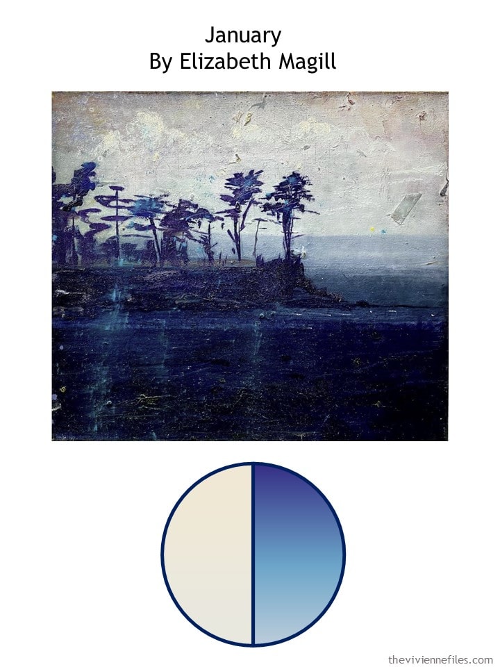
I’m getting to be a big fan of Elizabeth Magill – her paintings are deep, and rich with color…
If only I’d found this one last month, eh? But it fits nicely with our theme of clusters in neutrals, accompanied by a sizeable dash of an accent!
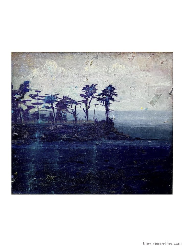
This could be a lifetime wardrobe – everything from white to ivory to a soft grey, and a sizeable range of subtle blues. I even see some purple in there!
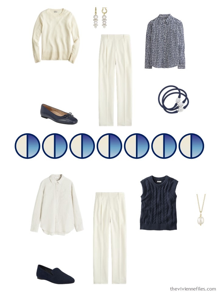
I’m going to start with the first ivory/cream wardrobe cluster that we saw – the one with the dressier pants, and the skirt. I see this heroine as having a wide range of activities planned, with the need to dress “nicely” from time to time…
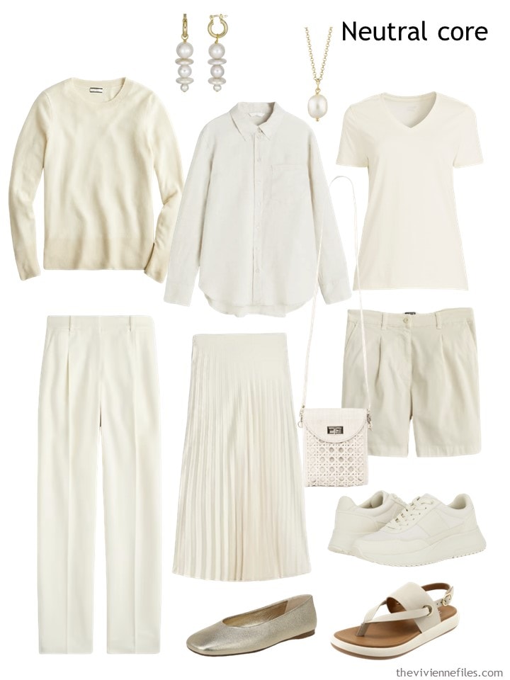
Earrings – Rodela; necklace – Lily Charmed; cashmere sweater – J.Crew; linen shirt – H&M; tee shirt – Lands’ End; twill pants – J.Crew; pleated skirt – J.Crew; crossbody bag – Soli & Sun; shorts – J.Crew; sneakers – Calvin Klein; gold ballet flats – Vince; sandals – SoftWalk
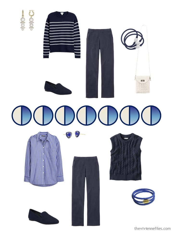
Next, her second neutral – a little less dressy, but one could still do quite a bit with nice corduroy pants, a silk blouse and a classic sweater vest:
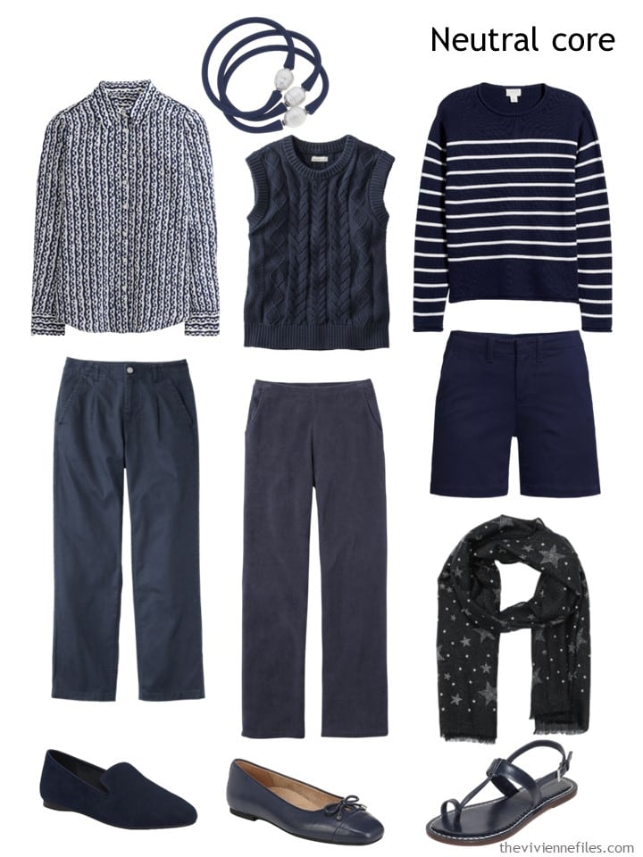
Navy & pearl bracelets – Canvas Style; print silk blouse – Boden; sweater vest – L.L.Bean; striped sweater – Caslon; ankle pants – L.L.Bean; navy cords – L.L.Bean; navy shorts – Lands’ End; scarf – Kate Spade; suede loafers – Birdies; ballet flats – Vionic; sandals – Bernardo Footwear
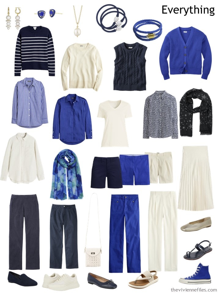
And last – she found this glorious blue called (of all the useless names…) Harbor View. I LIVE with a harbor view – our building is called Harbor Point. Never saw this color out my window…
Nevertheless, she’s smitten. There are a range of garments available from J.Crew in this color right now, including suit separates. But our heroine felt that she didn’t really need a blazer, nor a 2nd skirt. Your mileage may vary, of course!
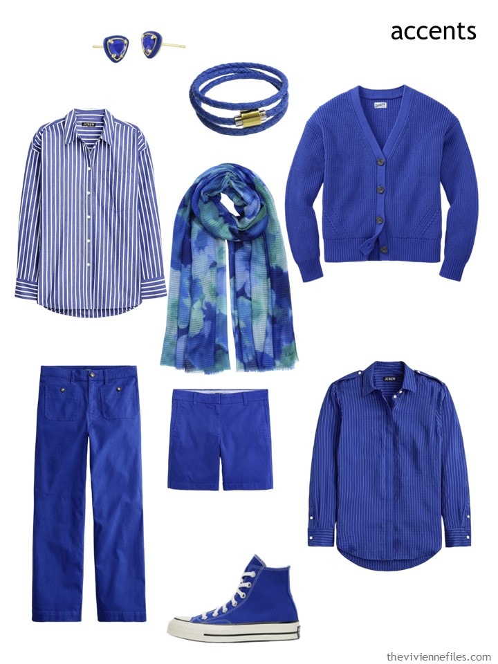
Small earrings – Kendra Scott; wrap bracelet – Liza Schwartz; Harbor View striped shirt – J.Crew; floral splash scarf – Echo; cardigan – Duluth Trading Co.; chinos – J.Crew; shorts – J.Crew; subtle striped shirt – J.Crew; sneakers – Converse
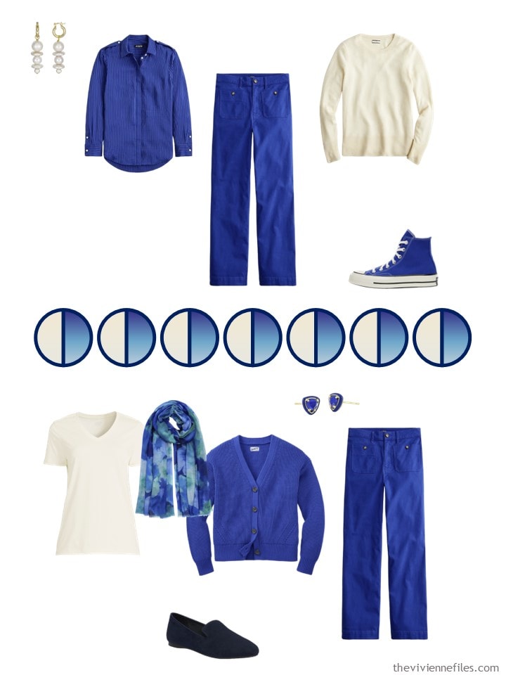
You know she’s going to skew a bit casual here when her blue shoes of choice are timeless Converse High-Tops!
Here’s her Spring wardrobe – much of it wearable now, much of it easily extended through the Summer:
Does she have options? Oh HECK yes…
This is another wardrobe that I could easily see packing for a long spring trip – wear 3 or 4 pieces, just over a dozen to pack…
Can you tell I’m ready to travel? Not in the cards for a long time to come, but I’m always thinking!
love,
Janice
p.p.s. This seems like the day to ask – do you often wear garments with sports team logos on them? I see SO MUCH STUFF now with logos; searching for sweatshirts is especially maddening…
I own 3 rugby jerseys, which I wear when I’m going to a match, or watching the particular team on television. I might make it down to the grocery store in the Ireland rugby jersey, but I don’t believe I’ve ever worn any of them out of the building. So I’m curious if I’m missing something that I should notice more!
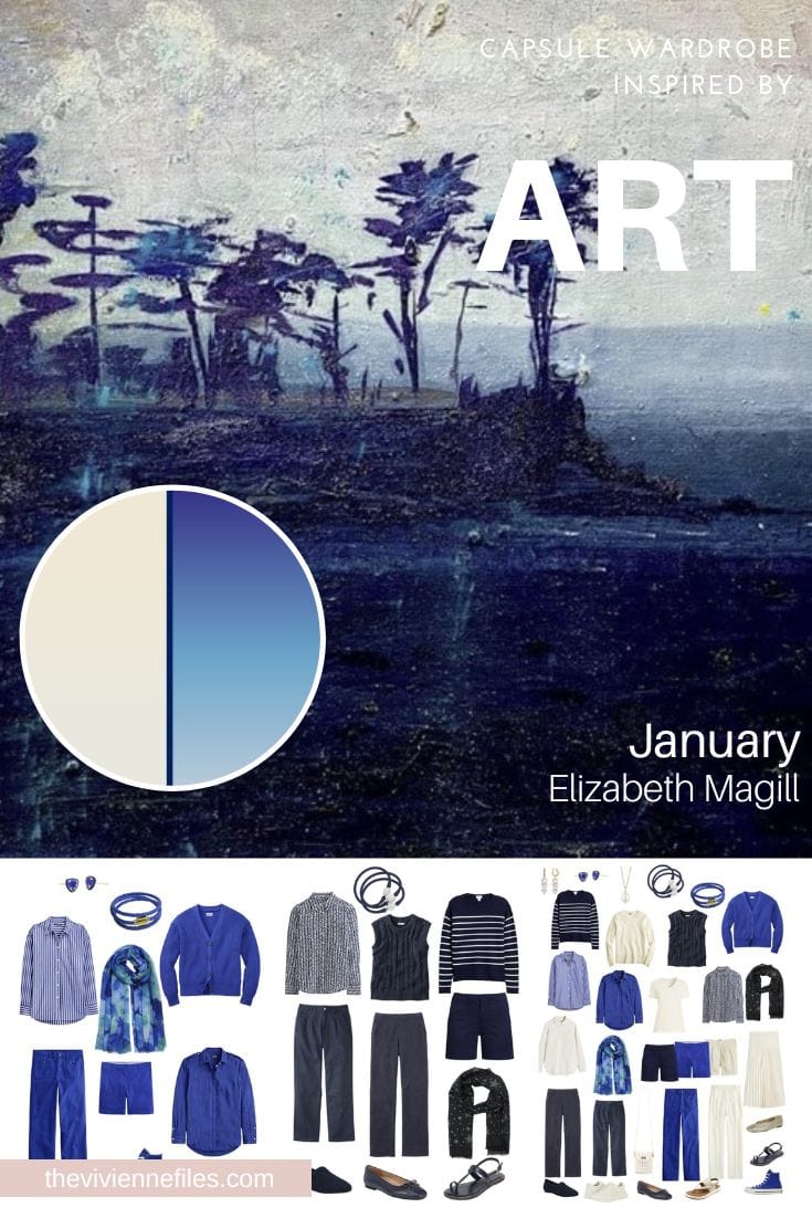
Like this wardrobe? Save it to Pinterest!
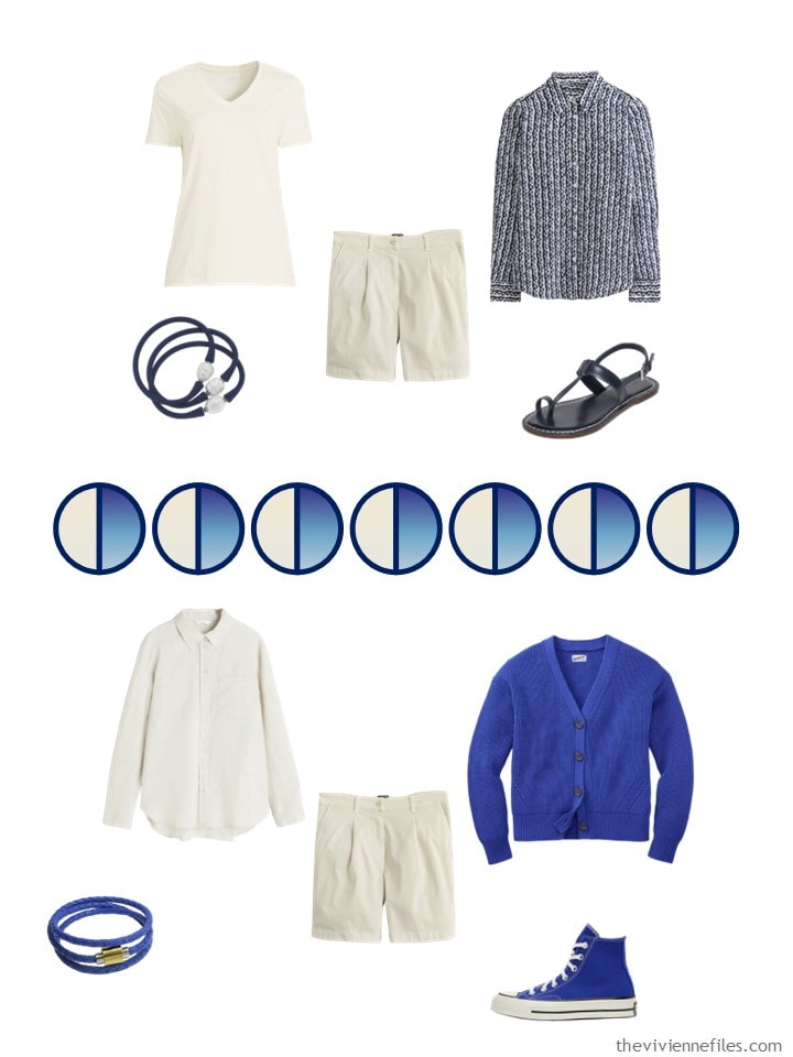
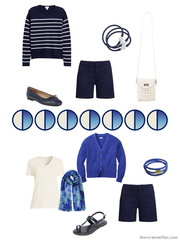
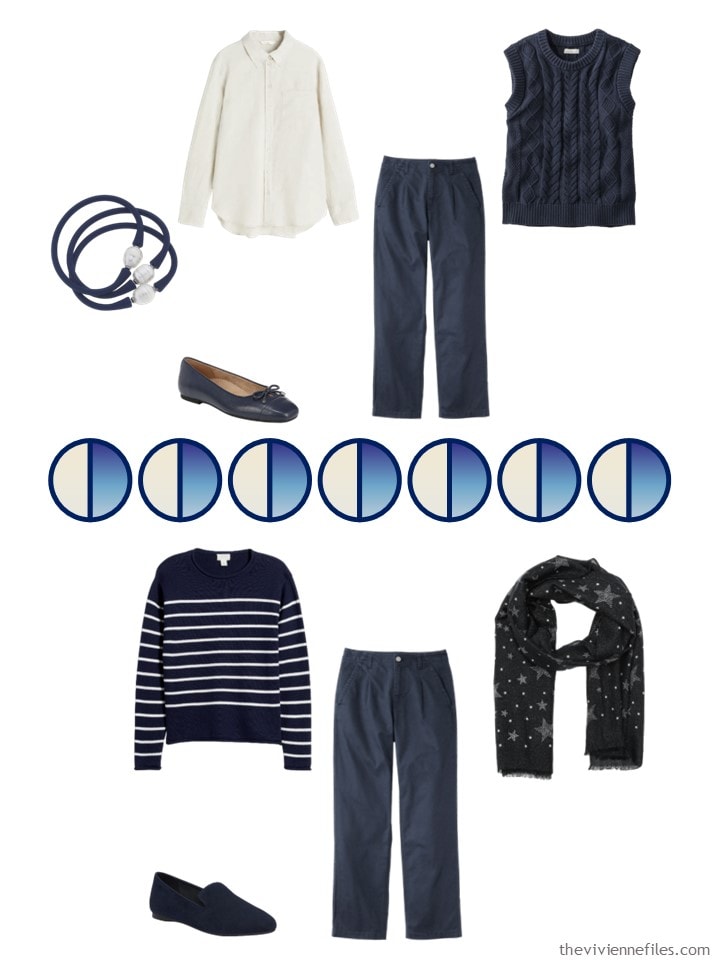
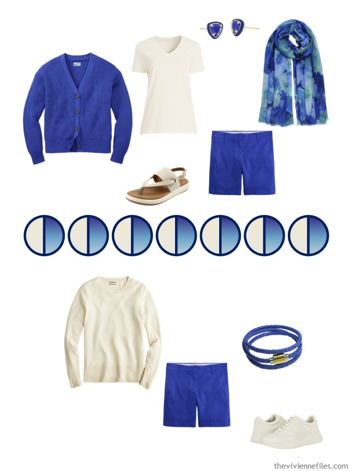
I am absolutely smitten with the navy core. Smitten. While I”m not sure about the Harbor Blue for me personally, I like the items themselves. Just love this. This is what I needed to start my week. Thank you Janice!
ps I do not tend to wear garments with sports logos. I do have a wardrobe of Air Force sweatshirts and tshirts, as well as various Dr. Who items….. and I do wear them out –
Sports logos? Yeah, no. University logos, sure. Guess that’s what happens when you spend formative years as a violinist rather than on the playing field… But this wardrobe sure would transition nicely – a handful of ts & tanks, plus maybe a summer dress or two & you’d be ready to go!
Enjoying harbor blue. I could live in these colors but I’m a bit too messy for all those light colors. I gave up on sport team logos except for my hubby’s college team when we go there for a game. Usually I just wear team colors and not logos. I’ll admit when I’m in the grocery store and see someone with my home team logo, I will often approach them and ask if they are from that city. So, I guess, logos can be a conversation starter.
Very nice! Both the painting and the wardrobe would be welcome in my house. I’d leave out the shorts, and add a dark navy skirt.
Logos, I mostly try to avoid, but university, or favourite team, maybe.
It is difficult to find plain sweatshirts.
Thank you!
Colorful Standard makes sweatshirts (excellent quality) in about a billion colors…
https://colorfulstandard.com/en-us
Enjoy!
hugs,
Janice
I love blue! What’s the difference between cream and ivory? I look best in a soft white or one with a touch of pink to my eyes (cream or ivory?). It’s the white with yellow I stay away from. When I order on line, it’s a guess between cream and ivory. There is a creamy white color (touch of pink) that Banana Republic sometimes has in their lineup that works beautifully with my coloring.
From what I’ve been able to see, ivory tends to have a lot more yellow in it versus pure white. Cream is a little closer to white but still has some yellow. Eggshell has more of a faint pinkish undertone. And I have no idea with ecru lol. Probably blue because I have trouble seeing extremely pale blue. It always looks grayish to me.
However, naming conventions for colors are super imprecise so it’s best just to look at it and try to figure out what the undertones are!
I would think that cream was more yellowish – you know, butterfat… But people who name colors don’t think that way. I look for ivory, off-white, ecru, bone, etc. It’s amusing…
hugs,
Janice
I’m a newbie here, and I’m loving this series of art inspired capsules. Thank you, Janice. And no, I never wear anything with logos on. Why should I be a free advertising board? :-)
I love this painting and wardrobe. It also never occurred to me that Duluth Trading Company would be a fashion source. Their description of the blue cardigan is artsy- not fartsy! Perfect.
I live in Packers Country and it is very common to see logo clothing on game day. I found that most sports fan clothing is not designed for boobs, so I pass.
I used your link for Eliz Magill. I like her stuff too, very block print-y. I like the way she uses a lot of solid color to silhouette the shapes of things. And the titles of her paintings are interesting….to say the least! Thank you for that nice introduction to her!
I could easily wear this wardrobe for a long time. The link for the blue Kendra Scott earrings takes me to Friday’s post.
The blue is one of my very favorite colors. If you look on the Duluth Trading Co. site under sapphire, they have more of this lovely color including tanks, camis, shorts, and even a rain jacket. I would probably get a tank and the Henley they offer as well as the cardigan.
Regarding logos, no, I don’t wear them on my body or my accessories.
Another home run, or should I say touchdown, by Janice.
I loved this post! I could see myself in all of the pieces, except I shy away from whites/creams, they just make my reddish toned skin look even more red.
I went back and looked at the Calder vs Mondrian. I really loved that post then, and I really like it now because it took two very similar color schemes and you really explained through your example of soft/graceful vs angular. I’ve always seen the “angular” as somehow more “modern” and the soft/graceful as more “romantic” the problem for me, is I always seem to mix the soft/graceful and angular in the wrong way, and my outfits end up looking haphazard. Could you do an update to this styling technique?
Another lovely wardrobe and, yes, color descriptions can be confusing as with paint colors. And a no to team logos, never been much into sports, would much rather be doing than watching. So my printed tees and sweatshirts reflect personal activities. These garments are mostly worn at home, to walk the dog, garden or run errands. They don’t work well with travel capsule wardrobes or nicer outfits.
The Calder vs Mondrian throwback post was interesting to see not only color but shape and texture applied to a capsule wardrobe. Fun deep dive.
It’s so odd – I really like this shade of royal blue, and looking at those blue items together, I just love it. But when put together with the dark navy and ivory (which I don’t like with navy as well as a purer white to begin with), it makes the navy seem kind of flat.
I think the Duluth Trading Co blue cardigan is an easier pairing with the navy for me than the J. Crew blue items. I’m not sure if it’s because that blue looks a bit darker or it’s the sweater knit texture that softens the color or what. The J. Crew items appear brighter and shinier (?) while the navy looks more matte. Of course, this is on screen, so in person, all bets are off! No final decisions until the items are in hand (and ideally, tested on ourselves).
We see this dark navy a lot here, but I wonder if a different version of navy would be more pleasing to my eye; there are lighter and/or brighter navy colors that might stand up better to the blue…although you then risk the blue and navy colors being too similar. Do you also find that there’s a sort of “uncanny valley” of color matching where the pairing looks off because it seems like it’s trying to match but fails? It might also be difficult to source a grouping of brighter navy pieces all at once.
I would probably throw some blue denim/chambray to support both the blue and the navy as well as keeping my eye open for prints that mix the blue and navy. The floral scarf is a good…and gorgeous…start to that, but I would love to see one that mixes in the ivory as well. I find a true white T much easier to add to any random outfit than an ivory/cream, so I would be thinking about how to blend the ivory color in a more integrated way. But I’m also high on the Integrated end of a ColorblockIntegrated preference continuum. Our heroine might really groove on unintegrated blocks of color.
High top Converse are not consistent with my current style, but they certainly give me a happy feeling since I wore a pink pair throughout junior high.
I don’t wear sports or any other logos ever. Agree sports clothing best for being at and watching matches. supporting your team etc. Not for going out in.
Often wonder why you show so many shorts because I only have one pair. I know Dublin Ireland is not a hot place so maybe that is why but when I think about what I wear in a heatwave it’s usually linen cotton or viscose loose trousers and rarely my only shorts.
Am I missing out of something or is it an American thing to wear shorts. I see tourists in shorts and woolly jumpers or rain macs in the summer and think it odd. Ohhh Now I remember why I don’t wear shorts – I burn in 10 minutes in the sun – how did I forget that.
Prefer the harbour blue to the navy which seems too dark. Not sure if harbour blue is too vivid a colour for my pale skin but it might just be okay.
Live the items you chose and would use this as a template minus the shorts which i would swap out for light weight trousers or a midi skirt or a knee to midi dress.
Love your style.
Check it often for ideas.
Susan, I’m not a shorts lover, either, even though I live in a climates that’s hot and humid during the summer. I prefer longer skirts or maxi dresses when it’s hot, with a sweater over my shoulders for the air-conditioned interiors. I’m not keen to show my aging legs to anyone!
Spell check keeps putting live instead of live – why – it’s annoying .
But, of course you knew what I meant didn’t you.
In another note – is it just me or does anyone else have trouble getting a bra that fits well and is comfortable. I finally managed it but it took months of trying bras on in different styles and sizes and cup sizes to get something.
Yes – bra shopping = the worst. You are not alone. Best advice i can give is : give yourself a few hours, go to a large department store with fitter available (Nordstrom used to do it, not sure if they still do), try a whole bunch of brands/styles to see what fits well and is comfortable… get your size in that style (because even within brand, it can change based on the style), buy 1 or 2 to keep you happy…. and then stalk the internet for sales for your chosen style & size because who can afford to pay full price for 5 bras…
I went to a bra specialty store for a fitting, tried on several bras, and one immediately felt right. Wore it for a few days but one of the “girls” kept trying to escape below the band even with tightening the band. So I returned to the store and a “sister” size was suggested – smaller band, larger cup. No escape but one strap kept falling down. I love the look of the bras but I finally figured out the problem was in the design – straps too wide-set and not enough side support which we need if our “girls” are wider set. If you have a favorite brand, you can search for “side support.”
Good bras are so expensive and average around $70. Once you settle on a style that works for you, check out the brand’s, Macy’s, Nordstrom, etc. websites for sale items discounted up to 40% on usually discontinued colors which can be lovely.
It dud it again and i was trying to be careful.
Re: logos – I think we are going to continue to see a proliferation of logo items on offer online because companies have figured out the technology and business angles to make a profit on print-on-demand sales. This includes sports logos, but also cartoon characters and other graphical motifs that people are a fan of. When you don’t have to maintain a physical inventory of sweatshirts with all the graphic elements in all the sizes you offer, but instead print on demand, there is very little cost to adding more options (whatever it costs to make/purchase/license/steal the logo, store it in their system, and add it to the digital marketplace). And they don’t have to limit themselves to only the very favorite ones with a lot of fans; they can go after more niche preferences as well. When I Google Shop “women’s rabbit sweatshirt” (which is a graphical element but not a logo per se) there are a gazillion hits from Amazon third party sellers, Internet-only companies I’ve never heard of that sound like they’re based overseas, and Etsy shops that are likely doing print on demand.
There’s a whole business of genuine licensed sports logos, Disney characters, etc., but I’m wondering if we are starting to see more companies (which may be just a guy and his computer) entering a sort of grey market for these things. The extent to which companies in parts of the world that do not have a high commitment to legal licensing are able to sell direct to consumers online will drive more and more of that.
But it seems that all these logo items are also being offered on what I consider more traditional shopping sites as well. It’s been happening at Amazon for a long time, of course, and it seems like other retailers are following suit. I have personally fallen into a neverending plethora of sports logo items specifically on both Kohls and Walmart’s sites in the last couple years as they have started showing third party items as well. The search capability on Google Shopping as well as most of the online retailer sites is never adequate to fully eliminate these endless offerings of log items.
And Nordstrom – SERIOUSLY. I just want a plain sweatshirt…
hugs,
Janice
Oh boy, it’s hit Nordstrom now too – UGH.
Have you checked the men’s departments? I haven’t bought a sweatshirt in a while but I used to buy good old Hanes mens sweatshirts when I wanted a basic inexpensive style.
Would it freak everyone out here on The Vivienne Files if I included men’s sweatshirts in our wardrobes? I’m more concerned with finding things to share with you – I have the purple sweatshirts from Colorful Standard, and I’m rockin’ them!
hugs,
Janice
Sometimes I’ve found a men’s sweater that I liked in L.L. Bean or Lands’ End and ordered one size down from my normal size. But I’m tall and normally wear a large sweater in women’s. Men’s garment arm-length is not a problem for me. Men’s garments are usually cut slimmer at the hips so it’s important to find out the “sweep” to see if it works for your hips. Call customer service if the info is not online. Overall, men’s sweatshirts may work for average or larger women but probably not for petites.
There was a tv show called Numbers (quite a while ago) where the lead character, a math professor, used to wear logo tshirts under a sport coat. I think under a blazer is kinda cool looking.
I do not wear a sports logos. When my son played basketball, I wore a plain sweater with one if the colors of the school, and that was as as far as I went. When I attended a dinner that was themed around the local university colors, I was stuck, because I have no orange in my wardrobe. so I wore white and purchased an inexpensive orange necklace, and that worked fine. I kept the necklace in case I ever get stuck again. But I don’t like to advertise on my body. I think I’m just old-fashioned.
I’m sorry for the typos. Siri does not always understand my dictation.
I’d do the same as you. Subtle message. Why do I need something that shouts a name in order to feel that I belong?
No logos. Team colours, sometimes. It’s gotten harder to support NZ teams in that way, since now I have hardly anything black! Definitely shorts in the summer here. I have four pairs of linen shorts, plus exercise shorts. Along with a linen skirt, that’s basically my summer bottoms :)
*SIGH* if only more of these suppliers offered petite sizes! Even with petite sizing (looking at you, Land’s End) I usually have to roll sleeves up but with regular sizing I’d have three inches of sleeve to roll up ;-(
I did like debra indy and looked back at the Calder vs Mondrian article.
Compared each option with the other item by item and found I’m definitely 100% Calder but world wear 17% of the Mondrian clothes mostly the less dramatic shapes and patterns.
Thank you ezzy for the advice to get measured and then look for sake items afterwards. You are correct paying full price is too much to ask.
Thankfully I did track down a good bra yesterday that was very affordable in Dunnes Stores Dublin.
Zero logos for me – ever! Pre-COVID, I had some work-related logo-wear that I had been given and was expected to wear, and I hated it. Somehow, during the remote work years, they all mysteriously “disappeared”, and no one has noticed…
I love the harbor view blue, and will have to pop over and see what they may still have in my style and size!
Lastly, I loved the look back – I’m team Mondrian, all the way! I never thought about styles that way, and it gave me a new perspective on what work on me and what doesn’t, and why.
Unless I am going to an event that requires a logo on my clothing, I do not wear logo clothing. If I do, it is a small logo that can’t be removed. I do have a logo on my bag. I wear that side close to my body. I don’t want to be a walking advertisement for anyone except myself — and I am not a corporate entity. I don’t have a logo that says “Louise from Louisiana!.”
I love these colors! :) Navy and shades of blue for me all the way. Like another commenter I would have denim woven into this. I don’t really follow sports and so I don’t have any sports clothing. I do have a sweatshirt with my college logo and my kids/my school colors are blue and gold so I wear a navy tee with a mustard cardigan (things like that). I do love a graphic tee or sweatshirt here or there. I was gone for the last 5 days visiting my daughter at college (thank you Janice for all the packing tips! My carry on and back pack were all that was needed!) and I bought a sweatshirt from the special coffee shop that we went to twice in this tiny town. My trick is to buy them really big… wash them a couple times for shrinkage and then use a pattern I love to re-make the sweatshirt to fit just the way I like it. Then it is fun for my home days, or running errand days and I remember all the memories of time with my daughter.
Love this whole wardrobe and would wear it all. I know I already have the navy and the white/ivory items in my closet. I love shorts and skirts and flowy dresses in the summer. Easy to wear and look like I put an outfit together!
The look back was very interesting and I agree it would be fun if you would do something like that again. Really was food for thought.
I’m not big on logos. There are purse/shoes I absolutely avoid when they have the logo on them. Now speaking of shoes do any of you readers wear a narrow shoe and if so can you recommend some?
Amanda,
SAS has slim and narrow sizes. And not all of their shoes are frumpy. I wear SAS brand almost exclusively on my skinny feet.
Hi, Amanda —
I have narrow feet, and it’s so difficult to find quality shoes that fit! My main sources are Nordstrom and Zappos. Also helps that they have free shipping both ways. I don’t like to pay for shipping!
I have never heard of SAS and will have to google!
Also have a narrow foot (9AA) and occasionally luck out at DSW . SAS works for me – comfy but many stylish brands – and a local shoe store will special order them for me. You will have to do some online searching. Maryland Square is a good place to start. Naturalizer and Trotters carry a lot of narrow shoes. The better brands are more true to size so once you know what size works for you in each brand that will make ordering easier. Also, New Balance shoes run narrow and work for me. Boo to Skechers for having only 2 styles in Narrow.
Last fall I wanted to buy a couple of pairs of booties to go with my neutral colors of olive and navy. Still no luck on the navy but navigating through DSW I found a pair I liked in a new-to-me brand – Propet. Went to the brand website and they were on sale in my size for 50% off! Right heel height, suede-like but waterproof for only $39.99 with free shipping and returns. Many styles work with orthotics. Spoke with a friendly customer service rep before purchasing. Here is the website:
https://propetfootwear.com/womens/
It’s worth the time and patience to find what’s right but when you score it’s a great feeling!
Oh so much food for thought. Well, I have a few memory sweatshirts with my college logo, but don’t wear them. Otherwise the only logo is a tiny discrete ‘T by Talbots’ tag on just a few items that can’t be removed unless I destroy the item to get rid of the logo. For the post…love the ivory still. Feel like the navy is too dark – my navy items are lighter and were called Indigo or Light Indigo at Talbots. The bright blue is semi appealing, but I might look for a softer not as vibrant shade. As for art being a style…I would be mostly Art Nouveau with a little Art Deco and Mid Century Modern. I adore the softness of the Edwardian look and Dior’s New Look, but also sleek 30s glamour and the practicality of WW2 fashion have an appeal.
I have an Oakland A’s jersey. I only wore it when we used to go to games, but the team has forsaken us here in the East Bay. So no more games.
I never wore it as casual wear. It was for games only.
Other than that, no sports teams logos of any sort. I have never liked clothing with any sort of writing on it/
Used to wear Washington R******s apparel all the time until conscience and political correctness took over. Not going to start over with Washington Commanders stuff. I no longer feel any affinity with the team and in fact have given up watching football (American) entirely. So no logos if I can avoid them. I hate that so many cute purses have those stupid metal logo plates!
I surprised myself with how Calder I am. With very few exceptions I would wear any of those pieces, and only one or two of the Mondrian.
Trying to scrub the image of a woman of a certain age wearing shorts and Converse high tops out of my brain…anyway when it’s warm enough for shorts it’s too warm for the canvas high tops, maybe a pair of the Converse low tops or Keds in the blue?
I think I could easily duplicate most of this wardrobe from my closet. Love these! I’m not fond of light colors on the bottom so i d change those out. There are a lot of great observations here to chime in on. I live in a hot climate so I do wear shorts, not with converse high tops! I cover up my woman of a certain age arms, but my legs are in great shape so I’ll proudly show those. 😉 When I lived in Europe I did not wear shorts, it did seem to be very American tourist like and the climate didn’t seem to call for them. I’m not too fond of logo wear as an everyday item but I have a few sport team logos I wear to games. I feel very frumpy in any sweatshirt no matter the color or logo so not looking for those ever. They are just a practical item for warmth in my mind so i’d rather find a jacket or cashmere hoody. Visually, I’m drawn to the Mondrian, but my closet is much more Calder.
I have been having a love affair with royal blue for the last three years. Mostly sweaters since it’s a winter color, mainly, but I have a couple of jackets and some cotton turtlenecks, too. I found suede shoes, too, and a purse. I know it’s retro but I wear royal with black. Actually, I didn’t know it was retro until I saw a mention in one of your columns. Also gray. It’s nice to see you pair it with navy. I was afraid that the colors would be too close but it looks good.
Ooo I like this. My take on it would be azure blue, indigo, ivory and silver grey. I’m surprised that she has only one scarf and that has got green in it. Thanks for the look back. In terms of style, I’ll be a Calder. I would only wear logos under sufferance. I’d wear team colours if they suited me but a discrete badge if they didn’t.
I had serious second thoughts after my post about shopping the men’s department! My practical side answered the sweatshirt search without considering your process and story development. You curate such beautiful collections from great sources. If I am on the hunt for a specific item I have no problem shopping any department but I can see how that might not fit for all. I’ve found the perfect white shirt, a workout shirt in the right color, and even a belt outside of my usual department. I think you have included scarves listed from men’s sections before so I don’t think there would be an outcry if you found the perfect item there. We are lucky to have options and the freedom to shop where we want to.
Yes! These are my core colors, and much of this is in my style! So hard as a young woman to find classy pieces that still feel fun, and work with my lifestyle — you’ve done an excellent job!