October 4, 2023
I think I’m going to be able to do these one at a time, which is an interesting approach!
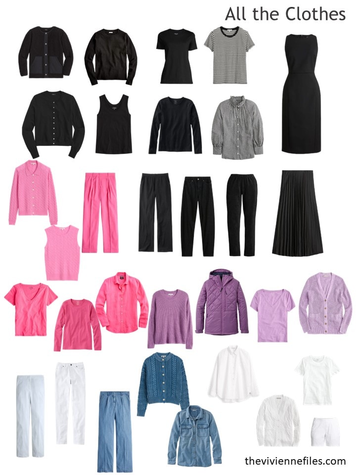
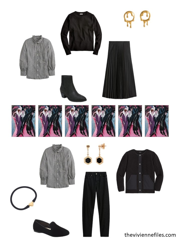
What would I be thinking if this was my wardrobe inspiration, and my wardrobe?
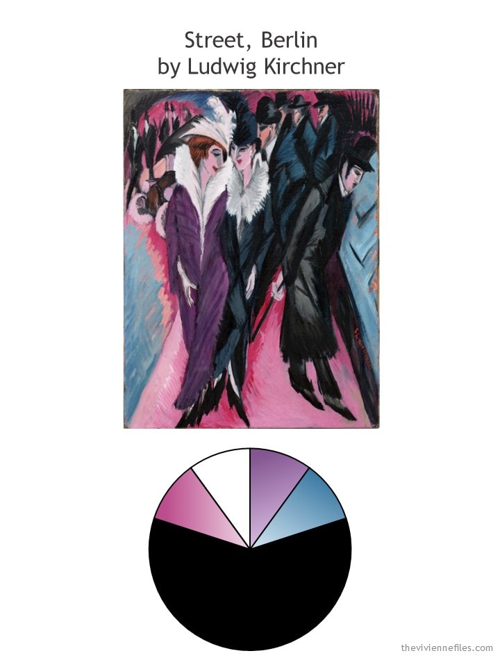
Well, I’d be pretty thrilled with this painting! It’s sassy, bright, and has purple right up front! And lots of black, which has been my favorite neutral for 40 years…
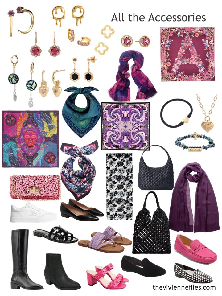
This wardrobe has a lot of appeal, to me. Maybe I would want more purple and less pink, but that’s a pretty small concern…
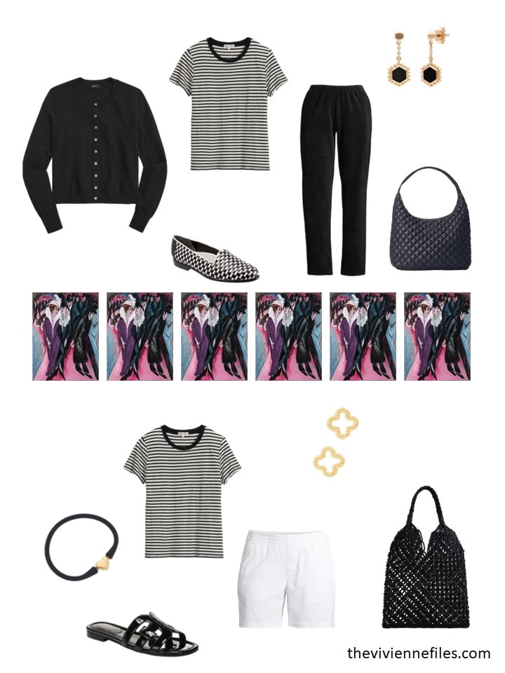
But I would have to have a pair of black shorts! Maybe not in October, but eventually. And I definitely feel a longing here for black and white stripes, checks, florals, or even a great paisley scarf.
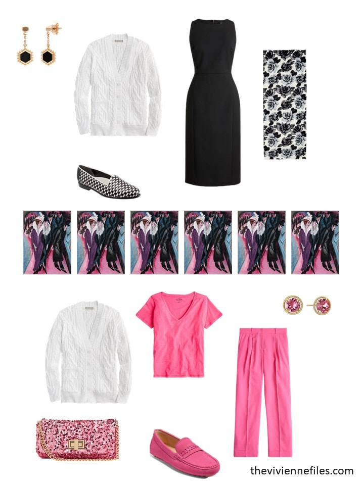
And a white cardigan. Yes, it’s sort of late in the year for a white cardigan (in the Northern Hemisphere, obviously), but I still think it would be handy:
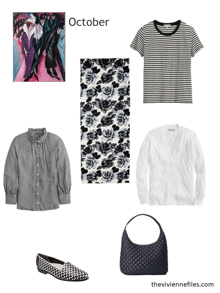
Striped tee shirt – Alex Mill; scarf – Bloomingdale’s; gingham shirt – J.Crew; handbag – MZ Wallace; cardigan – J.Crew; loafers – Trotters
Adding 3 new garments doesn’t really change the look of this wardrobe, except that the introduction of 2 prints seems to bring a little life to it all.
And the accessories don’t, overall, feel that they are radically changed. But cool woven shoes are never wrong!
I think we can all picture how these garments can be worn, but just for fun I always like to look at how things go together!
Do you really feel like your wardrobe isn’t complete without printed garments? I’m surprised to see that the first thing I thought of here was stripes!
love,
Janice
p.s. Four years ago, our heroine couldn’t wear pants anymore! It didn’t really slow her down….
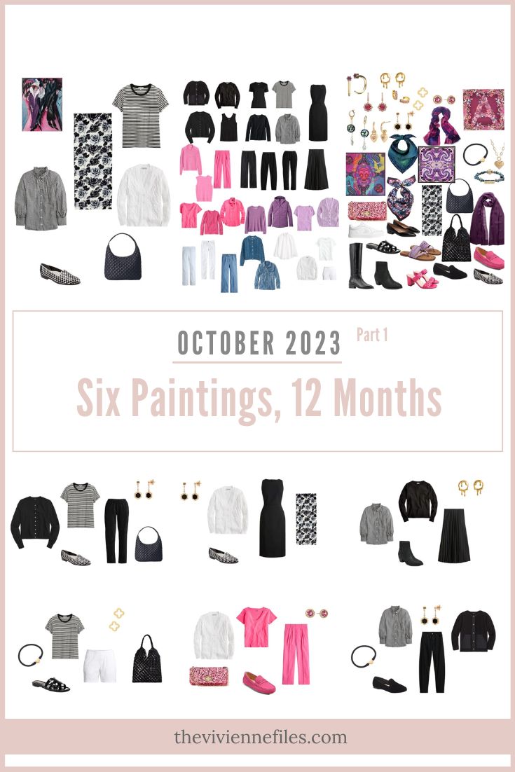
Like this article? Save it to Pinterest!
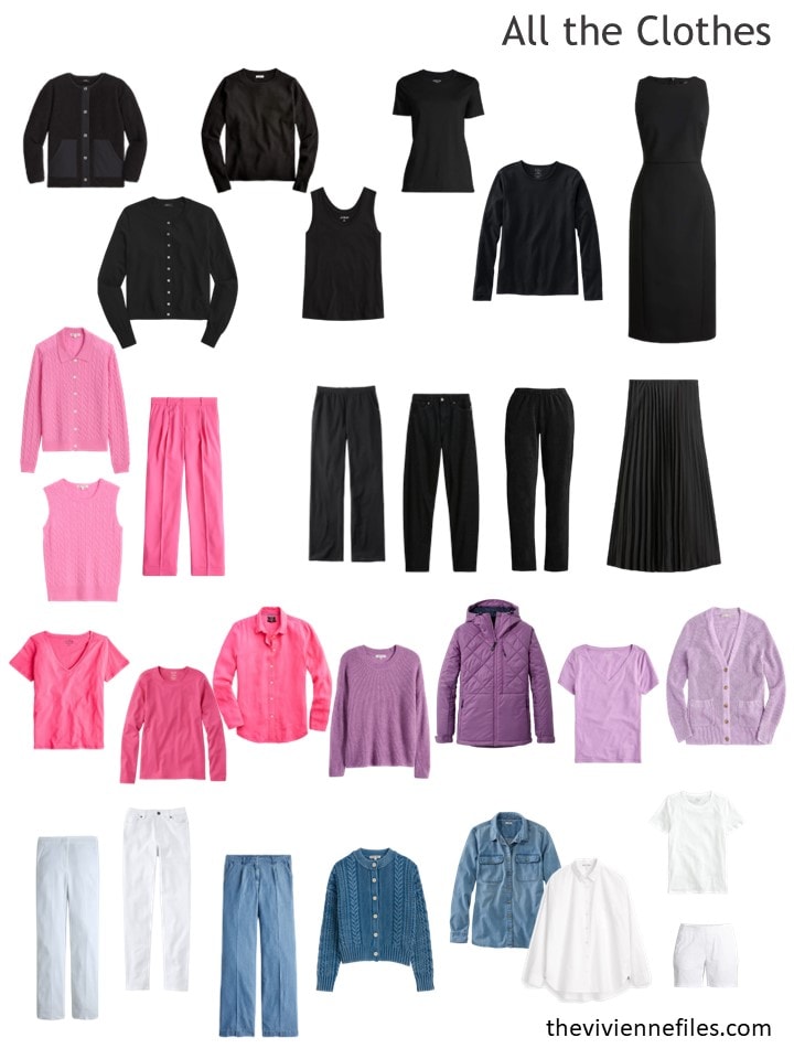
On my phone screen, the pink in this collection always looks too bright and jarring with the muted tones of the purple and blue. Today on my computer and the pink colour saturation perfectly tones with the purple and blue – how odd?
I ALWAYS have to have prints in my wardrobe – florals, paisley, snakeprint or checks. I also prefer plain accent colours to have a texture to the fabric or sparkle which acts as a pattern. I would have added several printed that combined at least two of the accents by now. I would suggest that dogtooth trousers would be a good addition. A few years ago I bought some black and white dogtooth trousers. I also have a pair of dark grey and black dogtooth trousers. I wear them with a floral tops and a grey jumper. The monochrome scarf and shoes are great. I have a navy and light blue monochrome rose scarf. It’s lovely and warm. I like the textured bag to add interest.
The look back is interesting and the scarf in the same colours is inspired. I do wonder how you search for such well coordinated scarves? You must trawl through thousands to find one which will go.
Like Beth T, I would also have many multi-colored prints in the capsule by now. Scarves can carry my need-for-prints to a certain extent, but I would definitely need print garments as well to be happy with a wardrobe!
I also love prints; In my wardrobe black and white gingham, stripes, leopard print and snakeskin are all regularly worn. I have a houndstooth dress but haven’t felt the urge to reach for it yet.
Welcome back! I hope things go smoothly for you. And thank you for the rose. You still brought us something beautiful when you were otherwise occupied.
These additions are lovely. They add so much punch to the wardrobe. I could easily slip into this wardrobe even though black isn’t my best color.
And stripes? Of course, stripes. And where are the stars? You usually have stars also. Your collections always inspire me.
Thanks again, Janice.
Hope you’re feeling better, Janice!
Stripes! Yes, to stripes. I love a nice Breton top. As for other prints, I like choosing a skirt or a two-piece “dress” in a print I love and then using that as a basis to add 1 or 2 cardigans, a jacket, pants, a solid skirt to go with the top and several solid tops to go with the skirt. The print has to be the right scale and classic enough to last through several years. Ideally, getting a print in a fabric that spans a few seasons is a bonus!
Your idea of using a two-piece “dress” as a wardrobe starter is absolutely genius! You’ve inspired me to find or make a teo-piece dress for myself. I made one years ago and adored it.
I first discovered that idea (two-piece dress) in one of the first books on capsule dressing I bought in the 1980s. I wish I could recall the name of the book. And, I wish I had remained disciplined in curating my wardrobe! Kettlewell colors has a number of top/skirt combinations that act as dresses. Depending on your style and color preferences, you might find something there. Biden also has an occasional combination, but, strangely, they’re not marketed as a two-piece so you really have to look.
AK, I know exactly the book you mean! I had a copy in my library, but I’m not sure if I kept it, and I can’t check at the moment. Unfortunately, I can’t recall the title, but it may pop into my brain eventually. That book had a lot of good advice.
These are my favorite clothes books – maybe one is the one you are thinking of:
Color Me Beautiful – Carole Jackson
Working Wardrobe – Janet Wallach
Looks That Work – Janet Wallach
Short Chic – Allison Kyle Leopold
Look Book – Ines de la Fressange (this works really well with J’s Common Wardrobe)
Looking Good – Nancy Nix-Rice (if you sew, it has a very good section at the end)
Good Morning and Welcome Back, I was becoming quite concerned for you. Beth, I had to look up Dogtooth – I know it as Houndstooth. Semantics. This wardrobe seems very well balanced to me. Generally I prefer printed tops unless I am layering them. My go to prints are small florals and my beloved plaid flannels – which I often wear as a topper even in the summer months. I was culling out my summer clothes in favor of fall, but we are to be in the 70’s again this weekend, so halted temporarily. Thanks for posting, hope all is well.
I changed it to Dogtooth because I was Houndstooth had red underlining indicating that it was wrong (still am!). That annoys me when Google thinks a correction needs to be made or even changes the word to something nonsensical!
The weather forecast for southern England is 24-26C (high 70’s F) at the weekend. This is 10 degrees higher than normal. Summer flowers are coming into bloom again.
Welcome back, Janice. Hope all is well. This is still my favorite painting and wardrobe. I’d change the black pieces for navy, add more purple, and mute the pink tones. I like my wardrobe to be mostly solids with just a few prints. Like Beth, I’d have prints combining 2 or more of these colors.
Your changes sound exactly like the wardrobe I am currently building for myself.
Yes to printed pieces! I prefer having printed tops and plain bottoms (skirts) but there are a couple of exceptions.
My favourite patterns are paisley, plaid, checks (I love a window pane check!), two-tone botanicals (rather than multi-coloured florals) and geometric patterns.
As a skirt and dress wearer, today’s look back delighted me and I’m wishing a couple of the pieces were still in production. What a lovely inspiration piece and wardrobe! I’m heading back to it to read the original post using the inspiration piece. (I love how you link articles.)
I was relieved to see a new post from you this morning, Janice, for your sake – not ours – and I hope things have improved in your sphere! 💜
Good to “see” you back again, and I do apologize for commenting so infrequently! I always enjoy your take on painting, scarves, etc. and have learned some serious curating of my wardrobe as a result. I have permitted my hair color to change from a very dark brown, sometimes highlighted to my blonde, on the way to gray color. That said I am very fair, with a scattering of freckles and I find that many of my clothes no longer suit my coloring. Any advice for for someone like me???
Hi Cheryl, I’m no expert but, as another very fair-skinned lady with greying hair, maybe I can help a tiny bit. My pale skin is washed out by large blocks of dark colours so I suggest lightening the shades of your tops. Try the medium-to-light versions of the colours that have worked on you before.
Does white or off-white/cream work better with your complexion? The answer to that is probably an indicator of whether blue-based (cool) tones or yellow-based (warm) tones are your friend. Once you know if you need cool or warm tones, you’ll be off to the races.
Crazy idea: take a trusted friend with you to a clothing store and try on a variety of coloured tops. (You don’t even need to buy anything!) Have your friend take photos of you wearing each colour so that you can see what works well with your complexion and hair colour.
Also, if you wear makeup, it might help for you to review the shades you wear. That could make a big difference.
I hope these ideas help you or they trigger other ideas that will help you!
This capsule is my least favorite. It’s much too “loud” for me. Of course, the others are very muted. Something for everyone. All that said, I do like the pieces you have chosen this month and really appreciate the accessible price points.
Janice, this is lovely however, I don’t wear much black. I know, I know, so many women swear by black as their basic. I prefer navy or charcoal grey
Getting back to your wardrobe, I’d absolutely do this with navy.
And I adore stripes or animal print or muted florals as accents.
Janice,
I hope your mother’s needs have been satisfied ! Glad to see you back !
My question on hold was this —- you did a post dated November 23, 2022, with a 1 Piece at a Time approach, which I love ! In that post you started out by changing the outer garment first instead of your more common approach of changing the top first , due to the sweater covering the upper torso, and the shirt being mostly obscured at first. This change in the outer garment first is my more usual approach when planning travel packing. So my question is this— have you done any other posts in the past besides this mentioned one that also changed the outer garment first for travel packing ? I don’t recall any , but if so, would you please remind me of when another one was posted ? Thanks !
Oh I suspect that I did, but I can’t remember specifics; if I run into one, I will share with you! Some day, in my mythical leisure, I’m going to put together a really GOOD index…
hugs,
Janice
OK, thanks ! Still looking forward to a published book too !
Glad you are back Janice, and I hope all is well! This is lovely. I love the addition of prints. I am a print lover, though after finding you I have added some solids to balance things out. I too would just sub navy for the black. I have a pretty navy based floral dress I got this summer that is sleeveless and button up with a collar, but has a fun long swishy skirt. Since the base is navy, yesterday I wore it with my navy v-neck pullover sweater and tall brown boots. It was perfect for fall. Getting all my wears out of it!
Hope your mom recovers soon Janice.
I’ve always loved this painting Janice – and the wardrobes from it. I stopped wearing black right before the pandemic and since I haven’t worked in the office since, it’s been fine. Blacks were always easier to coordinate but I find navy or charcoal works well. As a self-employed career coach, my dressy work wardrobe and my personal wardrobe are merged and a capsule of greys, blues, pinks and purple is my jam.
Welcome back, Janice. I hope health and family are becoming more manageable. It really is rough to cover all the bases when you’re not feeling up to par.
This is turning into my favorite collection this year. Especially the accessories. Any or all of them would look right at home in my closet.
I agree with Beth T that on my iPad the pink is very bright and saturated whilst the blue and purple are somewhat more muted. For me that just means I would have to punch up the blue and purple to harmonize with the pink. You see, I would wear more than one accent at a time so the values would need to be more consistent. I would be looking for more prints that incorporate all the accents. That sugar skull scarf would be terrific as a circle skirt or a tunic. Or a maxi dress. Or… stop it Allison! You have more than enough clothes!
Need to get in my closet and move my autumn things front and center. We have a cold spell on the way. *Mixed feelings*
I look best in warmer tones than purple or pink or blue or most green. I would not choose this painting for wardrobe inspiration. But I can see the appeal for many. I look like I am recovering from a bad case of the flu or Covid.
I am glad you are back and enjoy your blog. Take care of yourself and your mother. You will someday cherish this time.
I’ve been following along with this wardrobe, substituting navy for black because it’s my best color. It laughed when you said you’d do more purple and less pink because I’ve found the pink items I’ve purchased get worn the least. I know hot pink is trending so it was easy to find a LOT of it, but it’s such a pop of color it’s hard for me anyway to want to wear it all the time. Not a problem with dusty blue and all shades of purple. As I sit here WFH, I’m wearing navy pants and a navy tee, purple hoodie and jewelry that incorporates the purple, and that’s due to this wardrobe, so thank you!
(I wish I could say I’m wearing cool woven shoes, but alas, one foot is in a medical boot, so the other just has a navy sneaker)
PS I also agree with your additions this month. I wear a lot of navy and white printed tops to break things up. Once I’m out of the boot I might look for shoes like the ones pictured!
I’m happy that the contributions come individually.
These are not my colors at all, but I would choose gray instead of black.
I love this wardrobe. I did something similar with my wardrobe update using color palettes from one of Miró’s paintings. So fun!