September 11, 2023
She likes things to be simple, but interesting… Anything for a good experiment!
So when she was told that she would have 2 weeks access to the data regarding the varying distances to the moon, she knew that she packing would be a chance to try out some interesting things!
There will be at least a dozen other scientists at the University, working toward an accurate measurement of the vacillations of the earth’s axis. It’s fascinating, really!
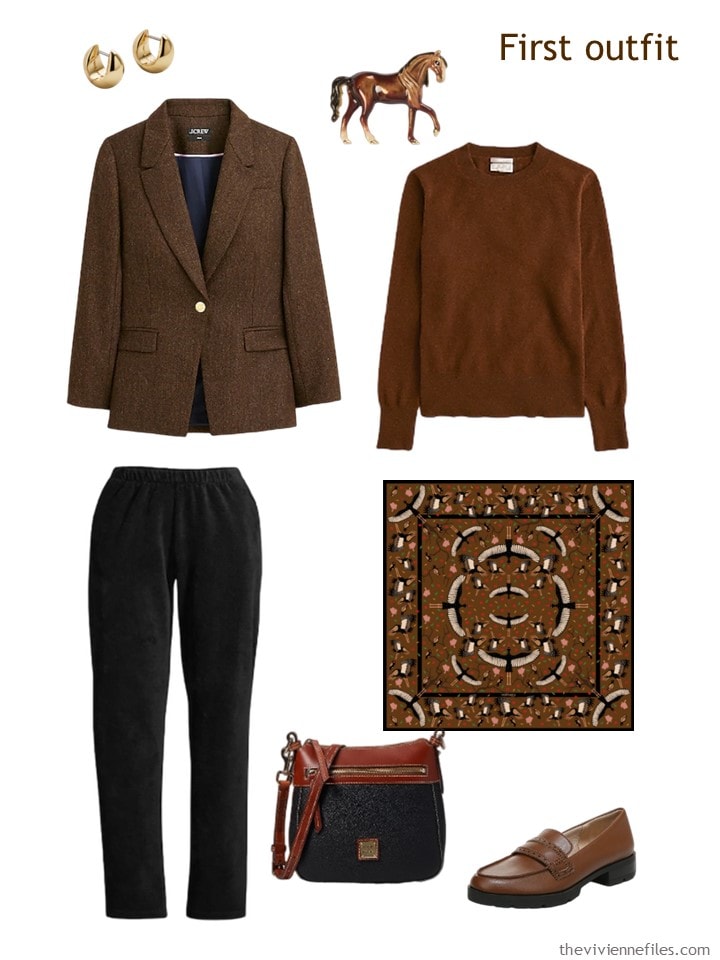
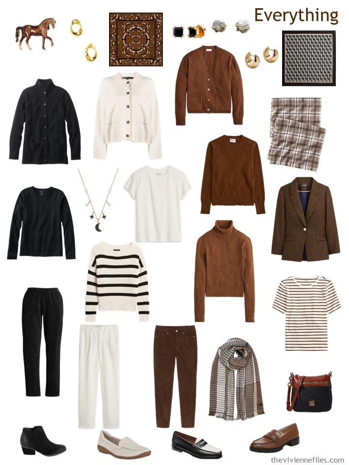
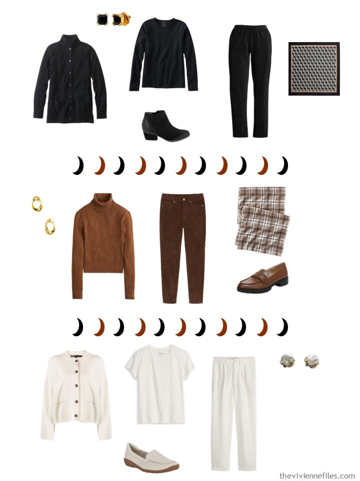
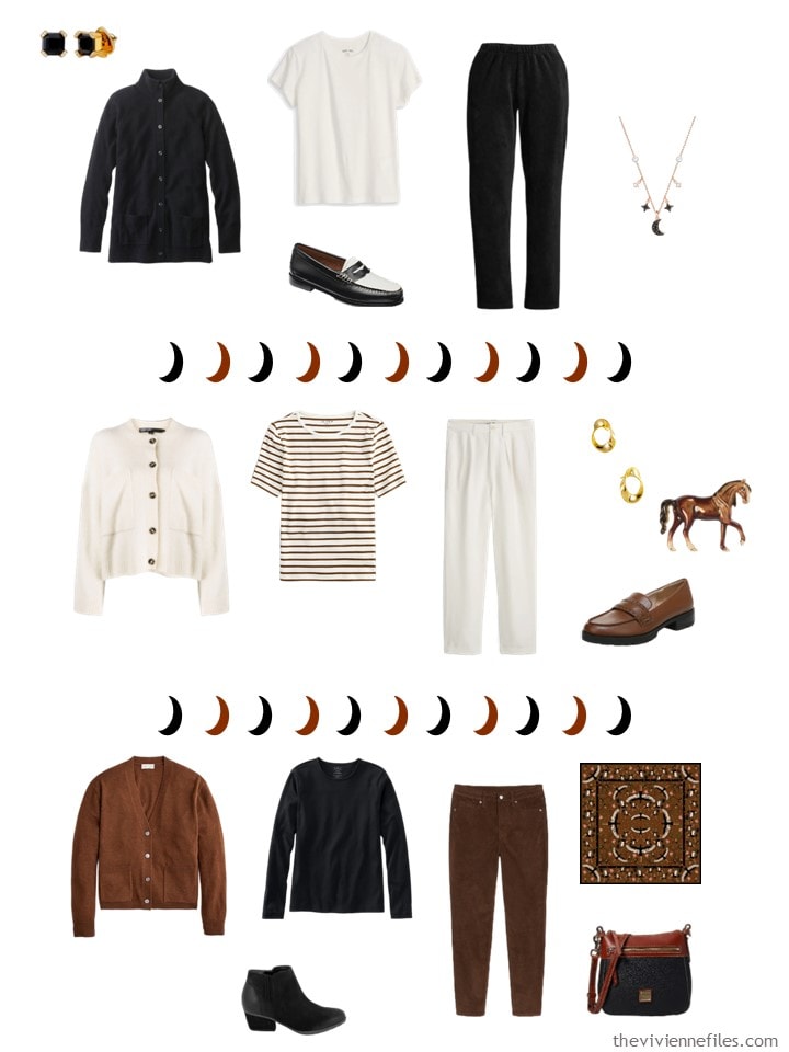
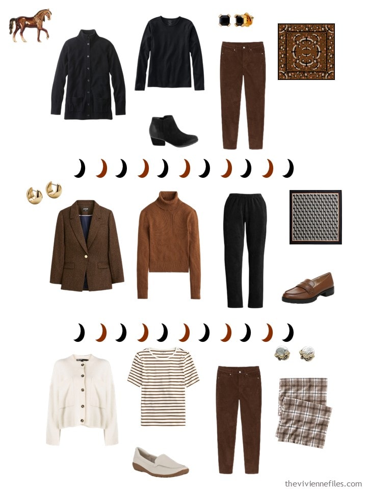
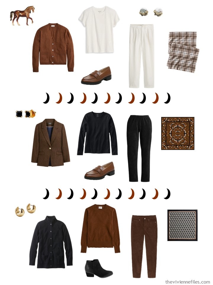
Earrings – BaubleBar; blazer – J.Crew; horse brooch – Fable England; sweater – J.Crew; corduroy pants – Lands’ End; stork bandana – Mur by Ayca; bag – Dooney & Bourke; loafers – LifeStride
While she’s concentrating on numbers, and distances, and appearances, she decides that she will pack a 3-color wardrobe, and experiment with how she gets dressed each day. She’s hopeful that she will arrive at a firm conclusion about what “outfit proportions” she prefers!
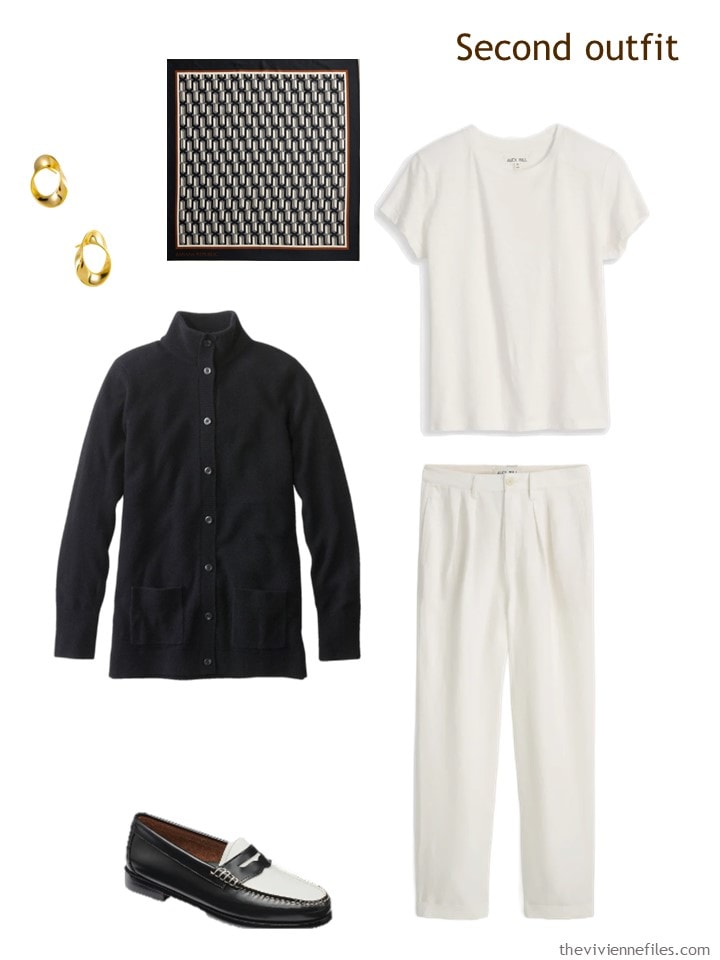
Earrings – Marie June Jewelry; black cashmere cardigan – L.L.Bean; neckerchief – Banana Republic Factory; tee shirt – Alex Mill; twill pants – Alex Mill; loafers – G.H.Bass
Realistically, she knows that she can combine garments in a variety of ways, but that doesn’t mean that she prefers all of the various combinations!
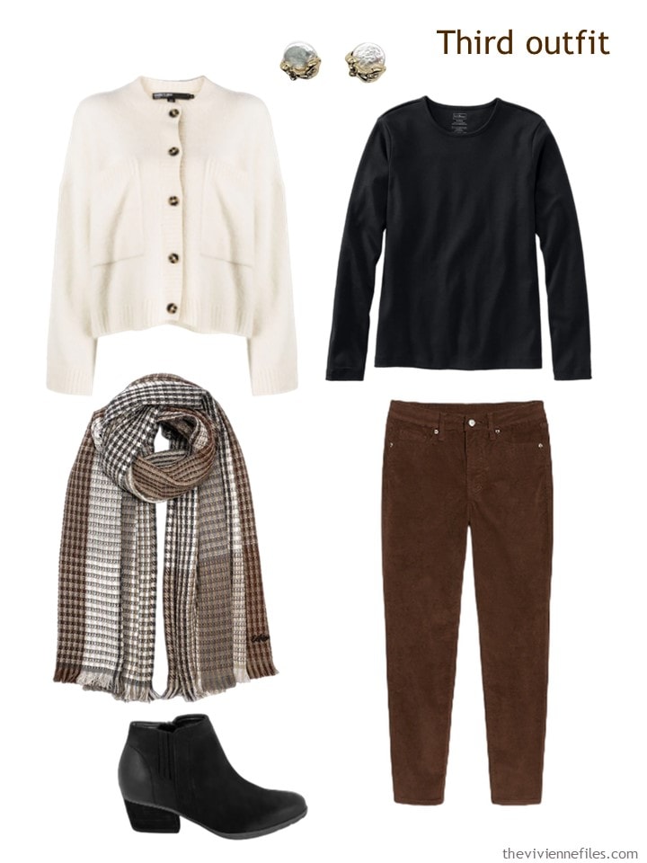
Cardigan – Bimba y Lola; pearl earrings – Babaloo Jewelery; black tee shirt – L.L.Bean; wrap – Echo; brown corduroy pants – Old Navy; boots – Blondo
She’s thrilled to pieces that she’s not staying in a dorm! Staying in a hotel with laundry services (and room service!) will make this trip more leisurely than sharing a room with a stranger, sleeping on a cot, and showering down the hall…
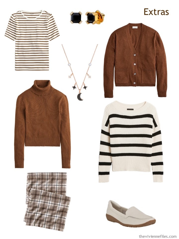
Brown & ivory striped tee – J.Crew; earrings – Kate Spade; necklace – Swarovski; brown cardigan – J.Crew; brown turtleneck – J.Crew; black & ivory sweater – Banana Republic Factory; plaid scarf – Lands’ End; loafers – Easy Spirit
Packing this is such a breeze:
On the train, she mulls over her outfit options – monochromatic?
Maybe “suit-like” outfits with a matching pants and cardigan, and a contrasting shirt?
Twinset-like ensembles with “almost matching” 2nd layers and tops, and contrasting pants?
Or columns of matching top and pants, with a contrasting 2nd layer?
The moon statistics may or may not give her the information that she wants, but she is optimistic that she will learn a little bit about her own tastes and preferences. That’s worth a lot!
love
Janice
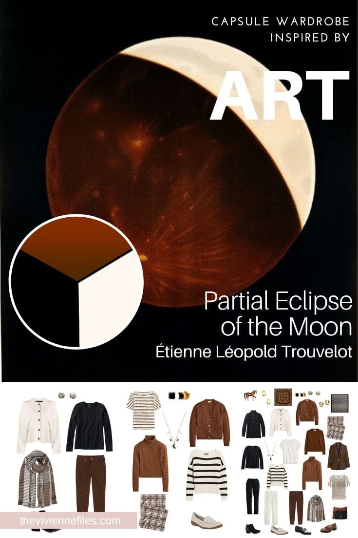
Like this wardrobe? Save it to Pinterest!
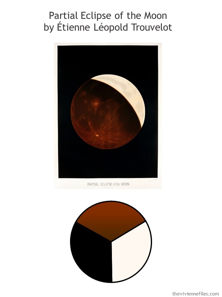
How clear! Now I grasp the method. Thank You, Janice!
Since I am just in process of adding brown to my wardrobe this is delicious. I love the 3rd outfit, though personally I prefer the lighter color as the top and then the darker color as the topper. If that makes sense. In fact I’m wearing brown and olive today. It’s been so sunny and warm here I’m still wearing a mix of summer and fall clothing, but hope to be in all fall soon. Love my fall clothing. Have a good day ladies, looking forward to reading comments as they roll in!
The temptation of the horse brooch!
I’m a bit giddy over these options in brown. 😍 Let’s hope retailers will bring it back for several seasons the way they did with mustard and olive.
A question about the Blondo boots: how do you treat them to waterproof them for winter weather?
Blondo carries several styles that are already waterproof, no treatment required.
And they are lovely boots! I have 2 pair that I live in in the winter…
hugs,
Janice
I rarely wear black and brown and only on my lower half. I would always wear a lighter colour on top. I can imagine that this wardrobe can be adapted for colour variation. For me the night sky is navy, indigo and ivory with hints of gold and silver. The look back is great because I have never worn a plain black dress in my life. If it is black, there must be a floral pattern to “lift it” next to my face. My colour choices for evening wear are navy, burgundy and purple with ivory and silver.
It would be nice to think that academics still meet up to work together. Maybe they do in some universities but with online access through a secure portal, most probably won’t stir from home to analyse the data. Meetings to discuss the data would probably happen online too. Maybe there will be a conference at the end of two weeks but even those will have live streaming and video conferencing for people who don’t want to travel but wish to participate. You can still dress up though but might not need second layers and tops need to have more interest to prevent you looking washed out on screen. Technology has made life insular.
Beth T, this is slowly going back to F2f for certain things – in my case anyway. This year we held a faculty forum in June and in October I’m going to a Conference. There’s nothing like in person discussion for certain things, although I also thank the aid tech brings.
Cheers!
I quite agree. Online is so impersonal and it allows dominant people to take over. Others with equally important points never get a look-in. Face to face is so important. People can be managed in a meeting so everyone has a chance to speak.
I see… a 3-piece (topper, 1st layer, bottom) in black, one in white, one in brown; and 4 bonus pieces (striped tee, striped sweater, brown blazer, one of the brown tops). Very versatile!!
For proportions, I see mostly waist length tops (nothing cropped, nothing long/tunic-y), and a longer cardigan option. the brown trousers may be cropped/ankle length, can’t really tell. For me, this wouldn’t help me experiment with proportions.
For silhouettes – some tops look boxy, some look more fitted; bottoms are skinny, straight, and boot – definitely plenty to experiment with there!
For deciding what percentage of a color you want in your look, how many “parts” need to repeat that color for you to be content, and whether you’re more of an “inner column”, “outer column” or “twinset” girl? perfection.
All depends on what you’re looking for! Great job Janice, as always :)
The term ‘proportions’ threw me off as well, although I got what Janice was trying to say. Maybe there is a different way to express it?…Maybe ‘colour concentration’ with monochromatic being 100% and an inner/outer column outfit being 66% concentrated in one colour?….maybe ‘colour distribution’?
On another note, I love black, ivory and camel together. I cannot wear camel at all as it makes me look like a peasant who has been toiling in the fields all day but I think this wardrobe would be brilliant on the right person. I’m allergic to horse hair, but I still love that horse brooch.
It’s funny, to me ‘proportions’ pointed at how the different color combinations accentuates the body’s proportion – eg. accentuating bottom or top half. Personally I usually prefer the suit, with the lighter color in the top (that sits at mid length, not touniquy and definitely not cropped!). Second place goes to darker inner column.
I enjoyed the experiment!
Lol with your comment on camel Rebecca!
I would love this with gray, navy, and ivory. And a skirt!
That’s what I have! And skirts! (navy, grey)
Love, love, love this wardrobe Janice! And the Pearl earrings are brilliant for studying the moon!! What fun.
Janice,
Well, you’ve read my travel packing mind once again ! I recently decided that I prefer to pack ( depending on the length of the trip of course ) using any combination of 3 colors, such as 2 neutrals and 1 basic color ( olive green or denim blue as the basic color) , with some accent color tops, or whatever my mood determines . Starting always with 3 pieces in each neutral — a bottom, a top , and a topper all in the same color , so that I always have both an outer and an inner column with which to work I start with 1 or more monochromatic outfits, then morph into analogous and some contrasting complementary colored outfits , always including off white near my face if using contrasting colors.
Thank you so much for this confirmation of how you think too, although I learned much of it from you to begin with !
Janice,
I also do tonal or matching twin sets too , though often I vary the textures of the top with the topper if both are in the same solid color.
huh. varying texture may just solve my personal hang-ups with “columns of color”! will give that a shot – thanks Shrebee!
I’m experimenting more with texture for plainer garments. It seems to satisfy my need for pattern.
Love these colors – the warm brown is gorgeous! Deeper than camel, closer to burgundy ….a perfectly aspirational fall and winter collection.
I don’t wear a lot of black + brown (though I do like cognac leather with black in fall/winter), but this is certainly a wonderful capsule for it.
I have a scarf with a warm brown background and a small repeating black horse print that I like but don’t wear very often because it seems so much a “wear with black and brown” scarf; I mostly do wear it with black and brown + denim. Is it just me or do others often find items with two neutral colors challenging to wear with anything other than 1-2 of those neutral colors? What I find easy to style with others colors: black + white prints, navy + white prints…well, any color + white prints. But when the second neutral isn’t white, it’s trickier. I think some neutrals feel more like colors to me when I go to mix them into outfits.
As an example of what I mean: the black/white or brown/white striped tops are easy to imagine wearing with another color because they pretty much function like a solid black or brown. I might wear black/white + red or brown/white + green. But if the capsule had a black/brown striped top, it doesn’t feel so natural to wear a red or green or other colored bottom piece with it. Somehow I can just ignore the white stripes and mix freely, but don’t feel that way about the black/brown stripes.
Overall, I’d be curious to see how our heroine might introduce an accent color (or more) to this neutral capsule and how she might combine the pieces.
I now feel challenged to test my brown/black horse scarf with some accent color sweaters and see what shakes out!
Anyway…though this color palette wouldn’t work for me, I really like the idea of our heroine taking this travel opportunity to really experiment with the various color combination possibilities here. I personally call these “color formulas”: the inner column, outer column/suit, modern twin set, colorblock. I don’t have a favorite among these in solid-colored outfits, but when print garments are added, I definitely wear some more than others: the modern twin set + print skirt and the print top + two different colors drawn from the print for bottom and topper (print + colorblock) are two favorites.
It’s interesting to consider how the relative amount of each color changes based on the specific items…the color percentages, as Ezzy put it. (I’m trying to stay away from “proportion” which often means the relative vertical amounts of your top vs bottom with 1/3 + 2/3 being the idealized version.) Like if you made a pie chart for each outfit with the three colors in it, different outfits would have different pie slice sizes. Not only would the color pie slices differ based on how many pieces you wear in each color, they would vary based on how much of each color actually shows in your outfit. For example, a pair of long pants + a long cardigan in Color A and a tucked in T-shirt in Color B would yield a pie chart that is more than 2/3 Color A; it might be more like 80-90% color A because little of the layered over T-shirt would show.
For those who want to dig deeper into this topic, remember the “color and proportion” series that Janice did in 2015? (Am I the only one who smiles every time they read/re-read an “old” post here and sees that the content is as relevant as it was the day it was posted? So much evergreen content, it’s wonderful.) This series also addressed the “light topper over dark column” vs. “dark topper over light column” and such for those who find they have distinct preferences there. (Like Sheila, my mom gravitates toward dark over light rather than light over dark, though she has been experimenting with that.)
This is the first post, and the links to the rest are at the bottom of it:
https://www.theviviennefiles.com/2015/04/color-and-proportion-how-color-affects.html/
Sally in St. Paul,
A thoughtful analytical thread as always ! I prefer light above and dark on the bottom as I am physically bottom heavy , though a medium light color on the bottom with an accent color on the top in a similar value as the bottom , also works for me , creating more of a medium value column . I have light warm personal coloring and cannot do either very high nor very low value contrasts in outfits.
I had to laugh as I realize I have on olive pants and cardigan, but my print blouse is black with a small olive, rust, brown print. hahahaha So a black blouse is NOT lighter than the olive! I primarily wear print tops so I guess my personal preference on a lighter top under a darker topper only applies to solid colors!
Sally in St. Paul,
I have to agree with you that when a striped top has 2 different neutrals in it, even in the same color family, such as a top with both a brown and a beige stripe, I do not feel comfortable pairing it with a solid accent color topper. A single neutral colored striped top plus white feels and acts like a monochromatic top to me and easily pairs with any number of accent colored toppers.
Yes your example of black and brown in the scarf would make me feel limited to only” pulling out” just one or the other of those colors without the addition of any other colors, except perhaps white or ivory . It would feel restrictive to me .
Sally in St Paul – I think i’d be able to do the combination color + multi stripe… (brown/beige stripe + accent orange or teal or purple)… IF my shoes matched the accent color. otherwise it feels too haphazard for me. (since my colored shoe selection is more limited, I would also find it a bit limiting.)
I love to mix things up so I love the third outfit with black, brown and cream (white?). I sometimes do all one color or a column of dressing but I find those are days I am not feeling great and I need a little extra calm. But mostly I go for three different colors (some neutrals), like jeans, a graphic tee or patterned blouse and a colored cardigan (that picks up a color in the blouse). I guess I just like a lot of variety in my outfits.
I loved todays Little Capsule Traveling Wardrobe!! The “Black Dress” article was so correct!!!
I went back and re-read the article about the little black dress. I’ve been with you from the beginning, but I just honestly can’t remember… Did you ever publish your book?
Nope. It’s all still stuck in my head – I can’t seem to find the starting point! But I remain optimistic…
hugs,
Janice
Loved today’s post and the way it made me think. I do love to go back and re-read posts and I do find them as meaningful today as 5 or more years ago. Sally thanks for the link. I always like reading the different responses and realizing how differently we think! Proportions, no proportions. So intriguing Ha
It was great seeing all these options together – it really helped me sort out my preferences. I think I most wear, in order, 1. Inner column 2. Monochromatic 3. Outer column and 4. Twin set. I always seem to feel chopped off in the middle if I wear a twin set type outfit, whether the top is longer or shorter.
This was so thought provoking. Great discussion. I am in the dark on bottom camp. Tops are either medium or light. Toppers seem to run to accents. Sally, you might find your horse scarf works with deep blue, green, rose, rust and yellow gold. When you have a warm neutral paired with a cold neutral, generally, I think you have better luck playing up the warm neutral with warmer accents. That has been my experience, but it may differ for others. Good luck with your experiment.
I think of the way I prefer to dress as tonal; different shades of the same color. Always darker on the bottom. So monochromatic comes the closest to my style.
Ezzy,
For travel packing using a given color twinset, I have to decide how many days that I may wish to see that same color used in different outfits without getting sick of seeing that same color being worn multiple times in a week ! I think that answer lies in changing the proportion of just how much of that color is in each outfit spread throughout the week. Thinking of the example of a warm yellow accent colored twinset of a tank and a cardigan, my options are 1. a full blast of the color worn as a twin set together ( but still always keeping the full twinset as a lighter color than the bottom garment) , 2. using just the twinset top under a neutral or other colored topper 3. using the cardigan over a darker column of color or neutral column and 4. using the twinset yellow color as a minor color in a print, along with other more dominant colors in the print. I would probably only choose 2 of those options within a given week as I easily tire of any given accent colors, though neutrals provide me with less eye fatigue and I might wear those more often within a week .
For a long time I felt I was too big to wear a light color on my bottom, but I have gotten over that the past few years. I have started enjoying both white and cream colored jeans with solids, plaids, and vertically striped tops. My shoes may be tan or colored, but not white or cream. Not sure why I have developed the aversion to the light colored shoes.
Even when you use colors that I don’t enjoy, I find ways to question my choices or substitute colors in my head. I also enjoy checking out other color choices on items that are appealing.
I enjoy starting the morning with your blog and my favorite cartoon. Both create a happy mind set.
Hi Janice,
I have been following you quite some time (from Germany, of all places) With great pleasure!!!. I just wonder – most of your cloths/wardrobe (?) is monochromatic. Sometimes, like today, you feature stripes (which prompted me to write). I am rather “füllig” – the translator says “plump” an expression which I quite like – BMI = 33… . I don’t really love stripes. And I always wonder, if I should wear patterns or not… to, well not to camouflage, but to look maybe more flattering? I also tend to spill stuff. A lot. That makes me not perfect for plain/monochromatic cloths. After wearing black for some years, which was menopausal related, I crave for color. Whats your opinion?
Hallo Heidi! Not Janice, but chiming in as another … plump … girl. I love pattern (especially in the summer when I find it too hot to wear a scarf or interest-adding-accent). Stripes on an angle are flattering, but more rare to find. Honestly, the cut/fit of the garment (usually a top) makes much more of an impact than the stripe [a well cut top with a thin horizontal stripe can look slimming, while a boxy or unflattering cut with a wide stripe makes me look short and fat], but alternate patterns are great too. I like medium-scale abstract patterns and medium-scale florals … or geometric patterns where the general “line” of the pattern is in diagonals (i.e. your eye is drawn along the diagonal line rather than horizontal). Hope that helps!
Hi Ezzy, thanks for your comment.
I was aware of some of your tips. But I really have to try out decent stripes in the more subtle variations..
When we talk of proportions, I’m with Shrebee as I prefer a blended outfit of medium tones. It evens me up as I have short legs. If I wear light colours, they are on the top. A pattern on top has to have the base colour in the darkest colour of the top so that it blends from top to toe. However, the 2nd layer could be another colour from the pattern. However, a pattern on a skirt has to have a completely blended plain top or an accent colour with a cardigan either in a neutral shade or the same colour as the top. Accessories in the accent colour too. A dress likewise has to have a colour from the pattern as a second layer as it draws the eye up. Last winter, I experimented with wearing an accent column for top and bottom with a patterned middle. I got lots of favourable comments. It added variety to the idea of a neutral column which I rarely wear.
I agree with Sally in St. Paul about staying away from the term proportion. Not sure what to replace it with as the term is a good sort of mental shorthand.
I also agree with her about the neutral plus (coloured) neutral vs. neutral plus white plus accents. Very tricky indeed.
Back in the days when I was trying to work with two neutrals plus accent colours todays post would have been the basis of my fall/winter 33 piece wardrobe. Never could make that work so I broke it down into one neutral plus accents. Now my fall neutral is dark espresso brown and my winter neutral is black. Any of my accent colours work with either of those. But not with both. At least to my eye. Perhaps there wasn’t enough contrast between my preferred brown and black that I felt uncomfortable wearing them together. I also prefer my summer neutral to be a dark navy, almost indistinguishable from black. I can’t even begin to imagine wearing espresso and navy together.
I’m still coveting that horse brooch. And I’m also quite taken with the Swarovski necklace.
Now it’s time for me to get ready to celebrate the Autumn Equinox by getting my fall wardrobe in order. That’ll be fun!
Ooooooo Espresso + Navy!!! that sounds like a FUN combination (in a slightly lighter navy than what you described) that I never would have thought of. Thanks for the idea (although it wasnt the point :))
I just came across this posting while searching Pinterest for ways to put black and brown clothing items together for a trip to NYC. I am so happy that brown is in style right now as I always feel cozy and warm in brown tones. I have a beautiful Met scarf, one of the William Morris ones, now discontinued I think, that includes the loveliest bits of ivory, caramel, cinnamon and black and I try to base my brown/ black wardrobe around it using your “Start with a scarf” posts as my inspiration. I love how your posts make me see colour combinations in a whole new way.