May 24, 2023
Finally, I’m getting around to sharing the 2nd 5 of the London Fashion Week colors!
I’ve been thinking a lot about how one chooses their core neutral color – what if you chose it based on your favorite accent colors? Maybe you’re really drawn to black, but your favorite accent color looks… wrong with black, to you.
Would it be wrong to put the accent colors cart(s) before the neutral color horse(s)?
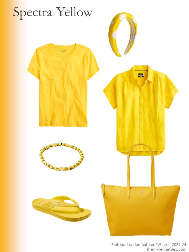
Tee shirt – J.Crew; headband – J.Crew; short-sleeved linen shirt – J.Crew; bracelet – Anthropologie; flipflops – Reef; tote bag – Lacoste
Let’s look at each of these 5 colors with black:
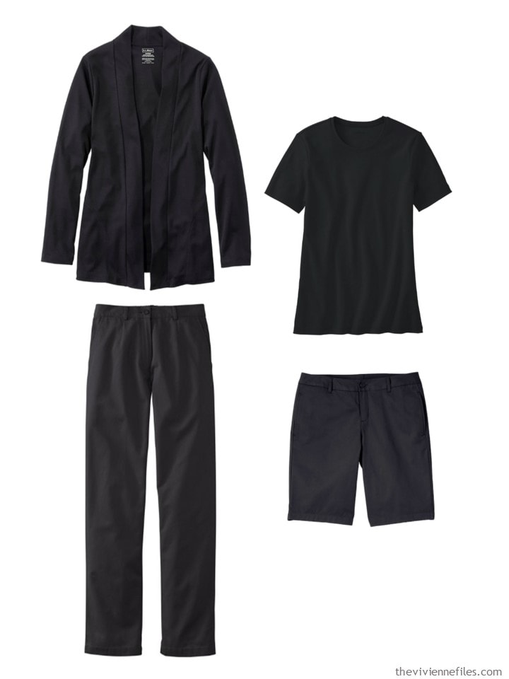
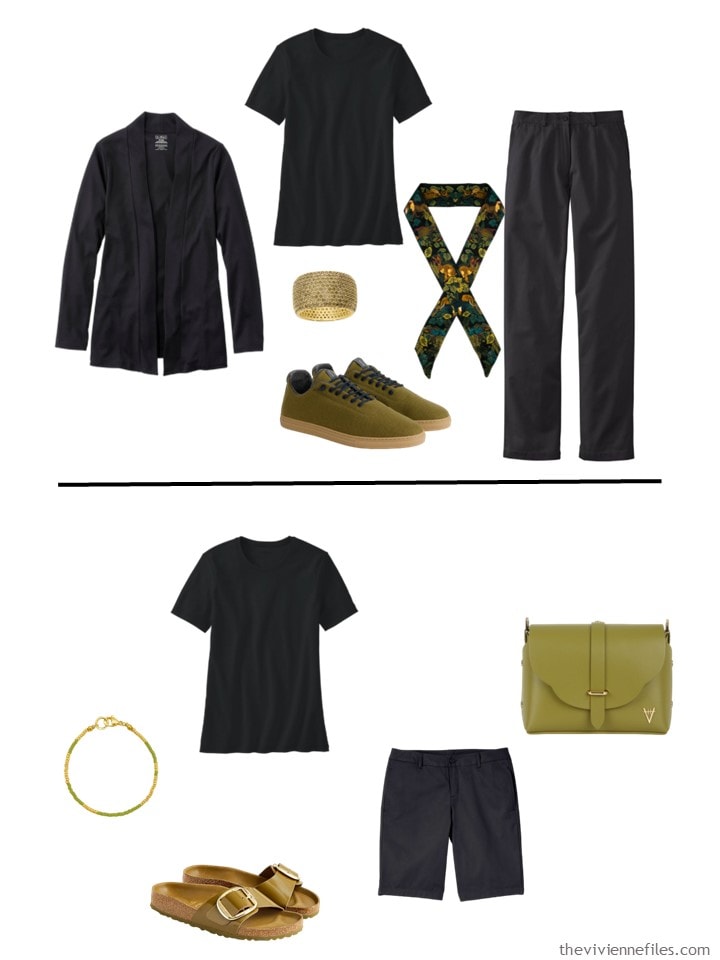
Black cardigan – L.L.Bean; black tee – L.L.Bean; black cotton twill pants – L.L.Bean; black chino shorts – Lands’ End
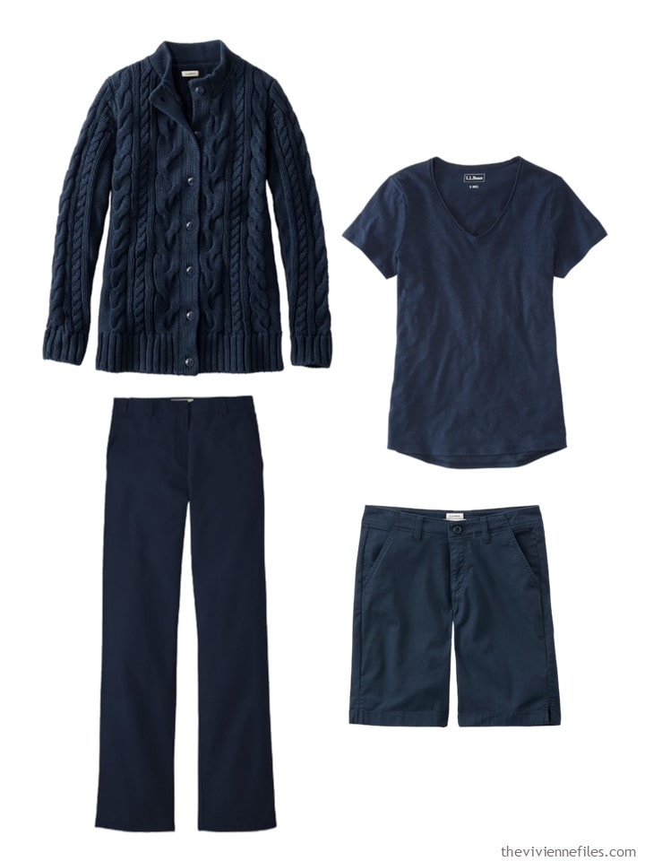
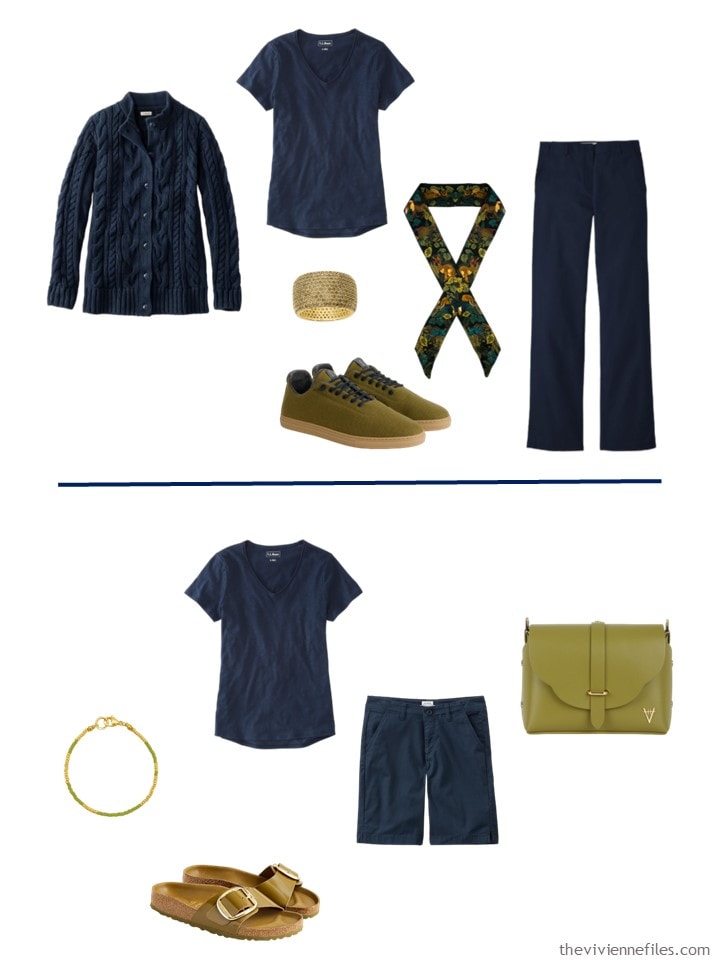
and with navy – almost identical garments, and I’m going to show them in the same positions etc….
Yellow and black? One either really likes it, or hates it!
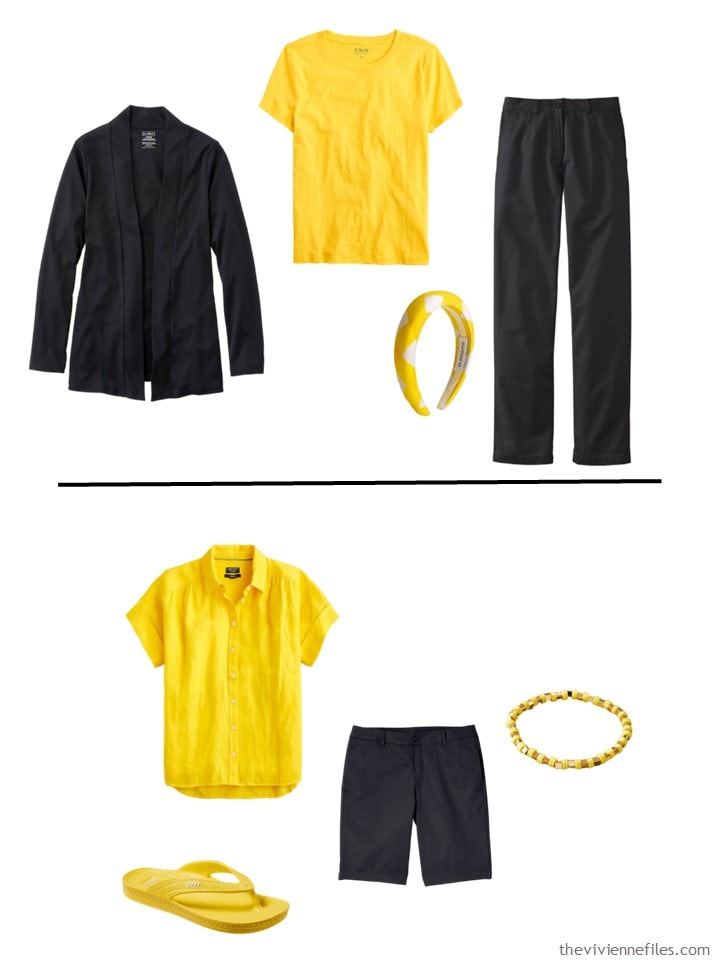
And yellow and navy will forever feel like high school to me!

I couldn’t find any garments that I liked AT ALL in this shade of green – but some of the accessories are great! The ring is lovely…
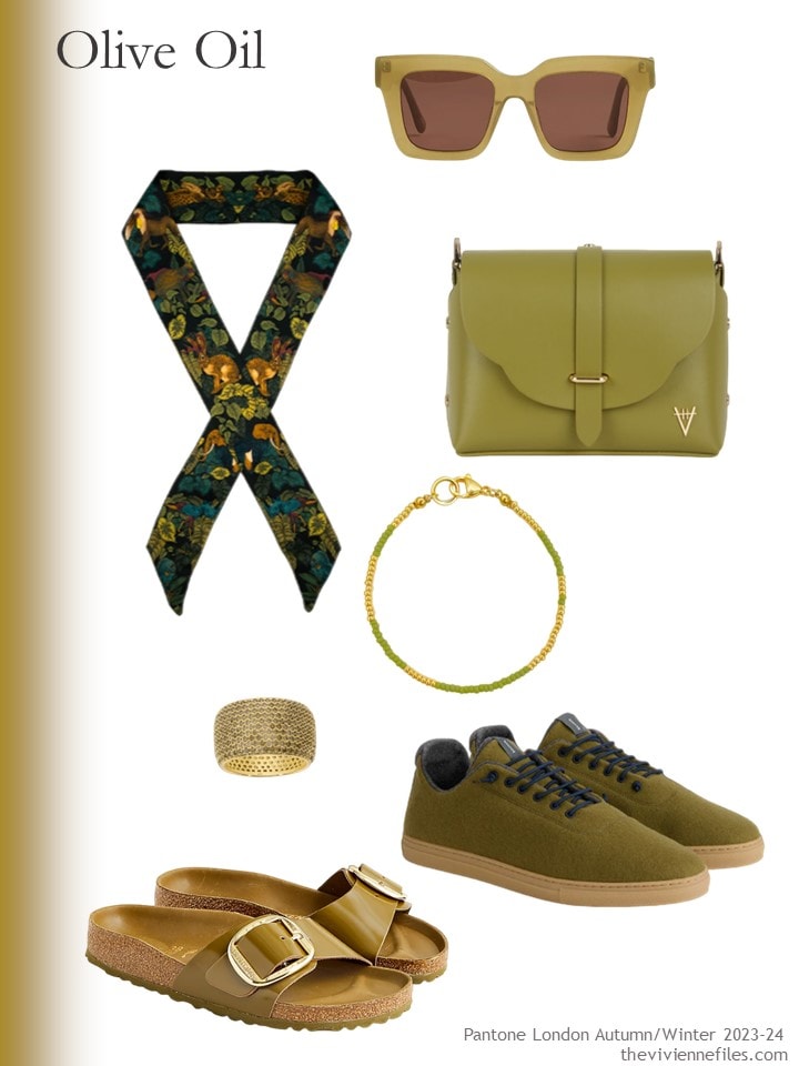
Sunglasses – J.Crew; silk skinny scarf – Ilona Tambor; bag – Hiva Atelier; bracelet – Stay Salty; peridot ring – Native Gem; wool sneakers – Baabuk for Alex Mill; sandals – Birkenstock @ J.Crew
From here on, I’m just going to show the colors with black, and then with navy. You can critique them!
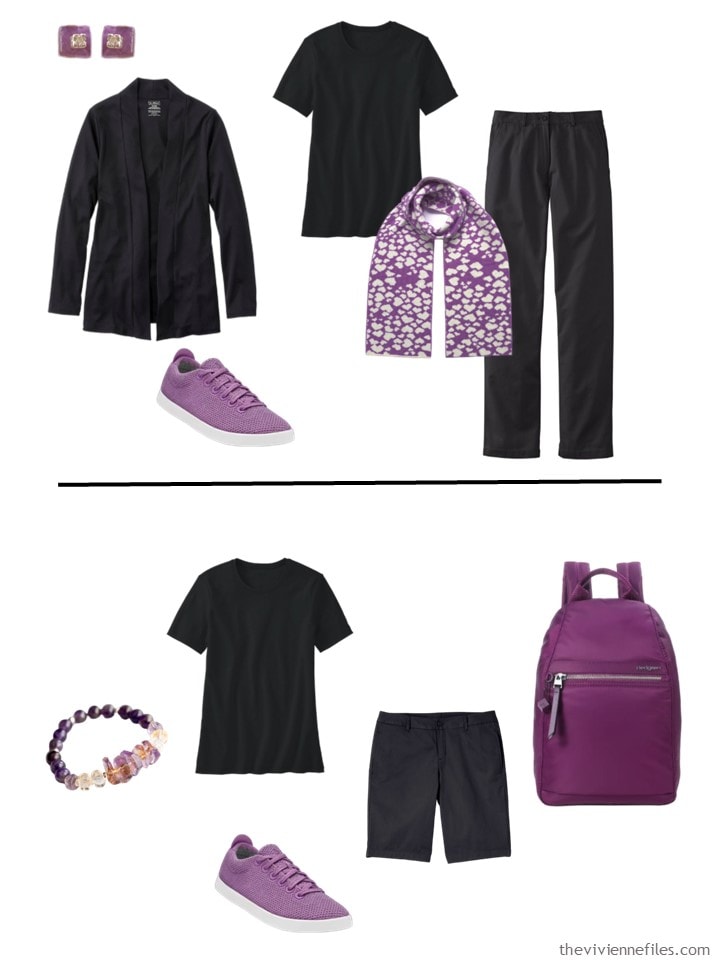
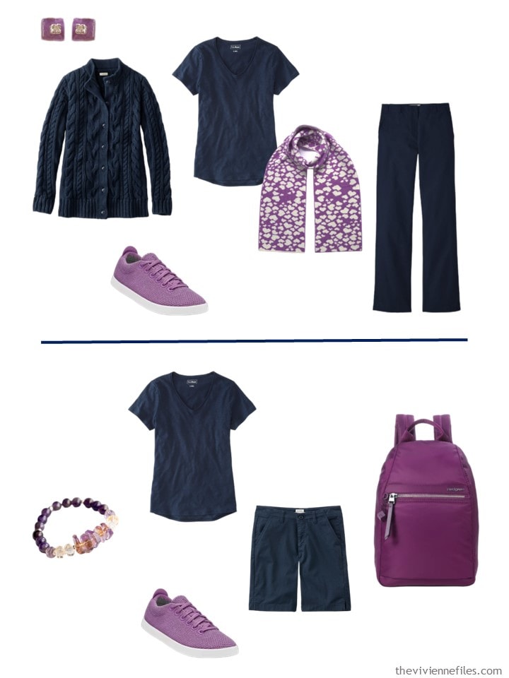
Believe me – I KNOW where to find purple! And this shade might be the hardest to find – not really bluish, nor really on the more red side of purple… sigh…
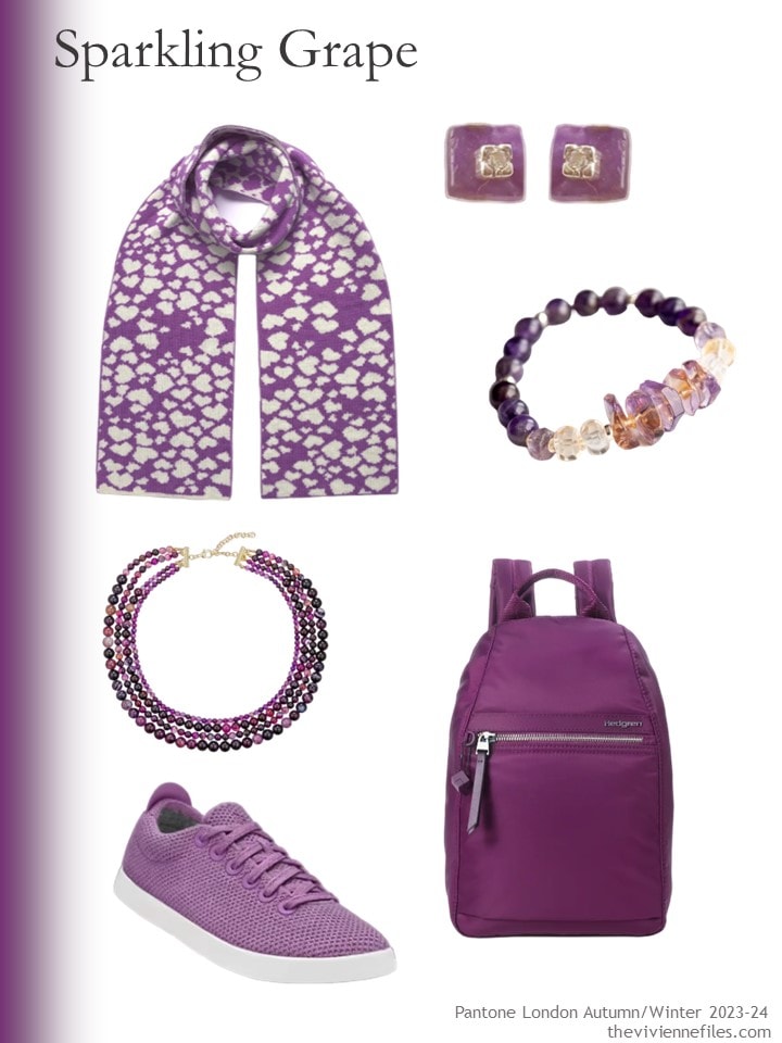
heart scarf – Ingmarson; amethyst earrings – Lily Flo Jewellery; ametrine and citrine bracelet – Fierce Lynx Designs; amethyst necklace – Eye Candy LA; sneakers – AllBirds; backpack – Hedgren
Here is Sparkling Grape with black:
and with navy:
Just a note – I’m NOT suggesting that these following items should be worn together – it might be overwhelming! And the sandals are too casual for the dress, in my humble opinion…
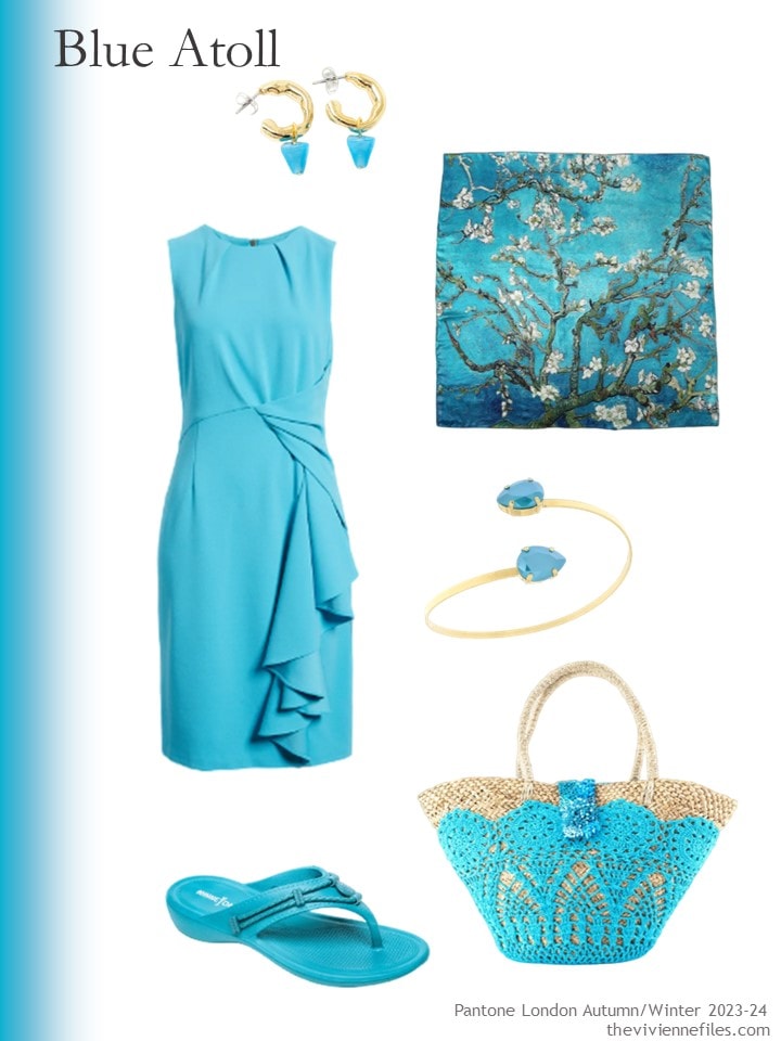
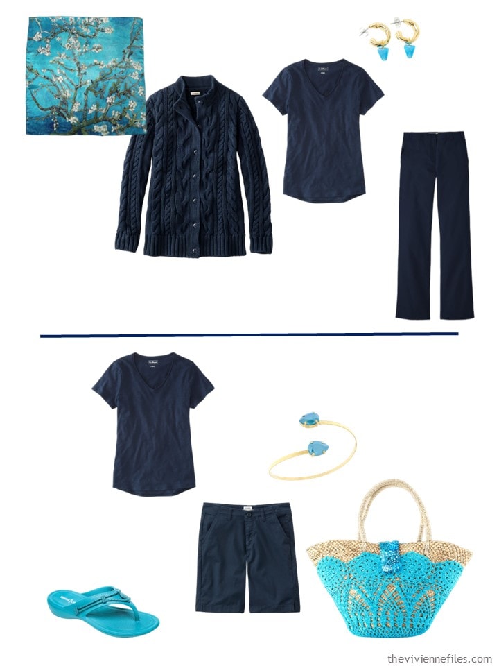
Blue glass earrings – Anne-Marie Chagnon; Van Gogh print scarf – Soft Strokes Silk; dress – Tahari ASL; bracelet – Rosaspina Firenze; flipflops – Minnetonka; beach bag – OhSun
Blue Atoll worn with black:
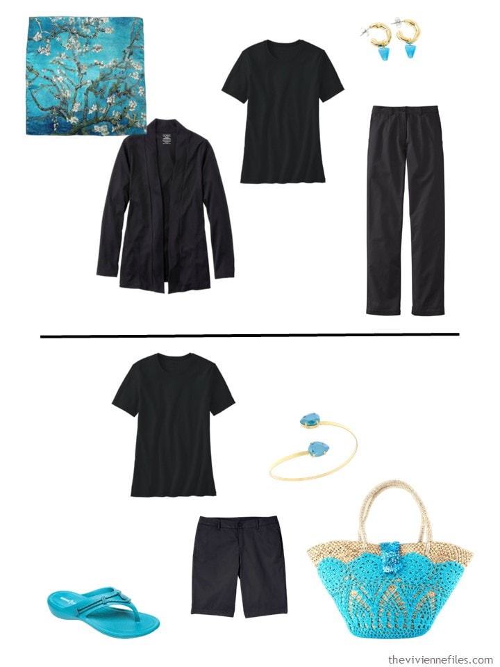
And with navy:
This Fired Brick is the color that I REALLY struggled to find – but persistence paid off…
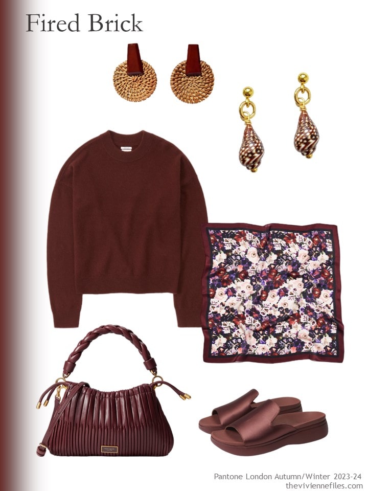
Wood & rattan earrings – Volsew Paris; seashell earrings – Smilla Brav; cashmere sweater – Abercrombie & Fitch; scarf – Luna & Avery; bag – Kate Spade New York; sandals – Vionic
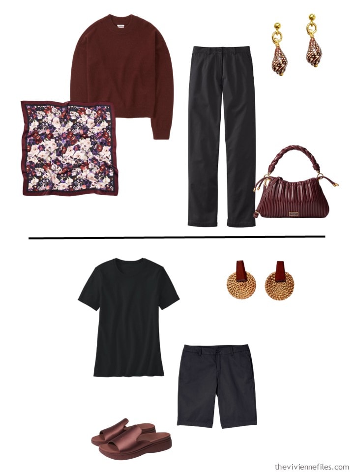
Here’s how it looks worn with black:
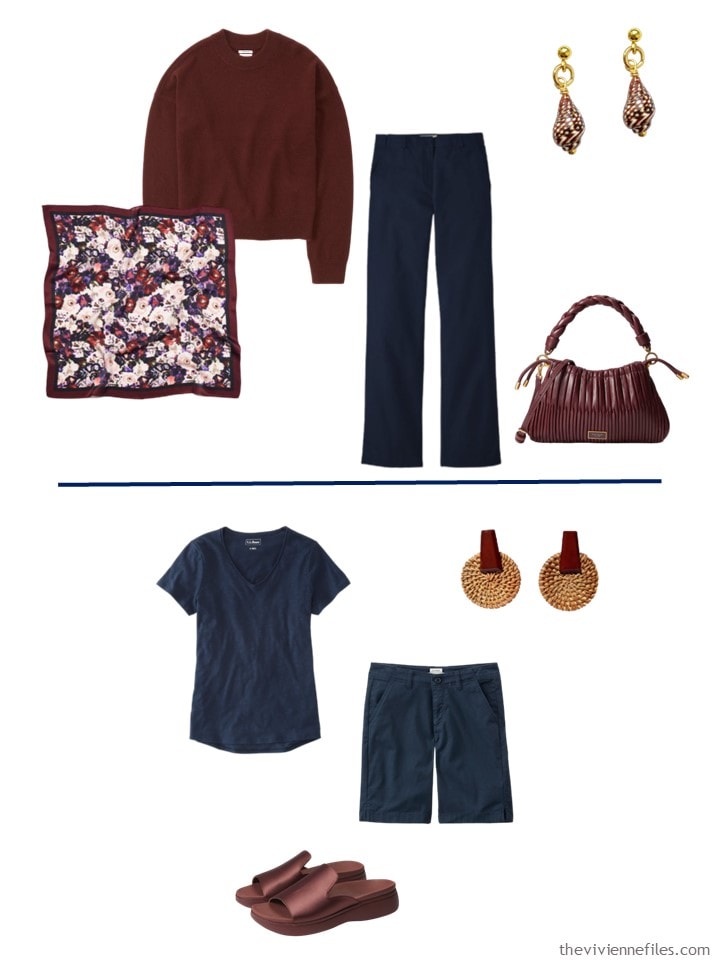
And this is Fired Brick, worn with navy:
Looking at this makes me feel that starting with accent colors might be a good idea, if your preferred accents don’t go with every neutral…
And I think this demonstrates that black does NOT go with everything, no matter how much some of us might want to believe that it does!
love,
Janice

Like this article? Save it to Pinterest!
OOh fascinating… For some of the colours the Black/Navy Dark Neutral didn’t impact the pop of the accent and then for some it definitely did.
Fired Brick (a variation on Burgundy) looks amazeballs with Navy and blah with Black.
The brights Spectra Yellow and Blue Atoll looked equally great with Navy and Black.
Olive Oil brings quite a different energy with the Navy (felt very southern european chic summer restaurant) over the Black (more London).
Overall Navy is a softer pairing over black and it took this post to really show that. It depends on what you want to communicate.
Blue Atoll & Navy! The blue sandals are lovely, the scarf is gorgeous++. Yerk, I don’t actually like any of the other accent colours, so it’s hard to appreciate them paired with either navy or black.
Agreed!
Your theory of choosing your neutrals based on your accent colours makes a lot
of sense.
I’m heavily biased toward navy – it’s my dark neutral – but I did try to be objective comparing black and navy with each accent colour. Still… I prefer the navy with all of the colours, except the purple. I think that one is a tie.
I once had a pair of suede flats in this olive that went well with my denim, black and khaki. Sadly, my dog also loved them and would sneak into the bedroom to run away with them. The blue and purple are very pretty and look great with the black and navy. The fired brick seems too muted and uninteresting for me but could be lovely on others.
PS. Maybe one day I’ll pay attention and post in the right spot 😁
Frankly, Pantone has created a problem here, in my opinion. I don’t care for ANY of the combinations, above. Maybe the firebrick with navy.
Is it possible that their intent is to get the customer to buy entirely new wardrobes??
I agree – these Pantone colours are nothing to write home about.
Excellent Point.
An interesting intellectual exercise, but navy and black are too similar to make it interesting. A lighter neutral (white or sand, perhaps) + either black or navy would be more interesting to me.
The issue may be that so many clothing retailers offer indigo (barely discernible from black) and call it navy. A brighter, clearer navy could look much better. If you have to bring it out of the closet under a very bright light to compare it with a known black item, then it’s just too dark.
Haha. So true! I have several things I have to bring into brighter light to tell which is navy vs black. And I have a light in my closet!
First of all – Olive Oil????? What a strange color. I agree with Nonchi that Fired Brick does look better with the navy – but OK with black. Also that while the colors can look good with both, the navy seems to be a bit softer and not as high contrast as the black. Of course, since I’m in the process of switching from black to navy there may be some bias there.
Fired brick with navy is the best combination to my eyes. It looks like ‘ox blood’ color to me. For olive oil, a color that I don’t wear well, I think I’ve seen shirts and tops in it at everlane and ibex.
I’m absolutely biased because I love and wear lots of purple shades. The Sparkling Grape color is the only one I remotely like out of these choices. Navy is also my preferred dark neutral as it’s less harsh on my aging self. That Olive Oil color is very strange to my eye. I like how you’ve shown these with both black and navy for comparison.
My son yelled “minion” on seeing navy and yellow 🤣
Blue Atoll is the best color here to my eye, and I liked it with both navy and black. The biggest takeaway for me was that I didn’t really love any of the colorblocked base navy or black outfits with the accent color accessories; I think the colors need to be more integrated for the combinations to work their best (for my preferences). I wouldn’t wear this shade of bright yellow, but surprisingly, I enjoyed the high energy of the yellow tops in both the black and navy outfits.
I love Blue Atoll & Fired Brick.. I get that they couldn’t just call them Turquoise & Rust ;-)
The blue atoll is lovely and the items you chose truly excited me. However, i wasn’t overly thrilled with the pieces paired with either black or navy (my dominant neutral). I think they would look much better paired with beige, which I usually dislike, or white. But, I know it’s supposed to be a fall/winter color so the fashion police would say, “No!”
Love the Blue Atoll and Sparkling Grape both in themselves and with both navy and black. As far as the Spectrum Yellow the only piece I would consider wearing is the J Crew linen shirt. I really like that piece. The border and the other pieces are too warm and the purse is far too goldish.
The Firebrick is meh 😒 and the Olive Oil, *shudders*.
Once again, I am in a minority as I liked the yellow, olive and the blue. For me, the brick and purple would never work. The olive struck a chord as it reminded me of a suede skirt that I had as a teenager. The skirt was a favorite because not only did it look amazing with many of my sweaters, but I was able to get it discounted due to it being a piece that I modeled for the store during one of their regular shows. I had that skirt from age 14 to 30 when it finally wore out. As for the neutrals with these, I think a medium warm brown would be nice or an ivory.
The classic neutrals that Pantond offered at LFW were khaki, beige (described as off white), light and dark grey. Plus very dark green which is a curious choice. No navy or black. I wonder what the accents would look like with these ‘neutrals”?
Btw Sparkling Grape gets my vote and I wear it with navy and grey.
Black, IMO, looks best with other neutrals and not great with colors. They are all improved with navy.
Fired Brick and Olive Oil make great neutrals for Dark Autumn coloring- and I’d wear either with black or navy.
Not all outfits need a neutral base. Blue Atoll would be great with Sparkling Grape, Olive Oil, or Spectra Yellow.
Also, you wouldn’t just wear the 2 colors together without a third (probably second neutral).
A black and white dress + a Spectra Yellow bag, or navy denim jeans + light grey shirt + Sparkling Grape accessories.
Just resurfacing after dealing with health issues.
Goodness gracious Pantone seems to be striving towards irrelevance. I saw the previous Pantone post and my impressions are that only a few are actually attractive. Even those have a difficult to wear aspect that Janice nailed- namely how easily would they include themselves into common neutrals in most closets. As accents in my home they’d be difficult to incorporate.
The beige, brown tans and cream spring and fall would struggle as would the cooler grey, white, navy and black winter and summer people. A lot of these seem too harsh to wear too close to the face.
A long time ago I settled on my favourite neutrals and accents. Some years they’re hard to find. I can scan the racks and zero in on my favourites. Most years the clothes are NOT in the Pantone pack thankfully.
I ignore my season completely – I love accents from spring warm pink & coral, fall brick or cranberry and khaki and summer blues greens and aqua all with a little grey in them while my neutrals fit more in the winter category.
I like darker inkier navy as it’s easier to match than lighter navies which can be all over the map in undertones from year to year as is Taupe. Black and Grey are easier. My whites range from cream, winter white, pure white and chalk.
Hurrah for Blue Atoll, or as I call it, cyan or aqua. This is one of my signature accent colors and I wear it with both navy and black. The only other color I would at all consider it the purple, though I would look for a bluer one. I love purple but have trouble finding the right one for me. This is not ir. I find wearing purple with navy difficult. It feels too close on the color wheel. I used to wear it with gray and black, but I have mostly phased out gray from my wardrobe. The other colors I’m not interested in.
I agree with an earlier comment that it would be easier to judge the impact of these colors in a more varied outfit, not just all black or all navy. Add, for example, a white tee or taupe linen pants to give better contrast, interest and realism.
For a Spring color person these are horrible colors….in fact Im stumped as to WHO would look GOOD in them? Pantone really missed the mark this season, so depressing these colors.
I will be wearing tomato red as a bright this season…looking for more as I have some.. it combines with navy which is my black as dark as I go.