April 3, 2023
I know a lot of us are doubtful about this wardrobe, but I’m still really liking it…
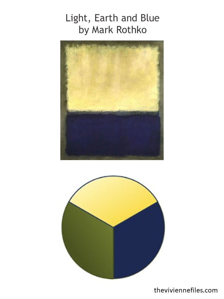
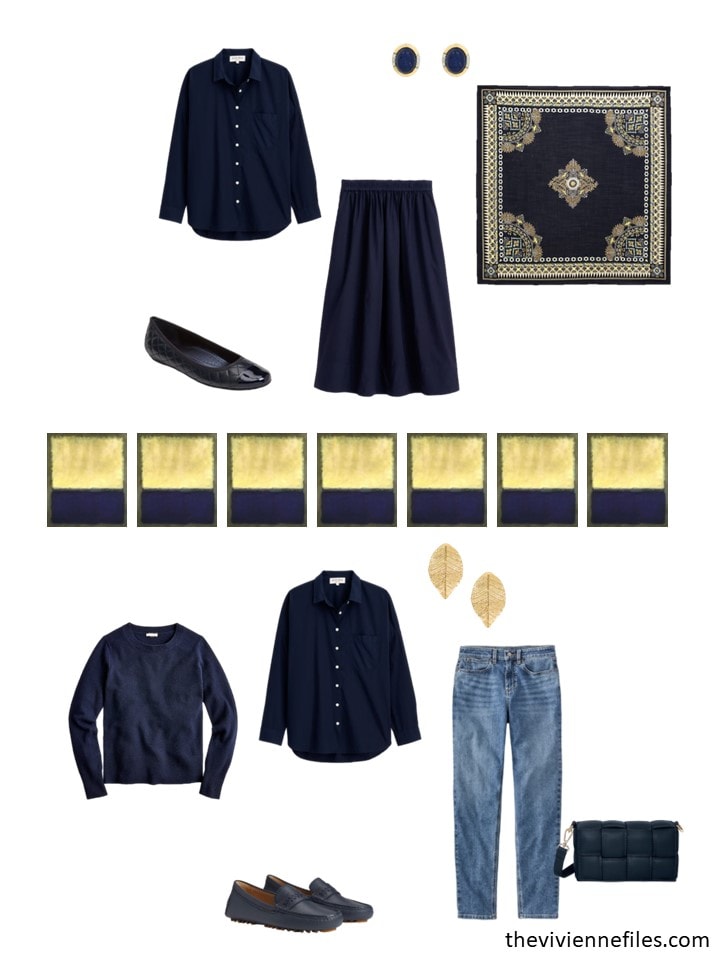
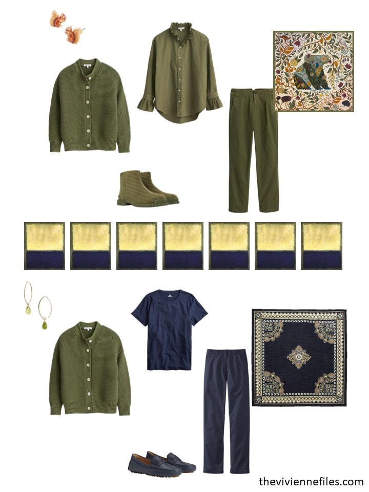
Our heroine realized that there’s a simple navy shirt that matches her navy skirt – that seems like a really logical purchase! And while she’s stocking up on obvious basics, she has neither an olive tee shirt NOR an olive cardigan…
Toss in the world’s most amazing scarf, a tote bag and some ballet flats to wear with her new navy “dress” and she’s all set!
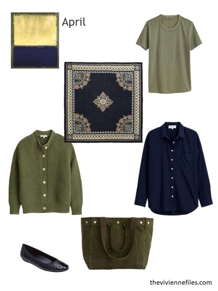
Scarf – Etro; olive tee – Alex Mill; olive cardigan – Alex Mill; navy cotton shirt – Alex Mill; navy ballet flats – VanEli; olive tote – Alex Mill
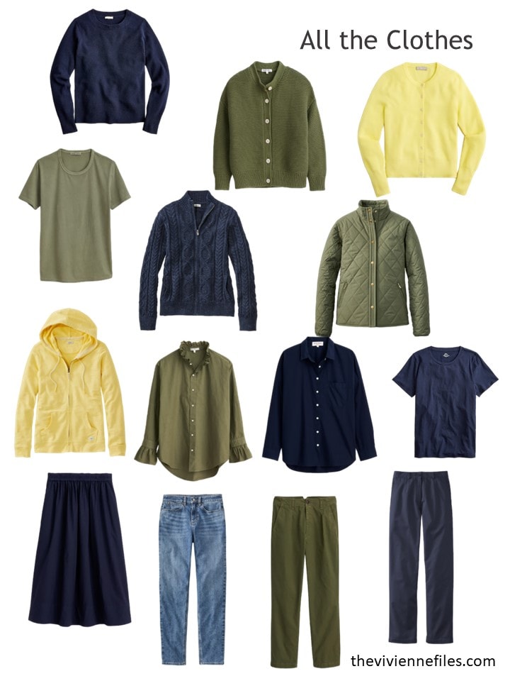
Her wardrobe is very disciplined, but still has plenty of possibilities:
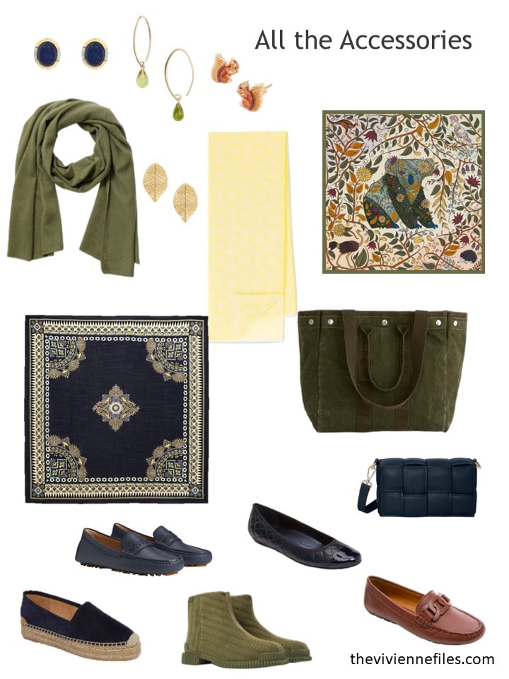
And her accessories are lovely; a couple of beautiful scarves can make so much difference to a wardrobe:
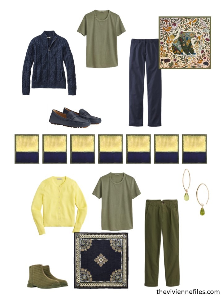
Her 3 new garments, as always, give her at least 6 new outfits – probably more!
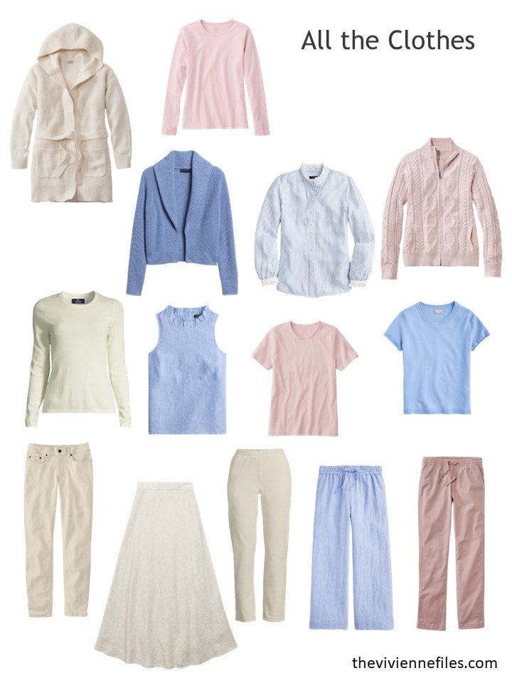
This next wardrobe is definitely for someone in a warm climate, with a complexion that is flattered by soft pastels… I dream of that in another life!
Here’s an example of why you should shop ONLY when you’re prepared to take advantage of something special that you see; this heroine was overwhelmed by the number of lovely blue possibilities she found! So she assembles a blue outfit for a sort-of-dressy event in warm weather – she’s prepared!
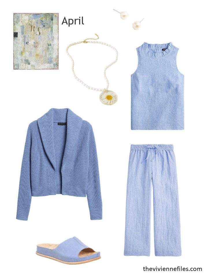
Pearl stud earrings – J.Crew; Daisy necklace – Dauphinette X J.Crew; French blue linen top – J.Crew; cardigan – Banana Republic; linen pants – J.Crew; sandals – Kork-Ease
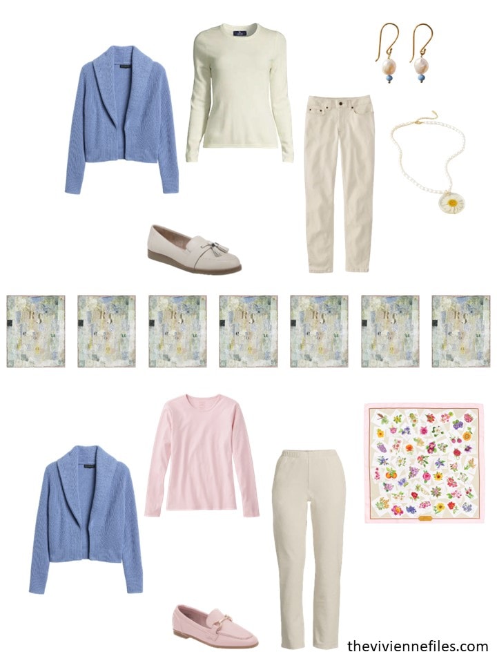
It’s not surprising that her new purchases look great in her wardrobe:
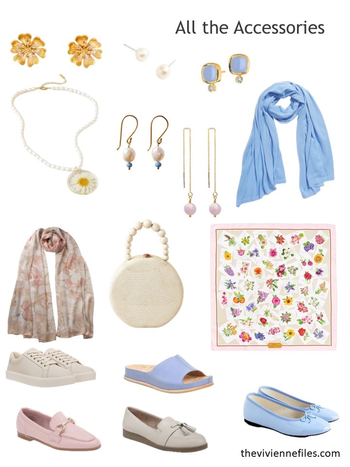
And her accessories have a definite charm:
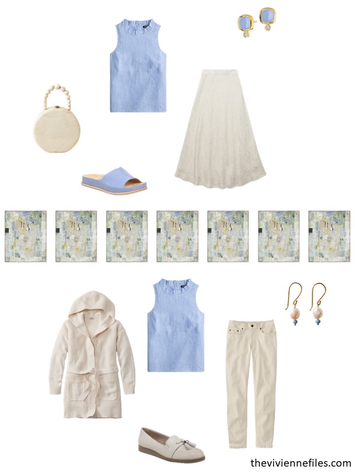
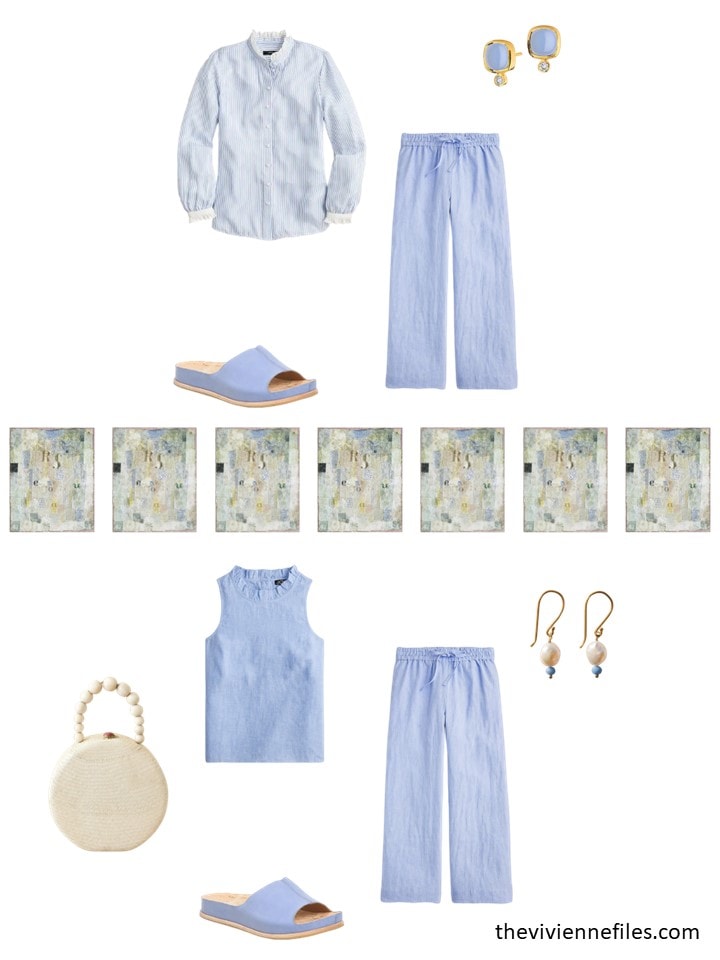
Even though all of her new purchases are the same color, they still bring a variety of possibilities to her wardrobe:
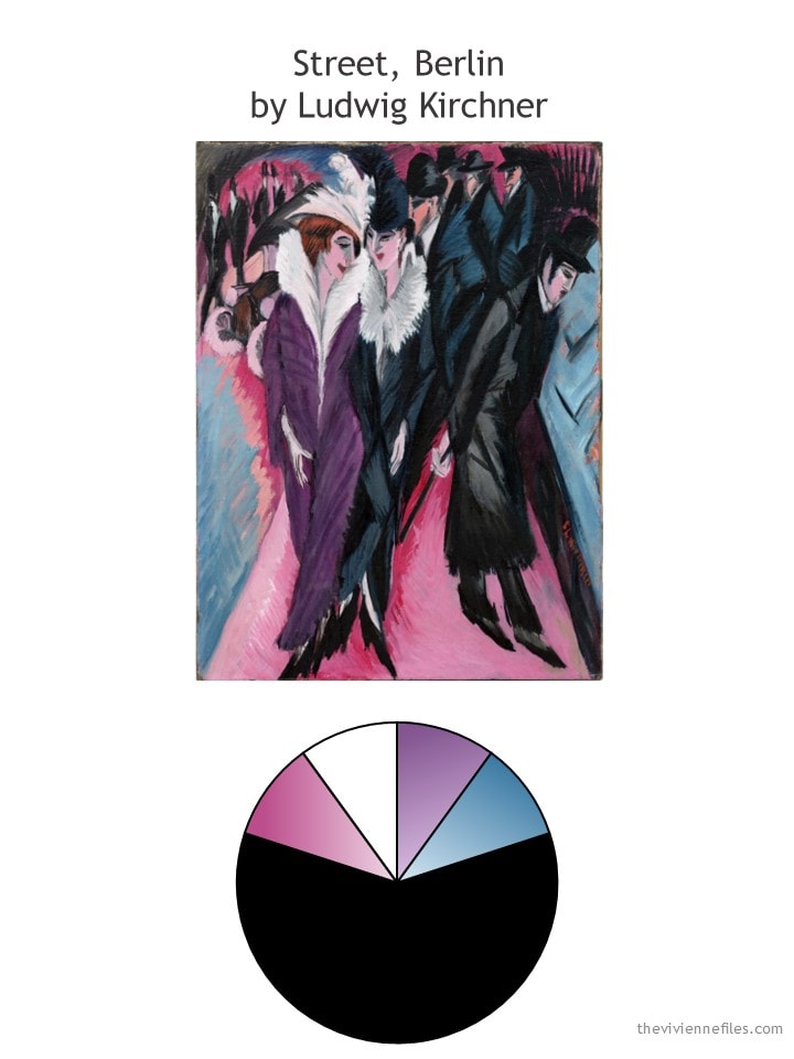
Oh, I LOVE this… The women in this painting have such attitude!
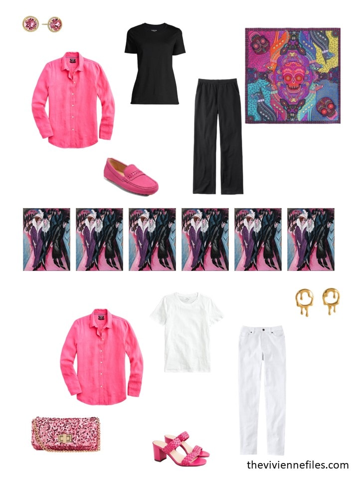
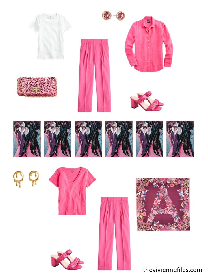
So THIS heroine looks at the lovely woman above, and realizes that she too can buy an entire ensemble in an accent color! This is the heroine with the coloring to look stunning in bright pink…
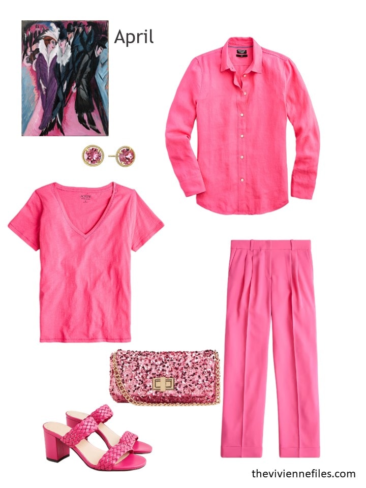
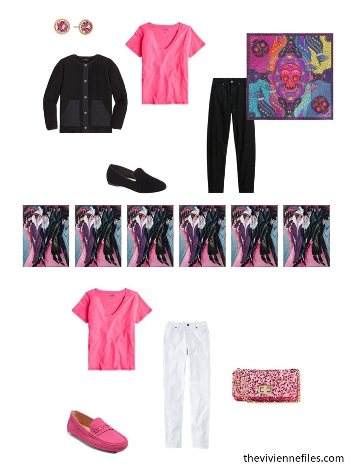
Earrings – Infinite Elements; Begonia tee shirt – J.Crew; linen shirt – J.Crew; sequined bag – H&M; pants – J.Crew; sandals – J.Crew
If you like this color, but not necessarily these 3 garments, J.Crew has a LOT of things available in this “Vivid Begonia” pink...
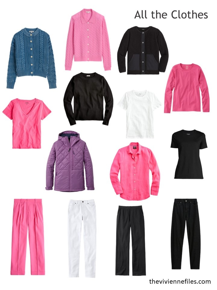
Yes, her wardrobe is pretty strongly pink, but with the black and white neutrals she has, she still is in a good spot…
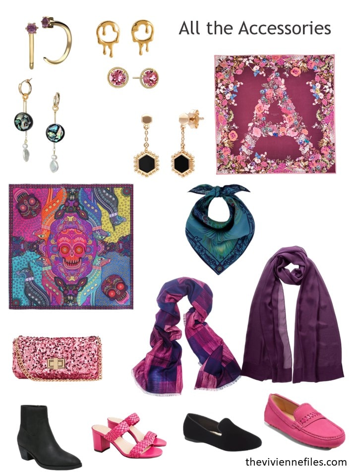
And her accessories just keep getting better and better; as much as I usually HATE things with skulls on them, that scarf she has is perfect with these new garments!
For the next while, she’s going to be wearing pink often, and she LOVES that… Being known for wearing a particular color (or, in my case, having certain highlights in your hair!) can be fun…
I will share the next 3 wardrobes with you on Wednesday; I wonder what I will find when I “go shopping” for our heroines…
Such fun!
love,
Janice
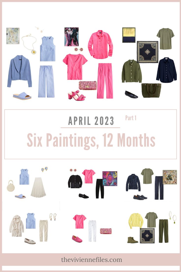
Like this article? Save it to Pinterest!
I had my colours done many years ago and am a winter. The bright pink colour is one of “my” colours but I just don’t like wearing it. I feel too “look at me”. When I see it like this, I want to really want to like it, but I know from experience that if I buy clothing in it, it will sit in my cupboard unworn.
The 2nd blue wardrobe is just lovely isn’t it? What a beautiful color. Although I wore it when I was (much) younger that bright pink just hurts my eyes. I can imagine people who might look quite lovely in it though. I quite like the Rothko. I do think part of the reason is it’s simplicity and discipline. Thank you and looking forward to the rest on Wednesday
I am loving all the colors of spring right now!
On another note, I used to receive your emails regularly, but have not for awhile now. I tried to follow the link to resubscribe, but it did not work. Help!
I have had that problem too! So disappointing since I relish reading these before starting my day.
If I replaced the lemon yellow in the first wardrobe (the Rothko) with a deep rust, it would totally work for me! The yellow is too clear and bright for me. Love the rest!
What a brilliant idea.
Ok, now you did it. I have a local event to speak at this evening & was all set with a nice, sedate outfit. Now I’m gonna have to go back & raid my closet for All Dressed Up & Fabulous gear! 😊
I love all three of these wardrobes. Simply stunning in each of their own ways.
I love bright pink and when Macy’s Charter Club line featured “pink lightning”, I grabbed just about every piece. I had lost weight (intentionally) in 2020, and loved the “look at me” vibe. Unfortunately, I have regained enough that these items are sitting it out this year, but I have high hopes for 2024. These pieces at J. Crew do tempt me, though …
I for one am happy you brought back the Rothko. I love olive and navy, and also pale yellow with olive, though I need it to be just the right shade of butter yellow rather than lemon yellow. It is a good way to bring autumn-leaning olive into spring.
I’m doing all six of them every month, no matter how unseasonal the art might be! I’m sure that doing the Klee in October should be interesting…
hugs,
Janice
I’m loving the Paul Klee colours. I wear wide leg linen trousers in summer and have various shades of grey, blue, pink and purple. I’ve always avoided pale colours on my bottom half but a pale blue cotton shirt dress might just work. Unfortunately Banana Republic don’t ship to the UK otherwise the shawl collar blue cardigan would be tempting.
I do want to like the wardrobe of the Street in Berlin but it is too gaudy for me. I would need it tones down a few notches. I’m looking forward to more purple and blue.
I love the last wardrobe and actually wore a pink cardigan almost that exact shade yesterday with a white tee, blue jeans and brown leather flip flops. I can confidently say that at my daughter’s Brazillian Jui Jitzu competition yesterday I was the only woman wearing a bold pink! :) I was easy to spot in the crowd for sure.
Overall, wonderful choices this month. (I hate both sandals and the Rothko scarf is a bit of a snooze. The daisy necklace and blue shawl collar cardigan are AMAZING.)
The yellow in the Rothko is growing on me, though I really do wish that wardrobe had at least one more accent color…and one that could be used in larger quantities than most of us would want from the bright yellow.
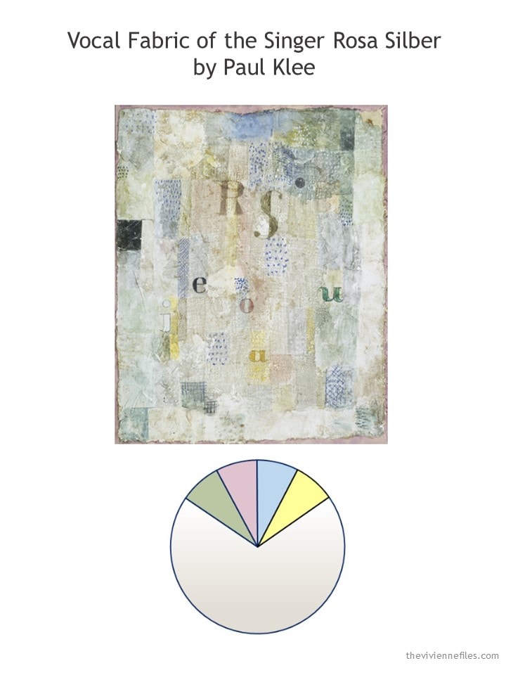
The Klee has a nice balance of colors now. The additional blue pieces are gorgeous with it. I like the choice of two print scarves – one more subdued, one more vivid.
Bright pink is, of course, currently over-represented in the Kirchner, but I am sure that will change next month. It’s clear our heroine loves this color, so I’m glad to see she has a good amount of it. Really looking forward to seeing more of the purple and blue in coming months!
Thanks for the look back. Really enjoyed your prose and the clothes, too. The art took my breath away this morning. Thank you for sharing wonderful pieces of art, your talents of writing & colors & outfit selections.
The bright pink brought to mind an incident I had shortly before this article was published. I was looking for a dress to wear to an upcoming event, and my eye kept being drawn to a fabulous jumpsuit in this exact color. I knew it wasn’t what I needed for the event, and I would never actually wear it anyway, but I kept going back to look at it.
I realized another lady was doing the same, and we fell into conversation. She was fabulously dressed and definitely had the coloring and stature to carry a bold garment like that. She told me she had nearly died 3 years ago, and since then had realized life is too short to be afraid to wear what you like. I encouraged her to get the jumpsuit if she really liked it, that she would look amazing. She did end up taking it, and I chose a more traditional cobalt blue dress and we both went away uplifted and excited about our purchases. That amazing, bold lady gave me much to think about.
I just received the scarf featured in the Rothko group. It is just beautiful
I’m so glad I got it. It looks great with the train group too