March 17, 2023
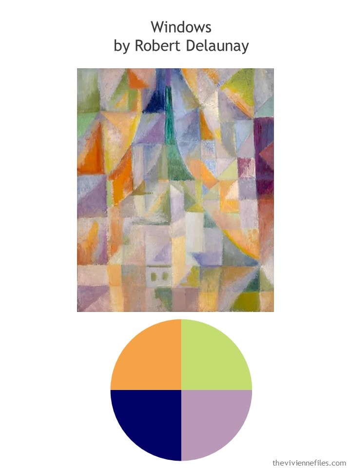
This is pretty cheerful! And I always sense a feeling of the Eiffel Tower when I look at this…
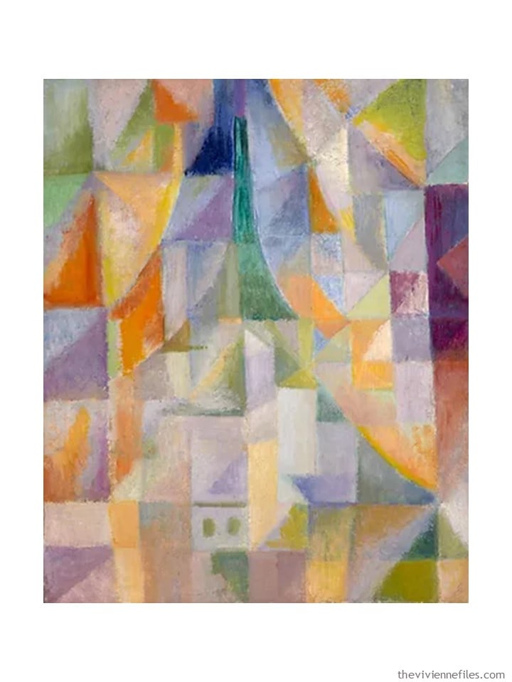
Windows by Robert Delaunay
So I have FOUR heroines that I’m thinking of, right now… Each of them is going to start the spring with an 8-piece core of beige – lots of linen!
And then each will channel her favorite painting to choose 8 accent garments… What colors might be chosen from our first painting?
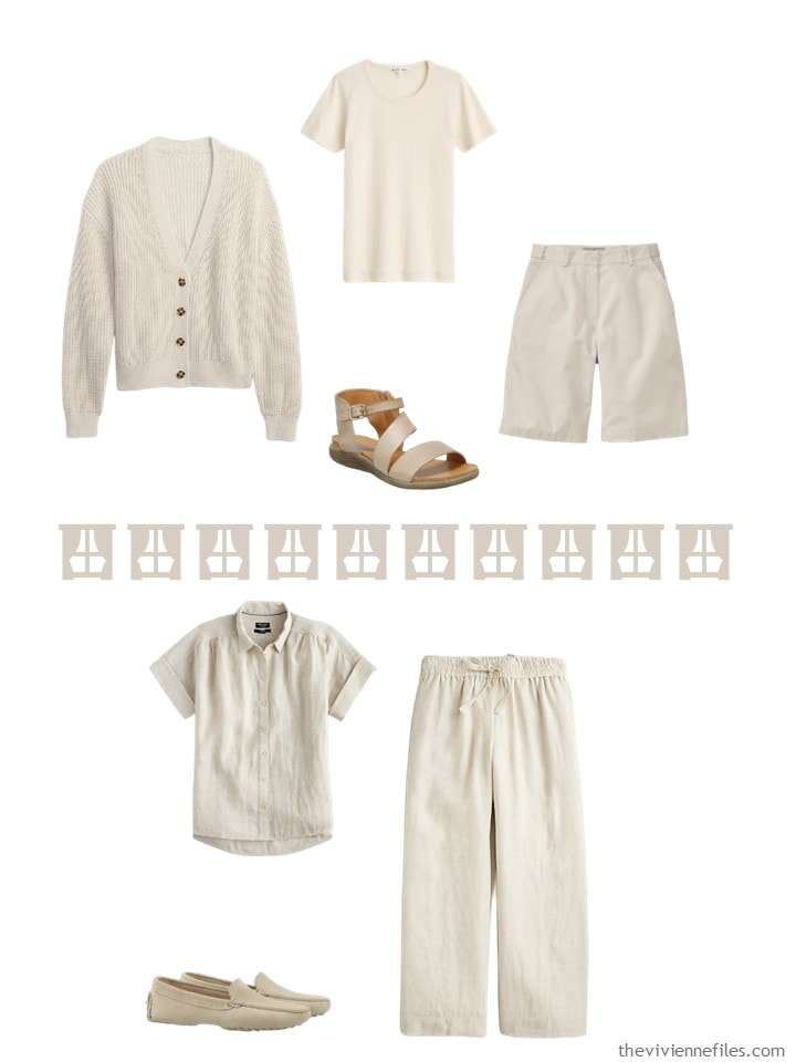
First, let’s look at what our heroines are each going to use as their wardrobe base…
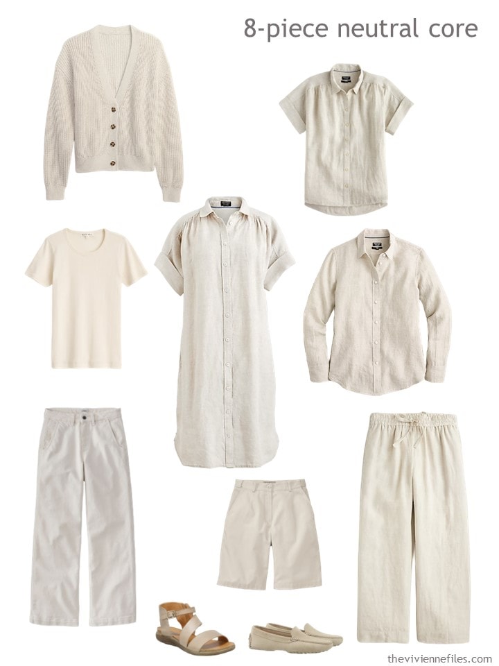
cardigan – GAP; linen shirt – J.Crew; pointelle tee – Alex Mill; natural jeans – L.L.Bean; dress – J.Crew; long-sleeved linen shirt – J.Crew; shorts – L.L.Bean; linen pants – J.Crew; sandals – Miz Mooz; loafers – Koio
Frankly, if you want a handful of linen garments for this summer (and then next 10 summers, to be honest; linen lasts a long time!), now is a good time to start looking…
I’m not going to show you the various outfits possible from this 8-piece capsule wardrobe; I’m pretty confident that they’re obvious! Just looking at these makes one long for warmer weather…
Let’s get to the fun stuff!
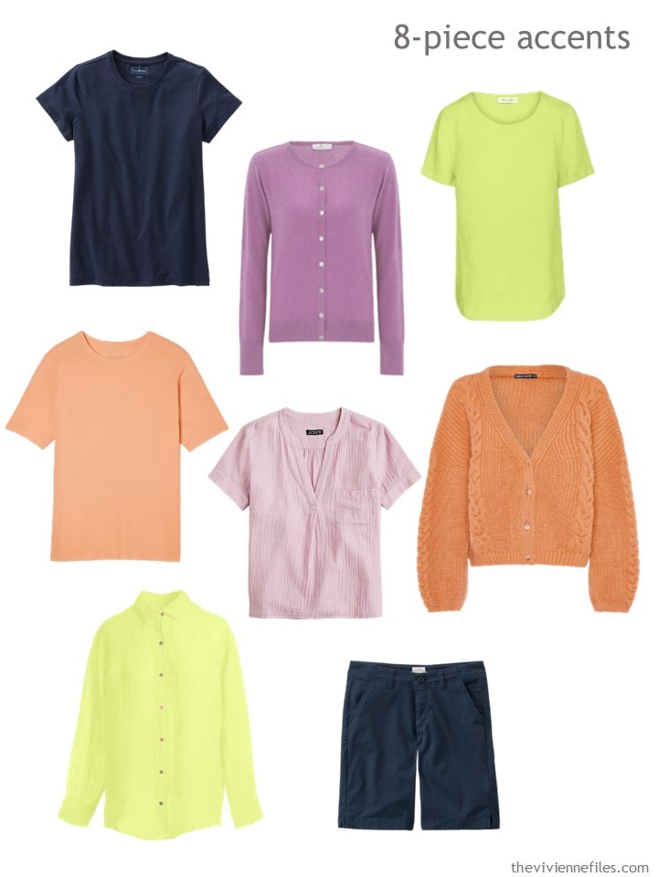
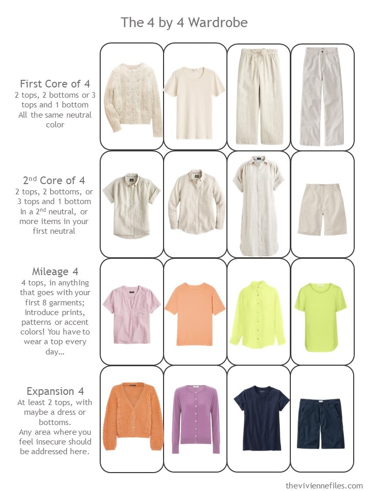
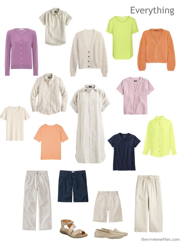
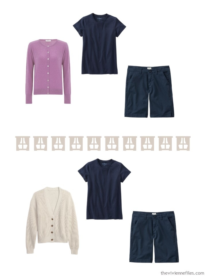
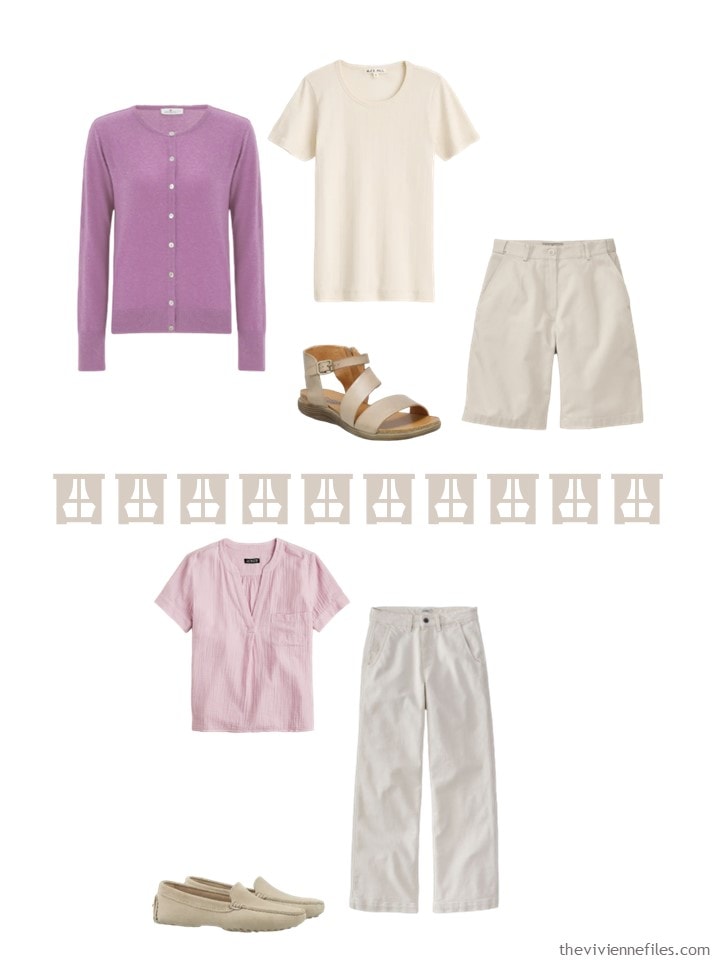
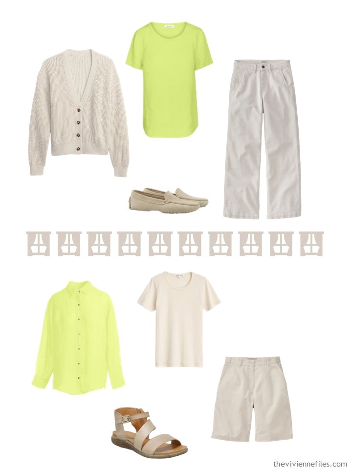
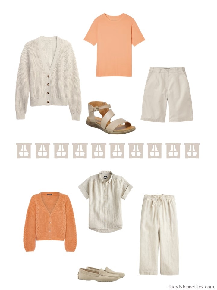
Navy tee – L.L.Bean; lilac cardigan – Peraluna; lime green tee – Haris Cotton; orange chiffon oversized tee – Everlane; pale orchid gauze popover – J.Crew; apricot cardigan – Cara & The Sky; lime green linen shirt – Haris Cotton; navy Bermuda shorts – L.L.Bean
Yes, the navy that she chose as 1 of her accents will certainly serve as a neutral too. You can’t blame her for wanting a pair of dark shorts for sitting on the ground sometimes..
Here’s how her wardrobe looks when placed in the 4 by 4 Wardrobe grid:
It might be more evocative, or just plain easier to picture outfits, when her wardrobe is shown in a more relaxed layout:
Her outfits range from simple neutrals to cheerful accent colors:
Yes, I’m going to do this THREE more times, with 3 other paintings…
love,
Janice
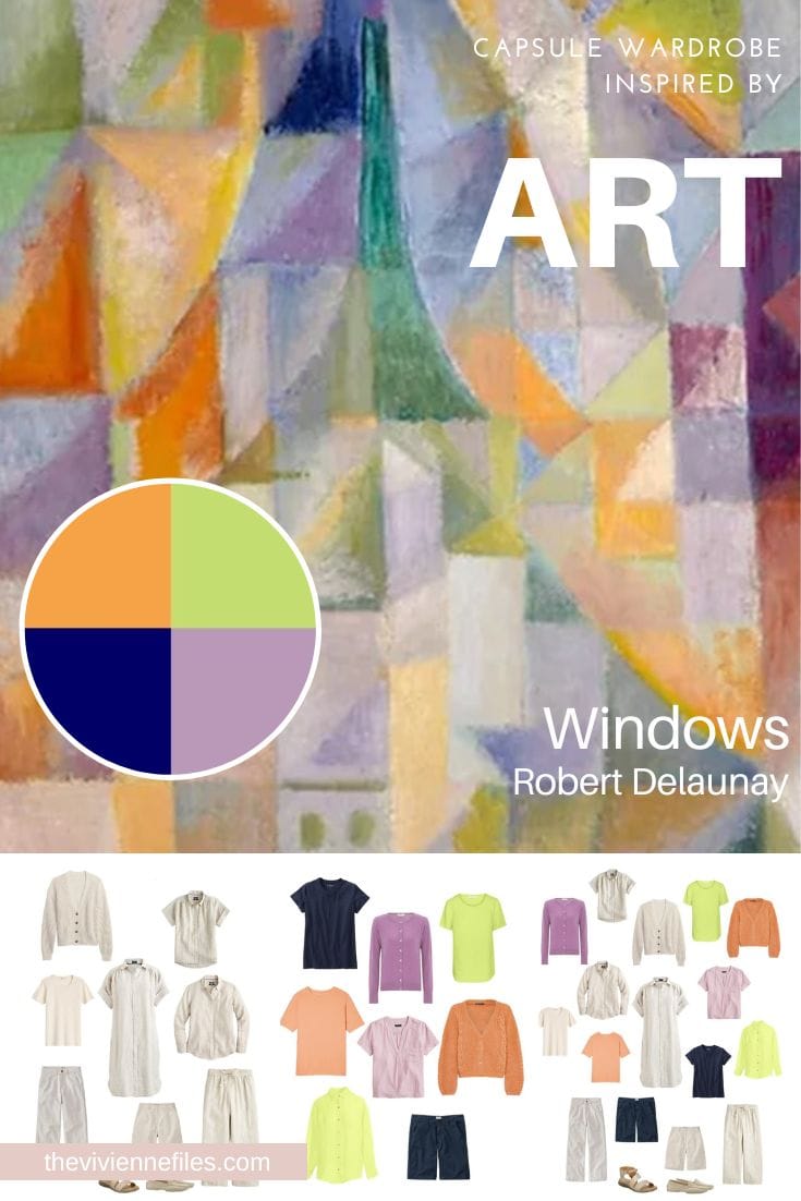
Like this wardrobe? Save it to Pinterest!
Reminds me of rainbow sherbert and spring flowers. Will look forward to the other heroines. For some reason, I find it challenging to take what you have laid out and substitute “my” colors. I’m just not good at it. Seems like other commenters do it all the time with ease. Maybe I just need to spend more time with it… I am in need of summer things and just can’t seem to wrap my brain around what it is I need to fill in. I’ll keep coming back! Thank you Janice have a great weekend everyone.
On the topic of long-lived linen, if you want a lovely pair of drapey wide-leg linen pants and enjoy sewing, I recommend the Florence pant pattern from Elizabeth Suzann. I made them from a nice black linen (also purchased from Elizabeth suzann) and they came out wonderfully. I am not an expert sewer but any means – this was my first clothing project. Now to make them in a lighter shade like this beige!
Hi Sheila, for some reason the reply button doesn’t work. I think about the wardrobes that Janice presents as building blocks. I appreciate the colors and then I look at the bottoms and tops and then figure out what works and what I miss. In this case, there’s too much beige/natural items and I miss denim or chambray, so would swap 1 or 2 items for that. And then go to my colors and swap them in as well. In here, light blue and coral/cameo rose for the lime and apricot. As for filling gaps in my wardrobe, that’s also something I struggle with, but also what Janice shows helps with that. For summer I’d like a couple of shorts that won’t dissappear when sitting down!
In a different line, I so enjoy these series Janice! Being greedy, would you mind “dressing up” the story a bit? I love to read about each heroine’s own character, background and where they all meet to dare observers notice they all have the same core pieces!
Oh I love this concept!!!! This particular one is NOT my colorway or style, but I’m definitely a “4+accent” kind of girl. I have trouble sticking to one neutral so I’ll adapt by saying “8 neutral pieces” and “8 accent pieces” without worrying too much (for example, I’d keep one beige pant and change one to navy.. and the shorts be black… ). I’m looking forward to the other heroines! I love seeing ways to build more color into a basic set of garments, and having that minimal number be enough. I know i have enough clothes, any new shopping I do, I want to focus on fit and quality… so there’s always fun to be had looking at new ways to capsule/ fit those needs. Janice, I love that you offer so many options to keep our brains churning – you have really expanded my mental box about clothes. Thanks as always! And Happy St. Pat’s!!!
I love this! Looking forward to seeing more.
Sheila, you are not alone. I have trouble with abstract thinking. That’s why I pore obsessively over these capsules. I did okay when Janice was doing the What to Wear series and it was one garment at a time. Still, I persevere. Arwen I couldn’t work the reply button either.
Hallelujah, not a stitch of black in sight! Thanks so much for “my” sherbert colors. This is almost perfect. The only change I’d need would be two capsules of 4, light and chambray/denim, instead of core of 8.
“Reply” is broken today so I’ll just comment here about the conversation on visualizing our garments in certain combinations. Visualizing is hard for me too.
I remember someone commented two or three years ago about photographing each of their wardrobe items and then they could pull the pieces together in Word or PowerPoint or PicCollage, etc. It’s quite labour intensive to photograph everything but it’s marvellous fun and very helpful once you have the photos.
I tried it one time – laying each item on a plain pale bedspread. I stood on the same spot each time so that the proportions were consistent between photos. It worked quite well and I could quickly build outfits and keep a record of them.
Just a thought!
This is a fascinating capsule example! Seeing just the 2 pieces of navy (a nice neat inner column of color) with the other accents is interesting since we don’t often see neutral colors functioning as accents.
Janice shows the 2 navy pieces together with the beige neutral or a colorful accent. I’m curious how other readers might use these navy pieces. Would you wear 2 beige pieces with one navy? Would you wear 1 beige + 1 navy + 1 colorful piece?
The dark navy with light beige feels like a very natural combination in my head, but I’m not as sure when I see them together…which I would NOT have expected. Perhaps it’s that the two colors differ both in value (dark/light) and in some saturation sense (the navy feels very saturated/bright and the beige feels muted)? Dark navy + white are a wonderful high contrast combination, but both colors have a “bright” nature to my eye so work together easily. I can more easily see this beige (which is actually a beige I really like, which is sort of rare) with a more faded or de-saturated navy/dark blue or with denim/chambray. I think I make this comment a lot! Often I see dark navy in capsules where a less deep, saturated blue (even if it’s still “navy” but has a softer feel due to fading or how the dye interacts with the fabric, like linen) feels more harmonious somehow. And I say this as a person who love dark navy!
I would love the neon green with this dark navy, but I’m not a big fan of it with the beige. Maybe it’s the same reason as above: the neon green is too saturated/bright for the soft beige, to my eye.
Of course, once there are thoughtfully selected accessories in the mix to do some color bridging and create final outfits, some of the color combinations I’m not as sure about might turn out to be ones I really like!
Looking forward to seeing what the other three heroines do with these beige pieces.
A few thoughts for those who have difficulty visualizing their own colors in these capsules…
I find that having images of my items on my computer makes it very easy to substitute in colors and see how they look together. I have taken photos of my own exact items and used remove.bg to remove the backgrounds, but you could also use stock images (as Janice does) of your exact items or similar items.
While the colors, etc., aren’t identical to what the items look like in real life, I find it close enough for testing how Color A looks with Color B, how the items of a possible capsule work together, how a column of Color A looks with a topper in Color B, etc. It’s definitely more reliable than me just trying to visualize it, anyway!
I know this is absolutely not something everyone is interested in doing! But I wanted to point out/remind us that we can do the same thing that Janice does. It can feel a bit like “what’s wrong with me that I can’t just mentally visualize it?” when really, I think a lot of us find that difficult and/or realize that what we visualize and what we see are different enough to matter.
And/or maybe I’m just a big kid that never outgrew playing with paper dolls… :D
I was just delighted when I saw this painting! I love Robert and Sonia Delaunay and I do see the Eiffel Tower possibility there. The wardrobe is lovely and refreshing, but I see other possibilities, especially the leaf green and maybe a touch of the cobalt blue.
I’ve always found it easy to substitute with my colours. Just looking at the painting, I would sub the acid green with teal. I would sub orange for pale blue.
I like variety in my wardrobe so lots of accent colours and shades don’t phase me. However, in an effort to use more of my clothes, I’m going to try monochromatic colour dressing. Whereby you decide on a colour, say purple, and you dress in shades of that colour for example lavender and purple. Accessories can tone in or remain neutral. If you wanted, you could go for two/three blended tone dressing say pink and grey with burgundy accessories.
I’m also going to have a serious look at my patterned garments. I’m nearly 60 and don’t wish to look frumpy or twee. Perhaps I could swap the patterns for self coloured patterns and textures. I also need to look at arm length on tops.
To Sally in St Paul re how I would use the navy pieces in this wardrobe.
Like you, I feel that the navy and oatmeal-toned pieces are a bit bland when paired.
Most outfits we discuss stick to two colours but I guess I’m slightly rebellious: I have zero problems with wearing three different-coloured pieces together. Eg. I might wear the pale pink tee and the lavender cardigan with either the oatmeal or navy bottoms. Or I might wear the apricot top plus an oatmeal sweater with a navy bottom.
I figure that just a scrap of the shirt is peeking from the sweater and so the triad of colour equation will apply. I think it’s:
60% (main colour)
+
30% (second colour)
+
10% (accent colour).
This basic proportion is extremely pleasing to the eye. The colour of accessories is also a part of this scheme.
Mileage may vary but I really enjoy going beyond two-toned outfits.
Wendy, thanks for chiming in. I really like this 60/30/10 idea as an approach for creating a 3 color outfit! I am now curious how often my 3 color outfits fall close to this equation…
Sally,
Thinking about the navy and the oatmeal. I would wear the navy shorts with a colored shirt and the oatmeal cardigan. I don’t know if I would wear the oatmeal on the bottom. Although I have pale yellow capri’s that I wear with a navy tee. I think if there was no topper I might wear them, especially if my shoes were a cognac brown flip flop/sandal. I don’t really care for the acid green with the oatmeal either and I think for the same reason, it feels too saturated, but that isn’t one of my favorite colors anyway. I would have pulled the more true green out of this painting. In fact when Janice said she saw the Eiffel Tower, I was thinking evergreen tree (yes, I live in the PNW!), LOL! I also agree that I would do 4 oatmeal and 4 denim/chambray pieces partly because I don’t like dressing all in one color so those 8 garments wouldn’t make any outfits for me on their own except the dress. But that’s just personal preference, I know ladies that look lovely in one color, so chic!
I like the 60/30/10 idea. I’ll remember to check that the next time I incorporate 3 colors. I also like to mix patterns. My favorite way for sure is tone on tone or a column of color. I guess variety is what I like. I will sometimes lay clothes out on the bed/floor that are in colors I have but pieces Janice shows. Then I quite literally move them around to mix and match. I then make notes for travel so I can get started when it’s time to pack. If it works well on a trip I also note that and can repeat it. I am not tech savvy enough to do what Sally does!
What a wealth of information and good ideas! I do use the Style App, so that will be helpful. I have photos of almost everything I own. I’ll have to take a look at this tomorrow (when I”m not at work and splitting focus) and put ideas into practice. What a great forum!
I have been using a newer app, OpenWardrobe, to organize and combine images of my wardrobe items into outfits and wardrobes. The app works on Android and iPhone and is being actively developed to continue adding new features. Excellent option if you aren’t a PowerPoint person.
Thanks for the tip about OpenWardrobe. I just downloaded it and will explore its possibilities over the next while.
For wardrobe management, I just download the photo from the retailers website or do a Google search where I can usually find a picture of it. I then upload to Pinterest. You could keep an outfit journal this way🙂
In can’t get the search button to work either. ☹️
Some great ideas for combining accents and neutrals and for keeping track of one’s wardrobe. When I change over from cool to warm, I’m always surprised by my ‘new’ wardrobe because I’ve forgotten about them. So I get a fresh perspective. One of my favourite combinations in summer is a navy top over pale grey linen trousers.
I have a light orange and a lavender cashmere (very light weight) poncho that I’ve never known how to wear. The colors are exactly like the ones in the painting. I love that these group help me shop in my own closet! Thanks Janice for this cheerful transition group!