February 27, 2023
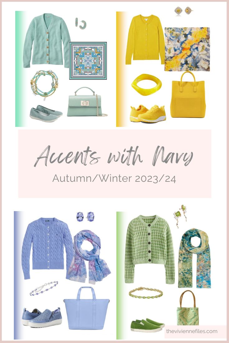
Let’s spend some time with the other 5 colors that Pantone identified as “important” for Autumn/Winter 2023/24…
yes, I would definitely put a brooch over the logo on this cardigan; I just couldn’t resist this, because the color is so perfect!
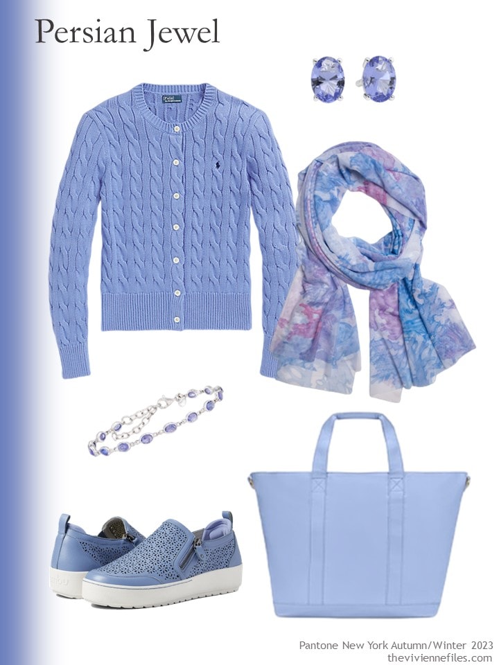
Cardigan – Ralph Lauren; earrings – Tishavi; scarf – Ala von Auersperg; bracelet – Ross-Simons; sneakers – Jambu; tote – Stoney Clover Lane
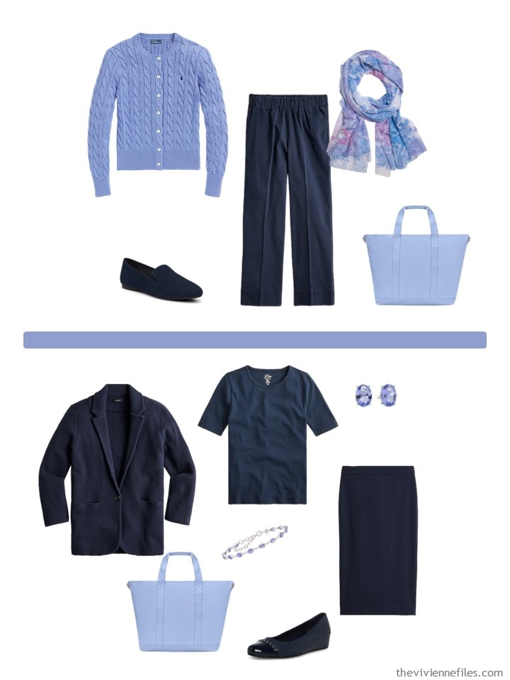
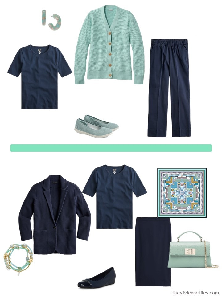
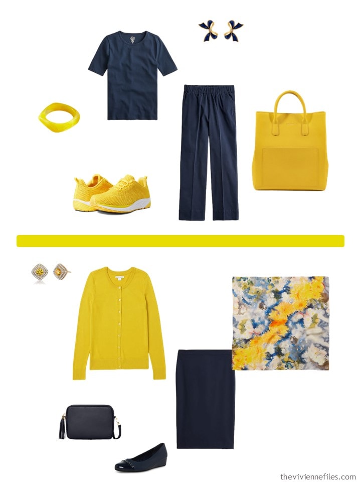
Of course, this color is lovely with navy:
I think I could have found a better name for this shade of green, but they never ask my opinion!
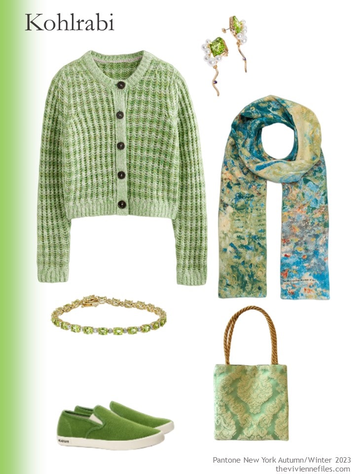
Sweater – Boden; earrings – And Other Stories; scarf – The Met Store; peridot bracelet – Amazon Collection; sneakers – Seavees; bag – Found Thread
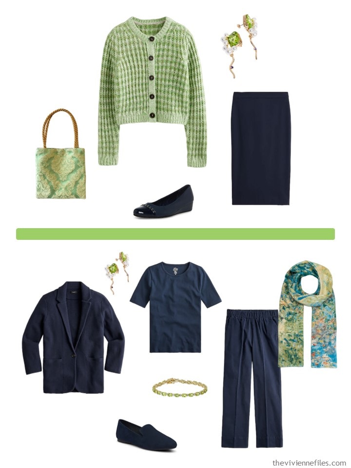
I’m not sure about this with navy – I think I will pull together a beige core wardrobe next week and try all of the colors with it…
I love this color!
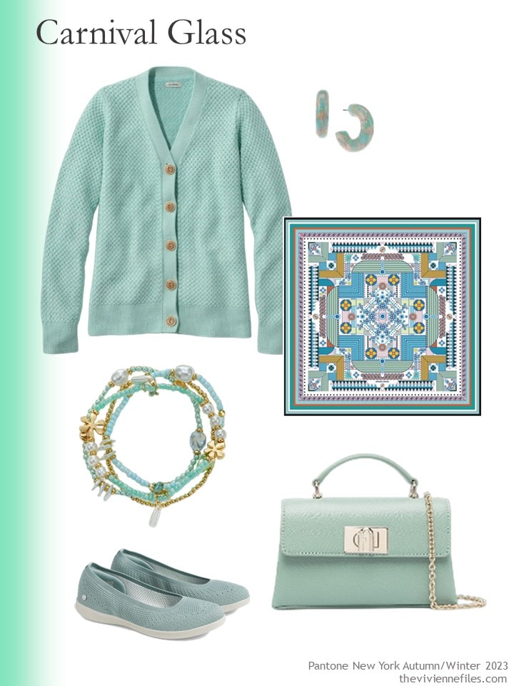
Cardigan – L.L.Bean; earrings – INC International Concepts; scarf – Jessie Zhao New York; bracelets – Style&Co.; flats – Skechers; bag – Furla
And I love it with navy; navy is a great neutral!
I think Pantone almost always include some shade of blush peach/pink. It’s a pretty versatile accent color, so if you like it, take advantage!
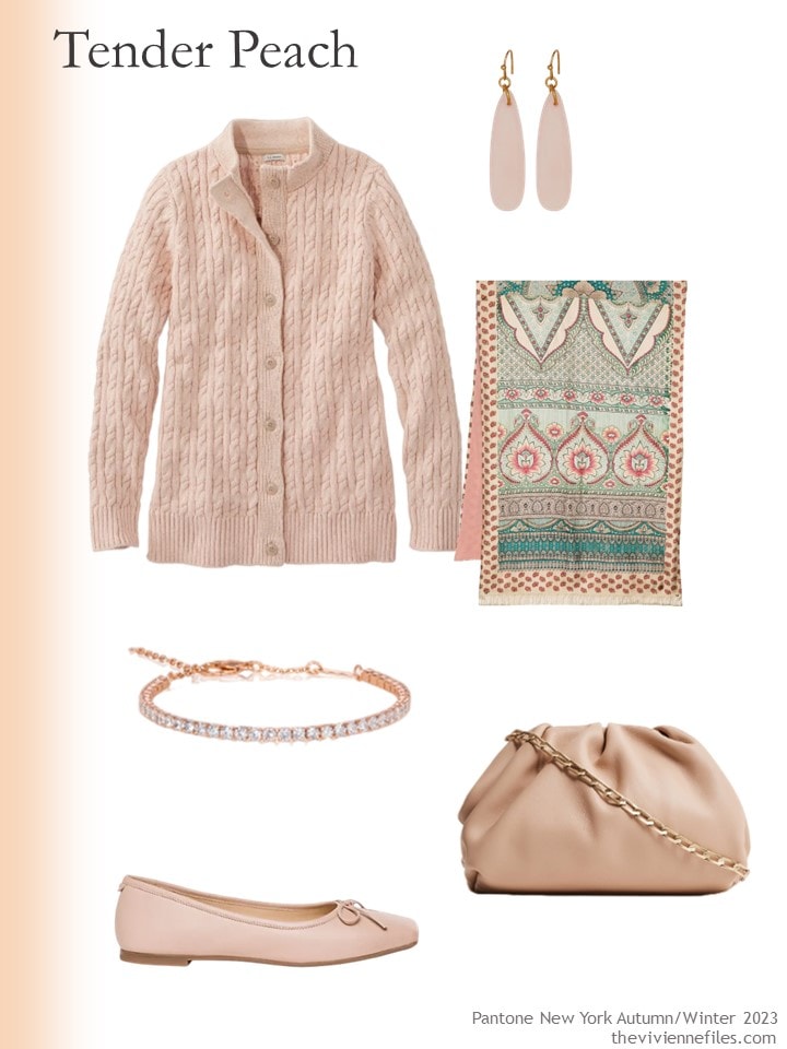
Woodrose marl sweater – L.L.Bean; rose quartz earrings – Universal Thread; scarf – Pierre Louis Mascia; bracelet – Anna Zuckerman; shoes – Bernardo; bag – Reiss
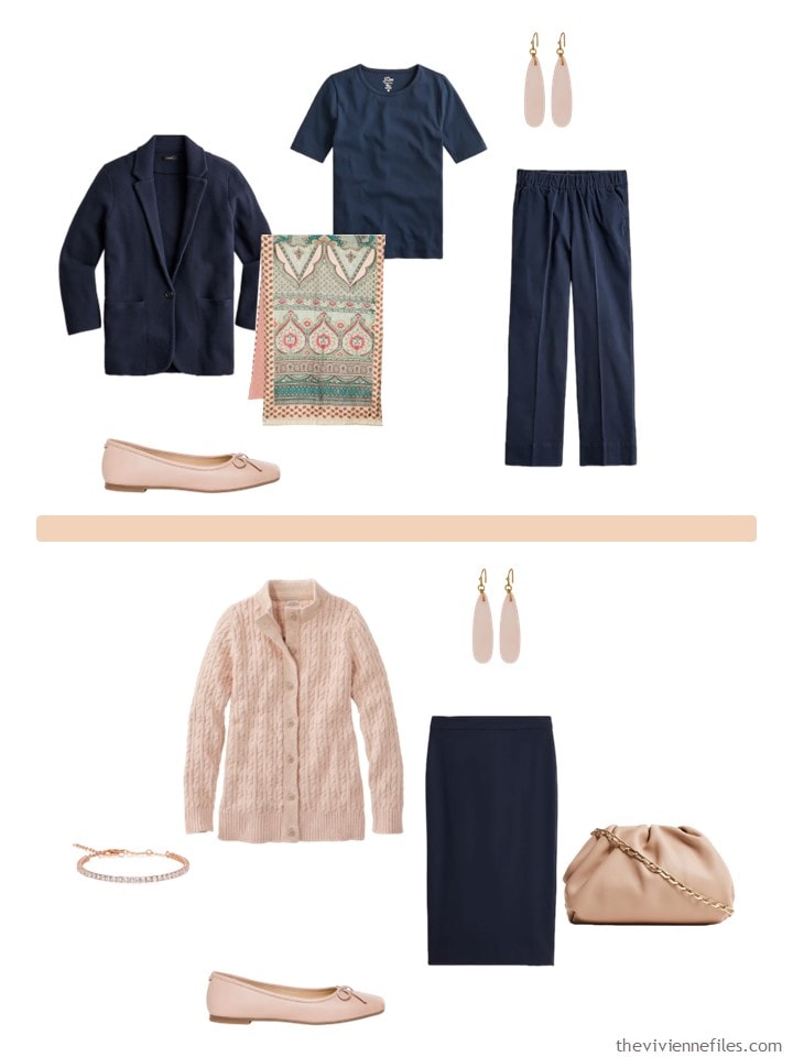
This is great with navy – I bet it would be lovely with grey too.
I’ve probably written this about a hundred times, but if you look good in yellow – WEAR IT! Many of us look 3 days past death when we wear yellow, although we admire it on others.
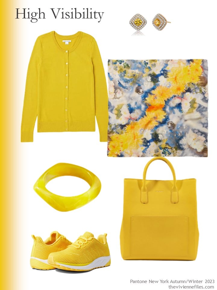
Cardigan – Amazon Essentials; earrings – Genevive; scarf – The Met Store; resin bracelet – Arden Jewelry; sneakers – Propet; tote – Campo Marzio
These are great together…
Just to remind us – this is the navy Core Wardrobe that I’ve used here. Having these 8 pieces can make your life much easier!
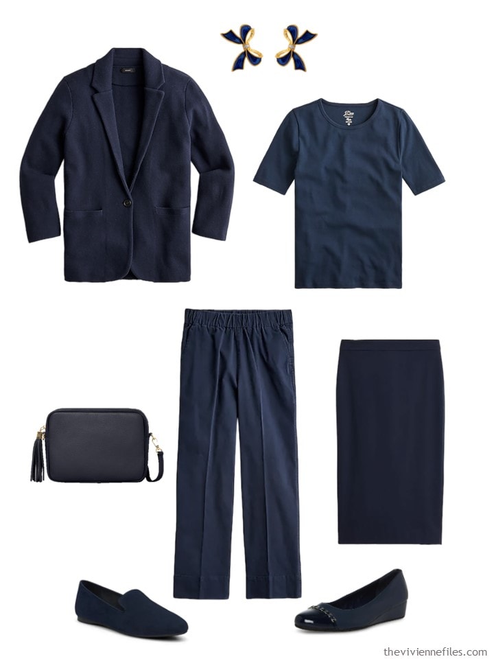
Blazer-cardigan – J.Crew; bow earrings – Milou Jewelry; tee – J.Crew; navy bag – Betsy & Floss; chinos – J.Crew; pencil skirt – J.Crew; navy loafers – Birdies; pumps – Anne Klein
So I want to look at all 10 colors with beige – maybe with some other neutral?
love,
Janice
p.s. Two years ago (more or less!), we looked at some other colors… They all are beautiful in their own way, and one can always be inspired by them… And do we all remember fabric face masks!!!!
Like this wardrobe? Save it to Pinterest!
Pantone really SHOULD consult you on naming the colors.
I’m looking forward to the exercise with beige.
Varying intensities of warm brown have really been useful to me this year.
These are all beautiful but to my eye look so much more like spring colors than fall. I would wear any of them now if I could find them – wait, the Persian Blue and Carnival Glass are staples in my yearly spring/summer wardrobes. I do like what you’ve done with them.
I agree that they feel more spring/summer. Not that they aren’t beautiful and not that you shouldn’t wear them all year if they look good on you. Maybe Pantone is learning that people have different likes and they are trying to cover the bases. Janice could have told them that! On the subject of Maroon/Burgundy in my mind I see a touch more brown tone in the first and blue tone in the second. Not sure that’s quite accurate but when I see it I “know it”.
Definitely with beige (or any cool brown for that matter) and could we have a grey as the third neutral? I would like to do the reds and greens with both of those – there were some lovely shades in both this post and the previous one that I would happily wear.
What’s happened to Agatha Christie! Will there be no follow up posts? How sad.😞😞😞💔
Oh, we will see someone from Agatha again; I just have to read the right story!
hugs,
Janice
The Persian Jewel is just beautiful. I was looking at some of the previous Pantone posts over the weekend and noticed the masks. Aren’t we all glad that (for the most part) those days are gone?
I seem to have dropped off the email list again. I am bereft Please reinstate me.
Thank you.
Judie Ashford
I too seem to have been banished! After not receiving an email for a couple of days, I was relieved when I visited the site and saw that Janet was still posting. I was afraid she was fighting off some dreadful illness, or had grown tired of browsing through endless clothing sites and had flitted off to Paris leaving us forlorn. Let’s hope that she’ll welcome us back soon!
Me too :-(
Persisn Jewel is one of my favorite colors, but it just doesn’t look good on me. On the other hand, I never wear yellow, though I’ve been told a nice, bright, clear yellow would look very nice on me, so maybe I’ll give a French Five a try.
I agree that navy is a great, versatile neutral, mostly due to this blog. I have now collected all the basics in it. I find I am missing black, though, both in my wardrobe and as a neutral here. It seems you are mostly using navy and gray or beige as your neutrals lately.. Those are lovely, of course, but as a Clear Winter I long for more Black and Bright stories.
These colors bring me so much more joy than the first set! I love most of the, especially the carnival glass (aqua) and Persian jewel (periwinkle) colors that I wear year-round. The real trick is finding sweaters and other warm clothes in those colors, so I hope that the manufacturers come through this fall/winter!
Seconding the request for gray as another neutral! Thanks for all the inspiration!!
For the first ever I was somehow lost and dropped. I am so thankful to know that was the issue and that you!!! are ok!!!!! Please reinstated me,
I love the burnt sienna but am finding as I get older it is a little too strong for me. What I love about the kohlrabi and carnival glass is they would be fantastic in late winter and early spring when snow may still be out and temps low but it should be spring. After retiring in Idaho I have learned I need winter warmth for Easter, but I want spring colors. Thank you for some great ideas
I would happily wear all of these colors except the high visibility yellow.
Seeing the colorblocked example outfits has made me realize how infrequently I mix colors that way. I have a strong tendency to look for that print bridge piece (hello, scarf) to bring the colors together. I think that may be why I feel that just about any neutral works with just about any accent color – it’s all about integrating them with a bridge piece – whereas some people have very strong responses that some neutral + accent combinations are light years superior to others.
I can see that especially in a smaller wardrobe and/or one in which you don’t have as many print bridge pieces that getting the best combination of colors that can stand up to a colorblocked outfit would be more important than in my larger magpie wardrobe with a million prints.
(Of course, there’s also just that stylistic preference where some people like to wear the colorblocked look more than others do. But I can certainly see being more selective if this is the case.)
I had to laugh at your note about the logo on the “Persian Jewel” sweater! I have a RL sweater that I absolutely adore and wear very often, but it’s a soft-colored (dove grey) sweater and so they did the logo in white/off white. INVARIABLY, someone says “What’s that on your sweater,” thinking that a bird has made a deposit!
I would be interested in seeing a med brown neutral and maybe a moss or forest as a neutral. As for these shades, I would pick all except the peach to wear.
These are fun. Just today I pulled out some royal blue pieces to give my dark winter wardrobe a bright injection of color. Sort of a french five (or seven). Should be fun!
Hi Janice
I have not received your emails since 22nd February 2023. Could you please include me.
I really enjoyed your writing and have gone back to 2011 and started reading it is so informative, enjoyable and entertaining. Thank you.
Help, yes, I see many people have fallen by the e-mail wayside; please add me to the list to get back on! Depending on you to get dressed in the morning!
I think you might want to re-sign up in the wee box on the blog main page – something has gone severely awry with the technology of the mailing list!
The world is moving faster than I can keep up – at least for technology!
hugs,
Janice