October 31, 2022
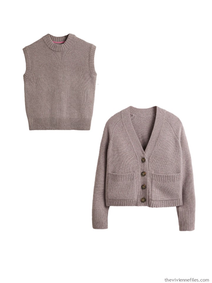
It’s described as grey on the Boden website, but it really looks more taupe to me, and to the reader who wrote to me with her concern…
What do you do if these sweaters arrive in your home, and they’re lovely and fit beautifully and you really like them, but they’re a color that is completely new to you?
My first thought is to treat this color like an accent color; if you can find shoes that match, it’s a bonus!
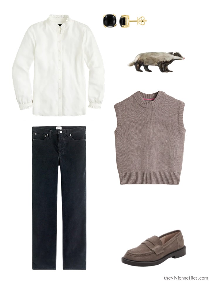
Ruffled shirt – J.Crew; onyx earrings – Effy; badger brooch – Fable England; Taupe vest – Boden; black corduroy jeans – J.Crew; loafers – Blondo
The cardigan could be worn over any other color with the same intensity and saturation i.e. any soft, kind of muted pastel…
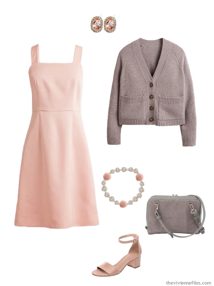
Dress – J.Crew; earrings – Jordan Road Jewelry; cardigan – Boden; bracelet – Sitara Jewelry; bag – Studio Ebn; sandals – Bernardo Footwear
Of course, you can always wear the 2 pieces with pants or a skirt in your favorite neutral…
Yes, you’ve seen this skirt before! I’ve found that my pleated skirt is one of my favorite, and most versatile, garments!
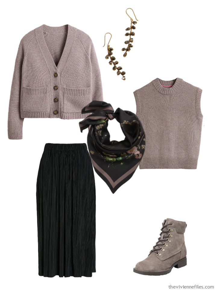
cardigan – Boden; earrings – Banana Republic; scarf – Allsaints; Taupe vest – Boden; skirt – Samsøe Samsøe; hiking boots – Børn
Maybe you have a scarf that will be the key to an outfit or 2 that mixes 3 colors…
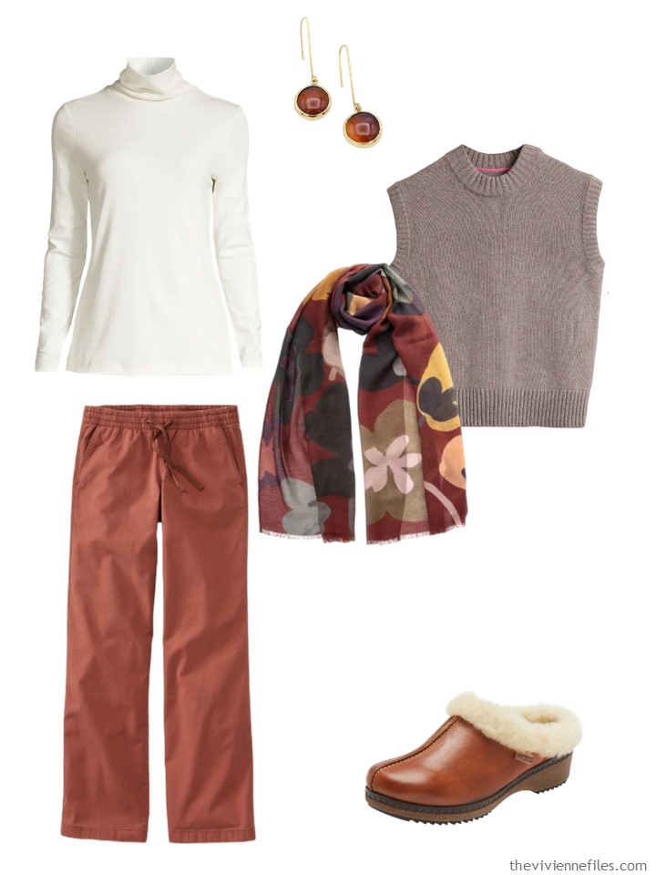
Ivory turtleneck – Lands’ End; earrings – Lala Salama; scarf – Elizabetta; Taupe vest – Boden; henna pants – L.L.Bean; clogs – Pikolinos
A very simple outfit of neutrals can serve as a simple backdrop for a lovely scarf and earrings:
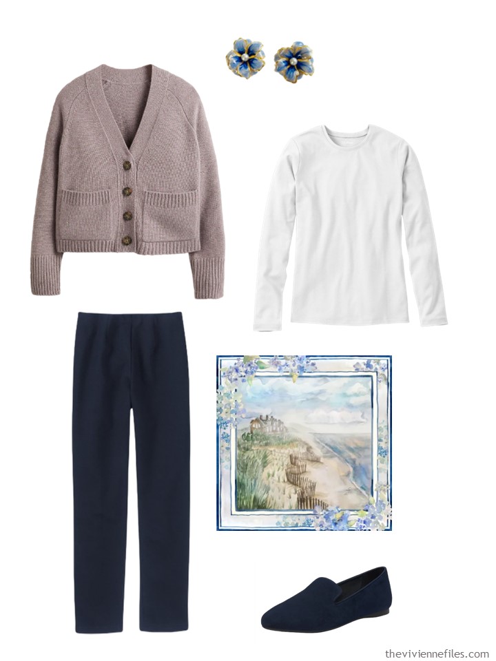
cardigan – Boden; earrings – The Pink Reef; white tee shirt – L.L.Bean; pants – L.L.Bean; Hamptons scarf – Banniere; loafers – Birdies
Maybe you have some AMAZING jewelry that would benefit from being worn against a calm neutral?
Banana Republic has some GLORIOUS labradorite jewelry right now; I would love to own all of it…
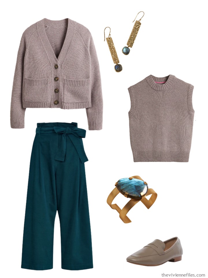
cardigan – Boden; pants – Emily And Fin; labradorite earrings – Banana Republic; Taupe vest – Boden; bracelet – Banana Republic; loafers – Rag & Co.
This is the hardest part of buying things online – colors are hard to really “read.” But if something appeals to you, don’t let this stop you; open your package carefully, and have some packing tape close at hand in case your purchase doesn’t appeal when you have it in hand…
love,
Janice
p.s. Six years ago, Belovedest and I were just back from a vacation in Italy…
Like this article? Save it to Pinterest!
The worst is a brand I buy from which has no filter to sort the images by colour. A pretty basic requirement you’d think. Thankfully, they still have a high street branch near me, so I can browse there.
I’ve been getting into taupe in the past few years. I wear it with teal and burgundy – my ‘autumn colours’.
Beth T,
My favorite Winter colors are Burgundy and Teal , but worn with either tan or brown as I am a “ Warmie” . Funny how we can both use the same accent colors despite your cooler coloring !
Wow, these are simply lovely outfit combinations! Beautiful taupe sweater.
The saving grace for this twin set is that they are cashmere and probably very soft and warm. The boxy Grampa” style of the cardigan, the high neck on the sleeveless top, the depressing colour and the price – a hard no for me 😞👎🏻
I actually love this color but agree that it wouldn’t suit me either. The “chunky” knit combined with the high neckline vest and boxy cardigan seems like a ticket to Frumpville. (But that’s OK, Boden really doesn’t like to sell clothes large enough to fit me, so there’s vry little risk I will shop from them.) I would love to see a twin set this color in a thinner knit and different silhouette, but this boxy look appears to be trendy right now.
Love the color. I would like to see this in a less bulky material. I’m petite, but bulky knits do not look good on my v-shape.
I would wear 1,4,5. Most likely with a scarf. Taupe is a hard one for me. Being slightly color blind I tend to see it as a brown or gray – depending on the shade. When someone says taupe it really doesn’t mean much to me….😀
So, that would be difficult for me. The colour is so lovely, but it can be awkward to work with. I find it appealing with what I call mossy forest colours…ie, any shade you might see in a forest. Also think it can be pretty with pink or rose tones. Surprisingly nice with a deep sappire velvet blue. I don’t think that the set would stay once I’d seen the cut because it looks a bit like the boxy crop sweaters that were popular when I was young. However, if it looks good on the reader who ordered it, then by all means she should keep and enjoy it. Not sure who the reader is, but she has my sympathy for the online colour quandry. I’m awaiting the shipment of replacement sweaters from the UK and not sure exactly what the chocolate, oatmeal or cool blue will look like. I thought my sweaters were good for another winter, but once unpacked…all the pills, fuzzies and worn spots were glaringly obvious.
I agree with pink – salmon pink, cameo rose pink or even coral pink.
Taupe is my all time favorite color! It can lead more gray or brown. I find they mix and match pretty easily. Once and awhile I will see something called taupe and it’s definitely more of a soft caramel color. I do not wear it well.
This post is a clear illustration of your genius and experience!
What a thoughtful and versatile arrangement of outfits
Taupe can be a great colour for me and I like the outfits with the suede boots and loafers. However, it looks to me like this colour problem requires buying more new stuff to make it work. Many of the items in the ensembles will be basic pieces you already have but buying new boots or shoes to make your new sweaters work is an expensive choice.
If you love the colour and think you’re going to start wearing it a lot, keep the sweater. If not, don’t spend any more money on the new colour (taupe). Since you asked :)
The taupe color looked so bland that at first I hesitated. But it is a beautiful contrast with black and white or navy and white. Beautiful jewelry or pretty scarf can really shine. And it is a very calming color palette. One thing: I’d love to see how some of these clothes look on real people/real bodies.
I would take this modern spin on a sweater set in ANY color! I love the look of a vest with a shirt underneath plus it would also make a lovely shell under a suit jacket! Cardigans go with everything so this set is a win especially with your creative combinations!
I would definitely keep it if it was a present, even if the color was not my favorite (prefer the navy or rose colors shown in the web). If I were buying it (or had a say in the buy) I’d go for one of my colors instead. However… Is not a different league, I’m in a different dimension LOL! Fun to look at the outfits anyway, I have a merino sweater on that color and it is quite versatile.
A very difficult weird shade of taupe. This one has a Violet undertone that skews to the pinky purple side of taupe which can be hard for some complexions. A straight up neutral taupe is a cross between a mid grey and cooler brown.
Wow, that’s not even close to grey! I see the problem. I’d send it back posthaste. It’s a bad take on taupe with a strong pinky violet undertone.
Sometimes taupe can go pinky Violet or greenish or even yellowish. Those are horrible to work with because the undertones show up fast when paired with colours opposing their undertones in the colour wheel. When shopping in person it’s helpful to pair it with red, blue and yellow to watch the undertones appear.
I like taupe but only when it stays in its neutral grey zone.
A grey should stay in the grey zone when it’s sold as a grey. Especially online.
Great points, Margery. To wear it as an accent color that is kind of a violet mauve taupe is one thing. If you want to wear it with other taupe items…not so much. I think a taupe with a more neutral beige aspect would be a lot easier to wear with a variety of neutrals/accents and to mix with other taupe items.
Thanks for the tip about putting taupe next to red, blue or yellow.
This looks to be a true taupe to me as well!! I enjoyed seeing how you paired these taupe pieces!! I loved your outfits but I just wouldn’t wear these taupe pieces because I look awful with taupe near my face!!!! It makes me look like I’m dead with circles and a grey tinge to my skin when I wear taupe near my face!!!! I look much more pleasant in mushroom!!!
This color looks great with the neutrals and the cooler pink and teal accents, but the rust gives me pause because of the purple/mauve tone that Margery pointed out. It looks just fine, but I think a more neutral taupe would be easier to pair with warm colors like rust. And I think a more neutral taupe would be better if the heroine is interested in expanding on taupe in her wardrobe. So bottom line, I personally would evaluate this color not as a taupe neutral but as a specific mauve-taupe accent color and decide accordingly. It’s definitely NOT grey, and it doesn’t look much like a standard taupe either!
$540 for a trendy cut of twin set in an odd accent color feels…I don’t know…I mean, everybody has their own guidelines for goal cost per wear, but I just think it would be hard to wear it enough to get value from the purchase. I mean, you’d have to really LOVE IT and be prepared to wear it constantly. And since it’s not a classic style, it seems like the window of opportunity for wear is already shortened. (Of course, if the heroine is happy to wear the silhouette after it’s no longer trendy, that would extend its lifetime.)
I agree with Lizette that the heroine needs to consider whether she is happy to see this twin set in her outfits without the coordinating elements Janice introduced in her sample outfits and/or she is happy to spend quite a bit more money to add this color in handbags, leather shoes/boots…which could get expensive quickly. Of course it’s also possible to introduce more inexpensive items to the wardrobe to coordinate with the taupe twin set, and I would be looking to see if I already own/can source second-hand a few print items that play nicely with the violet taupe…a couple scarves and a blouse, for example. (I wrote 3 whole posts about the modern twin set + matching shoes outfit formula using my outfits of the day, but even I acknowledge that having shoes that match your top isn’t *necessary*, haha.)
In any event, Janice – kudos on finding accessories that match/coordinate well with this odd shade of taupe! And that burgundy floral scarf is just gorgeous.
There is always customer service to contact re exact colour. I’d be hard pressed to hand over US $540.00 for apparel when I am not sure of the colour. Taupe is NOT gray but it’s really hard to tell just by these photos. So I’d keep my money and maybe consider Land’s End or C by Bloomingdale’s who have more classic styles in cardigans and shells along with excellent customer service. Some very high end purveyors might have swatches or colour samples….or one could get off of one’s duff, seek out a store that carries the Boden label and check out the colour IRL.…heck I just saw the brand on Zulily.
I get though where you’re coming from. Ordering on line is not for the weak of heart. I have made a few errors that would cost more than they were worth to ship back. I feel that for a really $$$ purchase I’d do my due diligence thoroughly or..hit the bricks and mortar.
I’m being pretty diligent about looking for mail order companies that provide free returns and exchanges! It’s so helpful…
hugs,
Janice
If I ordered gray and got that color, It would go back the next day!
I enjoy your posts, but do wish you would find alternatives to LLBean pants. They’re shapeless and baggy.
You had me at the badger brooch. It is adorably, whimsically unexpected. The Blondo loafers are favorites (minus the exaggerated heel.). A classic penny loafer is a style I continually return to.
Your genius for combining color and style really shines here.
You show this beautifully with similar tones & muted colors…. but I think it *could* also work in contrast, right?
A taupe sweater vest over a bright satin button down definitely tones it down, or a cardigan over a solid pastel takes your springboard and brings it into fall. This would be lovely to wear at a Thanksgiving dinner, if it gets warm, remove the cardigan. I don’t think I personally would be bold enough to go with a bright pattern, but it could work! I had a beautiful longer cardigan this shade back in the “Laura Ashley” brand days.
I’m saving this post for sure. Absolutely one of my very favorites. I can’t recall another post where I’ve been so enamored with each ensemble. Thank you!!