October 20, 2021
I’m been looking at the Pantone Spring 2021/22 colors; looking may be as far as I get with some of them – there are a couple of truly odd colors on this list!
But we can always start with a neutral wardrobe core, and then use one of the more accessible of the colors for accent, right?
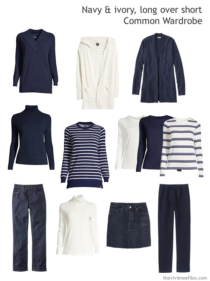
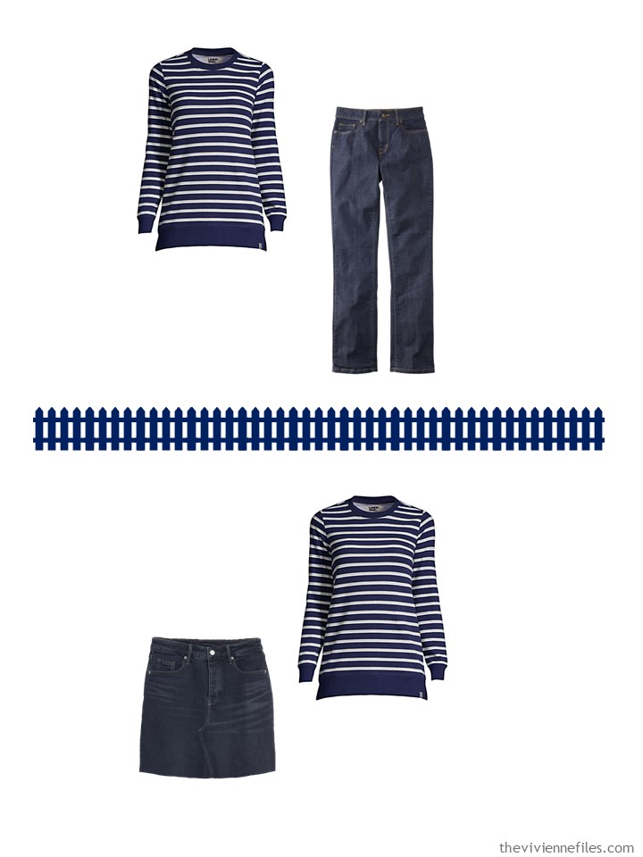
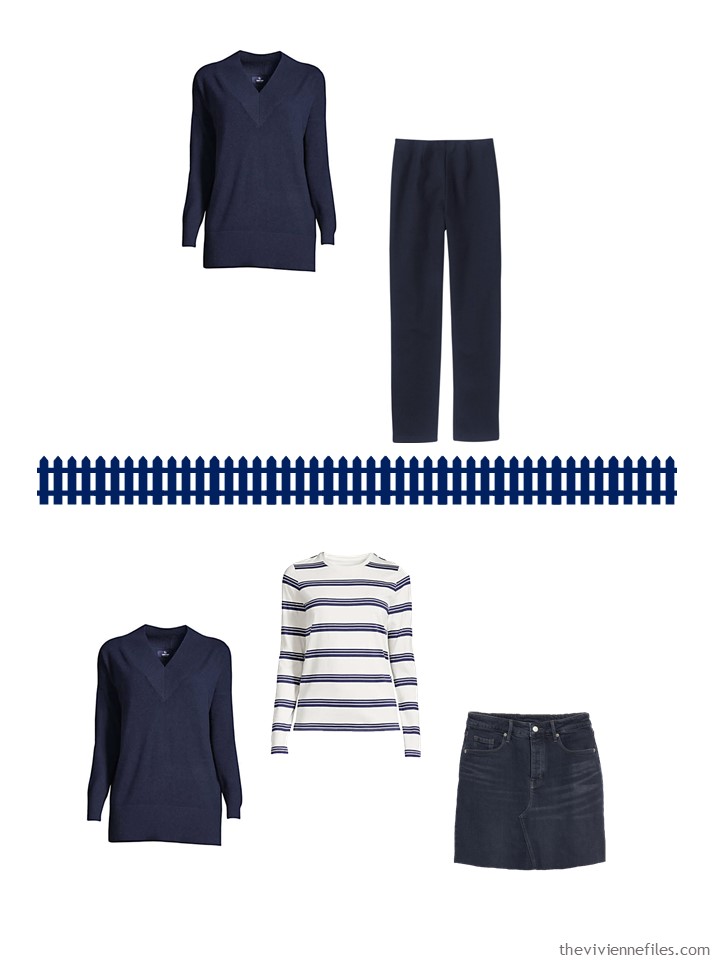
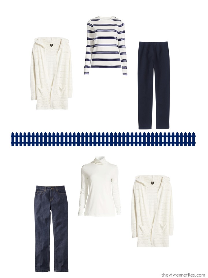
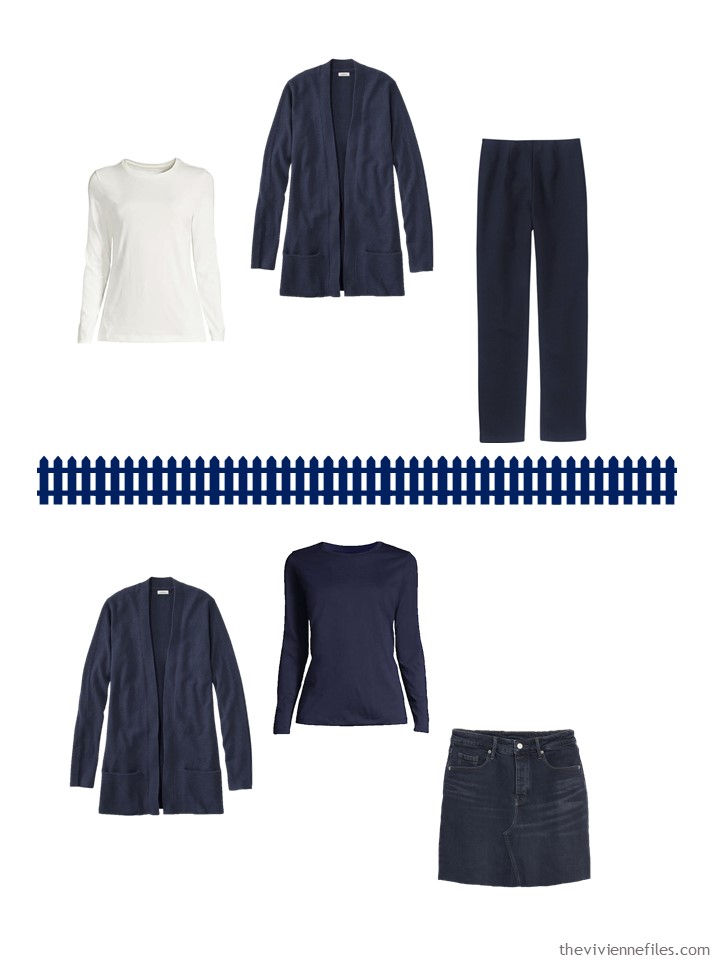
v-neck cashmere tunic – Lands’ End; ivory pointelle hoodie – Bobeau; navy cashmere cardigan – L.L.Bean; navy cashmere turtleneck – Lands’ End; striped sweatshirt tunic – Lands’ End; ivory, navy and striped long-sleeve tees – Lands’ End; jeans – L.L.Bean; ivory turtleneck – Lands’ End; denim skirt – Old Navy; navy knit pants – L.L.Bean
This version of The Common Wardrobe is not a long way from the original, shown below. The jeans are unchanged, the knit pants, long-sleeved tee and cashmere turtleneck are navy rather than black.
For other garments, I tried to stick with the original role that the garment played – 2nd layer, top, bottom – and then looked for a navy or ivory version, in a “long over short” option.
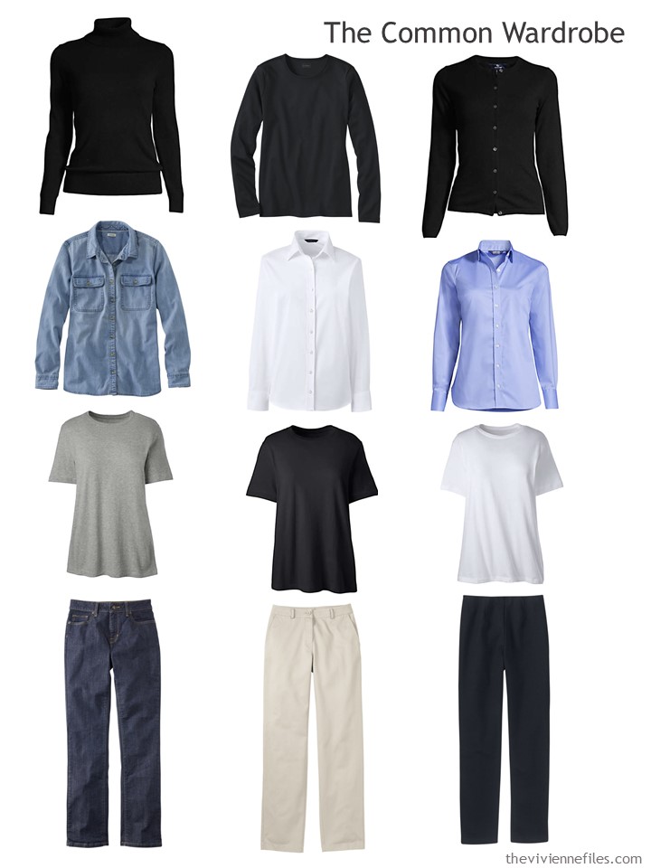
Black cashmere turtleneck – Lands’ End; black long-sleeved tee – L.L.Bean; black cashmere cardigan – Lands’ End; denim shirt – L.L.Bean; white and China blue shirts – Lands’ End; short-sleeved tee shirts – Lands’ End; jeans – L.L.Bean; stone twill pants – L.L.Bean; black knit pants – L.L.Bean
Today’s heroine has been wearing her navy and white Common Wardrobe while working at home, behind her picket fence, enjoying the ability to walk to the kitchen to stir a pot of soup or baste a chunk of meat during her breaks…
But now she’s going to have to go downtown a couple of days a week – not for any good reason that she can see except just to justify her employers renting a huge office…
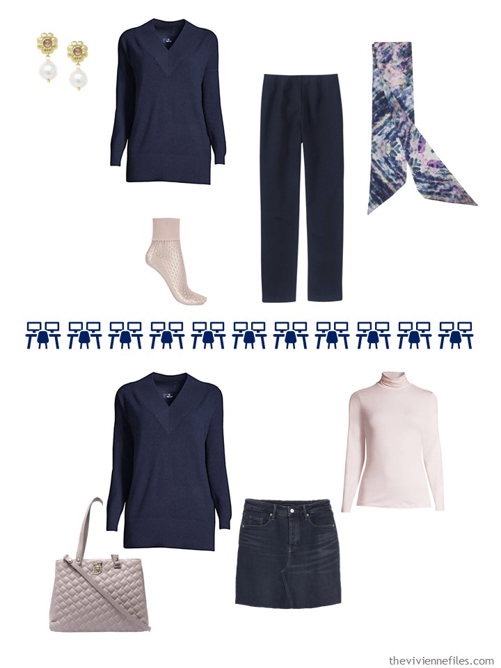
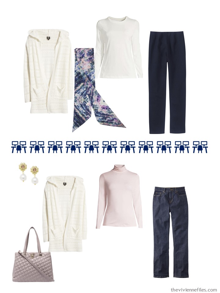
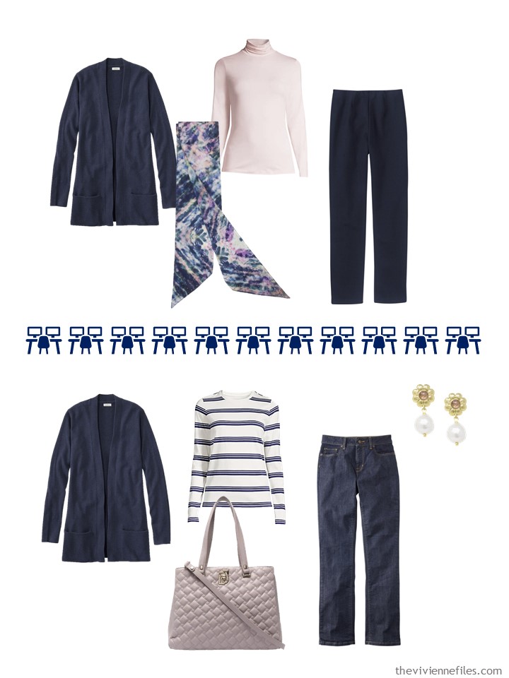
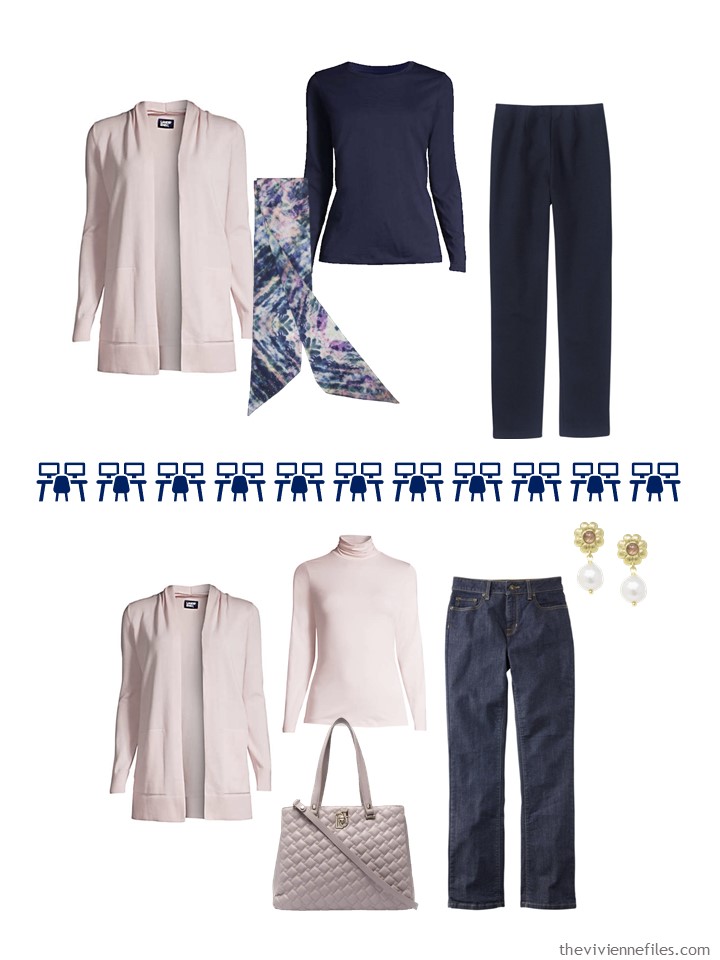
In order to comfort herself for this transition, she’s indulged in a French 5-Piece Wardrobe (plus 1!) in one of Pantone’s colors for the upcoming spring: Potpourri!
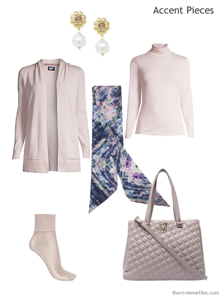
Earrings – Vintouch Italy; soft tea rose cardigan – Lands’ End; Loui Scarf – Say October; soft tea rose turtleneck – Lands’ End; socks – Wolford; bag – Liu Jo
If you’re a fan of Pre-Raphaelite art, you MUST click through the link to the Vintouch Italy earrings above; the model is the living embodiment of their aesthetic! And they have cameos…
She doesn’t plan to wear pink EVERY day, but it’s a lovely option!
Our heroine is sufficiently annoyed that she may very well treat herself to a 2nd accent color…
love,
Janice
p.s. Four years ago, our heroine was going to the opera – ALONE! Our heroines often do this, don’t they?
Like this article? Save it to Pinterest!
I always like your posts on the Pantone colours. I hope you do the rest.
I could find two lists – one for London Fashion Week where the colours include this colour Pot Pouirri. It’s quite an mix of pastels and brights. Some of them do have weird names!
However, the New York Fashion Week have issued different variations – why is that?
I can where most pinks but not this one which is lost on me. I have a polo neck top in this shade but I have to wear it under another top or blouse. It is too soft and subtle on me otherwise. My best pale pinks have a blue tint to them.
This is awesome – and I can vouch that this plan worked perfectly for me. I didn’t feel like I had to purchase a bunch of clothes to handle the client request to be in office for a three month engagement. Thank you Janice!
Also, all those readers who hate/can’t wear button-front shirts – take note: not a button-front in the lot.
The pink looks not too far off the blush color popular over the past few seasons… not my thing, but you’ve found some very nice lovelies to showcase.
True, true! No style complaints here!
Ah, the Modern Common wardrobe. Adjusted for the individual. Many of these things, or my version, I have in my closet. And if anyone wanted to continue the long over short, or just likes tunics, lands end has a 3/4 sleeve tunic version of those Pima cotton Ts. It’s helpful to read of Chris’s successful road test.
Sorry Pantone, on my screen it looks like a pink that lost all it’s color in the wash. Love the navy wardrobe though!
Love seeing the navy base… ant wait to what other accent colors you pair with it!
Love the navies and ivories, but that pink is so nondescript that I wonder why they bothered.
Not a fan.
Yes the pink is SUPER faded, but I really love how you showcase the difference it makes to add this very slight color to a navy and ivory wardrobe. I notice now that one of my problems is buying too many neutral pieces (in the same neutral!) and not enough accent or patterned pieces. It doesn’t take many to be “enough” but it does take more than one or two, for a whole season! Just a few will get you through a week or ten days, but unless you do laundry frequently, you need a few more shirts! I just keep piling up black, gray, and navy, and then I look at my closet and say “everything looks the same!” But add a color and everything looks great! Pick my light blue button-down linen shirt instead of my orchid tee, and suddenly my black pants and charcoal cardigan look totally different than they did the last time I wore them…
Hi!
I have been loving the blog for several years. pulling outfits together based on your suggestions has helped me cope with the self isolation. It is sad that I haven’t had anywhere to wear them, lol.
My question is can you suggest how wear all the beautiful scarfs you share with us. I realize that I can look this up but I would like to see how you imagine wearing them with the wardrobe pieces you suggest.
Thank you for this blog and keep styling!
Denise
The gremlins have invaded your interesting and unique post. The Liu Jo bag link takes me to Land’s End pants. Thanks for your work.
Thank-you for this. I have working on moving from black to navy as my base color, different shades of blue taking the place of ivory, with ivory, pink and red as accent colors. It’s a slow process as I’m not always disciplined enough to stick to the plan and sometimes wild card colors tempt me. You are definitely pointing me in the right direction. ?
I love the earrings which I would wear every day. I did click through to the model and she definately could be a pre-Raphaelite model. I’m fascinated to know how you found these earrings from the 10,798 pairs on the Wolf and Badger website?
Sheer dogged persistent, and filtering out all but pink!
Hugs,
Janice
You are so good at finding these beautiful accessories.
Thank you – I devote a great deal of time to the pursuit of them! Accessories are so important – we can all wear nice quality relatively simple outfits, with the accessories doing the heavy lifting of personal style…
hugs,
Janice
The link for the bag takes me to LL Bean pants!
I just fixed it – thanks so much for letting me know! It takes a village, and some days I’m the village idiot….
hugs,
Janice
Although I am a fan of navy + pink, this particular blush shade can be a bit hard to wear. I do better with it in chunky knit sweaters than in smooth fabrics…there’s so little contrast with my light pinkish skin color that the smooth fabrics blend right in. That’s great for a nude-to-me shoe but not so much for a close-fitting knit top! :D
For my navy + white fall Common Wardrobe on my blog, I tried olive/aloe vera and aqua as accents and was pleasantly surprised by how well it turned out.
I also tried my hand at a small set of Core Accessories. Janice, I would love to see what guidelines you suggest for core accessories to accompany TCW.
Janice, I just love this casual and cuddly Navy & Ivory Common Wardrobe. I would wear this when my osteoarthritis is acting up in the winter. I just replace the pants with denim long straight skirt, a long straight navy sweat skirt and a long pleated navy dressier skirt. Would love for you to show shoes, classic accessories and jackets/coats with this Navy & Ivory Common Wardrobe!! Would you please do that for me??!! Thank you so much!!
With the exception of that bland, no colour pink which would do me no favours..I need fuchsia, the wardrobe is very nice.I am black neutral all the way with olive and a shot of navy here and there. My experience has been that when one wears a rotating collection of black garments + a flattering accent colour nobody comments…change that to navy or brown or grey and the office is all abuzz with ‘ she wears the same THING all the time’ even if ‘she’ had many ‘things’ in those neutrals. I am not sure why that is. I did not work in an artsy environment..far from it. Interestingly, I did work with many French women of various ages ( all graduate/post graduate science back grounds) Natural blondes to the most silver of hair…most dressed with exceptional style from limited wardrobes….based on black! I do have to back you up with your suggestion a few posts back about ‘winterizing’ a summer dress with tights, boots or heavier sweater. I saw that all the time not just with les jeunes femmes but older women too! At first I thought it appeared a bit ‘bag lady’ but gradually warmed up to the look and started sporting it myself!
I have to say, I’m LOVING the modernizing/ personalizing of the Common Wardrobe. This iteration is closer to me than the original, but not quite there yet… I wish I could figure out what the modifications to make it there would be!!! I hope you keep demonstrating these alternative Common Wardrobes :) I agree with several other commenters, that shade of pink is not for me. BUT the concept, as always, is fantastic.
So, to expand a ‘common core’ : 1x French 5 for small capsule work/travel; 2x French 5 for a Garde du Robe, 4x French 5 for a 333? (I enjoy the numbers game)
I am totally smitten by this delicate tea rose. I plan to order this cardigan as I have a tank and a thin sweater pullover in this shade. As someone who does not wear white well, this very shade has become my light neutral. Thanks, Janice for this common wardrobe. I am gradually veering from dark navy to a soft vintage indigo (found in several LLBean garments). The soft indigo, denims and tea rose are lovely together.
Having bought the tea rose fleece jacket, I would suggest that if you’re at all interested in this color, go to the Lands End website and assess, because even there the shade of pink looks very faded compared to the color you actually receive. I have to wonder why the company did not make a better effort to show the color as accurately as possible, although the images of the turtleneck and cardigan shown above may very well come to you as a much lighter pink than the fleece. Hard to tell without buying something. In my opinion, the shade of pink I received is excellent for pale people like me with a blue/pink undertone in our very white skin. I can see how it would wash out almost anyone else though.
SO glad the shade works for you!!! Thanks for sharing :) Sometimes, when there are so many comments against a color, it is comments like these that keep my eyes from rolling at the source (in this case Pantone) with the “what were you thinking” (instead of the desired response: not for me, move on, with no judgement). Hopefully every color out there is loved by someone!!!
I totally agree. I even went back to give it a second look on the Land’s End website. Just too pale for me- but then orange doesn’t suit me either, and I can totally appreciate it in wardrobes and on other people.
The neutral wardrobe works every time! I’m travelling right now with grey/pink. My pinks are different shades but all work well. I bought myself a pink/mauve bracelet as a souvenir. Travel with the common wardrobe is fail-proof. The reception desk lady remarked on how she liked my outfit.
After following you for 10 years, I think that I’ve got it down to an art. Merci!
I’m also glad to see the common wardrobe revisited along with examples and encouragement to modify it to suit ourselves. I really enjoyed the long over short theme to this one. Finding the colors you’re looking for, in pieces that actually work together can be hard. Silhouette is one of those things that trips me up at times.