August 13, 2021
Happy Friday, the 13th!
We often ponder the merits of having a LOT of accent colors in a wardrobe… I think this post might offer an idea of how to manage them all!
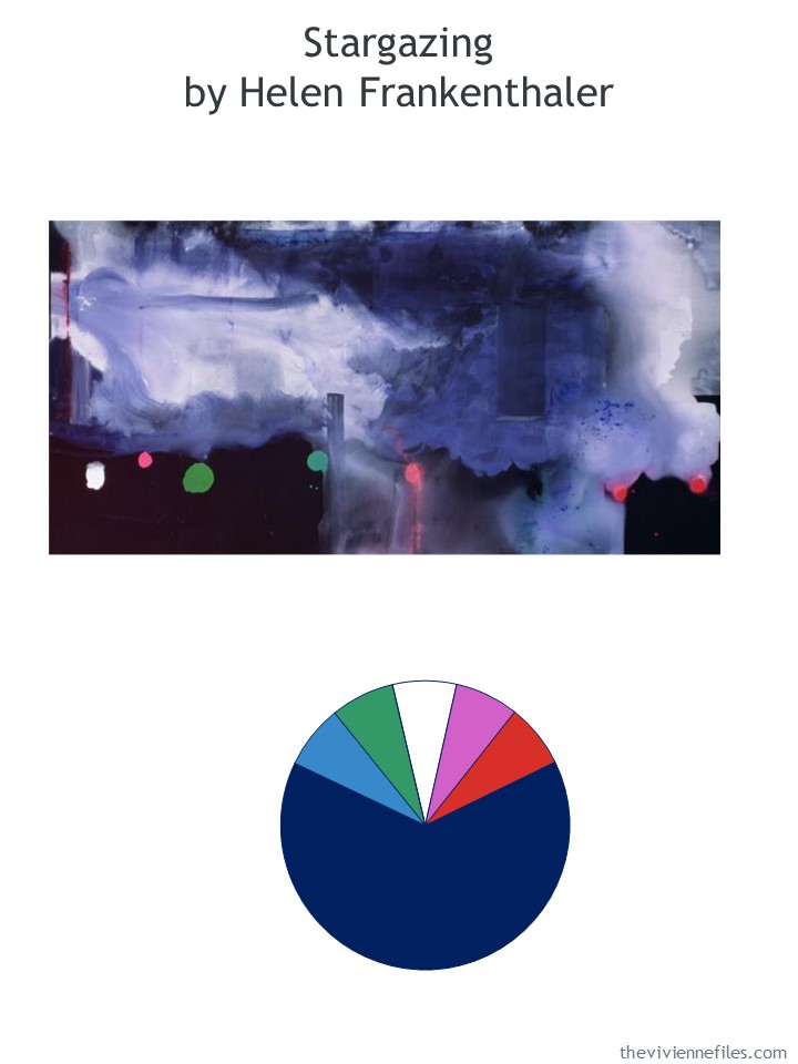
This heroine understands that she needs quite a bit of navy to establish a base for her wardrobe. After that – watch out!
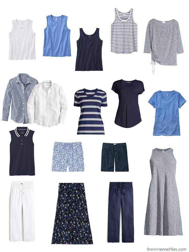
She starts with this – yes, it looks familiar:
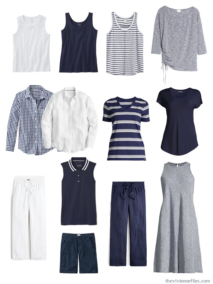
White tank top – L.L.Bean; navy tank top – L.L.Bean; striped tank top – Caslon; 3/4 sleeve top – Caslon; navy gingham shirt – L.L.Bean; white linen shirt – J.Crew; striped tee – Lands’ End; navy tee – Lands’ End; white linen pants – J.Crew; sleeveless pique polo – Tory Burch; navy Bermuda shorts – L.L.Bean; navy linen pants – J.Crew; dress – Lands’ End
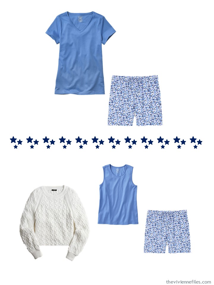
Of course, I would be perfectly happy with this – I’m content with neutrals. But our heroine has other ideas, starting with bright blue!
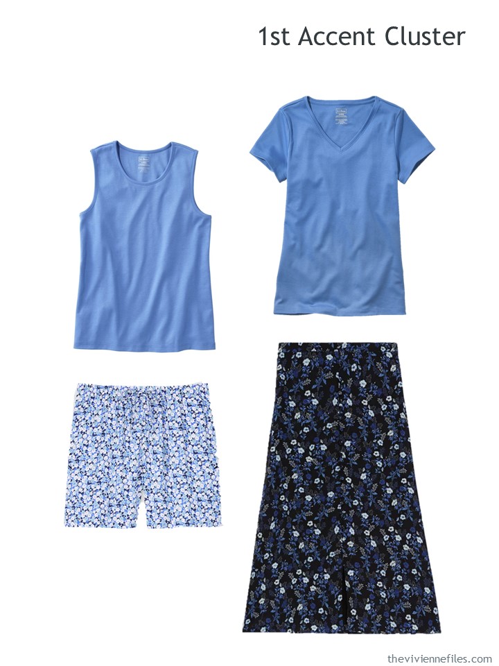
Tank top – L.L.Bean; tee shirt – L.L.Bean; Floral shorts – Uniqlo; skirt – The Kooples
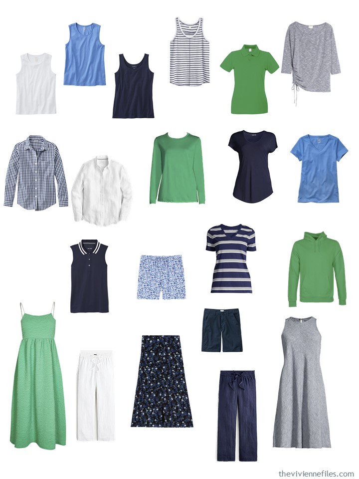
Just out of curiosity, this is what her wardrobe would now look like with these additions. Yes, it gets her to a “4 by 4” Wardrobe plus 1 garment:
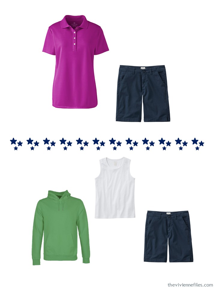
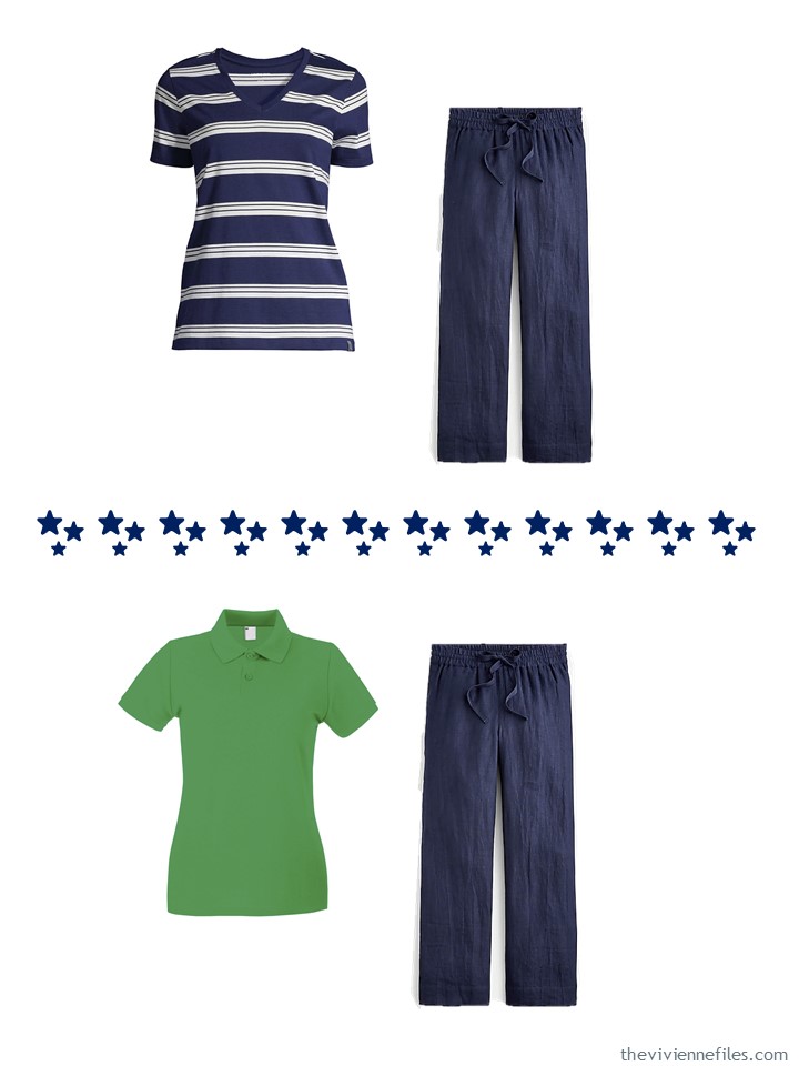
But she’s just getting started – let’s toss in 4 pieces in bright green:
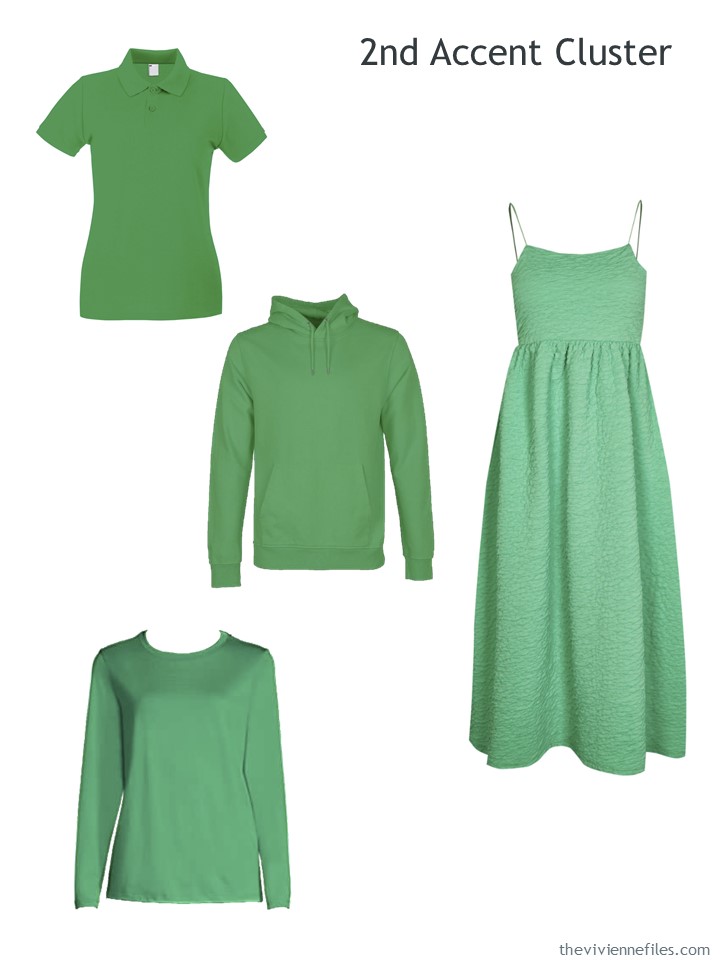
Polo shirt – Universal Textiles; hooded sweatshirt – Colorful Standard; long-sleeved tee – Lands’ End; dress – River Island
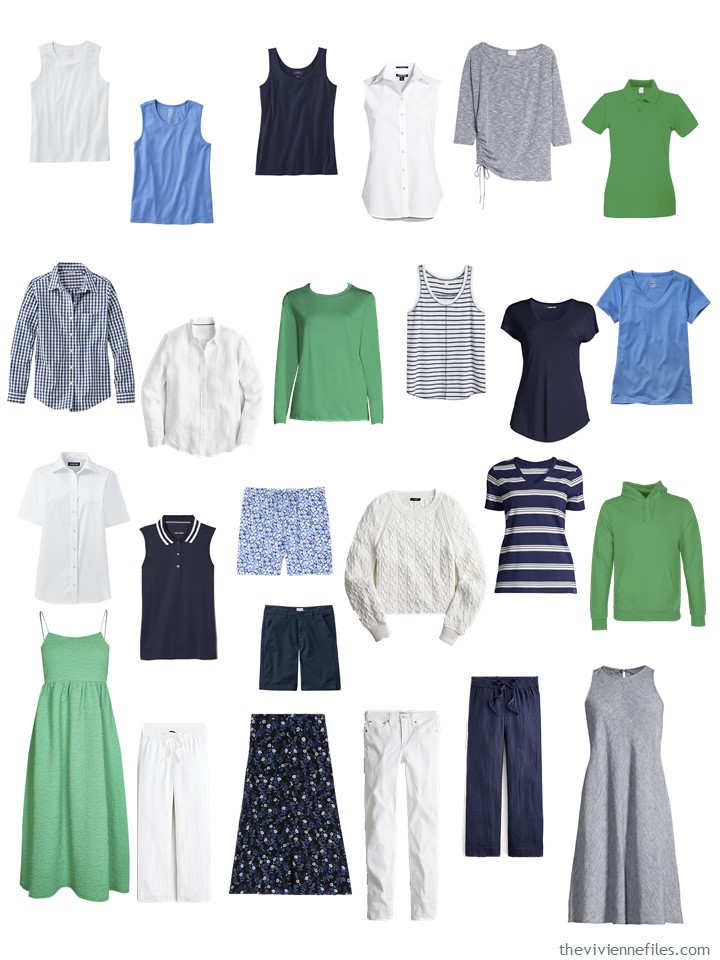
Now when we look at her entire wardrobe, it takes on a different, brighter feeling:
Okay, I admit that white is not strictly an accent color! But she really would like a few more things in white – they’re SO useful when the weather is miserably hot:
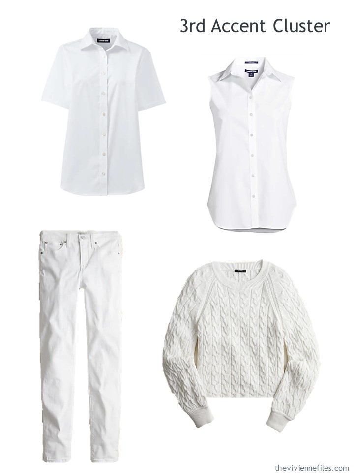
Short-sleeved shirt – Lands’ End; sleeveless shirt – Lands’ End; white jeans – J.Crew; sweater – J.Crew
This wardrobe is really taking on a personality!
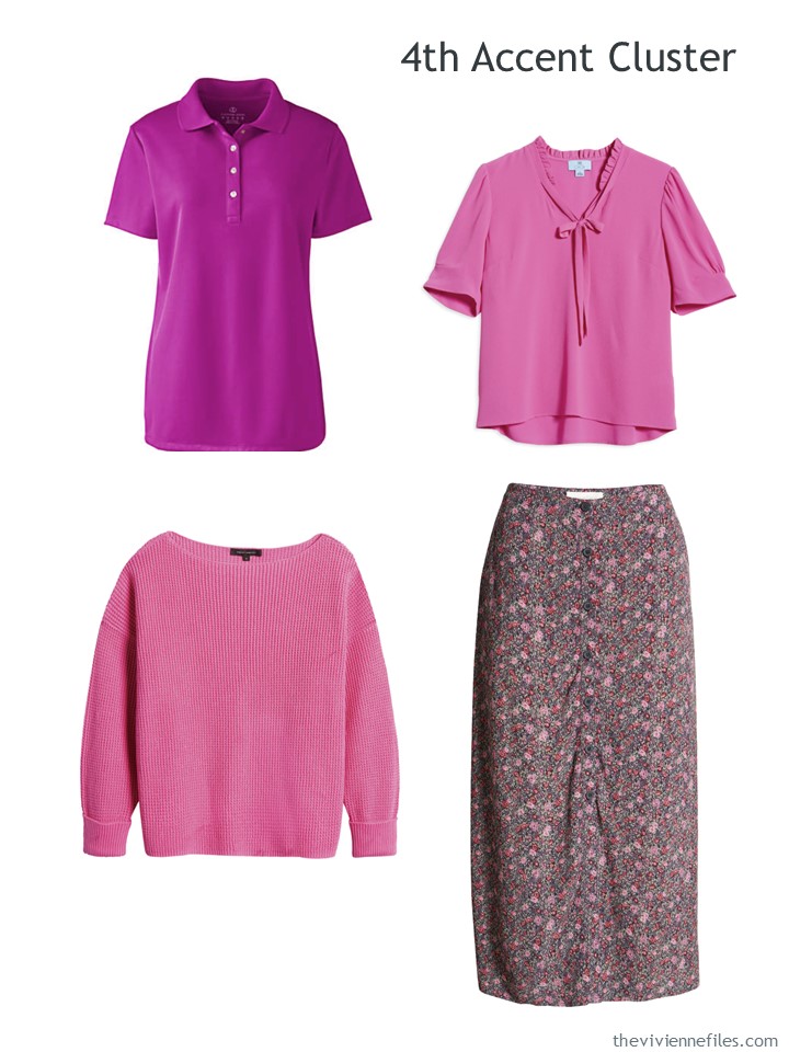
Many of us could stop right here and be more than content, but this particular heroine is still looking at TWO more accents. First up – pink in bright and strong varieties:
It’s just 4 more garments, but it flips the feeling of the wardrobe into something bolder and brighter:
And why NOT some red?
because it’s shockingly hard to find… that’s why she decided that she would grab some white shorts with her red things!
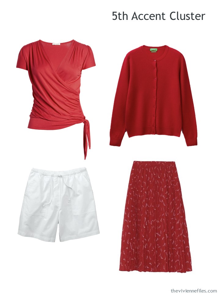
Faux wrap top – Loveappella; cardigan – Benetton; white canvas shorts – L.L.Bean; skirt – Michael Michael Kors
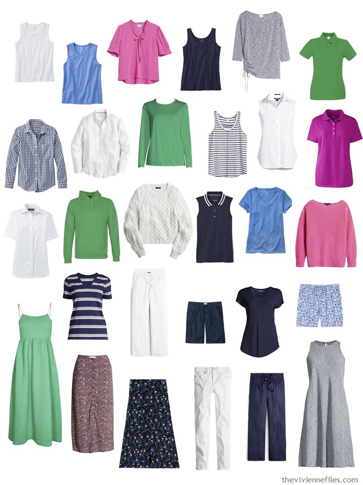
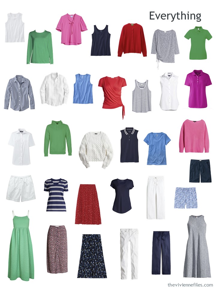
NOW she’s finished – and WHAT a wardrobe she has assembled…
My original intention was to figure out how many outfit options could be found in this wardrobe, but I’m NOT a glutton for punishment, and I couldn’t frankly think of a good reason to try to arrive at a specific number!
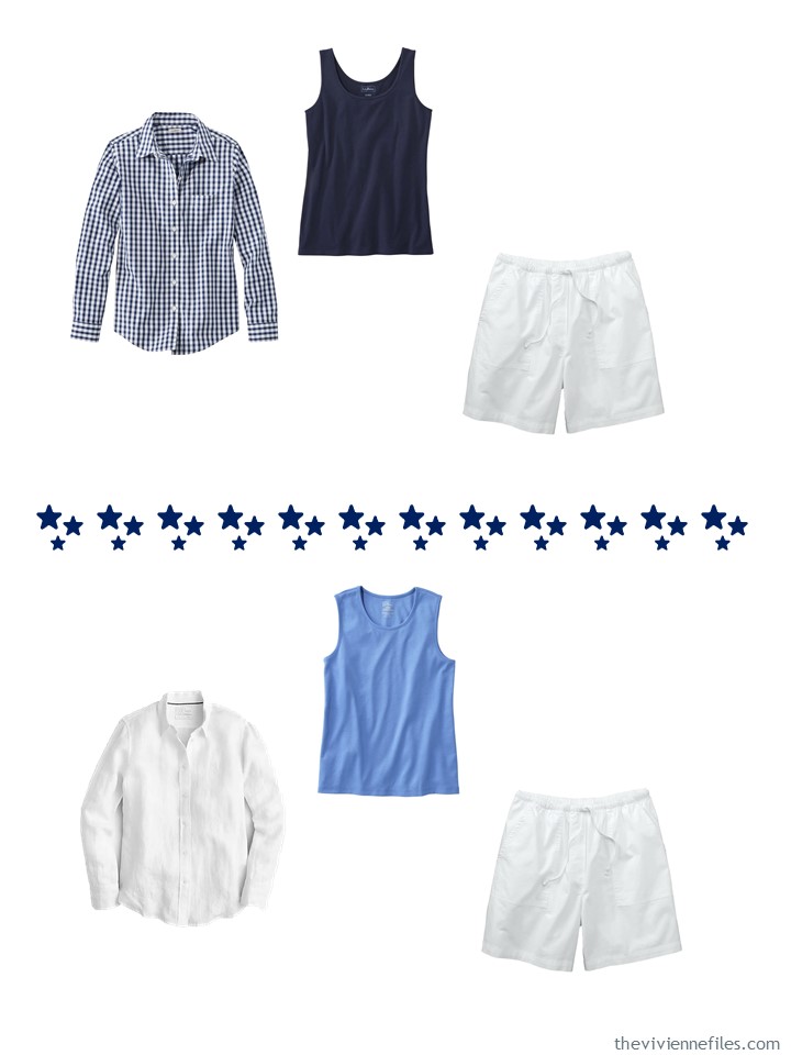
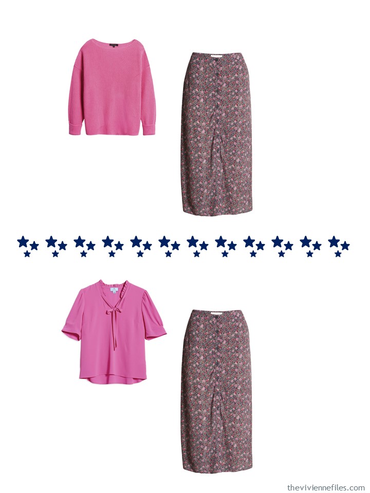
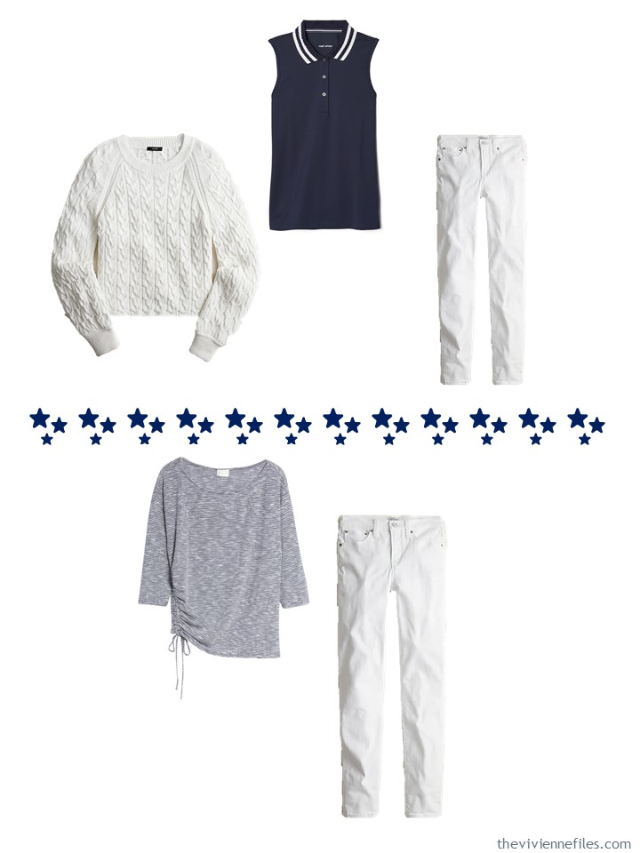
I think this heroine can be contented to know that she has everything she needs for an entire summer; here are just a few possibilities:
You may not have noticed, but this wardrobe is 33 garments! Not exactly what Courtney had in mind for Project 333, but I’m sure she respects any effort to organize and control clothing…
love,
Janice
p.s. Seven years ago, the wardrobe of the day was in navy, grey, teal, and burgundy. It still looks pretty good!
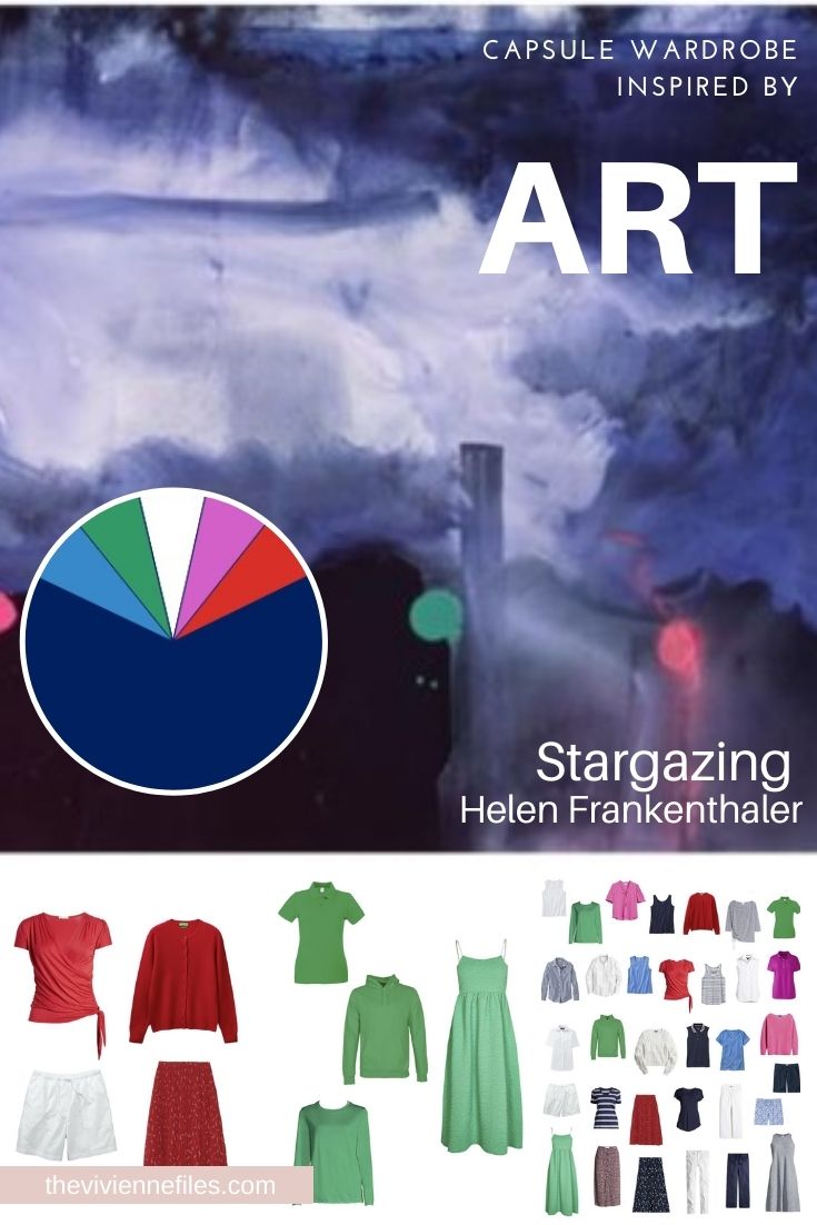
Like this wardrobe? Save it to Pinterest!
This reminds me…. stepping out on my deck now to check out the Perseids.
Stunning painting, Janice. I’m going to have a real good try at creating an autumn wardrobe of 33 items but it might end up as 52!
Dark blues and grey/taupe will be my base neutrals with shades of lighter blues, shades of pink/burgundy, shades of purple and teal.
The first step will be to try everything on and ONLY put the clothes that FIT me into my wardrobe and drawers. I’ve been struggling to lose my lockdown weight gain for nearly a year. Many of the items in my summer wardrobe are just wishful thinking. They fit me in the summer of 2019 and I assumed that I would have got back into them this summer. This has been a cause of frustration.
So, apart from a brief heatwave that we may get in a couple of weeks, I’m going to plan for autumn/winter. I’ll store the items that don’t fit because I’m hoping that a new exercise regime will bear dividends by next summer.
Thanks for all your help, Janice. I’m getting back to activities so I want to look my best.
Beth T- As to the trying things on and storing what doesn’t fit, I did that a few months ago. Even though I knew I was wearing only a small portion of my wardrobe, I was a little shocked when I saw the results. But I eventually felt better for the clarity. And motivated.
Thanks for the encouragement. Then the battle is to avoid filling the perceived gaps created by clothes in storage. A good exercise in self-restraint and ingenuity for devising new outfits.
Re: avoiding filling perceived gaps: I resemble that remark! It’s a struggle. I wonder if taking one’s capsule to the next step of generating and documenting how many different outfit possibilities exist in the capsule as it stands would help with that. Janice didn’t do it here for obvious reasons, but I find that once I start working through that math, I realize that I already have more possible outfits in the wardrobe than I could wear in the season. And that empirical demonstration helps put the theoretical “gaps” issue to rest. I get it that one of the appeals of the capsule wardrobe is that it makes it easier to get dressed every day without planning outfits in advance. But I suspect that for many people, capsule wardrobe + outfit planning > capsule wardrobe alone.
I have the same dilemma Beth, and have decided to take myself in hand too. I’ve planned out an exercise regime that is do-able for me that incorporates cardio, strength and flexibility training, but I also realise that my diet is need of an overhaul too. Some small adjustments at first I think – nothing major. Pity, as my bread and cake making skills have come on a treat!
Cake making for my in-laws was my lockdown slip up. My husband wanted me to make us cake too….
This is along the lines of how I arrange my wardrobe, navy up one end black up the other, white in the middle and then colours grouped together between them. The colours are the whole spectrum but not muted, greyed or yellowed ones. I was moving away from black for a year or two but it’s made a big comeback for me.As a neutral against now silver white hair it looks quite edgy and not too harsh yet. Navy is great for summer though.
Julie in Melbourne
Thanks soooo much for creating this palette. For me it’s perfect – all the colours I want and love. I’ve been struggling to put together a capsule to incorporate them all without seeing a sample. You’ve made my day! ??
Beautiful painting. Beautiful capsule. It’s very difficult to tell on screen, but it looks like the Treasure and Bond skirt has some tiny red flowers in addition to the pint. The red Michael Kors skirt just might have pink splashes. I’m not above wearing a pink top with that red skirt if there’s pink in the print. If you’re packing for a trip, sometimes one lovely print skirt and 4-5 tops will do the trick. And I would surely try a striped top with one of the small prints. This capsule has endless possibilities, doesn’t it? It would also be easy and fun to accessorize.
Now I feel better about my smattering of yellow/gold, (not navy) blues, and greens in my wardrobe. I wear a preponderance of reds and purples, but sometimes just fall in love with something a little different. The yellows, in particular, REALLY cheer me up during our gray winters. Thanks for pointing out all things are possible, even a lot of accent colors! Have a good weekend everyone!
Janice,
I have changed ! After always thinking that I had to have a crammed closet to feel that I had enough options, I looked at your lovely composite here and my first thought was” that’s too many clothes “ ! It isn’t , of course, but I am so used to seeing your more limited formats that it seemed so much of a larger comparison.
I don’t wear tank tops alone , because of exposing my “ batwing” arms, so that would cut down on some of the pieces, as well as eliminating the dresses, though I would love to look good in them !
The take away lesson here is the use of a neutral base , then adding accent colors in cluster amounts , for versatility , with fewer shoe and accessory requirements, which for me is beige in the Summer, with a rust brown as a second neutral in more of an accent role, or olive green as an accent neutral, along with off white , aquas, some teal, peach , coral and yellow as the actual accents . In order to keep the total numbers down, I try to keep the accent colors limited to two or three pieces of any given color so that I can include more colors without the jammed closet feeling .
Your accent colors here lend such a joyful feeling to what otherwise could feel very monochromatic , which I could not stand wearing just that after a while . I crave a balance of neutrals and color and this post floats my boat !
I agree! My first reaction was “Wait, this is too many clothes!!” Janice, you have converted us to minimalists!
Shrebee, it sounds like we share the same wardrobe. Narrow shoulders eliminate tank tops for me and I use all the same accent colours that you do.
Yes please!!!!! I’d love more focus on a core base color and a variety of accent colors – I like to mix it up based upon mood and season (bright pink in spring, wine in fall). Could you also occasionally focus on a few more muted color accents rather than brights? Thank you!
Love this concept and colors. I usually wear cobalt blue and emerald green and have scarves in these colors too. Thank you for showing how to work with more than one or two accent colors. I don’t wear skirts much any more but I do wear simple sleeveless dresses in the summer. And I only have one pair of shorts but usually wear capris or cropped pants. These are all colors I have in my wardrobe now and you’ve given some ideas on how to put things together. I really like the white pants with the gray top, very cool and simple.
This collection is just beautiful, Janice! Thanks so much for putting it together! I love the accent cluster ideas, as it is a great way to add on to a wardrobe without getting carried away! :)
Thanks for all of your ongoing inspiration!
This is my favorite so far! I love the concept of a core of neutrals that I add to with accent clusters. I’m sure there is a name for this approach but I’m too new to know. I’ve lost a lot of weight recently and gone gray so I need to update almost everything. I think this approach can work wonders for my wardrobe and my budget. Thank you.
Your work is remarkable! Appreciate all the time/effort you put into these wardrobes. Many thanks for helping us put more thought into what’s in our closets, how to make combinations, and how to shop. Everything makes so much sense!
What a wonderful wardrobe! I love the variety of colors and seeing how you grounded it with a base helps so much. I agree that it looks like a lot, but then I look at my closet and see more…. Still, I’m assembling a capsule for fall and feel really good about it with this perspective.
Janice, you are great at appealing to so many different wardrobe personalities! I am very content in my primarily all neutral wardrobe. My mind just cannot wrap itself around all these colors. Maybe it’s because I am a light summer and wear low contrast outfits. Who knows? It seems a lot of the other readers thrive on color. This post would certainly be a great guide for them. You are the best and I so look forward to my morning visit to TVF.
I also work from a base of navy and grey, but like the bright additions. But the 2 dresses seem to be left out in the cold—no second layer for cool nights. An elbow-length white cardigan would top those out just fine, also providing a light over-top for all the white bottoms and red skirt; a long sleeve navy open jacket or cardigan would accomplish much the same thing with (a little) more warmth, and turn all the navy bottoms into “suits”. I prefer solid color skirts to prints because all the tops will work with them , even stripes. Bet you can tell I’ve been reading your blog for years, and have learned a lot!
I’d love to see some colourful accessories with this wardrobe.
I second the motion…
Thanks for showing us a somewhat larger wardrobe with a good variety of accent colors. While I know many think this capsule has “too many” clothes in it, this is actually a pretty aspirational wardrobe for a lot of people. :D
I like the accent cluster approach here, and 4 (or French 5) pieces feels like a good number for each color.
I would love to hear more about the thinking that goes into building this kind of capsule. We have heard a lot about building the navy/white base, but how about the accent clusters?
Some of my thoughts as I worked through the post:
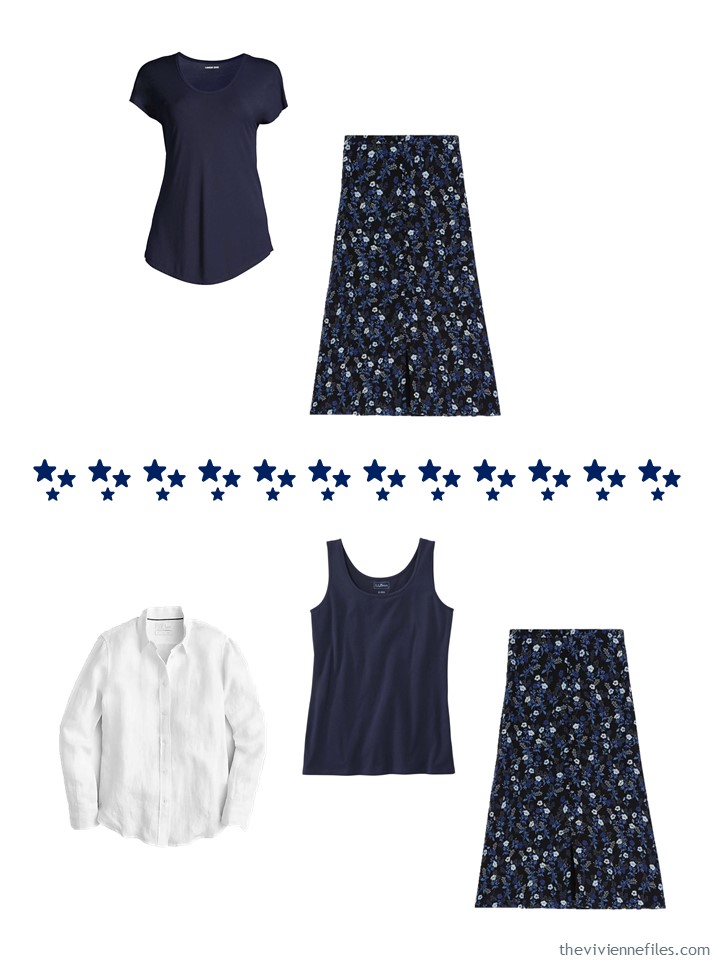
1st Blue cluster: I like the practical tops for layering, and 2 floral print skirts that work with all the base pieces, including the striped/check prints. The floral skirts do not anticipate any of the other accent colors though.
2nd Green cluster: 3 tops of varying styles that do not layer but work with the solid and print base pieces. What’s up with that sundress? Do you wear a white LS shirt as a jacket? It needs a cardigan! Maybe we’ll get one later…
3rd White cluster: I hope this heroine LOVES a white button up shirt because she has 3 of them but no basic short-sleeved white T! I would definitely sub a white SS T for one of the shirts. Oh, the white sweater is a pullover style? For summer? Definitely sub a white cardigan. We need it for the sundress and it will be much more versatile than a pullover style for layering.
4th Pink cluster: The polo shirt seems like an outlier color-wise but still works with the base pieces. The floral print skirt works with the two other pink tops and the base solids (and probably the prints too). Again, this skirt doesn’t readily coordinate with the blue or green accents, though.
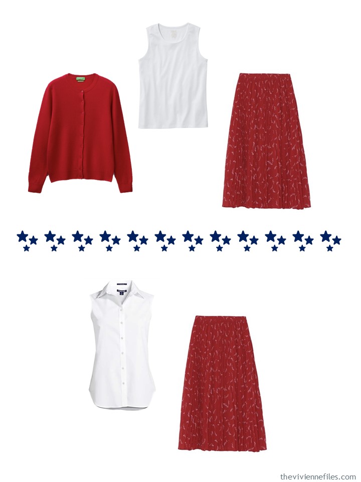
5th Red cluster: Will the red top and cardigan work together? I’m not sold on this cardigan, it doesn’t feel like the best use of this slot (though given there are no other cardigans in the wardrobe, I can see why it was chosen on that basis). It doesn’t readily work with the sundress. The red and white skirt will work with the white, red, and probably the navy solid pieces. Again, doesn’t readily coordinate with the other accent colors.
My overall sense here is that the accent colors are very siloed. I think if a heroine were building around the full color palette from the beginning, it might behoove her to consider some prints that combine accent colors. But we know that TVF capsules generally don’t show much in the way of outfits with 2 or more colors in them; it’s a lot of all neutral or neutral +1 accent. If that’s the way this heroine wants to go, that works fine, of course. But there are definitely people (raises hand) who say “I want a lot of color” who also will at least sometimes want to wear multiple accent colors in an outfit.
I would love to see this wardrobe accessorized. That may be where the prints-with-multiple-accent colors come in?
I also wanted to see what people think of the Blue cluster including the same knit top in sleeveless and short-sleeved versions. I waffle between thinking “oh that’s smart, if something works with one, it’ll work with the other” and “well that’s two things that are basically the same and isn’t that a waste in such a small capsule”? (Yes, every capsule on TVF is a small capsule to me, haha.)
Also LL Bean really missed a trick here. When I went to look at the Light Ocean tops, they gave me a “People Also Viewed” section showing, among other things, a camisole and down mittens (?!), but they don’t provide any information or links about whether other coordinating garments come in that Light Ocean color. Wouldn’t it be much better to let me know that they have a nice lightweight cardigan in Light Ocean also? Because if I were buying this tank and T-shirt, I would be VERY open to the coordinating cardigan to make the twin set! We all know that it’s much easier to buy the twin set up front than to try to create one later. (Searching on light ocean in the toolbar, they have a bunch of Light Ocean options, including a nice cotton cardigan that Janice has linked to before.)
Maybe the reason I favor neutrals is that I lack this creative analytical skill.
I would have loved to include things like a skirt that included all of the accent colors, but I was limited by what’s available in the world right now; I struggle mightily to find ANYTHING much in red that didn’t have writing on it.
This is a case where sewing would come in handy. And of course, someone building this wardrobe over time, rather than within the constraints of an 8 hour work day, would be able to be much more patient and find clothes that spanned the accent colors. Patience is key!
hugs,
Janice
You have somewhat answered the question I was going to ask about how you choose the garments for the accent groups. Whether it was selecting on availability, personal choice, sheer luck or cleverly to fill in an unseen chart creating overall balance of tops, bottoms, second layers and dresses?
Is there a formula for building accent colour groups in a wardrobe?
For me, accent colours need to have all bases covered, garment wise, so that I have total flexibility of colour combinations without compromising. I suppose, its because I prefer blended outfits a lot. So if I want to wear head to toe blue, pink, purple or teal (or shades thereof), I can or wearing accent trousers with a blended top and neutral second layer.
I’m working on guidelines for adding accents – I may have something to share as soon as Wednesday. The hardest part of this work – no question at all – is finding things available at reasonable prices, in a full range of sizes, from a decent company, with a good photograph.
Happily, I have a long attention span!
hugs,
Janice
Janice,
That has frequently been my issue ! I mentally come up with a pairing or inclusion of several colors in a color scheme, but then find it nearly impossible to find garments that include two or more of those chosen colors ! I have to patiently wait until I find a print with ANY of my colors , and hopefully more than just one color, and then build the capsule around that existing find !
I wish someone would market to just “ warmies”, like myself, with combined colors in the prints and in petite sizes ( large petite sizes ) ! And a range of print sizes for those of us who try to select the proper scaled prints and color contrast levels for our own dimensions and personal contrast values !
Garment industry, are you listening out there, I hope ?
Wow-this is me. I love my core neutrals of navy and white, and after losing 55 pounds in 2020-21 (on purpose!), I hit Macy’s this past spring. I concentrated on kelly green and hot pink. I already had some red pieces I shrunk back into, and branched out to include bright blue. I have more than 33 pieces, alas, but I have gotten a lot of mileage out of this color palette.
Now to figure out what I need to add to make this suitable for autumn and winter.
Oh my heavens! I think you must have been inside my head with this one! I’m one of those that just loves color and often struggle with creating a capsule that truly feels like it has enough variety yet is still cohesive. In the past couple of days, I have had a renewed interest in trying again. It seems amazing that there are only 33 pieces here. Earlier in the year, I focused on bringing in some white and navy core pieces, along with some beige khakis, so I have a start on creating something like this. I think I will use beige instead of gray and will want to include some denim as well. Skirts aren’t very practical for me right now but I agree that if I could find some print fabric that included a couple of the accent colors, sewing one up would be pretty easy to do. I, too, would welcome accessories for this grouping. I also really love that you used the bright green as an accent because it is one of my favorite colors and can be so hard to find in clothing. Thanks for working so hard to come up with solutions for all of your unique readers!
This color palette is basically where I aim to be in a few years! I started out with navy, white and pink this summer, and plan to add turquoise/blue, red, and who knows what in groups of 4 as the seasons go by.
Love this so much… Almost feels like my request which I emailed in couple of months ago. These are almost the same accent colours that I dye my hair. I have been working a navy base wardrobe which has taken years to develop but really does make everything else so much easier.
Then my hair rotates between royal blue which fades beautifully over the weeks to a pastel / chambray colour, hot pink which fades to soft baby pink, Purple which fades to lavender and finally some silver. I have started putting together clusters in these hair shades. So you can see quite an extensive collection of clusters is required to make this all work. One tip I can add in from the last 4 years experience in experimenting with accent colours (My hair) is to have core garments in your eye colour or any distinctive body colour you have. This personal consistent colour can always be worn and will always look good. All my hair accent colours look fantastic with the rich brown of my eyes. This is a very recent lesson I’ve learnt but it’s making the accent changes easier. Also funnily enough I’ve found keeping my eyebrows & eyelashes tinted a dark colour keeps face definition. I did experiment with tinting my eyebrows to match my hair colours but this just looked SUPER WEIRD. I’d love someone to explain why.
If this all sounds complex … well I suppose it is but it brings enormous pleasure to me and those around me so I don’t mind the effort.
I learned a lot from this post as I’m trying to add accent colors to my core neutrals. I agree with Sally in St Paul’s comments on accent colors. The prints in the light blue and pink work well with one of the core colors, but the print in the red only works with the white accent color. The green is a nice contrast color where you could wear one of the tops with navy or grey or the dress on it’s own but it doesn’t work as well as the light blue or pink cluster. I look forward to your adding accessories to help integrate the accent colors to the core. I wear different browns as my core colors and it is hard just finding reasonably matching browns. I mostly wear warm accent colors but do like to use greenish blues and some purples as accent colors. I’m always on the lookout for scarves that combine these color but am now also using FierceLynx bracelets. I prefer gold metal, ordered the few bracelets available in it, and asked for more. I got a prompt response back and learned that they can do a special order where they substitute gold metal for the silver. So I’m getting the July Summertime bracelet with gold metal, carnelian stones, and teal aparite that will look nice with my coppery brown core and teal accent garments. I’m born in July so that makes it extra special. Janice, I hope you will post that FierceLynx can do these special orders to make their bracelets work well for those of us who prefer gold metal.You make the request for gold metal in the notes.
I would so wear this wardrobe. might throw in a relaxed navy blazer in case I had to be business formal.