June 9, 2021
Ah, you would have laughed if you could have seen me starting this post – I thought that I would just open ALL THIRTEEN of the earlier posts, and copy things from there…
Now remember, since the beginning of the pandemic, I’ve been blogging from a laptop!
Just as well it didn’t work out – many of the garments from early weeks are long gone in many sizes…
So I’ve used quite a few familiar garments, and picked up some new things to fill in the blanks!
I really like to show these wardrobes to reinforce my personal conviction that these classic garments can come together to give you a great travel wardrobe, or the base of a Garde Robe du Mois.
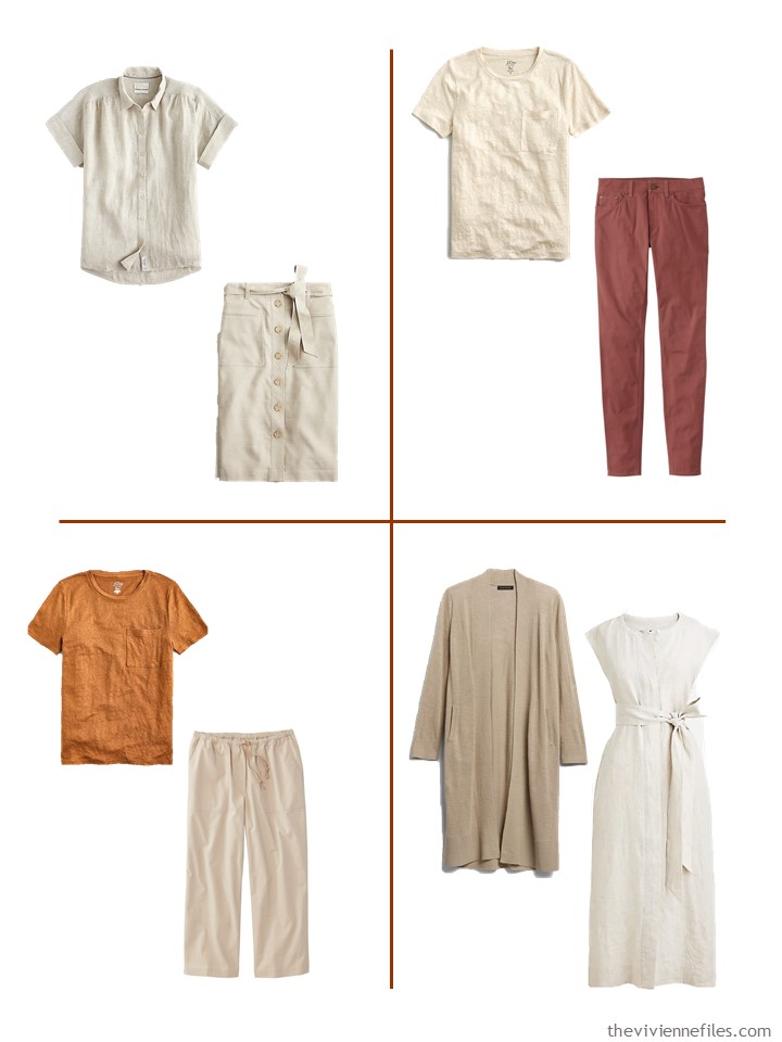
I love the subtle elegance of these colors:
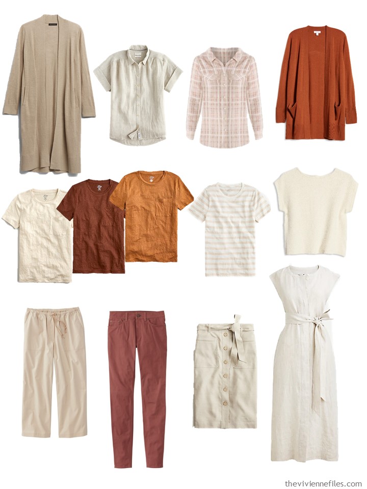
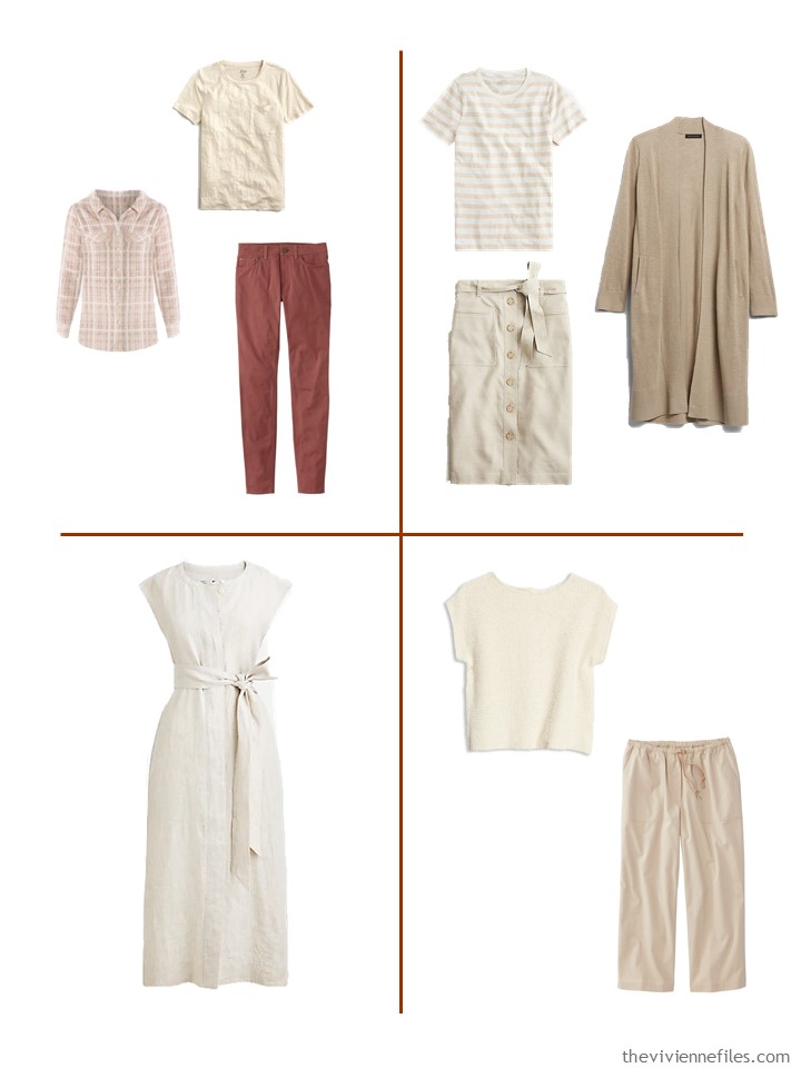
Beige linen blend cardigan – Banana Republic; flax linen shirt – J.Crew; seersucker plaid shirt – Chico’s; rust sequoia cardigan – Nordstrom; pale sand, dark twig and burnished pecan linen tees – J.Crew; striped tee shirt – J.Crew; cream button-back sweater – Madewell; coastal tan cropped canvas pants – L.L.Bean; pale sienna pants – L.L.Bean; flax linen skirt – J.Crew; linen shirtdress – J.Crew
Just imagine this with gold jewelry, elegant, simple sandals, and a couple of nice handbags… (should I do another post with accessories?)
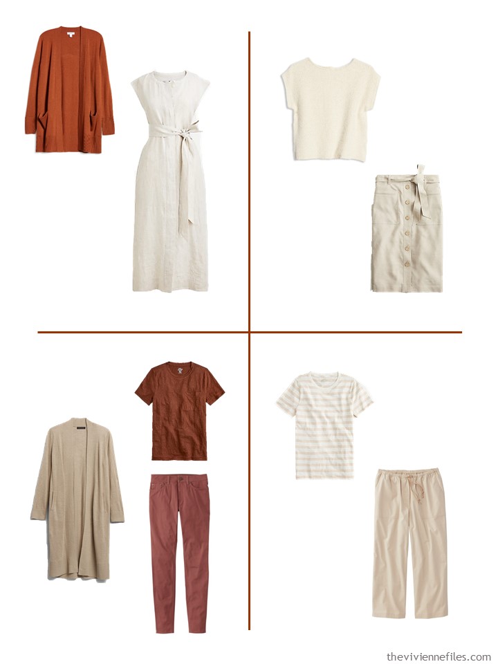
So many possibilities for how to combine these pieces; I believe that this wardrobe might be foolproof…
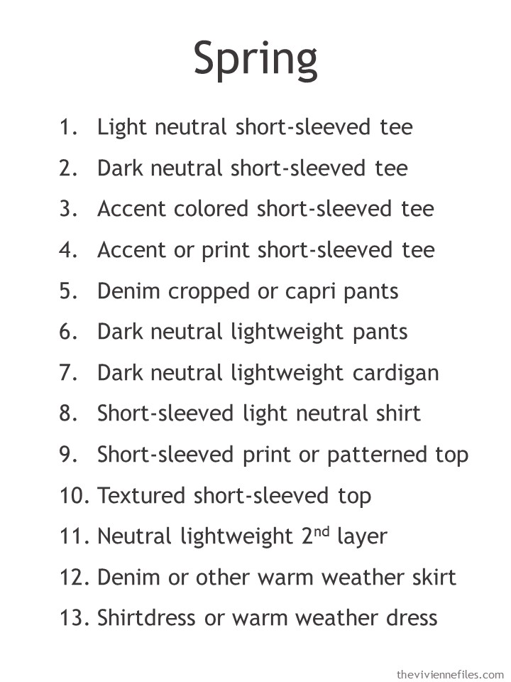
For your reference, the 13 garments that are included in these wardrobes are as follows:
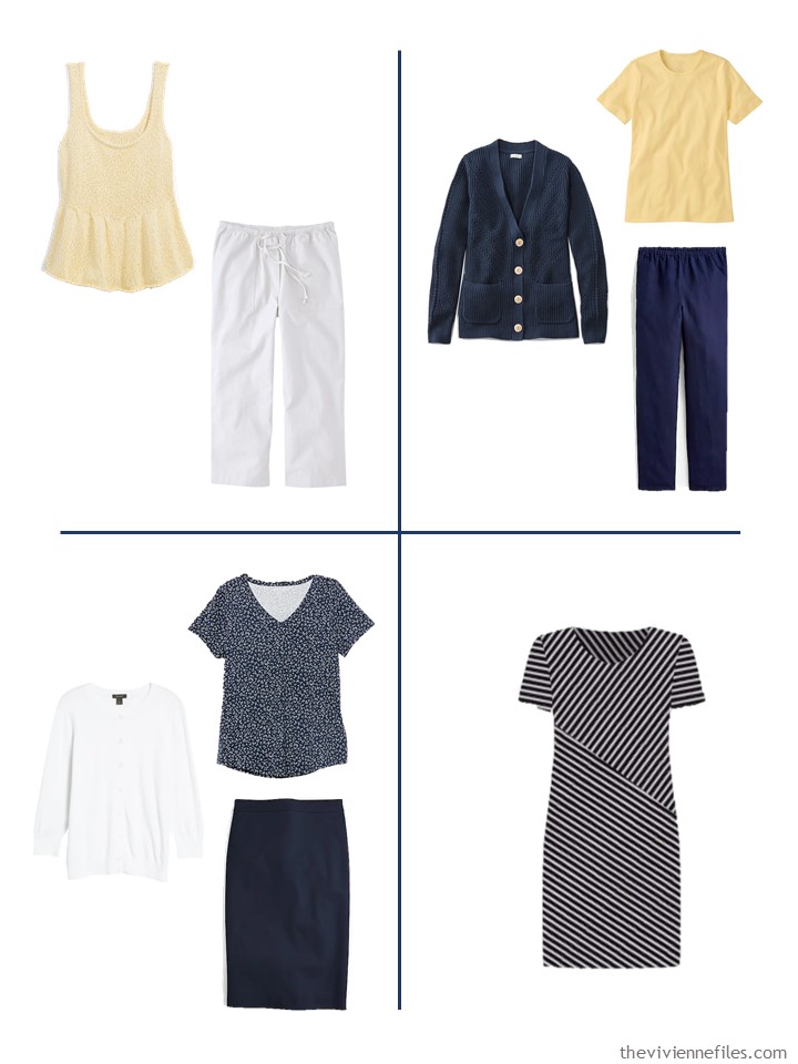
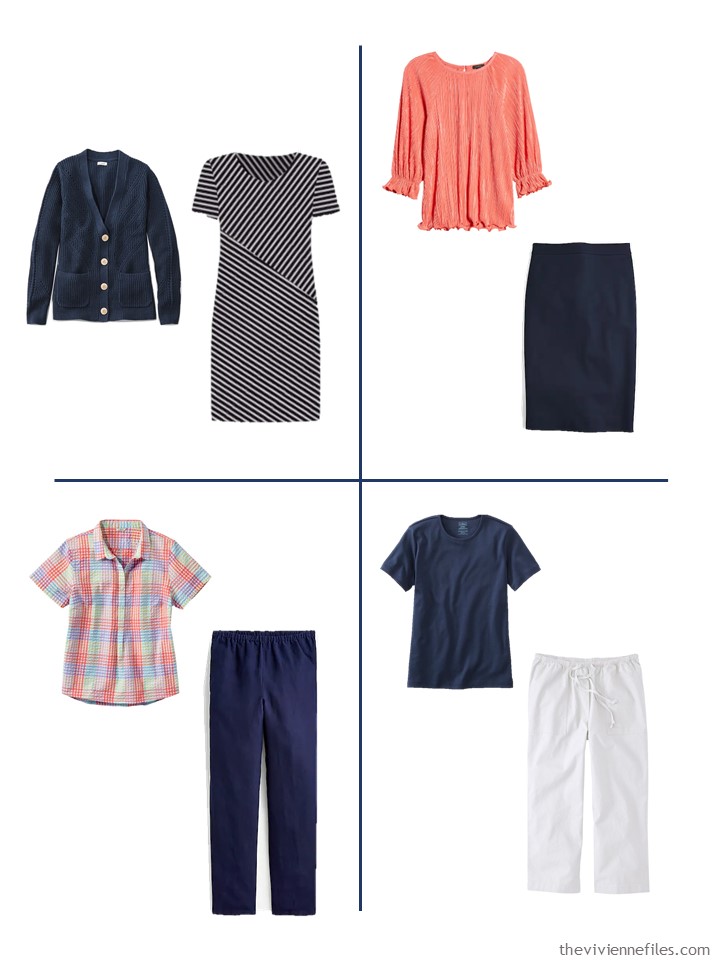
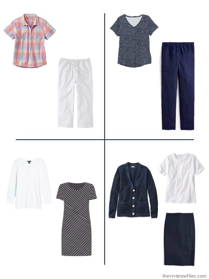
Another version, based on navy, uses coral and yellow as accents:
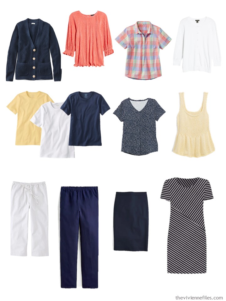
linen-blend cardigan – L.L.Bean; coral plissé top – Halogen; seersucker top – L.L.Bean; white cardigan – Halogen; butter yellow, white and raven blue tees – L.L.Bean; navy floral tee – Amazon Essentials; soft yellow sleeveless sweater – Old Navy; white canvas cropped pants – L.L.Bean; navy linen-blend pants – J.Crew; navy skirt – J.Crew; dress – Chico’s
I’m not sure that this wardrobe is foolproof, but it’s pretty easy to find a LOT of outfits here:
I want to do 2 more of these wardrobes for Friday – one will definitely be based on black! What other color should I try to find?
love,
Janice
p.s. Eight years ago, I went through painstaking analysis of how one might choose an Hermes scarf…
Like this article? Save it to Pinterest!
Yes please do an accessories post!
I want to second that! I adore the brown-based wardrobe and would love to see how you round it out.
The first wardrobe is just lovely. Not wild about the navy – even if it is one of my neutrals :) Can’t wait to see Friday!
Strangely enough I am the same, navy neutral but this collection didn’t thrill me. Where as the rust and beige was a real wow although not my colours.
Would love to see a denim/chambray/periwinkle blue collection with a bit of soft pink thrown into the mix.
Yes! A wardrobe based on those colours would be fabulous
Janice,
It might be the wrong season, but the core color brown comes to mind . How about denim blue ( the color , not necessarily the fabric) , or olive green ? Camel or tan, using both warm and cool accents — I realize that this is similar to today’s post .
I recently saw the following quotation “ Nothing to wear ? Or nothing to PAIR “ !
Ooooh accessories would be lovely. Please do a post.
I’d love to see olive green or sage green. Camel might be a good one, although that seems more for a fall/winter wardrobe.
I second that. Olive or sage green.
Love these wardrobes. Can we get a redo on the navy? It’s my basic but the yellow and orange sherbet accents weren’t great. Maybe navy and aqua? Navy and red? Navy and green?
navy green and purple!?!? stunning, but not sure about the seasonality of those colors :)
I wear navy, green and purple all the time in the summer. The key is to find the right shades – a grassier green and a slightly deeper shade than lilac. That way they don’t look too “heavy.” In fall/winter I then switch to an almost olive and a burgundy/wine (jewel colors don’t look good on me).
Navy or denim and hot pink and bright turquoise are my colors and usually are easy to find for summer.
A definite yes to accessories! I would like to see a denim/chambray wardrobe. I looked back at the 13 weeks and this color really stood out to me. Also, I am commenting on Monday’s post and the white cardigan from Nordstrom. I looked at it again this morning and discovered it’s so different than I had originally thought. It looked like a pullover but when I went to Nordstrom I realized it drapes beautifully and if you want more coverage it has buttons on the shoulder to keep it all together. It is so feminine and lightweight and I’m buying it!!
Thank you Janice for your wonderful and inspiring posts.
Forgot to say the sweater is ivory which is even better than white for me!!
My thoughts are similar to many above. I love how beautiful the cream and copper wardrobe is, though those aren’t my colors, and I agree that the navy and white, while those are my summer neutrals, just doesn’t.flow as well. I also use pinks, especially hot pink, and bright aqua as my accent colors, and I’m finding lots of both right now.
Yes, please to accessories. I would love to see olive and denim, perhapse with cream and light pink accents. The yellow and peach/coral might go better with those.
The first capsule actually inspired me to search for a tonal navy capsule in the archives. Couldn’t really find any but I was inspired with a few navy, cool light blue and white outfits. I love a good tonal black, grey and white outfit. Every once in a while an accent color creeps in but I’m so into textured and subdued patterns right now. Not stressed but stress dressing? Lol.
Hi Genevieve, did you see Starting with Nature: Moon with Jupiter, or Starting with Art: Blue by Kinuko Imai Hoffman? Beautiful wardrobes based on navy.
Yes, please do accessories! I would also love to see something with grey and red.
Another vote for denim/ chambray with soft pink.
Another vote for denim blue as the base neutral for the other Friday wardrobe.
Me three. For denim as base neutral for the other Friday wardrobe.
It seems many readers favor the tonal gathering of the first grouping. I would enjoy a denim colored tonal grouping. I always appreciate seeing the accessories!
I didn’t think copper was my color either until I tried on Banana Republic’s Salted Caramel Jumpsuit. I bookmarked the April 14th post and I was off. I don’t usually go for mass market jewelry, but found nice gold and tortoise pieces at Kohls. Eddie Bauer has good quality tees in warm earth colors. I found a cream, 100% cotton cardigan at Target, of all places. Seasonal color analysis can be so limiting, but I guess that’s the point!
I was trying to think why the first wardrobe so attractive, even though I generally wear cooler colors. It seems to me that it looks so interesting because the light neutral allows the accent colors to really shine. I’m thinking I would like a cool toned version of the first wardrobe, maybe using a light stone color and white as the neutrals. Accents of hot turquoise, violet, green.
Accessories, yes please! In addition to your planned black wardrobe I would like to see something in either gray or chambray colors. I notice a lot of chambray in the summer. As usual I’ve shopped my closet and made some substitutions in the navy wardrobe since the colors shown don’t really suit me. I have approximations of all the navy items. Color substitutions are as follows: bright pink top, light weight long sleeve Talbots plaid shirt purchased three years ago (Only short, three-quarter length and long sleeves for me), a green tee close to the green in the shirt, a blue textured top close to the blue in the shirt and white knit pants (I never wear capris except in the gym).Thank you Janice, as usual you are my inspiration!
Today I’m the odd reader out as I think the navy and white wardrobe is so much better than the cream and rust one! The cream and rust capsule is lovely and very cohesive, but every outfit looks the same to me…nice individually but just boring as a whole. (For others this monotony might be “soothing” instead of “boring,” of course.) However, the navy and white with two accent colors is much more varied, with items that capture different moods, and the resulting outfits provide a variety of looks…boho casual, classic femme, relaxed preppy, etc. (The yellow sweater looks MUCH better on the model; don’t discount it until you’ve seen it on the Old Navy site. The stripes on the dress look beige on my screen, but you can see that the “beige” is actually narrow white and taupe stripes.) Since I definitely value variety, the navy capsule wins hands down.
Of course, I love the navy, white, yellow, coral combination and am using it in my own navy and beige capsule (#2 Darcy capsule on my blog) along with aqua. If I were building out the navy and white capsule, I would probably add denim/chambray. For anyone who struggles with the high value contrast of navy and white but love the combination, I find that chambray/denim helps stair-step your outfit through an intermediate contrast level.
I would like to see the navy wardrobe accessorized. For Friday, I vote for an olive/sage/aloe green.
Really fair comment about the variety. the rust set is so pretty its like a painting; but for some of us, the navy is just right for day-to-day life and variety. (but… the cream dress in the rust capsule is just to die for. )
Sally in St Paul,
I think the impact of the first color grouping would depend upon the personal coloring of the wearer. The subtlety of the beige grouping could look lovely on the right person , and I wish that would be me, but alas, I am too pale for it to look as elegant as it might on someone with the right coloring . It reminds me of the Great Gatsby era . I am thinking of a blond with bright blue eyes or even a brunette with pale skin.
The navy grouping does provide more variety of moods and colors , which is something that is closer to what I wear , as I am a mood dresser , but I can still appreciate the individuality of each of the options that Janice presents . Both of these are well done in their own way, I think .
Or a person with coppery red hair as a wearer for the first group.
Shrebee, I 100% agree that both capsules are well done. I like that Janice showed two very different options…not just in terms of color palette, but the overall feel of the wardrobe. I personally will go for the “variety pack” every time, but I can definitely see the appeal of a more subtle, monochromatic capsule. The cream one is very elegant and as you say, would be perfect for the right person.
Another vote for olive green/sage green colors for Friday.
Always such great comments. Janice you really know how to get us thinking. I wanted to share that I had a quick weekend trip and used Janice’s teachings to pack a small carry-on. Last minute I threw in some jean shorts and a tee. At the birthday party I was asked to cut the cake, with a tiny plastic knife, lots of bright green icing. Can you guess where this is going? Yes, green icing on my arm in my watch transferred to pants and top, got on chair back when I pulled it out so also on back of clothes! Was planning on pants with different top for shopping/lunch next day and top with pants I had traveled in. Good thing I had a spare outfit. Good news is soaking in OXI clean got all the green out!
oh dear!!! sometimes throwing in a spare outfit (if it packs small and you have space) is a lifesaver!!! glad the OXI clean worked for you!
Olive and Sage with peach and gold accents.
Yes, accessories. Olive green family with sophisticated pairings. Thanks Janice!
Loved the lookback post – really enjoyed rich colors chosen there!
Hi Janice and Everyone! The first wardrobe had me at rust and sienna. I like the navy but I would lean more toward pinks or even lilac. And I vote for olive because I have the most of that in my closet.
I love the rust based one and luckily those are my colors. Would love to see olive!
Please do follow up with accessories for the natural/toast/rust wardrobe — I absolutely love it, I’m just going to copy it as closely as I can.
I love the rust-based one, but as a “true Winter”, I have a hard time wearing warm colors. Navy and white is my jam, and this spring/summer I am pairing it with kelly green and bright pink from Macy’s and J.Crew Factory. I never thought I was a “green and pink” gal, but I love bright colors, and even at my age (65 – how did that happen?!?) I can still wear them. Thank you, Janice, for all of the heavy lifting you do for us! I will probably never be a minimalist, but I do love building capsules around two neutrals and two/three accent colors.
How about black with white, pink and green (not olive). I am a winter coloring and this would be fabulous
I hate to be redundant but…
Yes! Please accessorize BOTH the warm and a revised cool.
As with so many others; the warm was all warm, whereas the cool (Navy & White) had warm accents which may be why it did not resonate with some of us… I would opt for shades of blue from light through royal, and turquoise or lime through leaf green. Nautical, Beachy, walking through a shady glade kind of vibe.
Thanks for all you do; from working so hard work to find each item to inspiring us all each day!
I completely agree. The beige rust wardrobe knocked my socks off. It perfectly appeals to me as a completely blended wardrobe (I’d swap in shades of grey and purple). I’d love to see accessories for this.
I’m not a fan of the navy either – dark navy is too dark for relaxed summer wardrobe. It feels like a working wardrobe where the heroine has been told quite late on, that she’s expected to stay for the weekend and join in some ‘team-building’ activities…
A lighter navy, denim or mid blue would work well. I saw a lady wearing a pink check shirt with yellow capri pants the other day – fresh and summery.
I’m adding my vote to see a denim/chambray/mid-blue collection with a bit of soft pink, light blue and lilac – just what I have for my weekend away! There are lots of dark blues around to lighten a wardrobe without going for the deep, dark navy which is almost black.
I absolutely love the cream/rust/brown capsule.