April 30, 2021
This post is for those among us who are deeply smitten with a particular color for their spring and summer wardrobe; I think that one can wear quite a bit of their favorite color without sacrificing a coherent wardrobe!
OH, she’s got cherry trees…
She’s got all KINDS of trees under which she plans to sit; she has a STACK of books that need to be read this summer!
And she has her eye on a particular color that she wants to wear this summer; when she saw this painting she began to formulate her plan:
She eschews the almost green shade of beige, and she chooses to believe that the darkest kimonos are black (while it’s possible that they’re navy…)
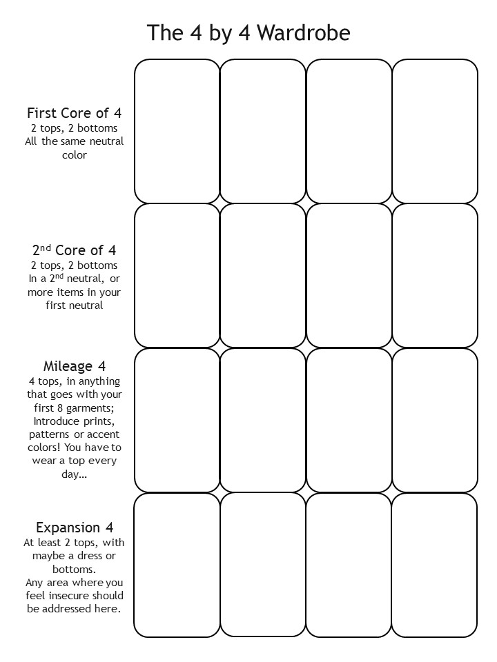
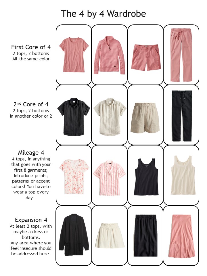
This is what she’s starting with:
And this is her color passion for this year:
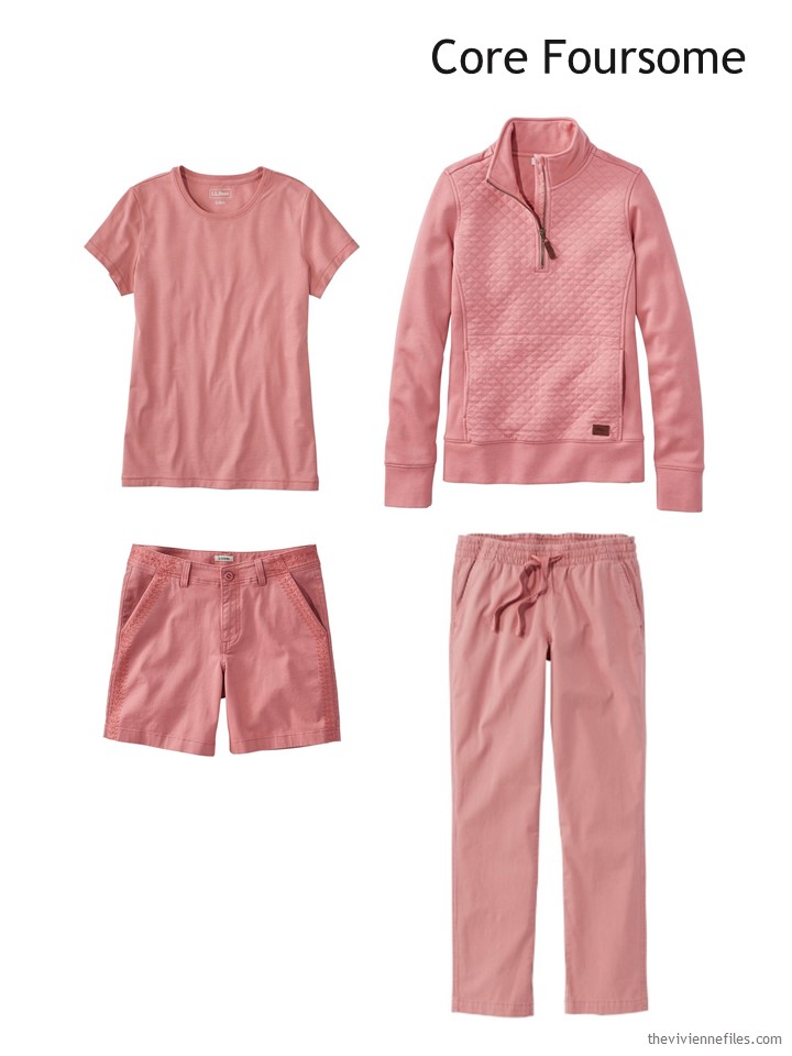
Tee – L.L.Bean; quilted quarter-zip pullover – L.L.Bean; shorts – L.L.Bean; chino ankle pants – L.L.Bean
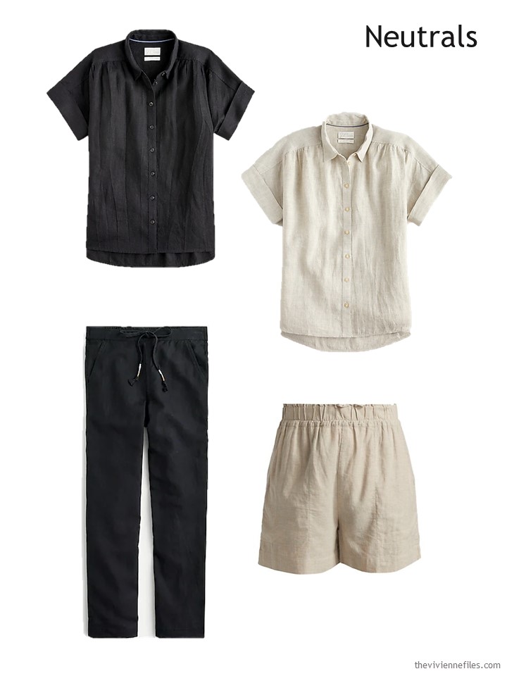
Still, she understands that she won’t want to wear this color EVERY day, so she grabs a few neutrals to start keeping her balance:
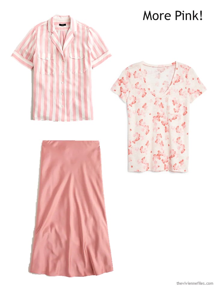
But then she falls BACK into her love of this muted rose shade, and her joy is wearing skirts in warm weather! (her secret is to have the perfect garment to wear under her skirts…)
Oy! She stops for a moment to regroup; is this too much rose?
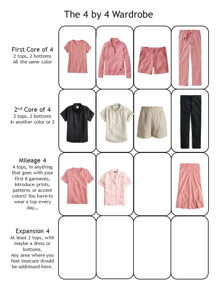
Nope – she still has plenty of space (at least mentally) for more neutrals, which will bring everything into balance:
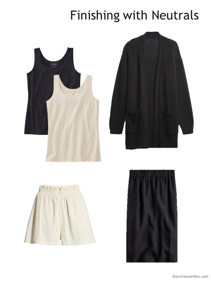
Black & cream tank tops – L.L.Bean; black cotton cardigan – GAP; ivory paperbag waist shorts – BP.; black linen skirt – J.Crew
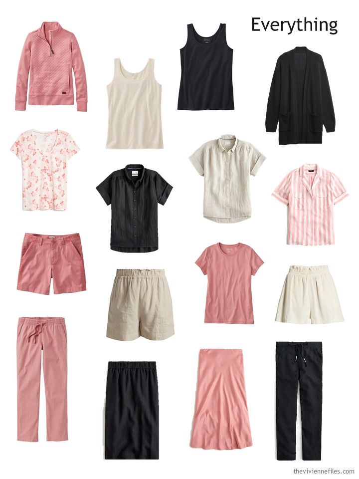
NOW it looks balanced! Yes, she has quite a bit of that particular shade of rose, but she also has enough neutrals not to be limiting…
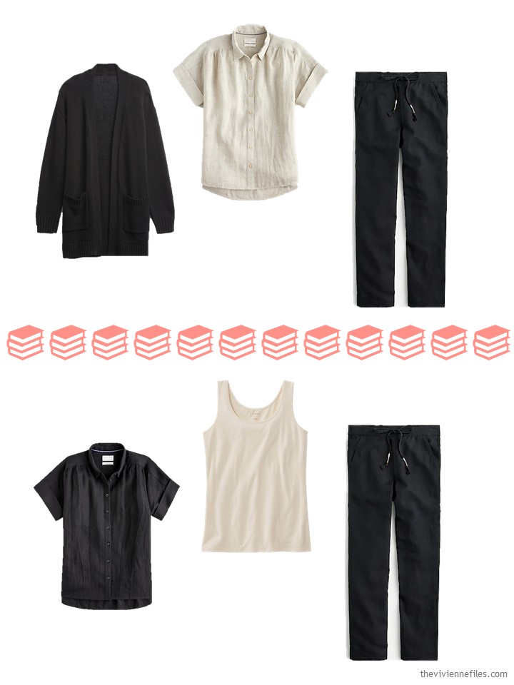
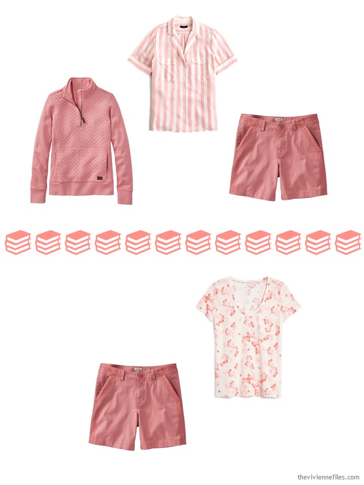
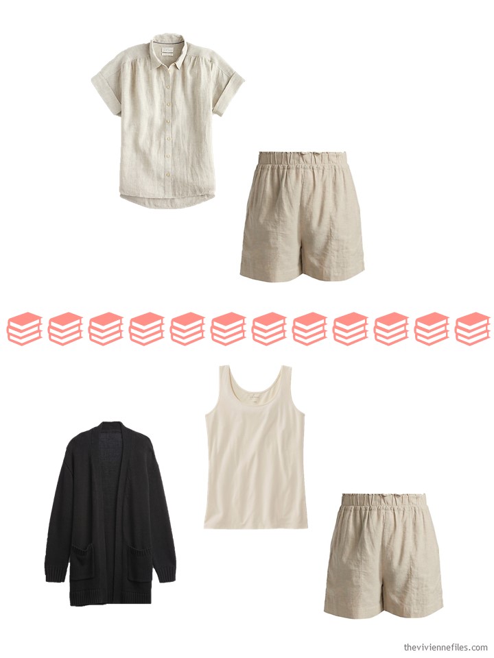
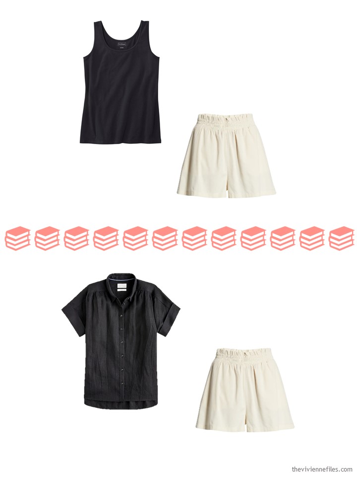
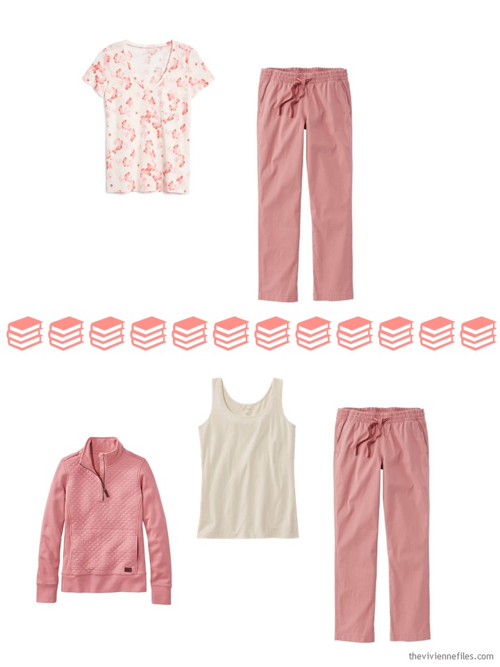
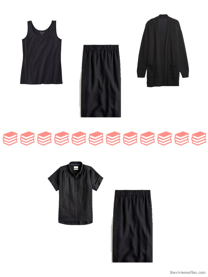
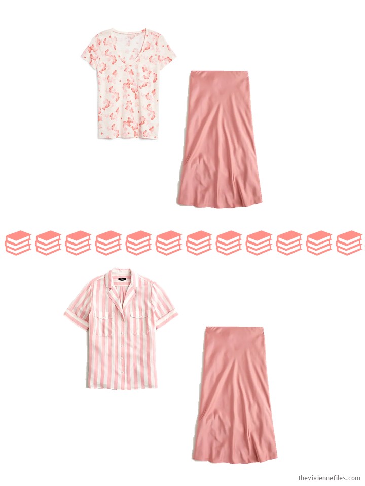
What does all of this look like when it’s not in the template?
It’s not as if she’s concerned that she won’t have any way to assemble outfits from this wardrobe, but she goes through the exercise of picturing her choices, just for fun!
Now, if she can just handle her pile of reading as easily as she handled her summer wardrobe!
love,
Janice
p.s. Seven years ago, I assembled an 18-piece wardrobe that was a true “Wardrobe Slot-Machine,” also known as a Whatever’s Clean Wardrobe. 18 garments that could be combined without hesitation gives this heroine 216 possible outfits…
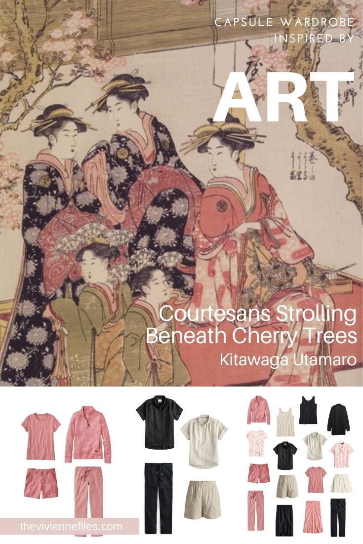
Like this article? Save it to Pinterest!
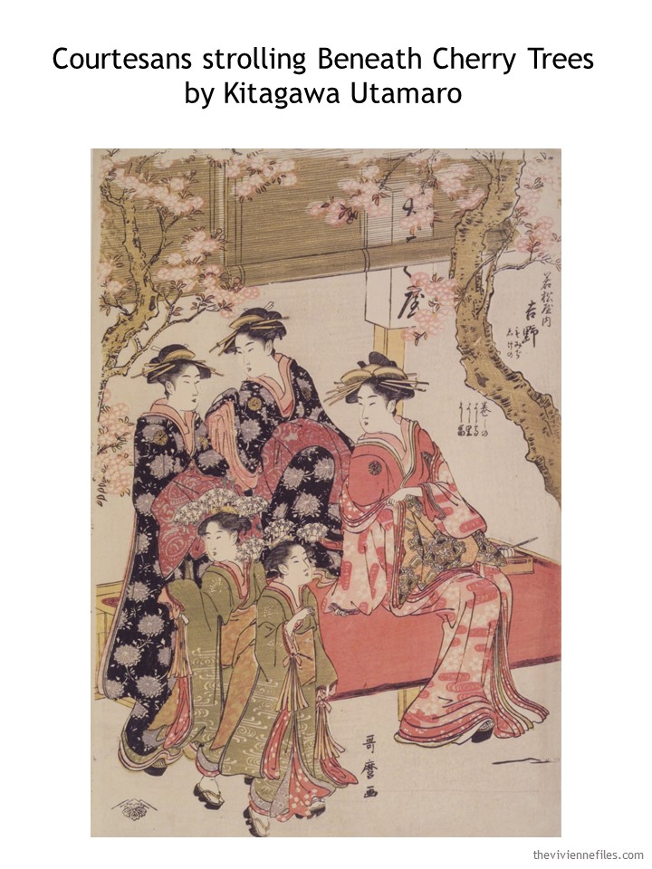
What a lovely painting! I’m fascinated of how much of the painting looks white on a quick glance, yet on a second glance I realize that there’s no true white AT ALL to be found.
Not sure, if there exists such a thing as too much of a color you love…
After spending last year almost exclusively in my super comfy black yoga pants and tunics, I can no longer find much joy in dressing super comfortably at home. Instead, this year majority of my purchases have been super feminine pink, floral, frilly, embroidered things, and am having much fun wearing them instead. So this painting is most inspiring! I have even started to wear my necklaces again -including some that I have judged too fancy for daytime wear. I’m alone at home all day, so nobody’s wiser. It’ll be interesting to see how my style develops as life normalizes :D
This is nice. Very well balanced and I like the idea of only one accent color, although here it functions almost as a neutral. I always think black is too heavy for warm weather, but then I forget about linen. It looks very cool and comfortable here. I think if the dark color was navy it would work just as well. And I can’t wait to sit under a tree and read. Mysteries, probably.
This is great and mirrors my own closet! I just bought a pair of lightweight pink pants – which I was actually planning on wearing today with a black/pink/red floral print blouse and a black sweater that has white trim. Forecast is for a 10 degree drop in temp from yesterday and rain. The pink keeps me feeling “springy” and cheerful. I’m all about wearing cheerful these days. Thank you Janice – so happy you are back and hope everything’s ok. Have a good weekend ladies.
If any fellow readers love this dusty rose color, you’re in luck because I’m seeing it everywhere: J. crew, Ann Taylor, Loft, even some at Talbots. Unfortunately, it seems to be pushing my beloved hot pink out of the stores, and my true winter complexion is very disappointed this summer. But happy shopping to those who can wear it!
Like you, I’m happier in clear colors, but it’s gratifying to see this color on my friends who glow in these more muted colors. My mother looked so pretty in those rose pink. She could wear powder blue, too. The color consultants of the 80s and early 90s certainly did boost better wardrobe planning and help many of us find coherence in our closets. I ran amok for a few years relying on memory and being more impulsive than disciplined and it showed in the closet. But, adhering to a plan and carrying my color chart means I can buy one item at the store and find 4-5 new outfits when I bring it home! Capsule dressing is so gratifying!!!
Hope all is well with you today. I love oriental art and this pink is my favourite shade. I wear it with navy, grey, and soft brown. Today, I’m wearing grey chinos, a grey tee with oriental style pink floral print and a rose pink cardigan. Like Sara K, I’m looking forward to wearing all my
“feminine, floral, frilly, and embroidered” garments in the summer.
This is so great! Although perhaps obvious to some, the use of both black and cream in the second “core of 4” really helps me out… I find that I veer towards Navy, Grey, and Cream for my neutrals, and it just never works for me to do a core of 4 in just 2. BUT! splitting it up between the 3… this works well, especially for a person who prefers cream near the face to grey… and grey on the bottoms to cream! I LOVE it when you take your “standardized” templates and tweak them for us, to show the possibilities of being creative even within those guidelines. It reminds me of your old “customizing the classics” posts – take rules, distill the value, show alternates that “break the rule” but keep the value. You are such a genius!! Thanks for sharing your talents and have a wonderful weekend
Aren’t we all imagining the lovely rose pink accessories with this capsule? A bracelet or scarf including black, rose & cream? I think the skirt is utterly lovely with the floral print and the striped tops. You could accessorize to dress those up and down and get so much wear from those two looks!
Such a pretty painting and I love the pink. “ She eschews the almost green shade of beige, and she chooses to believe that the darkest kimonos are black (while it’s possible that they’re navy…)” For me though I would embrace the green shade of beige and swap out the black for navy. Those are my neutrals. I’m too fair to wear the light beige color. What a pretty wardrobe. I’ll bet you are already mulling over the accessories for this lady of leisure. I am! Great sun hats and some fun reading glasses. Hope you are well, Janice.
This muted salmon-pink is beautiful and a color that works well with my light/soft coloring. I love seeing that this color is so widely available right now.
There’s something I’ve noticed quite a lot in these capsules that confounds me a bit and is wonderfully demonstrated in this post: even with a very tight color palette and few colors overall (like here, 2 neutrals and 1 non-neutral), often it seems that the heroine is building two (mostly) separate capsules rather than one integrated one. In this case, the narrative makes this explicit: she doesn’t want to wear the pink every day, so she grabs neutrals to balance. We see this as the outfits are built out also; there are 8 outfits consisting of beige and/or black, 5 outfits consisting of pink and white, and only 1 outfit that spans the divide…the pink sweatshirt and pants with beige tank underneath.
I am surprised by how little mixing-and-matching occurs here across the black/beige and pink/white sets of garments. I would have assumed that a heroine would want to be able to mix her neutral and non-neutral colors together in the same outfits at least part of the time! I can see having accent colors that work with the neutrals but not necessarily with each other, but I have been assuming that to be a coherent capsule wardrobe, the neutrals would need to work with the non-neutral colors. A wardrobe of (to be ridiculous) half mustard and half hot pink might be *balanced* but it doesn’t seem coherent.
This is curious to me because I have noticed very often that when sample outfits are built out in these posts, they do not mix-and-match across the palette as much as I would expect. Is this heroine waiting to add accessories to make that happen? (Although when outfits get accessorized in a follow-up post, they are the outfits from the original post, not new ones that arise from the possibilities introduced by the accessories.) Or is she truly on board with having 16 pieces in 2 mostly separate capsules?
I’m glad this post was so clear in the use of “balance” to mean something very different from what I might have thought it meant, so that I could articulate this thing that’s been niggling at my for a long time now! I’m curious to hear other thoughts on this. Since I don’t actually wear capsules, I can’t speak from my own experience at all, and am interested in whether other readers build capsules that feel as demarcated as the ones we often see here. I’m sure that what it means for a capsule to be “balanced” or “coherent” will vary from heroine to heroine, but it’s just striking to me how often outfits built from the capsules here confound my expectations by sticking more rigidly to narrow color combinations rather than exploring the realm of possibilities. I can’t tell whether this is a matter of personal taste or whether this is an indication that the capsule wardrobe concept is inherently limiting in this way.
It’s funny, I have a thrifted Target skirt that is black with an almost Art Deco floral print of this salmon pink, a more coral pink, and a very pale yellow that I like to wear with a black tank and salmon pink short-sleeved cardigan. It’s not the easiest color combination in the world, but it can certainly work.
I think that the addition of some accessories that span the 2 capsules would make mixing the clothes back and forth much easier. A simple bead necklace in black and beige with this shade of pink would change everything (assuming I can find one!).
hugs,
Janice
Janice, I wish you good luck in finding the accessories to bring these capsules together. I think it will be quite lovely!
Thank you so much Sally for verbalizing these ideas! I have had similar feelings myself. I would have articulated my thoughts as that I do not see much mixing and matching in the wardrobes to include the accent colors. I have noticed that when Janice builds a wardrobe she will design outfits with neutrals and one piece in an accent color (or two pieces in the same accent color). If accent colors are mixed, its usually just in accessories. I like to mix my accent colors in the same outfit. As an example: my summer capsule wardrobe has khaki and olive as neutrals, with shades of orange, teal and cream as accent colors. I would happily top khaki pants with an orange tank and a teal sweater! With a bold necklace or scarf to pull the look together. This has led me to wonder if mixing too many colors is unsophisticated and I have almost privately emailed Janice to ask. Maybe the more fashionable way to build a capsule is to rely more heavily on the neutral pieces? But I love my colors and see my neutrals as supporting players!
Thank you Sally and Lucinda for your comments. I too have wondered if mixing too many colors is unsophisticated.
Lucinda and Beverly, it’s good to know I’m not the only one with these questions. I do love the look of multiple accent colors. The sophistication question is an interesting one. I do not aspire to a sophisticated look per se, so I have never thought about it!
hmmm I never thought about whether it was unsophisticated or not – but good point! When I think of sophisticated I think of black, and ivory/white, and camel. Maybe red. Not at all what I wear I’m afraid. I gave up even thinking of being sophisticated a long time ago! I just love my color way to much and have made peace with it.
Lucinda,
I think your choice of combining accents in the same outfit has to do with two elements — your personality, and your own level of personal coloring contrast. For instance , a blue eyed red haired woman has high color contrast and looks great wearing contrasting colors. On the other hand, someone like me has low color contrast with my sandy beige hair, brown eyes and fair skin. If I wore heavily contrasting accent colors together, they would wear me and look clown like, but would look terrific on a highly contrasted personal coloring person .
Sally in St. Paul,
Many years ago I recall seeing a magazine article that presented a mix and match wardrobe that was color illustrated . I so wish that I had saved it, because it showed how very different a collection could look when one day wearing just all neutrals and another day wearing a color combo of some sort ! I like this separation of color groupings because if I mixed and matched a single accent color with the neutrals a lot of the time, I could grow very weary of just one accent color worn so frequently . In addition, if I wear a patterned top that is primarily in an accent color, I like that pattern to include my neutral bottom color, so then it visually makes sense to pair the two . A solid accent color more easily mixes with a greater number of various neutral color bottoms, IMHO . I crave variety , so I like a totally different color “ feel” each day . Some days are logical mix and match days and others are like Janice has expressed here .
I am a redhead, Shrebee! #nailedit!
This is a lovely and interesting capsule!
A 4×4 is my favorite way to build a capsule, and I often split a core of 4, so that I have 3 neutrals. Also as I looked at these items I noticed that there were 3 cores of 4, each with 2 tops and 2 bottoms – pink, black, and ivory – and 4 expansion items – a black, a pink, and two pink prints.
Sally, you have articulated just what I was going to comment! With this wardrobe I’d happily wear a pink top with ivory and black. Pink + pink + pink = a LOT of pink, even if it’s a favorite color. And rarely I would wear a “suit” made of separates, especially a black “suit.” I think of “accents” as accenting the neutrals in a wardrobe, so I usually mentally take these capsules and construct my own combinations of items to more closely fit the way I assemble outfits
-nancyo
I had similar thoughts but with a different slant because I love all the colours but no way could or would wear top to toe pink. I could easily see me wearing pink and black or pink and oatmeal though. One of the teachers at my children’s school had a capsule wardrobe of pink and black and was incredibly stylish. I love how we all bring a different perspective to the same clothes.
This is a lovely colour combination and a very versatile wardrobe!
I loved the “slot machine wardrobe” in the look-back too! This is something to aim for.
Although I’ve tried all the wardrobe combinations, the 4 x 4 just consistently clicks for me. This one is fantastic.
I totally love this 2021 dusty cedar rose color and have bought a herschel backpack, a superdry hat in this shade and white tiger onitsuka sneakers with matching details already… now you presented the perfect basics to go with my accessories! I like combining this color with a very light blue/ciel instead of beige only…
This is my first time commenting. This is a color pink I wear, although maybe not all pink at once. I love this set and the previous black and white one. Janice, your ideas are amazing and helpful. In this capsule, any of the tops or bottoms could be changed with any of the others to provide many more outfits than can be shown in one blog. Coordinating accessories would be lovely. When we can travel again, this is my inspiration.
Hi Janice and Everyone! Thank you Janice for outfitting my wardrobe to go to San Francisco next week ?. My tablet sees that ‘green shade of beige’ as olive – and now I can expand my packing wardrobe into my 21 pc Wardrobe Challenge for May.
Speaking of which: I cannot believe it is May 1st. The calendar says spring and it is time to change the wardrobe over, but I feel slouchy like winter (must have been the cloudiness and rain and wind this past week).
As per the matching accent discussion: I think it depends on what I have in my closet and what season it is. I think I have relied on the 21 pc wardrobe challenge for that reason: I choose 2 ‘neutrals’ and then choose accent colors that can match both of those. Sometimes my Closet Slot Machine has 2 accents that match together, which is a bonus. For examp!e, I could have a grey sweater over an apricot long sleeved top over a light blue turtleneck with brown pants (and cream colored socks). And I do not feel overdone at all. If anything, Janice the Brilliant has given me ideas of colors that can be worn together that I would not have thought of myself.
Have a great weekend everyone!
Ooh some great ideas here. That shade of pink is just so restful. I don’t know why BUT stripes don’t seem to flatter me and it’s so frustrating as I love a sharp polished nautical look. It doesn’t matter what way the stripes go, they just don’t flatter. If one of the clever ladies on this page can unpick that for me I’d be delighted.
This is a fascinating discussion about balance between neutrals and accents, mix and match and splitting neutrals in a 4×4.
I usually wear accent colours on my top half above a neutral bottom so the eye is drawn up. I do have a pair of pink linen trousers for summer which I wear as a blended accent outfit (as I do with purple) or a pink core over an ivory top. I do wear neutral outfits, particularly grey, but I would then add a pop of colour with a cardigan/jacket or accessories. Often the top garment has a pattern that combines the neutral and accent colours.
I would like to see some accessories that bring a pop of colour or tie in the black and pink. To me the black seems too strong for such a warm shade of pink. I would also relegate the black and concentrate on the greenish beige/khaki or light brown as a second neutral. Perhaps this is a capsule with three neutrals and one accent? Though I can’t decide whether the flowers on the black robes are lilac or pale grey? This would open up more possibilities. I would certainly keep an eye out for a patterned top, dress or scarf that would draw this palette together.
The look back was perfect as during the lockdown winter, I found that I was wearing the same group of 18 to 22 garments – 6 bottoms, 6-8 tops and 6-8 second layers.
I had hoped that now it is May and lockdown is easing that I could completely put away my winter things and wear my spring/summer clothes but no, it is still unseasonably cold in the UK with heavy rain and wind on Monday followed by Arctic air from Tuesday ? My hybrid wardrobe will be staying just in lighter colours. Perhaps by the time Covid restrictions end on 21 June, we might just have some warm weather.
Well, you’ve done it again Janice, haha! I just ordered all four of the pink LL Bean things in the core, plus the floral t-shirt and the black tank. So lovely and I can’t wait to receive them. We do a lot of camping and I am going to feel so cute camping in pink :-) and these will integrate so well with my existing basics. Thank you.
Late to this comment party, but LOVE these looks. Janice, how do you manipulate these digitally? I’ve downloaded a few wardrobe planning apps, but can’t visualize my 4 x 4 on them, or see my “capsule” all in one space.
Also, I tend to tie things together using scarves or cardigans/kimonos rather than jewelry. I love the way you use simple classic jewelry to make these work… brilliant!
I work in PowerPoint! I can remove backgrounds, resize images and drag them around to rearrange. Its probably a 20th century approach, but its works for me!
Hugs,
Janice