March 17, 2021
Yes, I used to live in Ireland. And I’m married to an Irish citizen. And I don’t own a STITCH of green clothing!
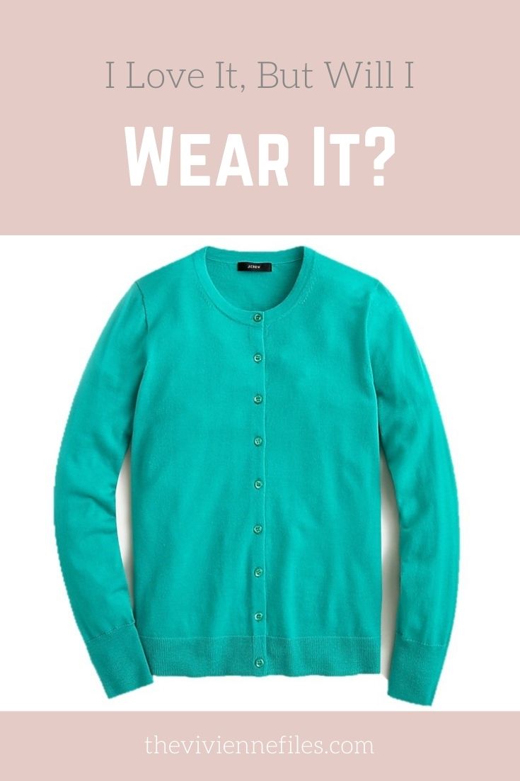
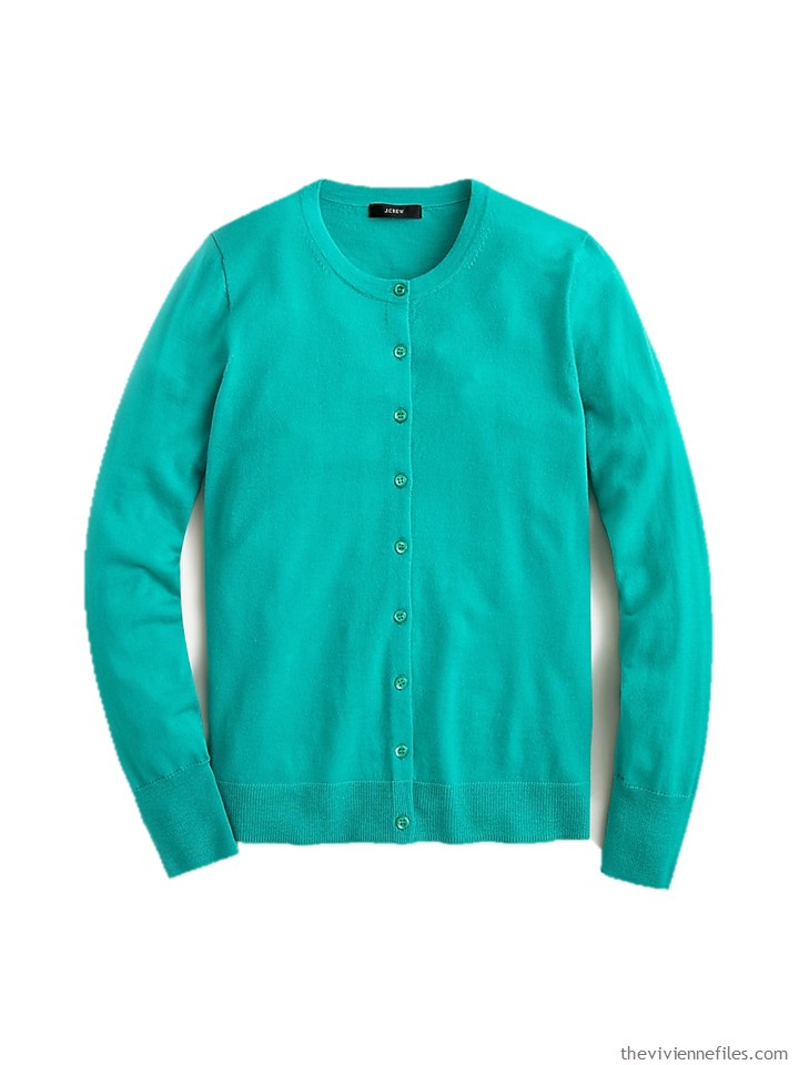
But one of you has been very tempted by this classic cardigan in this very lovely color:
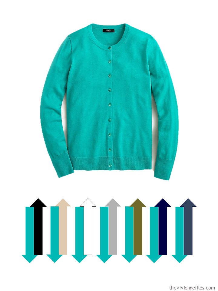
I was specifically asked about wearing this with beige, so I was able to avoid trying to find camel clothing at this “almost spring” point. Hallelujah for that!
You can see that the olive is going to be an interesting issue…
Are we all convinced that owning a simple white shirt and classic jeans is a good idea?
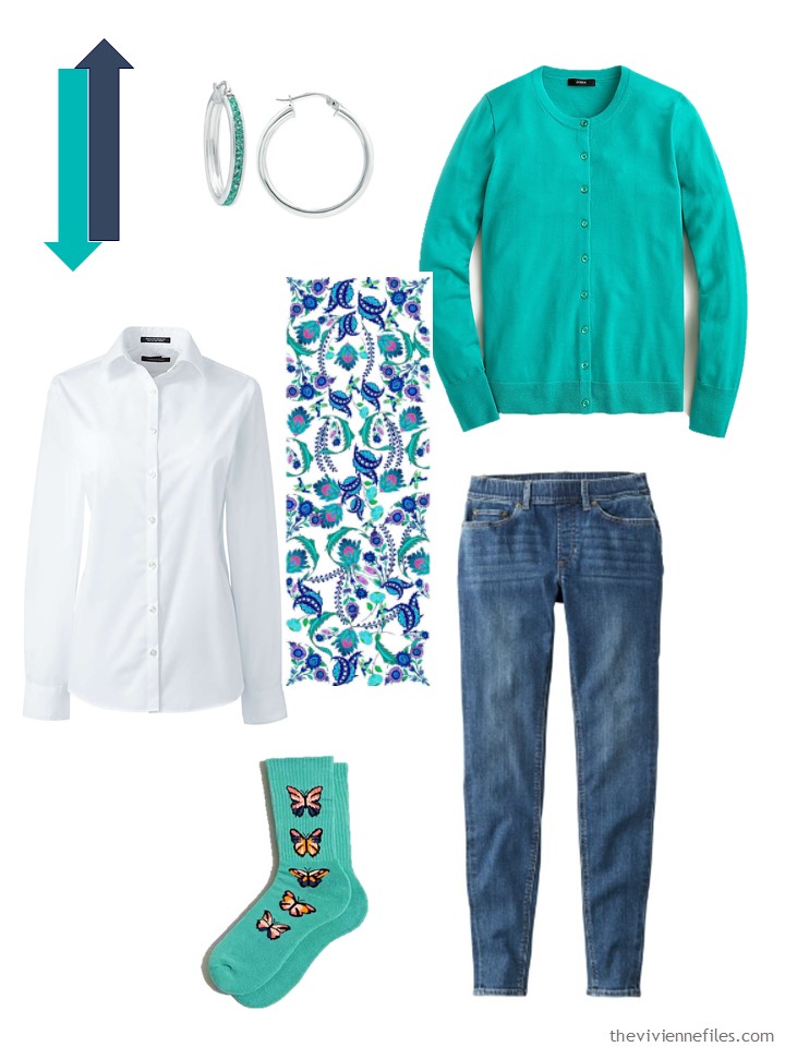
Earrings – Giani Bernini; cardigan – J.Crew; white shirt – Lands’ End; scarf – PJ Studio Accessories; socks – Urban Outfitters; jeans – L.L.Bean
This was a specific question, and I personally think that this color looks lovely with beige. The earrings and scarf are sort of perfect with this, I think.
And the bag is quite a few shades lighter than the cardigan, but I don’t see that as a problem!
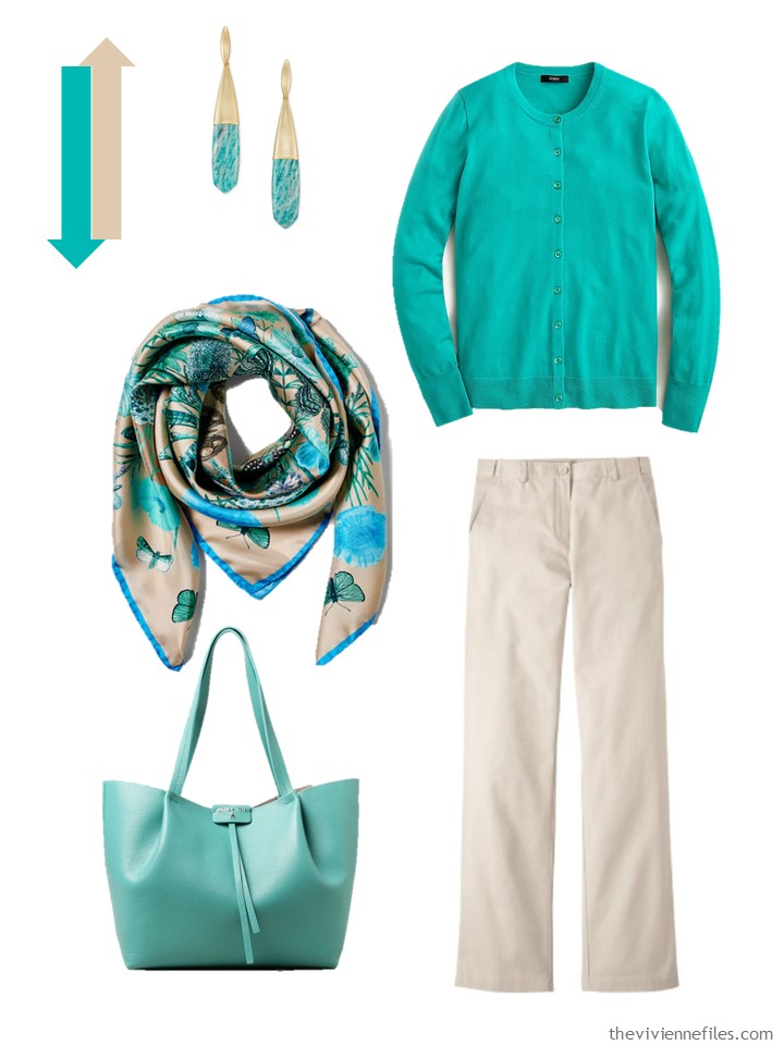
Earrings – Kendra Scott; cardigan – J.Crew; scarf – Aspinal of London; bag – Patrizia Pepe; wrinkle-free cotton pants – L.L.Bean
I was hesitant about black until I found the scarf and earrings. I really tried to find a blouse or tee shirt that included these 2 colors in either a floral or striped motif, to no avail. But if someone owned this sweater, she would of course keep an eye open for such a thing.
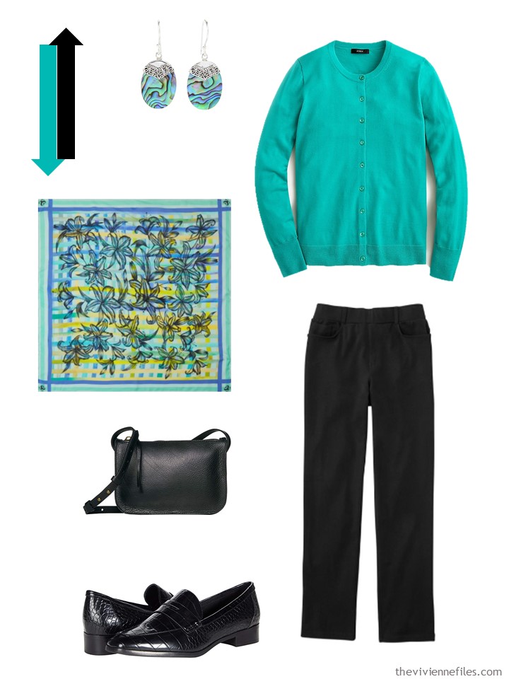
Earrings – Samuel B.; cardigan – J.Crew; Lily Square scarf – Shaku; bag – Madewell; loafers – Aldo; 5-pocket knit pants – L.L.Bean
This next outfit… I don’t know. What do you think?
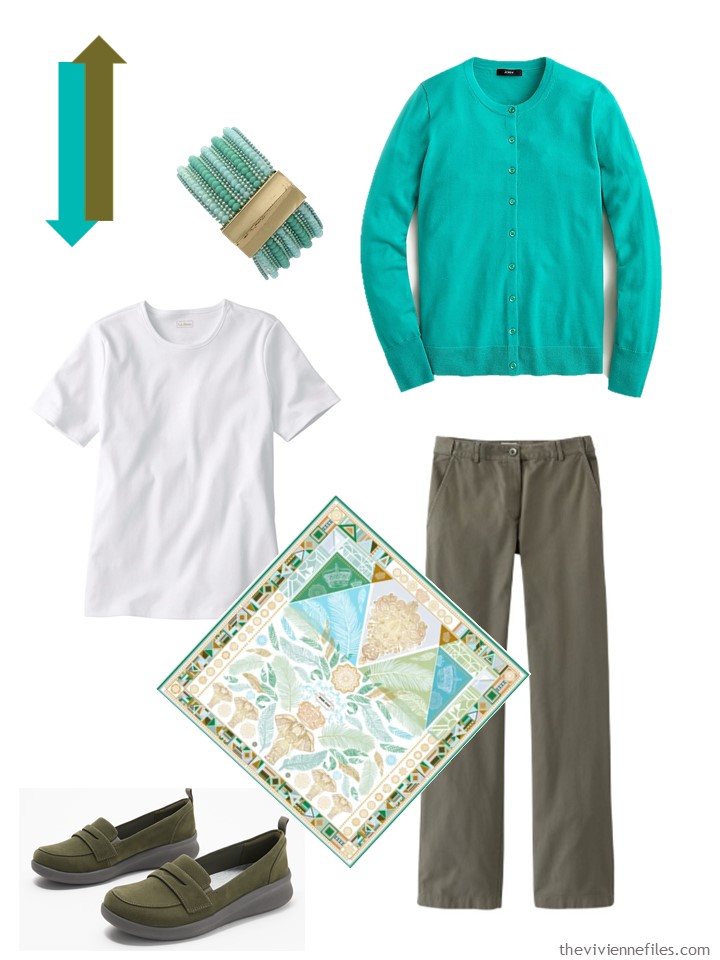
Bracelet – Olivia Welles; cardigan – J.Crew; white tee – L.L.Bean; scarf – Jessie Zhao New York; loafers – Clarks; cotton twill pants – L.L.Bean
The more I look at it, the more I’m not quite positive that this paisley shirt is the same color as the cardigan. And the more I look at it, the more I’m convinced that it doesn’t matter!
And who wouldn’t want paisley earrings to wear with a paisley shirt?
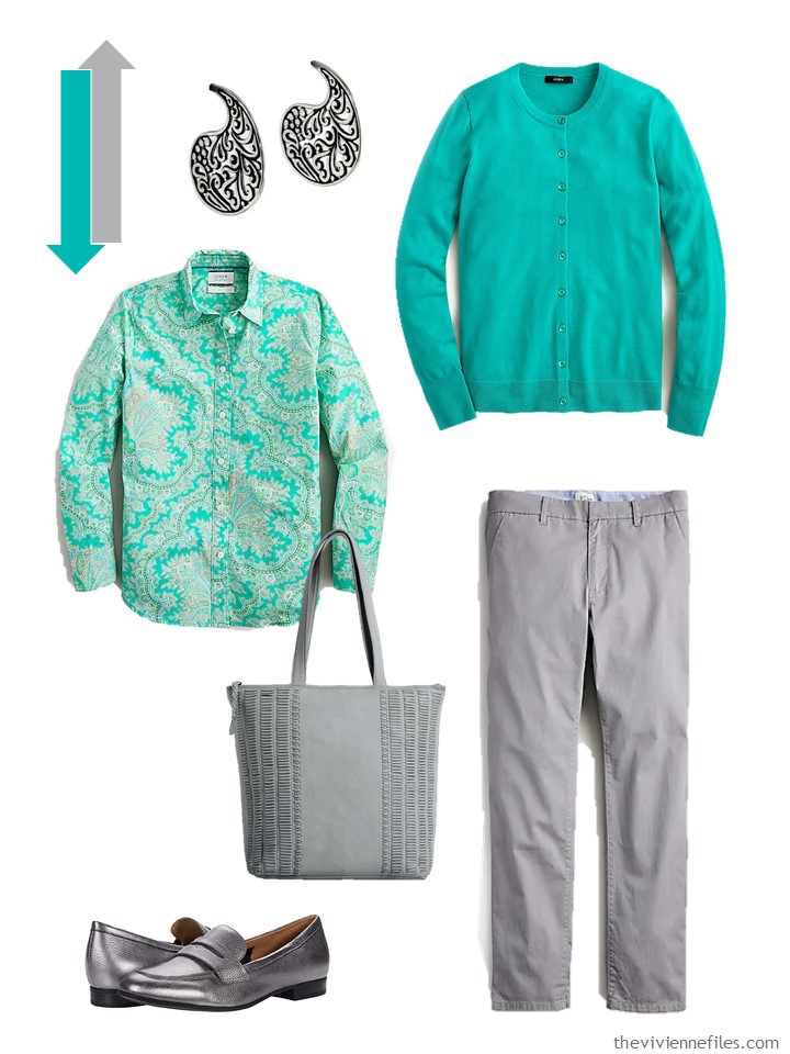
Paisley earrings – Lalana; cardigan – J.Crew; shirt – J.Crew; loafers – Naturalizer; tote – Day & Mood; chrome pants – J.Crew
This shade of green with white is obvious… And the sandals are just right!
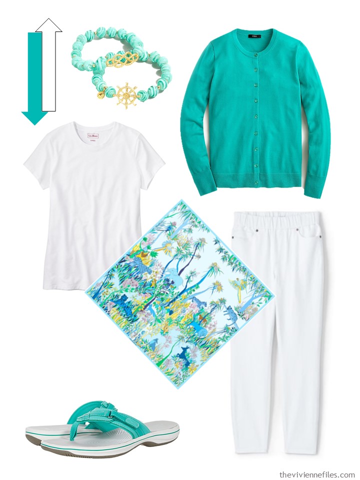
Bracelets – J.Crew; cardigan – J.Crew; tee shirt – L.L.Bean; scarf – Jessie Zhao New York; jeans – Lands’ End; sandals – Clarks
Ah… these pumps are such a great partner with this sweater… I could see this outfit on a beautiful spring day!
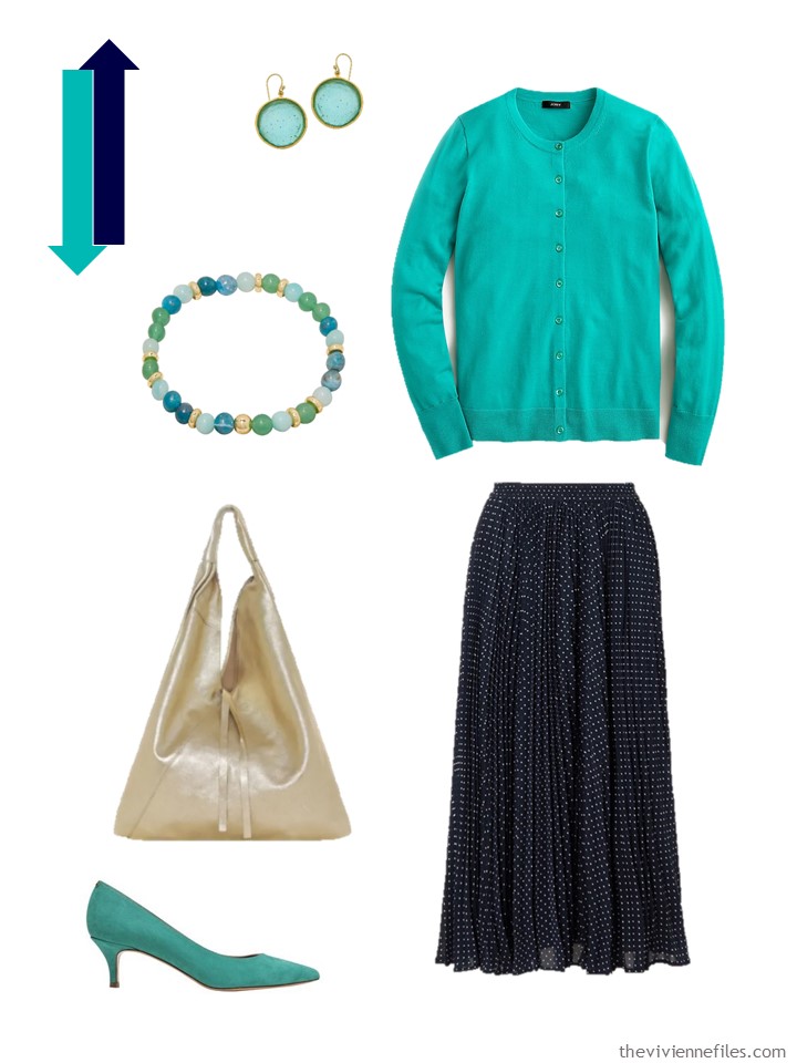
Earrings – The Met Store; bracelet – Gorjana; cardigan – J.Crew; tote bag – Sostter; skirt –Michael Michael Kors; pumps – Jerome Dreyfuss
Choosing a new accent color to try in your wardrobe is never easy; for me, finding 2 or 3 accessories that tie the new color into your existing clothes helps a lot!
love,
Janice
p.s. Four years ago, the art was by Henri Rousseau, and the wardrobe was black and cream, accented with almost the same shade of green as we used above!
Like this article? Save it to Pinterest!
About olive: That’s tricky, but for my $0.02 I’d say, that a dark olive that is not muddy or greyish, would work quite nicely. Not an easy shade to find -it’s one of the neutrals I always keep an eye on because it is a gorgeous shade that works well with brighter colors.
Aqua -which is essentially just a milder version of this color- is one of my perennial spring favorites. I usually wear it with sand beige or light grey and white. Maybe with a pop of bright red too, if I’m on colorful mood. Denim works too, but too dark blue makes me think of menthol and toothpastes XD
I like the cardigan and trousers together – but I’d go with white sneakers rather than the olive loafers. And I’m very tempted by that scarf in the first set.
I think the scarf ties the olive and the green (looks like blue to me!) together quite nicely.
You have some lovely scarves in today’s selection and I want them all! (a girl can dream…)
One of my favourite colours. I have a jacket in this colour and wear it with navy or white. Always looks fresh. It looks amazing with dark denim. I like the look of pairing it with black and a scarf of similar colours.
My initial reaction is that the beige wouldn’t work, but the accessories really pull the look together. I tend to put on earrings and a necklace and wear them 24/7 for a couple of months at a time. You are inspiring me to work on that! My scarf game is strong, but I think I need to branch out into bracelets.
I think the sweater is very much a Spring color. So, to my eye, the best looking neutrals are the lighter and more Springy. The beige looks great, as long as it stays light and more cool. The next neutrals would be the white and the navy. Denim, too of course. The colors that are more what I think of as fall and winter colors, black and olive, really don’t do the sweater justice. This is just what I can see from my monitor.
I like the olive set better than the black for this sweater. I think it works! My other thought was that with the white, I would look for a white t-shirt with a graphic similar to the scarf and not wear the scarf at all, as it looks like a very summery combo to me and the scarf not needed (though it is very lovely!).
I don’t know a lot about color theory, but it seems like finding the right cool undertones in a shade is the trick. I know olive can be found with cooler or warmer undertones depending on the prevalence of more blue or yellow. I have both in my wardrobe and when they are close together you can see the difference. So that may be the key with the olive.
On a separate note, I’m excited to be able to wear my Kerry Gold GAA jersey out in public today that I got 8 years ago when my husband and I took our dream trip to Ireland. So tell your husband I will be sporting the Green and Gold in style today! It doesn’t go with anything but jeans but we want things that make us smile and bring us joy even if it isn’t the most practical piece! ?
Erin go Bragh! ???
I’m right thee with you Erin. Years ago I bought my husband a pin that said “I Married Irish”. He wore it many times but now just considers himself to be part of the group! He’s sporting a BRIGHT GREEN polo today. Love the post Janice. On my screen the sweater is very much in the teal/turquoise family.
Janice,
I am surprising myself here by saying that I am liking this bright aqua ( what in the heck is a color name called bright patina?) green with the olive ! The scarf that you found to go with the green and the olive here amazes me ! In fact, as a reader above noted, all of your scarf selections here are terrific!
The aqua sandals with the white pants are telling me that they might be the way in which I can wear color on my too big feet without drawing the eye there to one big color block, like with solidly colored shoes . Maybe even find some with more narrow straps .
I own those Clarks sandals and I can tell you that they are super comfortable. I buy more colours every time I see them on sale.
Janice,
I just thought that this color green could go very nicely with that white tee from Monday and dark brown bottoms .
Indeed yes! It would…
hugs,
Janice
I had to order those butterfly socks! Then I went back and scrolled down and saw the scarf. I will have to check that our also.
Happy St Patricks Day !
This is a gorgeous green-teal color. It looks amazing with the beige! I agree with Sandy that it will look best with light and cool beige/stone rather than warmer beige/camel/tan neutrals. That scarf is perfection for this combination. For shoes, there are a lot of choices, but I find myself drawn to a light and cool leopard or cheetah print flat to tie back subtly to the black in the scarf. (Not too dark or orange, though. It takes some looking but they are out there. Nordstrom’s BP leopard flat is a good one, when it’s in stock.) The “more mint than green-teal” bag looks very good here. But if one doesn’t want to commit to a pricey bag in this color range yet, using Janice’s Amazon link you can find faux-leather bags with thousands of ratings and an average of 4.5 stars for under $30 to test it out.
Another option is to wear the cardigan with some darker teals. That would be how I’d approach the cardigan with black. Although I think the lighter color works well with black pants and Janice’s meticulously selected accessories (!), making the cardigan the lightest teal in the outfit rather than the darkest might make it easier to create cohesion as you work your way along the green-teal, darker teal, darkest teal (i.e., black) spectrum. The trade-off is that a darker outfit might feel less “springy” to some people. But if you like high contrast black/white prints, this cardigan would look marvelous with that, and that would lighten/brighten things up. I am thinking how great it would be with a black/white skirt or dress, for example. In Janice’s outfit, even opening up the cardigan and wearing it over a white top with a black polka dot, stripe, etc. print would look great. In that instance, a scarf with a bit of white in it might be ideal, but the featured one would still work just fine…especially since I would wear a pair of black/white geometric patterned knit flats (the Skechers Cleo Sherlock, currently $38 at Zappos using Janice’s link) instead of solid black loafers to repeat the black and white. And because I am clearly happy with a mix of prints and patterns in my outfits.
I am ambivalent about the olive. I think these pants work pretty well with the cardigan, especially with a perfect scarf to tie them together. But unless you have an incredibly tight curation of very specific olive shades in your wardrobe, it could easily start looking off…especially as you get to the yellower end of the olive range. Even with the perfect olive, the combination seems dependent on good print bridge pieces to seem totally right to me. However, I could also see my eye adjusting to the combination over time. An odd thing: when I put together olive and a cream/light-and-cool beige, then add the cardigan, somehow that feels more right than it does with the white. (Of course, the selected scarf points to the beige option as well.) So perhaps a light-and-cool beige instead or in addition to the white would be easier to work with when also using olive; I would experiment with that.
Also, Rachel in Oz completely nailed it with her observation that a lighter color for the shoe would be better than the olive. In addition to the white sneaker option, simple flats in nude, beige, or a coordinating teal seem like solid choices. I think having the olive pants and shoes makes the olive proportion of the outfit too high; adding a white/beige/teal in place of it brings the proportions into a better balance. I didn’t see that initially at all.
In the navy combination, the bracelet and pumps are absolutely spot on, but I think my eye wanted to see the navy and white from the skirt repeated somewhere. I’m not crazy about that boho style bag, so I would probably switch that out, which is an opportunity to repeat the neutrals. (I never need to be concerned about repeating gold in an outfit because I always wear my hair.) Another option is a navy and white striped shirt collar peeping out from the top of the buttoned cardigan…or showing more with the cardigan worn open. A little neckerchief scarf would also look nice with the cardigan and give it a tiny bit of retro flair.
I hope the smitten reader gives this color a chance in her beige wardrobe! It’s a versatile, beautiful, cheerful color that is very flattering to many people. I think she will find that this cardigan will blend well with a range of colors in the blue-green category, especially with prints (as shown with the paisley shirt), so it shouldn’t be difficult to built out around it…unlike some colors where you feel like it will take years to find the right things to work with it (ask me how I know).
Would I wear it? a resounding YES!! with my normal black and gray, with white or navy in the summer months, and if something fell in my lap with olive. I quite liked that pairing. All that said, I need to shop! Thanks.
I think a sweater that was slightly more of a bluish turquoise shade would go well with olive. During my formative years in the 60s, my parents’ living room was decorated in the ubiquitous avocado green and turquoise. I still rather like the combination.
I bought a cardigan that style, in that colour, in cotton for spring and summer when it was on sale a couple of years ago. I have to admit that I haven’t worn it much as I found it hard to style. I was thinking too matchy-matchy Thanks for all the great ideas. Perhaps this will be the year it gets good circulation in my wardrobe.
The “Patina Green” cardigan is a color I wear frequently with olive. When I saw the arrow with the olive color, it looked maybe just a bit too yellow-green to go with the Patina Green cardigan, but the olive shoes & scarf etc. you put it with aren’t that yellow-ish, so, to my eye, they go together very well. I happen to wear olive & “patina green”/teal together a lot & I think they work beautifully together–just watch that your olive & your teal both have similar undertones–that one isn’t more yellow/green than the other. BTW my Border Collies’ & my Australian Shepherd’s collars & leashes are a very similar teal color to the “patina green”–they’re made of a waterproof leather-like material called Biothane that’s used for dog collars/leashes & horse halters etc.– their teal shade is quite similar to the “patina green” cardigan!
aw, no doubt your pups look awesome in those collars and leashes! We have had 4 Aussies over the years, but now just one huge Great Pyr. – nancyo
I don’t like green and green, I often see people wearing green and olive and for some reason it makes me cringe. However I love all the combinations you’ve put together for the cardigan.
WOW this is a colour to get you noticed on any day regardless of the Saint ?. My mother had a blouse and skirt in this colour in the 80’s. It was the background colour to a floral paisley pattern in bright pink and orange. The 60’s to the 80’s certainly had some startling colour combinations.
The brightest green I wear is bright teal. It works with dark denim but looking at this cardigan with grey makes it look cold (surprising as I wear grey a lot). I can also see it with dark brown but with the navy, I’m reminded of a school teacher….
My favourite outfit of all these is the one with the stone trousers and the teal bag. The cool green with the light beige-grey just gives an overall softness to the outfit which suits me best. I had wondered how I could wear brighter colours and stone might well be the way to go. The teal bag makes that green/stone outfit. The beige and turquoise Aspinal A scarf is amazing. I could easily replicate this outfit as I have a teal bag that I hardly use and an amazing silk scarf.
I love all the little details in the clothes and accessories which I have found easy to replicate for my outfit today including a blue and jade green paisley shirt and teal socks with silver butterflies. I would love to find a necklace or bracelet with paisley motifs. I like abalone for its myriad of colours. As for teal shoes – they are on my ultimate wish list.
Hi Janice and Everyone! On my screen the sweater looks more turquoise or aqua to me. Lo and behold, waaaaaay back in the TVF color wheel archives is a mix of khaki, olive drab, white, turquoise and burgundy. I have worn this mix and the only setback is I wish I had more pieces in turquoise ;) I would no doubt wear this sweater in fall/winter, if only to bring a little color into cloudy days.
Absolutely love the olive combination best. Somehow intriguing, exciting, and calming all at once. It immediately reminded me of this old favorite:
https://www.theviviennefiles.com/2017/04/build-overnight-travel-capsule-wardrobe-start-with-art-before-parachute-opens.html/
Lovely sweater and great pairings, but to my eye there is no shade of green (incl. teal and turquoise) that play well with olive. It is just a bit jarring although the scarf certainly helps. I can highly recommend the Jessie Zhao scarves. They are beautiful designs and quality at a more affordable price point (still a treat!).
I think I (you, Janice) found my perfect spring cardigan!! I LOVED it paired with the jeans AND the gray/chrome pants….. and, I could easily see it with the beige…. Also, I can see the earrings and scarves and socks, etc, etc, etc going with my wardrobe.
Thank you, Janice!! Once again — you have answered the age old question for me: What will I wear??
As someone who is a winter in seasonal color analysis, this shade of green is totally wrong for me; I need either a true jewel emerald or a deep pine green. Unfortunately, I wouldn’t wear any of these outfits because none of them are compatible with my seasonal palette. Most of us can wear green but it has to be the right hue (warm or cool), value (light or deep), and chroma (muted or bright).