February 19, 2021
When Accent Colors Lead You Astray…
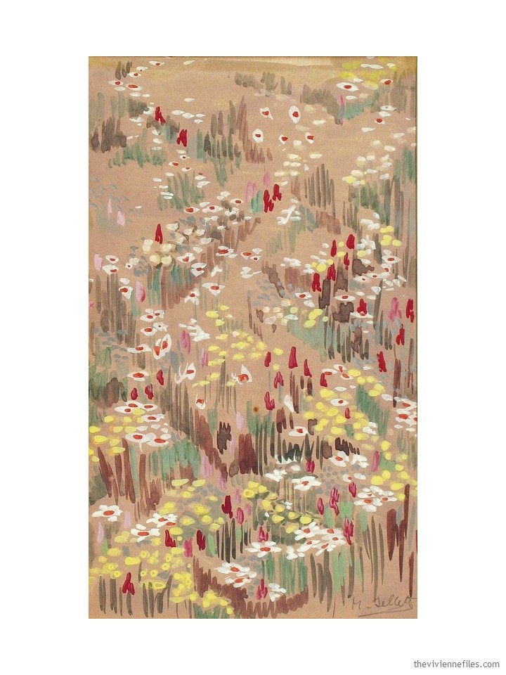
She wanted to start with this painting, and who could blame her?
She is in the process of shifting her preferred neutral from navy to camel, and her accent colors from cool and bright to warm and muted – it’s quite the project!
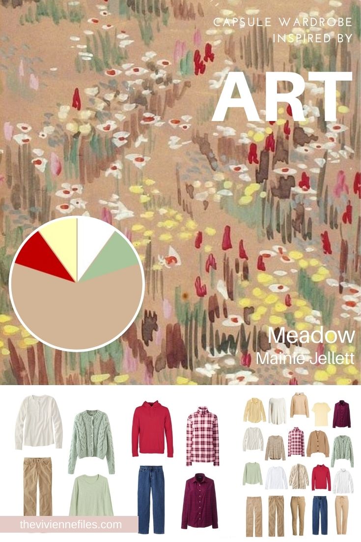
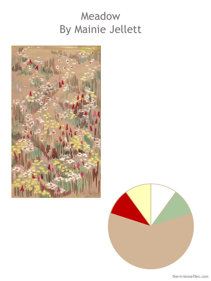
This painting is perfect for her… After some study, and some thinking, she chose these colors:
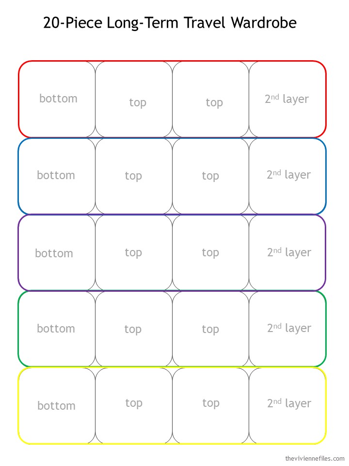
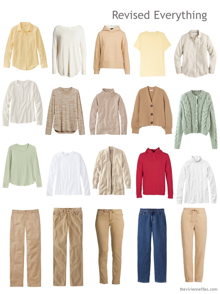
Her plan is to assemble her 21-piece wardrobe – Her Garde-Robe du Mois – this way:
yes, this is only 20 garments – she’s going to toss in her camel dress, when it’s clean!
Since her closet is sort of “betwixt and between” right now, she decides to start with pants; this is a pretty good idea for most of us, since these are the clothes that do the heavy-lifting in a capsule wardrobe!
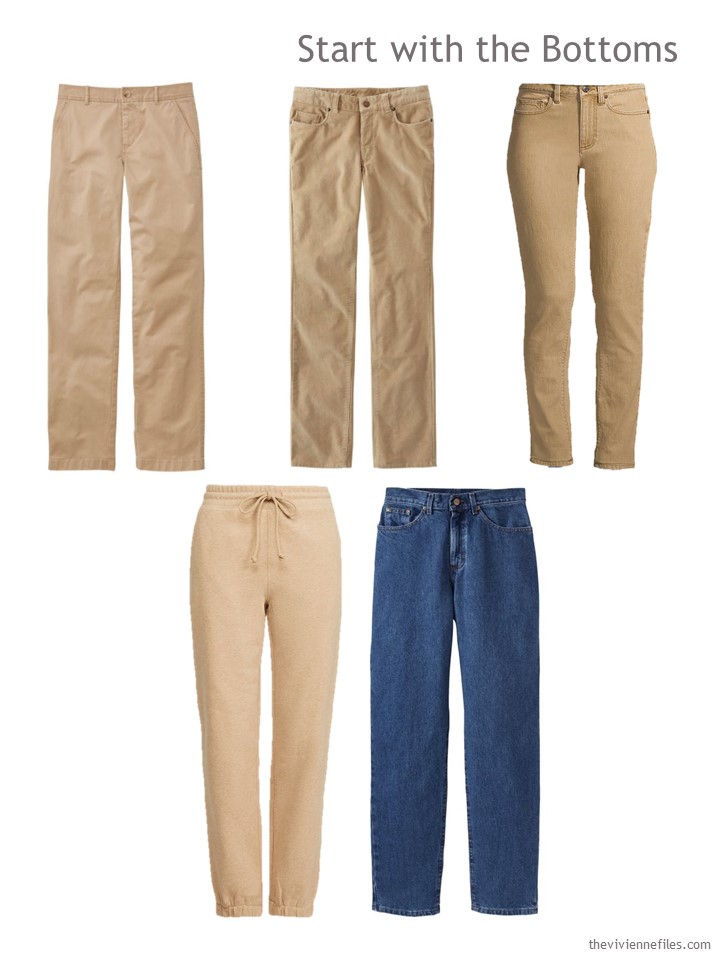
Chinos – L.L.Bean; cords – L.L.Bean; washed cumin jeans – Lands’ End; sweatpants – Rails; blue jeans – L.L.Bean
She’s not TOO concerned about the jeans – denim blue is about as neutral as a color can get, here in the early 21st century…
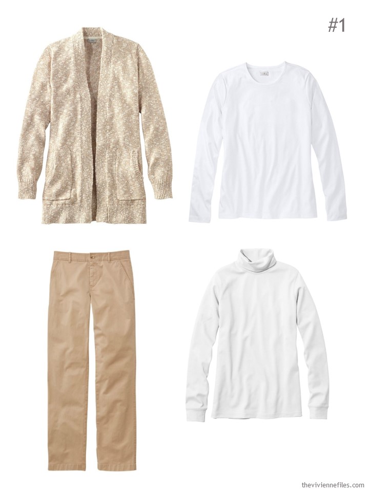
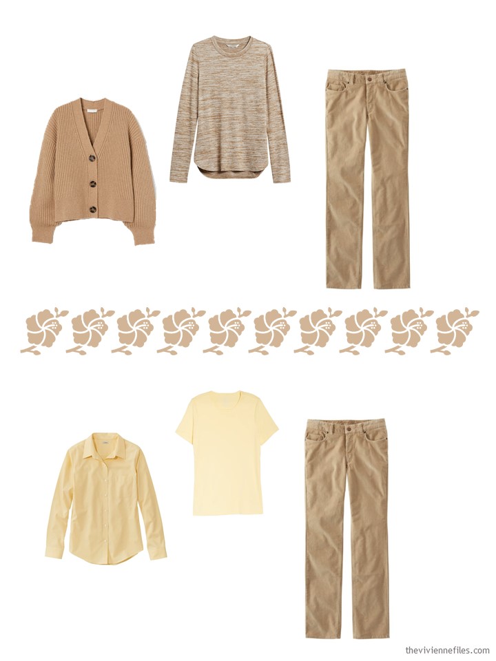
One pair of pants at a time, she chooses her clusters. First up is the most neutral, and maybe the closest to dressy… These 2 outfits of course could benefit from a scarf or some jewelry!
Her corduroy pants are just right with a more hefty sweater, or a thermal fabric top:
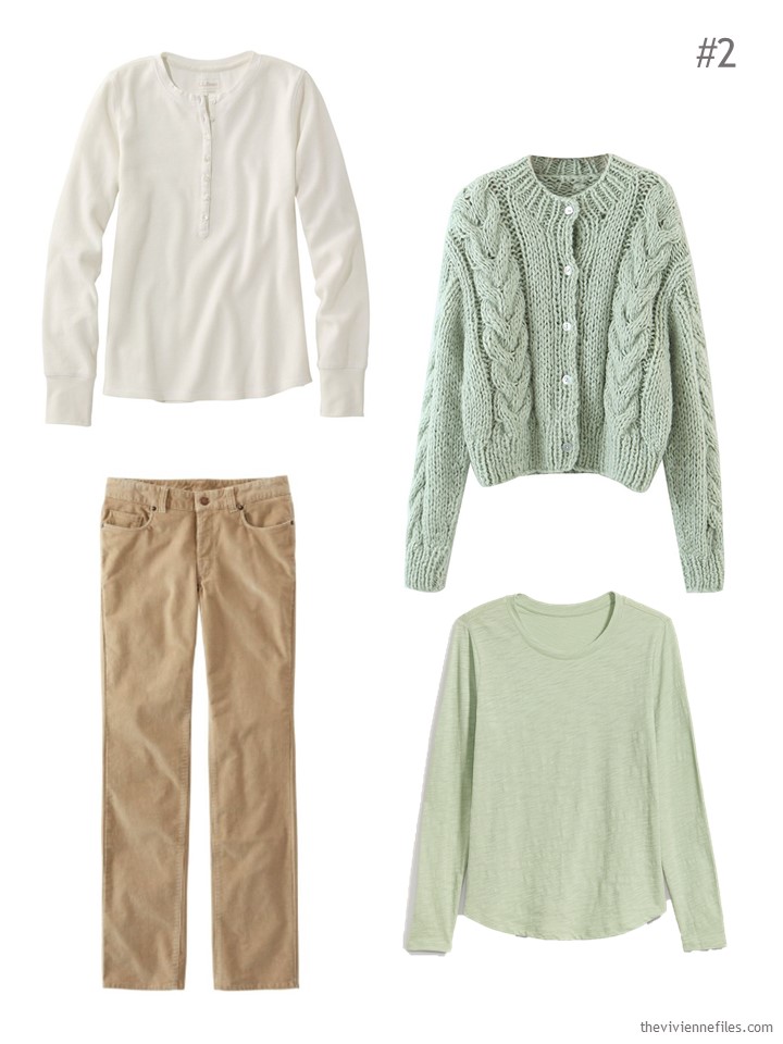
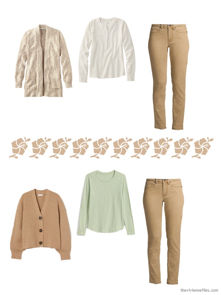
Paperwhite waffle Henley – L.L.Bean; mint cardigan – Goodnight Macaroon; cords – L.L.Bean; oasis fern tee – Old Navy
Her jeans and cardigan will be perfect with a yellow shirt, or with a neutral camel tee shirt:
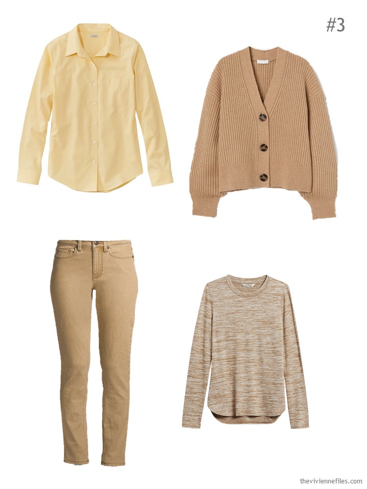
Yellow zest oxford shirt – L.L.Bean; cardigan – H&M; washed cumin jeans – Lands’ End; tee shirt – Banana Republic
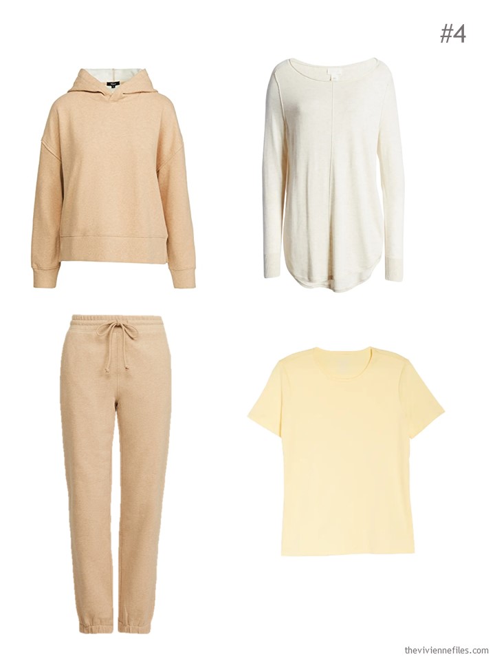
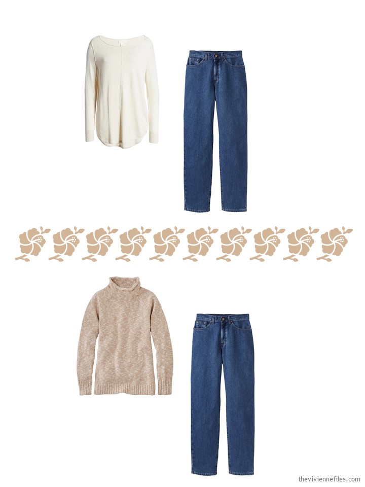
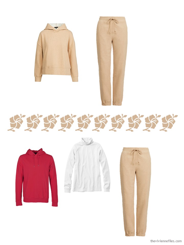
Since it’s been one of those years, and one of those winters, she definitely wants to include her camel sweatshirt and matching pants! A neutral tunic top, and a pretty yellow tee shirt, finish this cluster:
yes, the yellow L.L.Bean tee shirt is from Nordstrom; I’m so confused…
Now, her jeans. And she still doesn’t have any red in her Garde-Robe…
She pulls together a really lovely cluster that includes red, and her jeans, and 2 tops that are perfect with them…
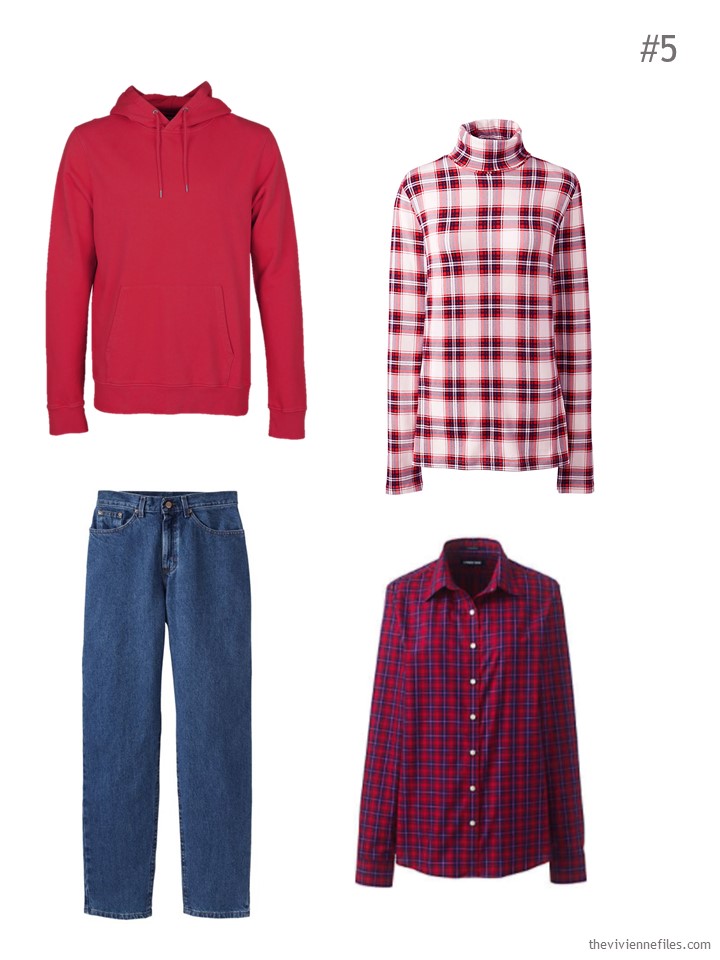
Hoodie – Colorful Standard; plaid turtleneck – Lands’ End; blue jeans – L.L.Bean; plaid shirt – Lands’ End
So all five clusters are, in their own ways, very practical, versatile and appropriate for this time of year.
But when she assembles her wardrobe, she feels…. uneasy….
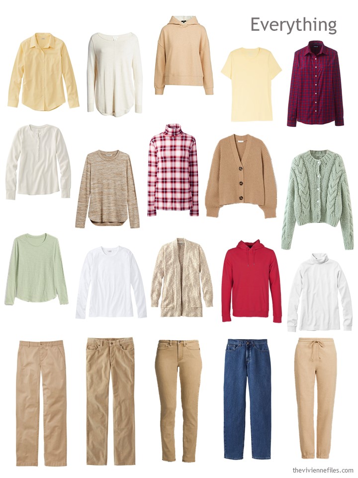
Okay, this doesn’t exactly scream “flawlessly versatile.” It’s not a lovely blended wardrobe that lets you get dressed in the dark.
Still, if I wasn’t shopping, I would STOP HERE AND JUST WEAR THIS….
This isn’t a crisis…
However, it DOES make clear what a goal might be for her next steps in transitioning her wardrobe to warm and soft:
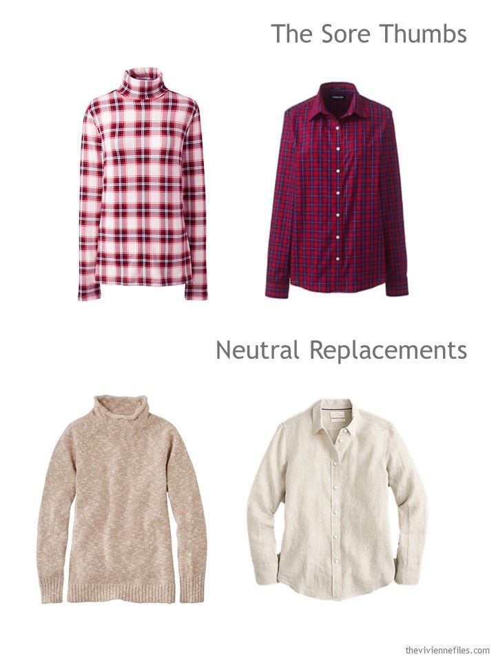
plaid turtleneck – Lands’ End; plaid shirt – Lands’ End; marled funnelneck sweater – L.L.Bean; linen shirt – J.Crew
There’s nothing at all wrong with her 2 red tops – they’re just not right for HER anymore. If they’re in good repair, she might look to resell them…
After her packages arrives, with her 2 new tops, she replaces her red plaid with soft beige, and has a new wardrobe:
Yes, she’s going to look for a green or yellow sweatshirt, but in the meantime, she can certainly wear the red one regularly; red and camel look great together…
She’s nervous now – does she have enough outfits? Of course she does… We always do!
Our heroine is now thinking that she should swap out her red accent color for the darker mossy green in “her” painting, or maybe that elusive mauve pink that she glimpses…
Making a major change in your wardrobe is difficult. Most of us aren’t in a position to just toss everything that doesn’t suit, and buy all new gear! It’s much wiser to cultivate the ability to have 2 wardrobes, for a while. Not always easy…
I’m slowly drifting away from red, and toward pink and purple, as my accent colors. Slowly…
Has anyone else done this successfully? How did you manage it?
love,
Janice
p.s. 3 years ago tomorrow, I was addressing another wardrobe problem! February is the time to handle these things, I guess…
Like this article? Save it to Pinterest!
Too bad there isn’t a soft peach in the painting, although that pinky mauve might do the trick. I agree, red is right out. Without the red it is a restful and soothing wardrobe. And would be great for spring.
My wardrobe is in this exact state. I have been in the process of transitioning from a cool dark wardrobe dominated by black and cobalt blue to a warmer and muted pallet with camel and denim as the neutrals. It’s taken a few years because of my fluctuating weight, COVID, and difficulty finding styles that fit my body shape, lifestyle and budget but I am slowly making progress.
A lot of us are doing exactly this…same challenges. Janice has counseled us to be patient and that keeps me focused. It’s a comfort to come here and read your comments. I like knowing that we’re in this together.
I feel like, if that red was a darker burgundy, it would work better, although the heroine may not like that color as well. I have a pair of jeans similar to that green and I have found a green top with burgundy accents that works.
I understand that the red feels BRIGHT and therefore out of place; but I have to wonder if the red was part of the allure of the painting for this heroine? Upon further analysis of the painting, it is truly used as an “accent” color.
A few thoughts:
– if she is transitioning from “cool and bright” to “warm and muted”, she may already have red accessories that will suffice for that pop of red
– the pattern on those garments. the plaid reads (to me) as very …not soft. i wonder if a shirt with an abstract floral print that had a smaller amount of red in it would read as more “in tune” with the rest of the wardrobe?
– i agree with others that using a softer pink may work better for her wardrobe accent color
-(I personally would shade the camel and put in a darker brown bottom too – the khakis and cords read “same” to me :))
Thanks as always Janice for some lovely food for the eyes and food for the mind – i love all your posts :)
Ezzy, yes! I had been very uncomfortable with the large swathes of red, but without it, the palette feels very flat to me. I would also have used a combination of the beige (it doesn’t read warm enough to be “camel” to me) and that medium brown from the painting to add more depth and variety and to make things blend a bit easier. But even with the brown added, the wardrobe still feels rather low on oomph. The idea of red accessories, to bring in a pop of the color, sounds like an excellent idea! If she likes the inclusion of some kind of red, it may be that a different shade than that bright, cool red would be better. I think burgundy, maroon, or rust might be more suitable. Of course it makes sense that she’s starting with the reds she wore with navy, but I suspect going in a warmer direction with red would be a good long-term plan.
I am also shifting away from red, and have added a small amount of blush pink, yellow, periwinkle blue, and a lot of purple! The colors I’ve added are already in some of the print blouses I have, so it’s not been horrible. Generally a new cardigan gives life to old tops, and occasionally a new top is added. I would love to do more with teal – one of my best colors – but then its the blue teal vs green teal dilemma. My bottoms are almost exclusively black and denim – although I have gray, tan, and navy cords for the winter, not sure what I’m going to do for summer – I do think the red sticks out like a sore thumb and also would have chosen the pink/mauve color – maybe a purse in the bright red? or shoes? just for a pop.
I love meadows and I look forward to our local meadow being transformed in the spring and summer with a profusion of flowers in a sea of green grass. At the moment, its muddy and water-logged from all the recent rain and snow.
This image would be great to create a year round wardrobe from. It has several tones of brown/camel, taupe/grey, moss/olive green, and Ivory, cream/white. The bright accents of yellow and red with the soft pink and mauve. One could wear the darker browns, olive and red in the autumn and winter with camel, grey, taupe in spring and summer with yellow and mauve. I would swap in tan or moss green trousers or a skirt. Patterned tops would also add variety.
Red has also become problematic for me too which I am a bit sad about. I used to wear it a lot in my twenties and thirties but now it can make me look sallow. ? Softer and darker berry reds suit me better. Wearing red on top with navy just cuts me in half and is a bit of a style cliche from another age. Burgundy is still OK as I have a top, jumper, trousers and boots in burgundy. Perhaps an intentionally blended burgundy top to toe outfit might look best on me? Even though I have got burgundy in my reorganised wardrobe to wear now, I think that I might put it back into autumn and wear it with brown or teal as it reflects red autumn leaves. Also cool reds and raspberry red look quite good with purple if the tonal values are similar. ?
Beth T, it’s interesting to hear about your experience with red. I like red A LOT and it looks pretty good on me in a true red or blue-red version. So what this is telling me is: Wear red now while I still like how it looks on me!
Just last night I realized how my go-to color for big purchases is red. I have a red-covered futon mattress, red sofa/chair, and a red car. A person could make a strong case that red is my favorite color :)
Janice,
You’ve nailed my desired template to a T! As a softly muted “ warmie , these are my colors . If only this painting was a scarf ! As for the red, I happily wear a toned down brick red . The reds here are too bright and with too much value contrast in the plaid shirt , something else to consider when having muted personal coloring and value contrasts . Though the mauve pink shows up in the painting, I clearly would not choose it as it is too cool based —a light peach or a blush would keep more to my warm color requirements.
The dark denim blue here seems out of place with the rest of the lighter colors. I do wear denim, but it becomes almost a separate capsule within my wardrobe, because I combine it with cooler colored tops for a column of color , as I am not tall. As was mentioned above, a medium brown or a dark sage green or perhaps even an olive green would work better here .
Overall, a lovely, light and happy selection !
Oops, make that the plaid turtleneck that I was referencing . On my monitor, it reads as overall “ cool” with red , white and blue inclusions .
One last red thought. I agree with Beth T that a softer version of red could be in a burgundy, which I do wear too, as long as I also wear an ivory turtleneck for light below my face, under it and/or a multicolored muted scarf that includes the burgundy in the pattern.
You do know that there are companies that will print fabric for you with any image or design you send them?
Of course, you’d have to either fringe or hem a scarf, but still..
hugs
Janice
No, I had no idea — thank you !
If you are using a company that prints fabric, you would have to be careful to choose an image that is in the public domain, or that you otherwise have the rights to use. Sorry, my art + law background rears its head! – nancyo
In the last couple of years, I’ve added a few slouchy cardigans in lighter colours to wear instead of jumpers. The mint green cardigan also comes in the most delectable shades of pink and purple as well as cream…
I’m thinking of crocheting a cardigan in light teal/jade as I can’t find the right colour online. Moss and sage greens are too ‘yellow’ for me. Adding that to my ruana crochet project though that might just become a poncho or cape.
To Sheila on the subject of green teal or blue teal, I solved the problem by having both! I found that some of my teal garments looked green or blue depending on the light. So as long as they are not obviously wrong together,, I shall blend them with a scarf that has the full spectrum of green-blue or is that blue-green?
Yes, a couple of years ago it was more the blue teal, this year it was more green. They do not work together for the most part, but the blue items are more for warm weather and the green for colder weather, so it kind of works overall.
I may be the odd man out here, but I love the tomato-y red with this palette. I feel the two red shirts come across as cool toned, which is not the direction our friend wanted to go with her wardrobe. I would keep the red, but make sure the tone is warm. I love the look of monochromatic ensembles, but this much beige is too mash potatoes and gravy for me. I would need many more accent pieces throughout. So whether it’s the darker green or warm red, bring on some color!
Celeste, I agree that there is a LOT of beige here, which seems kind of boring. I would like to see brown and/or olive added to have a second versatile neutral.
This is very soothing and I could use the taupes on the bottom but never near my face. I would change the LLBean cardigan to the available red and the H&M one to the lightest beige. I would also change the yellow shirt to the blue that goes nicely with denim.
I have also stopped wearing turtlenecks, since they make the “girls” look droopy even when they are not, so I would change that top to a crew or v neck in a similar style.
Even when the colours don’t work for me though, I get a lot of ideas for how to combine outfits and accents. Thanks.
If she really likes red, I would change the plaid button-down for a red t-shirt (which is what I thought the sweatshirt was at first, and would look great under the beige-y cardigans) and the red sweatshirt for a red cardigan or jacket that could be worn over the white shirts. The plaid turtleneck could do for a while, but I’d replace that with a patterned shirt in red and mauve if I could find one, or a any shirt in a raspberry color or print.
I love these posts that show a wardrobe in transition. The combination of shop your closet plus buy new items is a very helpful set-up since that’s what pretty much all of us are doing. This is much, much harder than creating a capsule from scratch.
Seeing her selections from her closet, it’s easy to imagine that she is transitioning from navy. Red, yellow, pale green…these are all terrific with navy. (Well, really, isn’t almost everything terrific with navy? I consider navy the second most versatile neutral after blue denim, which my eye is trained to see as the ultimate neutral.) But with beige, I’m not loving any of these accent colors, really. The red seems too bright (for her stated “muted and warm” direction), the yellow is just really not great with beige IMO (this yellow seems cool to me, and not different enough from the beige to contrast with it as a clearly different color, so it reads as a kind of weak, sickly, “off” combination to me), and the pale green, while absolutely lovely and muted (and my goodness, building such a harmonious twin set from two different companies is a marvel!), also seems too cool.
So what’s interesting to me about this is that having 3 accent colors that aren’t really great with beige, and having invested so heavily in beige as her new neutral already, when it’s time to purchase two new tops to replace the red print ones, she buys…..more plain beige?! That seems like the very last thing this wardrobe needs.
I think there could be some really useful analysis around that point where you’re ready to buy more to move your wardrobe in a different direction. To me, she has taken an unexpected step by pushing so very hard to this new neutral and eliminating all of her old neutral from the capsule, when these neutrals are clearly quite lovely together! I would have expected an intermediate “in progress” capsule to be a mix of navy and beige, rather than all beige, and for more attention to be paid to accent colors. By doubling down on beige….well, I hope she really, really likes beige, because at the end of a month with this capsule, she might be quite tired of it.
I am now wondering: Can this capsule be saved…by accessories?
It was funny to me that after seeing this underwhelming sea of beige (4 beige bottoms! there’s monochrome, and then there’s monotony), I noticed immediately that the 21 piece wardrobe in the look back post had a much nicer variety of pants colors: light stone, medium beige, olive, and blue denim. I just really think that a good representation of 2 neutrals makes for a better capsule than only 1. (I know there are white Ts here, but the white T is the blue denim jean that you wear on the top half of your body, isn’t it?)
I’m standing with Jackie and AK on the challenges of finding clothes to fit a changing shape without breaking the bank. Having lost a lot of weight by the end of 2019, I’ve put half of it back on in the last year. Back then, I ‘made the mistake’ of sending the clothes I had shrunk out of to charity. Now I’m having to buy trousers in larger sizes again, just so I’ve got something to wear whilst I slim down again, though that is still challenging as we are still in lockdown apart from essential activities. Having the same pair of trousers in four sizes is frustrating but c’est la vie. ?♀️
I’ve bought a copy of the Chic Closet, so I can follow these ideas. My wardrobe is more in limbo than in transition from Winter to Spring. I just can’t get enthusiastic about what I wear. Maybe it’s the gloomy weather as well as Covid restrictions. I’m even reassessing the values of navy and dark blues that I wear, as I’m drawn more to lighter navy or dark grey-blues. True navy just feels too dark, flat and overpowering.
I think Sally makes some excellent points. I am very unwilling to take issue with my style guru, but from my perspective, there’s too much beige and taupe and light yellow. Admittedly, I am a fair skinned brunette, so I do love contrast. But even in a muted wardrobe, there is a need for some contrast. I was yearning to see the olive/moss green included. I think it would make the red feel more at home, too.
You may take issue with anything here any time you want – that’s part of the whole point of The Vivienne Files! If you see something that you don’t care for, then you’ve learned something about your preferences, and THAT’S valuable. I can take the criticism…
big digital hugs,
Janice
And that is exactly why we love you and keep in following your instructive and inspiring posts !
The only thing more valuable to my understanding than a well-chosen TVF capsule that I love is a well-chosen TVF capsule where something is off to my eye! Any time I see something on TVF where I respond, Hmmmm, I know it’s a good time to dig deeper in my response and learn something about my preferences. And as this happens over time, I start to see patterns in my preferences. This then tells me a lot about how I want to build my wardrobe and my outfits. And where on any given day I may learn something like, Man, I really do want cardigans to have coordinating tops (matching or blending) because I love me a non-traditional twin set, someone else is learning that she prefers a very tight color palette, etc.
There are plenty of sites where I see something I don’t like/that feels off/is boring and it’s because…well, it’s too trendy and ridiculous for me, or it’s another variant on whatever is hot on Pinterest right now with 25 year old women whose style consists of looking like everyone else, or it’s a minimalist capsule of the 15 beige pieces that create the 150 looks that will meet every situation you could possibly encounter for the rest of your life and if you own 16 pieces you are a heathen, or an influencer is pushing some strange sketchy brand for money…and nothing new really gets learned from that!
Another helpful thing is reading the comments of other members of this community. Many a time, I have read another person’s response and thought, Oh yes, that’s right, that’s what I’m seeing too!
Janice, thank you for creating a space not where you only show and analyze wonderful capsules, but where we are encouraged to analyze your posts from our own perspectives and our own developing style parameters/preferences and to share our thinking with other readers. Differences of opinion are natural and need not devolve into criticism. To have an online community where differing opinions can be shared with respect is an ever-rarer experience. I for one cherish it.
I would like to extend this appreciation to my fellow readers who put up with my lengthy comments! I am definitely a talk-thinker (and type-thinker). I appreciate the generosity of spirit that is such a part of this space.
I did transition from a wardrobe that had far too much black in it, a color I never actually liked but looked good in for a long time (due to very fair skin). Eventually it became an overwhelming color that did nothing for me, and I eliminated it and replaced it with navy and grey (and shades of blue or light grey). It took many years, and I had to overcome a tendency to continue buying black when I knew perfectly well it was no longer working. It’s a process. It’s ironic to me that I was so resistant to the change when my favorite garment in my lifetime was something I wore as a child with a navy background and lavender flowers. I always preferred navy, so I don’t know why I persisted in wearing black, other than it was always (too) easy to procure. Just keep pulling out the pieces that no longer work, would be my suggestion. Put them in a box out of sight and unless you wake up in the middle of the night pining for them, you likely won’t even remember you got rid of them when you see how good you look in your new colors.
Alison, I know I have a range in my closet from items that are spectacular for me to items that are OK-but-not-great. I can eliminate the items that truly don’t work, but have difficulty cutting deeper into the pool of OK items.
Your post makes me ponder, What is it that keeps me from wearing my A team items and outfits every day?
I agree Alison, transitioning a wardrobe takes many years and it is a process that has evolved without me over analysing everything. With you it was accepting that you favour navy over black. For me it was because I inately recognised a need for neutrality in my life rather than a veritable riot of colour which could lead to sartorial clashes.
Changes were subtle and it was about making different choices when replacing items or filling gaps:
Choosing shades of grey or ivory for winter coats, instead of a clashing red coat.
Replacing brighter red with softer burgundy, wine or berry red.
Choosing dark grey-blues or blue teal rather navy.
Adding in more shades of purple and teal.
Finding a soft brown and discovering a proper taupe that’s not beige.
I also made subtle changes to my style by reading style tips:
Wearing coloured trousers or long skirts to create a column of colour or a blended outfit in one colour group which suits my petite height.
Finding the ideal length for jackets worn with skirts and trousers which was a lot of trial and error.
Embracing ankle length skirts and dresses as a style choice – regular midi length is ankle length on me. Worn with short jackets or cardigans, my silhouette is lengthened and my short legs hidden.
Accepting that though I might like the ‘idea’ of something, it might not suit me.
Fiona Ferris in her book, the Chic Closet talks about finding and listening to your ‘inner muse’. Over the next couple of years, as I head towards another significant birthday, I want reconnect with my inner muse to develop my signature style that can take me anywhere without trying too hard.
I need (and want) fewer clothes that work harder. The pandemic has taught me that that is possible. The only thing holding back, holding on, or holding out is ME!
Looking at the beige and the picture I would consider a poppy red, clear with yellow rather than blue undertones for a shirt/tee shirt in a soft fabric. I think that’s why the red hoodie works and the shirts didn’t. Also the discarded shirt and top had a very utilitarian feel somewhat out of sync with other wardrobe items.
I’m surprised that no-one’s mentioned the look back. It is a great example of a wardrobe transition, as well as creating a unified collection of shades of blues and greens.
Well done, Janice. We appreciate your efforts each week and it can’t be easy finding anything attractive or even new to show us. I feel that perhaps the designers and have lost their mojo and sense of direction a bit – haven’t we all? I’ve looked on several websites and I’m a bit underwhelmed to be honest. There are one or two gems but I just have a sense that I’ve seen it all before, several years ago. Also things are baggy, oversized and slouchy. What’s your take on the new season as you must look at thousands of items?
Although I have found two very pretty LILAC cardigans in different styles – a warm one for now and a pointelle lace for summer. Finding anything on the purple spectrum is a rarity, so two items is a bonus. Not only that but they are from the same shop – so I’m as happy as a Spring lamb! ?
Beth what a joy to find those lilac cardigans! We haven’t seen the soft lavender to lilac tones in years. It’s time for them to come back. I went looking the year Janice did that pretty lavender toned Hermes scarf with the Appaloosa pattern because it was so attractive and especially with the navy she put it with. Everywhere I looked – nothing but I’ve been hunting for it ever since.
I loved the look back capsule in the blues and greens and lightened up version. I’d use soft greyed pastel aqua & lime with navy, grey & white as my interpretation. I have a lovely scarf in lime with soft aqua tones that might be my springboard into summer. Hmmmm.
I agree, Beth, the look back was terrific. I enjoyed seeing how Janice handled that situation in two different ways, depending on what the heroine was looking for. I can’t get enough of those types of posts.
Hello Everybody! Upon further review of today’s painting, I think substituting the pink-mauve for the red would make this a more ‘muted’ harmonious combination.
That being said, if one wanted to include red (because it does make the meadow stand out), the combination could focus on red, camel/tan, white, and olive green.
I have to admit, I am not one who tends to be muted (in fashion or life ?)
To the question about moving away from red to pink— yes. I really noticed it this fall when I participated in the project 333 on Instagram. I had done a major closet purge previously, in January and again in the summer and couldn’t let go of some red tops and a jacket.
By forcing them into my capsule I figured out 1- I look great in them—- but 2- I don’t like to wear them anymore. I literally cut 3 items out of my 20 items of clothing rather than wear them.
I let go of them in January a year after I noticed I wasn’t wearing them but wasn’t ready to let go. I still have a red tote purse & red and white silk scarf just in case.
About 6 years ago now I started buying & wearing pink. It’s replaced the reds almost completely. I feel at home in pink, healthy and happy in it and it dials down my stress level when wearing it. That & pale blues, pale periwinkle, soft greyed aqua have all replaced more vibrant versions. I used to wear coral but now a peachy blush replaced it.
I’m 64, I’ve got several autoimmune issues that result in fatigue and quite a few stressful things in the past 3-4 years so that might be part of it. It feels easier to wear softer tones.
I would love to see some more compatible reds, and I would put them in a capsule with the beige, and add some of the other colors to the capsule with the denim jeans. And I really struggle with the pale yellow and beige combination, but that might be in part because those are two colors I absolutely cannot wear. But I’m glad that there are people who can, and who love them! – nancyo
For anyone, particularly in the UK, interested in the lilac cardigans, I bought them from George at Asda.
What occurred to me is that if a person chooses a piece of art (or a scarf or a sculpture or whatever) as her inspiration, she needs to ask WHY she is drawn to it — is it JUST the color combination, or is it the percentages of each color, as well? (There could be more reasons, too.) Here, I wonder if the heroine needs to consider those percentages very heavily. The accent colors really are accents in this picture — if the red took up as much space on the canvas as a LS shirt takes up on the body, the painting would have a VERY different feel. I think a woman with low-contrast coloring who is committed to ALWAYS wearing accessories could look terrific in a nearly-all beiges/camel wardrobe with lovely scarves and jewelry that had touches of the accent colors, probably usually in combination to get an effect similar to the painting. This has been an ENLIGHTENING post and discussion for me, and this high-contrast-but-greying lady is going to evaluate her wardrobe with fresh eyes today. Thanks, everyone!
Lori, I am unable to reply directly, but wow, your question about WHY is a great one!
I could see myself thinking, I love this {inspiration image} with the red in it, so I’m putting red into my wardrobe, and now I’m buying a bunch of red garments, and I’m putting myself in a shirt and red pants with beige shoes and it isn’t right at all.