February 24, 2021
This may or may NOT change your feelings about this wardrobe; I suspect that I’m going to revisit this at least twice! Maybe once use darker brown and olive to balance the red, and a second try to incorporate the mauve pink in place of the red…
This is where we started:
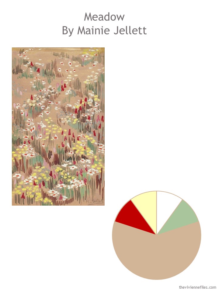
I already feel like the wheels are coming off – the red accessories that go so well with this outfit won’t be worn with any other outfits except maybe an all camel ensemble…
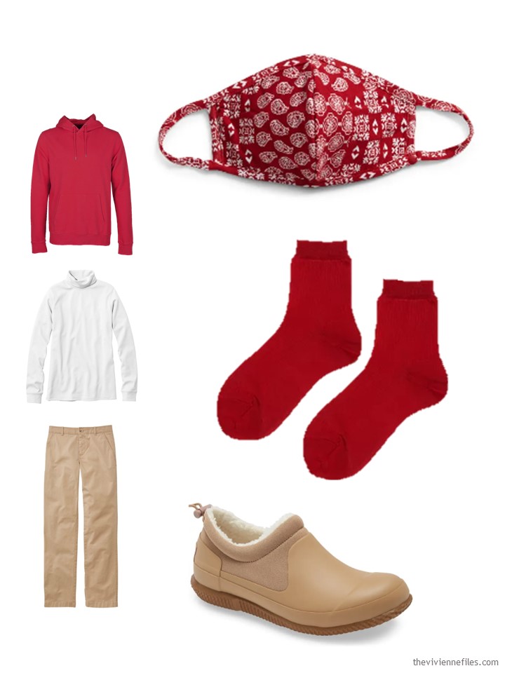
Sweatshirt – Colorful Standard, white turtleneck – L.L.Bean; Chinos – L.L.Bean; mask – Astr the Label; socks – Hansel from Basel; slipper shoes – Hunter
This outfit screams “reading on the sofa for 5 hours” to me…
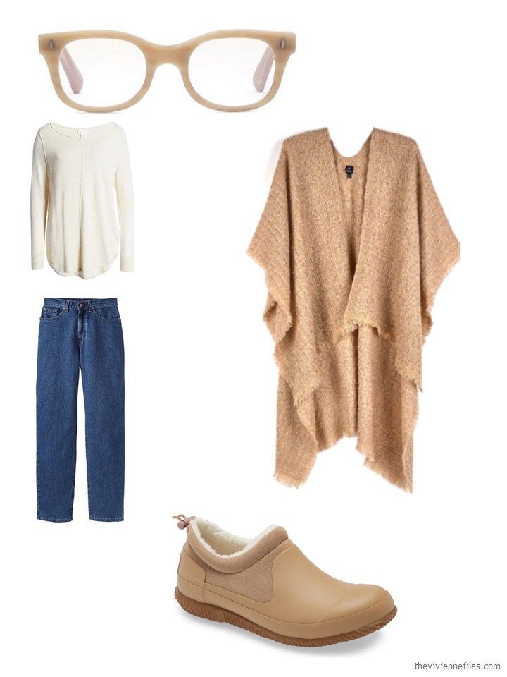
beige tunic – Caslon; blue jeans – L.L.Bean; blue light blocking glasses – Caddis; ruana – Echo; slipper shoes – Hunter
If you haven’t had a haircut in a REALLY REALLY long time, a pretty hair clip might be smart…
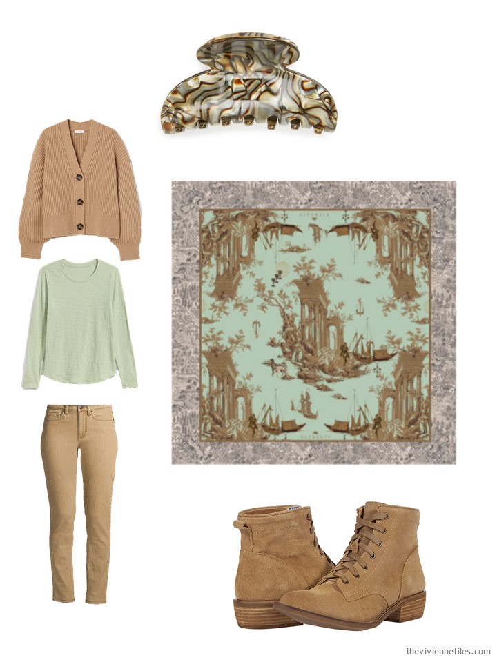
cardigan – H&M; oasis fern tee – Old Navy; washed cumin jeans – Lands’ End; hair clip – France Luxe; scarf – Klements; boots – Dingo
The green puts our heroine in the mood for 4-leaf clovers, and who could blame her?
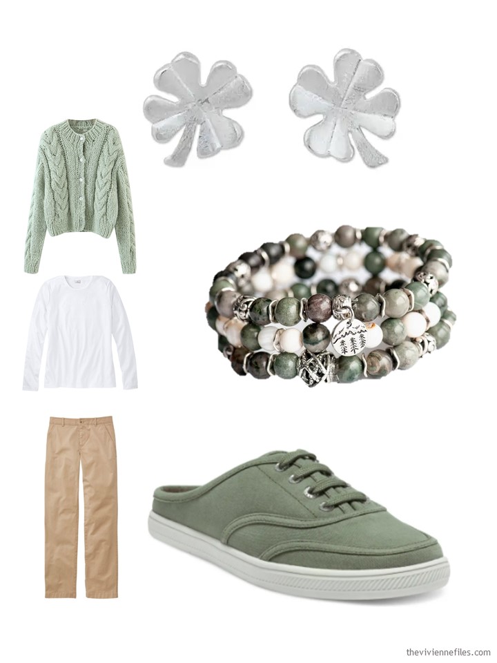
mint cardigan – Goodnight Macaroon; white tee – L.L.Bean; chinos – L.L.Bean; earrings – Ying; bracelet – Fierce Lynx Designs; slip-on sneakers – Vince Camuto
I think this next outfit really captures what this heroine wants – a subtle, warm ensemble that’s quietly attractive:
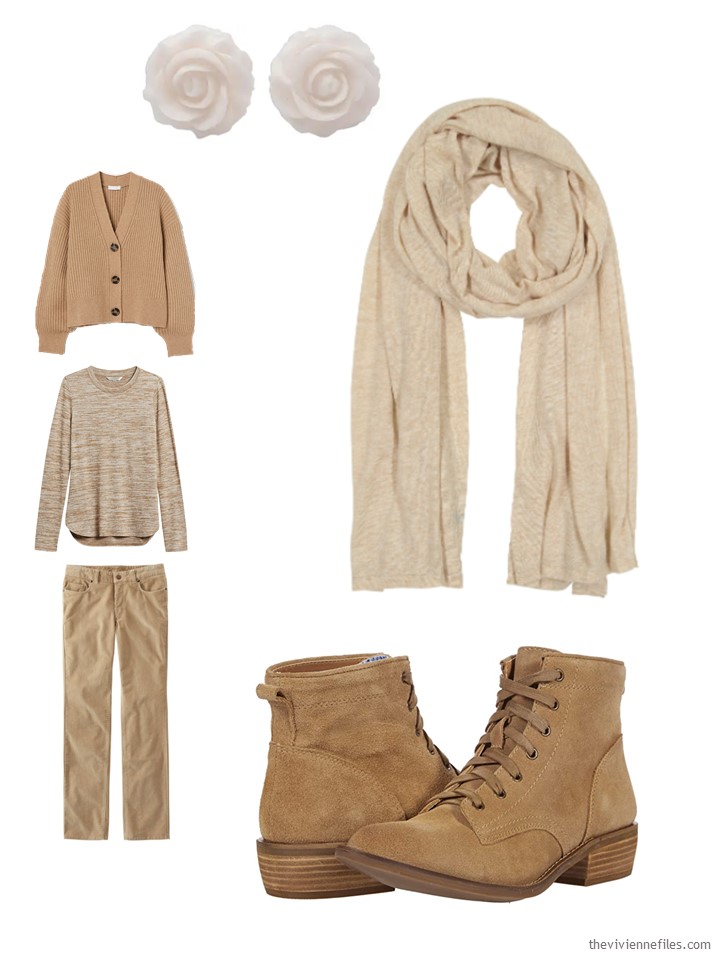
cardigan – H&M; tee shirt – Banana Republic; cords – L.L.Bean; earrings – Ayu Ary; Scarf – Echo; boots – Dingo
This scarf, and the ring, will work well with the red. But they feel too bright to go with most of the rest of the wardrobe… hmm….
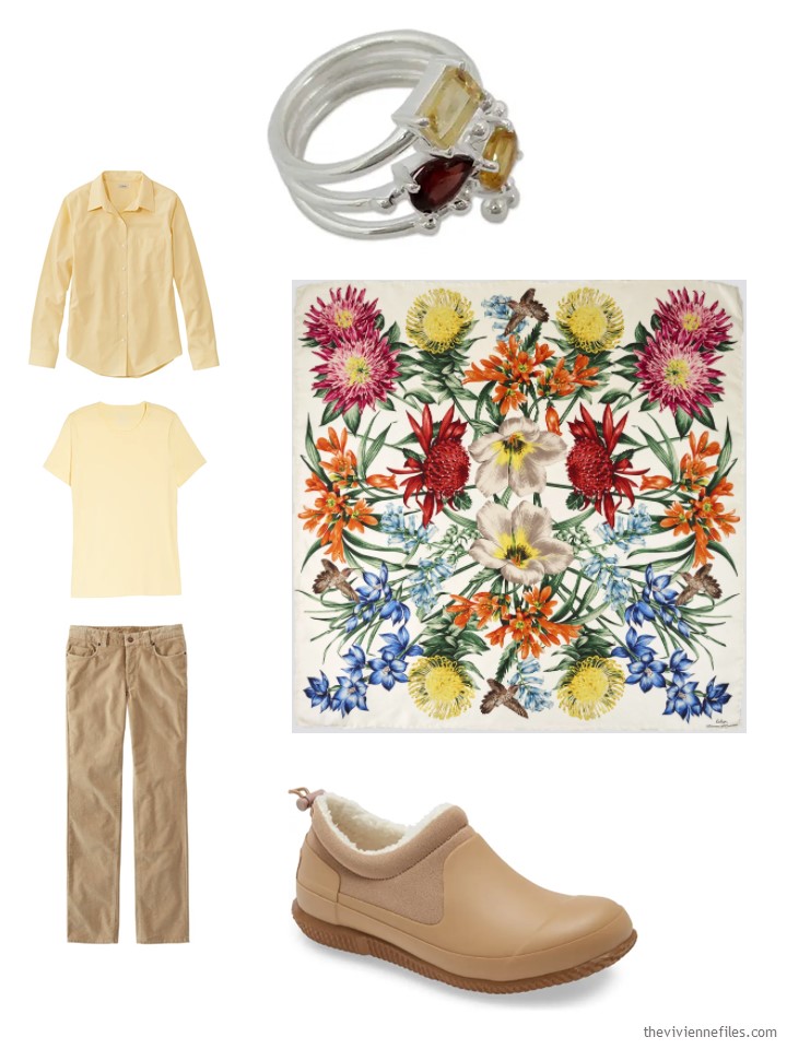
Yellow zest oxford shirt – L.L.Bean; tee shirt – L.L.Bean; cords – L.L.Bean; ring – Mahavir; scarf – Echo; slipper shoes – Hunter
This is another outfit that feels (to me) like what our heroine desired. Quiet. Calm. Warm. Subtle…
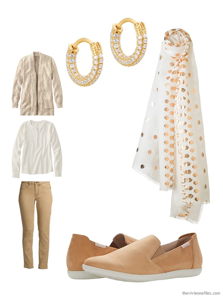
Cardigan – L.L.Bean; Paperwhite waffle Henley – L.L.Bean; washed cumin jeans – Lands’ End; earrings – Seol + Gold; scarf – Helen Kaminski; shoes – Mephisto
Yep, this scarf goes well…
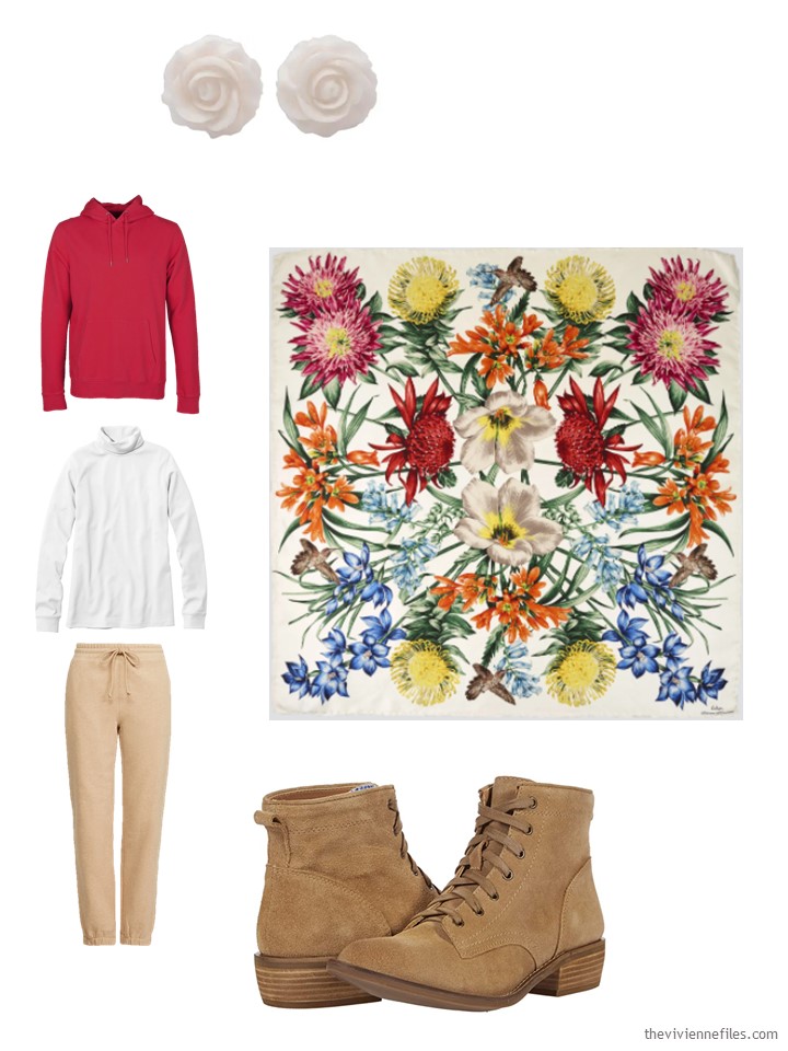
Sweatshirt – Colorful Standard; white turtleneck – L.L.Bean; sweatpants – Rails; earrings – Ayu Ary; scarf – Echo; boots – Dingo
This next outfit feels like another stay at home and lounge type of ensemble!
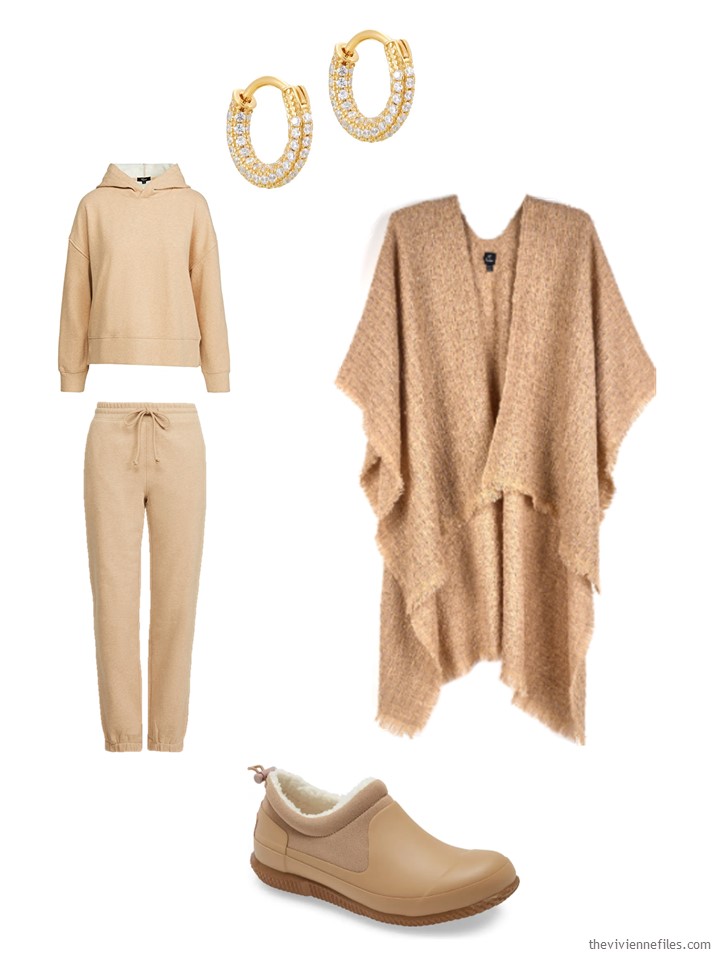
Sweatshirt – Rail; sweatpants – Rails; earrings – Seol + Gold; ruana – Echo; slipper shoes – Hunter
A simple sweater and jeans are a perfect base for your favorite scarf…
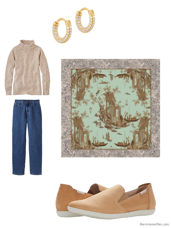
marled funnelneck sweater – L.L.Bean; blue jeans – L.L.Bean; earrings – Seol + Gold; scarf – Klements; loafers – Mephisto
It’s the same issue – the 3 items with red in them just don’t BLEND…. I like colors that blend!
Wardrobe choices that aren’t perfect the first try are still useful – we learn a lot from our mistakes, right?
love,
Janice
p.s. Four years ago, we added accessories to a very “denim-heavy” wardrobe!
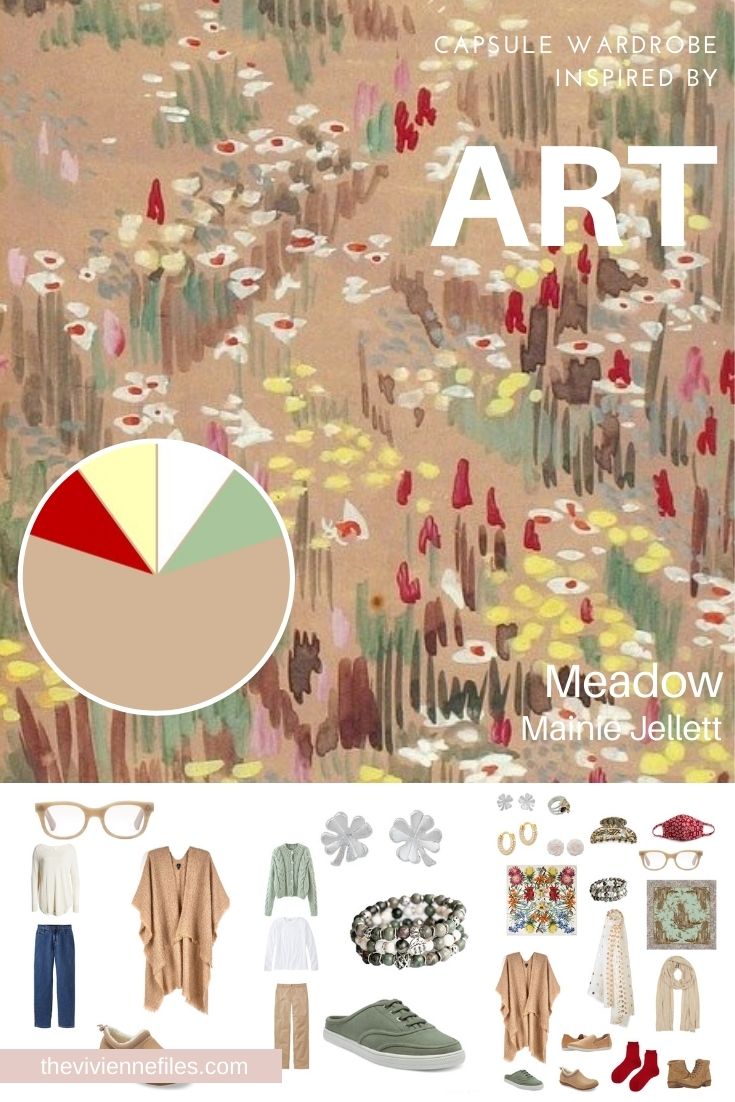
Like this article? Save it to Pinterest!
Just to let you know that the link to the H&M cardigan is broken on both images it features on. It’s a great shape – classic cut with loose sleeves for comfort. My kind of style.
To me, the source of the problem, and I do see there is a problem, lies in the painting itself. The throw back painting was brilliant. There did not seem to be a struggle with it as there is with this. However the struggle is way more typical of my experience with building a wardrobe.
This really interested me, as my wardrobe for Lent is similar – half of it camel or beige, then 2-3 pieces in dove grey, olive, denim blue and orange (no shade to my orange, just the lovely pure orange colour you associate with orange – although I’ve seen it called pumpkin and, wonderfully, brave orange).
So my orange acts rather as your red, except I don’t feel it is a sore thumb colour. My 2 orange tops look great with all the other clothes. Hanging in the wardrobe, it is nice to see something bold amongst the calm (and slightly bland) colours. I find in the darker days, a bit of colour really picks me up.
Maybe your heroine doesnt need to ditch the red, but try to add subtle red to her outfits.
Red earrings or a pendant necklace, maybe a red handbag, or red and camel? Make red something for every day, not one outfit.
I would have kept the plaid turtleneck too, if it is your favourite colour then rock it. But then I’m used to having to defend my orange.
Honestly, this wardrobe just doesn’t do it for me, though I can see it would look fantastic on those with the right coloring. I’m not sure an accent color HAS to blend with all the other colors, and the red and camel look good together, although overall the red does still kind of stick out. The accessories make a TON of difference and you’ve done your usual brilliant job of selecting them. Especially nice is that scarf that ties in the green and the camel Perfect.
I actually like this wardrobe! I think the “not blending in” of the red pieces is part of the beauty of both the painting and the wardrobe: maybe this heroine craves the tranquility and softness of the beige but also feels like standing out every once in a while.
I also have different “wardrobe moods”, so a not-so-blended wardrobe feels more relatable to me than a perfectly homogeneous one.
Alice,
I quite agree !
Me too.
The red doesn’t blend in the painting, either. For me, that’s the joy of it – the pop!
Janice,
The red is fine with the camel, works with the denim, and will work fine with brown and even a muted olive, so I have no problem with it in the painting as an accent pop of color, otherwise the painting would be too bland, The problem within a wardrobe , however, is what I have expressed before — how the intensity and value of the color fit with one’s own personal coloring or not. I wear camel/tan a lot as my alternate to the brown, olive, and denim neutrals in my closet. It works with my coloring , though an all beige or camel ensemble needs either texture , a gently colored scarf or jewelry to perk it up .
Color is so subjective to the individual wearer, and what works for one may not work for everyone, so I choose what I know happily works for me and allow others to do the same !
Oh, that bright floral scarf! It is really beautiful. I rarely wear the scarves I already own….
For me the beige would be taupe. I wear all taupe outfits and also add reds, blues, pinks, whites, and teal greens for accents when I want more color.. Obviously not all at once! I find it very versatile and it works with my coloring and/or mood of the day. I do think the pops of color work and as an example, would keep the red plaid with all beige/taupe and wear it with red tennis shoes or boots.
The painting is very appealing to me; I like the pops of red in it. However, I agree that the translation of these colors to a wardrobe doesn’t exactly feel right. I suspect that using a more muted red and changing the green to a muted olive might help some and adding some variation to the neutrals, like a cocoa brown, might help as well. I did enjoy the lookback and fell down the rabbit hole of all the posts associated with that painting. The story of the heroine that works in the field and needs sturdy, casual clothing but loves to look and feel feminine and pretty resonates strongly with me. I often feel like I can’t achieve the level of feminine and pretty I would like due to the clothing most practical for my job. And once again, I am completely taken in with the blended nature of the neutrals used in both the gray and olive and gray and denim wardrobes. The garment-dyed and/or heather nature of these clothes makes everything work together so well! I was actually thinking that a wardrobe including the gray, olive, and denim together would likely work well. Adding some sort of soft cocoa brown or taupe, a version of camel/khaki/beige/stone, and ivory would really round things out and keep with the “nature girl” feel. It also reminds me of the colors used in this example capsule wardrobe for men that I am continually drawn to for its versatility. It sometimes makes me wish that women’s clothing was as simple as men’s. https://www.realmenrealstyle.com/interchangeable-rugged-outfits/
Lyneisa,
From your photo, you can’t help but look feminine and pretty !
Shrebee, thank you very much!
Interesting article. Thanks
The accessories definitely help this wardrobe. She looks less like a Target staffer when the red sweatshirt outfit has a scarf with it. ;)
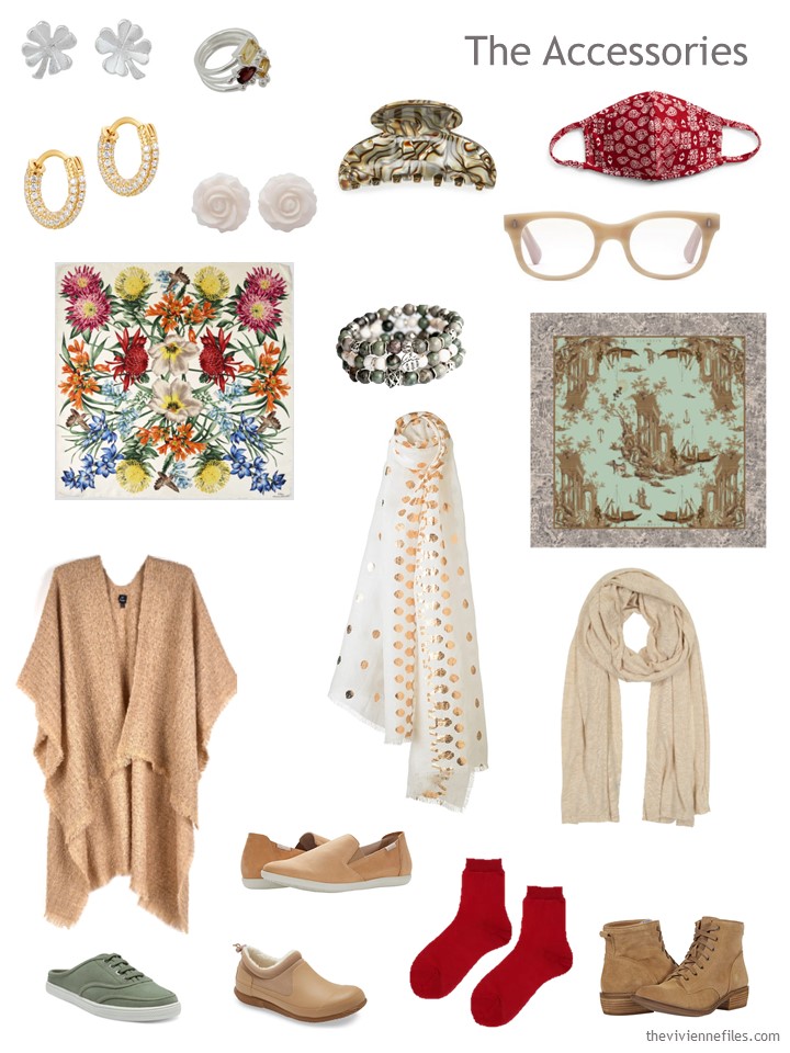
I am surprised at how much I love the outfit with the white polka dot scarf, the huggie earrings that echo the roundness of the scarf dots in their overall shape and the shape of the stones, and the simple slip on shoes. This one made me stop and think, Oh THAT is what she’s going for, I see it now.
I personally love the bold floral scarf, which so helps integrate the yellow and red. If she has a sometimes-calm, sometimes-bold style, then I can see it working. But if those calm all-neutral outfits are more her style (and it sounds like they are), then I don’t see this bright red making the cut long-term.
I’m still curious how a much softer red would work (I have a soft red cardigan with brown buttons that would probably be too blue-red for her, but that has the muted quality). But at this point, I would try ditching the red, supplementing the warm neutral base with a wider range of brown (so many of us really liked the recent monochromatic wardrobe in shades of brown), and consider introducing olive (she’s already got the terrific Fierce Lynx bracelet). It may be that a pair of red reading glasses and a red lipstick would provide the all the pop of red that she needs. If not, she can start adding a few items in a much softer, mellower red…I’m thinking of heather, marl, cable knits, tie-dye, ombre…something with texture and/or striation (kind of the opposite of the bright red sweatshirt).
If she does want to keep yellow in her wardrobe, as well as red in some capacity, she could do worse than pick up the slip on sneakers (which are a strange thing to me, but whatever) in the “sunset strip” colorway. They have a softness to the print that may be more congruent with her desired look. They are not “quiet” exactly, but they do seem muted. I would add in the “Apple a Day” jasper bracelet from Fierce Lynx (or something similar) at the same time. A reader suggested earlier using red in accessories, which I think is a great idea. I’m thinking that warm red blended with beige/brown might be worth trying as an alternative to the bold shocks of red (like the socks and mask)…though this does veer away from the “pop” of red idea in the original artwork. Just another possibility!
Lovely accessories!
What if our heroine decided to make a slight course alteration and base her wardrobe on that fabulous Echo scarf?
I love that scarf. It would be fun to see that as a start with a scarf capsule. And some people actually do look better with a contrast/pop of color, while others look better with less contrast. Something I learned from one of those wardrobe and color consultants. When she gave me guidelines, I got so many more compliments and my wardrobe came together. When she evaluated me for my color swatches, one of the colors we thought would be a great neutral for me was camel— great with my hair, etc. I was a news anchor back then. One night, I wore my lovely camel blazer. She called me the next day and said, as much as it blended with my coloring, it was, perhaps, a bit too much and washed me out. Her caution was to wear it with a pop of color. That helped, but I’ve stuck with more flattering neutrals, careful to keep some contrast in my choices. At the same time, other people look smashing with more blended selections. There’s no one formula, but Janice is doing such a great job of showing us the possibilities and how to find our best look. I’ve been recommending this page to friends everywhere and they love it!
I think the red keeps this wardrobe interesting. In the painting, the red draws the viewer in and creates movement and tension in the midst of the calm. The polarity is dynamic. This wardrobe captures one aspect of the painting brilliantly. If I could wear camel, I would enjoy this wardrobe immensely!
I think the red looks nice with the camel but may come across a little Christmas-y with the light green. However, one should wear whatever one likes!
Off topic: I have put on a few more than the Covid-15. Now that there is nicer weather, I think I should wear some forgiving jeans/slacks when I have to go out as sweat pants are, well, a bit sloppy for going to the doctor’s. Do you sweet ladies have a suggestion of nice-ish pants for someone who doesn’t know her (temporary) exact size that will also not break the bank? I plan on getting back to my proper size now that the weather is warming up and I can exercise outside. However, that will take more than a day. TIA
Mirren,
Try some dark fine fiber knit pants with a tie waist band, or ponte pants , not the heavy sweat pants type. I have found them to be both forgiving of the lbs, comfortable, and surprisingly, look nice when out in public . I have them in dark brown, navy blue, olive green and tan. They do not show every nuance of my figure !
Ooh this iPad ! Make that Moreen !
Hi Everyone! I think I have noticed where the disconnect is for me: the sagey green and the red. For me it’s like radio static. One or the other in this capsule, but not both. imho
btw… The ruana from Echo comes in a pinkish-mauve color which could fit into this combination.
can you add warm weather options – in Texas we either freeze or the next week hot and in short sleeve t-shirts – I really like your color choices but not wearable in Texas most of the time
All the comments about the original ‘Meadow’ wardrobe and the accessories are absolutely fascinating.
Now with the accessories, I can see where this heroine might be heading. I have noticed that H&M for instance have chosen a limited colour palette for their clothes – muted, softer, warmer, neutral shades with pops of other colours which are still gentle.
I think over the past year, we have not needed to stand out from the crowd and bright colours can look a bit harsh when you see yourself on screen in a Zoom meeting!
Perhaps our heroine has that jazzy floral scarf in her wardrobe which looks great with red, navy, denim and brighter colours? Perhaps, she has noticed the softer and warmer colours in the scarf and wants to try something new in the ‘brave new world’ we are emerging into?
I can see the appeal of the painting as a way of reinventing herself. Perhaps she already has some yellow as the floral scarf looks nice with that and the garnet and citrine ring can be worn as a bridge with red or yellow. I’d love to see this colourful scarf as the basis for a range of different outfits another time.
The painting has enough neutrals and accents to experiment with until she is comfortable with the accents and tones that suit her. It’s trial and error sometimes putting different colours together if you’ve not worn them before. Asking other people for their opinion can be reassuring. Accessories also help tie things together and are a way of experimenting and adding a new colour in small doses.
Perhaps she might eliminate red or just leave one outfit or have red accessories for when she wants to stand out from the crowd or to suit her ‘wardrobe mood’, as Alice suggested. Having a few very distinctive colours can be liberating and can surprise people who might have pigeon-holed you.
Not that I will ever wear camel, I’m really looking forward to seeing this wardrobe with mauve – perhaps that’s where the green and dark brown might come into play. The green also dampens down the intensity of red.
These posts have really got us thinking.
Hi Lynesia – Sorry, I can’t reply directly under your comment.
I share your predicament of wanting to be pretty and feminine in a world that is increasingly casual and informal. Although my jobs were in libraries, I used to spend a great deal of time shifting boxes, standing on steps, pushing trolleys, and sitting in cold draughts on the desk by the door.
Gradually, I ditched the skirts and dresses of my youth in favour of practical trousers for warmth. After spraining my ankles several times, I had to stop wearing high heels and wear flat shoes or boots for stability on steps.
These changes made me feel frumpy as I’m only five foot tall. I also felt less noticeable because flats made me feel shorter. I’ve also found trousers the most difficult garments to fit properly and shoes/boots likewise because of my very wide feet.
However, I learnt tricks to look taller by concentrating colour and pattern on my top half whilst leaving my trousers neutral or plain colours.
Complete colour co-ordination of my outfits has been the thing that has got me noticed. There is also a lot to be said for concentrating on cut, fit, fabric and the small details or embellishments that lift a garment from being commonplace. So I wear pretty and feminine garments on top of quite plain and boring bottoms. By concentrating on little decorative touches on my tops and jumpers like lace, crochet, beadwork, tiny frills, pin tucks, bows and floral patterns. I can feel pretty and feminine in an understated way. Well chosen jewellery and accessories adds to the coordinated look. Fabrics can also make a difference: satin or silky smooth blouses instead of cotton; shaped instead of baggy knitwear, jackets in tweed, velvet, suede or leather. All of these can be worn with jeans or cotton twill trousers to good effect.
It is true that you don’t need to dress in men’s clothes to succeed in an industry dominated by men. So underneath your overalls or high-vis jacket and trousers, you know that you are wearing well cut jeans, a pretty blouse and feminine jumper. Knowing that you look and feel good on the inside is a confidence booster.
This particular set of colors together I think becomes an excellent learning tool. When you begin deciding what “your” colors are, you often do face a wardrobe of magpie pieces chosen without any idea of coordination. We buy them when we see them. Do they go with what we have? Maybe, but only in certain configurations. One of the things I’ve learned from The Vivienne Files is that not every wardrobe (either mine or the ones presented here) necessarily goes together. They can lack internal cohesion. I found myself gravitating towards the ‘whatever’s clean’ design idea (once I understood what it meant, that you could get dressed in the dark). I culled everything that did not work with that idea (because I had too much stuff, not all of it mattered to me, and not all of it felt coherent). For me, the above colors absolutely do not work together, except in certain configurations. I would not use white, even if the canvas compels it; I would use an off-white or better, ivory. I would focus on how to make camel and off-white the core focus of the wardrobe, and then throw in pops of color. Red and camel (or red and ivory) are wonderful together. Pale green, I do not love in this wardrobe (these are all just personal opinions, no one has to agree) so I would darken that green, because camel and dark green are also gorgeous. Dark green and ivory are gorgeous as well. I do think that while paintings can inspire, they don’t have to be fully adhered to unless you love those colors together, but it’s rare that the person who can wear camel can also wear white that close to the face.
Alison,
I quite agree that the art or scarves or other tools as sources of inspiration here are just that — inspiration and not a rigid protocol for strict adherence to a given color combination ! We all have to do what works for us as the individuals that we are, of which Janice always graciously recognizes and confirms !
Alison, you make excellent points here that raise the question, How much does a given heroine value having a coherent wardrobe? For some, a more fully interchangeable wardrobe is relaxing to see, low stress to get dressed from, and reinforces daily a strong style identity. For others, this type of wardrobe is too tight to allow sufficient variety of colors/styles/shapes, makes it harder to shift between style personas, and does not readily support mood dressing. It’s clear from comments that we have readers all along the spectrum from “fully integrated whatever’s clean” to “magpie trying to bring a bit of order to the chaos” (that last one is me).
This post has been an amazing inspiration of discussion and strongly underlies how important the “personal” is in personal style. Janice, I hope you do continue to show us various paths a heroine could take with this wardrobe. I would love to see more of these imperfect wardrobes in transition posts!
YES! I totally agree with your comments Sally! We are all so unique in what we want out of our wardrobes! Personally, I’ve been pulling a 21-piece “monthly wardrobe” from my closet since Janet introduced the concept (November?), and have found it enlightening for my personal style. The fist month, I loved what I pulled (several accent colors that didn’t necessarily go together), but didn’t find it to be the most versatile. The second month, while I had my “needs” covered (Xmas, festive, etc), and easy mix-and-match, I was BORED by the end and really looking forward to adding back in more accents ( I limited to red and green for December).
I think the “various paths” transitions would be a really interesting exercise: for example, path 1 : more muted and harmonious, path 2: hammer home that pop!, path 3: more variance/shading in the neutrals, tone the pops stronger; path 4: same as 3 but tone the pops milder; etc
Janice – as always, you have done an amazing job. I love that you get your readers to THINK :) :) :)
Also love that this wonderful community THINKS :) :) :)
What a wonderful set of comments and perspectives! Just love VF!
For me, the art – while beautiful in itself – is not inspiring for clothing. It’s what so many said: color is SO individual; most of the shades in the painting don’t work on me. (I could interpret though for my coloring … maybe tomato red, darker camel, olive green, with a pop of saffron.)
But isn’t that what makes life interesting? Different strokes for different folks? Yes, a little painting pun there.
To Zaidie – Fly that orange flag, Sister. I love your philosophy about dressing with color!
… and … I agree that building a wardrobe off that terrific scarf would be amazing.
I don’t have any problem with the red in this wardrobe and would seek to add more of it, especially prints and patterns. And that scarf is perfect with not just the red but the denim and any of the many outfits that can be made with either. I agree with the comment above that it’s a great idea to differentiate this wardrobe from a Target staffer’s! – nancyo
Thank you Janice. What a wonderful discussion. Can I say I’m probably in the “Magpie” group!
ditto – kind of. I have managed to “limit” myself to, well, now it’s mostly six colors, and two neutrals… I look at the homogenous wardrobes sometimes and think “how classy and elegant” and the same time realizing that will never be me. As I had on a purple sweater, purple tennis shoes, purple floral scarf yesterday and got SO MANY compliments I realize I just really like/need the color. My closet will always be – as my husband calls it – a clown closet because of the color….but even one of my boys complimented me on the outfit!! Or maybe it’s just that I top it all off w/lavender hair. I love the discussions on this site and learn so much, as well as getting a laugh or two!
I really like to see both the pops of red with the neutrals as well as the softer colours, because it reflects the way I use my own wardrobe.
I love to alternate. One day I will stick to shades of one neutral such as beige/sand or denim blue, and the next day will be a bright day including 1 or several strong items such as red. My scarves range from neutral to soft florals, to extremely “fluro” bright colours.
I still feel the wardrobe is versatile without feeling completely “same-same.”
Thank you for an interesting challenge.