December 21, 2020
Pantone gifted us with 10 more “new” colors for the 2021 London Fashion Week! Actually, we’ve seen Illuminating yellow before, but the rest of these are new names for lovely colors that have existed since we first had rods and cones in our eyes…
Their colors for 2021 are Illuminating Yellow and Ultimate Gray, which made me laugh; back in about 1998 or so, I worked at an ad agency that unveil their new logo in the very edgy colors of yellow and grey!
The more things change, eh?
So if you’re in the mood for a gift to brighten up your wardrobe, I’ve got a few suggestions!
First is an elusive but really lovely cool pink – almost lavender…
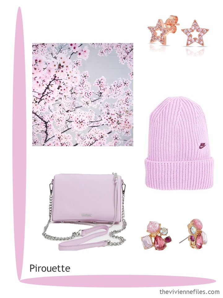
Scarf – Echo; star earrings – Bling Jewelry; hat – Nike; bag – Rebecca Minkoff; cluster earrings – Betsey Johnson
This might not be the easiest shade of green to wear, but I’m sure there are men and women who look lovely wearing it! Good for them, right?
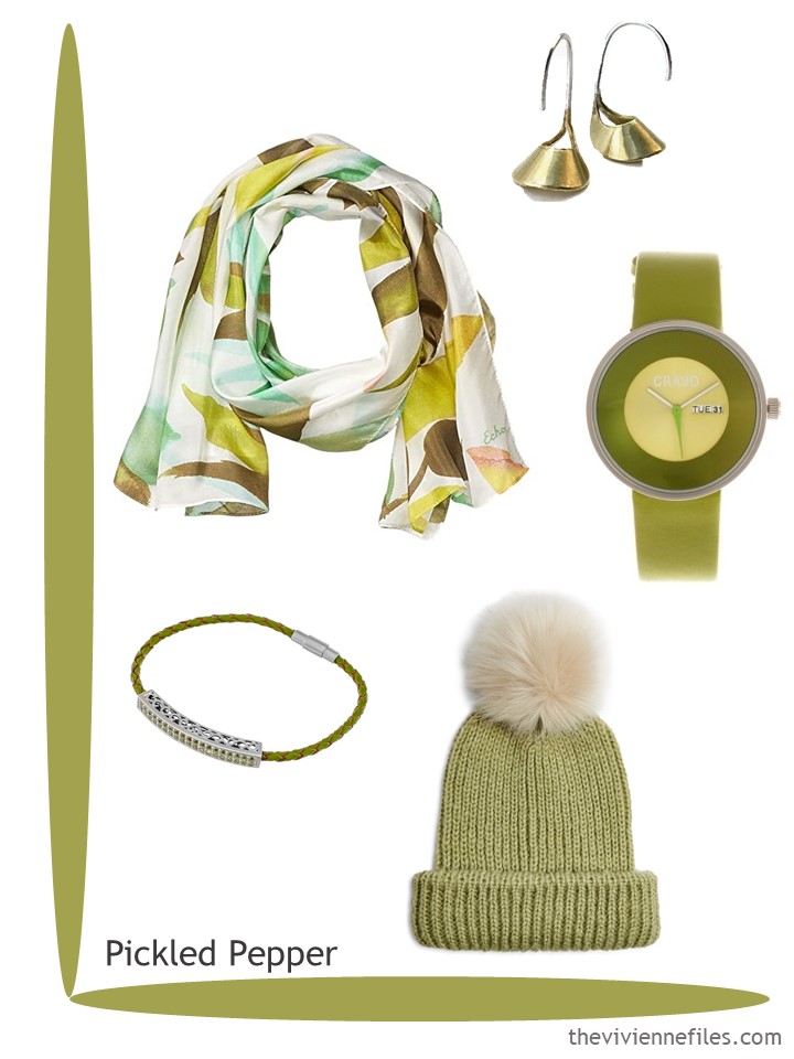
Scarf – Echo; earrings – Madewell; watch – Crayo; bracelet – Forever Creations; hat – Topshop
Ah, a beautiful muted purple! I could grow to love this color:
For those who can wear orange, we’ve got a nice softened shade here…
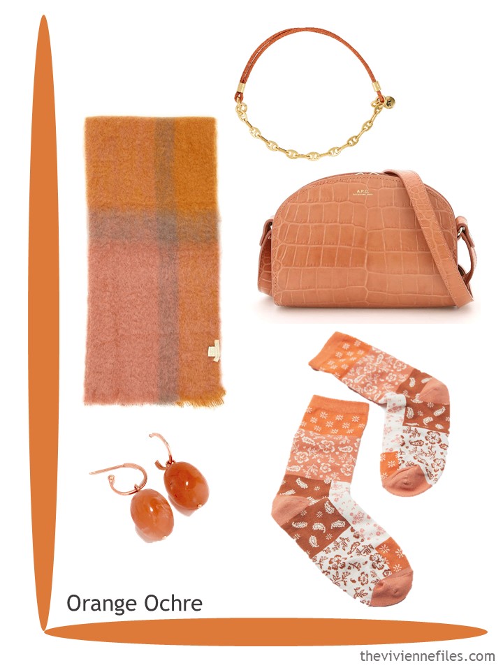
Scarf – Lovat and Green; bracelet – Madewell ; bag – A.P.C.; earrings – QVC; socks – Urban Outfitters
Beach glass comes in all sorts of colors, but this seems to be the shade that everyone has settled on for the name – I think it’s lovely, and such a change from most “wintery” colors!
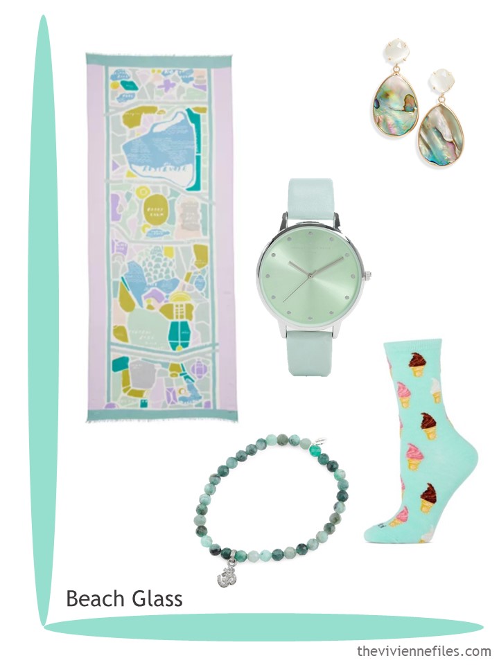
Scarf – Kate Spade; earrings – Halogen; watch – Johnny Loves Rosie; bracelet – Soul Journey; ice cream cone socks – Me Moi
It’s interesting to me that this color is so close to the other orange-ish shade above; clearly someone at Pantone sees a future for these colors! I love how warm and bright they feel on these short “almost 1st day of Winter” days…
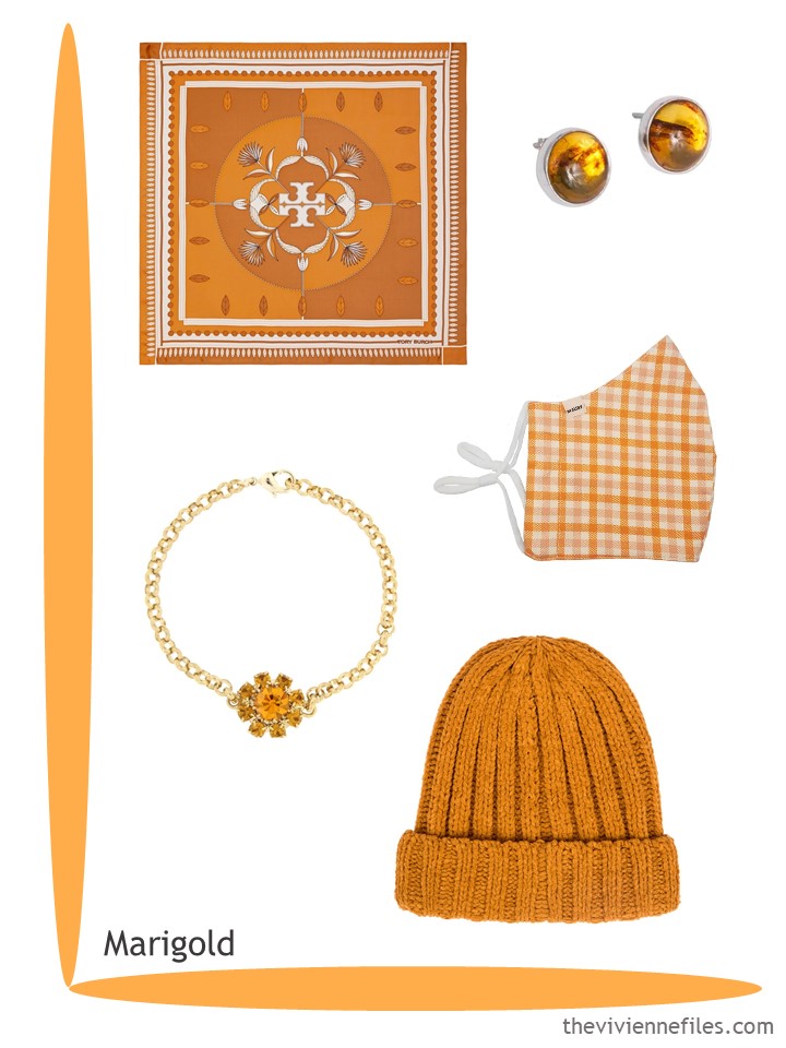
Scarf – Tory Burch; earrings – Luis Zuñiga; mask – Mauby; bracelet – Rosaspina; hat – Four Buttons
These shades of blue drive me NUTS! They’re painfully difficult to find, since I try to come as close as I can to the exact Pantone color. But this is lovely, and the scarf is deliciously complex…
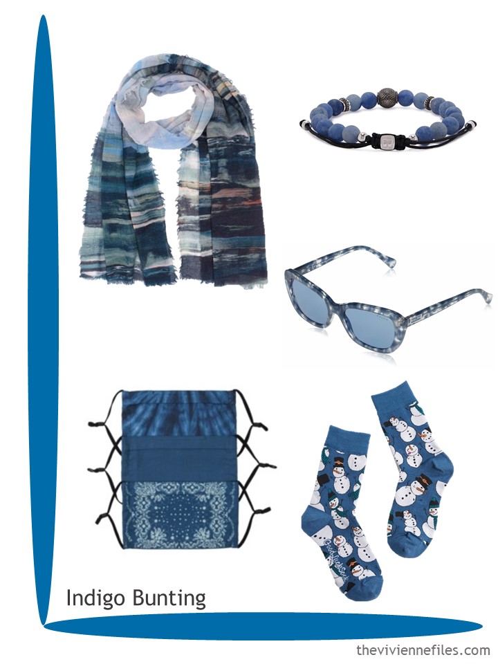
Scarf – Echo; bracelet – Tateossian; sunglasses – Ralph by Ralph Lauren; masks – Frye; socks – ModCloth
Not brown, not rust, not quite burgundy… Such a lovely color! Talbots calls it rosewood, and who am I to argue? And if you prefer a rectangular scarf, they have one….
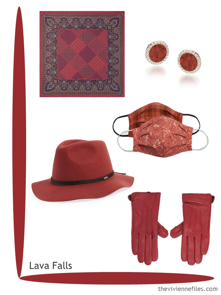
Scarf – Talbots; earrings – Brahmin; masks – Universal Thread; hat – Brixton; gloves – Barneys New York
This umbrella might be the single best thing I’ve ever shown on The Vivienne Files! Who wouldn’t want a bright sunshine color on a rainy day?
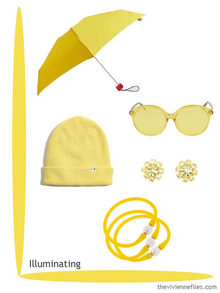
Umbrella – Hunter; sunglasses – Gucci; hat – Madewell; earrings – Rosaspina; pearl bracelets – Canvas Jewelry
This color feels like summer to me, which is a really good reason to wear it in December! (January… February… March…)
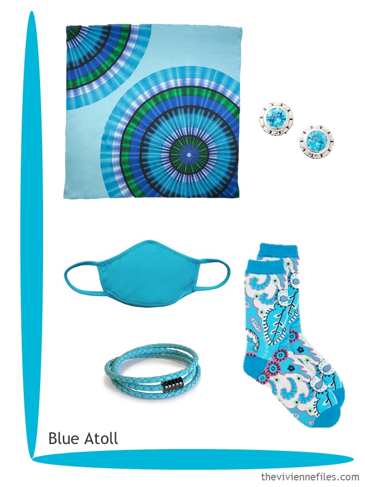
Scarf – Echo; earrings – JAI Sterling; mask – Pilyq; leather bracelet – Liza Schwartz; socks – Talbots
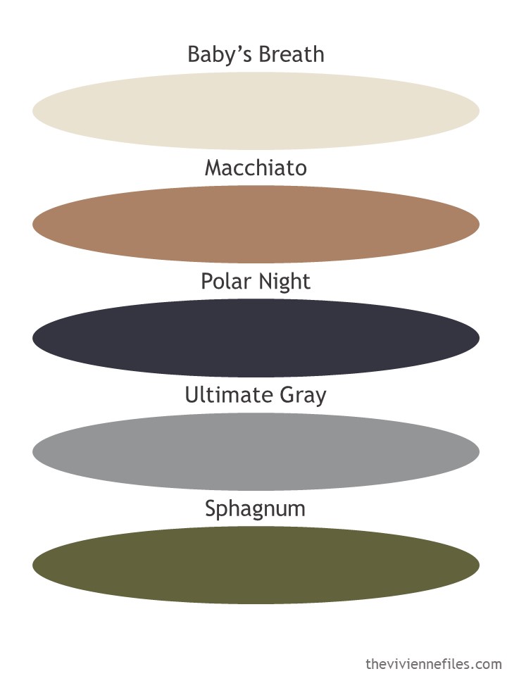
In addition to the 10 accent colors that Pantone announced, they also gave us 5 neutrals! These are all relatively standard accent colors, albeit some of them can be difficult to find. But that color Polar Night? Not black, not navy blue, not something I want to fight with! I feel that – if I found a sweater (for example) in this color, it would look blue next to black, and black next to blue.
I’ll stick to either navy or black – mixing them feels like a difficult maneuver to me!
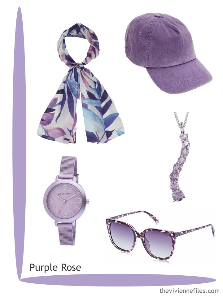
I cheerfully confess that if I were treating myself to accessories right now, Purple Rose would be showing up in my home!
What’s your favorite?
love,
Janice
p.s. Nine years ago, when I worked on Michigan Avenue and saw a bajillion women a day, I shared with you 2 brown coat and pant outfits, accented with blue.
Like this article? Save it to Pinterest!
Well, well. Something for everyone, it seems. I’m happy as long as there are pastels in the mix -that pink is particularly lovely.
Well this is a visual delight for a grey and damp Monday morning. I shall be Pirouhette-ing down the aisles today and wouldn’t it be wonderful to find some Purple Roses in that delectable colour. If these colours eventually show up in clothes, I shall be delighted. Put with grey, these colours are lovely. In fact, my purple blended wardrobe began with a pair of linen trousers in Purple Rose, though mine were called Purple Heather. Pirouhette is an amusing name but it is a lovely shade of lilac pink.
I have a cardigan in the shade of Lava Falls. It is difficult to describe but it looks great with burgundy, a shade or two darker. Rosewood is a better description as it has does have a pinky hue to it. I also wear my cardigan with very dark wine coloured trousers.
I would be interested to see how these brighter accents look with the neutrals, which seem to be rather muted.
Like the look back to brown and blue. Just wish brown would come back….
Ooooh maybe Janice will work her magic on blending a neutral and a brighter hue in a color combination story!
The scarves are absolutely gorgeous. Living in a warm country, these colours are perfect for our sunny summer wardrobes.
Thank you as always.
I cannot resist Blue Atoll! Absolutely perfect for summer right now.
Count me in on sphagnum and pickled pepper…worn not just by Peter,!!,
Touché! Peter doesn’t get to hog pickled pepper!
I like the Marigold and Pickled Pepper. The Orange Ochre is nice but too close to peach for me I think. I have brown corduroys new this year and I wore them with a butter yellow sweater and chocolate brown leather boots & watch. I felt awesome. I’m so glad I’ve been able to find brown pants. I have a blue sweater similar to the color in the post, maybe I’ll try that next time I will be getting dressed to leave the house.
Your wardrobe sounds as beautiful and a sunny spring day :)
Sphagnum? Really? It sounds like something that is expelled when you’re sick! Couldn’t they just have called it Moss??
Carlene, couldn’t agree more on that color name!
The whole “colors of the year” thing tends to leave me perplexed (although I really love your posts about it!), but I stumbled upon an article about the reasoning behind the choices for 2021, and I have to admit my feelings toward them have definitely warmed up.
Ultimate Gray is meant to mostly represent two things 2020 has given us that we’re likely to bring into 2021: resilience (as the color of stones) and… sweatpants! Some of us will gladly leave them behind, but our newfound love for comfort will definitely leave its mark into the way we see style and elegance.
Illuminating Yellow, perhaps less surprisingly but still quite aptly, represents our wishes for 2021: happiness, hope, and sunshine. And to be honest, I’m quite fine with that.
My worry is that interior designers will latch onto this and paint everything grey again. Might be OK in sunny climes but in the UK, grey interiors look cold and gloomy, just like the weather outside! Even buildings were painted battleship grey!
I love the blue Atoll! Nothing like that in my wardrobe though. Is it a kind of turquoise?
I am currently wearing a cardigan from Loft (a few years ago) that is Orange Ochre! I would have called it pumpkin but Orange Ochre sounds fancy! Love these groupings. Just shows that you can add in a few well chosen accessories and zhuzz up your basics to reflect the latest colour trends.
For me it is the illuminating yellow. I have been looking to add yellow to my winter wardrobe of black, grey, burgundy and red, but I haven’t found the right thing yet. This yellow make open things up.
I hope you have a lovely holiday. Thank you for keeping things beautiful in a very challenging year.
Janice,
The Macchiato color is the exact color of a cardigan that I have been hoping to replace for several years now ! The rest of the introduced accent colors are all too bright for me, but the Lava Falls or Rosewood looks just right ( I feel like Goldilocks with that statement ) Sphagnum also holds strong possibilities . My hope for the upcoming year is to find some tops that are patterned to wear with any of the solid colors that I select. I am still keeping an eye on garment total numbers, even so . I have found that I want space around my garments and not have a sense of crowding anymore — one of the changes in my life, thanks to Covid .
I’m drawn to the purple and pink.. not sure if either on of them would look the best on me though. And the yellow still makes me happy. I’ve kind of decided I don’t even care if it’s one of my best colors or not – I just feel good wearing it. And that’s what’s really important – isn’t it? Can’t even tell you how much I’m looking forward to the January scarves reveal. Scarves from Wolf and Badger pop up on my email feed, and I’ve seen some truly lovely ones lately. Then I think “that would be a great 12 month wardrobe” Not that I’ve got the talent to put it all together – but it’s fun to think about. Thank you Janice!
These colours are wonderful – I love them all but Pickled Pepper is my fave. I will be using that a lot in 2021. I have a stash of fabric which features that colour. I can hardly wait to get started. The best of the season to you. Thank you always.
My favorites are Beach Glass, Indigo Bunting, and Lava Falls.
Beach Glass and Blue Atoll are both in that tricky blue/green category that makes them hard to match. I wear a variety of colors in this general grouping, though Blue Atoll seems a bit bluer than my range. The Beach Glass bracelet has inspired me to do a beading project…a necklace blending a variety of light colors in the blue/green range.
Indigo Bunting is a nice name for this color since it is evocative of a male indigo bunting in breeding plumage, though IMO the prototypical indigo bunting’s blue is somewhat more purple than this. Again, getting the ratio of blue and green can be maddening! I find this color very similar to what I call “cobalt” (though my cobalt is perhaps slightly less green).
Lava Falls is not what I think of when “lava” come to find, but it’s a nice and versatile color. It’s very similar to my “burgundy-maroon” color that blends well with both of those. I own the Coldwater Creek shaker poncho in “garnet” that looks more burgundy/wine on the screen, but more Lava Falls in person. I’m finding that poncho an easy blend with a bunch of items in the maroon to burgundy range. Another beading project…a Lava Falls/”burgundy-maroon” necklace.
Pirouette (reminiscent of but icier than ballet slipper pink?) and Purple Rose (is “rose” used in color names to indicate a muted/dusky color?) are both very appealing. I wore both of them a lot as a kid with flaxen hair, and I expect to wear them again when my hair goes grey-white, but right now, they are too cool for my golden-yellow hair. The Purple Rose scarf is gorgeous and has a Beth T feeling to me ;)
Pickled Pepper is a spot on name! I love this color (I call it “apple green”) worn with navy once the weather starts to warm up in the spring. I only have one garment in this color (a wonderful textured knit tank), but several scarves that mix it with navy or, in one fun silk square from a thrift store, “blurple.”
Orange Ochre (yes! that’s what the pigment looks like) and Marigold (reasonable name) are colors I don’t wear. I like the look of the Orange Ochre OK but the Marigold is like an oranger version of the dreaded mustard (I do own a pair of mustard ballet flats but that’s as far as I will go with it). I prefer a clear, bright orange or an orange edging into coral, even for accessories.
As for the neutrals…Baby’s Breath is just stone, Sphagnum (gross) is just moss, Polar Night is indeed an unmatchable nightmare waiting to happen, and Macchiato is one of those warm browns I am happy to ignore. But Ultimate Gray…that’s a nice, balanced grey I would like to see widely available!
The yellow, Atoll Blue and good old gray! Gray, if you can wear it, is the ultimate neutral. Janice has show us how it can be worn with tan, cream, white, black and navy. And pretty much any accent color you can think of. This is really important when you’re buying shoes and you can only afford 1 quality pair in a certain style. What I noted about this color selection is that some colors are clear and others are grayed or have brown added. Some of us look much better in these colors and others need those clear tones. Why is this important? Well, even if you don’t subscribe to the notion that you should dress by color chart, if you pull in oranges that are clear and oranges that are grayed (softened in tone by adding gray) you’ll have a harder time pulling together your outfits. Janice’s advice to be strategic and patient makes perfect sense. I still use a color chart long past the days when it was trendy. Store clerks used to sneer at me …yes, they did! It’s much harder to sell to someone who has a plan! I strayed from that for awhile and soon realized I had a wardrobe going out of control. Now, with Janice’s smart planning guidelines and the chart, everything is working again. Janice’s wizardry at finding accessories surpasses anyone I’ve seen online. What a great guide!
Hi Janice! These Echo scarves are beautiful. Maybe you can use your influence to convince Echo to start shipping to Canada.?
Hi Janice and Everyone! Love the ideas for the Panettone colors (esp the scarves and sox ?.) I am not sure about pickled pepper or illuminating yellow on me (and definitely not together) so I would be intrigued to see how they would work with other colors.
In my continuing revelation of my shopping habits, there are 2 conditions under which I buy clothes: 1- I am HARD on clothes. I am not a dainty person. 2- I –think– I have a color that will match with a featured color combination but alas it is the wrong season (e.g. short sleeved instead of long sleeved/turtleneck). I am a 3-layer gal in the wintertime, all long sleeved.
That yellow umbrella brings back a lot of memories – my mother always carried a yellow umbrella because she said that the color was so bright that it was impossible to overlook it and leave it behind anywhere! Janice, today was one on which I especially needed a breath of beauty and peace, and these lovely colors have provided it, especially Pirouette and Purple Rose. Bless you!
The Girl with the Yellow Umbrella – now there is a heroine in the making…
While I think about it, the Lava Falls Fedora is a great archaeology or adventurer’s hat…
…and yellow and grey together, my aunt had a kitchen in these colours in the early sixties, her take on post war 50’s style. As a child I remember thinking it was so modern. Nothing really new colour wise is there?
Will there be a trend back to coloured bathroom suites?
It’s fun looking at accessories because they set the style of an outfit. Magazines often feature outfit ideas of taking a garment to wear on different occasions like office to party or lunch out to country walks. The garment stays the same but the ‘look’ is often created by the accessories.
I will admit that if the accessory suggestions Janice presents are not in ‘my colours’ or my style, I admit that I move soon to those that are. I have realised today that I’m overlooking the opportunity to assess my accessories in my wardrobe (next project) using your posts as a yardstick.
So looking at these accessory groups and ignoring whether I would wear the colours or not, I have assessed my own choices and why I’m drawn to certain things.
Pirouette – I love the scarf because it reminds me of white and pink cherry blossom that appears in Spring in the UK. I look forward to the trees blossoming and this year the Spring skies were so blue, it intensified the pink colour. Grey and pink are my colours for Spring. The cluster sparkly earrings are similar to ones that I own. I also have some pink sparkly earrings in the shape of teardrops.
Pickled Pepper – not my colour. I’m intrigued by the earrings which look like miniature horses hooves or a seed stalk from a tree. I don’t tend to wear plain metal earrings but maybe I should look for intriguing shapes. I also like the faux fur bobble on the hat. Beanies look terrible on me but I have a faux fur brimless hat and a fleece hat with faux fur trim. I love faux fur in winter. My choice of scarf here would have been a faux fur cross-over scarf.
Purple Rose – love everything bar the hat which would have to have a full circular brim. Sally is right that the scarf would be my choice and I have a similar one. As I tend to wear this colour in summer, I would like to find a linen hat in soft purple. If coloured watches are IN again, perhaps I might replace my much worn but broken purple watch.
Orange ochre – not my colour but I admire several things. Warm check scarves with a tweed or wool coat or jacket. Love the bag – I have one similar in Raspberry Red. Floral socks are perfect and these also come in lovely shades of pink. I also like the single chunky stone earrings which bring a flash of colour but aren’t blingy. I’ve often thought plain coloured earrings dull but these are slightly chunky and irregular which is more interesting. Something to consider….
Beach glass – I like the colour which features in my country walks capsule. The abalone earrings are lovely and more green than the blue abalone ones I have. I’ve been looking out for an abalone shell bracelet and ring.
Marigold – again not my colour. At first glance, I thought the bracelet was a pendant as that is something I would wear round my neck. I’m not sold on single decorations on a chain bracelet as I find that the weight of the ornament makes the bracelet slip round so the ornament is hidden. I
Indigo Bunting – love this. My husband says it reminds him of Prussian Blue (fascinating story about the creation of this colour by accident in Berlin). The scarf would go with a wool ‘fair isle style’ cardigan I bought in Scotland about 30 years ago. The colours are lovely. I like everything about this capsule, even the fun Snowman socks which I would appeal to Sally ?.
I had to look up what an Indigo Bunting was – wow what a stunning bird! Google also showed me other colourful birds including a Painted Bunting with plumage in several of the colours here. This put me in mind of the African Lilac Roller Bird which also has plumage in a variety of colours. Janice has done a few posts featuring birds – could Starting with a Bird be a new sequence perhaps. There are so many colourful birds all over the world.
Lava Falls – another favourite. Love the colour and the simple style and elegance of all the accessories. Something that I’d like to aspire.
Unshowy but would still get you noticed. I’d certainly like to see this collection worn by a heroine in a story.
Illuminating yellow is another colour I dont wear but a single colour brolly and sparkly single colour earrings are achievable. My brollies tend to be floral which don’t necessarily go with my outfits. Single colours or ones with an all-over single colour pattern might look more stylish. Finishing off the outfit on a rainy day rather than grabbing one to hand on my way out.
Blue Atoll – This is a bright colour on me but I wear it in high summer with pink. The earrings are lovely. I have several sparkly items with this colour bought inexpensively in charity shops or vintage fairs. Love the paisley socks. I’d certainly wear those in any of my colours.
So thanks Janice for creating these visual delights. By looking at all the colour groups I have confirmed my choices and opened my eyes to other things to consider. I’d love to see some heroines with these in their wardrobes.
I LOVE these versatile colors! They could be worn all season! The question is will we see clothing in these colors in the stores? Hope so!!
I might need that yellow umbrella! I live in a desert region but that blast of sunshine is irresistible! Failing that a few scattered bits of the yellow would be fun with navy, grey or white.