October 30, 2020
Most of us are being very disciplined with our wardrobes right now, but I think that we (and those around us) might benefit from the occasion cheerful update. With that in mind, I tackled the “newest” colors from Pantone.
First up – if you can wear yellow, DO IT. Many of us look like a Halloween decoration when we wear it, and that’s too bad. Nothing is more eye-catching and smile-prompting.
And this gingham sweatshirt comes in 4 colors, including pink. I AM tempted…
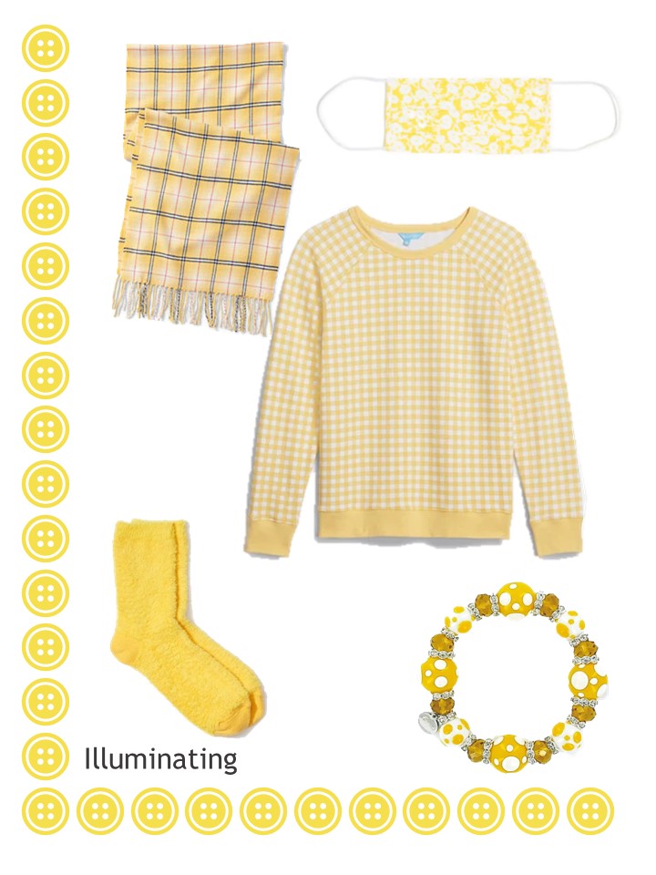
Scarf – Lands’ End; mask – Lost + Wander; sweatshirt – Draper James; socks – LOFT; lampwork bead bracelet – Linpeng
This shade of blue might be an accent for some of us, or for many it will just be some pretty new additions. I wasn’t able to exactly match the Pantone color (heck, I wasn’t able to match ANY of the colors exactly!) but I tried to work with the overall “feel” of the color.
In my defense, I spent more time on this post than I have on any in at least a year! But I’m stuck at home – at least I can find pretty things for my friends, right?
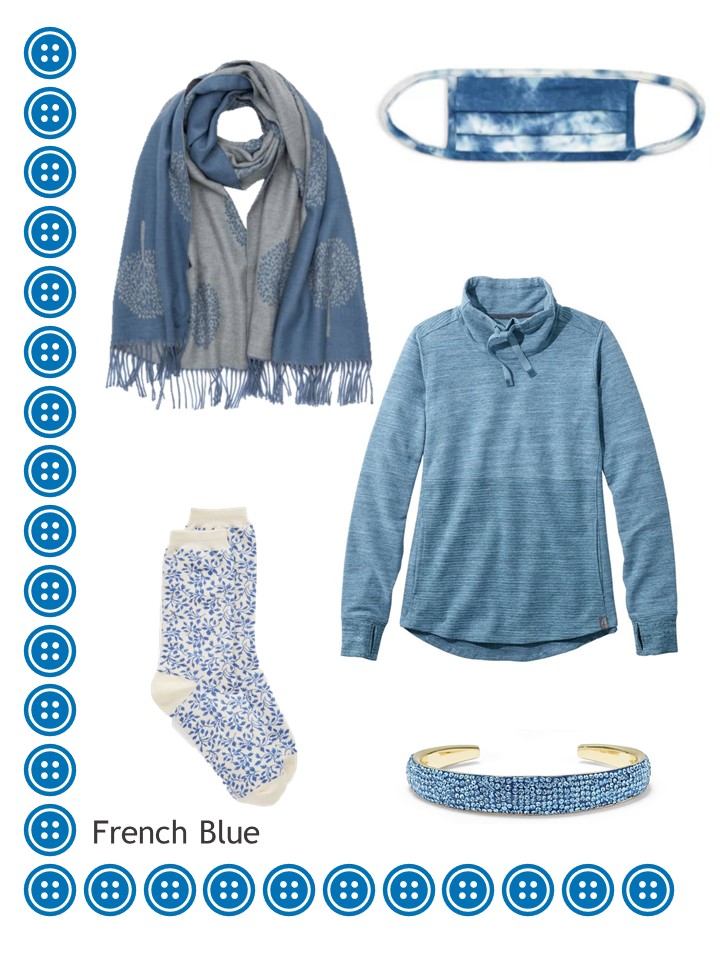
scarf – At Last…; mask – Fore Collection; sweatshirt – L.L.Bean; socks – Talbots; bracelet – Vince Camuto
Ah, this is so pretty… And if you’re smitten with pastel green and lilac, get thee to Talbots (online, of course!) to admire their current offerings. Lovely… And don’t forget that they are the best source for holiday-themed socks…
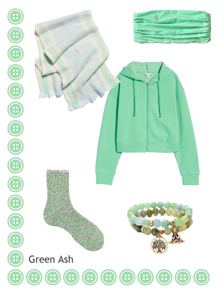
Scarf – Free People; gaiter face mask – Brunna.Co; sweatshirt – Topshop; socks – Couverture & The Garbstore; bracelet – Xinrui
Who would burn coral? Would it burn? What an odd name for a pretty color…
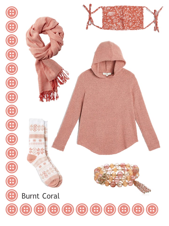
Scarf – L.L.Bean; mask – Rixo; sweatshirt – Loft; socks – A New Day; bracelet – Anne Klein
Has anybody else noticed that after washing a mask a dozen or so times, it begins to wilt, sag, and just generally look disreputable – not to mention not working well? A good mask is the most important part of your outfit, right now…
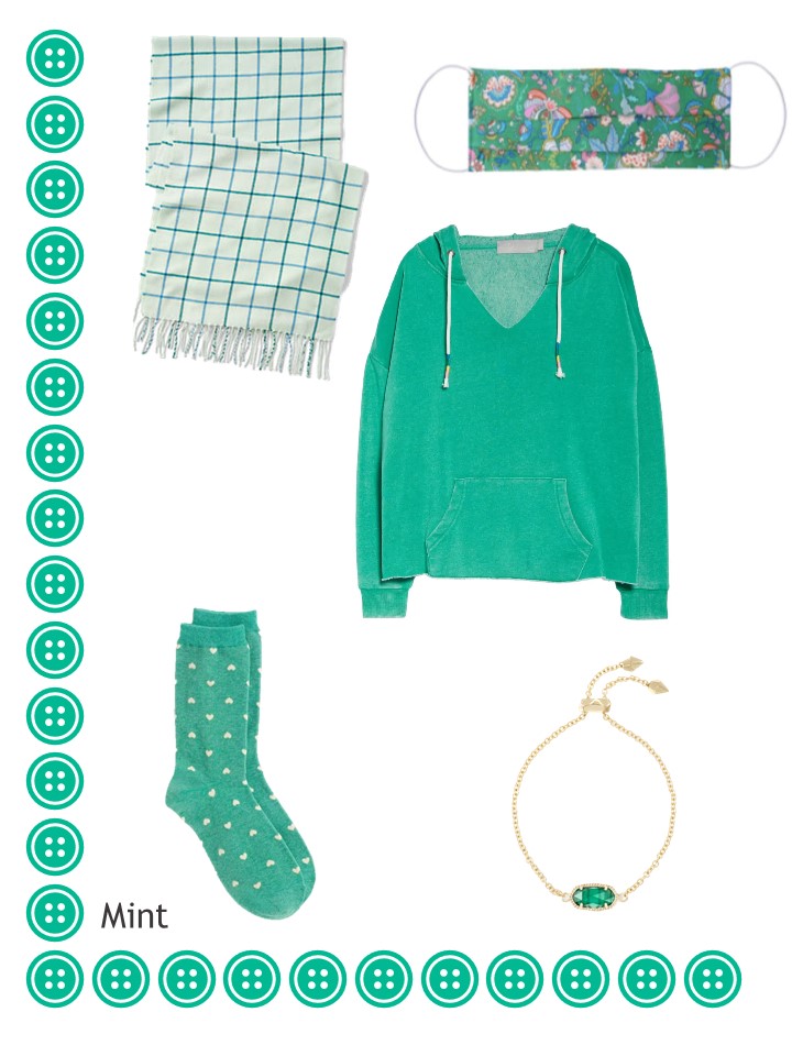
Scarf – Lands’ End; mask – Rumour London; sweatshirt – Vintage Havana; socks – Talbots; bracelet – Kendra Scott
This purple is glorious – regal and intense…
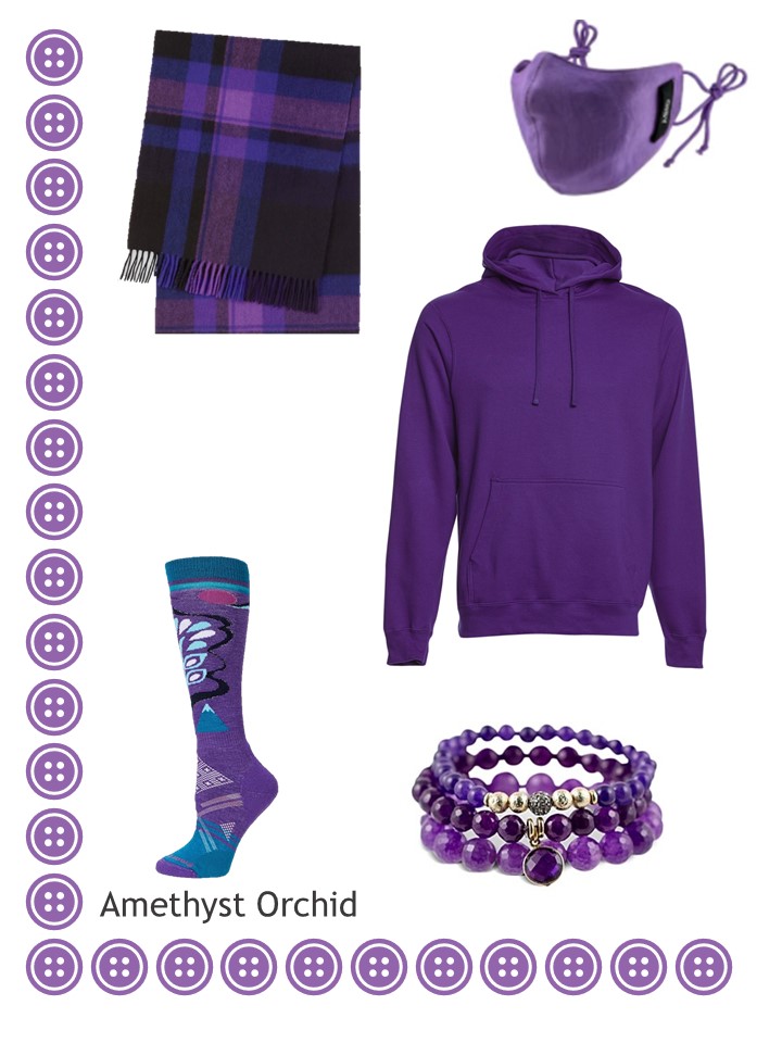
Scarf – Uniqlo; mask – GISY; sweatshirt – SwimOutlet; socks – Smartwool; bracelets – Sequin
Even if you live in jeans, something feminine and soft is never a bad idea:
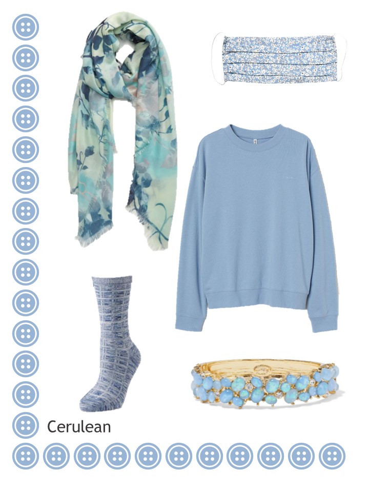
Scarf – Nordstrom; mask – Monte; sweatshirt – H&M; socks – Cuddl Duds; bracelet – Kenneth Jay Lane
This is more a warm brown (to me) than rust, but it’s still a warm and alluring color:
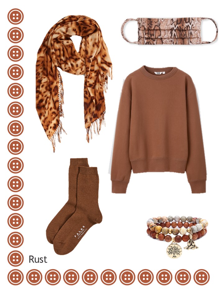
Scarf – Nordstrom; mask – Melissa Odabash; sweatshirt – Uniqlo; wool socks – Falke; bracelet – Xinrui
Oh how I SEARCHED for a darker pink, but I had no success. I don’t feel like this is a real compromise, though! And my temptation level here is pretty serious…
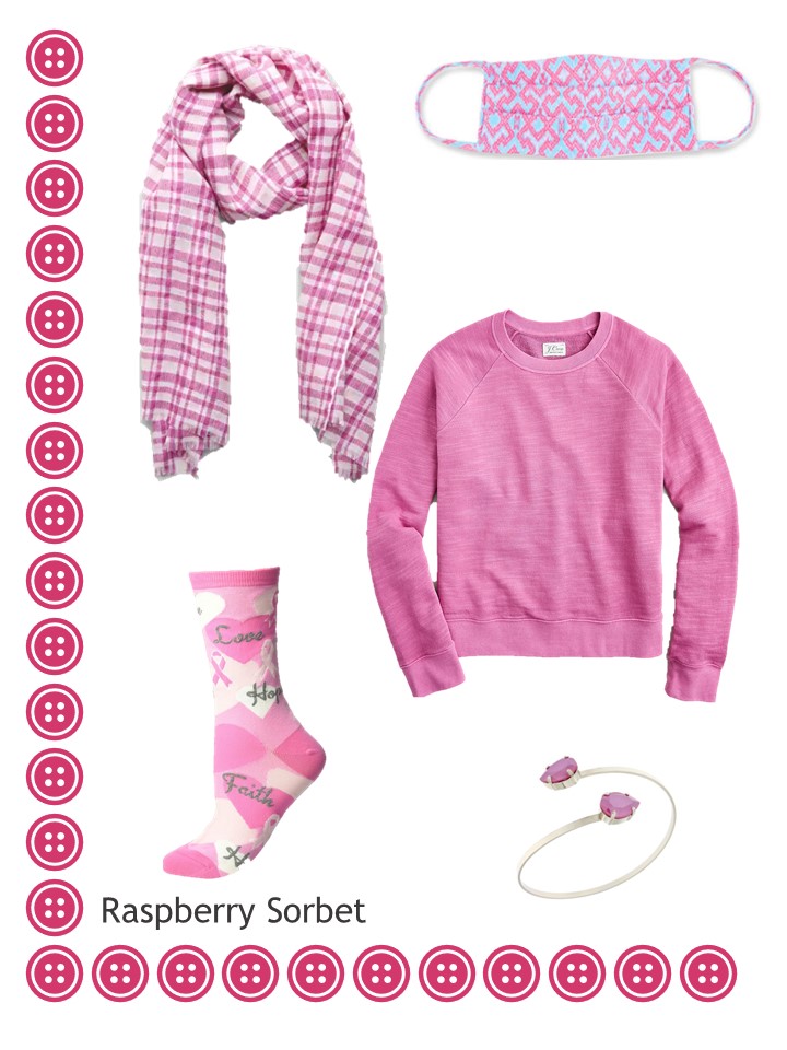
Scarf – Cos; mask – Melissa Odabash; sweatshirt – J.Crew; socks – K.Bell Socks; bracelet – Rosaspina Firenze
This last color just scream AUTUMN to me – it feels like a football game outfit. (yes, even if you’re watching it on television!)
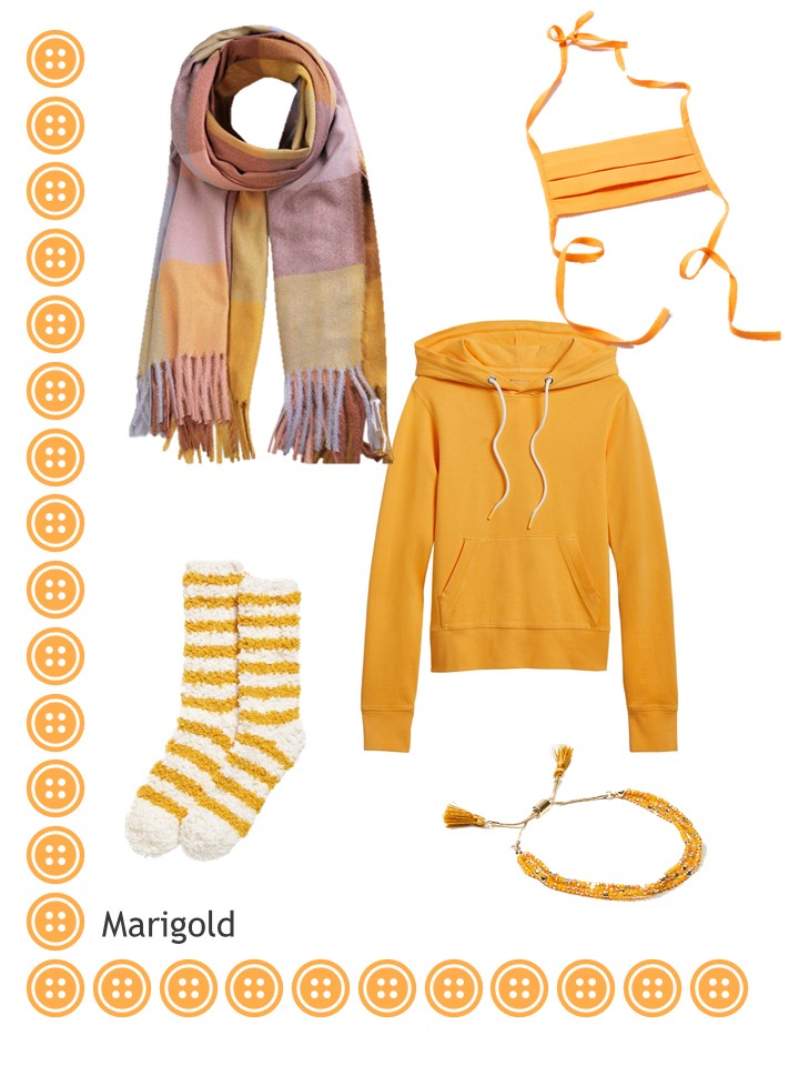
Scarf – Sojos; mask – Urban Outfitters; sweatshirt – Athleta; socks – Old Navy; beaded tassel bracelet – Loft
We all have to find the balance between getting plenty of wear from the clothes we already have, with treating ourselves (and those with whom we spend SO MUCH TIME) to occasional bits of beauty.
In 2020, keeping our spirits up is important!
love,
Janice
p.s. Five years ago, we added accessories to a 4 by 4 Wardrobe in navy and camel, based on the painting Dantis Amor by Rossetti. Lovely…
Like this article? Save it to Pinterest!
It is wonderful to see some deeper rich “winter” colours like the amethyst orchid and raspberry orchid on the list. I’ve bought some more mid tone colours in the meantime but these are the colours which work best for my skin tone. May they turn up in the shops soon.
Another day and another ????. I’m seventh heaven – two lovely blues, delictable pink and stunning purple – what’s not to love? The Green Ash is pretty too. I even like the Burnt Coral which some manufacturers would still call Pink and is close to the Cameo Rose which I’m trying out for the first time this year. I seem to be settling on it as a Spring and late Summer/early Autumn colour for me.
The Pantone Colours released at London Fashion Week are slightly different. The purple is a pastel shade and if you were hoping for a red, there is one in the London colours.
https://www.pantone.com/color-intelligence/fashion-colour-trend-report/london-spring-summer-2021
The neutral colours are interesting too. I didn’t used to pay much attention to the Colours of the New Season because I generally find that by the time ‘the Season’ arrives, the colours are different.
A word to the wise, if you are looking for any of these colours – buy now – the shops are full of them! I was in a general store with my daughter the other day for some homewares but she couldn’t tear me away from the clothes. She hadn’t noticed, as I had that FOR ONCE they were in MY colours! All these colours were there! I have to go back to the shop today to return a throw that was wrong…. and I haven’t yet put my summer clothes away – the raspberry pink beckons…..Help….
I like that headline: Escaping Into the Joy of Colour.
You are so right about the yellow. I have a yellow trench (a bit lighter than the yellow you are showing). EVERYbody comments on it. I always say it’s not for the faint of heart or the shrinking violet. Yellow makes people sit up and notice you! But I love the coat. After a looonngg Canadian winter with black coats everywhere, it’s a perfect pick-me-up.
ahhhh That purple is really intense! and the Raspberry Sorbet, what’s not to love? I even like the green ash, though it would do nothing for me! I’ve been adding yellow – a couple of sweaters, and I find it makes me very happy! It’s always interesting when I see the Pantone colors, and then what turns up in the shops… Right now I’m hunting for interesting pants to add to my December 21. I received a Chico’s catalog today – for some unknown reason – and there are some interesting possibilities there – plus some of them are celestial themed – maybe I could make some points with my grumpy astro boy. Have a good weekend everyone! Happy Halloween whether you’re doing anything or not!
I bought a bright yellow shaker knit sweater with strands of pretty much every Pantone colour around the neck (sounds awful but I get so many compliments). It definitely is not a colour for the timid. I would probably wear any of those colours with my jeans right now. I did look at the gingham sweatshirt in pink because right now I’m definitely into pink. Colour is certainly what we need to weather the grey days of isolation.
Janice, I hand wash my masks and air dry them. I haven’t had any problems. (I also made them myself out of quilting cottons, so that might make a difference, as well.)
I’ve also made quite a few masks out of quilting cotton and even added a filter layer of organic cotton batting. Wash by swishing in warm sudsy water, rinse thoroughly, and air-dry overnight. All have been getting regular use by family and friends for 6+ months.
Everything is so beautiful, but that gingham sweatshirt is really pretty. Thanks for the lovely post
Well done on these accent bundles! It must have taken an AGE to curate these lovely and well-harmonized groupings. For myself, the pink, coral, or French blue would be my choice, but for a person who wears purple well, that set is outstanding.
I always enjoy seeing the “new” colors and the color names. Because I am a strange person for whom making relevant spreadsheets increases the fun of any activity, I have a spreadsheet that tracks my wardrobe inventory and calculates numbers of wears, cost per wear, etc. This has forced me to develop unique identifying names for each of my items (e.g., “seafoam/cream striped long-sleeved T”), which in turn led me to standardize my personal color names. So I was curious to compare my names to Pantone’s.
Illuminating – um, okay. I actually don’t have this color in my wardrobe or lexicon but it is similar to my “light yellow.” I was surprisingly attracted to the gingham sweatshirt…I think that soft pale mustard color is quite nice.
French blue – this is a great name for this color, which looks to me very much like the color of a “French blue” men’s shirt. I call this one “cerulean blue” like the pigment used in watercolor that has that softening quality (no, I am not an artist or knowledgeable about art!). I am glad to already have a cowl neck top/sweatshirt in a similar color to the one featured (which I call “chambray”).
Green ash – the green ash tree (leaf) is a very different color from this color, which is similar to my “seafoam” and “green-mint” colors. It’s funny, I had just been looking at that bracelet a while back because I liked the olive/mossy colors of the second strand.
Burnt coral – nonsensically named, I agree. I call it “sandstone coral” based on the color name used by Christopher and Banks this summer, when this was one of their major accent colors. That hoodie is sooo pretty.
Mint – “mint” is a much lighter color in my vocabulary…this one is closer to (but still darker, more vibrant, and greener than) my “aquamarine” or “light teal” colors. I’m really not going to spend $97 for two masks, but if I were, these are very nice ones. (My homemade quilting cotton masks are holding up very well, but I am curious whether a trio that I purchased recently will have the issues Janice mentioned.)
Amethyst Orchid – another color I don’t have, but I think “amethyst” would be the name I’d use. I do have an amethyst (the stone) bead necklace that this post has inspired me to dig out of my jewelry box.
Cerulean – huh, this is much lighter than my cerulean. I was sure I would have this blue in my vocabulary but I don’t, not quite. So many blue names are already taken, so this one would have to be “pastel blue” (it is pretty much the lighter version of the “dark pastel blue” I do have). That scarf has whappage!
Rust – OK, but my “rust” is more orange/red than this warm brown I would call “cinnamon”…or for a heathered version of this color (to pay homage to the gorgeous mini rex rabbit this color) “castor.” I do own one thing this color…a scarf with black horse silhouettes against a cinnamon background that I love to wear with all black plus tall cognac boots in the fall. (I would NOT purchase that scarf now, but since I have it, I do like to pull it out occasionally and do a “warmed up black” outfit.)
Raspberry Sorbet – nice name! I have several things in this color family that ranges from “hot pink” to “light hot pink.” I adore the softer pink color of that sweatshirt.
Marigold – saving the worst for last…no, that’s unkind…I have my own personal reasons for avoiding this cheery shade that others may wear like a champ. I simply will never be able to wear this color because (1) it looks terrible on me and (2) I had to wear it in cheerleading outfits, band uniforms, school T-shirts, etc., growing up because this was the exact shade of the gold in my junior high and high school’s black and gold color scheme. And if I were to wear that grouping of clothes now, I would look ill AND like I was gearing up to root for the U of Minnesota Golden Gophers!
I showed this post to my daughter as she also likes lots of colour in her wardrobe Hers is very curated into two month colour changes that she is strictly follows….
She was very impressed with your spreadsheet idea, Sally! So am I.
She said that I should do a spreadshreet or, even better to catalogue my wardrobe like the Librarian I am. However, I don’t catalogue books in my job, let alone the books at home or my clothes.
I certainly need to do something novel to create an aide-memoire of a seamless flowing year round wardrobe, where the clarity and tone of my accent colours changes with the seasons. I also want to have all my different colour groups represented throughout the year.
Apparently, I’m letting down the public perception of Librarians who spend all day cataloguing everything, wear tweeds (I don’t) and tell people to hush.
I prefer to consider myself as Bat Woman or a Ninja….!
By the way – the ‘public perception’ is way off beam anyway!
Beth T, public perception is a funny thing. After she retired, my mom took a part-time job as a book shelver at her local public library (which she absolutely loved), and the other employees ranged in age from 18 to 65 and were about as varied as a person could imagine. The only thing they had in common with their appearance is that not a one of them matched the stereotype of the stern, old-fashioned librarian in tweed and glasses!
Good on your Mum! If her wardrobe was as colourful as yours seems to be, she would have brightened up anyone’s day. Back in the day, I knew several Punk librarians and a previous boss used to be a long-haired Goth in his younger days but by the time I worked with him, he’d become a cords and jumper man. Shame that he’d had to conform to the male Librarian stereotype to become a manager.
Ha! I work in the Middle School library, I really missed wearing a funky hat for Halloween yesterday. I use Style App to halfway track my clothes, what colors, give me stats on what I wear most often, and cost to wear. It’s not as flexible as I might like it to be, but I lack the vision/energy needed to set up a spreadsheet and keep it up. With Style App and my phone I just enter in what I’m wearing on the calendar. The biggest chore was entering everything in the first time. But I had a minimal closet when I started so it wasn’t too bad.
You made me look up the Pantone Autumn 2020 colors. I don’t remember if there was a post about that, maybe I missed it. I’m not ready for Spring of 2021 yet, I guess. Still trying to wrap my head around the change of seasons and the loss of summer to the fires out here in the West. The 2020 Autumn colors are very soothing, I thought.
A great roundup, thank you Janice. Most of the colors are quite strong, my preference is for softer, more muted colours. French blue, coral and cerulean would be my favorites here, though just a touch of coral in accessories probably. I cannot see cerulean without thinking of Miranda Priestly’s ‘sermon’ on cerulean in ‘The Devil Wears Prada’! The rust, called cinnamon here in Australia, has been prominent this current Spring/early Summer but I remember seeing it first in our last Spring 2019 (your Fall 2019). Earthy colours and green are strong here ar the moment as well as a shade close to the Raspberry pink mentioned.
Alison, I am having the same reaction to spring colors. My family was affected by the LNU Complex fire in Northern California and the summer heat is just now starting to change to more fall temps. I hope you are ok.
The lovely deep purple shade is making me smile, however. It looks like a great shade for fall and winter.Something lovely to help manage the sadness. I will check out the 2020 autumn Pantone colors.
As a painter, I had to laugh about your remarks about burnt coral. “Burnt” colors are very common in paint and pigment, the names referring to how the different colors were developed, sometimes by heating a substance to get a different variant of the color. Thus we have burnt sienna, burnt umber, both made by heating different colors of earth/soil to get a darker, more intense version. A common black pigment was made by burning bones! And of course burned wood gives charcoal. That being said, I don’t know if there are actually any pigments made by burnt coral. – nancyo
How sad (and amusing) when a mask is considered an accessory! Perfect for the times we are living in.
I thought long and hard about including them but finally concluded that this is our lives, and we have to accept the masks for at least a while longer. They might as well look nice if at all possible, right?
hugs,
Janice