July 8, 2020
I’ve wanted to look at some colors, and some accessory families, for a while! And if I’m not mistaken, Spring 2021 colors should be around soon? But I saw these colors – specifically for the London Fashion Week (go figure) and I thought I’d visit them….
Yes, some of these color are familiar; We looked at the New York version of these back in January!
This might be a good time for me to share with you a few of the things that I keep in mind when I’m putting together a blog post for you:
- I try to avoid showing anything that isn’t available in almost every size originally available; nothing’s more irritating that seeing something that you really like, and finding that you can’t have it!
- I try to never show things that are second-hand, even though I firmly believe that we all should be trying to buy used things as often as possible. This is the same issue as above – once one of you has purchased the item in question, everybody else is disappointed!
- I try to avoid things that are painfully expensive. Of course that’s relative, but I’m generally reluctant to share anything that has a 4-figure price tag, unless it’s just absurdly perfect and worthy of drooling, even as we all eschew the extravagance!
- I try to match the target colors as closely as possible, for as long as possible. Eventually, I will surrender and come as close as I can…
All that said, let’s see what prettiness awaits!
First up, when I think of Mandarin Red, I think of something completely red, deeply saturated, and shiny like lacquer! This color is, frankly, a whole lot closer to coral. (For what it’s worth, the diamonds in the border are the exact RGB (red green blue) code provided by Pantone for each color…)
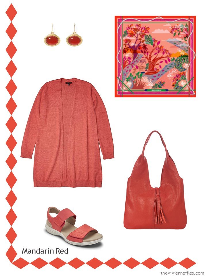
Carnelian earrings – The Met Store; cardigan – Eileen Fisher; scarf – Jessie Zhao New York; bag – Massimo Castelli; sandals – Aravon
I love Samba! Although it in some cases was tough to distinguish from Burnt Henna, below…
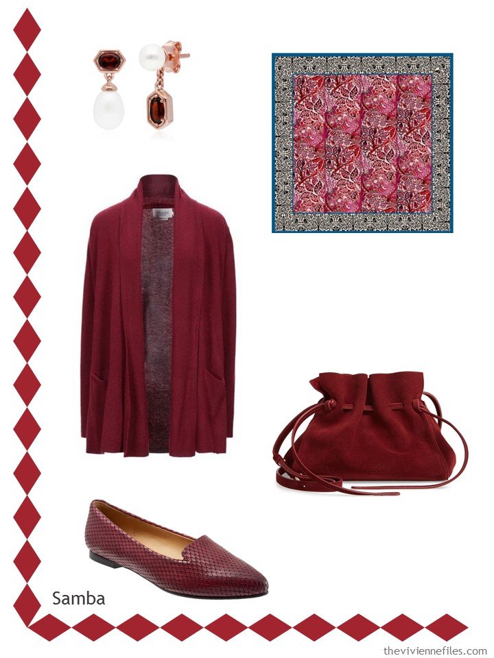
Garnet and pearl earrings – Gemondo; cashmere cardigan – Absolut Cashmere; scarf – PJ Studio Accessories; bag – Mansur Gavriel; loafers – Trotters
This color is TOUGH – it’s not navy, but it’s not royal, and it’s certainly none of the pastel blues…
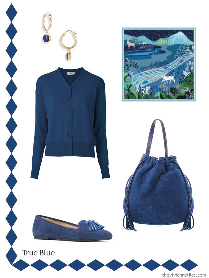
Lapis earrings – Gorjana; cardigan – Egrey; scarf – Jessie Zhao New York; bag – Massimo Castelli; flats – Hush Puppies
And this name – Exuberant might be how you’ll feel wearing this color, but in real life you’ll do much better just searching for orange:
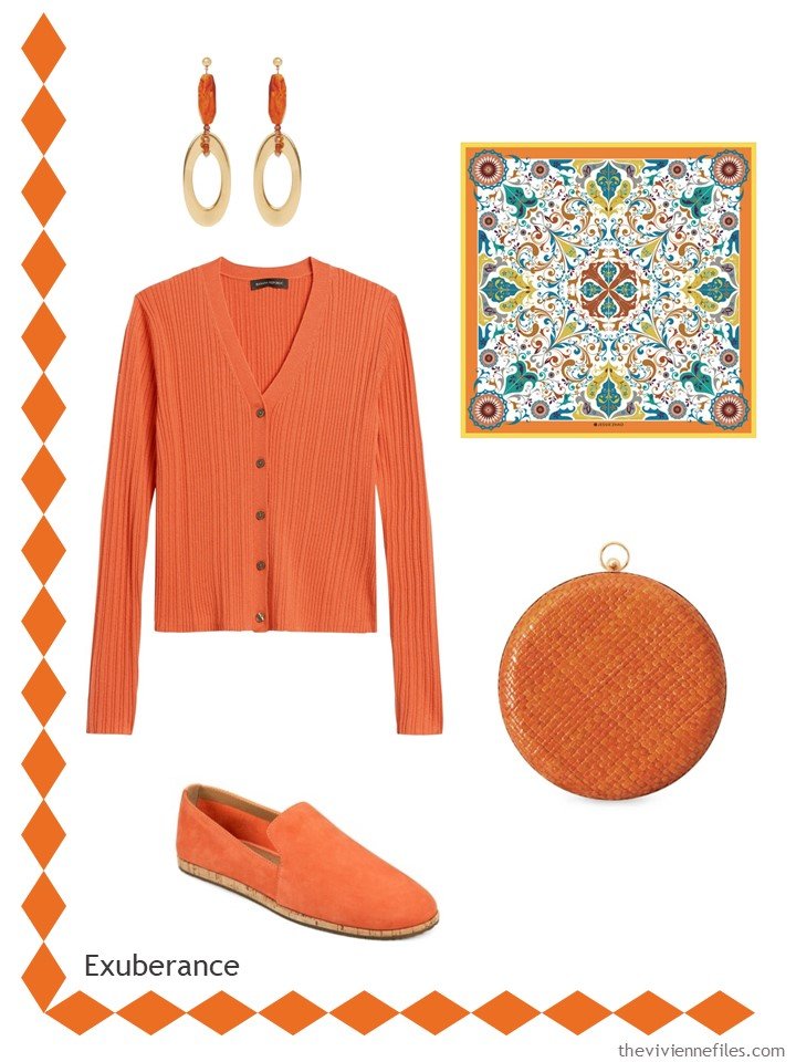
Earrings – Pietrasanta; cardigan – Banana Republic; scarf – Jessie Zhao New York; bag – Brunna Co.; loafers – Aerosoles
Military Olive is about as far as you could ever get from my wardrobe, but I think that these pieces are lovely…
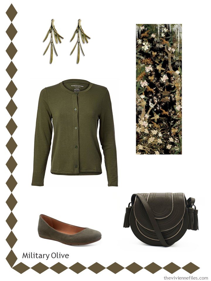
Rosemary earrings – The Met Store; cardigan – Majestic Filatures; scarf – PJ Studio Accessories; bag – Nooki Designs; ballet flats – Sun + Stone
Yes, I try to look for the color, as show, for as long as possible! If, after an hour, and looking at literally hundreds of things, I thrown in the towel and show you the closest thing I can find!
And I would NOT eat celery this color. In my world, celery is green. Clearly, Pantone lives in a different produce world!
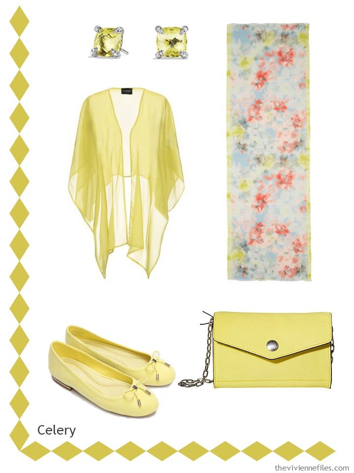
Citrine earrings – David Yurman; shrug – Atos Lombardini; scarf – Rebecca Minkoff; bag – Rag & Bone; ballet flats – Kenneth Cole
Oh my, this makes me long for autumn….
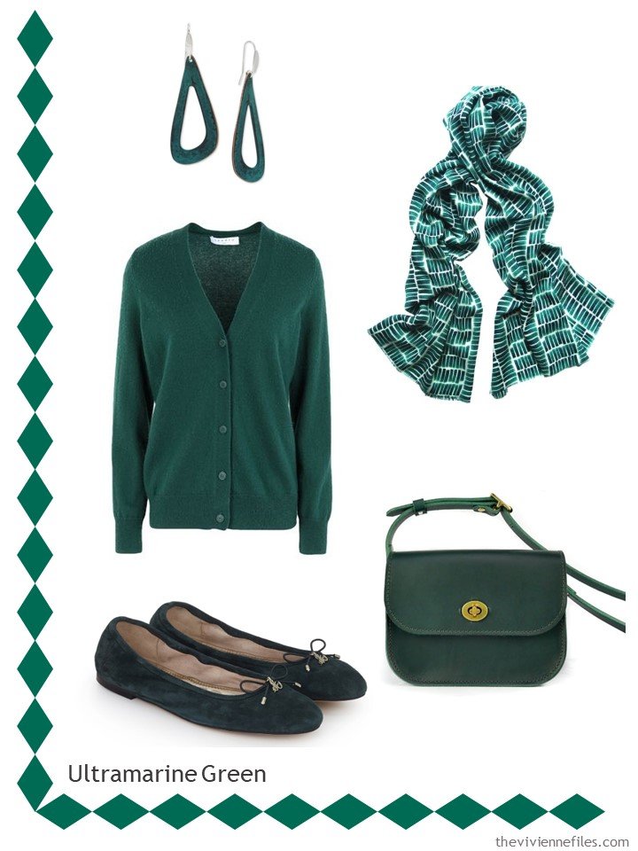
Earrings – Robert Lee Morris; cardigan – Sandro; scarf – Claire Gaudion; bag – Village Leathers; ballet flats – Sam Edelman
This is NOT Strong Blue – this is soft medium blue. And it’s not growing on retail trees…
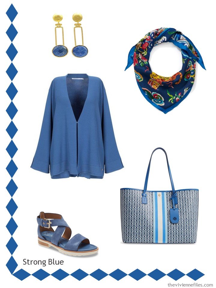
Earrings – Bebek Jewels; cardigan – Xandres Xline; scarf – The Met Store; bag – Tory Burch; sandals – Söfft
Possible, when the weather cools a bit, and stores begin to bring in more autumn and winter merchandise, I will be able to find this color in a “more brown/less red” version. Currently, this deep wine shade is as close as it gets!
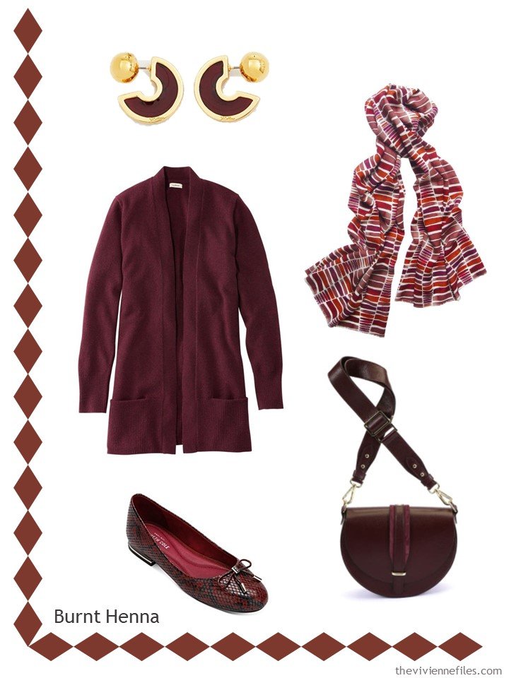
Earrings – Viollina; cardigan – L.L.Bean; scarf – Claire Gaudion; bag – Hiva Atelier; ballet flats – Kenneth Cole
I love the subtle richness of this last color! I would wear these pieces with white, or with more “Tawny Birch”…
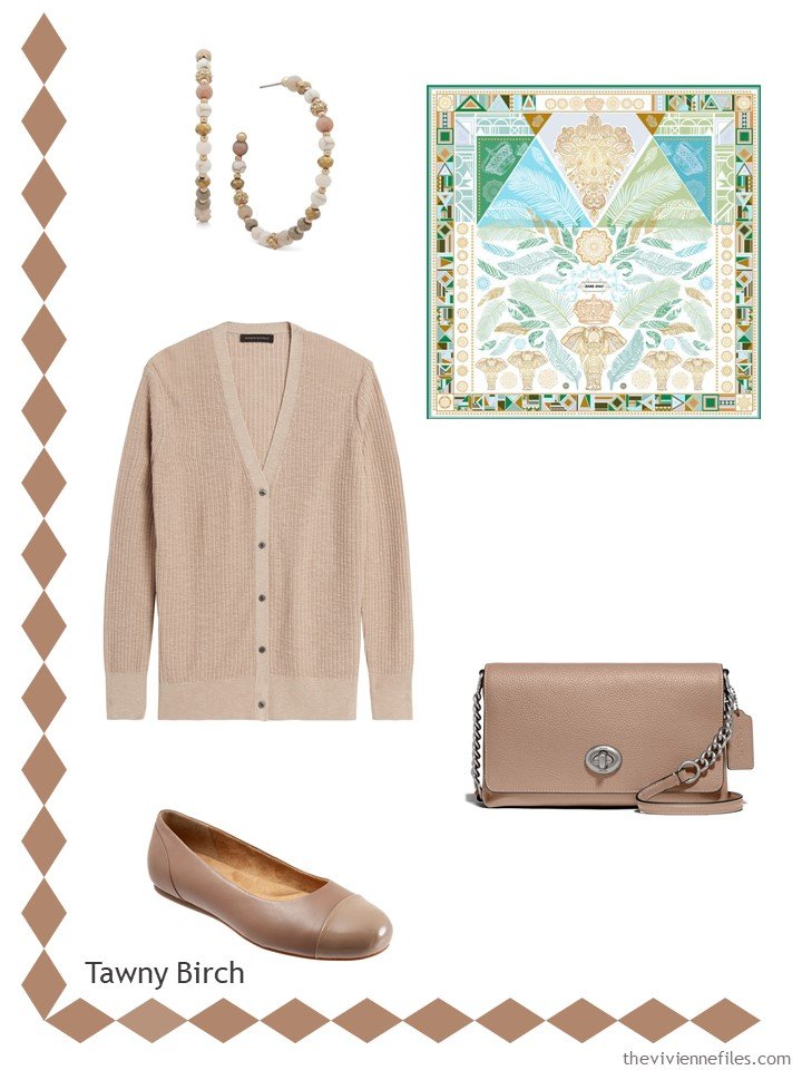
Earrings – Lonna & Lilly; cardigan – Banana Republic; scarf – Jessie Zhao New York; bag – Coach; flats – Softwalk
Favorites? I always love to picture in my mind how each of these colors would look with a handful of neutral pieces from my own wardrobe….
love,
Janice
p.s. Back in January, we looked at the New York version of these colors!
Like this article? Save it to Pinterest!
Janice, I love that you place a scarf with beautiful complementary colours alongside the Pantone colour. Thank you for that inspiration! I am busy thinking about my fall timeless wardrobe capsule – drifting away from camel and navy to something new!!!
Those scarves are just to die for. Reflecting this morning yours is my favorite blog. And I can not tell you how much I appreciate that you’ve stuck to the original mission and not let politics/world events intrude. There’s a reason I don’t watch the news. What a lovely oasis you are each morning. Thanks so very much!!!
Oh gosh – role on Autumn – blues and red! I might even add some ultramarine green to my country walks wardrobe. The scarves are gorgeous – inspiration for a few wardrobes perhaps? I like the bags too and the dark red snake print shoes….. ?
Though I am miffed that the Rose Tan, Peach Nougat and Magenta Purple got lost somewhere between New York and London. ?
Peach Nougat is now Exuberant Orange (quite a contrast) but Rose Tan and Magenta Purple are replaced by Olive and Strong Blue. The latter I like but it’s not the same as Purple which I was looking forward to ?
Celery (Green Sheen in NY) seems an odd one for autumn/winter – more spring-like.
It must be about the third autumn/winter in a row that the shops in the UK will probably be full of olive and orange clothes. ☹
Hopefully, there might be more blues and reds but the Rose Tan and Magenta Purple would have been nice…. Well I shall just have to find purple secondhand. ?
Mind you with the textile industry turned upside down goodness knows what colours or clothes might be in the shops come September! Perhaps they might just find some brown again? ?
Janice,
All are loved by me except what Pantone is calling Celery and perhaps the Tawny Birch , which has too cool of an undertone for my warm coloring . You have done another amazing job with the selection of the accessories — kudos to you !
Janice,
If my celery looked this color, I’d throw it out !
Very beguiling collections for each colour, and what a good illustration of how five pieces could expand a neutral base for a new season. We never see such lovely colours in shoes or beguiling styles of bags in the shops here. But we can dream!
I’ll have to check the Pantone code, butTrue Blue looks like IBM blue to me. Yep, the IBM logo called for a specific Pantone color. Luckily, it was a color I could wear for 16 years! Still have a few pieces.
Samba and True Blue are my favorites. But all of the scarves that you feature are simply divine!! Also, to get back to an earlier discussion, I ordered a PJ Studios scarf – Ruskin’s Meadow Duck Egg Blue – for my birthday a few weeks ago. On my monitor it looked like an aqua blue, but in person it’s more of a mint green. The other colors are lovely, so I think I can make it work.- nancyo
I don’t know how we’re supposed to choose when you do such good work styling each color! The scarf for mandarin is perfect, as is the entire selection for olive. My favorites will always be blues of any variety but I really like the ultramarine and the reds as well. Drapy cardigans are my favorite 2nd layer so I loved all those options you included.
Jessie Zhao – what a find! Just lovely things! Couldn’t resist the True blue scarf and to quote someone I need another scarf like a bad headache, but….Where have you been all my life you stunning piece of processed mulberry! Now if you could just find me a navy belt more than an 1” wide with a brass/gold buckle. Harder than a pair of brown pants!
Look forward to your post every day.
I’m going to look at more scarves on Tuesday – I just saw a bunch of gorgeous ones from PJ Studio Accessories that I CAN’T resist. And they’re on sale!
hugs,
Janice
Ok, I need to move to a cooler climate lol. I live in the Panhandle of Florida near Panama City Beach. I barely have to wear a sweater in the winter. I love your post and try to reassemble it in color and appropriate pieces. I’m a country bumping with Uptown taste lol.
Great Post. I love to see the new colors but usually I sub what I already have unless it a new thing is perfect.
Thank you Janice for putting all of these posts together. I too, look forward to your post each morning! I love to look at the scarves you select – one more beautiful than the next and always inspirational.
I particularly love the the Tawny Birch collection. The scarf is stunning and perfect for my area. As someone else said about living in Florida – I’m in South Florida where the temps are rarely below 70 – it becomes a fun scavenger hunt to find pieces that are suitable for our climate.
Thank you as always for brightening the days of all of us!