June 24, 2020
Another cry for help from my email – a question I LOVE to get… If I order these, how will I wear them?
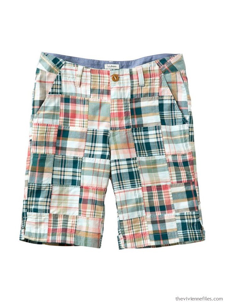
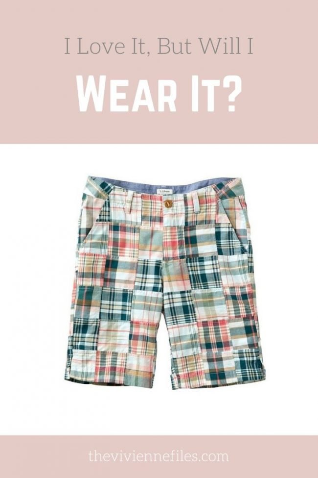
Patchwork shorts – L.L.Bean
Okay, this is maddening, bordering on insane. The color, described on the website, for these shorts is “Deep Admiral Blue.” Unless I’m drinking something more amusing than coffee at this hour, the primary color here would be forest green? With beige, coral and white?
Whatever! The easiest way to find at least 1 or 2 garments to go with a contemplated new purchase is to look for items that are the same color, from the same company. So we start like this:
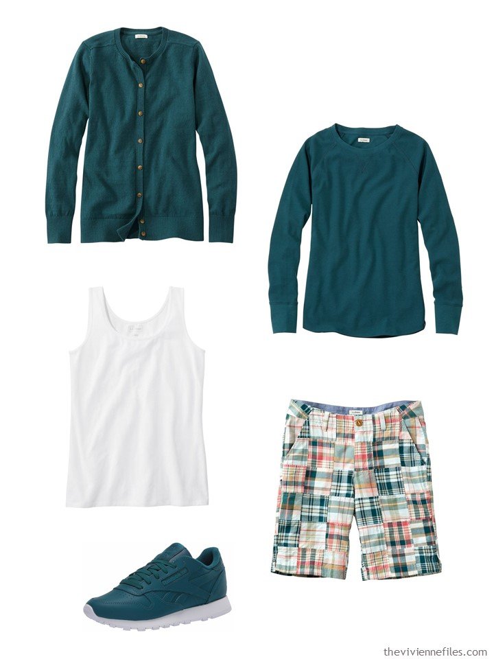
Deep Admiral Blue Heather cardigan – L.L.Bean; waffle tee shirt – L.L.Bean; white tank top – L.L.Bean; patchwork shorts – L.L.Bean; leather sneakers – Reebok
The tan or beige color in these shorts is sufficiently prominent that wearing beige with them would look great. Generally, even if a garment has 47 colors in it, I don’t pair a plaid or printed garment with a color unless that color is reasonably visible from some distance in the printed piece. You don’t want to be looking with a magnifying glass for that one perfectly-colored thread to match something!
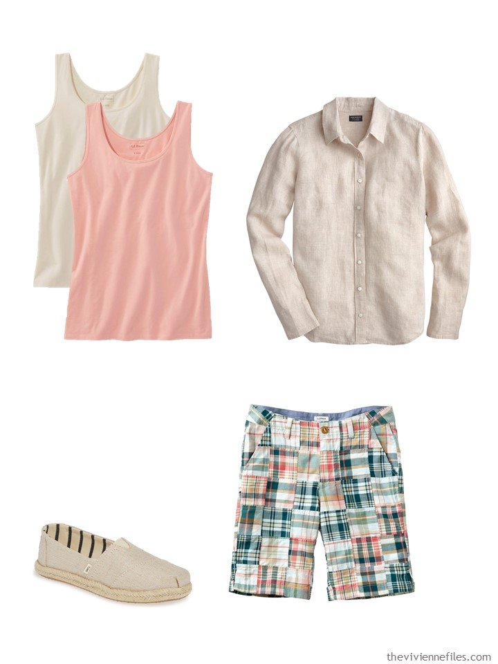
Cream and soft coral tank tops – L.L.Bean; flax linen shirt – J.Crew; espadrilles -Toms; patchwork shorts – L.L.Bean
Of course you could wear a simple white tee shirt with these shorts, but maybe a top with a bit of detail might be fun. And a coral tee is an easy choice:
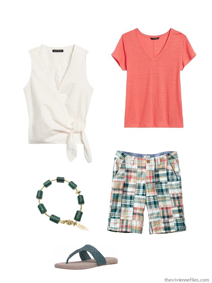
Linen wrap top – Banana Republic; coral beach tee – Banana Republic; malachite bracelet – Farra; sandals – Sbicca; patchwork shorts – L.L.Bean
A tunic? Sure! And a couple of matching pieces to get you from “outdoors in the heat” to “inside in the walk-in freezer that is a restaurant” because you were smart enough to bring your cardigan with you:
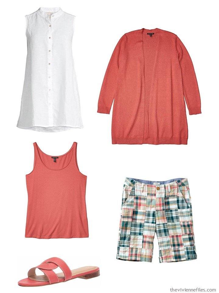
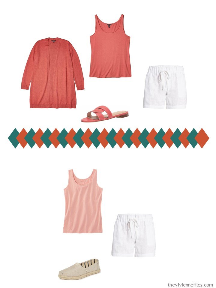
Mandarin collar sleeveless shirt – Eileen Fisher; bright sandstone cardigan – Eileen Fisher; tank top – Eileen Fisher; patchwork shorts – L.L.Bean; sandals – Kaanas
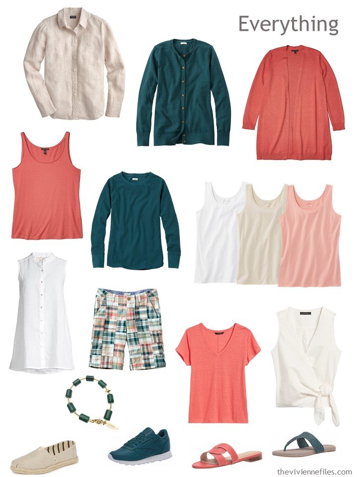
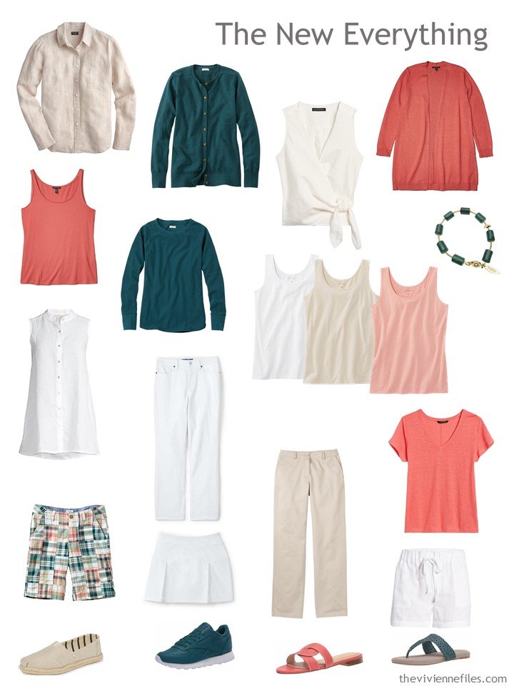
After rummaging through our heroine’s closet and finding lots of ways for her to wear her new shorts, we’ve assembled these 12 pieces of clothing:
Of course, you can’t travel with this as your travel capsule wardrobe unless you REALLY love those shorts, and maybe have 2 or 3 pairs of them… But if you add a few bottoms, hmm?
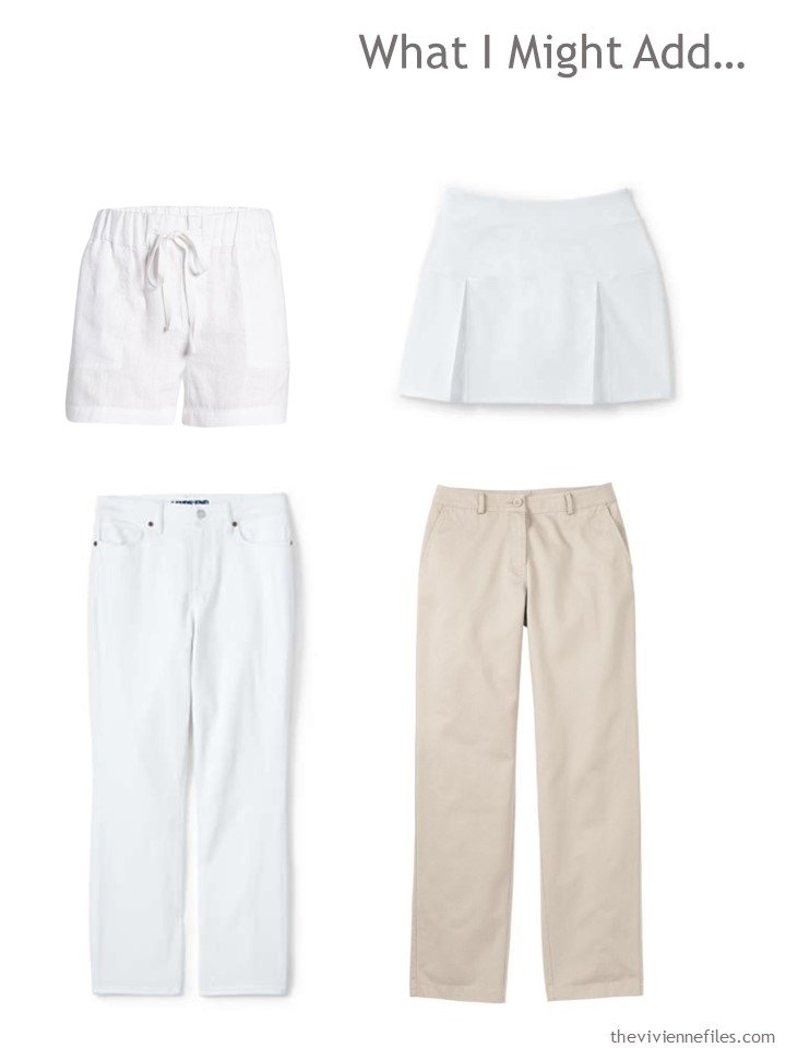
White linen shorts – Caslon; white skort – Lands’ End; white jeans – Lands’ End; heritage stone twill pants – L.L.Bean
NOW, you’ve got a capsule wardrobe! Yes, 3 white “bottoms” might be risky if you spend a lot of time doing things that get you dirty, but for others it might be just fine. If the white worries you, beige (or that elusive green?) would be good substitutes.
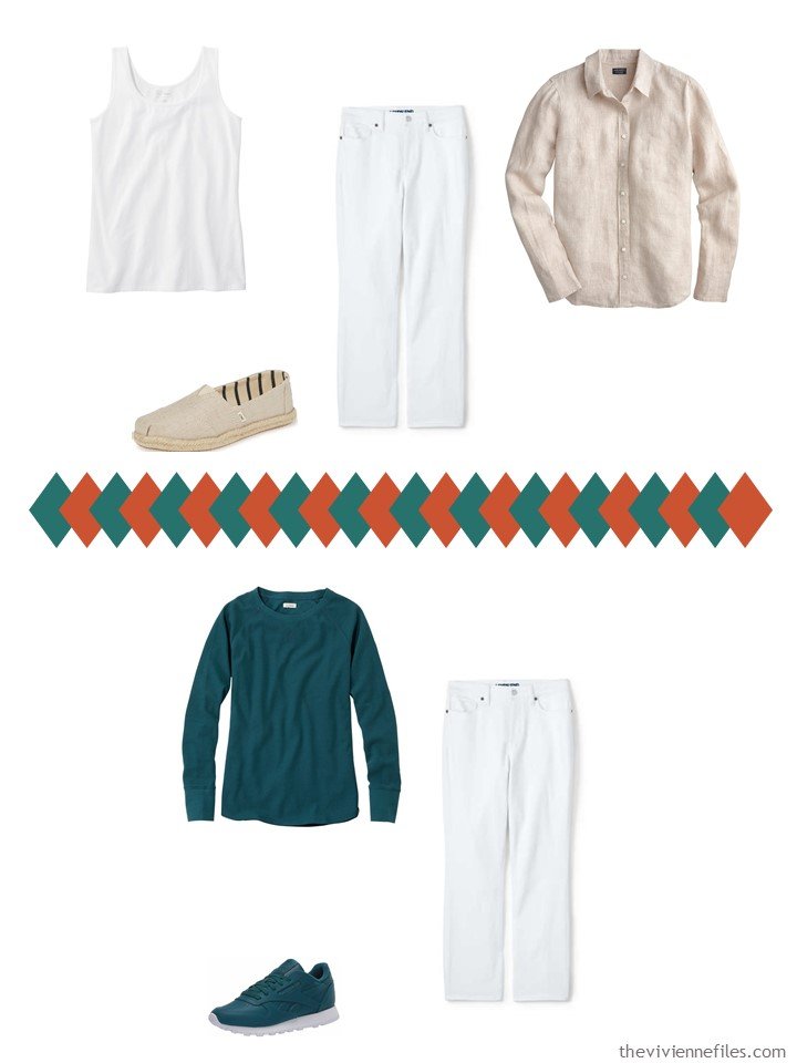
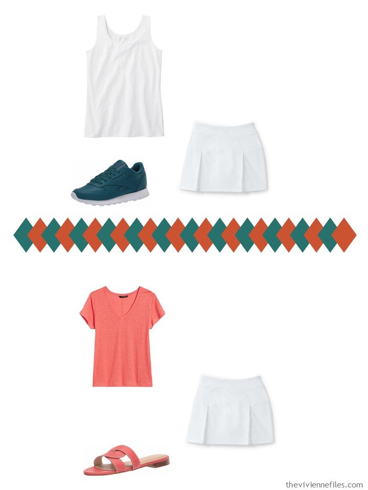
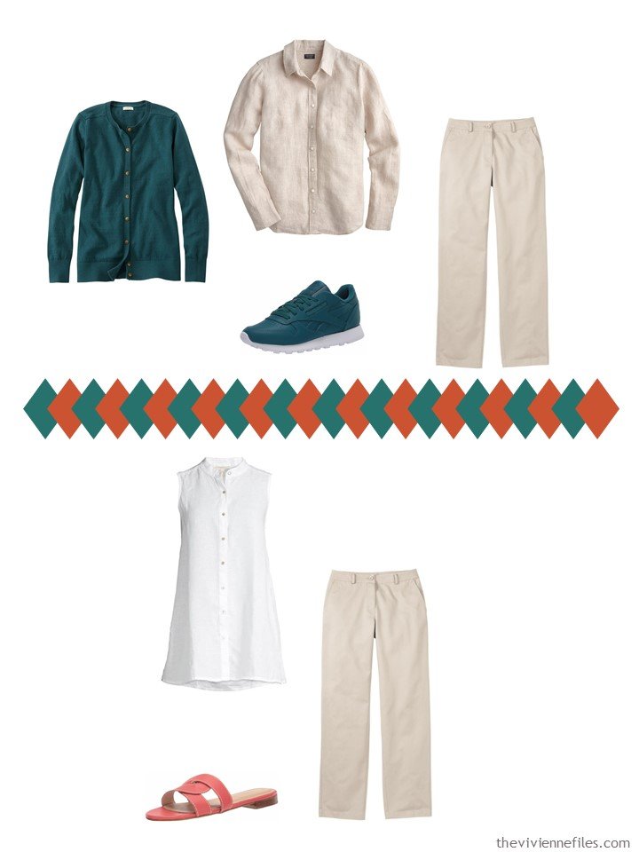
Now, in addition to all of the gajillion ways to wear her shorts, our heroine has a lot more outfits! Here’s a few…
can you sneak your teal tennies onto the tennis court?
I so wish that someone would make shorts like this, or a narrow skirt, in black and white. Maybe with pink…
love,
Janice
p.s. Seven years ago, it was all about Chic Sightings in navy and green!
Like this article? Save it to Pinterest!
Lovely wardrobe – apart from the shorts! Shorts have never suited me. If it was a midi skirt, it might just work for me. However, I love the Admiral Blue which could take this wardrobe into the Autumn with a bit of swapping for long sleeved tops, jumpers and long skirts/trousers. Admiral Blue would be a good alternative to navy.
You did a lovely job with this capsule. And I agree that there is no blue in there. I would guess that the Admiral likes the forest better than the ocean!
The shorts remind me of the madras check which was so popular in the mid to late 1980s here in Australia. I had at least two pairs!
I made a patchwork dress in sewing class at school in the late 1970’s! These shorts are a nod back to that era along with flares and crochet knits.
Perfect timing! Recently I was gifted a vintage Lilly Pulitzer knee length patchwork skirt and this post helps immensely.
I was concerned about having so many colorful patterns in a bottom piece however seeing the outfits & proportions. I can make it work.
What fun colours, and I agree would wander into fall nicely with a darker neutral…I think our heroine needs a lovely, gauzy skirt in white or coral, for whimsical and dressier evenings but those seem hard to find these days…perhaps a pleated one instead. Have finished the Aria Code and just wanted to mention that the Metropolitan Opera is still offering a free opera every day to stream…I think it’s “Dr. Atomic” tonight.
These shorts are calling me. Anything from LL Bean in their Juniper color would work with these shorts too. They have a cotton pullover sweater (that I just bought with your link) and a utility jacket in this color. Both could easily slip into this wardrobe.
The Juniper is lighter than the teal.
Juniper is a lovely colour with just the right amount of muted tone to it. Just right to add to my country walks capsule of teal, jade and grey.
I note that the majority of clothes in Juniper are in the mens section. A lot of outdoor wear these days is designed to be unisex so wearing a bloke’s jumper or shirt in the right colour is fine by me, as long as the arms aren’t too long.
If you sew or have access to someone who does, madras fabric in all kinds of colorways can be found on the internet. A simple skirt could be a beginner’s project.
If I had a sewing machine, I could bang out an elastic-waist skirt with side-seam pockets in a few hours. Sadly, I don’t have a sewing machine, and I don’t know WHERE I’d put one… But I can see this in my future!
hugs,
Janice
Hi all: Really love the color combination here. But is this deep Admiral’s
Blue really tending toward forest green? Or teal? Sometimes it just might depend on the device one is using.
Oh Linda, you’re entirely right. It’s always sort of a crapshoot about colors, isn’t it? But I thought that this color, whatever it’s name is, was beautiful, and perfect to transition through the seasons. If someone could figure out how to ensure the color fidelity of images seen on screens, there’s a fortune to be made…
hugs,
Janice
I admit to sometimes using a kind of wonky hack…looking up the RGB color code for a pixel in an image. I right click on the image and “copy image address.” Then I go to the site imagecolorpicker.com and paste the image address in the third box next to “Use this box to get the HTML color code from a picture” and click “Take image.” The image will appear in the big box at the top. Click on a pixel and the color code information will populate.
When I did this on the patchwork shorts, I got RGB(13,64,63)…so just about equally green and blue, not hunter green. The cardigan showed RGB(22,60,68)…still very much between green and blue, but a hair more blue. I compared this to an image of the color “marine blue,” which was definitely more blue…RGB(12,75,126), and to an image of “hunter green,” which was more green…RGB(15,68,48).
If I want to visualize this colors, I just create a grid in Excel with large cells and fill the cells with the various colors using the RGB codes.
Of course clothing is made from fibers, and there might be a range of colors in the fibers. The image of the item might have wrinkles that cause shadows to appear. Different images might be taken in different lighting. There are many, many caveats. Nevertheless, in a pinch, I think it can be helpful. I’d love to hear if anyone else has tried anything to figure out these pesky colors on computer monitors.
That’s brilliant! Consider that stolen….
hugs,
Janice
It’s also how the receptors in our eyes recieve colours. Remember the photo of the white dress with gold lace trim that did the rounds on social media a couple of years ago?. Yet some people saw it as blue dress with and black or brown lace. This is why colours under shop lights look different in daylight and in the lights if your home.
I thought the shorts were hunter green until the “deep admiral blue” (aka dark teal aka marine blue) was paired with them…I love this color combination. Like so many people, dark teal is a great color for me, so I will seriously have to consider LL Bean’s “deep admiral blue” items in the future. (Over time, I would like to replace much of the black in my closet with dark teal.) And those teal sneakers are terrific! I haven’t worn Reeboks in a while (I am VERY picky about the fit of any kind of athletic type shoe I would use for miles of walking), but I might have to try them.
This is a very solid collection…but so “solid” that I would replace the white skirt with another patterned bottom, probably a skirt. Teal/coral/white is a popular palette so I think that would be doable. I would also replace the light peach tank for a teal one to make greater use of the teal cardigan (which I LOVE). LL Bean missed a trick by not offering a tank in this color, so it might be harder to match exactly, but even a mid-value teal-green would be lovely. Perhaps Christopher & Banks mid value “galapagos green” or darker “galactic teal”? Even a lighter teal that coordinated with the light stripe in the shorts would look great.
And seriously, if those shorts appeal, can you resist the packable bucket hat in the same patchwork print? I think it would be a very, very fun addition to this capsule…and I would not hesitate to wear them with the shorts for a tongue-in-cheek mega-matchy look.
I will never understand why these companies don’t start with a plan – i.e. these 16/18/20 colors for the upcoming season and then make certain that they’ve got all of the reasonable core garments in each of these colors. Why they don’t hire me, I don’t know!
hugs,
Janice
Every company needs a Janice! Another thing I wish they’d do- a couple of two-piece dresses every season in prints, along with several tops, bottoms & second layers to go with them. I’d end up buying more than 1 or 2 pieces. I used to have a 2-piece that was a red/ navy tiny check. With a red one navy belt the blouse & skirt were a dress. Wore them with navy blazer, red blazer. Then the blouse with red navy trousers, skirts and even jeans. The skirt worn with a range of solid navy & red styles. So easy,
I remember, seriously 37 years ago, I had a paisley print blouse and skirt in burgundy, navy and grey. At that time, I had suits in all 3 colors, as well as cardigans, sweaters, etc. etc. The fact that I can remember garments from back in the 80’s is proof that they made an impression on me! You’re right – why these brands don’t think about their consumers a little bit more absolutely dumbfounds me….
hugs,
Janice
What’s so strange is how often they will have, say, a cardigan in aqua and then the tank in a similar but not quite the same aqua…like the cardigan will be a bluer shade and the tank will be a greener shade. What is the point of that? I will say that Christopher and Banks crushed it this summer with their “sandstone coral” collection. I ended up with a tank, a shirt, a cardigan, a knit jacket, and a denim skirt in this color, which is only a fraction of the available items. (I was also impressed that they had the items available in straight, petite, and plus sizes!)
The two piece dress is idea is amazing! Why don’t we see that now?
Ah, you can now see what I spend a great deal of time doing – trying to find colors that work well together, without pulling out my hair or having my eyes cross from trying to eyeball if things will look nice together on the page! It’s almost easier to choose things to wear, because they will at least be spread out across your body; when I put things close together on a page, they MUST look match pretty closely. I won’t settle….
hugs,
Janice
This is a pretty collection! I do love these shorts! About two-piece dresses… Honest to goodness, the first article I ever read about how to build a wardrobe from a plan discussed the elusive print two-piece dress. Short version was to pick a neutral and purchase a jacket/cardigan and simple, seasonless dress that could be worn together. Then, find a print two-piece dress containing your chosen neutral and another coordinating neutral, plus other colors. Step 3 was to buy a top and trousers in the second neutral, then start bringing in tops in the accent colors, incorporate different textures in some pieces, and so on and so forth. This article made a huge impact on me because it made SO much sense. I went for YEARS trying to find a top and matching skirt in a print that contained two reasonable, easily matched-to neutrals that would look good on me (i.e., no black), plus accent colors, that ALSO could be worn together and look cute (not dowdy) and would ALSO work with toppers and trousers (no weird sleeves that couldn’t be layered). At the time, no such unicorn existed. Alas, I finally gave up but the idea is still always in the back of my mind. I would love to find something like this to build a wardrobe from!
For my very first big trip ever, to Zimbabwe in 1985, I packed a two piece print dress. EVERYTHING worked with everything else. What gives? Where are they now?
Love the shorts, love the pallette, love the capsule. I could wear this year after year.
Love this wardrobe! I bought some LL Bean patchwork shorts last year in blues, but the fit didn’t work for me. And what’s funny is that I have some black and white patchwork fabric in my stash from years ago, but I’m not sure if it’s enough to make anything I would want to wear. Janice, you can buy a really nice sewing machine for a modest amount of money these days, and they are all portable, so theoretically you could stash it in a corner somewhere. – nancyo
The 2 piece print dress disappeared after the mid 80’s. I remember the books in the early 80’s were full of capsule wardrobes and sometime in the early 90’s it became really dowdy to wear matching prints top and skirt together. I always liked the concept- maybe it died because the designers realized it would kill their profits if women discovered a comfortable flexible minimal “uniform” capsule wardrobe. But that little “mustn’t wear matchy matchy” often repeated rule took over, and even destroyed nice tidy little jewelry sets “too matchy matchy,”. I read it in magazines, saw it repeatedly on TV show fashion segments and it destroyed a perfect wardrobe workhorse!