May 4, 2020
Holy handbags of Buddha, it feels like a MONTH since I’ve done a post like this! Give that it rained about 72 days in April, I’m ready to start thinking about the possibilities of warmer weather…
So today (and tomorrow!) I’m going to look at tank tops, which I think might be unsung heroes in some wardrobes. They add a dash of color, and a bit of coverage, when it’s often needed…
Let’s go!
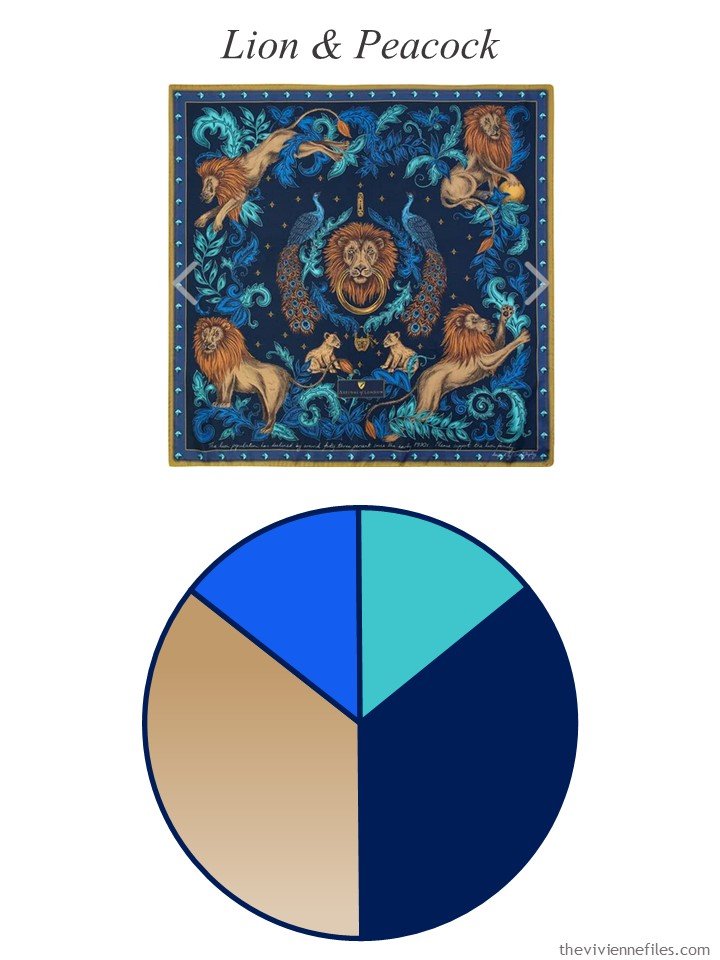
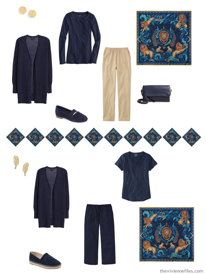
Remember this timeless scarf, and palette?
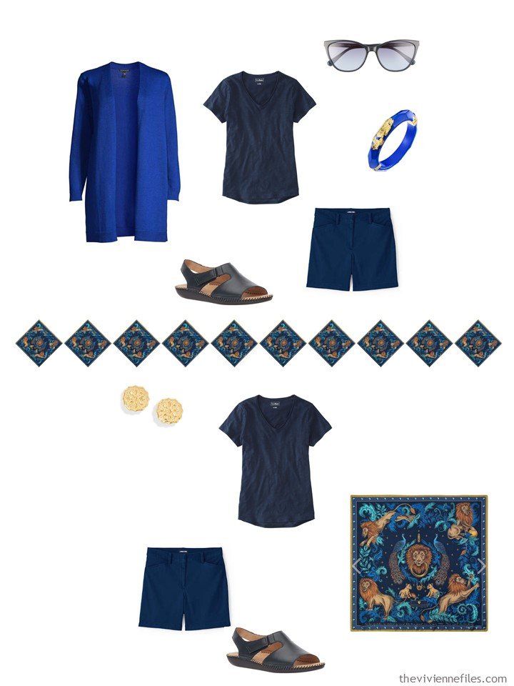
For May, this heroine needs shorts! And the turquoise tank top and bracelet are perfect accents for an overall “navy suit-like” outfit. (yes, linen cardigans are insanely useful in warm weather – I have one at my mother’s home, and one here!)
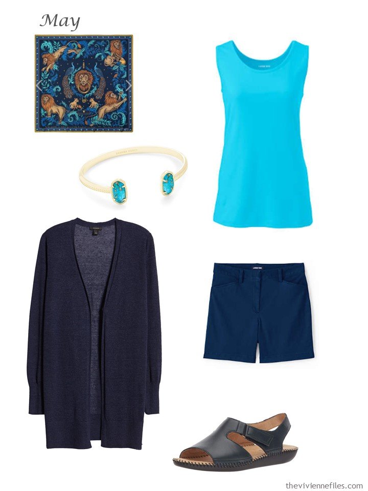
scarf – Aspinal of London; bracelet – Kendra Scott; sea mist blue tank top – Lands’ End; navy linen cardigan – Halogen; deep sea navy shorts – Lands’ End; sandals – Naturalizer
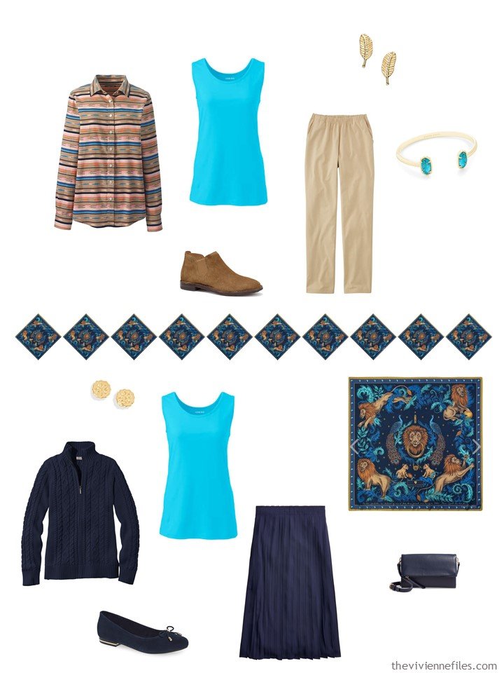
The turquoise is a new accent here! But since it doesn’t need to match other blue tops, it’s uniqueness here is a benefit, not a problem:
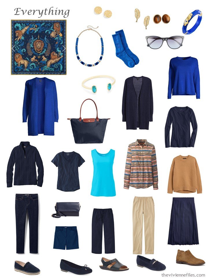
As always (if we’re doing this properly!) there are lots of new outfits possible with the addition of 3 garments. The tank top here is particularly useful because it brings a new accent color into outfits that are for cooler weather. Think of them as long underwear?
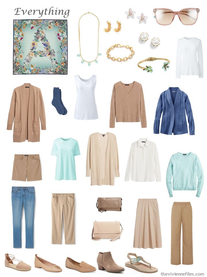
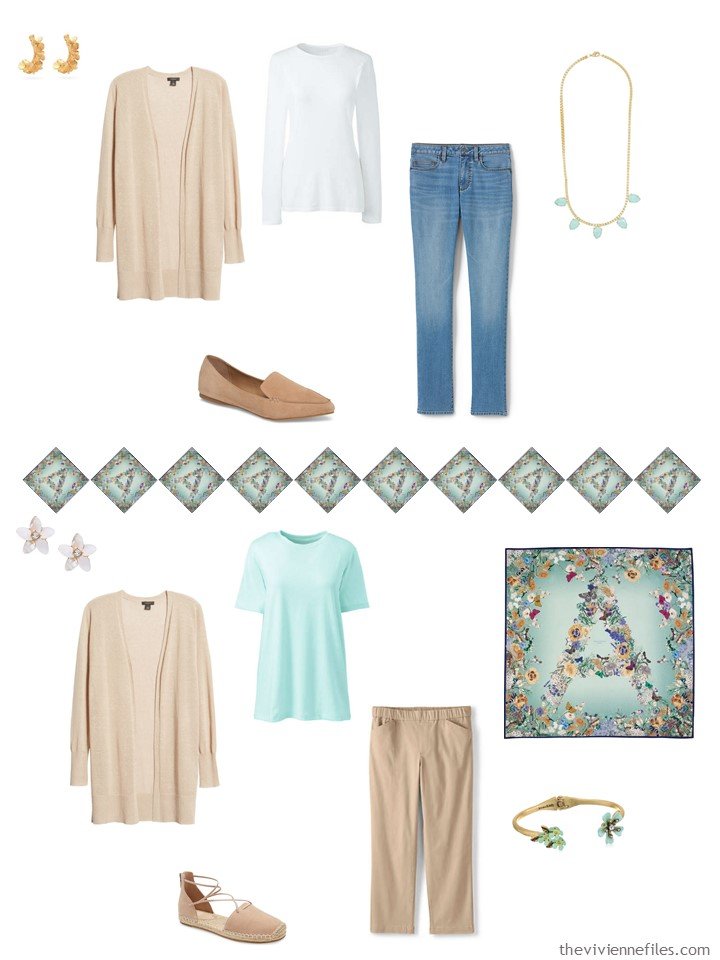
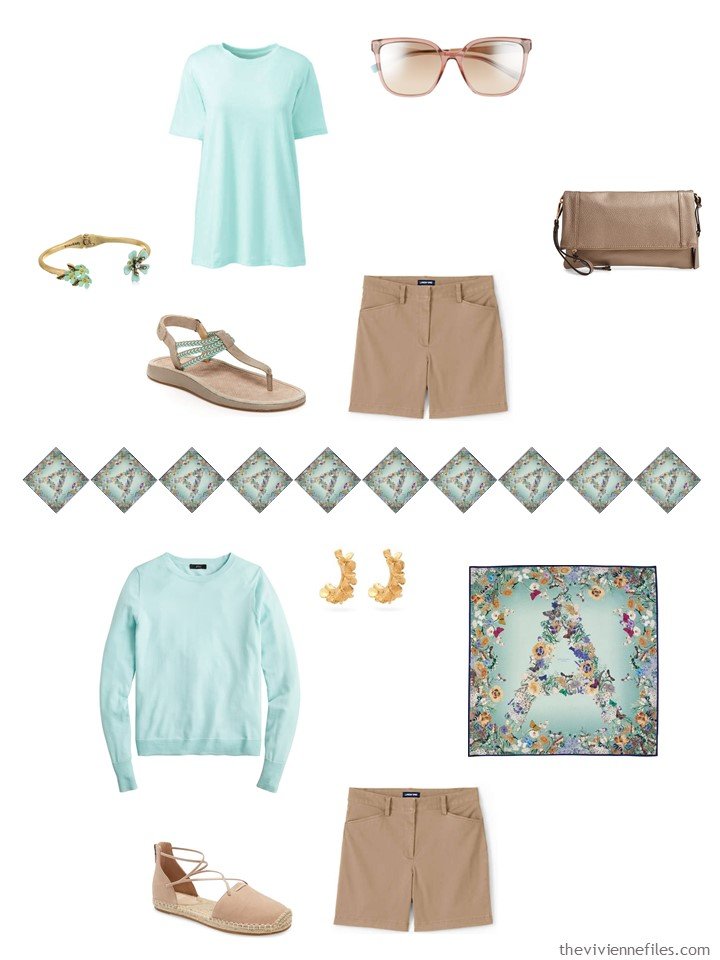
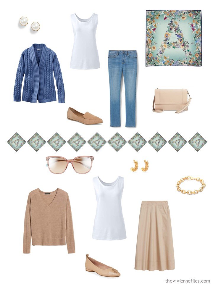
I still really love this soft color combination, although I already feel as if the mint green color has vanished from the marketplace!
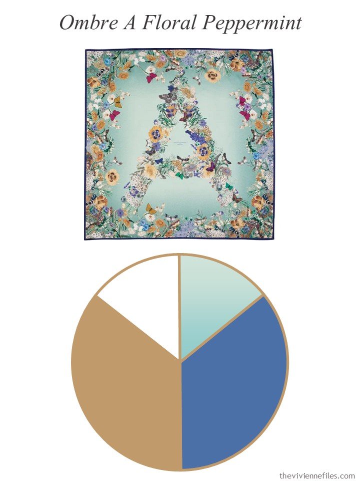
scarf – Aspinal of London
I would have LOVED to include a mint cardigan, or linen shirt, here, but it wasn’t to be. So instead, I managed to find mint-accented SANDALS!!!!! and a pretty bracelet…
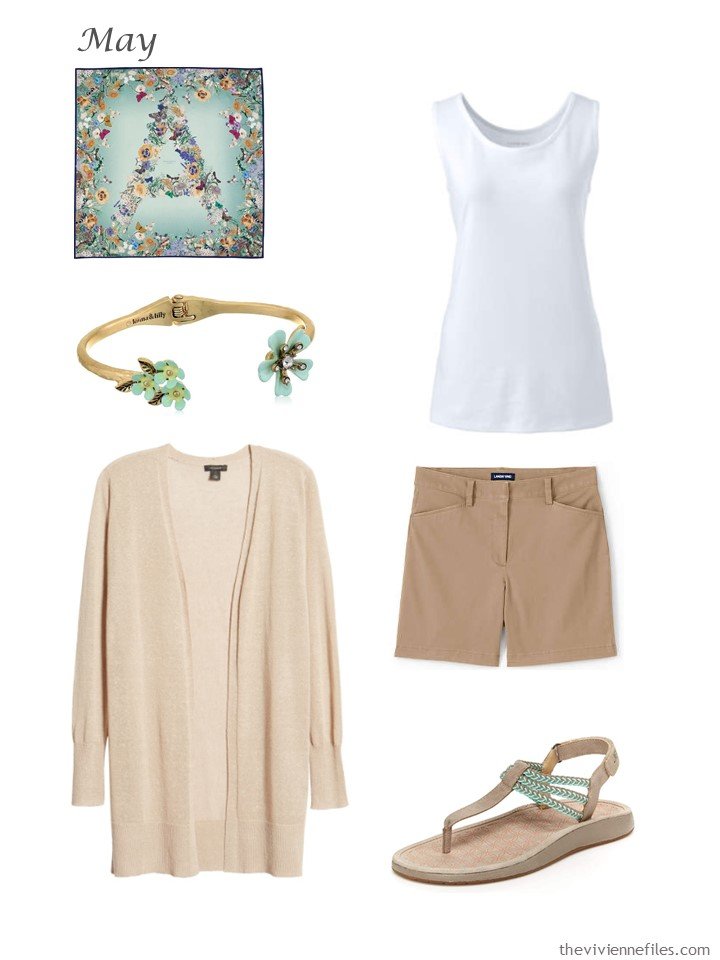
scarf – Aspinal of London; bracelet – Lonna & Lilly; white tank top – Lands’ End; tan cardigan – Halogen; desert tan shorts – Lands’ End; sandals – Jambu
I wonder how I would look in these colors? (just kidding, I think…)
I love these; good thing I’m not completely starting from scratch…
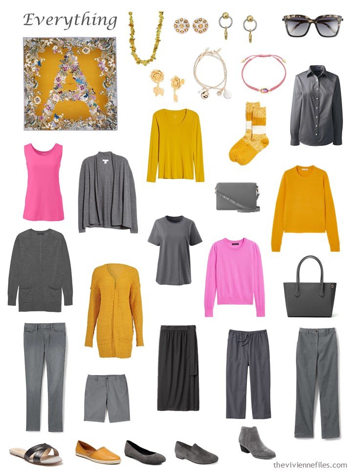
Ah, here’s this somewhat… unusual scarf and color combination. This wardrobe continues to remind me that there are color combinations that we’ve never dreamed of, that will work well with a bit of thought and discipline!
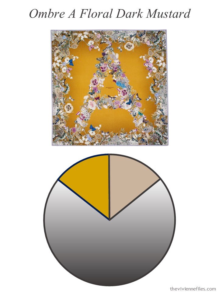
scarf – Aspinal of London
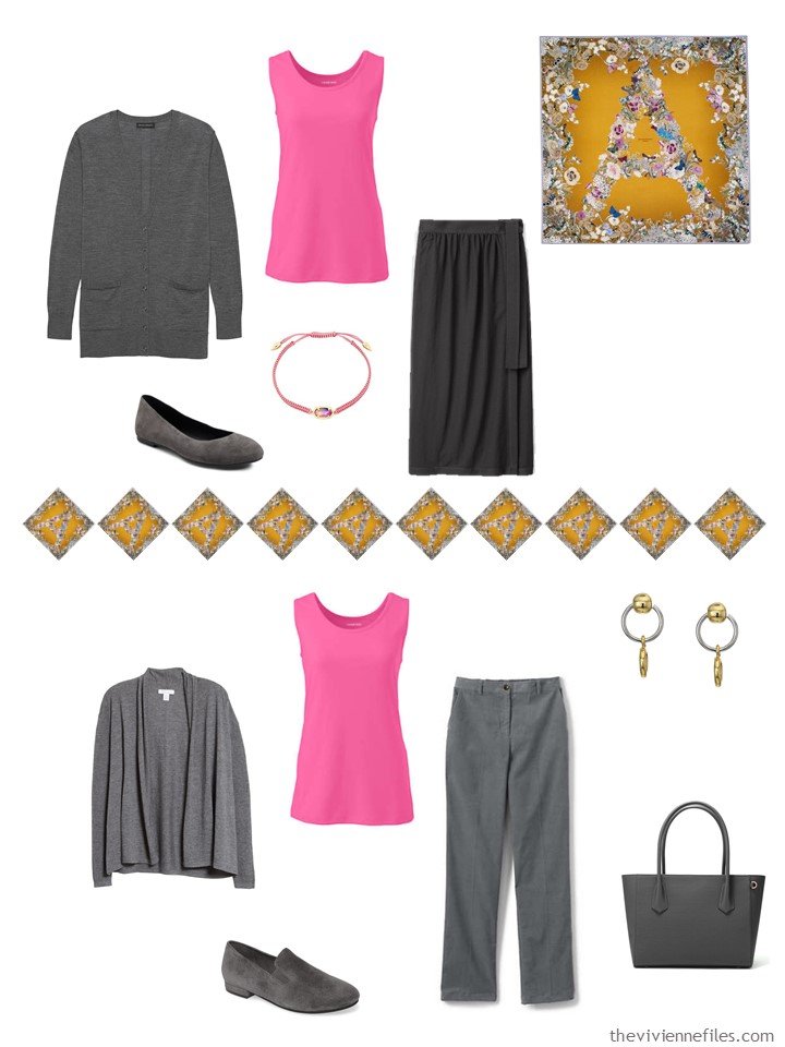
There is, indeed, a bit of pink in this scarf, and a touch of blue too, but I’m going to stick with 2 accent colors, for now. I might even change this color palette wheel to include the pink and remove the tan that I don’t appear to need! How things change… (there’s an understatement, eh?)
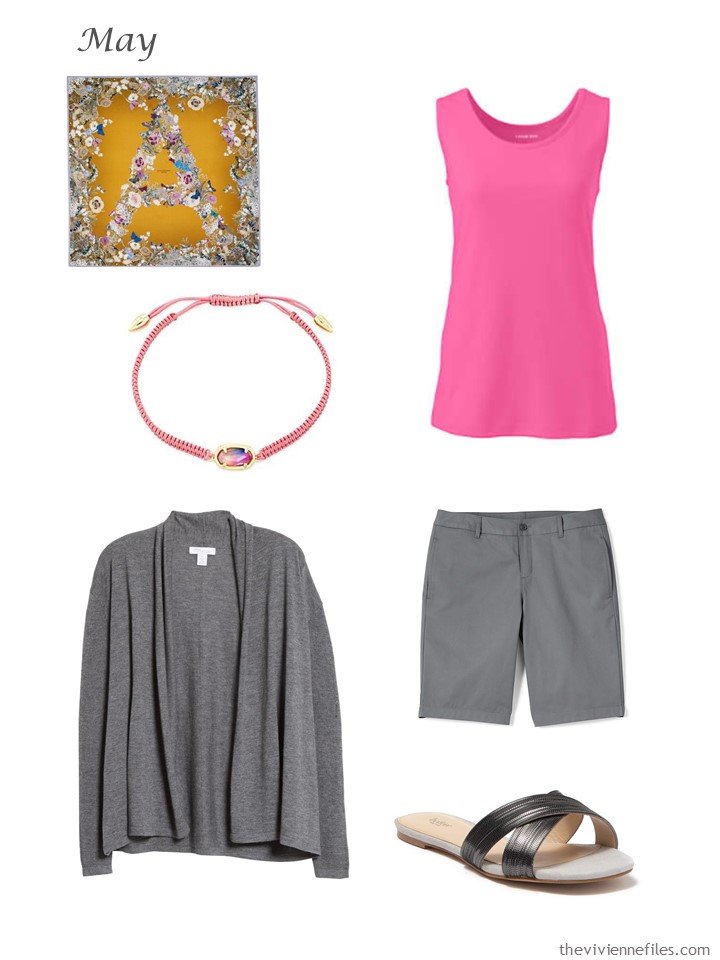
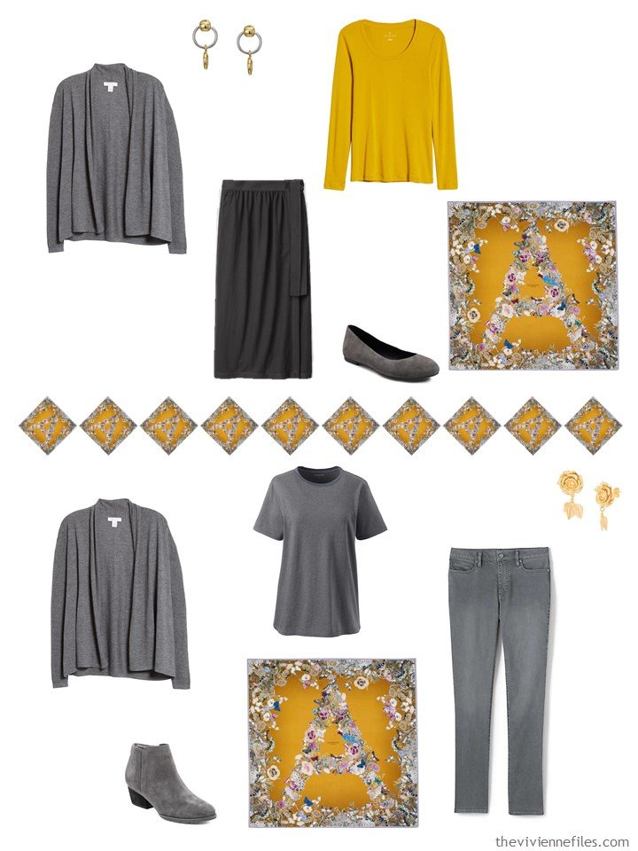
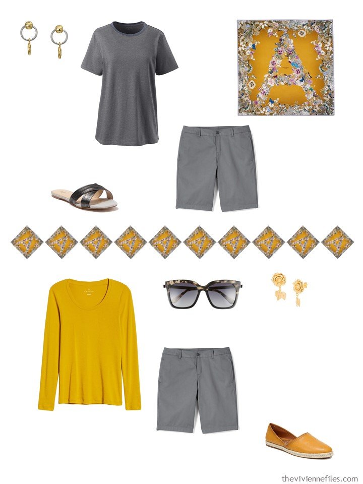
scarf – Aspinal of London; bracelet – Kendra Scott; pink phlox tank top – Lands’ End; grey linen/cashmere cardigan – Nordstrom Signature; arctic gray shorts – Lands’ End; gunmetal grey sandals – Botkier
This wardrobe gives a heroine 3 clear color scheme options:
- all grey (or grey and white) for days when you’re in a monochromatic mood, or when you want your accessories to get all of the attention;
- mustard and grey, for when you’re feeling bold! and
- pink and grey, when you want to bring some prettiness into the picture…
Here’s a case in which the tank top can be worn into quite cold weather, on those days when you need some color in your cheeks!
These colors are classic…
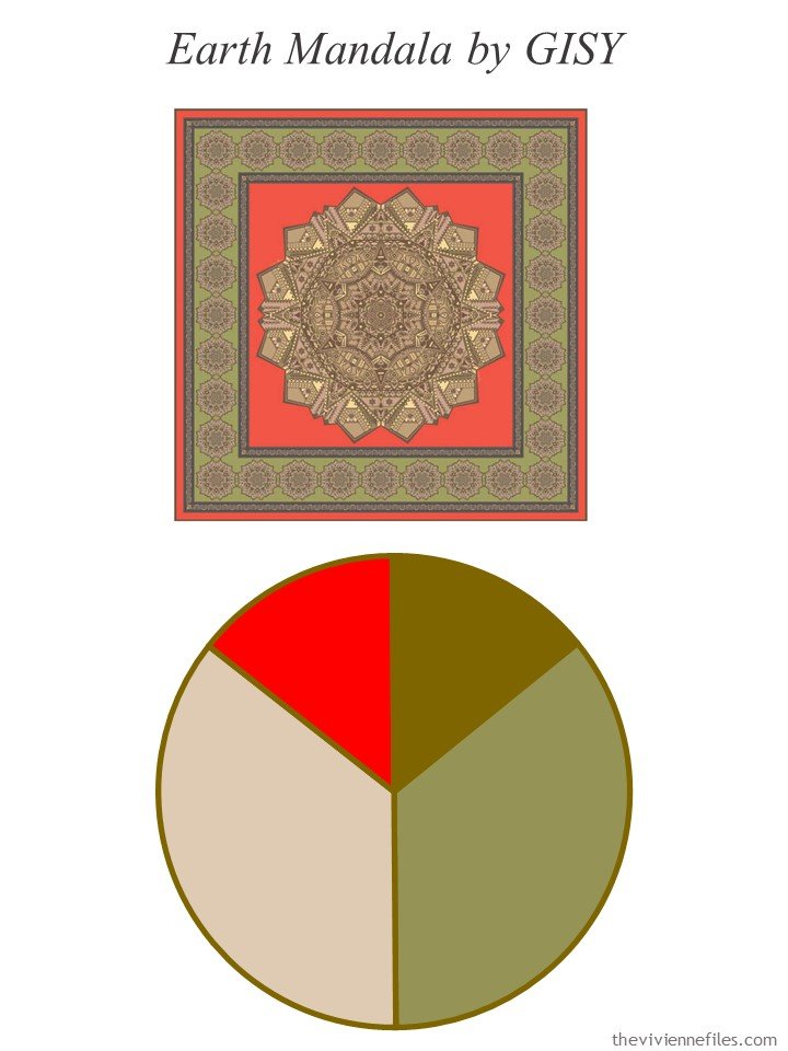
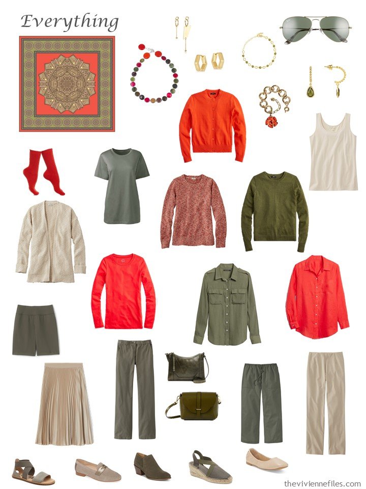
scarf – GISY
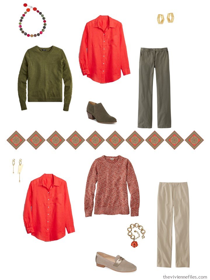
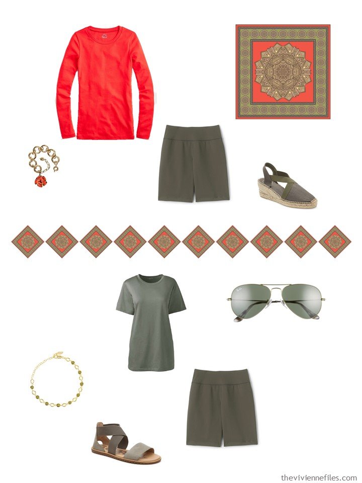
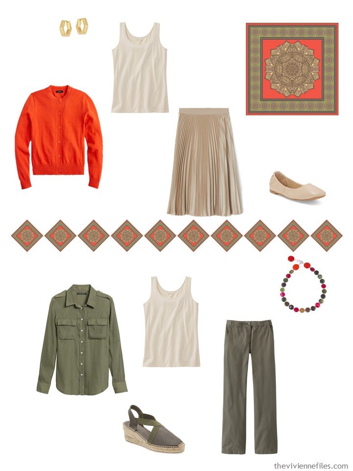
Oh this shirt is perfect! (some days, the small victories make it all worthwhile…)
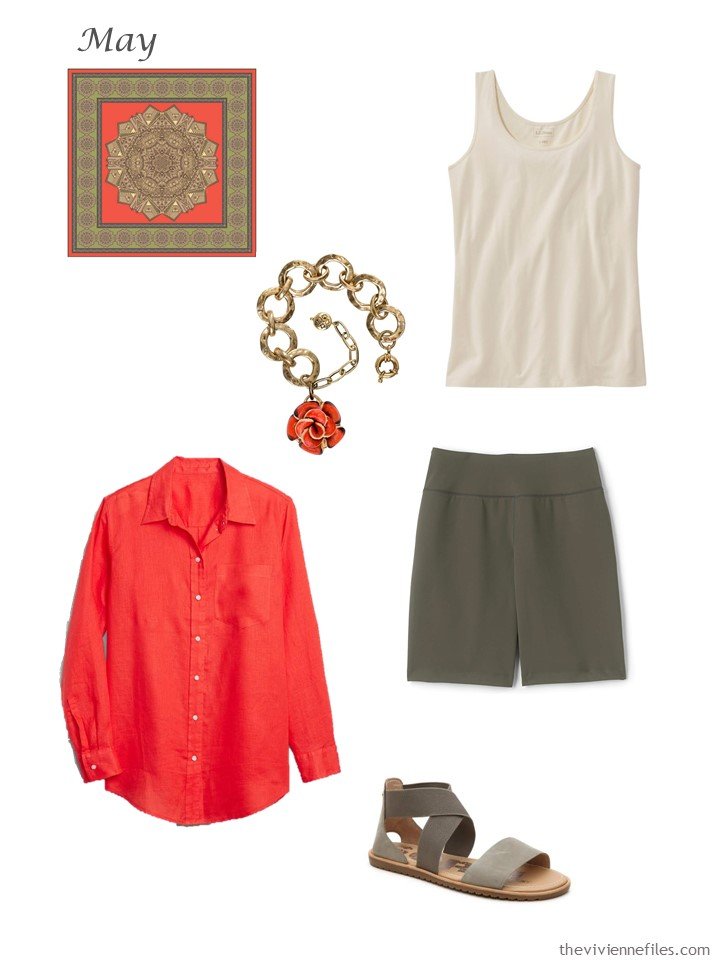
scarf – GISY; bracelet – Patricia Nash; cream tank top – L.L.Bean; orange linen shirt – GAP; forest moss shorts – Lands’ End; sandals – Sorel
The shirt offers so many new opportunities! Well, all 3 pieces are mighty useful, but the shirt just makes me smile…
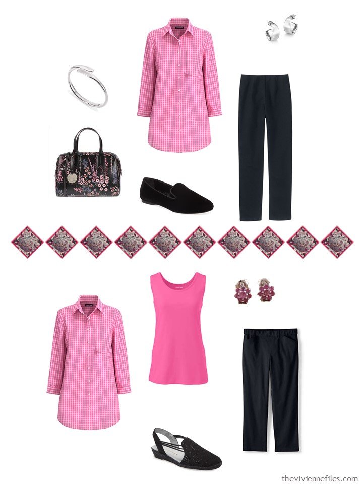
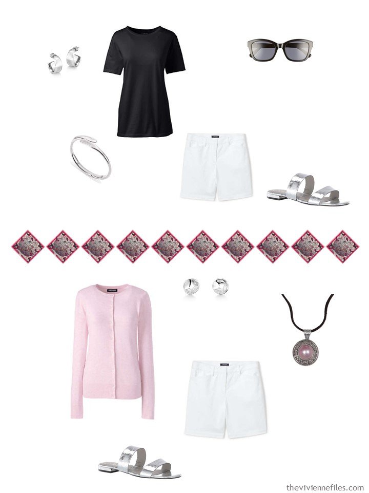
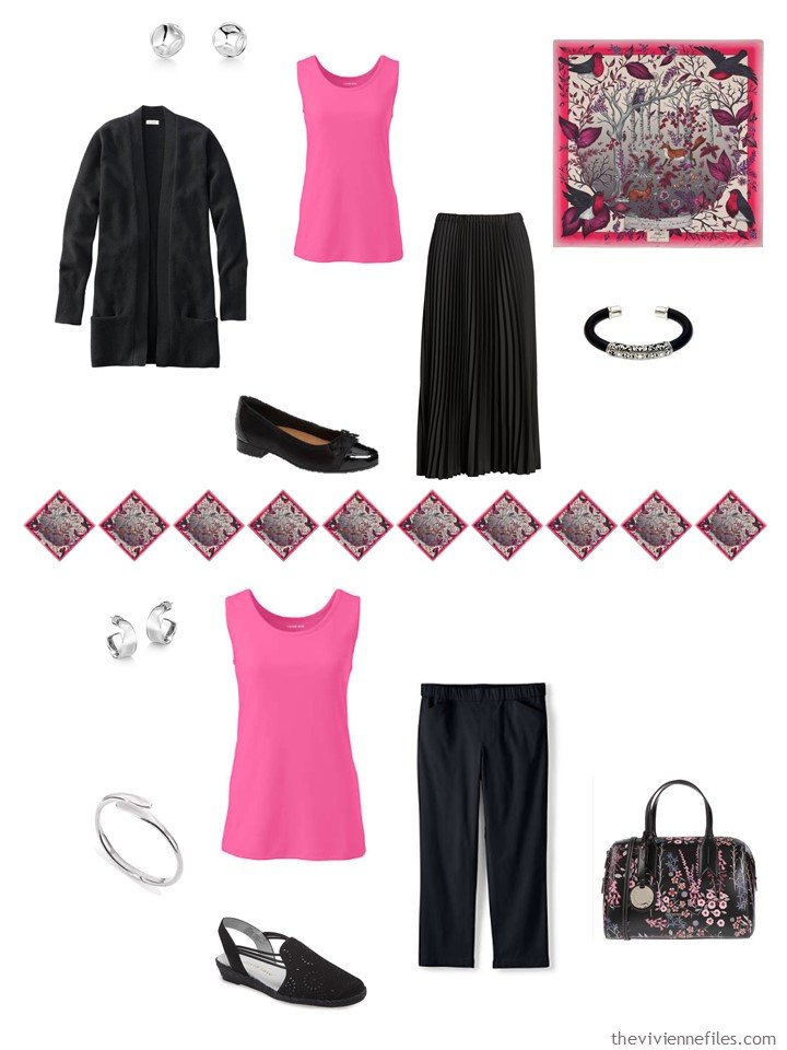
So many ways to get dressed – this would be so nice for travel – if you wore 3 garments to travel, you’d have 11 to pack…
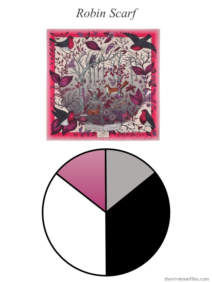
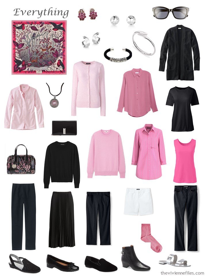
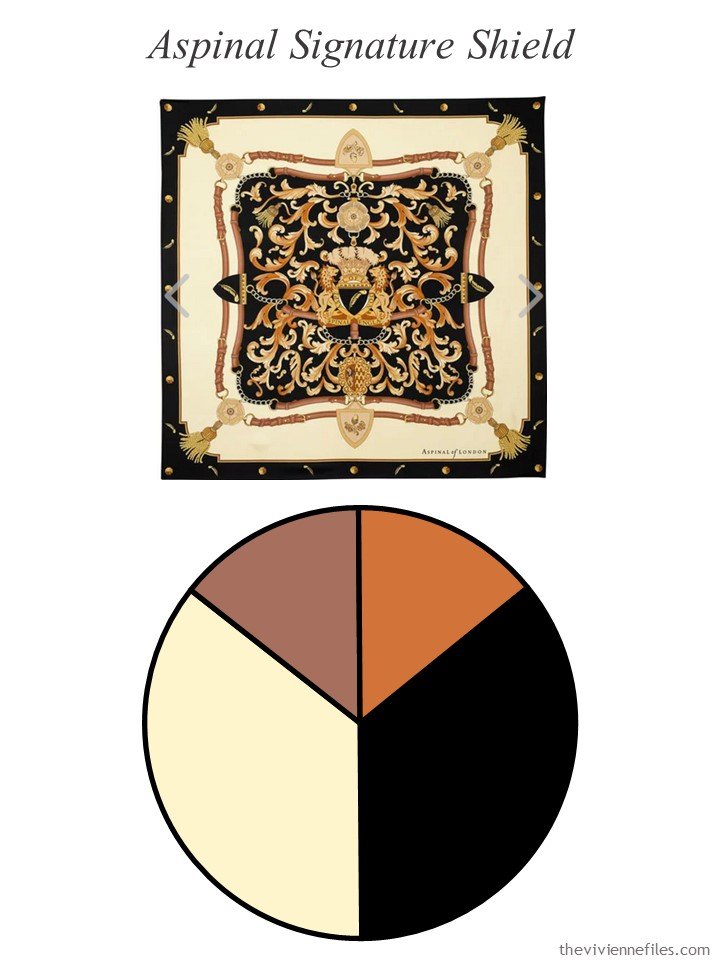
How about some pink and black and white???
Yes, the tank top and tunic are the same color; if you see a color you like on a website it’s wise to search for that color on the site to see what else might be useful – you might find something you like better! Or just find another garment that makes your first choice a ton more useful…
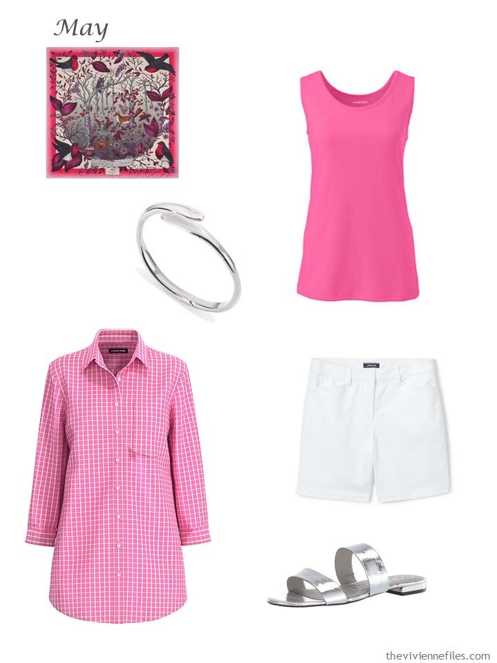
scarf – Aspinal of London; bracelet – Jenny Bird; pink phlox tank top – Lands’ End; pink phlox tunic – Lands’ End; white shorts – Lands’ End; silver sandals – Calvin Klein
These new shades of pink are brighter than the earlier garments in this wardrobe, but unless you plan to layer them all together they don’t have to match. And you can always wear colors that tone together – look up the term “camaieu” in French. It means dressing in (or otherwise combining) shades of the same color…
Give me this suitcase, and a wad of cash, and wave goodbye…
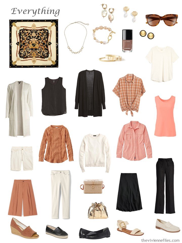
This last palette has gone through a bit of a change in emphasis – I could indeed build a wardrobe in bone and black, with tiny touches of rust or that other soft cocoa brown color. They would have to be tiny touches, because they’re tough colors to find! But a shade of that rust – a bit softer – blends well and is readily available for warm weather.
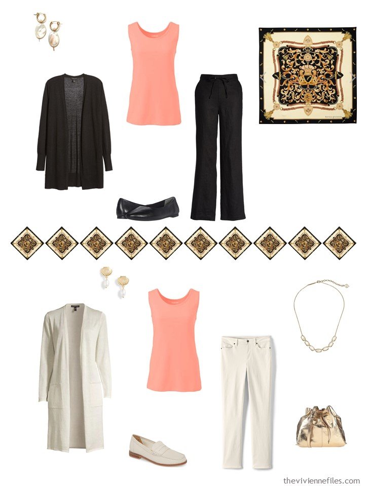
Oddly enough, these 2 tops are NOT from the same place…
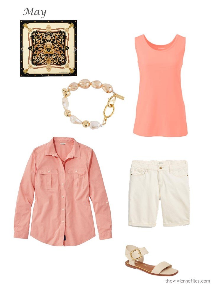
scarf – Aspinal of London; bracelet – Mounser; desert peach tank top – Lands’ End; coral shirt – L.L.Bean; shorts – Old Navy; sandals – Tory Burch
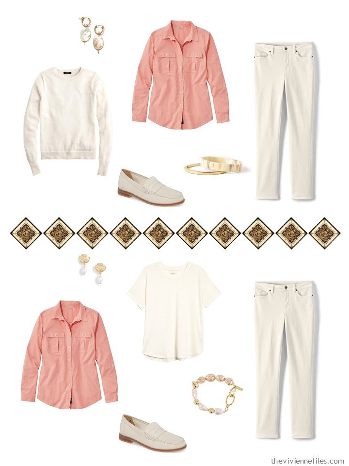
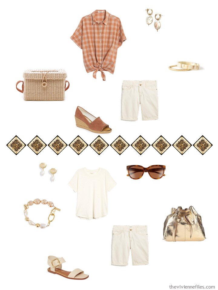
The new tops make this entire wardrobe feel softer and summer-ier. Is that a word?
I love the way outfits come together:
Now that the 18 month-long April is over, are you ready for warmer weather? I’m getting there…
And which wardrobe this month? I’m still smitten with pink and black, to nobody’s surprise!
love,
Janice
p.s. Just last year, we were starting with Georgia O’Keeffe, and Starting from Scratch in black, brown, grey and pink. I’d completely forgotten this one!
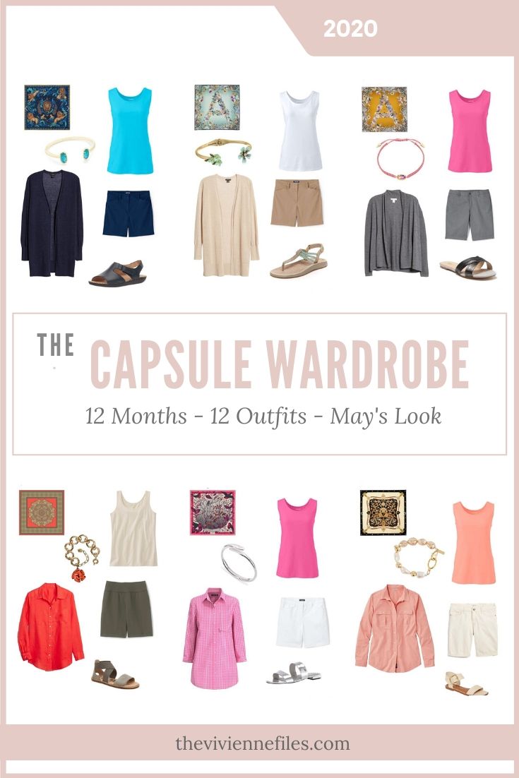
Like this article? Save it to Pinterest!
AAAHHH warm weather. We’ve had some nice weather here in Seattle, but here’s the thing. I’ve been working (because I’m a tech for a middle school) but the heat in the building has been turned off (for awhile) and it’s very cold. I found myself wondering if I should bring out my winter clothes just to stay warm… and all my lovely spring things are waiting for me in my closet. Love the pink and black. I also really like the teal version of that scarf. It’s lovely…
Hi Janice! That’s my mom’s name too. Please add me to your list.
Susan in
San Francisco
Hi Janice ! Where oh where did you find those ‘mint green’ clothes ? (and it seems every store has their own moniker for this color)!
This month I am loving the last wardrobe with the bone, black and tan/rust. The colours you added make it feel very appropriate for warm weather.
I LOVE LOVE this post!!! So much inspiration. I bought the Aspinal in dark mustard and am currently on a quick trip using your inspiration for my packing wardrobe. (Yes, I’m social distancing.) I did the travel capsule in grey, mustard, teal, and white. The reality is I over-packed simply because there’s no place to go with my great outfits … but it was nice to pretend.
I also had the peppermint version of the scarf in my cart but didn’t hit “buy” fast enough. Opportunity lost, for sure.
Thank you, also, for including shorts in your posts. I recently moved south and I really can’t escape having them in my wardrobe now. I appreciate how you show a variety of formality in the outfits you pull together. Nice!
Every time you post the scarves, I return to the Aspinal site. I love the pink/red robin scarf. On the other hand, I have already a lot of scarves that could pull this wardrobe together. In my mind, I am planning a big trip when travel becomes possible again so I should choose accordingly.
I love what the flowered black and pink handbag does for that wardrobe. It brings joy to every outfit combination. If I were shopping for a bag, I might think I would tire of it or that it was too limiting, being so memorable. But, no. It’s great and adds so much to the whole wardrobe.
Janice,
Boy oh boy have you ever done your “homework” ( now a new double entendre’) for this post ! I am hard pressed to pick a favorite one !
My “ buying finger’ has been itchy recently , as I have really knuckled down and purchased NADA except for food and supplies since early March, but I saw a white crinkle cotton light weight topper with tab roll up sleeves in a catalog that I like put out by Appleseeds Company. I literally wore out the topper from them that I’ve had for several years, managing to put a hole in it, which I repaired , but now only wear around the house— which is now a lot ! So, I pulled the trigger and ordered it while free shipping was a special offer — saved $13 !
I also ordered from LLBean a short sleeved light blue cotton striped top with darker blue flowers imposed within and between the stripes. The two blue values are my “ go to” at home Summer colors for module foundations . Looking ahead, I also ordered an olive green pair of long casual trousers, one of my Spring and Autumn color basic colors . I hope the color matches or coordinates with existing olive pieces . I get lucky that way sometimes , emphasis on the sometimes, with purchases made years apart, that color match .
Yes, a happy accent color addition can really perk up a collection ! You pointed out the three potential color schemes with the gray and white, mustard and gray, or pink and gray. This is exactly how I like to break up colors within a capsule, depending on my mood of the day . Some days bright, some days muted and introspective !
It’s still a bit chilly here in PA, but at least I’m seeing blue skies between the big white clouds— a pleasant relief from all of the rain, rain, and more rain ! Ah well, it isn’t ice !
Oh my! That seafoam gold cuff just called my name. It’s coming in the mail soon, Amazon tell me.
My coloring is vivid enough that I can’t wear that wardrobe as is, but it’s still my favorite.
It’s been over 100 here for the last three days (hot even for here!) so a cool April sounds amazing right now. But I wanted to say for those of us in hot climates that I’ve really liked having tanks and other undershirts that only cover your bra and don’t go all the way to the waistline. I really like mine from halftee, but there are other companies that make them. They are so nice when it’s hot!
I also really like the bermuda shorts you chose from Old Navy. I have some from a few years ago, and this style is now a basic and well-loved part of my summer wardrobe. The slim style to the knee is really flattering.
My favorite of these is by far the denim and mint wardrobe. And I don’t even like mint! But the wardrobe is lovely and understated. Perfect, to my taste.
I could never wear it, but the poppy/olive/beige wardrobe makes me happy to look at!
Janice,
After many reminders in your posts over the years I have finally had an “ aha “ moment ! I have several orphaned tops in my wardrobe that do not match any toppers in an exact color match, but I can wear these garments with neutrals in a “ suit” look . My insistence on trying to create solid color twin sets from these orphans has created a shopping conundrum ! But— today— it finally dawned on me that I don’t wear the twin set pieces together anyway as a top and topper unit, when their color is darker than the bottom neutral color ! So — no need to be matchy matchy, and start wearing the tops, which I have been avoiding doing , waiting for the magical topper piece to come along and color match ! Thank you for making this so evident ! That means that I now have more wear-at-home items as a result ! Boy, some people are a little slow in the learning curve and too perfectionistic — me !
As a quick follow up, I still do prefer to exact color match, or darned close, colors that are picked up from within a print , to be worn with the prints. It just makes me happier when I can find that match !
I used to be like that – buy a patterned skirt or blouse and then try and find exact matches for all the colours in it. It’s only in the decade that I’ve realised I don’t need to be so matchy-matchy. Sometimes a lighter or darker tone of the colour will look just as effective, particularly now my hair is showing white through the ash-brown. I’m drawn more to the softer muted shades which allows for greater leeway. However, my bugbear is red which I used to wear a lot of and you really DO need to match red!
Well you finally did it! I am so sick of my usual gray and navy wardrobe during the endless cold, gray days we’ve been having that I had to add that wonderful pink phlox tunic to my closet and while I was at it, I added two more pieces in that color to perk everything up. Come on warm weather!
It really is the easiest thing to do – if you like a color enough to have 1 garment in your wardrobe, you really should like it well enough for 2 or 3. And if you get them all at the same time, from the same place, you’re pretty sure that they’ll match each other. Anything that makes getting dressed easier is smart!
hugs,
Janice
Janice,
In a response to fun color combos that would be nice to see you explore might be periwinkle with lime or aqua, or mint, and coral with lime, or aqua, or mint. How about greenish turquoise or teal and lime, aqua or mint and coral or peach ? How about burgundy or eggplant and the other colors mentioned here ? Thanks !
And perhaps periwinkle and lavender or teal and lavender or coral and lavender ?
My favourites are still the mint scarf and the Robin scarf. However I would add a bit more blue and maybe a flash of a fuschia butterfly in the mint wardrobe and a bit more grey (to tone down the black) in the Robin wardrobe (which is pretty much perfect). Weirdly though the two wardrobes which I feel are very balanced and also make me zing are the Earth Mandela and the last wardrobe for the Signature Shield. I wouldn’t wear any of those colour combos but they are amazing.
Talking about unusual colour combos. I decided that I can experiment whilst at home as the only people seeing me are my family. If I go out, it’s still chilly enough to wear a coat!
So at the weekend, I wore teal and pink. It is unconventional (as my daughter said) but I have a summer scarf in a muted blossom pattern.
Light and dark pink flowers, teal leaves (aqua, mid-teal and dark teal) and soft brown branches. I also have a skirt with similar colours. So dark teal trousers, ditsy pink floral top and a mid-teal cardigan. I may start experimenting with soft brown in the autumn. As my hair becomes more noticeably white, so I am drawn more to the softer muted colours of the Soft Summer palette.
I’ve just realised why I like three wardrobes in particular – Robin, Earth Mandela and the Signature Shield, the last one. It’s because the accents and neutrals vary in tone which gives a greater depth and interest to the mix. This is how I dress and the possibilities become endless. I like to wear head to toe in one colour sometimes. Varying tones look more interesting rather than all pieces exactly matching.
I’m really looking forward to seeing how all the wardrobes pan out as time goes on. My least favourite is the yellow ochre, grey and pink. I can see where you are going with it buy I would probably choose a darker more intense pink. I’m thinking back to.a yellow and pink floral dress my daughter had when she was little. They were intense tones. Perhaps you might find a patterned shirt or top that combines the yellow and pink for the autumn. Now that would be sensational!
Beth T,
Thank you for your thoughts on my above post about not exact color matching. When I watch a movie, I observe how the characters are dressed and the female lead last night had a print shirt done in a dark muted pink and gray pattern, but she had a burgundy turtleneck underneath it that was not an exact color match to the pinks in the print, but did harmonize as being in the same color family as the print, as you suggested in your post. I’ll have to give that a try to expand my mental limited box approach in thinking about garment pairings !